The Shocking Truth About Yield Curves
You can’t turn on the news without hearing about interest rates. Yet, despite all the attention interest rates garner, many miss a remarkable pattern and life lesson.
Before we delve into remarkable patterns and causal correlation, let’s clear the air regarding interest rates. Interest rates determine the cost to borrow, either short term or long term. They also determine the yield investors can get in return for locking up their liquid assets for a predetermined time period.
How often have you either heard or read, “Interest rates are falling,” or, “The Fed is raising interest rates” or some such news regarding interest rates (rates, plural)?
Folks tend to mix up the rates monopoly-controlled by a country’s central bank—in America, the Federal Reserve, aka the “Fed”—and market-set rates.
If America’s Fed feels it should reduce or increase money supply, one tactic is to raise or lower, respectively, the federal funds target rate. The Federal Open Market Committee (FOMC) meets eight times yearly to discuss if it should raise, lower or stay the fed funds rate (also sometimes referred to as the overnight rate or the short rate) and how much the rate should move, if at all.
The short rate is that at which banks lend to each other and drives the interest rate banks pay you for deposits (savings accounts and certificates of deposit [CDs]). This is the rate (singular) investors mean to imply when they talk about the Fed monkeying around with rates.
Rates on US Treasurys and all other bond rates aren’t set by the Fed, the government, the president or an evil conspiracy. Those rates are set by global market forces. (As a point of trivia, in the industry, the 10-year US Treasury rate is sometimes referred to as the long rate.) In our contemporary global economy, traders reach across country lines to trade bonds in a global, free and open market.
Make no mistake—though investors blather about “rates falling” and “rates rising” and “the Fed raising rates”—the Fed-controlled short rate and all other rates—Treasurys, other sovereign debt, corporate bonds, municipal bonds, etc.—move independently of each other, sometimes in the same direction and other times in opposing directions.
Let’s say that again differently. Sometimes when the Fed raises the fed funds rate, other rates rise, too. Other times they fall. More often, they do a mix of things—differing maturities on different types of bonds move up or down or stay flat to varying degrees. That is true in America and everywhere else.
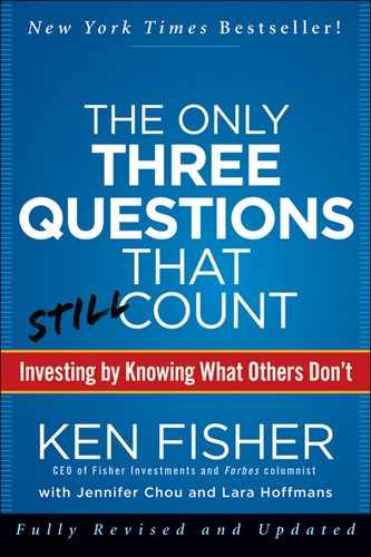
For those very new to this topic, the difference between the shortest-term Treasury bill (which is a very short-term rate, not the “short rate”) and varying longer-rate maturities can be plotted visually on a graph resulting in a yield curve. (The same can be done with any other form of bonds, as long as they’re the same type and credit quality—you can do corporate bond yield curves, muni-bond yield curves, etc.) The vertical axis plots interest rates from zero at the bottom to higher rates up top. The horizontal axis plots time from now at the left to longer-term maturities stretching out to the right, with the far right being 10 or 30 years into the future. A typical yield curve can look something like the hypothetical one in Figure 2.1.
Figure 2.1 Hypothetical Yield Curve
Shorter-term rates usually tend to be lower than longer-term rates, while longer-term rates tend to be higher in return for taking the additional risk of locking money away for longer periods. When short-term rates are lower, the curve slopes upward and is positive. Sometimes, rarely, shorter-term rates are actually higher than long-term rates. When this happens, our graph slopes downward to the right and is inverted. Still rare, but less so than an inverted yield curve, is when rates are all at about the same level—this is referred to as flat.
The Interest Rate Brouhaha
You may have heard an age-old mythology phrased “Don’t fight the Fed,” which is meant to prompt you to sell stocks when the Fed raises the short rate. Nonsense—on average, stocks have done perfectly fine when the Fed raised the short rate—although not always. But nothing is “always” one way or the other. Figure 2.2 shows some recent periods of a rising fed funds rate and subsequent S&P 500 returns.

What you can see is the S&P 500 and a rising fed funds rate correlate pretty closely at times. I wouldn’t take that to mean anything—the stock market is generally more positive than negative, so there is no surprise here. And sometimes the market was more positive than at others. But because positive markets have followed a rising short rate, “don’t fight the Fed” is rendered one of those Question One myths you should ignore. This isn’t to say a rising short rate is any kind of a bull or bear market indicator—but neither is a dropping short rate. There is no credible, consistent link between the short rate moving any direction and bull or bear markets.
What are Fed-fighting fans missing? The first step in asking a successful Question Two is setting aside any unproductive fretting about concerns that don’t matter. Anyone can Google the FOMC or go to the website (http://www.federalreserve.gov/fomc/#calendars) and see when they’re meeting. What’s more, the FOMC under both Greenspan and Bernanke has become ever more transparent about when it plans to lower or raise the fed funds rate and by nearly exactly how much. The Fed raising the rate a quarter of a point, or even half a point, is hardly a market-moving event when the Fed has been talking about the planned pace of rate moves for months.
Instead of focusing on short rate movements, focus on the yield curve. Most investors will tell you a positive yield curve is good and an inverted one is bad. That’s more or less true. The yield curve is normally positively sloped. A truly inverted yield curve is rare and has a reputation for being bearish.
But right now, you’re thinking about yield curves incorrectly, and it can hurt you. Before we can discover something new, let’s check if what we believe about yield curves is correct with Question One. Is it true an inverted yield curve is a harbinger of doom? The answer is—it depends on what you mean by “yield curve,” or more specifically, where.
One problem behind the yield curve—I won’t call it a myth so much as a misunderstanding—is folks tend to lump recessions and bear markets together. They’re not the same things. You can have a bear market without a recession, and vice versa, though they do tend to come together because the stock market will price in dour sentiment and falling earnings caused by a recession. But it doesn’t always (e.g., if the recession is long feared and well priced).
A moment for two definitions: A bear market is a prolonged stock market downturn exceeding 20% or so. (The difference between a bear market and a correction is magnitude and duration—a correction being much shorter lived, only months, and usually under 20% or so.) By contrast, a recession is generally defined as two consecutive quarters of negative GDP growth, but it’s tough to know if you’re in a recession while it’s happening since GDP numbers get heavily restated afterward.
Two mildly negative quarters of GDP can be difficult to feel as they occur. Recessions usually aren’t labeled recessions until long after they’ve started—sometimes not until after they’re over. For example, the 1973 to 1974 bear market was followed immediately by a recession that was steep and pervasive throughout 1974, extending into 1975. It was one of the biggest of the post–World War II era yet wasn’t recognized as having happened until 1975. Meanwhile, in September 1974, President Ford and his economic advisors were still calling for tax hikes to slow the economy and fight inflation. That’s because no one knew we were in a recession.
While I was pretty darned young at the time, I remember the period very well. For me it was a strange time. What I remember was all the people I talked to in 1974 thought the economy was strong, when later we’d learn it had been declining all year. In many ways, I wasn’t very sensitive or plugged in that year. My wife and I had just lost our young daughter. I was pretty well shattered and capable of working only part time for about six months. I didn’t trust myself to have a good view of what was happening with the economy, so I spent a lot of time asking others what they thought was going on. Without intending to, I did a pretty good job of polling a big cross-section of investors and businesspeople. Pretty much no one knew in 1974 we were already long in recession. I don’t think much of anyone saw it as a recession until 1975, and by then, it was mostly over—and that was a huge one. It was heavily masked by the high level of inflation then—for many firms, revenues remained strong as unit volume shrank. Still, if few saw it, note how few would see a mild economic decline.
The official measure of recession comes from the National Bureau of Economic Research (NBER; www.nber.com). Their definition captures more data, though one prominent data point is GDP, and more accurately characterizes an economic contraction. The NBER characterizes a recession thusly:
The NBER does not define a recession in terms of two consecutive quarters of decline in real GDP. Rather, a recession is a significant decline in economic activity spread across the economy, lasting more than a few months, normally visible in real GDP, real income, employment, industrial production and wholesale-retail sales.2
Historically, a steep yield curve suggests an environment in which financial institutions can lend profitably, and lending is an important driver of future economic activity. However, an inverted yield curve creates a disincentive for banks to lend, thereby reducing liquidity (remember this for later in this chapter), and it’s a fairly reliable predictor of recessions.
But whether an inverted yield curve causes a bear market or not depends on whether the related bad news is priced into the market. For example, in 1998 we had a flattening yield curve here in America that had people in a collective tizzy. Fear of an upcoming inverted yield curve ran rampant. That, along with the Russian ruble crisis and the Long-Term Capital Management crisis, was widely expected to drive stocks down, long and hard. We had a big midyear correction but no bear market—the S&P 500 finished 1998 up 29%.3 Fear of a flattening yield curve was so prevalent it lost its power to create a major decline.
Fast forward to 2000 when the yield curve actually did invert. This time, nobody paid heed. Instead, folks were lauding the “new economy” and saying, “Earnings don’t matter” and “It’s different this time,” as they rushed off to parties celebrating the launch of dot-com stocks. Among other things, the recent memory of 1998 may have convinced them inverted yield curves didn’t matter. In 2000, the yield curve, because it wasn’t widely noted and feared—the tribe was looking elsewhere—was a good harbinger of economic weakness and peaking Tech stock prices that led to a three-year bear market. If everyone is talking about it, dreading it and stocking up on canned goods because of it, then the inverted yield curve has likely lost some of its bearish oomph. If everyone skips about singing, “Tra-la-la! It’s different this time,” as in early 2000, then an inverted yield curve can devastate stocks.
Even with that clarified, people still see yield curves incorrectly. It’s important we see them correctly because of the economic conditions an inverted yield curve implies. You think about interest rates here in America and the yield curve they engender. Why wouldn’t you think about US interest rates? What other interest rates would you consider? The Question Two I’m about to share can be recast over and over again into other problem-solving contexts where it works just as well. So here goes.
Question Two: Is there a yield curve more important than America’s? You’ve probably never thought to ask yourself that question. Why on earth would you? What could possibly be more important than America? Particularly to Americans!
After all, when we look at US yield curves from 30, 50 and 100 years ago, we can see some pretty compelling long-standing evidence they can signal how healthy the economy is. Everyone knows that (or at least, plenty of folks believe it—including most reporters, which means pretty much everyone). It’s widely accepted America’s yield curve matters and is a somewhat reliable indicator of good and bad economic times ahead. Whenever the short rate has been above long-term rates, banks became disinterested in lending as aggressively. And that’s less good. Thirty years ago when America’s yield curve inverted, the only way for a bank to make money lending was to lend to a worse credit risk at a higher rate than the bank’s borrowing costs. This was and is risky, and banks dislike doing it. In fact, the riskier the customer they need to profitably lend, the less they like it and don’t want to do it. In the days of yore, America’s yield curve and its camber mattered. A lot! Of course, in those days most folks didn’t know the yield curve mattered.
Think Globally, Think Better
Fast forward to now—we have not just national banks, but fully global banks, a wide array of derivatives and financial futures for hedging and electronics allowing instant access to precise accounting and trade information globally. Now money flows fairly freely across borders. A global bank can borrow in one country and lend in another and hedge its currency risk all as fast as you can read this sentence. I can borrow money from an investment bank that got it from a syndicate of insurance firms in Europe that crossed the money through global banks, and I may never know the source was overseas. To me, as the borrower, it’s just money.
Decades back—in a world of national banks, minimal high-volume electronics for accounting and trading, no material hedging instruments and fixed instead of flexible currency prices—it was the national yield curve that mattered. No more! Global tendencies prevail over local ones in every country, including America, the greatest country in the world. Foreign interest rates and yield curves provide or deny liquidity heavily impacting our own. They also determine the cost effectiveness of using leverage as a means to snap up both domestic and foreign assets.
The analysis of any country’s yield curve—even a country as massive as America—has become less meaningful. The right way to think about this now, something I fathomed no one had ever written about before I first did, is the GDP-weighted global yield curve. The global yield curve is representative of worldwide lending conditions. In today’s world, if the global yield curve says one thing and America’s says another, go with the global. America’s or any other single stock market will subordinate to the global curve.
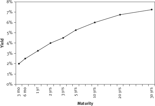
Figure 2.3 shows the global yield curve as of September 2011. The reason it’s important? If a bank can borrow more cheaply in one country and lend more profitably in another, it will. Everybody, including banks and their customers, likes cheap money. Note this illustration is based on the global yield curve being GDP weighted. It makes sense intuitively that a country with a larger GDP would have greater impact on the global yield curve.
Figure 2.3 Global Yield Curve, September 2011
Sources: International Monetary Fund, World Economic Outlook Database, September 2011; Global Financial Data, Inc.; Bloomberg Finance, L.P. Yield calculations exclude Greece.

In constructing the GDP-weighted yield curve, first I made a list of the countries included in the MSCI World Index. I didn’t use the full list of ACWI countries because the developed nations’ GDPs dwarf those of the emerging nations, so their interest rates would barely register—and accurate data on some emerging nations is devilishly tough to come by. Then I input the latest GDP for each of the countries. The GDP for all of these countries can be found at the web site for the International Monetary Fund (IMF; www.imf.org). My list looked something like this:
| Country | GDP ($ in Billions) | GDP Weight (%) |
| Country A | 50 | 14.3 |
| Country B | 50 | 14.3 |
| Country C | 250 | 71.4 |
| Total | 350 |
As Global as You Can Get
In measuring global markets, the best indexes we have currently are those built by MSCI, Inc. All MSCI indexes are properly constructed—in other words, market-capitalization and float weighted—but the two we focus on most are the MSCI World Index and MSCI All Country World Index (the World Index and ACWI for brevity’s sake).
The World Index represents 24 developed nations including America, Britain, Australia, Germany and Japan. I frequently refer to the World Index when discussing market history because it provides ample historical data—and having data to measure helps decipher history. More important, it is comprehensive, and each constituent is weighted by its float—i.e., its market liquidity. That is, a stock has little market effect if it’s not trading actively. One example is Berkshire Hathaway, which isn’t included in the World Index or the S&P 500 because it’s so seldom traded relative to other stocks.
As a proxy for the total global market, another good choice is the ACWI as it also includes emerging nations. Currently, 45 countries make the cut—the stocks in the World Index plus Mexico, Brazil, China, India and so on. Because there is limited history and little data for the Emerging Markets, it’s less useful than the World Index for measuring performance history. But it’s a well-constructed index and an excellent proxy for the global market.
To find more information on these indexes and track historical performance, go to www.msci.com.
Clearly, that is all hypothetical information, and a shorter list for illustration’s sake, but you get the idea. To get each country’s appropriate GDP weight, sum for the total world GDP and divide for each country.
Next, input the short-term and long-term interest rates. (Here I show the 3-month and the 10-year rates.) I have access to some great data sources letting me compile interest rates quickly, but anyone can find this information for free on any good financial website.
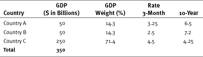
That part is just data entry. Now I subtract the 3-month rate from the 10-year rate to get the spread. A positive spread means a positive yield curve, and a negative spread means an inverted curve.
Note Country C actually has a negative spread, meaning its yield curve has inverted slightly. And Country C has a massive relative GDP. Does this spell doom for Country C? We aren’t done yet. Next, multiply each country’s spread by the appropriate GDP weight, and sum up the column for the global yield curve spread, as shown here:
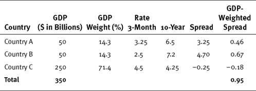
Though Country C has a negative yield curve, the global yield curve is still positively sloped—the 10-year is above the 3-month. The global yield curve spread is 0.95—a spread from low to high of almost exactly 1%. You can imagine Country C, with a much bigger GDP than its friends on this imaginary index, is a country like the United States. The other countries’ yield curves matter, too, even to a country as big as Country C.
If credit conditions are suboptimal for Country C’s banks and institutions, they can borrow in other countries without feeling much of a slowdown, which is not what they would have done decades ago. (You can use the same methodology to calculate the global short-term and long-term rates if you want to create an actual global yield curve. Just multiply each country’s interest rate by its GDP weighting, then sum up for the global rate. In our hypothetical example, the global 3-month rate is 4.04 and the 10-year rate is 4.99. Subtracting the shorter-term rate, you still arrive at the same yield curve spread of 0.95.)
Therefore, an inverted US yield curve by itself is no basis for immediate panic. Rather, you must look at what global rates and the global curve are doing. An inverted yield curve in a single nation when the global curve is positive might be a reason to underweight that country. But it’s no sure-fire reason to get globally bearish, not by a long shot. The global yield curve is a more useful leading indicator for stocks and the global economy than any single country’s curve.
Figure 2.4 shows the spread between global short-term rates and global long-term rates since 1985—another way of depicting the relative steepness of the global yield curve. Anything above 0% is a positive yield curve and anything below is inverted. The higher the line, the greater the spread between short-term and long-term rates and hence, the steeper the curve.
Figure 2.4 Global Yield Spread
Sources: Global Financial Data, Inc.; International Monetary Fund, MSCI World monetary zones.
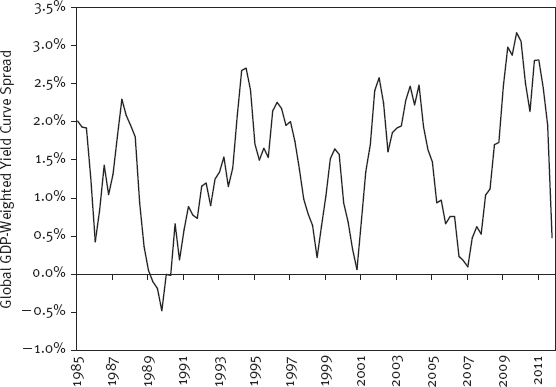
Note the global yield curve inverted in 1989, signaling the oncoming recession (a global recession, by the way). It also got very flat at the end of 2000 and early in 2007—both ahead of global recessions. Recall, at points in 2005 and 2006, the US yield curve was very flat or even inverted, depending on how you measured. Inverted! But in 2005 and 2006, the global yield curve was still positive—and there was no US or global recession then. Interestingly, US stocks rose 4.9% and 15.8% in 2005 and 2006, respectively, lagging world stocks both years, which rose 9.5% and 20.1%.4 Such an outcome wouldn’t surprise you if you knew the US had inverted but the world had not.
If the global yield curve is inverted or flat, be cognizant of what that could mean looking forward. Whether positive or inverted, it should be more important to your global view than any single-nation yield curve.
To my knowledge, until I did it, no one ever constructed a GDP-weighted global yield curve to summarize global credit conditions. This is a simple and perfect example of a Question Two—fathoming what is unfathomable to most people: The global, not national, yield curve is more important today. And yet fathoming what is unfathomable to most people isn’t complicated, prohibitively theoretical or hard to grasp. It’s actually pretty darned basic and simple.
One really neat point mentioned earlier is you can extend this principle to many other phenomena. It’s the global budget deficit that matters (or doesn’t) to global GDP and markets. It’s the global level of inflation that will drive inflation in America and elsewhere. You can use the same methodology I just described to create a GDP-weighted global money supply and watch its growth. Why? Because it’s global money creation that will drive global inflation, not what any single country does. You know you worry about trade deficits and current account deficits. By definition, these simply disappear on a global level, but we cover how to think about that later. You can apply global thinking to so many things that the age-old but seldom-applied notion of “Think global, act local” is a truly valuable saw—one way ahead of its time.