Forgetting for now why the P/E myth is so easy to buy into, we know people overwhelmingly do believe high-P/E markets predict below-average returns and above-average risk.
But if it were true, you could show some form of high statistical correlation between the claimed cause and result. A statistician will say you can have high correlation between two things out of quirky luck with no causation. But the same statistician will tell you that you can’t have causation without high correlation (unless you run into scientific nonlinearity, which doesn’t happen in capital markets to my knowledge—but you could check on your own with the Three Questions when you’re finished with this book). When a myth is widely accepted, you will find low correlations coupled with a great societal effort to demonstrate, accept and have faith in correlations that don’t really exist.
Investors will root out evidence supporting their favorite myths and create justifications for their belief—factor X causes result Y—while ignoring a mountain of evidence that X doesn’t cause Y at all. Now let’s suppose everyone is of good intent. Still, even with the best of intentions, it’s easy for people to latch onto evidence confirming their prior biases and ignore evidence contradicting their views. Looking for evidence to support your pet theory is human. Accepting evidence to the contrary is no fun at all. This is done in varying ways. One way is to look at a particular time period verifying the false belief and ignore other periods. Another is to redefine either X or Y in a bizarre way so the statistics seemingly prove the point and then generalize afterward about X and Y without the bizarre definitions. Discoveries of data supporting popular myths become popular discoveries.
Why High P/Es Tell You Nothing at All
A great example of redefining X or Y is the now-famous study by John Y. Campbell of Harvard and Robert J. Shiller of Yale.1 Their paper didn’t introduce a new idea because fear of high P/Es had been around forever. Their study merely introduced a new delivery of data confirming the view high-P/E periods are followed by below-average returns, an already widely held belief.
This was actually a better redo of a study they presented in 1996. But this 1998 publication got very popular, very fast because it supported what everyone already believed with new statistical documentation. Campbell and Shiller were and are noted academics. Inspired by the prior study, in 1996 Alan Greenspan first uttered the phrase “irrational exuberance” relative to the stock market, which reverberated around the world almost overnight and entered our lexicon permanently.
My friend and sometimes collaborator Meir Statman, the Glenn Klimek Professor of Finance at the Leavey School of Business at Santa Clara University, coauthored with me a paper not refuting their statistics, but reframing their approach more correctly with the same data—and you will see P/E levels aren’t predictive at all. We basically asked Question One from beginning to end. Much of what follows stems from our paper “Cognitive Biases in Market Forecasts.”2
In their study, Campbell and Shiller found high P/Es acted as people always thought they did, leading to below-average returns 10 years later. First, they noted the P/E at the outset of each year and subsequent annual market returns going back to 1872, which is about as far back as we have half-tolerably reliable data. Prior to the inception of the S&P 500’s data in 1926, they used Cowles data, which is an imperfect but generally accepted proxy for pre-S&P 500 years. (All old databases are imperfect. Whenever you’re looking at old data, there is apt to be lots wrong with it, but the Cowles data is the best we have.) Then they graphed the data points on a scatter plot and found a slightly negative trend line.
Figure 1.1 largely re-creates their hypothesis, showing P/Es from 1872 through 2010—again using S&P 500 and Cowles data.
Figure 1.1 Relationship Between P/E Ratios at the Beginning of a Year and Stock Returns Over the Following Year (1872 to 2010)
Sources: Robert J. Shiller, Ibbotson Analyst, Global Financial Data, Inc., Standard & Poor’s, Federal Reserve and Thomson Reuters.

I’ve included the years since their paper (and updated through 2010) to ensure our findings are relevant today. But you’d get the same basic effect if I hadn’t. The negatively sloping trend line shouldn’t influence you. You plainly see the scatter points aren’t particularly well grouped around it. The scatter plot is, well, scattered—sort of like a shotgun blast in a mild wind.
The key issue I had with the study was Campbell and Shiller based their work on an odd definition of P/E—not one you intuitively leap to. They created a “price-smoothed earnings ratio.” 3 The newly defined P/E divided the price per share by the average of real earnings over the prior 10 years.4 (Real means adjusted for inflation.) Fair enough, but that isn’t what you think of when you think P/E, right?
But, if so, what definition of inflation would you use? I bet you would use something like the Consumer Price Index (CPI). (The CPI comes up as one of your first results when you Google “inflation.”) Ironically, they chose an esoteric wholesale price index. Again, not what you might default to. So instead of what you think of as P/E, they used a 10-year rolling average based on inflation adjustments based on an inflation index most wouldn’t think of. Got it?
With a normally defined P/E, as you would think of it, there isn’t much of a statistical fit at all. However, Campbell and Shiller’s engineered P/E gave a result consistent with what society always believed—that high P/E means low returns, high risk. And the world seemingly loved it.
In statistics, a calculation called an R-squared shows the relative relatedness of two variables—how much of one variable’s movement is caused by the other. (It sounds complicated, but it’s not—I show you how to find a correlation coefficient and an R-squared in Appendix A.) For their study, Campbell and Shiller got an R-squared of 0.40.5 An R-squared of 0.40 implies 40% of subsequent stock returns are related to the factor being compared—in this case, their reengineered P/E. Statistically, not a bad finding (although not an overwhelming one). Though not a whopping endorsement of their theory, this finding still supports their hypothesis.
Note: Campbell and Shiller’s study, tepid support or not, became wildly popular because it supported the view society had long held. If you present data violating society’s myths, those data won’t be met with great popularity. That’s nice because when you discover the truth, the world won’t be trying to take it away from you in a hurry.
By using the same basic data and traditional notions of P/Es at the start of each year from 1872 to 2010 and actual 10-year subsequent returns, updating this study for this edition, we get an R-squared of 0.25. The P/E only potentially explains 25% of 10-year returns—statistically pretty random. Something else entirely, or some group of other variables, explains the other 75% of price returns. I wouldn’t make a bet on an R-squared of 0.25, and neither should you. Said another way, Campbell and Shiller’s R-squared was 0.40 and ours was 0.25—so a big chunk of their result was based on how they defined P/E differently.
This myth wasn’t hard to debunk. You can arrive at the same general conclusion with Google Finance and an Excel spreadsheet. When it isn’t a myth and it’s real, you will find you need no fancy statistical reengineering and no fancy math in your analysis.
But there’s yet another issue. Even if it were valid, who cares about views of subsequent 10-year returns? Investors mainly want to know how to get positioned for this year and next, the now and the soon, not for 10 years from now. Would you really have cared what the next 10-year return was in 1996, when the next four years rose massively only to be followed by a big bear market? Would you have wanted to miss the big up years in a row, and would you have been content to hold on through the big down years? When you look at simple P/Es on a shorter-term basis, the high-P/E-is-risky thesis falls apart completely, as we shall see.
What’s more, forecasting long-term stock returns is a near impossibility because stock prices in the long term are the result primarily of shifts in far-distant levels of the supply of equities, which in today’s state of knowledge (or ignorance), no one knows how to address. Some of my academic friends get angry when I bring this up. But remember, when anyone gets angry, they are afraid and just can’t quite put their finger on their fear. In this case, I think it’s because very little real scientific work has been done analyzing shifts in supply and demand for securities. Yet, by definition, shifts in supply and demand are what determine pricing. There are great future advances to be made here, but so far, the progress is minimal despite supply and demand being basic to economics. (We get to supply and demand for securities in Chapter 7.)
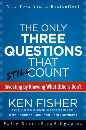
For now, let’s take a look at our scatter plot again, this time using normal, non-engineered P/Es and subsequent one-year returns from 1872 through 2010 (see Figure 1.2). Note we have a much shallower negative trend line, and the scatter points are even less cooperative. This is our same shotgun blast with a few stray pellets. Does this indicate any sort of correlation at all? With an R-squared of 0.01, the answer is no. If an R-squared of 0.25 is pretty random, an R-squared of 0.01 is randomness itself—pure, perfect randomness.
Figure 1.2 Relationship Between Annualized (Overlapping) One-Year Returns and P/E Ratios (1872 to 2005)
Sources: Ibbotson Analyst, Global Financial Data, Inc., Standard & Poor’s, Federal Reserve and Thomson Reuters.
Finding a correlation where simply none exists is pretty creative; and simply, none exists here. To begin debunking myths on your own, you don’t need a super computer and a Stephen Hawking doppelganger (that’s probably illegal anyway). If you need ultra-complicated math to support the existence of a market myth, your hypothesis is probably wrong. The more jury-rigging and qualification your analysis needs, the more likely you’re forcing your results to support your hypothesis. Forced results are bad science.
If Not Bad, Can They Be Good?
We have shown there’s no correlation between high P/Es and poor stock results (or good ones). Even in light of such damning evidence, some may be reluctant to let go of the “high-P/E-equals-bad-stocks” doctrine. Consider this another way: It may further shock and appall you to learn years with higher P/Es had some excellent returns. Moreover, the one-year returns following the 13 highest P/E ratios weren’t too shabby—some negative years, but also some big positive years. This isn’t statistical but should give you pause.
Need more evidence? No complicated engineering necessary here, either. Figure 1.3 shows a basic bell curve depicting P/Es and subsequent annual market returns.
Figure 1.3 139 Years of Historical P/E Ratios and Stock Market Returns
Source: Global Financial Data, Inc.
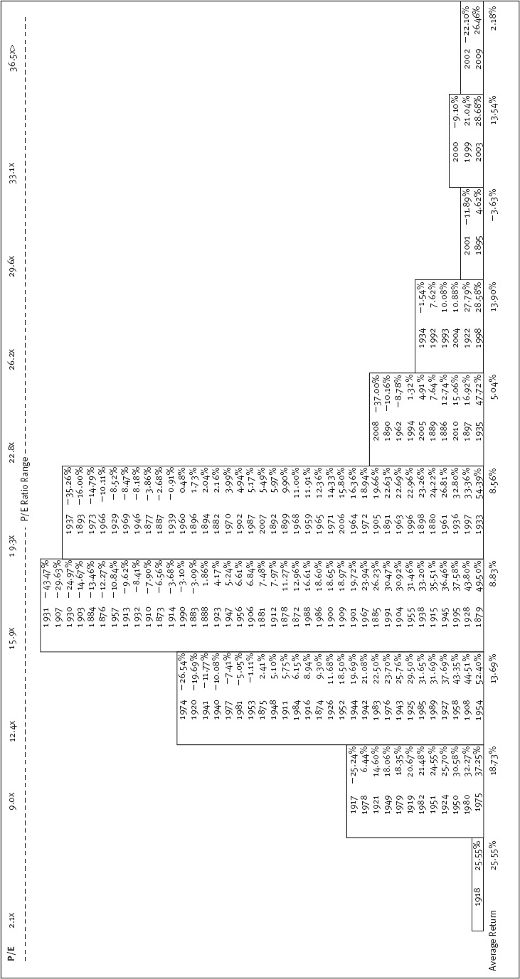
Here’s how I arrived at the bell curve. We noted the broad market’s P/E each January 1 going back to 1872 and ranked each year from low P/E to high P/E. Then we grouped them into intervals creating the familiar bell curve-like shape—with otherwise unrelated years falling into buckets according to their P/Es. The “normal” P/Es fall in the fat part of the bell curve, while the “high” and “low” P/Es fall on the edges.
When you note the P/E ratios for the past 139 years along with the subsequent market return, some empirical truths emerge. Most startling? Most double-digit calendar-year stock market declines—the monster drops everyone fears—occurred when P/Es were below 20, not when they were very high.
In the past 139 years, there were 20 times the US market’s total return was negative more than 10%. Sixteen times—80% of those most negative years—were on the middle-to-low end of the P/E range (based on the bell curve). Fifteen (75%) happened in the fat part of the curve—on “normal” P/Es. Hardly fodder for a myth. Anyone can get these data off the Internet. Anyone can array them. It doesn’t take fancy math. It just takes a little effort. But most people don’t ask, so they don’t try. And since they don’t try, the myth still exists.
So big double-digit drops don’t automatically follow high-P/E markets. But since the myth is so widely and rigidly believed, could there be some kernel of truth to it? For example, high-P/E markets must fall more often than those with low P/Es, even if they aren’t the monster drops. Right? Well, no! P/Es were below 22.8 in 116 of those years, and the market finished in negative territory 32 times (27.5%).
Of those 17 years when P/Es were 22.8 or higher—the historically high end of the P/E range—the market ended down seven times (30.4%). Neither high- nor low-P/E markets did materially worse.
You’ve seen the data. You’re henceforth unshackled from this investing old wives’ tale.
Here’s a simple test you can use repeatedly. Someone tells you X causes Y in America’s markets—like the P/E example—and even has data to demonstrate it’s true. If it’s really true in America, then it must also be true in most foreign developed markets. If it isn’t similarly true in most other developed Western markets, it isn’t really true about capitalism and capital markets and, hence, isn’t really true about America—just a chance outcome. I’ll not belabor you with the data here—this book already has too many visuals—but if you take the same bell curve approach we used for America’s stock market and apply it to foreign markets, the only country where low-P/E markets seemed materially better is Britain—and that is based on a few, relatively big years. Elsewhere, you get the same randomness as in America.6 Whenever anyone tells you something works a certain way in America, a good cross-check is to see if it also works outside America. Because if it doesn’t, it doesn’t really work robustly in America either!
Some will say, “You must see the high-P/E problem in the right way.” (Warning: a precursor to a reengineering attempt to support a myth, and it likely won’t hold.) For example, they may agree it isn’t just that a high P/E is worse than a low P/E, but when you get over a certain P/E level, the risk skyrockets, and when you get under a certain P/E, it plummets.
For example, they may assert market P/Es over 25 are bad and P/Es under 15 good and everything in between is what confuses everyone—throwing the averages off, leading you to not see things the way they would have you see them. Fair enough! That’s easy to test. You take all the times when the market had a P/E over 25 and envision we sold and then bought back at some level— you pick it, I don’t care what it is as long as you apply it consistently. It turns out, historically, regardless of the level picked, none really beats a long-term buy-and-hold in America.
The same is true overseas (except, again, in Britain, where you can make a weak case a low P/E has had a variety of approaches seeming to work—but only in Britain, which is probably just coincidence—and if you throw out a very few, very big years in Britain from a very long time ago, it falls apart there, too).
Suppose you sell when the market’s P/E hits 22 and buy when it falls to 15. That approach lags a simple buy and hold. Suppose you change the 22 to 23. Still lags! How about dropping the 15 to 13 or raising it to 17? Still lags. What’s more, there isn’t a buy-and-sell approach that works overseas.
You may disbelieve all this. Great. Prove I’m wrong. To prove it, you must find a buy-and-sell rule based on simple P/E beating the market with one-, two- and three-year returns. It must work basically the same way in a handful of foreign developed markets and if you start or end your game on different dates. Try to find it. Maybe you’re better than I am, but I looked and looked and can’t find it in any way anyone would believe.
Every time a high-P/E market leads to very bad returns, like in 2000, 2001 and 2002, you will find a comparable number of examples where it does well, like 1997, 1998, 1999, 2003 and 2009. There is simply no basis for this myth.