
David Siegel, author of Creating Killer Web Sites (1997, 22), discusses a design project he carried out for a leading publisher of children’s books. Siegel wanted to encourage exploration of the information model behind this Web site, and at the same time to suggest that reading books can be fun. In the original design, he included a long “entry tunnel” (an animated, sometimes interactive, presentation used to set a theme and tone for a Web site). Visitors needed to solve a problem, switching on the lights in this entry tunnel, in order to arrive at a room with book displays they could browse. The result was that the content of any book was 14 clicks from the site’s front door. People enjoyed the site, but rarely reached the book display.
In the revised design, visitors arrive at the site and are whisked through a very short entry tunnel—an animated GIF of the front door opens, and the user enters. Without clicking at all, the user sees a book display, showing the table of contents of a randomly selected book. Selecting a chapter—the user’s first click in the site—displays that content.
This chapter introduces the concepts and techniques of information design. During information design, the objects and actions possible in a system are represented and arranged in a way that facilitates perception and understanding. Information design includes the design of application screens, World Wide Web pages, menus, dialog boxes, and icons. The content of information design may also include spoken language and other sensory information such as three-dimensional displays or pressure, but discussion of these less common techniques is postponed until Chapter 9.
There are many standard pitfalls in information design. Consider the millions of Java applets producing small animations in Web pages throughout the world. Possibly one in a hundred of these is truly useful. Consider command buttons that appear with brushed-aluminum finish, or spectral reflections. Such visual effects catch our attention, but people quickly tire of them. At best, they do not contribute to communication; worse, they can undermine it—many of these special effects reduce the legibility of button labels. Graphical decoration that does not serve a communicative purpose is a hallmark of poor information design.
Some experts assert that information design is best left to graphical design specialists. Graphic designer David Siegel (1997, 8) concurs with hypermedia pioneer Ted Nelson’s comment: “Multimedia must be controlled by dictatorial artists with full say on the final cut.” We disagree. Traditional graphical design addresses problems that are far simpler (e.g., posters, maps) than those of interactive information design. Visual design principles are important to interactive system design; this is eloquently demonstrated in Edward Tufte’s classic books on visual displays (Tufte 1983, 1990, 1997). But the problems of posters and maps take us only part of the way. Information design succeeds if it makes people’s activities easier or more pleasant, and fails otherwise.
4.1 Stages of Action in Human-Computer Interaction
We have organized our discussion of information design (and the next chapter on interaction design) by the stages of action proposed by Donald Norman (1986) as a framework for studying human-computer interaction. Norman was an early pioneer in HCI; he is a cognitive psychologist who has written extensively about the mental planning and interpretation processes associated with human-computer interaction.
Norman describes two gaps between users’ understanding of their tasks on the one hand, and a computer system’s support of these tasks on the other. The Gulf of Evaluation refers to the “cognitive distance” between what is displayed on a computer screen and the user’s mental representation of task objects and goals (top half of Figure 4.1). In contrast, the Gulf of Execution refers to the distance between a user’s current task goals and the procedures and actions that the system provides for pursuing these goals. We will discuss issues related to this second gulf in Chapter 5.

Figure 4.1 The Gulf of Evaluation in human-computer interaction (after Norman 1986). (The Gulf of Execution is discussed in Chapter 5.)
Figure 4.1 shows a hypothetical accountant working on a problem with last month’s budget. In order to use the computer for this task, he must perceive what is displayed on the computer screen—a group of pixels is seen as a line or other figure, brightness and color are experienced, and so on. He must then interpret these simple perceptions as objects that play a role in the computer software—for example, an icon, a button, or a highlighted column in a spreadsheet. Finally, he must make sense of what he has seen with respect to his task goals, perhaps realizing that he has successfully updated a spreadsheet total, or that he has mistakenly selected the wrong column of numbers.
Norman’s framework emphasizes that people’s interactions with a computer are not simply a matter of looking at the display and deciding what to do. Many years of research in cognitive psychology have demonstrated that our understanding of information in the world is constructed through an active process of perception and interpretation (Shaw & Bransford 1977). The goal of information design is to support the perception, interpretation, and comprehension of computer-based information. In the rest of this chapter we discuss a number of concerns and tradeoffs in achieving this goal.
4.2 Perceiving Information
At the heart of information design is guiding viewers to see the structure(s) in an information display. The colors, pixels, or tones that a display device can present are the designer’s palette. These features are created and arranged to suggest a higher-level structure. For example, Figure 4.2 demonstrates how a refined information design can elegantly reveal complexity. The image is taken from one of Tufte’s (1983) books on visual design; it shows over 200 research papers that reported a relationship between temperature and the thermal conductivity of copper.
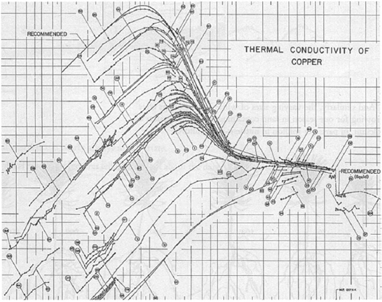
Tufte’s example is simple and economical. Each data set (each study’s data points/results) is represented as a connected set of points, forming a curved line segment. This groups the individual points into higher-level structures, reducing the number of graphical entities by more than an order of magnitude. Graphing multiple curves on the same coordinate system creates even more structure, coming from their relative shapes and convergence. Tufte uses this example to show how it is possible to present a complete data set—in this case thousands of data points—while also conveying emergent summary information.
4.2.1 Gestalt Perception
In the 1920s, a group of German psychologists described the Gestalt principles of perceptual organization (Gestalt comes from the German word for “whole”). These principles describe the configural properties of visual information—how individual bits of information are grouped together, what elements will be seen as a coherent figure, and what elements will appear as background. These principles became one of the foundations of perceptual psychology, and have many applications to the design of computer information displays (Table 4.1).
Table 4.1 Gestalt principles of perceptual organization that aid perception of user interface visual elements.
| Gestalt Principle | User Interface Examples |
| Proximity; elements near each other tend to be seen as a group | Words on a menu bar, columns in a tabular display, text in a paragraph |
| Similarity: elements that share visual characteristics (shape, color, etc.) tend to be seen as a group | Toolbar icons (proximity operates here as well), data visualization |
| Closure: there is a tendency to organize elements into complete, closed figures | Overlapping windows, menus, dialog boxes and other user interface controls |
| Area: there is a tendency to group elements in a way that creates the smallest possible figure | Icons on a workstation screen, pop-up menu on top of a document display |
| Symmetry: there is a tendency to see symmetric elements as part of the same figures | Window manipulation controls (e.g., scroll bar, selection handles) |
| Continuity: there is a tendency to group elements into continuous contours or repeating patterns | |
| A page of paragraphs, a grid of spreadsheet cells, a left-justified list of selections or parameters |
Gestalt principles do not tell you how to represent information entities (e.g., what icon to use); rather they are concerned with the consequences of low-level perceptual details such as shape, size, position, and color. More than one principle may operate at once, such as in a menu bar or tool palette, where items are positioned next to each other, are of the same size and general shape, and are lined up to form a contour. The use of multiple cues like these is sometimes referred to as redundant coding of perceptual cues. Redundancy of this type increases the speed and accuracy of perceptual processing.
The principles of Gestalt perception direct attention to the many relationships among information elements in a complex display. These relationships interact and combine to create groups and subgroups, forming the basic structure of an information display. When designers talk about a display’s “gestalt,” they are referring to the viewer’s immediate perception of figure, background, and form, as in Tufte’s example of copper thermal conductivity-temperature relationships.
4.2.2 Organization in User Interface Displays
User interface displays contain many levels of perceptual structure. The basic display elements—the pixels, contours, and characters—are grouped into higher-order structures such as paragraphs, icons, file lists, check boxes, and menu bars. These in turn are grouped into even higher-order structures. For example, Figure 4.3 shows a dialog box used to set page borders in Microsoft Word. This structure (which appears on top of an open document) includes radio buttons for choosing the kind of border; a scrollable list of line styles; pull-down menus for color, width, decoration, and scope; and a special area for previewing the effects of new settings.

Tufte’s goal for graphical data display—to make each data point and the overall interpretation immediately accessible—cannot be applied directly to user interface design. In Figure 4.2, it is enough to convey a cloud of points, because the details of any particular point are not interesting. In contrast, most elements of a user interface display convey functional information about the system. In a dialog box, each control makes a specific task-related contribution. The radio buttons for settings are interpreted and operated differently than the pull-down menu for style.
Nevertheless, user interface design should be guided by the same Gestalt principles that are operating in the graph analyzed by Tufte. Viewers should perceive an immediate sense of organization, but at the same time see the individual control elements. Unfortunately, this leads to an inescapable tradeoff: Presenting information about all current options helps people understand what is possible, and supports flexible interaction. But every piece of information or control that is presented increases the complexity of the visual display (Tradeoff 4.1). The designer must make hard decisions about what is essential. There is just too much information to present.
Displaying all active task entities enhances understanding and feelings of control, BUT each display element adds to the complexity of the user interface design.
One way to reduce complexity is to decompose and link related information. For example, a control in one dialog box may open a secondary dialog. The dialog box in Table 4.3 is one of three “tabbed” dialog boxes accessed through the Borders and shading … item on the Format menu. These three dialog boxes organize and link a huge amount of information: two groups of 5 radio buttons, one of 32 radio buttons, two scrolling menus, 10 pull-down menus, five preview widgets, 15 commands, two groups of four input fields with scrollable preset values, and two groups of four check boxes; a grand total of 90 elements. And this is for a rather small portion of word processing functionality!
Table 4.3 Ideas about information design suggested by current MOOsburg tools.
| VSF Information | MOOsburg Technology | Ideas about VSF Information Design |
| An exhibit looks like a … | Multimedia notebook | Electronic whiteboard |
| Web pages | A video and audio presentation organized into pages Rectangular white space with colored lines and text Netscape-like browser with underlined hot links | A teacher-coach looks like a … Email |
| Threaded discussion | Chat | A list of messages organized by date or sender |
| A list of comments indented to show replies/responses | Sequential log of messages prefaced with sender name | |
| The fair looks like a … | Room panorama Interactive map | Panorama of walls, floor, maybe doors and windows Geographic coordinates showing landmarks, paths |
| A judging form looks like a … | Voting booth | |
| Threaded discussion | Privacy curtain with levers or buttons labeled with choices | |
| Exhibits at top level, evaluative comments/replies indented | A fair summary looks like a … | Charting package |
| Multimedia notebook | Interactive map | Labeled X and Y axes with lines, histograms, etc. |
| A video and audio presentation organized into pages | Path traced out on a map, showing notable places to visit |
Designers must limit what is displayed to what is essential, and structure what is displayed such that the most essential information is most easily perceived. For example, Borders and shading … opens the border-setting dialog box by default, suggesting that these settings are more likely to be changed than Shading or Page Borders. The Options … button opens a subdialog box for border offsets; again this implies that border offsets are not changed as often as style, color, or width.
The impact of Gestalt principles can be seen in the shape, contrast, and layout of many information displays. For example, the dialog box in Figure 4.3 includes command buttons that are rounded rectangles with single line labels. Similarity and proximity combine to help viewers see these display objects as a group.
Just as the use of similar visual characteristics promotes the grouping of items, the use of contrasting features causes elements to fall into different groups. The radio buttons in the left column of Figure 4.3 are of a different shape and size than the scrollable list or the pull-down menus in the center of the dialog box. The pull-down menus have a similar shape to the command buttons, but are distinguished by the two arrowheads on the right.
The use of multiple contrasting cues to create structure in a display leads to another fundamental design tradeoff (Tradeoff 4.2). Perceptual distinctions such as size, shape, and color can be used to organize complex displays. But each visual cue adds complexity and clutter to a display. As more distinctions are built into a display, any one feature will become less noticeable and valuable in guiding perception.
Perceptual distinctions highlight and group user interface elements, BUT the more distinctions a display uses, the less noticeable and useful any individual cue will be.
A common example comes in the use of color as a perceptual cue. Color can be an effective way to create contrasts and promote grouping. But if the design introduces too many color values (e.g., 12 different shades), this visual characteristic would become confusing. People cannot distinguish and group many color values at once. In such a case color would become a nondistinct, decorative attribute that might actually interfere with other visual distinctions. Color distinctions are effective when they are few in number and consist of relatively muted shades.
User interface structures can also be reinforced with the careful use of white space, the parts of the display that contain no graphical elements. For example, the space between columns in a text display causes them to align vertically and form a subgroup structure. In Figure 4.3, the white space between the button at the lower left and the two buttons at the lower right segregates them. The similarity of shape groups them together relative to other display elements, but the use of white space suggests that there is also a task-relevant subgrouping (opening a toolbar versus canceling or accepting the changes).
Mullet and Sano (1995, 75) offer a simple squint test to check user interface design groupings. They suggest that designers examine their work with one eye closed and the other squinted. If the display organization is not apparent in these circumstances, it is unlikely to be immediately perceived by users.
A more direct way to create perceptual groupings is to add explicit graphical separators or bounding boxes. For instance, the three columns in Figure 4.3 are separated by faint lines, and the entire subdialog has a bounding box that separates it from the general-purpose command buttons.
Borders and bounding boxes are a popular structural cue; after all, a set of nested lines or boxes represents an intended decomposition very directly. However, as with other visual cues, these borders add clutter to the design, decreasing the effectiveness of other visual cues. In Figure 4.3, the separator lines are relatively subtle and restrained, taking up minimal space. Unfortunately, it is not uncommon to find bold (e.g., four-pixel) lines, or bounding boxes that are nested three deep. In such designs, the separators can become the most noticeable element in the design (see Johnson 2000, 149–58).
The most common design errors with respect to perceptual organization come from trying to do too much. Packing in too much information makes the structure of a display difficult to perceive. Including too many distinctions in shape, font, color, and so forth makes a display cluttered. Heavy-handed remedies, such as bold separators, nested bounding boxes, and bright colors, only make matters worse. The best advice, of course, is to understand people’s tasks well enough to make the hard choices about what to present. Then, use restraint: Design a small number of display elements that contrast clearly and meaningfully; that are simple and subtle in color and shape; and that are grouped chiefly by proximity, symmetry, similarity, and continuity.
To some extent, designing a well-organized and balanced information display is a matter of art. Indeed it is, in the sense that a visually balanced design is more pleasant to look at and use. It is also a matter of human performance: A balanced design is easier to decompose, understand, and use. Moreover, in designing a series of user interface displays, it is important to achieve visual balance in a similar manner throughout the related screens. Many designers—even experts—would like a procedural strategy to help ensure that they achieve balance and that they do so in a consistent manner throughout the user interface design.
A standard recommendation is grid-based design. It is surprisingly simple. The most basic grid consists of six vertical columns of equal width, exactly spanning the width of the display area (usually leaving some border on both right and left). This provides a layout structure with considerable flexibility, but ensures that all elements will align, and makes it very easy to verify that the display is symmetrically balanced across its central vertical axis (Mullet & Sano 1995).
The figure below shows a grid-based design developed by Aaron Marcus and Associates for Kaiser Permanente. The smallest unit of the grid defines the vertical height of the font and the input fields. Larger display elements are constructed as multiples of this smallest unit, and related display elements (e.g., the lower row of buttons) are sized and positioned similarly. The entire set of elements is symmetrical around the center axis. Even the Kaiser logo has been sized to fit into the grid layout scheme. Subsequent screens in this series use very different visual elements, but follow the same grid size and layout conventions. The result is that when viewers move from screen to screen, the immediate perception is of a regular and predictable information structure.

An information display designed using a grid. The image on the right shows the grid used to size and position the elements in a regular and pleasing fashion.
4.3 Interpreting Information
Perceiving an information display as a set of objects and groups enables the interpretation process. During interpretation, the contents of the rectangle in the center of the figure in the previous sidebar are recognized as input fields used for logging into the system. Perceptual processing identifies the major structures in the display—rectangles of various sizes, text strings, and so on. But in order to act on this information, the user must interpret what these display elements mean in the context of this particular software system.
Returning to the dialog box in Figure 4.3, we can see that the Microsoft Word designers use a visual language to aid interpretation. The visual language consists of the shapes, terms, and groupings that are used in a regular and consistent fashion to express system features. When experienced users see the rounded rectangle labeled “OK,” they interpret it as a command that will apply the selected border settings. At the same time, they do not interpret the rounded rectangle labeled “Auto” as a command; in this vocabulary, the label on a pull-down menu is recognized as a command parameter.
In a good visual design, the vocabulary of shapes, terms, and layout techniques stands on its own. The need to reinforce the meaning of an element with explicit structures (e.g., bounding boxes) or explanatory text indicates a gap or ambiguity in the design vocabulary and adds clutter. Thus, a high-level goal of information design is to build a visual language in which each distinction communicates something significant to users. Unsystematic or unmotivated variation is distracting.
To support the interpretation process, designers need to anticipate and support users’ reactions to user interface elements. In this section we focus on three strategies for doing this: choosing images, symbols, or words that are already familiar to users; refining a set of design elements through successive abstraction; and selecting images or words that suggest task actions implicitly.
4.3.1 Familiarity
People learning and using computers already possess a good deal of relevant knowledge. For example, we all know one or more natural languages. This means that labeling a user interface button as Find or Search can take advantage of the meanings people already know for these words. The terms do not convey precisely what the button will do, but they do suggest the function in a generic way that people can recognize and remember, and that is good enough for most circumstances.
GUI Bloopers
Jeff Johnson’s book GUI Bloopers (Johnson 2000) is a rich source of user interface problems, observations, and advice that he has collected over many years as a design consultant. He organizes the chapters into numbered “bloopers” that capture the most common mistakes he has observed in the design of screens, terminology, dialog boxes, and so on. For example, Chapter 4 of his book discusses 10 textual bloopers summarized below (Johnson, 2000, 187–245).
Johnson’s book of user interface do’s and don’ts provides many examples of how the quality of a user interface can be destroyed by poorly conceived details. Fortunately, Johnson also offers many strategies for avoiding these common mistakes. Each blooper is followed by one or more design rules; these can be applied as blooper-avoidance guidelines. For example, Johnson suggests that we can guard against the “Unclear terminology” blooper by avoiding similar terms, avoiding concepts that differ in subtle ways, avoiding ambiguous terms, and testing the terminology on prospective users.
| Textual Blooper | Variations and Examples |
| Inconsistent terminology | Different terms for the same concept (results and output); same term for different concepts (view) |
| Unclear terminology | Concepts too similar (membership vs. subscription); ambiguous terms (file, load, object) |
| Speaking Geek | Using programmer jargon (rom, macro, download); turning common words into programmer jargon (resources, dialog); turning verbs into nouns (compile, compare); exposing terms from the code (string, “error 347”); assigning arbitrary meanings to short, nondesccriptive terms (cat, awk) |
In contrast, consider a command button labeled grep (this is a search command in the UNIX operating system). This particular command returns all lines of a set of files that match a specified regular expression; grep is an acronym for “global regular expression print.” But knowing the rationale for the name does not help much; people tend to learn names like grep by brute-force association (Norman 1981b).
A familiar vocabulary eases interpretation, BUT familiar terms are usually less distinctive and precise, and what is familiar for one person may not be familiar for another.
| GUI Bloopers (continued) | |
| Careless writing | Inconsistent writing style (mixing nouns and verbs); poor grammar, spelling, and punctuation |
| Clueless error messages | Message determined by low-level code (“Cannot delete cached page”); reason for error not passed up to higher-level code (“Error parsing datafile. Data not parsed.”); generic message components (“Name contains invalid characters”) |
| Misuse (or nonuse) of | Omitting overusing”…” |
| Inconsistent use of colons on setting labels | Blank space alone versus colon followed by blank space |
| Tooltips that say the same thing as label | Button labeled “Print” also provides tooltip that says “Print” |
| Same title on different windows | Window title bars don’t identify specific windows; programmer copied window code but forgot to change title; programmer didn’t know title was in use elsewhere; programmer thought title fit both |
| Window title doesn’t match invoking command | Selection of a command (New Employee) results in window with nonmatching title (Add Record) |
Categories and examples of common mistakes in the design of user interface terminology and messages.
One might conclude from this that designers should use familiar terms and symbols as much as possible, but making design decisions about familiarity is not always simple. Familiar terms often have multiple meanings. For example, “view” and “update” can be either nouns or verbs. Even if a system vocabulary uses “view” only as a noun, there are many possible interpretations—a data presentation, a partial view of a virtual space, one of several problem analyses, and so on. “Enter” is a common user interface term, but depending on the context it may mean either “submit these data” or “come into this space.” (Try interpreting this message: “Select and enter data file.” See “GUI Bloopers” sidebar.)
Another problem in choosing familiar terms is a variant of the concern discussed earlier in designing for satisfaction—what is familiar to one user may not be familiar to another. Not all users are native speakers of English. A user interface developed in one country or culture cannot simply be translated to achieve the same level of familiarity in another. One outcome of requirements analysis should be an understanding of the user populations who will use the system, so that the information designers can focus on the languages and symbols most likely to be familiar.
A common belief among designers is that graphical elements will produce a more universal interpretation because we all live in the same physical (visual) world. This is true to some extent. Red traffic lights mean stop all over the world. A schematic human figure without a skirt means a man, and with a skirt means a woman. In user interface displays, a question mark means a help command; an icon of a folder means a container for data files. Many of these elements are low level and have become so familiar that it is easy to forget that they are part of a nearly universal user interface language.
However, symbols and icons do not always address the concern of “familiar to whom?” A traditional rural American mailbox (a cylinder with a hinged door, mounted on a pole) is often used to represent email services. But few Americans have ever used such a mailbox, and many have never even seen one. Their familiarity with this design comes from books or pictures. In other countries mailboxes have an entirely different look; mailboxes—and mailbox icons—are often square rather than cylindrical. In fact, the mailbox icon common in Italy is similar to the trashcan icon in American user interfaces. An American mailbox icon would be unfamiliar for Italian users; an Italian mailbox icon could actually mislead American users.
4.3.2 Realism and Refinement
Abstract imagery is often effective in visual design. Road signs are a good example. The figure in a “pedestrian crossing” sign does not mean that a human oriented and sized in exactly this way is just ahead (Figure 4.4). Drivers know that the sign is simply indicating there is a right-of-way for pedestrians coming up. People perceive and classify the simple shapes in road signs very rapidly, even when the shapes are only briefly glimpsed. These images are good examples of visual refinement, because they include only the most critical visual features (Mullet & Sano 1995).

Figure 4.4 Road signs are highly refined visual images, because they include only the most critical visual features.
At the same time, psychologists have demonstrated remarkable capabilities for people to recognize images that are realistic. In a classic experiment, people were shown thousands of photographs just once; several weeks later they were asked to recognize these photographs from a mix of thousands of similar images they had never seen. Recognition accuracy was above 95% (Shepard 1967). How can user interface designers decide when to use realistic images and when to develop more refined shapes?
It is important to consider not just the accuracy with which a user can recognize an item, but also the process of recognition. A photograph or realistic drawing is usually more complex than an abstract symbol (Tradeoff 4.4). This means that even though people may recognize what a realistic item portrays, the perception and interpretation process may take longer. Learning to recognize the meaning of a simpler and more abstract image will lead to better performance in the long term. Realistic images also tend to suggest instances of a concept (e.g., the printer down the hall) rather than the abstract concept often intended (e.g., printing).
People’s recognition memory for realistic images is accurate and long-lasting, BUT realistic images are often complex, and suggest instances rather than concepts.
Mullet and Sano (1995) emphasize that the best level of abstraction for an image depends on the user’s task and on the display technology available. However, they suggest that in most cases, developing relatively refined images will improve a visual design. They advise removing all but the most distinctive and characteristic features. For instance, an effective icon for a calculator might include only the squares for the number keys, with larger rectangles at the lower right and top to show the calculate key and the display. Numbers and labels on the keys could be eliminated, producing a simpler and more immediate interpretation of the image as a calculator.
The interpretation of abstract images is enhanced when an entire set or family of icons is refined together. A good example is the four text alignment controls on the Formatting Toolbar of Microsoft Word (Figure 4.5). These buttons show an abstract representation of the task goal—lines aligned left, centered, aligned right, or justified—but as a group are a very effective indicator of text alignment functionality.
4.3.3 Recognizing Affordances
One result of interpreting a user interface element is knowing what you can do with it. This is sometimes called recognizing the element’s affordances. An affordance is an aspect of an object that makes it obvious how the object is to be used. In user interface displays, the features that create affordances are usually visual, but user interface designers have explored auditory and tactile features as well (Gaver 1986, 1989; Gaver, Smith, & O’Shea 1991).
Recognizing an affordance is an immediate consequence of perception. A button affords pushing; a check box affords checking; an input field affords entering text. The affordances of current display elements serve as input to the planning process in which users decide what to do next (Chapter 5). For example, the “type here” affordance of a blinking cursor may be used as input to a plan for how to insert a word in a text field.
A common-sense way to think about affordances is that they are features of a display element that suggest things to do. The title bar at the top of a window looks like a bar that you can grab and drag around, a notebook tab looks like a section separator that can be pressed, and the lever on a gauge invites you to drag it to a new position.
In interactive systems, affordances are sometimes tightly coupled with actions. For example, the hyperlinks in a Web page are typically underlined and colored blue, but as the pointer passes over a link, the pointer may also change shape (e.g., into a hand). The new pointer image emphasizes that this text affords highlighting. In this case, the user interface offers both persistent display information (the blue underline) and dynamic, use-sensitive information to communicate the affordance of a link. Similarly, the “handles” provided for moving or sizing windows may appear only when the pointer is in position.
Affordances must be visible to aid interpretation (Tradeoff 4.5). This means more competition for screen space and more complexity. Scroll bars, guides and rulers, handles, or other format controls are visible and ready for interpretation during editing tasks. Fortunately, people are practiced at focusing or narrowing their attention; a person focused on a task is usually able to ignore irrelevant affordances. But a visual element that is part of the area in focus may be distracting, particularly if it is visually distinctive.
TRADEOFF 4.5 
Dynamic hiding of controls that are not in use conserves space and simplifies the display, BUT also conceals the controls’ affordances from the user.
One solution is to make the affordances dynamic. For example, some windowing systems show scrollbars only when the pointer moves to the side of the relevant window. In graphic editors, the handles for resizing objects appear only when an object is selected. This leads to a less cluttered display, but means that users must know that the controls are available and must learn the procedures for activating them.
4.4 Making Sense of Information
The last step in crossing the Gulf of Evaluation is making sense of the information that has been perceived and interpreted. Users do this by relating the information to what they currently understand about their task, and evaluating whether and how it addresses their active goals and interests. They try to determine whether what they have seen (or heard, or felt) is connected somehow to objects or events in the world. If they cannot make sense of the information, they may try out new interpretations. They may also be willing to put things “on hold” for a bit, gathering more information to better grasp the big picture. But a continued failure to make sense of system information leads to confusion, an inability to plan further action, and frustration.
Minard’s (time-series visualization of Napoleon’s Russian campaign is a classic example of a visual design that aids comprehension (Figure 4.6). The width of the upper light-gray band shows the changing size of Napoleon’s army as it moved from the Polish frontier to Moscow. The diagram indicates that the army had more than 400,000 men as they crossed the Niemen River in June, but only 100,000 in Moscow a few months later. The lower dark band shows the army’s retreat, annotated with links to the increasingly frigid temperatures graphed at the bottom. The combined visual representations are an extremely rich but compact description of this disastrous military campaign.
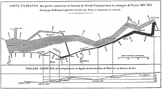
Minard’s tableau produces a strong separation between the light and dark bands. To make sense of it, viewers must integrate the display with their knowledge of maps in general, with maps of Eastern Europe in particular (e.g., recognizing the rivers as landmarks), and with general knowledge of the Russian campaign (e.g., that many men were lost). The bands are then easily understood as travel paths plotted on the map, with the size of the paths indicating the size of the marching army.
As this example suggests, making sense of information requires information integration. Viewers connect new information with whatever knowledge they have available, ranging from long-term personal knowledge or domain expertise, to events or opportunities that happened a split second ago. Often a user must integrate several different display states. For example, a user opening a new document in Microsoft Word first sees a File menu drop down. Then the menu choice Open is highlighted, the File menu disappears, and a dialog box with a scrollable list and the prompt select a document: appears. By integrating this sequence of visual display, the user understands that the system is now ready for identification of the needed document.
The process of making sense relies on people’s abilities to detect patterns and relationships across different information presentations and to relate these patterns to knowledge of the world and of the task underway. In this section we discuss the ways in which consistency, visual metaphors, information models, and dynamic displays can facilitate users’ ability to make sense of user interface displays.
4.4.1 Consistency
One thing that helps people make sense of information displays is consistency. If similar elements are presented in similar ways across different displays, users are better able to integrate across screens and make the necessary connections. A visual design program is a set of visual design features that are used to create consistent displays. These features may be of many sorts—some may be decorative or artistic, such as a logo or a subtle color scheme. More obvious features are the elements defining the visual vocabulary, the shapes and sizes of controls, font types and sizes, and the character of the icons used. Information layout is also part of the design program—for instance, always positioning the ok button at the lower right of a dialog box.
Consistency in design lets people create and benefit from expectations. When things look and act as expected, it is easier to make sense of what is happening. But as is true for any general advice, focusing on consistency will not lead to the best overall design (Tradeoff 4.6). There are often other task-specific factors that outweigh the benefits of consistency (Grudin 1989). An oft-cited example is the positioning of standard command buttons (e.g., Cancel, ok) in dialog boxes. These usually appear in the bottom right corner of a dialog box. Users expect them to be there, and know what to do with them when they see them. But for some dialog boxes, there may be additional buttons in the grouping, or other aspects of the visual design may be compromised by insisting on a bottom row of buttons.
TRADEOFF 4.6
Consistent use of shapes, sizes, colors, and position sets up expectations that help users make sense of information, BUT in some cases consistency may actually impair user performance or satisfaction.
Terminology should also be used consistently. “Move backward,” “Backward,” and “Reverse” are all possible terms for a command that moves an object backward. But in the context of a second “Move forward” command, only one is consistent; only one expresses a coherent design program. A user who knows the command syntax <action> <specifier> as well as the specific command “Move forward” can infer the command “Move backward,” along with several other similar commands. The ability to make inferences of this sort shows transfer of learning: What is learned once can be transferred to a new case. Command language consistency has significant effects on the ease of learning and using sets of command (Carroll 1985).
Consistent use of language and visual characteristics within an application is called internal consistency. Designers also must worry about external consistency, which refers to the use of design programs across different systems or applications. The similar user interface styles found in Macintosh or PC-Windows applications are examples of external consistency. Like internal consistency, this commonality supports transfer of learning, in this case from one application to another.
4.4.2 Visual Metaphors
The scope of consistency can be extended one step further: An information display can be consistent with objects and actions in the real world. When a visual element looks like an object in the real world, people will often use the visual metaphor implied by the similarity as an aid in making sense of the information.
In Chapter 3 we discussed how conceptual metaphors (a store or a library) can be useful in understanding how new concepts and services work. A concrete technique for evoking metaphoric thinking is with visual or auditory displays. For example, Minard’s representation of Napoleon’s Russian campaign (Figure 4.6) evokes the metaphor of a European map. The diagram is not literally a map; an authentic map would have provided a poorer design base for his overall purposes, and no real map incorporates graphical elements such as the representation of Napoleon’s army. But the viewer’s familiarity with maps and with Eastern European geography are critical in making this an effective information design.
Visual metaphors are pervasive in user interface design. The “messy desktop” is often cited as an example; it captures the notion that tools and task objects can be scattered, grouped, and piled on a surface, and are available for interaction by pointing, grabbing, and dragging. Spreadsheet programs exploit a “ledger” metaphor. Word processing applications present documents as sheets of “electronic paper.” Electronic mail builds from metaphors of mailboxes, address lists, signatures, and other elements of postal services. Information systems often use the metaphor of “digital libraries.” Immersive virtual environments use the entire physical world as a metaphor.
The most useful design metaphors are a balance of consistency and familiarity with inconsistency and innovation. Metaphors provide overall organizing concepts, but should not be taken too literally (Tradeoff 4.7). The intent of technology is to enhance the physical world, so by definition consistency with the world must break down at some point. The messy-desktop metaphor must not be taken too literally or the design will replicate the familiar problems of real desks and offices: incoherent piles of documents, time wasted searching for tools and data, valuable documents accidentally thrown away, and so forth. Instead, most desktop systems have tools that address these problems; some simply stretch the metaphor (e.g., Arrange, Clean Up, Find), and others are plainly inconsistent (e.g., Alias, View-as-list).
TRADEOFF 4.7
Visual metaphors leverage real-world knowledge of objects, BUT metaphors that are very literal may introduce information that is irrelevant or misleading to a task.
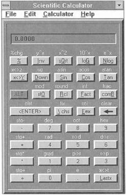
Figure 4.7 shows a good metaphor that was applied without enough thought. The desktop calculator is clearly a useful appliance, and typically it is presented with a strong physical metaphor. Extending the calculator to have scientific functions is ambitious, with strong implications for complexity. The example has a one-line output display, widely spaced “buttons,” and shifted functions. These constraints are necessary for physical calculators, but can be addressed in virtual appliances in various ways: a toggle could be used to change labels and functions on keys, and the keys could be positioned more closely, reducing unnecessary pointer travel and allowing space for more keys. A multi-line (scrollable) output display could be provided. The space constraints for the online calculator are just not that compelling; the designers were captured by their visual metaphor (Mullet and Sano 1995, 33).
4.4.3 Information Models
A great challenge in contemporary user interface design is the richness of the information presented to users. As computing power increases and becomes more accessible, interactive systems incorporate ever more data and functions. People navigate vast spaces of information, analyzing and interacting with it at varying levels of detail. It is common to hear of people who “got lost” in these spaces—and not only new users. An information model is a set of concepts, relationships, and representations that are developed to help users make sense of large data sets and complex functionality.
The most common information model is the hierarchy, where every node (except the root) has a unique parent node, but any parent node may have multiple child nodes. Hierarchies are simple and efficient. They map well to information that can be organized by levels of abstraction: Intermediate nodes are used to represent categories at increasing levels of detail. A hierarchy decomposes and organizes navigation through a complex space (with an average of n branches at each nonterminal node, the space is reduced by a factor of n at each step).
Not surprisingly, hierarchies are a pervasive information model. Conventional menu interfaces are hierarchies. The Dewey decimal system and other standard library classification systems are hierarchies. Many Web sites rely on large information hierarchies; it is relatively easy to convert a hierarchy into a site map that provides an overview of a complex set of pages. Clearly, though, the success of a hierarchy depends on how well it decomposes the information space it presents (Tradeoff 4.8).
TRADEOFF 4.8
Hierarchy is an intuitive and powerful structuring device, BUT heavily nested hierarchies with artificial relationships are confusing and difficult to navigate.
A hierarchy that uses unfamiliar concepts as intermediate nodes will confuse users rather than help them in making sense of the information space. Imagine an online shopping system that uses item part numbers as a basis for a browsing hierarchy. The part numbers may mean something to the employees of the company but are likely to be seen as arbitrary, unhelpful, and confusing to users. Another common problem is when a lower-level concept is grouped under an inappropriate parent node.
A related concern is the tradeoff between breadth and depth in a hierarchy. Offering many choices at each level (high breadth) reduces the number of levels that the user must navigate and integrate. However, perceiving, interpreting, and making sense of many choices at each level (high depth) is difficult. This issue has been studied extensively for menu hierarchies. In most cases, user interface designers have found that broad and shallow menu systems lead to better performance and greater user satisfaction than ones that are narrow and deep (Shneiderman 1998, 249).
A strict use of hierarchical decomposition can lead to inflexible designs. Complex information spaces are sometimes more appropriately modeled by general networks. For example, a Web page is often referenced by more than one other Web page; users may want to access a generic service such as email from multiple points in a menu system. Relations among items may be bidirectional, as when two Web pages refer to each other. Particularly with the advent of the World Wide Web, these more general network models are becoming more common (see “Web Design” sidebar on pages 136–137).
When an information model is complex, it is often desirable to visualize the underlying data model in a single display (Andrews 1995; Hendley, et al. 1995). Information visualization is a user interface technique in which visual features are used to code different attributes of the data. For example, a set of interconnected Web pages can be visualized as a network of nodes and arcs, where the arcs are used to show connections to other units.
Many of these projects combine related sets of information in two- or three-dimensional spatial displays—for example, long-distance telephone traffic that is shown overlaying a map of the calling area. Color often plays a key role in information visualization, as shown in Figure 4.8, where color is used to show cancer statistics as a function of geographic area. As in Minard’s visualization of Napoleon’s campaign, the map provides an organizing scheme for the information model, while taking advantage of viewers’ familiarity with spatial representations of this sort.
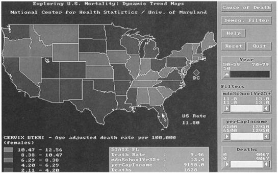
Figure 4.8 Visualizing U.S. cancer statistics as a function of state (screen shot available from ftp://ftp.cs.umd.edu/pub/hcil/Screen-dumps/DQcancerstats/cervix.gif).
4.4.4 Dynamic Displays
A major advantage that user interface displays have over traditional displays such as maps is the possibility for dynamic redisplay or animation. Computer-based displays can be dynamically restructured, changed in size, filtered, and animated. People are good at making sense of motion and depth variations, so including dynamic features such as these can provide powerful cues to the overall structure of an information model.
A popular example of a dynamic display is the fish-eye view (Furnas 1986). This technique combines a large overview of an information model with local expansion of the portion of the model currently in focus. In order to fit more information into the overview, the more peripheral information may be “squeezed” or distorted in some way, just as one might see when looking through an optical fish-eye lens.
The fish-eye technique has been generalized and explored in a number of focus+context visualizations by Stuart Card and colleagues at Xerox PARC (Card, Robertson, & Mackinlay 1991). In the simplest examples, the overview of the information model might be in outline form, perhaps a program listing. Each module might then be selectable for in-line expansion. But the concept can also be applied to more complex situations, such as a viewer that provides a three-dimensional view of a hierarchical file structure (Robertson, Card, & Mackinlay 1991).
Figure 4.9 shows a hierarchy visualization that uses a hyperbolic transformation to condense the information in the periphery (Lamping, Rao, & Pirolli 1995). The visualization updates when users click on a node, using a smooth animation to shift the focus to the new node. Because of the degree of distortion in the periphery (e.g., see the subtrees at the lower right), this particular visualization allows a very large amount of data to be presented at once.
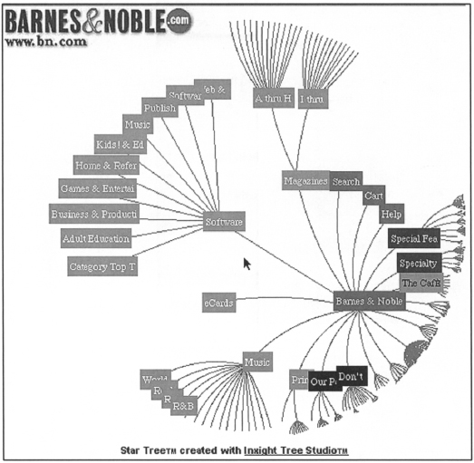
Figure 4.9 A hyperbolic browser (Inxight Tree Studio) used to visualize Web pages from Barnes & Noble (http://www.inxight.com).
Displaying an overview of large information structures provides an orienting context, but competes for screen space. Visualizations of large data sets may also be so complex that the underlying structure is hard to detect (Tradeoff 4.9). An alternative is to reduce the amount of information displayed at any one time, and let the user request more information as needed. In the Pad++ system, users zoom in and out of a hierarchical structure; at any given point, the context includes only what is in the neighborhood at the current level. Users “pull back” to get a broader view (Bederson & Hollan 1994).
TRADEOFF 4.9
Visualization of complex data sets helps to grasp the underlying structure of the information, BUT for large data sets the visualization may be too large and complex to be useful.
This technique is interesting because it provides no persistent overview; the overall structure is understood by integrating across screens. The argument is that if users can move rapidly and continuously among views with more or less detail, then perhaps there is less need for a persistent high-level view. Figure 4.10 shows how the MOOsburg map uses this technique; users orient to major roads, and then zoom in to find specific streets or buildings.
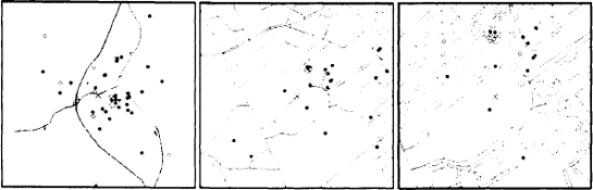
Figure 4.10 Three views of the map used to access locations in MOOsburg. On the left, the map is zoomed out to the coarsest level of detail. In the middle, an intermediate view is provided, and on the right the user has zoomed in close enough to see building outlines. This tool leverages community residents’ familiarity with the streets and buildings in the town. When the mouse is moved to a street or defined site (a dot), its name will appear in a status area.
Another approach to balancing information needs with screen space is semantic filtering. In this technique, the semantic attributes of each data point determine its visual representation—whether it is visible, what its coordinates are, its shape and color, and so on. Williamson and Shneiderman (1992) demonstrate this with HomeFinder, a map-based example. HomeFinder displays a schematic map of Washington, D.C., with a dot representing every home currently for sale. Sliders for price range, number of bedrooms, cost, and distance, and check boxes for features such as garage and fireplace are set as a filter on the query. The display is updated in real time; as the user moves a slider, houses appear or disappear from the map, conveying very precisely how each parameter affects the information in the display.
Multiple coordinated views of an information structure can also help in grasping the underlying model. For example, the View Matcher—a tool for learning to program in Smalltalk (Carroll, Singer, et al. 1990)—presents five complementary views of an example application (Figure 4.11). The application view itself is linked to the Smalltalk source code, the execution stack, an object inspector, and software documentation. As a programmer interacts with the application, each of the five views is updated. In Figure 4.11, the Blackjack game provides an overview, while the other four views provide detailed information about what is happening in the overview. This general technique is common on the Web, with one frame presenting an overview or index, and details presented in other frames (see “Web Design” sidebar).
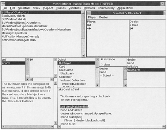
Figure 4.11 The View Matcher for learning Smalltalk coordinates five different views of an example application: the application view (upper right), the code view (lower right), the explanation view (lower left), the object inspector view (middle left), and the message stack view (upper left).
Web Design
During the past decade, the World Wide Web has become a major focus for user interface design. The growth of the Web and of its importance to information access, communication, and electronic commerce has been awesome. There are two aspects to Web design: designing individual page layouts, and designing the linking structures that connect information within and between pages.
Designing Web pages was initially a step backward in user interface technology. Early versions of HTML had no tag for centering and did not support tables. User interaction with Web page forms processed by CGI scripts involved round-trip server communication reminiscent of mainframe applications of the 1970s. Early Web pages were often just lists of directories and file names—pretty similar to the FTP and gopher directories they replaced. Indeed, there were strong practical incentives not to employ images in page layouts, because they increased download times and contributed to the already-halting rhythm of early Web-based interactions.
The use of links in Web pages quickly evolved from somewhat boring mimicry of hierarchical file structures to utter chaos, with everything linked to everything else. Many de facto standards emerged, such as presenting home or site-map links throughout a given Web site, and explicitly indicating layering and chunking of Web pages within a site.
As larger sets of information became available, designers began to focus on the challenges of structuring and presenting them in usable ways. There are now a multitude of Web stylebooks written by consultants and other practitioners (Horton 1994; Nielsen 1999). Most of these books rely on personal opinion rather than user studies, but several general issues overlap with the information design concerns of this chapter.
Page size: The richness and uneven quality of Web information has made users impatient. Only a small proportion are willing to scroll down to view nonpresented parts of a Web page. The advice is to design a Web site with pages that fit in a single screen. From this perspective, the need to include within-page links is a sign of poor design.
Writing style: People do not want to read a Web page; they want to quickly scan so that they can decide where to go next. HTML offers good support for text formatting and presentation, but authors must take a “scan-friendly” approach to writing. A quick overview of a page’s content should be apparent in the first few lines; the first line of a paragraph should convey its contents.
Frames: The use of frames to coordinate different substructures in a Web site is quite common—for example, an index frame that is used as a top-level menu. But many experts caution against the use of frames, because they can cause unpredictable problems for peripheral tasks such as reloading of pages or printing.
Multimedia: HTML is touted as a framework for “hypermedia,” because it supports the presentation of diverse kinds of content, including graphics, audio, and video, as well as text. But richer media such as images and video bring a huge cost in the time it takes to load a page. Authors are advised to present a thumbnail or other placeholder, and let users choose whether they want to separately download the full contents.
The Web is a fast-changing infrastructure for technology and application development. New technologies such as Java have enabled client-based interactivity. Many elegant Web page and Web site designs can be found, as well as some pretty awful ones. Each site reflects the sensibilities and quirks of individual designers: The graphical conventions and structure of the page you are viewing may be quite different from those of the next page you see.
Techniques for dynamic display are emerging very rapidly, but it is important to keep in mind that the ultimate success of any information visualization will depend on its ability to support sense-making with respect to task goals. As Plaisant et al. (1996) emphasize, different techniques are appropriate for different tasks. Open-ended exploration has very different needs than data monitoring or diagnostic activities. The computing resources, screen space, and perceptual processing entailed by sophisticated graphical techniques can be quite large, and it is important to weigh these against users’ actual information needs. This general dependency on task goals is a key motivation for a design process that is founded on specific use situations.
4.5 Science Fair Case Study: Information Design
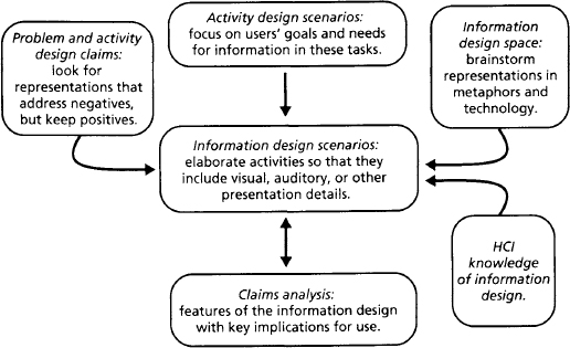
The goal of information design is to specify representations of a task’s objects and actions that will help users perceive, interpret, and make sense of what is happening. Users must be able to determine the status of their current activity, and what they can do to pursue their goals. In SBD, we carry out information design by elaborating the activity design scenarios with presentation details (Figure 4.12): Individual user interface elements are developed and combined to convey an overall information model. During the elaboration process, the pros and cons of information design features are considered and documented through claims analysis.
4.5.1 Exploring the Information Design Space
Earlier we looked for new ideas about virtual science-fair activities by thinking about real-world activities, and about the general tools and services available in MOOsburg. During information design, we also carry out this sort of brainstorming, but the emphasis is on the ideas a metaphor or technology suggests about information presentation.
Our understanding of physical science fairs again provides an overarching visual metaphor. For example, we can envision that when Alicia and Delia visit the fair, they walk into a high school gym and see poster boards positioned in groups on the floor; the exhibits look like pages tacked up on bulletin boards; student authors are standing next to their exhibits; groups of visitors cluster around exhibits; and judges can be recognized by their badges. This is a powerful and useful metaphor, but we do not want to constrain ourselves to this or apply it too literally (Tradeoff 4.7).
In Table 4.2, we have reused the metaphors presented earlier to brainstorm about science fair activities, but focus on implications for information design. In most cases, the design ideas are visual in character, although some metaphors point to a role for auditory information (e.g., oral commentary as part of a documentary, or a “buzz” of conversation at a cocktail party). Although it is quite natural to consider new metaphors at this point, for the sake of simplicity we have restricted ourselves to this familiar set. As always, there are no right or wrong answers. The goal of metaphor brainstorming is to expand the understanding of design possibilities.
Table 4.2 Metaphors for a virtual science fair, with emphasis on information design.
| VSF | Real-World | |
| Information | Metaphor | Ideas about VSF Information Design |
| An exhibit looks | Lab journal | Loosely organized pages with handwriting, sketches |
| like a … | Documentary | Movie or animated sequence of screens and audio |
| A teacher- | Peer (colleague) | Friendly face of same age, character as student |
| coach looks like a … | Director | Professional-looking image with specific tools, agenda |
| The fair looks | Study room | Empty work area with a place to write, materials to read |
| like a … | Public lecture | Uninterrupted single presenter in focal view |
| Cocktail party | Groups of people, auditory cues to conversation, activity | |
| A judging | Balance sheet | Grid with cells displaying labels, values, equations |
| form looks like a … | Discussion | Questions, answers, comments in sequential order |
| A fair summary | Report card | Check marks, letters, or numbers marking assessment |
| looks like a … | scales | |
| Guided tour | A sequence of exhibits with annotations or comments | |
| Thank-you note | Form letter with personal salutation, thanks, signature |
The metaphors for central science fair objects such as the exhibit space and the exhibits serve an important orienting function in brainstorming. For example, the physical science fair metaphor emphasizes spatial relations and containment structures; the cocktail party metaphor suggests that we visualize people and their communication; and the lecture metaphor suggests the presentation of slide shows or other multimedia materials. Again, we are not looking for the “right” metaphor, but for a range of ideas.
A high-level metaphor may also evoke ideas for how to present specific task objects. For example, the physical science-fair metaphor suggests a display of tables, poster boards, and so on. Under this metaphor, an exhibit looks like a set of documents arrayed in a two-dimensional space (i.e., the poster board). In contrast, the cocktail party metaphor suggests a display that is filled with visitors; in this metaphor, the exhibits might be in the background (e.g., on the “walls”) or they might be objects that people pull out and display on demand (e.g., from their “pockets” or “briefcases”).
A natural complement to descriptions of different metaphors is a sketch. Even a quick hand-drawn sketch can be a great aid to group discussion, especially if these discussions include stakeholders from the work setting. Figure 4.13 contains rough sketches of three metaphors for the main screen of the virtual science fair.
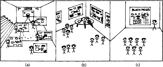
Figure 4.13 Three views of a virtual exhibit space suggested by the metaphors of (a) a high school gymnasium; (b) a cocktail party; and (c) a classroom lecture.
In parallel with discussions of visual metaphors, we explored the information-design possibilities suggested by MOOsburg tools. (Novel technology should also be considered at this point if relevant or feasible.) Because our goal at this phase is to organize and present information, the relevant technologies are more specific than those discussed in Chapter 3 (Table 3.2). Table 4.3 lists information design ideas that came from thinking about MOOsburg tools.
Many of the ideas in the two tables can be combined. For example, a multimedia notebook might be used to edit and present a lab journal; a Web browser might be used as a presentation device for a documentary (e.g., as a sort of slide show). A room panorama could be used to present a traditional fair (the main objects are exhibits), a cocktail party (the main objects are people), or a lecture (the main objects are a presenter and his/her materials).
Metaphor and technology discussions will inevitably raise other more pragmatic concerns—hardware and software platforms, implementation or delivery costs, team expertise, and so on. Although discussion and resolution of these nonusability issues are beyond the scope of this book, tabular summaries like those shown here, complemented with sketches like those in Figure 4.13, should provide a good starting point for identifying and discussing these other categories of concerns.
4.5.2 Information Scenarios and Claims
Activity scenarios illustrate the functionality proposed for a system in the context of specific uses. During information design we insert details of what the user sees (or hears or feels, depending on the application). As we do this, we also elaborate how the actors will perceive, interpret, and make sense of the information they encounter.
A key resource at this phase of design is the claims analysis of the activity design scenarios (see Table 3.3 in Chapter 3). Many of these include pros or cons related to the perception or comprehension of science fair information. For example, one concern about providing an unlimited virtual exhibit space was that students may end up producing overly large or complex exhibits. This concern should be addressed by the information design. Another example is the embarrassment some students might feel in having their incomplete projects advertised. As always, the design heuristic is to address the negative impacts while maintaining or enhancing the positive ones.
We focused first on one scenario, the visit of Alicia and Delia. The information needed in this activity is central to the entire project—they first see the fair itself and then an individual exhibit. This scenario is also a good example of our primary goal to increase community involvement, so we wanted to be sure that the information design was particularly appropriate and engaging in this situation.
Figure 4.14 shows how the visit activity was elaborated to include details about information presentation. On the left is the activity design scenario; on the right are additions that illustrate our information design ideas. Some of the new material describes information displays, while other material describes the actors’ perceptions and reactions to these displays. In the course of the scenario, details are provided about a number of important elements in the information design—the initial view of the fair, the other visitors, the exhibits as a group, as well as the content of Sally’s exhibit.
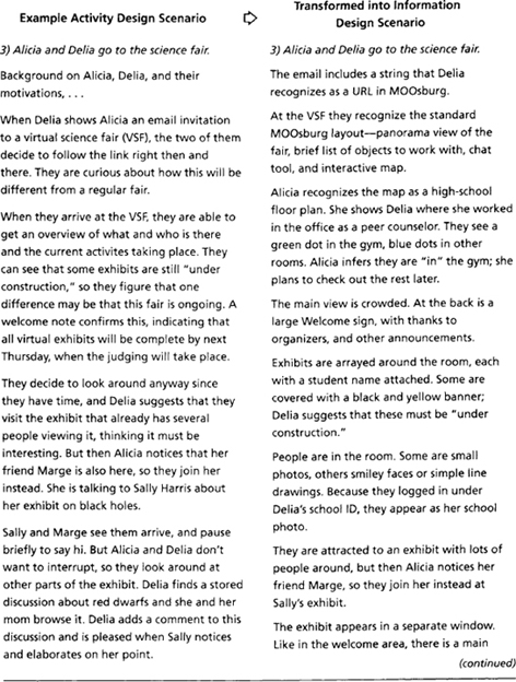
Figure 4.14 (continued)
One important design decision concerned the representation of student exhibits. Like other MOOsburg activities, the virtual science fair is created as a “space” within the existing town structure. But we considered two alternative designs for the exhibits:
- represent each exhibit as a nested subspace, each with a room panorama and interactive map for navigating within the space; or
- represent the exhibits as independent objects, with their own representations and user interface.
The subspace alternative extends and reinforces the general spatial metaphor of MOOsburg; exhibitors could post materials on multiple walls and bring in many diverse supporting objects. This design emphasizes creativity and richness in exhibits. However, it complicates the information design for visitors—conceptually a visitor must “jump into” the fair space to get to each exhibit subspace. It also makes exhibit construction more complex—each subspace owner (student) would need to develop a customized map. Because our root concept emphasized broad community and student interaction, we chose to adopt the second, simpler model.
At the same time, the presentation of exhibits should be rich and flexible enough to suit the needs of many different exhibitors. We carried over the MOOsburg concept of a main view, but surrounded it with information displays that represent the many contributing elements of each exhibit. This idea was combined with the earlier concept of a template, so that new projects are given a default layout. The elements themselves were inspired partly by our analysis of physical science projects and partly by the metaphors of slide shows and lab journals. We used similar reasoning to elaborate the other activity design scenarios; the information design elaborations are summarized in Figure 4.15.
Figure 4.15 Elaborations to the science fair scenarios that describe the features and reactions to information design.
Figure 4.15 (continued)
Where did the many details of the information scenarios come from? As for activity design, the answer is difficult to provide, because so many factors contribute to the overall design. Many of the details follow from MOOsburg’s virtual-world metaphor. But we have also tried to address potential usability problems noted in earlier claims. And, of course, we were influenced by the general HCI concerns discussed in the first half of this chapter.
Table 4.4 lists the information design claims analyzed in parallel with scenario development. Like the scenarios, the claims become more extensive and detailed as visual representations are proposed and their usability implications are examined. These claims list a number of important features in the information scenarios, pointing to each feature’s likely impacts on users’ ability to perceive, interpret, and make sense of what is happening in the online science fair. At the same time, they document how that design was influenced by a combination of metaphors, technology options, and general tradeoffs in information design. For example:
- Some of the detailed exhibit content is nested in layers in hopes of simplifying initial perception (Tradeoff 4.1).
- Exhibits under construction are flagged, even though this adds visual complexity and continues our concern about student embarrassment (Tradeoff 4.2).
- The exhibits are organized into bounded views. This helps to separate the elements, but the boundary lines add clutter (Tradeoff 4.3).
- We use task-specific “science-project” terms in the template, even though they may not be familiar to all viewers (Tradeoff 4.4).
- We use both thumbnail images and more abstract icons, depending on the concept being conveyed (Tradeoff 4.5).
- The judging form hides its “editability,” because form modification is secondary to judging exhibits (Tradeoff 4.6).
- The custom interface for judges is a specialized view of a complex information model (Tradeoff 4.9).
Table 4.4 Claims analysis used to guide and document information-design reasoning.
As in all scenario-writing efforts, the development of the science fair information-design scenarios was a creative process involving analysis and synthesis of many factors. The activity design scenarios provided the initial situation and goal constraints; metaphors and technology helped to generate possibilities; the general tradeoffs in information design assisted in selecting among and synthesizing ideas and constraints.
The scenarios and claims are not a complete representation of the information design. It is impractical and probably impossible to describe every detail of a visual display, or to narrate every aspect of a person’s perception and reaction to a display. The choice of which and how much presentation detail to include is left to the design team developing the vision. For systems that envision novel or complex information designs, the number and detail of the information scenarios are likely to be greater. For a system involving more conventional WIMP (windows, icons, menus, and pointers) interface designs, it should be sufficient to work through a few scenarios such as those shown here.
4.5.3 Refining the Information Scenarios
Although textual scenarios and claims are important SBD design products, there is much truth to the old saying that a picture is worth a thousand words. The visual details of a design can be crucial in conveying exactly what is being proposed. Even at this very early point in design, a team should explore the “look and feel” of user interface proposals. This can be done quickly and inexpensively by sketching important views described by the scenarios (Figures 4.16 and 4.17; some usability engineers refer to these as “key screens,” e.g., Kreitzberg 1996).
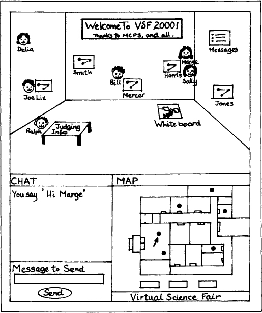
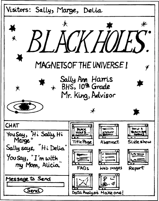
These science fair sketches show what the system might look like at two points during Alicia and Delia’s visit. The welcome screen is clearly important, because it orients and motivates the actions of all visitors; this view must convey what the fair is “all about.” The view of an individual exhibit is also important; much of the detailed activity of the fair takes place using this representation.
As sketches like these are discussed and refined, the individual visual elements also become an important topic of design. For example, the scenario mentions a generic icon that will represent exhibits in the overall exhibit space; we need to design the image for this icon. The scenarios also mention various controls and menu items that are interpreted and used by the actors; we need to design the details of these controls. Elements such as these comprise the visual vocabulary that plays a critical role in the perception and interpretation of task information (Mullet & Sano 1995).
Detailed Design
Some detailed design elements are inherited from MOOsburg. This is common—most user interface programming platforms have predefined visual objects and control elements (often called “widgets”). For example, all objects in MOOsburg have menu options for being locked down in a place, picked up, and so on. Thus, we focused our design work on the new menu options needed by the science fair. We worked first with the scenario in which Mr. King works with Sally, because he uses the menu system to discover and implement nested layers in her exhibit.
This scenario mentions several exhibit construction tools; we decided to put these in a Construction menu, so that the menu name would imply what services it contains. Although the content of the menu is not specified in the scenario, we assume that it will enable Sally and other authors to link their project files to the exhibit. We postpone the details of this interaction until Chapter 5. However, we note that it must contain an option for creating a nested layer.
Thinking about this menu caused us to consider other aspects of menu design. For example, Rachel needs a menu option for making copies of exhibit elements. But rather than create a new menu just to hold this option (thereby cluttering the display), we choose for now to reuse the pervasive Save as … dialog available through the operating system’s File menu.
The design of the Construction menu led to a related design issue. This menu will support exhibit creation, so we considered the possibility that it appears only for users who are students or coaches. That is, when Alicia and Delia (or other visitors) view Sally’s exhibit, the Construction menu will simply be absent. This simplifies the information design for visitors while supporting the specific needs of students. At the same time, there are costs to making this choice: Truly helpful contributions by visitors are now impossible, and there may at times be confusion about menu options (Table 4.5).
Table 4.5 Claims associated with features proposed during detailed information design.
| Design Feature | Possible Pros (+) or Cons (-) of the Feature |
| Hiding the Construction menu from visitors | + reduces the number of controls that visitors must interpret |
| - but prevents well-intentioned, helpful contributions by visitors | |
| - but students and visitors may be confused when logged on together | |
| Generic icons representing all exhibits in the VSF | + simplifies and speeds perception of the overall science fair display |
| - but implies a degree of similarity among exhibits that may be inaccurate | |
| - but students may be unhappy with the lack of individual expression | |
| Thumbnail views of an exhibit element’s content | + previews the entire exhibit, attracting viewers to interesting elements |
| - but increases the visual detail and complexity of the exhibit display |
Our design of exhibit icons considered the tradeoff of realism and complexity (Tradeoff 4.5). We debated the use of project-specific images for exhibit icons (e.g., a thumbnail image of the title page). We ultimately decided against this because we believed that it would not scale well—the overall scene would quickly become complex, and details of individual exhibits would be hard to perceive. Furthermore, the visit scenario emphasizes the importance of social context (i.e., other visitors) rather than exhibit content. Thus, we designed a generic exhibit icon, while recognizing the negative consequences of doing this as a claim for information design (Table 4.5).
In contrast, our reasoning about the icons representing the different components of Sally’s exhibit recognized their dual role: They provide an overview of the exhibit, but also serve as view-access controls. Here we concluded that the interpretation benefits of a preview outweigh the complexity costs of a set of thumbnail images (Table 4.5).
In addition to providing an overview of the exhibit, the scenarios describe how the different elements convey the type of media they contain (Word, Excel, etc.). One possibility is to make this an implicit effect of the thumbnail images (i.e., a text document looks like text even in miniature). But we also considered various icon “decorations” that could indicate more directly which application was used to create the element.
When discussing these alternatives, we created the sketches in Figure 4.18: the sketches contrast an unadorned thumbnail of a Microsoft Excel chart with two other possibilities that include information about the source application. These visual details (the name in the middle, the familiar graphical “X” on the right) make the icon more complex, but may better convey the nature of the document it represents. Eventually, we decided that even a simple miniaturized window provides sufficient affordances to suggest the Excel opening behavior (e.g., as Mr. King did in the second scenario).
Participatory Design
End users can also help to develop or refine an information design. In a project developing educational software to support remote collaboration in science projects, Chin and colleagues (Chin, Rosson, & Carroll 1997; Chin & Rosson 1998) carried out sessions with teachers and students, to develop rough sketches of what the system might look like. Muller and colleagues (1995) describe similar experiences for software supporting telephone operators; many other examples have been reported by projects exploring and developing methods for cooperative design (Greenbaum & Kyng 1991).
Figure 4.19 shows a felt board and other simple office supplies used in participatory design of the science fair screens. Small groups of teachers, students, and community members were given activity design scenarios and asked to mock up screens illustrating the activities. Notice that the felt board resembles a Netscape browser; we added this constraint to simplify the design problem. As expected, people’s Web experience influenced their design ideas (e.g., they used frames to organize the display and changes in color to show when an item had been viewed). The Web browser constraint seemed to help these participants get started more quickly, but probably discouraged more radical presentation ideas (see Chapter 6).
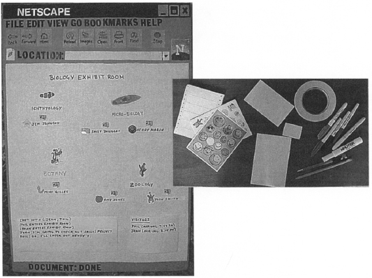
4.6 Consistency and Coherence
As we discussed earlier, a design can be assessed with respect to both internal and external consistency. At the least, the individual display elements and the overall design program should be internally consistent. For example, the two sketches in Figures 4.16 and 4.17 reserve different areas of the screen for similar functions—the main object “in view” is in the upper part of the screen, a chat tool for communcation is in the lower left, and controls for navigation are in the lower right. At the same time, we need to consider the consistency of the individual elements in a display. Do all buttons (e.g., Send) have the same look, and do they use the same font in the label? Do scrollbars appear in the same place and with the same look?
Notice that the current information design reflects a compromise between consistency and task-specific creativity. We provide an exhibit template that controls the displays that students generate to some extent (e.g., as compared to a custom Web page). This means that the overall fair should gain some coherence, because as viewers move from one exhibit to another, the general layout will stay the same. At the same time, by allowing individual students to edit the template, the design leaves open many of the details that will be presented at each exhibit.
Summary and Review
This chapter has discussed many of the issues that must be considered when designing the representation and organization of the information a system will use. Norman’s (1986) stages of human-computer interaction were used as a framework to consider these issues. The virtual science-fair scenarios were elaborated to include proposals for an overall information design as well as detailed design of individual elements. Central points to remember include:
- Norman’s analysis of stages of action in HCI is a useful framework for issues related to user interface design. The Gulf of Evaluation (perception, interpretation, and making sense) emphasizes the perceptual and cognitive issues associated with information design.
- Gestalt principles of perceptual organization offer useful guidance in thinking about how to select and arrange the elements of a visual display.
- Making images and words familiar and realistic can aid interpretation, but too much familiarity can dilute important distinctions, and too much realism can lead to interpretations that are too tied to concrete instances.
- The design of affordances—what an interface element suggests about its use and manipulation—is a key technique for supporting information interpretation.
- It is the overall information model—how it maps to users’ mental model of the task, the extent to which it is self-consistent, and so on—that determines how well users will be able to integrate and make sense of their actions as they progress through a task.
- Rough sketches of screen layout or of individual screen elements can be very useful in making information scenarios more concrete, especially if the team decides to share these with user representatives.
Exercises
- Use the Gulf of Evaluation to analyze the information that you process when you check your email for the first time each day. What happens during perception? Interpretation? Making sense?
- Make a screen dump of your online course schedule. Analyze the display from the perspective of the Gestalt principles in Table 4.1. Can you see any examples of these principles in action? If so, are they helping or hurting perception? Can you see any opportunities for improvement?
- Design a new command vocabulary for your university’s course registration system. For simplicity, assume an entirely text-based user interface. Develop two contrasting vocabularies, including one that emphasizes familiarity and another that emphasizes flexiblity and generality. Which one would you prefer to use? Why?
- Browse your personal file system. Design two different visualizations for the files (e.g., a hierarchy or other network; include dynamic behavior as relevant). Sketch samples of the two designs, and discuss how each design supports the common file-system tasks of file management, retrieval, and version control.
- Surf the Web to find one Web page that easily passes the “squint test,” and another that definitely fails. Analyze the visual features and graphical layouts. Why does one succeed while the other one fails?
Project Ideas
Continue your work on the online shopping project, elaborating the activity scenarios to include information design.
- Discuss metaphors again, but now from the perspective of information presentation.
- Reason from the claims analyzed from the scenarios developed thus far.
- Write one scenario as a complete narrative; for the others, just list the new details of presentation and user experience.
- Write claims to document tradeoffs that you addressed in the information design.
- Develop at least one sketch in support of each scenario.
- Discuss how your design reflects a coherent visual design program.
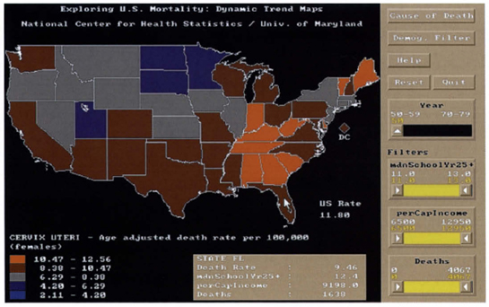
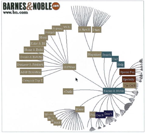