
Doors let people into spaces. That’s what people are looking for when they come up to a door, whether it’s made of wood, metal, glass, or some unknown material: Where is the handle, and how do I use it to unlatch and push open the door? As Don Norman has pointed out in his book The Design of Everyday Things (1988), even such an obvious and simple user need is easily defeated by poor design.
Norman (1988, 3–4) illustrates his point with an amusing anecdote of a friend “trapped” in the doorway of a European post office. The door in question was part of an outside entryway (a row of six glass doors), with an identical internal entrance beyond. As the man entered through the leftmost pair of doors, he was briefly distracted and turned around. The rotation caused him to slightly shift his position to the right. When he moved forward and pushed a door in the next row, it didn’t move. He assumed it must be locked, so he moved to the next pair of doors. He pushed another door; it also refused to move. Beginning to feel confused, he decided to go outside and try again. But now when he pushed the door leading back outside, it also didn’t move. His confusion turned to mild panic … he was trapped! Just then a group of people entered at the other end of the doorways. Norman’s friend hurried over and followed them, and was successful this time.
The problem was a simple one and would have been easy to avoid. Swinging doors come in pairs, one side containing a supporting pillar and hinge, the other one free to swing. To get through, you must push against the swinging side. For these doors, the designers went for elegance and beauty Each panel was identical, so there were no visual clues as to which side was movable. When Norman’s friend accidentally changed his position, he became out of sync with the “functional” panels within the row of glass. The result was an entryway that looked nice but provided poor support for use.
The goal of interaction design is to specify the mechanisms for accessing and manipulating task information. Whereas information design focuses on determining which task objects and actions to show and how to represent them, an interaction design tries to make sure that people can do the right things at the right time. The scope of possible action is broad—for instance, from selecting and opening a spreadsheet, to pressing and holding a mouse button while dragging it, to specifying a range of cells in the spreadsheet.
Interaction design focuses on the Gulf of Execution in Norman’s (1986) analysis of human-computer interaction (Figure 5.1). The user begins with a task goal, such as the desire to investigate an irregularity in last month’s budget. To pursue this goal, the real-world objective is translated into an appropriate system goal—a computer-based task such as examining an Excel spreadsheet. The system goal is elaborated as an action plan that specifies the steps needed to achieve the system goal: point at an Excel icon, double-click to open it, point at the first cell containing a sum, and so on. Finally, the plan is executed: The mouse is grasped and moved until the cursor is over the icon, a double-click is performed to launch Excel, and the pointer is moved to the bottom of the first column.

Figure 5.1 Stages of action in a budget problem: choosing, planning, and executing an action, and then perceiving, interpreting, and making sense of the computer’s response.
The example in the figure continues through the cycle to emphasize the important role of system feedback. While the execution takes place, some visual changes appear; for instance, when the file is opened, a new figure (the window) is seen. These changes are interpreted with respect to the spreadsheet context, and ultimately with respect to the budget question.
This is a deliberately simple example, but even a trivial interaction such as opening a spreadsheet can be undermined by usability problems. Suppose that the spreadsheet is very large and only a portion of it shows when it is opened, making it difficult to determine its status; or suppose that it is has links to other files that are not present, resulting in warning or error messages. And, of course, opening the spreadsheet is just the beginning. As the task progresses, the computer responds with changing information displays that must be perceived, interpreted, and understood in order to plan and carry out the next set of steps.
As in Chapter 4, we have used Norman’s (1986) framework to organize our discussion of interaction design. Here we are concerned with the three stages making up the Gulf of Execution—selecting a system goal, creating an action plan, and executing the action plan. For the sake of simplicity, we limit our discussion to standard user interaction techniques—the WIMP user interface style (windows, icons, menus, pointers), the default on most PCs and workstations.
As in all aspects of system development, designers have many options to choose from in designing a user interaction. Their goal is to compose and sequence user-system exchanges in a way that is intuitive, fluid, and pleasant for the task at hand. Doing this depends on understanding the details of the usage situation. There are no simple right or wrong answers; as usual, interaction design is peppered with tradeoffs.
5.1 Selecting a System Goal
To pursue a task with computer support, a user must first translate his or her real-world goal into a software-oriented goal, also known as a system goal. The simplest case is one where the system object or action is identical to the real-world concept—perhaps in our example above, the accountant sees an object named “last month’s budget.” This is a very close match to what is wanted; deciding to open it is trivial. The system goal in this case has high semantic directness, in that the user’s task goal is mapped very easily onto an appropriate system feature. Of course, the names or pictures of system objects and actions do not usually match task goals exactly, so some amount of processing and inference is required. One goal of interaction design is to minimize this cognitive effort as much as possible.
5.1.1 Interaction Style
A powerful technique for helping people translate their task goals into system goals is direct manipulation (Shneiderman 1983). A direct-manipulation user interface is built from objects and actions that are direct analogs of objects and actions in the real world: User interface controls look like buttons that can be pressed; and data containers look like folders that are grabbed, dragged, or stacked. An active application looks like a window that has been opened for the user to see inside. Choices are shown as menus to be opened and browsed so that items can be selected.
User interface controls that look or sound like familiar objects in the real world simplify the problem of choosing a system goal (Hutchins, Hollan, & Norman 1986). If a user wants to put something away, there are folders waiting to be used. When a user wants to organize information, the objects are on the screen waiting for action. Of course, direct-manipulation techniques require that the right objects and controls are present at the right time—displaying a large set of folders on a screen will be of little help if the goal involves navigation to a Web page.
Even this simple example makes it clear that direct manipulation is not a universal interaction technique (Tradeoff 5.1). Persistent visibility of objects and actions is essential, but a large number of display elements will lead to visual clutter. People must decide which of their many tasks are frequent or important enough to “leave out in the open.”
TRADEOFF 5.1 ![]()
Visible user interface controls that are analogs to real-world objects simplify the mapping from task to system goals, BUT not all task goals have visual analogs.
Direct manipulation also requires that objects can be represented visually, and that the operations on these visual entities are analogs to physical actions (e.g., pointing, selecting, and dragging). But there are many system concepts that have no obvious visual representation. In the accountant example, how could a system visually represent “the two managers who did not yet turn in their budget numbers”?
Direct-manipulation user interfaces are often complemented with some form of a command language. A command language consists of a vocabulary and composition rules (syntax) used to identify and manipulate task objects indirectly. Instead of pointing at a file or a piece of data, a user types or says its name, or specifies it through a logical expression, a mathematical equation, or some other symbolic description. In these cases, the distance from a task goal to a system goal can be substantial—the user must remember and produce the right vocabulary words in the right order.
Expressing system goals with commands is economical and flexible. Text requires minimal display space, and simple commands can often be combined to create more complex expressions. This makes it possible to satisfy many different system goals with a relatively small vocabulary. But even for small vocabularies, learning the rules for specifying and ordering commands (the command syntax) can be difficult (Tradeoff 5.2). Many common objects and actions have multiple names in natural language (e.g., copy/ duplicate, move/relocate, and table/matrix). If these concepts represent possible system goals, users must remember which of the synonyms to use.
Expressing system goals indirectly with names or symbols is flexible and economical, BUT learning a command vocabulary can be difficult or tedious.
Buttons and menus offer an interesting compromise between direct manipulation and command-based interaction. They are persistent visible objects that users can point at and select. But the content that they represent is usually a command. In a menu system, complex command expressions may be constructed through a sequence of choices. For example, the procedure for opening a new browser in Netscape might be summarized as “Execute the File command New with an argument of Navigator.” Indeed, one reason that menus are so pervasive in WIMP user interfaces is that they have a flexibility and economy similar to command languages, while offering the advantage of recognition over recall.
5.1.2 Opportunistic Goals
Sometimes a person has no particular task goal in mind. For instance, someone first starting up a computer in the morning may have no specific agenda, and instead relies on the computer display to remember what needs doing. In such situations, attractive or convenient system goals may be adopted in an opportunistic fashion.
Opportunistic behavior is evoked by perceptually salient or engaging elements in the user interface display. An interesting possibility is detected, which causes the user to remember a task or to adopt a new goal. A familiar example is the response often exhibited on arrival of new mail, where users drop whatever task they are engaged in to check out a new message. Opportunism is also common when novice users are confused or distracted, and seek guidance from the system about what to do next. In these cases, any object or control that looks intriguing or helpful may be accepted as the right thing to do.
Intriguing task options encourage flexible goal switching, BUT opportunism may lead to inappropriate, confusing, or frustrating experiences.
In most cases, opportunism is not a serious usability problem. Setting aside one task to pursue another can enhance feelings of flexibility and increase the spontaneity of one’s activities. However, designers should analyze sources of opportunism in their user interfaces, and seek ways to minimize it when it would interfere with task goals (Tradeoff 5.3). Novices become seriously derailed when they are drawn into complex or exotic functionality (Carroll 1990). People may want to know when new email arrives, but they should be able to deactivate such alerts when concentration is important.
5.2 Planning an Action Sequence
The steps needed to achieve a system goal comprise an action plan. With experience, many such plans will be learned and automated, such that they require little conscious thought (Anderson 1983). Most users do not consciously plan the steps for accessing and making a selection from the bookmark list in their Web browser; opening a spreadsheet may well happen without conscious attention. However, for more complex tasks, or for people working with a new application, the user interface is a critical resource in determining what steps to take (Payne 1991).
The concept of a plan is related to the task analysis techniques discussed in Chapter 2. Task analysis specifies the steps and decision rules needed to carry out a task; this can be seen as an idealized action plan for the analyzed task. Plans can be decomposed and analyzed at many levels of detail, depending on the interaction concern in focus (e.g., making a selection from a list box versus constructing a piechart). First-time or occasional users may need to think about the details of selecting or manipulating individual user interface controls, but experienced users will operate at a much higher task-oriented level of abstraction.
Action planning is an active process. People retrieve what they know about a system from their mental models. They use the system information available and make inferences to fill the gaps, often relying on experiences with other systems. As a result, the plan guiding the behavior of any one user may overlap only partially with the action plan intended by the designer. People are not machines. Even if we could somehow be taught every possible plan for every possible contingency, we would be unable (or unwilling!) to ceaselessly retrieve and execute these plans in rote fashion.
5.2.1 Making Actions Obvious
How do users know what to do at all? To a great extent, they learn by experience. Users rely on their current mental models and on their reasoning ability to decide what to do. As execution takes place, system feedback may lead them to revise or elaborate their action plan (i.e., through perception, interpretation, and making sense). The success and failure of such episodes results in learning about what works and what does not work; mental models are updated and plans are reinforced or revised.
One way to help users learn what to do is to make it easy to predict, by trying to emulate real-world tasks (Moran 1983). For example, people editing a report will circle or underline a piece of text, and then write an editing mark or comment near it. A word processor that follows this scheme will be easier to understand than one that expects users to first enter their comment and then point to the text it describes. Thus, one design strategy is to document existing procedures, and then define action plans that build on these procedures. The problem with this is that most software projects seek to enhance or improve current tasks. This means that there will always be computer-based tasks that have no real-world analogs (Tradeoff 5.4).
Action plans that correspond to real-world tasks and manipulations are intuitive and easy to learn, BUT many computer functions extend real-world tasks.
An effective direct-manipulation interface can also simplify action planning. The same physical analogies that aid selection of system goals (recognizing a folder as a place to put things) also help to suggest what actions to take (grab and open the folder). This effect on action planning is related to the concept of affordances discussed in Chapter 4. People need not memorize “press a button to activate it”; a screen button affords pressing because it looks like a real-world button. Dimming choices on a menu makes the grayed-out items look inactive, discouraging inappropriate selections; even a relatively subtle affordance like this can be important in ensuring smooth interaction.
As pointed out earlier, it is impossible to support all user tasks with direct manipulation interfaces. Physical analogies work well for simple actions, such as identification, selection, movement, interconnection, and duplication operations. But how do you carry out a search by direct manipulation or apply a global substitution? Researchers working with programming languages have spent decades exploring direct-manipulation techniques for writing programs, but support for logic, abstraction, and reuse continue to challenge these efforts (Cypher 1983; Lieberman 2001; Rosson & Seals 2001).
5.2.2 Simplifying Complex Plans
In WIMP user interfaces, people rely on icons, buttons, dialog boxes, or other user interface controls to guide them through action sequences. The user looks at a menu bar, and one set of choices is offered; he or she opens the menu and another set appears. A menu item is selected, and another set of more specific choices is presented via a dialog box. And so on. This simplifies planning, because users only need to know the next step. What would otherwise be learned as the command words and parameters of a command language is implicit in a sequence of menus, or in the input fields, check boxes, and other controls of a dialog box.
Nonetheless, plan complexity is still a major design concern. People are always trying new things, and as applications become more powerful, the usage possibilities become more complex. Problems are likely to arise when users attempt tasks with many steps—for example, many levels of nested menus, several interconnected dialog boxes, or many links leading to a Web page. A long sequence of interdependent actions is hard to keep in mind, and users can lose track of where they are. This can lead to omission or duplication of steps, or other errors (see “Designing for Errors” sidebar).
Studies of human memory have shown that people have a limited capacity to hold information in mind (Miller 1956). We can hold more information if it is possible to chunk it—that is, organize several interrelated bits of information into a single unit. Chunking often is a natural consequence of use; the more times certain bits of information occur together, the more likely they are to become a chunk. Information that naturally occurs together may be chunked even without previous exposure. Common examples of information chunking are people’s names, phone numbers, dates, and so on.
User interface controls help to chunk interaction sequences. Figure 5.2 illustrates this for the task of using Microsoft Word to indent a paragraph. From the perspective of the system software, this task requires seven inputs from the user: specification of beginning and end points identifying the text, selection of the Format menu, and of the Paragraph option within that menu, selection of the First line indentation option, typing an indentation amount, and selecting ok. But from the user perspective, the plan includes three chunks: paragraph selection, accessing the paragraph settings, and setting the indentation.

Figure 5.2 User interface controls organize complex plans into smaller, more manageable sequences of actions.
Defining the chunks of an action plan is a critical aspect of interaction design, but chunking that is arbitrary or that ignores implicit task boundaries is worse than no chunks at all (Tradeoff 5.5). Steps that naturally go together should not be placed in separate chunks. And steps that are very different should not be squeezed into the same chunk. Suppose that in the indentation example above, the line to be indented is identified by pointing at the text (step #5). This would disrupt the third chunk, resulting in a disjointed and awkward interaction.
Decomposing complex plans into chunks aids learning and application of action plans, BUT the sequence may create arbitrary or unnatural step boundaries.
Action planning is also simplified by internal and external consistency (Chapter 4). For example, if some tasks require users to first identify an action and then indicate the object to which it applies, while others require the opposite order, people will almost certainly make errors in learning these procedures.
Problematic interactions with computer software are usually reported as errors, but this term may not really reflect what is happening in most cases. The term “error” implies that someone is to blame. But most user interaction errors arise without any intent, and so should be analyzed as misunderstandings or confusions (Lewis & Norman 1986). But regardless of terminology, such problems are inevitable and designing for error is an important piece of interaction design.
Norman (1981a) makes a basic distinction between mistakes and slips. If an inappropriate intention is established and pursued, a mistake is made; if the right thing is intended but a problem comes up along the way, a slip occurs. In HCI, mistakes are common for novice users, because their mental models are relatively incomplete. Slips are common among experts, who have many overlearned action sequences and who often execute plans with little or no attention. Lewis and Norman (1986) expand on this analysis, giving examples and design approaches for minimizing errors. The table on the facing page names and exemption several error types, along with general sign advice for minimizing them.
Lewis and Norman also discuss techniques for helping users detect or rec from errors (see also Carroll 1990). A general technique is to provide a forcing function that prevents the user from tinuing down an error path. Specific examples include:
- gags (e.g., locking the keyboard);
- warning (e.g., an alert explaining you cannot copy a file to a locked diskette);
- do nothing (e.g., simply ignoring request to change the color of an ported graphic);
- auto-correct (also sometimes called DWIM or do-what-l-mean, e.g., the auto-formatting and spelling correct common in modern word process
- let’s talk about it (initiating a dial e.g., as when a file name is not recognized); and
- teach me (e.g., letting the user account words to a spelling dictionary).
The memory phenomenon responsible for conflicts of this sort is interference. Interference is the inverse of transfer of learning; in these cases prior knowledge leads users to do the wrong thing.
5.2.3 Flexibility
People are good at multithreaded activities, that is, pursuing multiple goals at once. We often interrupt ourselves, set aside our current goals, and take on new goals (see Section 5.1.2 on opportunistic goals). This makes us responsive to our environment; we can rearrange task priorities as a function of new information, or even as a function of what seems more or less rewarding at the moment. It also increases our feelings of control—we see ourselves as people who make decisions about and manage our own behavior.
Designing for Errors (continued)
| Type of Error | Example Situation | Design Approach |
| Mistake: asking for nonexistent function or object | Mistyping the name of a command so that its function cannot be executed | Represent (e.g., in lists, icons) what is available |
| Mistake: over-generalizing an earlier experience | In a listserve, using “reply” when intending to reply only to the sender of a message | Present through training or documentation a more complete set of example |
| Slip: doing something that is appropriate, but not for the current interaction mode | Trying to input text into a document while the Font dialog box is open | Minimize modes and which necessary mark well with status and feedback cuese |
| Slip: making a request that is interpreted as something else | Using a keyboard shortcut to turn off underline before adding a space (in Microsoft PowerPoint this reverses the existing underline) | Improve consistency of low-level controls within and across applications |
| Slip: completing an automated (but inappropriate) action | Deleting a text selection before the selection has been correctly specified | Predict locus of such error and increase the amount feedback (or alerts) provide |
As the power and sophistication of personal computers has increased, multithreaded interaction has become pervasive. Most machines can easily run three or four different applications simultaneously with little or no impact on processing speed. The implications for interaction design are strong: People must keep track of where they are in one plan while they pick up on another; when they return to a deferred plan, they need to remember where they were, so that they can resume. For complex plans with many embedded activities, people will put a plan on hold but expect to maintain the current task context. A user filling out a complex Web order form should be able to leave the form temporarily (e.g., to investigate another product) and return to it later without losing the data already entered.
Multiple overlapping windows are commonly provided to increase the flexibility and control of user interactions. Each window holds the status and data relevant to an ongoing plan. Property sheets are special cases of this general technique; they are opened to investigate or set task-relevant characteristics such as the preferences defined for a Web browser or email program. Users can put aside one task and continue another simply by clicking on a window to bring it (along with its status information) into focus.
An obvious cost of multiple windows is an increase in plan complexity (Tradeoff 5.6). When multiple tasks are underway, people often are forced to take on an extra task—finding and activating windows. They may end up spending valuable time on housekeeping chores such as minimizing, resizing, or rearranging windows. They may also be drawn into tasks that have low priority (opportunism). Providing clear indications of task identity and status (e.g., title bars, the current state of contained data or processes) can help to address this problem.
Allowing plan interruption and resumption enhances feelings of control, BUT management of simultaneous plans is demanding and may increase errors.
A variant of multiple windows is a tiled display. This style can now be seen in the many Web applications that use frames. Different categories of information are presented in persistent subareas of the display. An important difference between overlapping and tiled window displays is that users see all of the tiled presentations all the time. In fact, this is a key design consideration: If a task involves multiple related goals and information sets, designing a coordinated tiled display can encourage dynamic construction and switching among plans. Our work on programming tools for Smalltalk demonstrates this—a tiled display supports simultaneous interaction with complementary views of an example application (Carroll, Singer, et al. 1990; Carroll & Rosson 1991).
In order to work on two tasks at once, individual plans must be interruptible. User interaction modes work against flexible task-switching and activity management. A mode is a restricted interaction state, where only certain actions are possible. Common examples are an “insert mode” that only accepts text input; an alert box that must be dismissed in order to continue work; or a dialog box whose settings must be accepted or canceled before returning to the main window.
Modes are sometimes necessary—for example, when an urgent system event has taken place and the user must acknowledge this or take some action before continuing. However, in general, designers should avoid putting users into situations where they are forced to complete a plan before continuing. The ever-present Cancel button on dialog boxes is a compromise solution—users may not be able to continue work on their data while a dialog box is open, but at least they can quickly leave the mode.
5.3 Executing an Action Sequence
The final phase of an action cycle is execution of plan steps. In some sense, execution is an inconvenience—what users really want is to accomplish their goals directly, but they must do this by carrying out a sequence of physical actions. On occasion, though, the execution process itself may be rewarding. Video game experts probably feel a sense of accomplishment and reward when they push a joystick just the right amount. In either case, the design of simple and fluid action sequences will greatly impact people’s competence and satisfaction in plan execution.
The most important actions to get right are those that are repeated over and over: pervasive actions such as selection, opening, moving, control keys, menu navigation, and so on. Not surprisingly, these are the sorts of interactions addressed by many user interface style guides (Apple Computer 1992; IBM 1991; Sun Microsystems 1990). From a design perspective, pervasive controls are also the elements that developers have least control over; the look and feel of these controls is usually inherited or highly constrained by a windowing system and associated code libraries. Nonetheless, careful examination of these primitive operations can be important in selecting user interface software tools.
5.3.1 Directness
The choice of input device for a task should consider how well it meets the task’s performance requirements. The mapping of a physical movement with a device to a task’s input requirements is referred to as articulatory directness. Twisting a device is a direct technique for adjusting rotation, and typing a number to specify rotation angle is an indirect mechanism for providing this input. Pressing a mouse button while dragging corresponds closely to grabbing and holding on to something as it is relocated; clicking on an object, and then moving the mouse and clicking again to reposition it, is less direct. Table 5.1 lists a number of common input devices, along with their physical characteristics and likely applications.
Table 5.1 Example input devices with different operational characteristics.
| Device | Input Characteristics | Sample Applications |
| Button | Simple discrete input | Command execution or attribute specification |
| Keyboard | Spatial array, small-finger movement, allows combination key presses, discrete | Open-ended, continuous symbolic input |
| Mouse | Grasped with hand, one or more buttons, large arm movement, analog | Pointing and selecting in a 2D-space |
| Trackball | Grasped and rolled with hand, constrained movement in horizontal plane, one or more buttons, analog | Panning (rolling over) large maps or other 2D surfaces |
| Joystick | Grasped with hand, pushed or twisted, one or more buttons, constrained movement in three dimensions, analog | Setting direction of movement in virtual space, continuous zooming |
| Data glove | Tracking of finger and hand position in three dimensions | Grabbing and positioning objects in virtual space |
The term pragmatics is sometimes used to refer to the physical behaviors required by a user interface (Buxton 1983). User interface pragmatics is a concern for user engineering and refinement in the same way that the perceptual and cognitive characteristics of a user interface are analyzed and refined. Physical actions have an underlying structure or “phrasing” that should correspond to the conceptual task they implement. For example, in the paragraph indentation example shown earlier (Figure 5.2), the first two chunks in the plan have been mapped into two distinct gestural phrases:
- Pressing the mouse down to specify the start of the selection, and then holding it down while dragging, creates a tension that is relaxed when the mouse button is released. When the button is finally released, the event is used to specify the end point of the selection.
- Similarly, pressing the mouse down on the Format menu title, and then holding it down while navigating to the Paragraph menu choice, defines another gestural phrase. In fact, early versions of pull-down menus did not operate this way; menu access and choice were independent actions. A better understanding of user interface pragmatics led to the convention of “spring-loaded” menus.
As Table 5.1 suggests, input devices vary in their pragmatics, and this in turn interacts with task requirements. Buxton (1986) makes this point by contrasting a trackball with a joystick (Figure 5.3): The trackball affords a rolling movement over an input area, somewhat like a mouse. This makes it good for “panning” a two-dimensional information structure (think of panning as multidirectional scrolling). Thus, a designer might choose a trackball for interacting with maps, circuit diagrams, or other spatial representations.

Figure 5.3 Two pointing devices with very different pragmatics. A trackball affords rolling in multiple directions; a joystick affords pushing in a desired direction with varying degrees of force.
In contrast, a joystick is optimized for directional pointing; movement occurs in the indicated direction, perhaps with acceleration or intensity determined by gesture force. This means that joysticks work well for tasks where you want to control the orientation or angle of a movement or data, such as tracking a target, or avoiding obstacles while moving through an environment.
These analyses of individual devices are useful for simple tasks, but complications arise when a task requires a combination of input (Tradeoff 5.7). For example, Buxton (1986) describes a task that requires control of three dimensions—changing depth or point of view while moving around in a map. This more complex task involves two simultaneous inputs—one that specifies horizontal position and another for depth. The combined input is quite challenging with a trackball; rolling and twisting a ball at the same time is quite difficult to execute. The joystick is a better choice for the more complex task, because pushing and twisting motions are easy to combine.
Physical movements that reinforce task goals enhance ease and pleasure, BUT actions most natural for individual task goals may combine poorly or conflict.
5.3.2 Feedback and Undo
One of the most crucial elements of interaction design is feedback—the system-generated information that lets users know that their input is being processed or that a result has been produced. If people cannot see how fast they are moving in a space, they cannot adjust their speed to increase accuracy. If they cannot see that a target has been selected, they will not know to manipulate it. If they cannot see what text they have typed, they will not be able to detect and correct mistakes.
The need for feedback is obvious, yet from a software construction perspective, it is easy to ignore: Tracking and reacting to low-level actions require significant testing and code development, so user interface developers may be tempted to minimize their attention to such details. One important responsibility of usability engineers is to make sure that this does not happen.
Of course, constant and complete feedback is an idealization. Every bit of feedback requires computation; input events must be handled, and display updates calculated and rendered (Tradeoff 5.8). As feedback events become more frequent, or as the updates become more complex, system responsiveness will deteriorate. Thus, a challenge for interaction design is determining which aspects of an action sequence are most dependent on feedback, and what level of accuracy is adequate at these points (Johnson 2000).
Immediate and continuing feedback during execution helps to track progress and adjust behavior, BUT frequent or elaborate updates can introduce irritating delays.
An example is window manipulation—early systems animated the movement or resizing of the entire window contents as feedback. However, this made the interactions sluggish. Modern windowing systems demonstrate that a simple frame is sufficient in most cases to convey size or location changes. (As an exercise, see if you can think of cases where this would not be a good solution.)
Designing task-appropriate feedback requires a careful analysis of a task’s physical demands. Speed and accuracy trade off in motor behavior: A task that must be done quickly will be done less accurately (Fitts & Posner 1967). Thus, dynamic feedback is important for a sequence of actions that must be carried out rapidly. Similarly, if accuracy has high priority (e.g., positioning a medical instrument under computer control, or deleting a data archive), extensive and accurate feedback should be provided.
Even with high-quality feedback, execution errors will be made. Frequent action sequences will be overlearned and automated; automated sequences may then intrude on less frequent but similar behaviors. Time and accuracy of pointing depend on target size and distance (Fitts’s Law; Fitts 1954; Fitts & Peterson 1964). Thus, from a performance perspective, an information design should make objects as large as possible and as close as possible to the current pointer location. But this is not always feasible, and pointing latency and accuracy will suffer. Users also make anticipatory errors—for example, pressing Delete before verifying that the right object is selected. And, of course, many execution errors have nothing to do with motor performance, but rather result from distraction or lapses of concentration, as when a user mistakenly presses Cancel instead of Save at the end of an extensive editing session (see “Designing for Errors” sidebar).
Sometimes execution errors are easy to correct. A mistyped character is easily deleted and replaced with another. In a direct-manipulation system, a mouse that overshoots its target can quickly be adjusted and clicked again. But when errors result in substantial changes to task data, the opportunity to reverse the action—i.e., to undo—is essential. Indeed, this is a key advantage afforded by work within a digital (versus real world) task environment: If the system is designed correctly, we can say “oops, that isn’t what I meant to do,” with very little cost in time or energy.
Although some degree of reversibility is needed in interactive systems, many issues arise in the design of undo schemes (Tradeoff 5.9). It is not always possible to anticipate which goal a user wants to reverse—for example, during paragraph editing, do users want to undo the last character typed, the last menu command, or all revisions to the paragraph so far? Another concern is undo history, the length of the sequence that can be reversed. A third is the status of the Undo command: Can it also be undone and, if so, how is this interpreted? Most interactive systems support a restricted undo; users can reverse simple events involving data input (i.e., typing or menu choices) but not more significant events (e.g., saving or copying a file). Undo is often paired with Redo, a special function provided just for reversing undo events.
Easy reversibility of actions aids confidence and encourages speed, BUT users will come to rely on undo and be frustrated when it “undoes” the wrong thing.
Of course, even simple undo schemes will do the wrong thing at times. In Microsoft Word the AutoFormat feature can be used to correct keyboard input as it is typed, such as changing straight quotes to curly quotes. But unbeknownst to most users, these automatic corrections are also added to the undo stack—typing a quote mark causes two user actions to be stacked, including the ASCII key code for the straight quote, plus its automatic correction. A request for undo first reverts to a straight quote, a character the user will have never seen while typing!
Feedback and undo are broad issues in user interface design. Although our focus here is on their role in plan execution, feedback contributes to all levels of planning and action. The order summary in an online store helps the buyer make sense of the transaction thus far. Being allowed to go back a step and fix just one problem with the order data will have a big impact on satisfaction. Reminding a user that he or she is about to commit $450 to the order on submission may be irritating at the time, but it forces the important step of verifying an action with important (perhaps not undoable) consequences in the real world.
5.3.3 Optimizing Performance
An obvious design goal for execution is efficiency. Users asked to input long or clumsy sequences of events will make errors, they will take longer, and they will be unhappy. For routine and frequent interactions, time lost to inefficient action sequences may be estimated and valued in hundreds of thousands of dollars (Gray, John, & Atwood 1992). Thus, it should come as no surprise that much work on user interface design and evaluation techniques has focused on performance optimization (Card, Moran, & Newell 1983).
Perhaps the biggest challenge in optimizing performance is the inherent tradeoff between power and ease of learning. In most cases, a command language is more efficient than a graphical user interface (GUI), simply because users can keep their hands in one position (on the keyboard) and refer indirectly to everything in the system. An experienced UNIX system administrator is a classic image of a power user. In a GUI, users point and click to access objects and actions; this takes considerable time and effort, especially when objects or actions are deeply nested. However, a GUI is much easier to learn—users recognize rather than recall the available objects and actions, and careful visual design can create affordances to guide goal selection and plan execution.
Most user interfaces support a combination of graphical and text-based interaction. System objects and actions are presented visually as window contents, buttons and menus, icons, and so on. At the same time, frequent functions may be accessed via keyboard shortcuts—keyboard equivalents for one or more levels of menu navigation. Particularly for text-intensive activities such as word processing, such shortcuts have substantial impacts on input efficiency and on satisfaction. Comparable techniques using keystroke+mouse combinations can be equally effective in drawing or other graphics-intensive applications. Simple macros that chunk and execute frequent action combinations provide a customizable fast-path mechanism.
Whether or not a user interface includes special actions for optimizing performance, careful attention to a sequence of actions can improve execution efficiency. Consider the design of a menu system. The time to make a menu selection depends on where the menu is relative to the selection pointer, how long it takes to reveal the menu, and how long it takes to find and drag the pointer down to the desired item. A design optimized for efficiency would seek to minimize execution time at all these points (while still maintaining accuracy). For example, a context-sensitive, pop-up menu reduces time to point at and open a menu. Dialog boxes that are organized by usage patterns optimize time to interact with the controls. (See Sears [1993] for detailed discussions of layout appropriateness.)
Providing good defaults (choices or input suggested by the system) is another valuable technique for optimizing performance. Dialog boxes display the current values of required settings, but if a setting is optional or has not been specified yet, a most-likely value should be offered. It may not always be possible to guess at a good default (e.g., when users enter personal information for the first time), but even if a partial guess can be made (e.g., that they live in the U.S., or that their travel will take place this month), people will appreciate the input assistance, as long as it is not difficult to reset or replace suggestions that do not match task needs. Defaults also help in planning, by suggesting what is normal behavior at this point in a task.
The problem with optimizing an interface for frequent action sequences is that it is difficult to optimize one execution path without interfering with others (Tradeoff 5.10). More conceptual issues arise as well. For example, ordering menu items by frequency of selection may compete with a task-based rationale (e.g., editing operations versus file manipulation). If a frequently used button on a dialog box is positioned near the starting position of the pointer, the resulting layout may be inconsistent with the visual design program in place. If some menu functions are accessed directly via a cascaded menu tree, while others are accessed by opening and interacting with dialog boxes, inconsistencies in the overall dialog structure can result (e.g., compare Insert Picture versus Insert Object in Microsoft Word.)
Optimized action paths and good defaults for frequent tasks improve task efficiency, BUT may introduce inconsistencies or intrusion errors into less frequent tasks.
There is no easy solution to these tradeoffs, but working through detailed use scenarios can uncover possible performance issues. For example, the keystrokes of alternate action sequences can be modeled mathematically to compare their efficiency (see, e.g., the keystroke-level model of Card, Moran, & Newell 1980). Current research is aimed at automating this sort of low-level modeling and comparison. For example, Hudson et al. (1999) describe a user interface tool kit in which user input events are recorded by the user interface controls that handle them (e.g., a menu that is opened, or text that is entered into a field). When a usability engineer demonstrates a task, an automatic record of user input can be created and used as the basis of performance modeling.
An important application of performance optimization techniques is users with special needs. A blind user can use a screen reader to hear descriptions of items in a visual display, but careful attention to where and how task objects are displayed can have significant impacts on how long it takes to describe them. Users with motor disabilities can benefit immensely from customization facilities supporting the flexible definition of keyboard macros, speech commands, or other substitutes for tedious pointer-based navigation and selection.
5.4 Science Fair Case Study: Interaction Design
Interaction design continues the design of user interaction details. A fully elaborated interaction scenario should describe user input and system responses in enough detail that it can serve as a partial specification for software design. Interaction design is sometimes referred to as dialog design, because it is concerned with the step-by-step exchange between humans and the system. Whereas information design concentrates on what users see and understand, interaction design considers how users will select or manipulate system information.
The activities of interaction design are very similar to those of activity and information design (Figure 5.4). The interaction design space is explored, knowledge of HCI interaction principles and tradeoffs is applied, and the information design scenarios are elaborated to specify the details of user interaction. Throughout, the analysis and discussion of claims guides designers’ attention to particularly important aspects of the user experience.
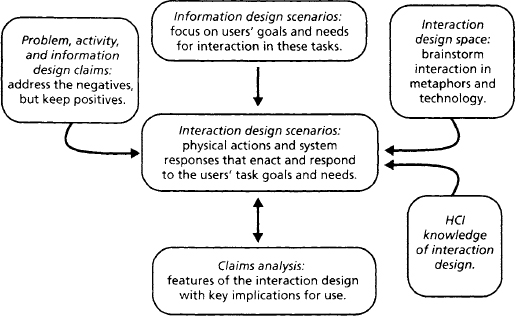
As we move on to interaction design, remember that in real-world projects this phase of design would be tightly interleaved with activity and information design. Designers explore functionality in activity scenarios, and then refine and test their ideas by generating information and interaction scenarios. Information and interaction design are necessarily interdependent—the interactions possible with a system are determined by the information the design presents.
5.4.1 Exploring the Interaction Design Space
Earlier we considered metaphors for basic functionality and for information design; now we turn to the design of interaction techniques for accessing and manipulating science fair objects and actions. Our general metaphor of a physical science fair leads to a direct manipulation style of interaction: Students constructing exhibits might work with “piles” of materials; they “grab” and “tack up” the documents to their exhibit. People visiting an exhibit first “scan” the room and then “walk over” to an exhibit; when they want to see details, they “lean in” to an exhibit.
Other metaphors suggest different ideas about the interaction design space (again for simplicity we limit ourselves to the metaphors already explored in Chapters 3 and 4; see Table 5.2). The metaphors for viewing exhibits suggest a virtual-book style of interaction on the one hand (open to and turning pages, reading one page at a time), and a movie or slide show on the other. The visit metaphors point to a range of interaction possibilities—handwriting recognition for notes, auditory or video stream output, and gesture recognition for greetings or other social behaviors.
Table 5.2 Metaphors for a virtual science fair, with emphasis on interaction design.
| VSF | Real-World | |
| Interaction | Metaphor | Ideas about VSF Interaction Design |
| Viewing an | Lab journal | Open to a page, read whole page, turn page to continue |
| exhibit is like … | Documentary | Buttons to start/stop play; pause or replay if desired |
| Coaching a | Peer (colleague) | Video or audio for two-way conversation, face-to-face |
| student is like … | Director | One-way commentary, seizing control of the interaction |
| Visiting the | Study room | Gesture or character recognition as notes are written |
| fair is like … | by hand | |
| Public lecture | Constant stream of auditory and/or visual output | |
| Cocktail party | Walking in a door, waving at friends, shaking hands | |
| Filling out | Balance sheet | Type into fields, add up numbers for tallies |
| judging form is like … | Discussion | Raise hand, add comment in place, take turns commenting |
| Creating a | Report card | Select category, enter numeric or symbolic value |
| fair summary is like … | Guided tour | Point at objects, type or speak related comment, move or |
| Thank-you note | Add recipient and address to default content, write signature |
Once more we complement the exploration of real-world metaphors with ideas suggested by the current set of MOOsburg tools (Table 5.3). Often the two sources are complementary—for example, it is easy to imagine using an electronic blackboard to take informal notes encoded through handwriting recognition. This pairing leads to further ideas about input devices: A mouse is a poor device for drawing gestures or characters, so if we choose this style of interaction we may want to support a pen or stylus. Raising hands or waving an arm implies that users will have input sensors on their hands or arms; we might instead consider a more symbolic alternative, perhaps a schematized “wiggle” or vibration made by the visual representation of participants in a room. As always, the intent here is not to settle on the right or wrong techniques but to explore a space of possibilities.
Table 5.3 Ideas about interaction design suggested by current MOOsburg tools.
| VSF | MOOsburg | |
| Interaction | Technology | Ideas about VSF Interaction Design |
| Viewing an | Multimedia | Chose a page, scroll up and down to view elements |
| exhibit is | notebook | |
| like … | Electronic | View entire board or magnify portions by zooming |
| whiteboard | ||
| Web pages | View one page at a time, click on links to see related pages | |
| Coaching a | Identify recipient and address, then type message | |
| student is | Threaded | Select comment, then choose “reply” and type response |
| like … | discussion | |
| Chat | Type characters at any time, press “send” to submit | |
| Visiting the | Room panorama | Rotate to view all, approach and grab objects, post notes |
| fair is like … | Find locations of interest, click to move to new location | |
| Interactive map | ||
| Filling out a | Voting booth | Select and read question, click on button to enter vote |
| judging form | Threaded | Go to student thread, read, reply to comments, enter new |
| is like … | discussion | |
| comment | ||
| Creating a | Charting package | Enter and select categories and numbers, choose chart |
| fair summary | type | |
| is like … | Multimedia | |
| Create a page, type characters, use menus to import | ||
| notebook | images | |
| Interactive map | Click at location on map, add summary object, repeat |
5.4.2 Interaction Scenarios and Claims
The information scenarios in Chapter 4 described how task objects and actions might be presented in the science fair, and how these elements could be organized into groups and higher-level information models. Design issues revolved around how users would perceive, interpret, and make sense of what they saw in the online displays (the Gulf of Evaluation). We turn now to questions of action: how do users choose a goal to pursue? How do they pursue their goals? How do the system’s user interface controls influence the success and satisfaction of their efforts?
At this point in the usability engineering process, we have deliberately narrowed our coverage of the case study. Figures 5.5 and 5.6 show just two interaction scenarios—Mr. King coaching Sally, and Alicia and Delia visiting the fair. These two scenarios cover several central stakeholders and activities; between them they touch on a large portion of the overall design. They are complex enough to illustrate the techniques we use for interaction design. And, by restricting the example in this way, we are able to present a full scenario narrative. Remember that narratives such as this are a cumulative end product of the three design subphases; along with the claims, screen designs, and other supporting documents, they serve as the design specification used for prototyping and usability testing (Chapters 6 and 7).
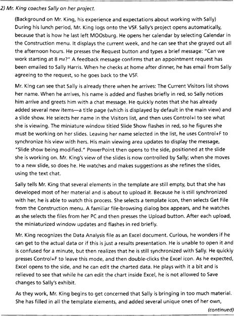

Figure 5.5 (continued)

It is impossible to account for every idea in a design; sometimes features are introduced because someone on the design team wants it that way, or everyone agrees that it seems the right thing to do. As we developed specific ideas about user actions and science fair responses, we analyzed the usability implications as claims. Not surprisingly, many of the interaction concerns are related to issues raised during activity and information design (see Table 3.3 and Figure 4.14). Several of these open issues included:
- dealing with the potential complexity and diversity of individual exhibits;
- helping visitors feel welcome and comfortable as they join ongoing activities; and
- encouraging more intensive, interactive exploration of exhibit contents.
By the time interaction design takes place, many constraints are in place. For example, we decided earlier to address the complexity of Sally’s exhibit with nested components. When we thought through people’s interaction with such icon because Delia has never changed this part of her profile. Their icon flashes red briefly, which Delia finds a bit embarrassing; she hates to be noticed in a crowd.
There are also a number of objects that Alicia and Delia infer are exhibits: They all have the same icon, a miniature board with graphics; Alicia sees her neighbor Jeff Smith’s name underneath one. Delia points to some black and yellow flags across some of the exhibits, suggesting that these must be “under construction.”
Delia starts to open an exhibit in the middle with lots of people around it, but then Alicia notices her friend Marge. She tries the technique she has used elsewhere in MOOsburg, selecting Marge’s icon and then using “Control+l” to see if she is working with anything. An exhibit with the label “Sally Harris” flashes briefly in red, so they decide to open this one instead.
The exhibit appears in a separate window. Like the VSF itself, it has a main view that is currently showing Sally’s title page, “Black Holes: Magnets of the Universe!” In place of the map in the lower left, Alicia sees a group of what appear to be miniature windows. The one labeled “Title Page” is currently selected, and when she selects “Abstract,” the main view updates its content to show a brief paragraph introducing the exhibit. There is a list of visitors to the left, a list of exhibit tools, and a chat window. As before, Delia’s name flashes in red for a few seconds when they arrive, and Marge and Sally pause their conversation to say hi.
Alicia and Delia don’t want to interrupt, so they explore the other exhibit elements. Alicia is impressed when Delia recognizes the Excel file, opens it, and starts playing around with Sally’s data; she didn’t realize until now how much computer software Delia has been learning about in science classes. When they start up the slide show, they hear Sally’s voice-over explaining key points.
Delia notices an FAQ board as part of the exhibit. By now she is very comfortable with the little windows, so she double-clicks to open it on the side. She sees that questions have people’s names attached; in fact she discovers a question left by her friend Martin. She elaborates on his question and is a bit surprised when the VSF tells her that he has been sent a notice of the updated discussion—now he is sure to tease her in school tomorrow!
Alicia is curious about something labeled “Star Model.” When she clicks on it, they see an animation of a black hole gradually sucking in surrounding stars. They wonder whether this element is also interactive like the Excel file, so they double-click. Sure enough, a separate window opens to the side, displaying Sally’s simulation model, along with suggestions about experiments, and a folder of earlier experiments. When they select one created by Martin, yet another window opens and shows Martin’s animation. They don’t have time to make their own right now. But Delia thinks this is neat, so she plans to come back later with her friend Heather.
material, we considered the idea of showing the nested element in the main view, effectively replacing the context provided by the parent. But because this would remove the task context provided by the parent window, we decided to use secondary windows for nested elements. We documented the negative impacts of this decision (increased complexity in window management) in a claim (Table 5.4).
Table 5.4 Claims analyzing important features of science fair interaction.
Visitors arriving at the science fair are welcomed implicitly by the appearance of their personal icon (their avatar) in the main view. Our elaboration of this reinforces the connection to MOOsburg, suggesting that some visitors appear with custom photos as icons, while others arrive in a more generic form. This gives special recognition to people who have more regular involvement. At the same time, we were inspired by the cocktail party metaphor, and wanted to provide a more visible welcoming event. We decided to briefly flash an arriving visitor’s icon (or name at an exhibit), thinking that this would attract attention and prompt hellos from other visitors. We added this feature despite its obvious tradeoffs (distraction or possible embarrassment), because it is consistent with our root concept of increasing community interaction.
At the same time, we wanted to promote awareness of other people’s activity. We learned from the science fair studies that visitors often treat the science fair as a social event; indeed, the visit scenario was designed to explore this. As an example of this opportunistic goal, Alicia wants to find out what Marge is doing. The science fair display is already crowded with people and object icons, and we did not want to make it even more complex by adding person-specific activity cues. We decided instead to implement this as a query, even though this departs from the real-world metaphor of looking around to see what is happening.
Adding this special key command prompted us to look for other opportunities with similar needs. For example, we elected to support a view-synchronization function (allowing Mr. King to watch Sally work) with a similar technique. An important piece of the rationale for both of these cases is that these services are not required for basic interaction at the VSF, so it is less costly to “hide” them in special Control key commands.
To explore the issue of increased interaction with the science exhibits, we described detailed interaction with the miniature windows. We considered both simple selection, where the miniatures work somewhat like radio buttons, and activation, where they open the source application for further exploration. We imagined how a young student like Delia might react to Sally’s Excel analysis, persuading ourselves that she might have enough computer background to benefit from a live spreadsheet. At the same time, we addressed Mr. King’s concern about data protection by specifying that there will be a read-only mode.
As in previous chapters, many of the interaction design claims are related to the general tradeoffs discussed in the first half of this chapter. For example, we addressed issues related to pursuit of opportunistic goals (Tradeoff 5.3), decomposition of complex activities (Tradeoff 5.5), opening related activities as independent execution threads (Tradeoff 5.6), and choosing default displays and selections (Tradeoff 5.10). These tradeoffs were not applied directly to generate the design ideas or the claims, but rather they helped us to direct our attention to common HCI concerns.
5.4.3 Refining the Interaction Scenarios
Adding interaction details to the design scenarios gives them a more concrete feeling. It is almost possible to imagine the actors stepping through the activities. Of course, it is still necessary to infer some of the very specific details (e.g., what it feels like to double-click on an icon, or what it means to make selections in a dialog box), but these primitive actions are easy to imagine for anyone who has a general familiarity with interactive computer systems.
However, even though these scenarios in Figures 5.5 and 5.6 are quite elaborate, the low-level details about selection techniques and input events must still be decided. Many of these details will not be addressed until an interactive prototype is constructed (Chapter 6); the software platform or user interface toolkit will predetermine many such decisions. But in parallel with development of the interaction design narratives, careful consideration should be directed to the available options for input and output devices and user interface controls.
Detailed Design
To implement an interaction scenario, the system’s input and output devices must be specified. It is not enough to say that Alicia clicks on a map; this clicking action must be mapped to a particular device, cursor image, and so on. Different devices have different implications for physical behavior (recall Table 5.1). The interaction designers should carefully examine the devices supported by the selected development platform (indeed, sometimes such concerns will help determine the appropriate platform). For the virtual science fair, we simply adopted the default input and output mechanisms used in MOOsburg—a mouse for pointing and selection, keyboard for text input, and a single screen for output—although we may eventually support speech input and output.
Another aspect of detailed design addresses the user interface controls (often called widgets). In the science fair project, many of these details were fixed by the Java user interface libraries used by MOOsburg (Isenhour, Rosson, & Carroll, in press). However, we ask the questions in Table 5.5 to think about user actions and feedback. For example, MOOsburg displays generic system menus (e.g., File) in a fixed menu bar, but context-specific menus (e.g., for moving or opening an exhibit) appear as pop-up menus near the selected object. This emphasizes the connection between selected objects and their behaviors, and reduces the execution time for evoking the object-specific functions. However, the technique hides initial view of the options, and requires the infrequent behavior of clicking the right mouse button. Because of this we reversed the “right click for options” convention and displayed the options in response to the left click normally used for object selection.
Table 5.5 Qustions used to raise user action and feedback concerns about user-interface input devices and controls.
| Ul Control | Sample Questions about Specific Interaction Mechanisms |
| Pointing/selection | How many pointer shapes are available? What is the relation between pointer and insertion point? What keys can be used to position the pointer and how? What selection shortcuts are available, and how do these vary across tasks? |
| Menus | How are they opened? Where do they appear? How are submenus accessed? How are inappropriate items indicated? What shortcuts or fast paths are supported? |
| Text input field | How is the insertion pointer positioned? How is unacceptable input signaled? How are defaults initialized and removed? |
| Undo | What is the unit of change? How does it vary across tasks? How far back can you go? What is the undo/redo relationship? |
| Buttons | How is pressing signaled? How are active and inactive buttons distinguished? What happens when a window is resized? |
| Icons | How is selection indicated? How does the icon draw itself when its referent is moved or copied? Are multiple images supported and, if so, how? |
| Dialog boxes | Are they modal or not (or either)? How are they positioned? Can they be repositioned? How is embedding indicated? How is navigation among fields supported? How are defaults set and reset? |
| Alerts | Where do they appear? Do they include sound? Are they modal? Do they have a time-out mechanism? |
| Windows | How are they opened and positioned? How are they moved and resized? How are hidden (but active) windows surfaced? What window relationships can be signaled? |
Interaction Storyboards
SBD adapts Wirfs-Brock’s notion of user-system conversations (Wirfs-Brock 1995) to examine short interaction sequences in depth. Wirfs-Brock uses this technique to elaborate use cases in object-oriented design—a user interaction is modeled as a two-sided conversation, with the user’s input events making up one side, and the system response the other. A point-by-point analysis of this sort can help to force out otherwise hidden issues.
Wirfs-Brock generates textual descriptions for each side of the conversation. We used instead a simple sketch of the screen at each point during the dialog, annotated with information about what the user sees and does. The result is a rough storyboard, a graphical event-by-event enactment of a complex or crucial sequence of user-system interactions. (A storyboard is an example of a low-fidelity prototype; see Chapter 6. Note that we have developed this one in a graphical editor to make it more legible, but often a rough sketch would be sufficient.)
Figure 5.7 shows a storyboard developed during the detailed design of the visit scenario. It does not represent the full narrative, but focuses on a portion of the episode that raised special interaction concerns—the actions on miniature windows that either update the main view or open a separate window to the side of the exhibit. We took the case where there is already an Excel window open to the side and Alicia and Delia go on to explore the star simulation. This level of interaction seemed reasonable in a visit situation, and we wanted to see if the general scheme of view selection and application launching would work.

In Figure 5.7, the dark borders signify the currently active window and controls. The brief episode shows how Alicia and Delia open first the Excel application, work with it overlaid on the exhibit, and then go back to the exhibit and open another source application. At this point, there are three windows on the display: the overall exhibit view, and the two source applications (in fact, there would also be the original science fair view, which we have ignored in this storyboard for simplicity; it would be a second complex window in the background). The complexity would multiply even more if visitors opened more source applications. By walking through the details of this interaction sequence, we obtained a more concrete feel of what it would be like to click on a control to view its content, and to double-click for more extensive interaction. We persuaded ourselves that the two forms of interaction would be distinct for users (single-click versus double-click) and that they offered a natural mapping to the task goals (the more intense action of double-clicking produces a more intense result of activation).
This storyboarding activity also had a pervasive side effect: We decided that clicking on any window that was part of a set (e.g., an exhibit with several secondary windows open) would cause all of the windows in the set to surface together. The related windows provide a context for interpretation, and so they should be managed as a group.
The virtual science fair envisioned to this point has raised many questions that are best addressed through prototyping and user testing. It is not enough for us to convince ourselves that we have made the right decisions—ultimately, the users will decide. For instance, the techniques just described for exhibit viewing and application launching are in need of empirical evaluation; the creation and access of nested components is another good example. In Chapters 6 and 7 we will show how design scenarios and claims are used in prototyping and usability evaluation.
Summary and Review
This chapter has discussed issues relevant in designing interaction sequences for interactive systems. We elaborated the science fair design to demonstrate how interaction issues can be envisioned and discussed. The use of storyboards as a detailed analysis technique was also illustrated. Central points to remember include:
- Norman’s Gulf of Execution provides an overarching framework for understanding the planning and execution of interaction sequences.
- Direct-manipulation user interfaces can make system goals and actions obvious, but may do so at the cost of complex visual displays or tedious execution sequences.
- Task decomposition through menu selection is a powerful technique for simplifying and guiding plan development, but can backfire if the decomposition does not match the user’s mental model of the task.
- Some user interface errors are true errors (mistakes); others are best understood as slips. Mistakes and slips are unavoidable in user interaction, so designers should anticipate and design for them.
- Giving the user control is important in interaction design, but this may come with an increase in task management (e.g., multiple windows).
- Common interaction sequences should be amenable to optimization through good defaults, fast paths, or custom creation of macros.
- Input devices can vary significantly in their physical affordances (e.g., contrast a mouse to a joystick); understanding and respecting these affordances should be a key aspect of interaction design.
- All systems should support undo sequences, but an effective undo scheme requires an analysis of how users think about their behavior, so that it reverses actions in predictable ways.
- During interaction design, many details will be predetermined by the software packages supporting a development team. These packages should be carefully examined for interaction options and associated effects on planning and execution.
Exercises
- Use the Gulf of Evaluation and the Gulf of Execution to analyze the task of deleting the oldest three messages in your email list. Start with your Inbox open, then describe:
- Initial perception, interpretation, and making sense of the display. How does this understanding help you choose a system goal that will achieve your task goal?
- Your action plan. What steps must you take to achieve the system goal?
- The execution steps. How is the plan implemented?
- System feedback. What responses does the system provide during plan execution that are perceived, interpreted, and understood in terms of progress on the task?
- Invent two menu systems that you could use to support the tasks of writing a check, determining current balance, and making a deposit into an online checking account. Design one set of menus to match your understanding of these tasks as well as possible, and make the other depart from this understanding in significant ways. Discuss the implications of each set of menus for system use.
- Step through two different email tasks (e.g., writing a new email, and transferring an email to a folder). For each one, analyze the support for the undo process provided by your email client. Does it reverse your actions in a predictable and natural way? Discuss why or why not.
- Analyze your computer’s file manager with respect to facilitites for optimizing frequent tasks. What techniques does it support? Which of these have you incorporated into your own use? Why or why not? What other techniques should be added?
Project Ideas
Continue your work on the online shopping project by adding interaction details to the information scenarios:
- Discuss the interaction implications of different metaphors, and consider the implications that different input devices might have for your system (it’s fine to include devices that don’t really exist yet!).
- Elaborate your information scenarios. Choose at least one scenario to present in fully detailed form; for the others, describe the interaction techniques you have envisioned and their effects on goal selection, planning, or execution.
- Select one or two low-level sequences about which you have particular concerns. Analyze these concerns through a more detailed storyboard.
- Document important user interaction tradeoffs in your design through claims analysis.