
In the early 1980s, our group at the IBM Watson Research Center investigated the difficulties people experienced getting started with personal computers. In these studies, we provided all required software, hardware, and documentation, and then watched quietly. Our observations illustrated how people did not, and perhaps could not, make effective use of what appeared to be carefully designed documentation and self-instruction material. As part of this project, we carried out a study of the Apple Lisa, one of the first systems to incorporate a graphical user interface, an interactive tutorial, and an extensive library of manuals specifically designed for end users.
One of our volunteer users turned out to be a linguist working as a documentation developer. He was fairly knowledgeable about the state of the art in documentation, and was quite impressed with the Lisa manuals and interactive tutorial. He declared to us at the outset of the session, “You’re going to be watching a lot of reading. I am the kind of person who reads everything before doing anything.” However, within a few minutes, he had discarded the manuals and was improvising with the tutorial exercises, actively exploring the system, and making lots of errors (Carroll & Mazur 1986).
User documentation is stored information about how to use a system. There are many forms of documentation and many purposes served by documentation. The most typical example is the traditional bound reference manual. But documentation also includes online help utilities, intelligent tutoring systems, and user forums. It can be a standalone subsystem, like an interactive tutorial or a frequently asked questions (FAQ) forum, or it can be tightly integrated with core system functionality, such as input prompts and error messages. It can support new users just getting started with a system, experienced users recovering from errors, or expert users refining their knowledge and use of advanced options.
The main problem that defines or frames documentation design is that people interacting with software systems have a wide variety of information needs. They need to know what a piece of software is for and what tasks it supports. For example, a spreadsheet program is for table-based calculation, not for document preparation or real-time conferencing. People need to know how the software supports those tasks and what procedures are possible. For instance, the spreadsheet probably supports graphing and macro definition. People need to know how to carry out various procedures, such as how to specify cells for a graph and how to reference cell indices in a macro.
People also need to know something about how the software works (i.e., they need a mental model). One reason for this is that a mental model will help them make sense of their interactions with the software. Take a simple word processing example: It is obvious that paragraph formatting is represented by a character, once you know it. But if you do not already know it, text manipulation can be confusing and frustrating. Some text insertions will reformat and some will not, some text deletions will remove paragraph formatting and some will not, and so forth. Another reason for providing how-it-works documentation is that people will spontaneously generate mental models for how things work. Without guidance, they often produce incorrect models.
Each of these information needs is itself a complex documentation problem. None of the problems can be satisfied once and for all with a single description or explanation, presented in a single manner. For example, the graphing capabilities of a spreadsheet program should be presented in a way that reinforces an appropriate mental model of what the system can do and how it works. At the same time, graphing procedures (action plans) must be guided by prompts and error messages in the user interface. Graphing capabilities must be described in instructional materials—the manuals, the interactive tutorial, and the online help. The information needed for a given usage situation must be easily accessible, and it must be presented in a way that aids interpretation and sense making (Chapter 4).
From these initial considerations it might seem that documentation design should be a lively and attractive topic in computing—and, to some extent, it is. However, documentation is also dogged by paradox. One of the well-known clichés of computing is that nobody reads documentation. Indeed, it is worse than that: The cliché should be that nobody reads documentation and nobody writes documentation, but everybody needs documentation.
8.1 The Production Paradox
Attitudes toward and use of documentation are described by a principle of human cognition called the production paradox: People want to produce things, and they want to achieve meaningful results. This is not an issue of job performance, that is, of pleasing managers and bosses; it is a more fundamental issue of self-perception. People want to see themselves as competent, engaged, and productive. However, in order to be productive in the long term, people often must carry out activities that undermine their short-term productivity, such as reading or writing documentation (Carroll & Rosson 1987).
Users want to achieve task goals that are meaningful to them, goals they already understand and expect to achieve, such as finding a particular piece of information or document, or communicating something to someone. Sometimes the software they use facilitates these goals, and sometimes it obstructs them, but the act of reading documentation about the software is always a distraction (Tradeoff 8.1). An analogous account can be given as to why software developers devalue the task of writing documentation.
TRADEOFF 8.1 ![]()
Documentation helps people to use systems more productively, BUT people do not experience reading documentation as meaningful work activity.
The production paradox helps in understanding many of the problems people have using documentation. People often skip around. Instead of carefully reading explanations and following procedures, they browse and scan sections, perhaps alternating among several manuals. Documentation designers know that people skip around in documentation, and they attempt to discourage this, such as with the somewhat pathetic plea to “Read everything before doing anything.” A more drastic technique in online training is to require specific actions before moving to the next step. Users do not like this technique.
An alternative approach to the skipping-around problem starts with asking why it happens. Skipping around can be seen as a way to transform the passive tasks of reading and following instructions into the more meaningful tasks of exploration, diagnosis, and hypothesis testing. Skipping around is an attempt to learn by doing, rather than by reading. People want to learn about a system while they are trying things out; this follows directly from the production paradox. Skipping around is not a problem, but a symptom: Users do this to create more meaningful tasks for themselves. The problem is that skipping around can lead to tangled errors that are difficult to analyze or correct.
Error management is another example of the production paradox. Most people do not try to make errors, but errors often help them to explore the boundaries of what they know. In our studies of people using systems and documentation, we have observed people who almost roll up their sleeves in anticipation when they recognize a nontrivial error state. As in the case of skipping around, error diagnosis and recovery are active and meaningful tasks.
Traditional documentation design treated error as rare and problematic, addressed via troubleshooting appendices. In reality, error and error recovery are frequent and common. Even experts spend about a quarter of their time in error states (Card, Moran, & Newell 1983); novices often spend more than half their time recovering from errors (Carroll & Carrithers 1984). The variety and sophistication of contemporary documentation technologies, especially context-sensitive and intelligent help, permit ambitious approaches to learning from error—using errors to help people understand what the system is for, what they might want to do with it, and how to pursue both of these goals.
A theme in modern documentation design is the integration of documentation with meaningful activities. Instead of simply defining operations and options, documentation should explain how to accomplish a real task with the software, a task that incorporates the use of particular operations, while illustrating respective options and their interactions. Key guidelines for writing effective documentation are the tight coupling between people’s goals and strategies and the presentation of information that enables these goals and strategies.
8.2 Paper and Online Manuals
A person’s first encounter with documentation for a system is often a self-paced tutorial. Instruction-oriented documentation became common in the 1980s with personal computing. Classroom approaches to training were not economically viable for inexpensive personal computers, whose users varied greatly in technical background and application needs. The computing industry adopted the concept of self-instruction, so that users could teach themselves how to use new software. Computers and software were bundled with comprehensive training materials (see “Systematic Documentation” sidebar).
The first examples of self-instruction were paper manuals. People worked through lessons following procedures, reading explanations, and carrying out self-test exercises. The design of such manuals has evolved to address the production paradox in a variety of ways. For example, it is common for instruction manuals to emphasize hands-on activity, to be organized in terms of people’s tasks instead of system functions and operations, to coordinate the textual material with other information such as associated screen images, and to provide error-recovery procedures (see Figure 8.1).
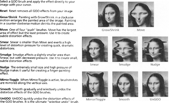
Figure 8.1 This page from the manual for Kai’s Power GOO (Torzewski & Sullivan 1997) illustrates explicit coordination (the gallery of image transformation effects are coordinated with the names for the effects) and error management (the first command defined is Reset and the last is UnGOO). The manual addresses the user requirement for a meaningful task in an interesting way: The image to which the transformations is applied is highly recognizable, and the examples immediately suggest the open-ended and engaging task of creating one’s own reinterpretation of Mona Lisa.
People’s diverse learning needs have also promoted a lively third-party industry providing a variety of specialized paper documentation. For example, a user might obtain:
- A getting-started manual that introduces a few core tasks.
- A comprehensive self-study tutorial covering all application tasks.
Documentation design is not just writing. Every piece of documentation—every label, prompt, and error message; every help frame; and every paragraph of every manual—is constrained by every other piece. Terminology and assumptions about people’s prior knowledge must be consistent throughout. In this sense, the documentation is itself a system. Like the software it describes, the documentation has an overall design that can be systematically analyzed and decomposed into an implementation. Recent documentation technologies, such as hypertext and multimedia, make this point emphatically: They provide a much richer design space for documentation, and thus many more ways to achieve poor documentation design!
Systematic documentation emerged in the 1960s as an example of hierarchical decomposition; task analysis and structured programming are other examples (Gagne & Briggs 1979). It models human knowledge and task-oriented goals as hierarchies: For example, the concept of a spreadsheet involves subconcepts such as cell, column, and equation. The goal of graphing a set of spreadsheet cells involves the subgoals of selecting the cells and formatting the graph; the latter decomposes into selecting a graph template and specifying labels for axes, and so on. The decomposition can be carried to arbitrary levels of detail.
After the documentation designer constructs a comprehensive task hierarchy, explanatory material is created to address each terminal node as a separate information objective. Subsequent references in the documentation to a given concept or task can then repeat or point to the relevant piece of the hierarchy. An important strength of this approach is that it ensures that prerequisite information is incorporated into documentation.
But systematic documentation has important weaknesses as well (Tradeoff 8.3). People do not always experience systematic documentation as meaningful when they read it. An overall decomposition of task knowledge and goals may not correspond to the way anyone thinks about a particular task. Indeed, general-purpose decompositions often emphasize subgoals too much, at the expense of conveying the bigger picture. A focus on low-level goals (e.g., formatting the text in a spreadsheet cell), with only secondary attention to the larger task context (e.g., creating a budget report) can frustrate and de-motivate people. Decomposing a task into subtasks allows a complex activity to be built up from its parts, but the knowledge gained may not be useful in real task settings.
- Job aids presented as cards that briefly define a specific function or operation.
- A comprehensive reference manual that defines all features, functions, and operations.
Paper has a number of advantages and disadvantages (Table 8.1). Turning pages is not a meaningful activity for people who want to use software. Bulky manuals (indeed libraries of manuals) are intimidating and de-motivating (Tradeoff 8.2). Their sheer mass emphasizes how much the person does not yet know, and how many pages remain to be turned. It is difficult to coordinate the information in manuals with system activity, because people become absorbed in system interactions and forget to check the manual in their laps. This increases the possibility that errors will not be recognized and addressed when they first occur and that multiple errors may accumulate, creating a tangle of errors that is difficult to diagnose and recover from.
Table 8.1 Commonly cited advantages and disadvantages of paper-based documentation.
| Advantages | Disadvantages |
| Highly portable, can be used anywhere | Finding and turning to a page is an extra task |
| Easy to scan at varying levels of detail | Paper is bulky, takes up office or desk space |
| Can be annotated with normal writing tools | Large manuals may seem intimidating to novices |
| Familiarity, based on well-practiced reading habits | Lack of coordination between paper and software |
| Reading is faster from paper than screens | Fixed organization of content |
| People like owning books and other manuals | Paper and print deteriorate over time with use |
TRADEOFF 8.2 ![]()
Online manuals facilitate information access, navigation, and search, BUT are harder to read and browse than paper, and less convenient to annotate.
Nevertheless, paper manuals remain an important delivery medium for user documentation. Paper is highly portable, easy to scan, and convenient to annotate. Despite the reluctance people often have toward reading manuals, they seem to like having manuals. Some of the downsides of paper can be addressed merely by making paper documentation available online. People always have the manual content ready to hand, and they do not need to dedicate desk space to a physical manual. They can navigate the manual with links, instead of turning pages; for example, an online index can be a list of links. Even better, they can use string searches, or sophisticated information retrieval tools (Egan, et al. 1989a, 1989b) to access relevant content, instead of laboriously scanning physical pages.
However, there are also downsides to placing information online. Displays produce poorer images than printed materials; they can be as much as 25% less readable. Displays often present less information than a printed page, particularly, of course, when the online information is allocated only a portion of the display. This means that online manuals usually have more frames than the number of pages in a paper version. This makes navigation more difficult. Finally, online information structures are more difficult to grasp; browsing online information is typically less effective than browsing a paper manual. Because of issues such as these, optimal online and paper designs for the same information content tend to be different.
TRADEOFF 8.3 ![]()
Documenting tasks as components that combine systematically into larger tasks organizes complex information, BUT may not match real-world tasks.
8.3 Demonstrations and Tutorials
All manuals have inescapable usability problems. For example, they tell rather than show. For graphical user interfaces, it is often easier and more effective to show people what to do or what will happen than to describe it in words. Demonstrations are scripted user-system interactions. A demonstration captures a user’s attention with animation, and shows brief but intriguing interaction episodes. The idea is motivated by video games, such as PacMan, that present documentation as an animation which plays over and over, attracting and training new users at the same time. Demonstrations are very good at expressing simple and dynamic information (Waterson & O’Malley 1992). They orient users to important elements of a user interface display and illustrate typical behaviors with this information. Demonstrations motivate people to try out software, while removing the possibility of error (Palmiter & Elkerton 1991; Payne, Chesworth, & Hill 1992).
The key disadvantage of demonstrations derives from one of their strengths: Learners do nothing but watch (Tradeoff 8.4). Often even simple requests—stop, replay, back up, or skip—are not possible. Demonstrations may offer a realistic view of the software in use, but they provide little opportunity for goals, planning, action, or sense making. This weakness can be addressed by enabling at least a small degree of interaction. For example, a demonstration might display a brief description of a screen object when it is selected, or prompt viewers to provide the next command in a sequence. Such techniques make learners more active and enhance learning.
TRADEOFF 8.4 ![]()
Demonstrations provide attractive and safe previews of functions, BUT people cannot learn how to find, execute, and control a function by viewing its effects.
A problem for both manuals and demonstrations is that they do not respond to people’s behavior. Manuals can coordinate illustrative screen shots with error-recovery information, but this may not help if the reader is viewing a different screen or page. A demonstration executes with little or no regard for what the viewer is doing. This lack of responsiveness is a key motivation for interactive documentation. An interactive tutorial is similar to an online manual. It presents a sequence of presentations and exercises designed to promote learning, but using digital media. Because these tutorials are online, they can incorporate built-in demonstrations; they can illustrate typical user-system interactions, often by running actual system code. An interactive tutorial can also provide scaffolding (learning supports that enable new users to do more interesting tasks than they can do on their own) in the form of prompts, special feedback, reflective questions, and so on.
In an interactive tutorial, the display of information is triggered by system states and input events. Instead of showing a screen image and asking the learner to verify that the system is in this state, the tutorial determines the state itself. This is enormously useful in error management: An interactive tutorial can monitor for specific errors and provide immediate feedback and recovery guidance, cutting down the possibility of tangled errors that are difficult to diagnose and address.
Online tutorials can also be specialized to address differences among learners. For example, scientists and accountants use spreadsheets in different ways-accountants do not need inferential statistics, while scientists make limited use of percentages. Mathematicians and Web designers make different uses of word processors—mathematicians make extensive use of symbols, while Web designers need to worry about what can be translated into HTML.
Substantial differences in domain knowledge and usage interests such as these are relatively easy for people to self-diagnose, so different tutorials can be designed around different basic tasks. The learner can indicate a domain preference at the start of an instructional program, and thus obtain the version appropriate to this interest. This version specificity leverages a learner’s prior knowledge in acquiring new information and makes the learning process more personally interesting and meaningful.
Tutorials can also provide alternate learning tracks for different types of learners. For example, a fast track can be created for people who learn quickly, who want only a quick overview, or who are relearning to use a program. Remedial tracks can be provided for people who experience difficulty with portions of the tutorial. And, of course, error-recovery support should be available from any point in the tutorial experience. Figure 8.2 suggests some of the control-flow possibilities for an interactive tutorial.

Figure 8.2 Multiple tracks in an interactive tutorial can be designed to address different learning needs.
Tutorials can be designed to simulate the real system, or they can be directly integrated into the system. An advantage of integration is that it helps to ensure a smooth transition from learning about the system to using it. In a tutorial we created for the Smalltalk language, learners developed Smalltalk classes in their tutorial exercises. At the end of the tutorial, these classes were part of their Smalltalk class library; the tutorial was not just similar to real programming, it was real programming (Rosson, Carroll, & Bellamy 1990). Of course, a disadvantage of this approach is that the range and complexity of potential errors is greater when working with the full system.
The greatest challenge in designing interactive tutorials is staying focused on the most important concepts and operations. The possibilities for interactive learning are many and are increasing. It is easy to overwhelm users with graphical animations, video images, and sound, while teaching very little (Tradeoff 8.5). It is also tempting to provide a tutorial that is too thorough: For even a modest application program, there are far too many possible tasks and variations to provide a tutorial for each. Instead, an analysis and iterative design process should identify the tasks most people want to do most of the time, and then prepare materials that guide them through these tasks (see “Minimalism” sidebar).
Minimalism
The minimalist model for documentation is an attempt to move beyond systematic design. It emphasizes the iterative design of documentation that learners can use to learn by doing (Carroll 1990, 1998; Meij & Carroll 1995). The following key principles guide the design of minimalist instruction.
- Documentation should be action oriented: People should be continuously encouraged and supported to act as they work with information. In a practical sense, this means that most of the learner’s time should be spent interacting with the system rather than reading about how to achieve these interactions. Verbiage should be kept to a minimum, and prompts for action and analysis should be common.
- Documentation should leverage learners’ prior knowledge of work domains. The material should be presented in familiar task contexts, such as, for example, construction of a budget report or analysis of a budget discrepancy. The content and structure of the documentation and the tools that present it should correspond to the content and structure of real tasks. When possible, connect the learning tasks to the learner’s real-world activities, such as analyzing and modifying information that supports actual work.
- Documentation should anticipate and manage errors: Nuisance mistakes (e.g., mistyping a file name) should be prevented when possible. However, common conceptual errors (e.g., confusing a data file with an application file) should be discovered and analyzed through empirical testing, and adequate and timely error detection and recovery information should be provided. When possible, these likely error episodes should be treated as opportunities for reflection and greater understanding of how the system works.
The design of minimalist instruction shares some similarities with systematic documentation design, but it is more demanding. For example, in minimalist design it is crucial to investigate the domain knowledge people bring to their use of systems and software, and the sorts of inferences people are likely to make in given circumstances. Information that users are likely to already know or can infer need not be made explicit; such information clutters the documentation and discourages user activity.
Of course, minimalist documentation has its own set of disadvantages (Tradeoff 8.6). People who expect documentation to be sequential and explanatory may be intimidated if they are asked to make sense of open-ended and incomplete instructions. Many people do not see error recovery as a learning opportunity, but rather as an irritating distraction. Documentation designers also can be intimidated by the need to analyze, and take into account what they discover, about learners’ prior knowledge, as opposed to merely describing how the software works.
TRADEOFF 8.5 ![]()
Interactive tutorials allow documentation to be dynamically linked to users’ needs and activities, BUT can overwhelm users by trying to do too much.
In recent years, many applications have begun to build wizards into their online help systems. A wizard is somewhat like an interactive tutorial, in that it guides users through the steps of a new task. However, each wizard is very task specific, making it more like a help system than a general training system. Wizards are particularly common during installation or customization procedures, where a task is done only rarely, and then in a very scripted (and thus easily supported) fashion.
TRADEOFF 8.6 ![]()
Meaningful activities motivate and orient people to apply information, BUT may lead to anxiety about continually making sense and taking appropriate action.
8.4 Information in the Interface
One thing that manuals, demonstrations, and tutorials have in common is that they are not what users want to do. People install a spreadsheet to carry out spreadsheet tasks, not to read manuals, watch demonstrations, or work through the sequential tasks of an interactive tutorial. Fortunately, contemporary user interfaces provide many options for embedding information so that it can be incidentally encountered by people as they work on their own tasks. User interfaces that do a good job at this are often characterized as walk-up-and-use systems, emphasizing that users are not expected to first read about or learn the system but rather can get right down to work.
One large category of information in the interface is system messages. User interfaces include labels for many task objects such as programs and files, they prompt for user input, and they notify users of progress and errors. When these messages are specific and action oriented, they can be important documentation resources. When a new Macintosh user clicks on “Register With Apple,” a Web browser opens on the “Apple Product Registration” Web site, making it very clear what actions to take next (including canceling the task). At other times, a message is too general to guide action. An error message such as #VALUE! in a spreadsheet indicates that something could not be calculated. A more action-oriented message would indicate why the calculation is not possible (X is an unbound variable) or what would make it possible (assign a value).
Of course, there are design tradeoffs lurking. A message such as “Application cannot open” provides useful information, but less so than “Insufficient memory to open application.” The latter is longer and more specific, but requires more screen space to display and more reading time to comprehend (Tradeoff 8.7). The message “There is not enough memory available to open ‘Microsoft Excel’. Do you want to quit the application ‘Microsoft PowerPoint’ and open ‘Microsoft Excel’ instead?” is even more action oriented, but even longer (Figure 8.3). Where should message content stop? Is it helpful to say how memory is allocated among applications? Should a message explain memory allocation, and perhaps provide information on how to install additional RAM? At some point, calling such documentation a system message becomes a stretch.

TRADEOFF 8.7 ![]()
System messages integrate documentation with ordinary interaction, BUT messages that are specific and task oriented may be lengthy and consume screen space.
Information layering allows system information to be rich but still consume only modest screen space. Information is organized into different levels, with each level providing more detailed help or explanation. For example, a special key combination invoked on an icon might open a small information window stating what the program does and what it assumes about the operating environment. This would allow people to find out enough about an unfamiliar program to start it up. But the information box might also provide access to more detailed information, such as a button for additional feature summaries, a demonstration, even a tutorial. Similarly, a more lengthy explanation of the error message “X is an unbound variable,” for example, could be accessed by clicking on the error message.
Layering is a very general technique. Farkas (1998) describes procedure prompts that have links to (1) conceptual background information, (2) an example, (3) detailed steps, (4) little-used options and infrequently encountered circumstances, (5) tips for efficient use, and (6) links to related topics. Of course, such an approach has disadvantages. The layering structure can become complex enough that it becomes a learning and control obstacle itself. Second, it could be quite expensive to develop documentation in which every error message, prompt, or display object has its own small hypertext information model.
Another technique for documenting a system via its user interface is to define special interaction modes. In a training-wheels environment, a filter causes many system states to be inaccessible. The learner can do less—just as one can do less with a bicycle that has training wheels—but is protected from the consequences of serious mistakes. In one system using this technique, just a few core system functions were enabled. Selecting other functions produced the message ”<name of function> is not available in the Training Displaywriter.” This message recognizes that the learner has taken a specific action, but redirects planning and acting back to the core functions. Training-wheels interfaces have been shown to help learners get started more rapidly, spend less time in error recovery, and more quickly learn advanced functions later on (Carroll 1990).
Icon tooltips is a pervasive technique for embedding documentation in the interface. A function name or brief description appears in a pop-up label box when the user pauses the mouse pointer over the icon. This is an example of dynamic presentation of information discussed in Chapter 4; the additional documentation becomes visible only when implicitly requested (though sometimes a user is only pausing to think!). If designed with care, a set of tooltips can provide just enough additional information that a relatively experienced user can make use of unfamiliar icons or buttons. Unfortunately, these bits of information are often included as afterthoughts and sometimes provide little or no new information (Johnson 2000, 235–36).
The tooltip mechanism is a descendant of Macintosh balloon help. In contrast to tooltips, balloon help is turned on and off explicitly through a menu choice. When it is on, information about user interface objects is presented in a balloon when the mouse pointer passes over it (Figure 8.4). Although the level of assistance provided is up to the documentation designer, balloon help tends to provide assistance at one level of detail beyond a tooltip. In the figure, the text explains what will happen if the user chooses the option in question. Some implementations of balloon help incorporate layering through hypertext links, raising the richer possibilities and tradeoffs discussed above.

8.5 Socially Mediated Documentation
Manuals, help systems, tutorials, and system messages are designed by professionals. But much of the information we acquire about software comes from other people. People like to help others, and they like personalized attention to their own information needs. Indeed, one-on-one human coaching is the gold standard for instruction—it is dramatically more effective than methods such as classroom instruction (Bloom 1984). User groups often organize themselves so that individuals who master a subset of advanced functions provide guidance when other group members need to use these functions (Nardi & Miller 1991; Nardi 1993). User groups create a form of information exchange that is also a social interaction, which in turn can form a basis for friendship, confidence, trust, empathy, and fun. Documentation, however effective, cannot evoke these qualities.
A key requirement in socially mediated information is access to knowledgeable colleagues. But some users work alone, and others work in small organizations. What happens when a colleague with special knowledge is not around? One approach is to search for a newsgroup, a structured email discussion that is distributed worldwide by a network of news servers. Replies to posted messages are displayed along with the messages they reply to, forming a threaded discussion. This approach creates a sort of ad hoc Internet help desk; answers to and discussion of a question become part of an information archive accessible to everyone. Figure 8.5 shows part of a technical newsgroup moderated by Microsoft. The interactions from newsgroups like these are sometimes summarized as a list of FAQs (frequently asked questions). These information repositories can often be browsed or accessed by keyword search.

Many examples of socially mediated documentation reflect a culture of knowledge sharing. USENET newsgroups are moderated by the users themselves (if moderated at all). This allows, and even encourages, people to pursue their interests in technical documentation in concert with pursuing their social lives. For example, Rheingold (1993) refers to USENET newsgroups as “virtual communities.” Many newsgroup discussions reflect rather diverse content. For example, people may contribute stories of personal experiences, as well as focused technical descriptions and queries. Irrelevant postings are not uncommon, and occasionally there are extensive meta-discussions about what is and is not an appropriate posting for a given newsgroup.
Newsgroup communities raise new documentation challenges (Tradeoff 8.8). A group of expert programmers might enjoy interacting personally and professionally in a newsgroup; the quality of their discussion is likely to attract less expert programmers. However, novice questions might then dilute the discussion and drive off the experts who originally attracted the novices. Thus, one might have to trace the experts as they move from site to site on the Internet! Other problems with informal newsgroups include the difficulty of finding a relevant newsgroup and newsgroup thread for a query, the possibility that no one will respond to a specific problem or help request, and the chance that incorrect or suboptimal (even if well-intentioned) help will be provided.
TRADEOFF 8.8 ![]()
Socially mediated documentation can be fun and empowering, BUT the offered advice may be wrong or suboptimal, and it may be difficult to find relevant resources.
8.6 Using Context and Intelligence
A prime motivation for interactive documentation is responsiveness to the user’s current situation. However, the information available (i.e., system state) corresponds only roughly to the task context understood by the learner. A person understands things in a task-oriented vocabulary that may not map directly to system states; for example, a learner may think “I am creating a letter,” but the system state is that a text file is being edited. A person thinks he or she is “recovering from an error,” but the system state is that a file has just been deleted. The basic problem in using task context to enhance documentation is that what a person is thinking is always underdetermined by what the person is doing.
In the past three decades there have been many attempts to better diagnose and support users’ activities. The greatest progress has been made by focusing on very specific tasks and system states. An example is intelligent tutoring systems (Anderson, et al. 1992). Intelligent tutors guide a user through tasks that are carefully designed to provide information about what a user has and has not done, and what they have seen in response to their actions. This information enables the system to simulate a user’s mental model and to predict what this user will and will not understand at any point. On the basis of the simulated model, the tutor selects tasks that lead the user to practice missing skills and concepts, clarify misconceptions, and explore new areas of knowledge.
One problem in building intelligent tutor software is that it requires extensive task analysis. Users also are not able to pursue their own work with an intelligent tutoring system (Tradeoff 8.9). If an unanalyzed task is undertaken, learning support collapses. A complementary approach is to provide more broad and flexible responses to context, with less effort directed at being specific and thorough in the help offered. For example, software agents can recognize key features in people’s circumstances and activity, and provide guidance related to these features (Chapter 9). An example of an agent is the Microsoft Office Assistant, which appears as a paperclip, a display monitor, a butler, a dog, and so forth, offering specific help triggered by specific user behavior. For example, if a user is working with Microsoft Word, typing “Dear Frodo, <return key>“ triggers the help offering in Figure 8.6.

TRADEOFF 8.9 ![]()
Intelligent tutors can provide guidance specific to a learner’s current situation, BUT the person must work within the system’s limited task repertoire.
A strength of agents is that they operate within the user’s task context. The agent does not dictate a task, and does not collapse if a person behaves creatively. A corresponding weakness is that agents are often wrong (Tradeoff 8.10). For example, we typed “Dear Frodo, <return>“ right here in this textbook file, and an agent popped up. This was inappropriate, even funny. But it is annoying to be offered help on writing a letter when that isn’t what is happening.
TRADEOFF 8.10 ![]()
Help agents provide specific support triggered by task actions and events, BUT can be misleading and annoying when they are wrong or not helpful.
A second disadvantage is that agents can fail to be helpful. The letter-writing agent provides a form for the recipient’s address and so forth, but the assumptions about address format and so forth can conflict with what is actually needed. An agent that seems to work better is the spelling agent. It flags possible misspellings with a red underscore as a person types. It still makes a wrong analysis on occasion, but it seems more forgivable to diagnose “Frodo” as a misspelling than to wrongly guess that a letter-writing task is underway.
There is always a significant risk when software implies that it is intelligent (Chapter 9). People view intelligence as a characteristic of human beings, and perhaps some animals. Intelligence in software, at least at present, is a good deal more brittle and narrow, and less reliable and insightful. From the standpoint of effective HCI, this seems to be largely a matter of expectations: There is a risk in conveying intelligence, such as jumping in with a guess that letter writing is underway, and then being exposed as wrong. It is probably better to be more modest in offering assistance, such as using a simple underscore to indicate possible misspellings, and then pleasing users by often being correct.
8.7 Science Fair Case Study: Documentation Design
Some of the issues regarding documentation for the online fair have already been discussed in Chapter 4 during information design. For example, labels selected for buttons, menu choices, and instructions on a screen are all part of the overall system documentation. Walk-up-and-use systems rely solely on such information to guide use, so that they can be self-explanatory and require no learning effort. Examples are kiosk information systems commonly found in shopping malls, airports, or other large public spaces.
The science fair is somewhat like a kiosk information system, because it assumes that use will be discretionary. Thus, it must be immediately useful and usable. If students or community members try to do something with the system and fail, they may never return. The basic functionality must be as self-evident as possible. At the same time, the science fair is not a simplistic system. As illustrated by the scenarios in Chapters 3 through 5, the system is designed to support a wide range of services for exhibit construction, browsing and interacting with exhibits, and general support for community interaction and discussion. Help and information systems must be designed for introducing and guiding use of the full range of services.
As we indicated earlier, documentation design can be viewed as a specialized design problem embedded within the design of the system as a whole (Figure 8.7). One product of requirements analysis is an understanding of stakeholders’ technology background and domain experience that will influence their learning about the system. The design scenarios create an activity background for analyzing the learning needs of users. Usability evaluation should test the effectiveness of the user documentation along with other aspects of the user interface. Indeed, treating documentation as a separate topic is artificial; training and help scenarios should be raised and developed in parallel with other design scenarios.

Figure 8.7 Scenario-based design of documentation is integrated with the design of other services and activities.
8.7.1 Exploring the Documentation Design Space
The metaphors useful to documentation design for the science fair overlap to some extent with those we explored during information design. The general information model and its components should be comprehensible and self-explanatory, and certainly this is also true for user documentation. However, the design emphasis when planning user documentation is slightly different—the goal is to envision and respond to situations where an unexpected need arises, where people do not have the necessary background, or where they need specific guidance of some sort.
Table 8.2 lists some of the real-world metaphors we explored when thinking about documentation for the virtual science fair. The ideas suggested by the metaphors are often specific to one or two aspects of user documentation. For example, a warning sign is a common metaphor applied in designing error messages or other task-specific feedback and prompts. A police-officer metaphor is similar, but directs design attention to the “rules” of user interactions within the system. For example, this metaphor caused us to brainstorm about unplanned situations that would be experienced as inappropriate in some way, perhaps rudeness or disruption at an exhibit.
Table 8.2 Metaphors used to explore the design of documentation for the virtual science fair.
| Metaphor | Implications for Documentation Design |
| Warning sign | Specific attention-grabbing signal that something has gone wrong or is about to happen |
| Police officer | Posting and applying generally accepted rules of conduct |
| Neighbor | Watching for interesting or problematic information, and then telling friends about it |
| Coach | Specific attention to an individual with suggestions for improvement or refinement |
| Teacher | Lectures, demonstrations, and discussions of novel, important, or complicated ideas |
In contrast, the neighbor, coach, and teacher metaphors are more comprehensive. Thinking about how neighbors treat one another emphasizes a socially mediated view of documentation. It caused us to think of ways in which participants might look out for one another’s interests and help others who run into difficulties. The coach metaphor is similar, but with a slight shift in focus toward an individual’s behavior and development. The teacher metaphor led us to think about information that might have been pre-analyzed and shared via a structured presentation or group discussion.
MOOsburg does not yet have a user documentation design; currently, new users discover how to use the system by exploring what is there, modeling on other people’s use, and so on. Thus, we explored more general technology options in thinking about documentation for the science fair activity in MOOsburg (Table 8.3). For example, hypermedia is pervasive in user documentation. This general linking technique is very useful in providing context-specific information or help—the idea is to analyze documentation needs into bundles of information that are attached to the locations where help is most likely to be needed. The information itself can be of different forms, although textual descriptions are easiest and most common. Indeed, one form of such information might be an animated procedure or demonstration of a more abstract concept.
Table 8.3 Technology explored during documentation design for the virtual science fair.
| Technology | Implications for Documentation Design |
| Hypermedia | Links to context-specific information distributed throughout a system’s services |
| Animation | Scripted and stored demonstrations of small procedures or interaction episodes |
| Online book | Comprehensive set of descriptive information with index, chapters, etc. |
| Online forum | Dynamic and evolving multiparty discussion of problems, issues, and approaches |
| Chat, video | Real-time communication about a problem or opportunity |
The online book and forum are more comprehensive technologies. Rather than trying to guess where information will be needed, the focus shifts to organizing the information in a way that will be useful to people accessing it from a variety of task contexts. In an online book, a professional analyzes and implements the organization, whereas in an online forum the organization grows out of people’s experiences with a system (e.g., FAQs). Chat or video technology could be used to support a more personal style of help access and retrieval, such as a version of the coach metaphor described above.
8.7.2 Documentation Scenarios and Claims
Rather than create documentation versions for each design, we focus here on just the scenarios that raised specific needs for help information, and we consider how best to provide that information given the rest of the design and our analysis of stakeholders and their activities (Chapter 2). Another way to develop ideas about documentation design is to envision new scenarios that take the perspective of other actors, such as actors who have less experience with computing or with science fairs in general. But for the sake of simplicity, we continue to develop our small set of scenarios. Also for simplicity, we abbreviate much of the surrounding scenario activity, describing only the information-seeking episode.
When we examined the five design scenarios for points at which help or training needs were apparent, we found the following episodes:
- Sally worries about how she will add her star lifecycle simulation to the standard template. Thus far, we have finessed this issue, simply indicating that she finds out how to do this (from “Sally plans her exhibit on black holes”).
- Mr. King is concerned about the complexity of Sally’s display. He looks for ideas to address this and discovers the option to create nested elements. He and Sally then work through an example of nesting a folder (from “Mr. King coaches Sally on her project”).
- Ralph wants to make a change in the judging form and isn’t sure whether and how to do this. He experiments and finds out that he can do this (from “Ralph judges the high school physics projects at the science fair”).
Figure 8.8 contains the relevant parts of these three scenarios, extended to address these documentation needs. The first scenario illustrates the use of an action-oriented error message; this can be seen as a mix of the warning sign and the coach metaphor, in that an alert is provided but it contains a sugggestion for what to do next. The scenario also takes advantage of our requirements analysis studies that indicated most science fair students are quite familiar with Web browsers and Web applications; the interaction technique used to extend the capabilities of the science fair template is analogous to what is used for extending the file types recognized and handled by Web browsers. At the same time, the design uses information layering to provide a backup for less sophisticated users, presenting a More Information … button in the same group as the other options.

Figure 8.8 (continued)
The second scenario illustrates a more conventional help system, an “online book” organized by topics and searchable, the same type of help system provided for most modern applications. Of course, this scenario represents a wealth of similar scenarios, because the help system Mr. King accesses is designed to be comprehensive. The third scenario illustrates the use of socially mediated information, in this case an annotation that was created by the science fair organizers. It also reflects the police officer metaphor, in that the organizers are conveying the rules for what is and is not allowed when judging.
Like other design activities, these scenario elaborations were developed in parallel with claims that documented important issues (Table 8.4). The claims encouraged us to consider users with different skill sets. For example, the information layering used in the first scenario has a number of consequences. For people like Sally, who is relatively sophisticated, the brief message requires minimal reading and thought, and the option to move immediately on to the specification dialog is just what is desired. Because she was envisioned as a typical example of a student building a science exhibit (i.e., with good technology skills), the design opted for this relatively brief and action-oriented message that assumes background knowledge of helper applications. At the same time, it is important to realize that not all students will have this background, and to provide the two backups of either getting more information or canceling the request altogether.
Table 8.4 Claims analyzed during VSF documentation design.
| Scenario Feature | Possible Pros (+) or Cons (-) of the Feature |
| Action-oriented error messages | + encourage people to continue their activity rather than to stop and read |
| - but people may decide to take action when they lack prerequisite knowledge | |
| Using Web browsers as a model for file type extension | + makes users familiar with this process feel competent and in control |
| - but users not familiar with the process may be uncertain about what to do | |
| - but users may be uncertain about the scope of their modifications | |
| Offering a “More Information …” option on an error message | + conveys that users may be able to use background knowledge to |
| solve the problem + minimizes screen space and text comprehension demands like this | - but novice users may be leery of following an open-ended prompt |
| Table of contents as a default view of help information | + offers a familiar overview of what people will find in the help system |
| - but may be disappointing or frustrating in its lack of specific details | |
| Keyword search in help information | + encourages the asking of detailed specific or technical questions + provides direct access to relevant content in a large information repository |
| - but may be frustrating when users do not know in advance the right words to use | |
| Forums for contributing comments and helpful advice | + remind users that assistance is a shared community activity + suggest that use and learning of the system is open ended and evolutionary |
| - but if everyone contributes, the information may become complex and awkward to navigate and understand |
Some of the other claims reflect an influence of the more general tradeoffs discussed earlier in this chapter. For example, the help system that Mr. King consults opens in a separate browser. But it is not organized as an online manual; rather it is a hypertext system, with a table of contents provided as an overview, and keyword searching offered for more direct access (Tradeoff 8.2). The disadvantages indicated are not serious in the cases we have considered, but could be problematic for people who have no experience with online help or hypertext structures in general.
The science fair FAQ feature is a particularly important extension to the overall design. Because the fair is part of MOOsburg—an environment designed to support community interaction—it makes sense that we should provide corresponding mechanisms that enable participants to help and inform one another. By providing a virtual science fair FAQ, we both encourage and support explicit and deliberate sharing of concerns and ideas. The disadvantage is one discussed earlier, namely, that if many people contribute to such a forum, the quality of the content may suffer, making the forum less useful (Tradeoff 8.8).
8.7.3 Refining the Documentation
Like any other design activity, the development of user documentation is an iterative process. The error messages or other prompts are an extension of the information model developed in Chapter 4 and should be carefully examined to ensure that they reflect consistent style, use of language and graphics, and so on. Usability specifications can be written specifically to capture the goals of documentation—for example, using the file type extension dialog could be analyzed as a subtask in the usability specifications (Chapter 7, Table 7.5). Users’ performance on this subtask would then be tested along with other tasks to determine the usability of this part of the design.
Summary and Review
This chapter discussed issues and approaches to the design of user documentation for a system. A broad view of documentation was presented, including information incorporated into the system (prompts and error messages), printed materials, and online help and references. Three of the virtual science fair scenarios were elaborated to illustrate the design of documentation for this system. Central points to remember include:
- People’s attitudes about learning and the use of documentation are paradoxical. They want to produce results of a high quality, but often are unwilling or unable to use the documentation that could help them to achieve their goals.
- Putting documentation online gives readers more flexibility in access, but most people are more comfortable with paper and find it easier to read.
- Learning by doing increases people’s motivation and their subsequent ability to apply what they have learned, but it makes the learning process more demanding.
- Making messages specific and action oriented supports learning by doing, but the amount of detail required in such messages may make them so lengthy that people will ignore them or find them irritating.
- Other users of a system are a valuable source of ongoing information and help.
- Intelligent tutors are developed by modeling and tracking a set of well-defined tasks, whereas help agents are triggered by specific user or system events.
- Documentation design should be approached as a design problem on its own, with training or help scenarios developed and refined and prototypes built and iterated, in parallel with the design of the system as a whole.
Exercises
- Compare the training needs of a hypothetical Star Wars video arcade game with those of a control system for a nuclear power plant. Make a list of similarities and differences with respect to user population, tasks, and use situations. What does this analysis suggest in terms of documentation for new users? Why?
- Open one of your own documents in your favorite word processor. Explore the buttons and menu systems until you find an unfamiliar feature. Try out the new function without referring to the help system. Keep doing this until you make a mistake, and then try to correct the mistake. Afterward, write down an analysis of what happened:
- What feature did you try?
- How did you think it would work and what happened instead?
- How could tell you had made a mistake?
- What did you have to do to correct the mistake?
- What did you learn overall about the system as a result?
- Surf the Web looking for links that no longer work (i.e., a target page does not exist). Find at least two different examples of an error screen produced in response to following the nonworking link. Use claims analysis to compare the two screens: What are their key features, and what positive and negative consequences do these features have for the people who follow the nonworking link?
- Study the user guide for an electronic appliance (video recorder, digital camera, microwave, etc.). Critique and discuss it as an example (or not) of minimalist documentation. Be sure to cover the three main principles summarized in the module on minimalism—suggesting and supporting action, encouraging users to apply prior knowledge, and anticipating and managing errors.
Project Ideas
Analyze and design user documentation for your online shopping project. Consider both first-time or casual users, and people who use it regularly but need help for more advanced functions. Add documentation support where relevant to your online shopping scenarios, sketching screens or individual message boxes to provide supporting details. As you go, develop claims that document key features of your information design.