
Xamarin.Forms Layouts are used to compose user interface controls into logical structures. Technically, a Layout is a specialized subtype of View that acts as a container for other Layouts or Views. It contains logic to set the position and size of the child elements in Xamarin.Forms applications.
We will now explore all the types of layouts that are available for Xamarin.Forms.

We can use StackLayout when we need to position elements in a single horizontal or vertical line.

The height and width of the items placed into the layout are adjusted by the layout automatically, but if we want to we can force it using the HeightRequest and WidthRequest properties.
We can set the Orientation property to StackOrientation.Horizontal or StackOrientation.Vertical to sort the elements in our layout.
If we want to define a layout like this:

We can see that it is composed of two horizontal layouts.

In the second layout, we can recognize two vertical layouts:

We then need to develop a stack layout structure that will appear like this:

The elements inside each single layout can be set using the Children property.
We can also set the distance between the border of the parent layout and the stack layout that we are building by setting the Padding property.
The distance between horizontal and vertical layouts can be set using the Spacing property:
StackLayout horizontalLayout = new StackLayout () {
   Orientation = StackOrientation.Horizontal,
   HeightRequest = 50,
   Spacing = 5,
   Padding = 10,
   Children = {
      image,
      new StackLayout {
         Orientation = StackOrientation.Vertical,
         Spacing = 5,
         Children = { title, subtitle }
         }
      }

   };
StackLayout is a View, and when ready, it can add the Stacklayout to the Children property of a page or to the View property of a cell.
We can also assign the LayoutOptions property in order to position the elements on the screen.
Views in Xamarin.Forms have two layout properties: HorizontalOptions and VerticalOptions. Both properties are a type of LayoutOptions enum.
The following are the layout options available in Xamarin.Forms:
Start:StartandStartAndExpandposition the elements at the beginning of the pageCenter:CenterandCenterAndExpandposition the elements at the center of the pageEnd:EndandEndAndExpandposition the elements at the end of the pageFill:FillandFillAndExpandposition the elements from the beginning to the end of the page
Basically, the Start, Center, End, and Fill options define a view's alignment onscreen. The Expand suffix defines if a view may have more space available.
Views with the Start, Center, End, and Fill layout options preserve only a combined size of thier children.
The Expand suffix demands all the width or height of a screen if the view can expand and the area is available.
We can use AbsoluteLayout to position elements providing proportional coordinates and/or device coordinates in order to place them at absolute positions. With Absolute Layout we can position elements onscreen by aligning them to proportions. For example, we can position the Label element to half the width from the left (center) and a full height from the top (bottom) of the screen.

Different platforms have unique characteristics to draw a component onto the screen. For example, iOS draws tab handles on the bottom of the screen and Android draws at the top by default. Xamarin respects all platforms' unique characteristics and behaves differently on each platform. As we can see in the preceding image, the AbsoluteLayout element draws its child elements differently on each platform.
To position the element where we want, we can use AbsoluteLayoutFlags.
AbsoluteLayoutFlags is an enumerator that can have the following values:
NoneXProportionalYProportionalPositionProportionalWidthProportionalHeigthProportionalSizeProportionalAll
To set AbsoluteLayoutFlags we can use the static SetLayoutFlags method of AbsoluteLayout:
AbsoluteLayout.SetLayoutFlags ( child, flags );
We have different ways to position the children in an absolute layout.
In this example, we position the element in the left half of the layout:
var layout = new AbsoluteLayout();
var leftHalfOfLayoutChild = new BoxView { Color = Color.Red };
layout.Children.Add
(
   leftHalfOfLayoutChild,
   new Rectangle(0, 0, 0.5, 1),
   AbsoluteLayoutFlags.All
);
As we can see in the following image, we can position and scale the red box to fill the left half of the screen:

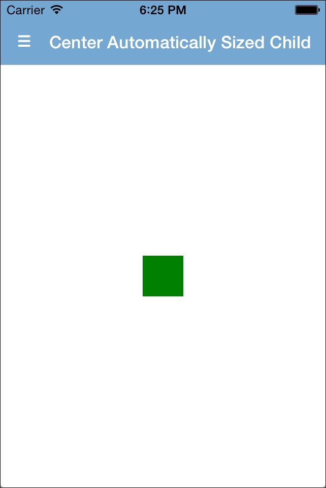
If we want to center the element and give it an automatic size, we can write it like in this example:
var layout = new AbsoluteLayout();
var centerAutomaticallySizedChild = new BoxView { Color = Color.Green };
layout.Children.Add
(
  centerAutomaticallySizedChild,
  new Rectangle (
  0.5,
  0.5,
  AbsoluteLayout.AutoSize,
  AbsoluteLayout.AutoSize ),
  AbsoluteLayoutFlags.PositionProportional
);
It will look like this:
If we don't set any flag when we define the rectangle, it will be positioned in the absolute coordinates.
In RelativeLayout, we can position elements by providing the initial coordinates and the height and width of each of them.

We can use the following lambda expression:
Constraint.RelativeToParent ((parent) => { return parent.Height / 2; }))
We can position an element relative to the center of its parent, as shown in the previous code.
We can do the same with the horizontal position using the Width property of the parent.
In this example, we are adding our element to the layout and positioning it horizontally in a third of the parent, Width, and vertically in half of the parent, Height:
relativeLayout.Children.Add (myElement,
                Constraint.RelativeToParent ((parent) => {
                    return parent.Width / 3;
                }),
                Constraint.RelativeToParent ((parent) => {
                    return parent.Height / 2;
                }));
We may use relativeLayout to create a screen with a background image or screen with stacked elements. As we can see in the following code, we'll have stacked boxviews:
relativeLayout.Children.Add (
  new BoxView() { Color = Color.Red, WidthRequest = 50, HeightRequest
  = 50 },
  Constraint.Constant (50),
  Constraint.Constant (50),
  Constraint.Constant (100),
  Constraint.Constant (100)
);

relativeLayout.Children.Add (
  new BoxView() { Color = Color.Yellow, WidthRequest = 50, HeightRequest = 50 },
  Constraint.Constant (50),
  Constraint.Constant (150),
  Constraint.Constant (100),
  Constraint.Constant (100)
);
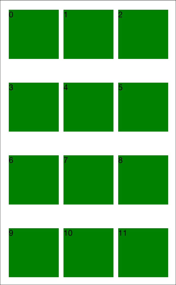
The grid allows us to position elements in rows and columns.
In this case, when we add an element to the Children property of the grid, we can define the number of the row and column where we want to put the element.
The Grid has the following properties that we can use to define our layout:
Children: This is an array of elements that display in a defined position of the gridColumnDefinitions: This allows us to set the Width of the columnsColumnSpacing: We can use this property to set the distance between columnsRowDefinitions: This allows us to set the Height of the rowsRowSpacing: We can use this property to set the distance between rows
For example:
var grid = new Grid {
   RowSpacing = 50,
   ColumnSpacing = 10
};

for (int i = 0; i < 12; i++) {
   int row = i / 3;
   int column = i % 3;

   grid.Children.Add (
   new Label {
      Text= i.ToString(),
      BackgroundColor = Color.Green
      },
   column,
   row);
}
The result of this code will be something like this:
ContentView is useful when we need a placeholder that contains a single child element.

This is probably the simplest layout we can imagine in Xamarin.Forms.
In this case, we only have the availability of the Content property, and we can set it with just one Element. This is typically used as root for other customized layouts.
For example:
var layout = new ContentView {
   Content = new Label { Text = "I'm Content!" },
};
ScrollView is very useful when we need to have scrollable content.
We can set one single element using the Content property, and we can also set the Orientation property in order to indicate the scroll direction (horizontal or vertical).

For example:
StackLayout stack = new StackLayout();
for (var i=0; i<100; i++)
{
   stack.Children.Add (
     new Button {
       Text = i.ToString()
     }
   );
}

ScrollView scrollview = new ScrollView {
 Content = stack
};
The result of this code will be a scrollable list of 100 labels.

ScrollView may be used to create a scrollable list, but in terms of memory management and performance, it's better to use native lists. Each platform has its own list component to stack elements. These components provide more control over list items, provide better CPU and RAM usage, and better customization. We should always consider using native list elements instead of ScrollView.
We can use Frame when we need to embed a single element and give it a container with a shadow or outline border.

In a Frame layout we can set the HasShadow property to true or false to either add or not add a shadow to the container, and we can set the OutlineColor property to specify the color assigned to the border.
For example:
var frame = new Frame {
   Content = new Label { Text = "I <3 Xamarin.Forms" },
   OutlineColor = Color.Silver,
   HasShadow = true
};
This example produces the following layout:
