
Xamarin.Forms Views are the building blocks of cross-platform mobile user interfaces. They are visual objects such as buttons, labels, and text entry boxes. These UI elements are typically subclasses of View.
ActivityIndicator is a visual control used to indicate that something is ongoing. This control gives a visual clue to the user that something is happening, without including information about its progress.

This component is very useful for notifying the user when we need to do some asynchronous work that takes time.
To do so, we can implement the INotifyPropertyChanged interface in our service or data class and add a Boolean property that we will call IsLoading:
private bool isLoading;

        public bool IsLoading {
            get { return isLoading; }
            set {
                isLoading = value;
                if (PropertyChanged != null)
                    PropertyChanged ();
            }
        }

        #region INotifyPropertyChanged implementation

        public event PropertyChangedEventHandler PropertyChanged;

        #endregion
We can use this property to notify users when we are loading data and when we have finished.
The last step is to bind this property with the visibility of the ActivityIndicator:
ActivityIndicator activityIndicator = new ActivityIndicator ();
activityIndicator.SetBinding (ActivityIndicator.IsVisibleProperty, "IsLoading");
activityIndicator.SetBinding (ActivityIndicator.IsRunningProperty, "IsLoading");
We can use the BoxView to draw a solid colored rectangle.
The box is a simple component.

We can define the color of it and we can position it in a layout:
var box = new BoxView { Color = Color.Blue };
The element button reacts to touch events. We can manage and handle our actions with the touch event.

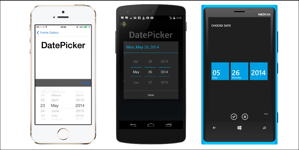
DatePicker is an element that allows the user to input a date with a scrollable interface.


We can use the ListView control to display scrolling lists of data.

In order to develop a ListView, we need to first define three classes:
Item: The raw description of the single element to displayData: The list of items with all the data to displayCell: The layout of the single element to display
When we have those three classes we can use them together in our ListView.
In our example, we want to display a list of items with a coloured box, a name, and a birthdate.
First, we create a new class called MyItem and add three properties: BoxColor, Name, and Birthdate:
public class MyItem
    {
        public Color BoxColor {
            get;
            set;
        }

        public string Name {
            get;
            set;
        }

        public DateTime Birthdate {
            get;
            set;
        }
    }
Now we need to create the MyItemData class, which will be a list of MyItem and will contain all the data that we need to display:
public class MyItemData : List<MyItem>
{
  public MyItemData ()
  {
    this.Add (new MyItem {
    Name = "Engin",
    Birthdate = DateTime.Parse ("20/10/1979"),
    BoxColor = Color.Blue
    });
    //... add all the items or load them from a db
  }
}
The last step we need to follow before creating the ListView is to create the ViewCell. So, now we will create a new class called MyItemCell, which needs to inherit from ViewCell.
Here, we will define the layout for the single cell.
We have to define a box and set the binding of the BackgroundColor property to BoxColor and the two labels setting the binding of the Text property to Name and Birthdate.
After that, we can compose our layout, as we've seen in the layout section of this chapter:
public class MyItemCell : ViewCell
{
    public MyItemCell ()
    {
        BoxView box = new BoxView ();
        box.SetBinding (VisualElement.BackgroundColorProperty,
        new Binding ("BoxColor"));

        Label nameLabel = new Label ();
        nameLabel.SetBinding (Label.TextProperty,
        new Binding ("Name"));

        Label birthDateLabel = new Label ();
        birthDateLabel.SetValue (Label.TextProperty,
        new Binding ("BirthDate"));

        View =    new StackLayout {
            Orientation = StackOrientation.Horizontal,
            Children = {
                box,
                new StackLayout {
                    Orientation = StackOrientation.Vertical,
                    Children = { nameLabel, birthDateLabel }
                }
            }
        };
    }
}
We are now ready to create our ListView. We can create a new file called MyListView and add this code on the constructor:
public class MyListView : ListView
{
    public MyListView ()
    {
        List<MyItem> data = new List<MyItem> ();
        ItemsSource = data;

        DataTemplate cell = new DataTemplate (typeof(MyItemCell));
        ItemTemplate = cell;

        //additional properties
        VerticalOptions = LayoutOptions.Fill;
        BackgroundColor = Color.Transparent;
        HasUnevenRows = true;
        SelectedItem = null;
        IsPullToRefreshEnabled = true;
        SeparatorVisibility = SeparatorVisibility.None;
    }
}
We first define the data and assign it to the ItemsSource property of ListView.
Then, we just need to define ItemTemplate; we can use the custom cell we've already created.
We also have the option to define other properties:
VerticalOption: How to fill the space vertically in the container with the ListViewBackgroundColor: The background color of our ListViewHasUnevenRow: If we assign this property as true, we can define a custom height for each cellSelectedItem: Here, we can decide to show one item as selected, or we can set it to null if we want all the items to be unselectedIsPullToRefreshEnabled: When true, it automatically enables thePullToRefreshfunction to refresh the data in ListViewSeparatorVisibility: We can set this property asDefaultorNoneto show or hide a separator between the itemsSeparatorColor: Here, we can define the color of the separator line
When we need to add OpenGL content to our app, we can use the OpenGLView element. OpenGL is currently supported on iOS and Android; Windows alternatively supports DirectX. Both OpenGL and DirectX are core frameworks optimized for game development. OpenGLView is for displaying OpenGL content (such as part of a game) where we want onscreen.

We can use the ProgressBar control when we want to display the progress of some activity in our app.

This element provides a search box. SearchBar in Xamarin.Forms has several properties to implement a good search experience:
Placeholder: Default text, shown to the user when SearchBar is emptyText: Default text will appear inside of SearchBarCancelButtonColor: Specifies the foreground text color of Cancel buttonSearchCommand: Actual binding method that executes search logicSearchCommandParameter: Extra parameter for the search command
We may create an exact result with both the Entry view and Button view. However, it takes extra development and SearchBar already has it. It's good practice to try not to reinvent the wheel.


We can use this element when we need the user to input a discrete value constrained to a range.

TableView has a behavior similar to ListView.
The difference is that we can use TableView as a container to build up data input and display forms using different cell types.

TableView does not support data-binding, so we must add rows dynamically to its Children collection.
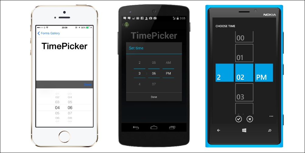
TimePicker is an element that allows the user to input a time with a scrollable interface.
The WebView control allows users to browse websites or HTML generated in code.
Although the best solution for showing an entire website from the app is to redirect the user to the specific browser, we can use WebView to present a HTML page embedded in our app. If we want to, we can also build our own embedded web browser.

When we embed a WebView on Xamarin.Forms, it uses the native web browser control on each platform.
Local resources can also be displayed.
To display a web page by loading a URL from the Internet, we just need to set the Source property on the WebView control.