
jQuery Mobile
jQuery Mobile is a JavaScript library that’s built on the jQuery core. It provides the CSS framework, an events framework, widgets, and layout and form controls for developing touch-friendly user interface web applications. These apps are supported on desktops, smartphones, and tablets. This chapter covers page structure and navigation, theming, icons, transitions, events handlers, layout controls, form elements, and widgets for mobile web applications development.
This chapter includes recipes on the following topics:
- The CSS framework
- Page structure—header, content, and footer
- Pages—container, transition, and navigation
- Navigation bar
- Dialog boxes, panels, and popups
- Collapsibles
- Grid views, listviews, and tables
- Form elements
- Events
Downloading the jQuery Mobile Library
You can download jQuery Mobile library from http://jquerymobile.com/download/. Download the latest stable version. At the time of this writing, the latest version was 1.4.3. Click on the ZIP file link to download it. Save the file on your local system. If you have selected the 1.4.3 version of the jQuery Mobile, the saved filename is jquery.mobile-1.4.3.zip. Extract all files from the ZIP file into a work folder.
Copy the jquery.mobile-1.4.3.min.css file to the styles folder in your web page development root folder. Copy the jquery.mobile-1.4.3.min.js file to the scripts folder. The structure of your development environment should look like this:
- images/
- scripts/jquery-2.1.0.min.js
- scripts/jquery.mobile-1.4.3.min.js
- styles/jquery.mobile-1.4.3.min.css
- *.htm
Add the following lines to include the jQuery mobile library and CSS in your HTML files:
<link rel="stylesheet" href="styles/jquery.mobile-1.4.3.min.css" />
<script type="text/javascript" src="scripts/jquery.mobile-1.4.3.min.js"></script>
Add the jQuery mobile JavaScript file (jquery.mobile-1.4.3.min.js) after the jQuery core library JavaScript file (for example, jquery-2.1.0.min.js).
The mobileinit event is triggered after the jQuery mobile JavaScript file is included and initialized. If you want to make any changes during the jQuery Mobile initialization process, such as change the global settings, you can set up the callback function for the mobileinit event. This callback function must be registered before it can be included in the jQuery mobile JavaScript file.
Testing on Mobile Devices
You can test your code using any recent browser (preferably Firefox or Chrome) on your desktop or by using a browser on your mobile devices. Refer to Appendix C for details about setting up Tomcat server and IIS server and also about testing your web application on mobile devices. The screenshots in this chapter are from the Safari browser on an iPhone 5s.
Mobile Applications
You can wrap your mobile web applications using PhoneGap and convert them to mobile applications. PhoneGap also provides APIs for accessing mobile device-specific features. For details about PhoneGap, visit http://phonegap.com. Converting mobile web applications into native applications and deploying them on mobile devices is out of the scope of this book.
11-1. CSS Framework: CSS Classes, Themes, and Icons
Problem
You want to understand the features provided by the CSS framework for the jQuery mobile library.
Solution
The jQuery mobile library provides CSS-based enhancements to develop a rich Internet application interface.
Common CSS Classes
Table 11-1 displays the list of CSS classes that can be used to style any of the widgets. Widget-specific classes are explained in other recipes in this chapter.
Table 11-1. Common CSS Classes
|
To Achieve This |
Use This Class |
|---|---|
|
Create rounded corners for the element. |
ui-corner-all |
|
Reduce the font size and element’s size. |
ui-mini |
|
Overlay a shadow on the element to give popping-out effect. |
ui-overlay-shadow |
|
Cast shadow around the element. |
ui-shadow |
Themes
A theme provides a consistent look and feel for all user interface controls. In the jQuery Mobile 1.4.3 library there are two swatches available—“a” and “b”. “a” is the default swatch and it displays widgets in light gray. The “b” swatch displays widgets in a dark color (usually black). Swatches are specified by using a single character of the alphabet (c through z). To specify which theme to use for a widget, you can use data-theme="b" (for example). You can add the data-theme attribute at an individual widget level or at the parent level. For example, to change the theme for the whole page, you can use:
<div data-role="page" data-theme="b">
Table 11-2 displays widgets using themes “a” and “b”.
Table 11-2. Widgets with Themes “a” and “b”
|
Widget Name |
data-theme="a" |
data-theme="b" |
|---|---|---|
|
Header |
|
|
|
Label |
|
|
|
Input Text |
|
|
|
Date |
|
|
|
Textarea |
|
|
|
Input File |
|
|
|
Flip Switch |
|
|
|
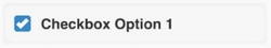
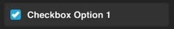
Checkbox |
|
|
|
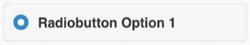
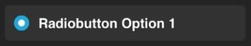
Radio Button |
|
|
|
Select Drop-Down |
|
|
|
Slider |
|
|
|
Range Slider |
|
|
|
Button |
|
|
Custom Themes
The Themeroller tool found at http://themeroller.jquerymobile.com/ enables you to add new themes (c-z), customize them by selecting a different color and by setting CSS properties, and preview, download, and include them in your web pages. Table 11-2 lists commonly used widgets with themes “a” and “b”.
Icons
jQuery mobile provides built-in icons that are ready to use. Figure 11-1 displays all the icons available in the jQuery mobile library. You can use data-icon="iconName" and class="ui-icon-iconName" for displaying an icon in a container (such as buttons, listviews, and so on), where iconName is listed in Figure 11-1. To display an icon in the circular container, add the class - ui-corner-all. The icons in Figure 11-1 are created using the following syntax.
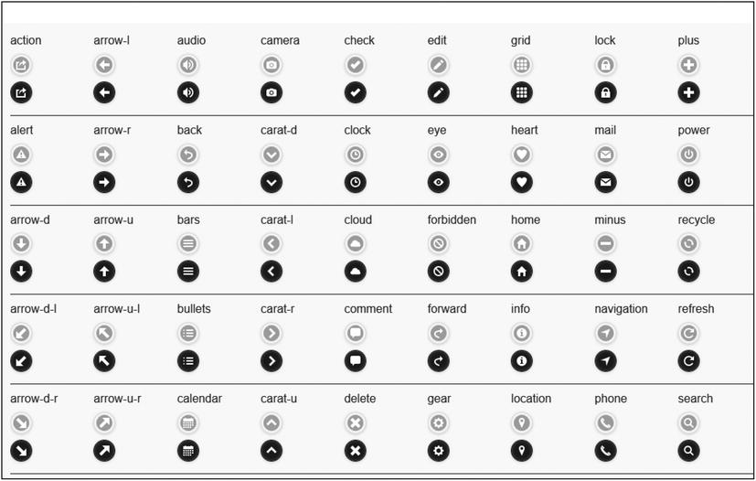
Figure 11-1. Available icons
Using theme “a”:
<a href="#" class="ui-btn ui-btn-a ui-corner-all ui-shadow ui-icon-iconName ui-btn-icon-notext">
Using theme “b”:
<a href="#" class="ui-btn ui-btn-b ui-corner-all ui-shadow ui-icon-iconName ui-btn-icon-notext">
where iconName can be any valid icon name listed in Figure 11-1.
11-2. Understanding Page Structure
Problem
You want to understand the basic structure of a mobile web application page.
Solution
In the jQuery mobile framework, an HTML file can have multiple pages. At load time, the first page in the HTML file is displayed. A typical page consists of a header, the content, and a footer. The following is the structure of a page:
<div data-role="page">
    <div data-role="header">
           <h1>pageHeading</h1>
   </div>

       <div data-role="main" class="ui-content">
              htmlContent
       </div>

       <div data-role="footer" data-position="fixed">
              <h1>pageFooter</h1>
       </div>
</div>
Listing 11-1 demonstrates the basic page structure of a mobile web application.
Listing 11-1. Mobile application page structure
<!DOCTYPE html>
<html lang="en">
<head>
      <meta name="viewport" content="width=device-width, initial-scale=1">

      <link rel="stylesheet" href="styles/jquery.mobile-1.4.3.min.css" />

      <script src="scripts/jquery-2.1.0.min.js"></script>
      <script src="scripts/jquery.mobile-1.4.3.min.js"></script>
</head>

<body>
      <div data-role="page">
         <div data-role="header">
                  <h1>Page Header</h1>
         </div>

         <div data-role="main" class="ui-content">
                    <p>Content here...</p>
         </div>

         <div data-role="footer" data-position="fixed">
                  <h1>Page Footer</h1>
         </div>
      </div>
</body>
</html>
How It Works
In this code listing:
- The following code specifies the page zoom level in the browser and its content dimension by using a meta viewport in the head section. Without this setting, the content display on smartphones and tablets would look zoomed out and if the user zooms in manually, parts of the content would be off-screen. With this setting, the content width is set to the correct scale so that content is not zoomed out and instead fits within the width of the device.
<meta name="viewport" content="width=device-width, initial-scale=1"> - The following lines are used to include all required libraries and the CSS style file:
- jQuery Mobile CSS file—<link rel="stylesheet" href="styles/jquery.mobile-1.4.3.min.css" />
- jQuery library—<script src="scripts/jquery-2.1.0.min.js"></script>
- jQuery Mobile library—<script src="scripts/jquery.mobile-1.4.3.min.js"></script>
You might have different versions of the libraries and CSS files. As of this writing, the latest version of jQuery is 2.10 and the latest version of jQuery Mobile is 1.4.3.
- Each page in the mobile web application is specified by setting the div element’s data-role attribute to "page". The syntax for specifying a page is <div data-role="page">.
Within this page element, there typically are the following three areas:
- Page header is specified by <div data-role="header">. In this section, the header’s content is set by using the header element (<h1>).
- Page content is specified by <div data-role="main" class="ui-content">. In this section, you can use any valid HTML code structure. ui-content adds padding and margins to the content.
- Page footer is specified by <div data-role="footer" data-position="fixed">. In this section, the footer’s content is set by using the header element (<h1>). data-position is set as "fixed" so that the footer position is fixed at the bottom of the page.
Figure 11-2 displays the page when viewed on an iPhone 5s. The server setup section in Appendix C describes how you can set up a local server and view developed web pages on your mobile devices.

Figure 11-2. Basic page layout
11-3. Creating Buttons and Links
Problem
You want to create buttons and links.
Solution
A button is a clickable control. When it is tapped, an action is performed, such as opening a dialog box, popup, or panel, navigating to another page, or making a call to the server to get data. You can create buttons by using any of the following three HTML element types. The following is the syntax to create buttons:
<a href="#" class="ui-btn">buttonText</a>
<button class="ui-btn">buttonText</button>
<input type="button" value="buttonText">
where type can also be Submit or Reset.
Listing 11-2 demonstrates an example to display different types of buttons with various display options.
Listing 11-2. Buttons with different settings
<!DOCTYPE html>
<html lang="en">
<head>
<meta name="viewport" content="width=device-width, initial-scale=1">
<link rel="stylesheet" href="styles/jquery.mobile-1.4.3.min.css" />
<script src="scripts/jquery-2.1.0.min.js"></script>
<script src="scripts/jquery.mobile-1.4.3.min.js"></script>
<style>
strong {color: green;}
</style>
</head>
<body>
<div data-role="page">
<div data-role="header">
<h1>Buttons</h1>
</div>
<div data-role="main" class="ui-content">
<strong>Default Buttons:</strong><br>
<a href="#" class="ui-btn">buttonText</a>
<button class="ui-btn">buttonText</button>
<input type="button" value="buttonText">
<br><br><strong>Reduced Width:</strong><br>
<a href="#" class="ui-btn ui-btn-inline">buttonText</a>
<button class="ui-btn ui-btn-inline">buttonText</button>
<input type="button" value="buttonText" data-inline="true">
<br><br><strong>Rounded Corners:</strong><br>
<a href="#" class="ui-btn ui-btn-inline ui-corner-all">buttonText</a>
<button class="ui-btn ui-btn-inline ui-corner-all ">buttonText</button>
<input type="button" value="buttonText" data-inline="true" data-corners="true">
<br><br><strong>With Shadow:</strong><br>
<a href="#" class="ui-btn ui-btn-inline ui-corner-all ui-shadow">buttonText</a>
<button class="ui-btn ui-btn-inline ui-corner-all ui-shadow">buttonText</button>
<input type="button" value="buttonText" data-inline="true" data-corners="true">
<br><br><strong>Theme B:</strong><br>
<a href="#" class="ui-btn ui-btn-b ui-btn-inline ui-corner-all ui-shadow">buttonText</a>
<button class="ui-btn ui-btn-b ui-btn-inline ui-corner-all ui-shadow">buttonText</button>
<input type="button" value="buttonText" data-inline="true" data-corners="true" data-theme="b">
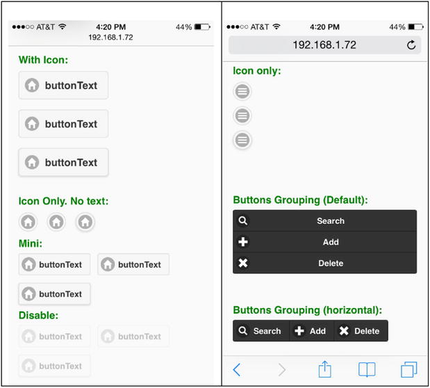
<br><br><strong>With Icon:</strong><br>
<a href="#" class="ui-btn ui-btn-inline ui-corner-all ui-icon-home ui-btn-icon-left">buttonText</a>
<button class="ui-btn ui-btn-inline ui-corner-all ui-icon-home ui-btn-icon-left">buttonText</button>
<input type="button" value="buttonText" data-inline="true" data-corners="true" data-icon="home" data-iconpos="left">
<br><br><strong>Icon Only. No text:</strong><br>
<a href="#" class="ui-btn ui-btn-inline ui-corner-all ui-icon-home ui-btn-icon-notext">buttonText</a>
<button class="ui-btn ui-btn-inline ui-corner-all ui-icon-home ui-btn-icon-notext">buttonText</button>
input type="button" value="buttonText" data-inline="true" data-corners="true" data-icon="home" data-iconpos="notext">
<br><br><strong>Mini:</strong><br>
<a href="#" class="ui-btn ui-btn-inline ui-corner-all ui-icon-home ui-btn-icon-left ui-mini">buttonText</a>
<button class="ui-btn ui-btn-inline ui-corner-all ui-icon-home ui-btn-icon-left ui-mini">buttonText</button>
<input type="button" value="buttonText" data-inline="true" data-corners="true" data-icon="home" data-mini="true">
<br><br><strong>Disable:</strong><br>
<a href="#" class="ui-btn ui-btn-inline ui-corner-all ui-icon-home ui-btn-icon-left ui-mini ui-state-disabled">buttonText</a>
<button class="ui-btn ui-btn-inline ui-corner-all ui-icon-home ui-btn-icon-left ui-mini" disabled>buttonText</button>
<input type="button" value="buttonText" data-inline="true" data-corners="true" data-icon="home" data-mini="true" disabled>
<br><br><strong>Icon only:</strong><br>
<a href="#" class="ui-btn ui-icon-bars ui-btn-icon-notext ui-corner-all">No text</a>
<button class="ui-btn ui-icon-bars ui-btn-icon-notext ui-corner-all">No text</button>
<input type="button" value="buttonText" data-icon="bars" data-iconpos="notext" data-corners="true">
<br><br><strong>Buttons Grouping (Default):</strong><br>
<div data-role="controlgroup" data-mini="true">
<a href="#" class="ui-btn ui-btn-b ui-shadow ui-corner-all ui-icon-search ui-btn-icon-left">Search</a>
<a href="#" class="ui-btn ui-btn-b ui-shadow ui-corner-all ui-icon-plus ui-btn-icon-left">Add</a>
<a href="#" class="ui-btn ui-btn-b ui-shadow ui-corner-all ui-icon-delete ui-btn-icon-left">Delete</a>
</div>
<br><br><strong>Buttons Grouping (horizontal):</strong><br>
<div data-role="controlgroup" data-type="horizontal" data-mini="true">
<a href="#" class="ui-btn ui-btn-b ui-shadow ui-corner-all ui-icon-search ui-btn-icon-left">Search</a>
<a href="#" class="ui-btn ui-btn-b ui-shadow ui-corner-all ui-icon-plus ui-btn-icon-left">Add</a>
<a href="#" class="ui-btn ui-btn-b ui-shadow ui-corner-all ui-icon-delete ui-btn-icon-left">Delete</a>
</div>
</div>
</div>
</body>
</html>
How It Works
Three types of buttons are created using the <a>, <button>, and <input> elements. For page navigation, popups, and the panels display, the <a> tag is used. For submitting forms, the <input> and <button> tags are used. The following section explains the classes and data attributes used in this example.
Setting the Button’s Width
By default the button’s width is the same as the width of the display screen. You can change it to be the same as its text by adding the ui-btn-inline class to the <a> and <button> elements or setting the data-inline to true for the <input> elements:
- <a href="#" class="ui-btn ui-btn-inline">buttonText</a>
- <button class="ui-btn ui-btn-inline">buttonText</button>
- <input type="button" value="buttonText" data-inline="true">
Setting Rounded Corners
You can make the corners of the button rounded by adding the ui-corner-all class to the <a> and <button> elements or setting data-corners to true for the <input> elements:
- <a href="#" class="ui-btn ui-btn-inline ui-corner-all">buttonText</a>
- <button class="ui-btn ui-btn-inline ui-corner-all">buttonText</button>
- <input type="button" value="buttonText" data-inline="true" data-corners="true">
Showing or Hiding a Shadow
You can set buttons to show their shadows by adding the ui-shadow class to the <a> and <button> elements. For <input> elements, the shadow is displayed by default. You can prevent a shadow from being displayed by setting data-shadow to false for the <input> elements:
- <a href="#" class="ui-btn ui-btn-inline ui-corner-all ui-shadow">buttonText</a>
- <button class="ui-btn ui-btn-inline ui-corner-all ui-shadow">buttonText</button>
- <input type="button" value="buttonText" data-inline="true" data-corners="true"
data-shadow="false">
Theming
By default, a button inherits its theme from its parent container. You can change the theme by adding the ui-btn-a or ui-btn-b (for themes “a” and “b”) classes to the <a> and <button> elements or by setting data-theme to "a" or "b" for the <input> element:
- <a href="#" class="ui-btn ui-btn-b ui-btn-inline ui-corner-all
ui-shadow">buttonText</a> - <button class="ui-btn ui-btn-b ui-btn-inline ui-corner-all
ui-shadow">buttonText</button> - <input type="button" value="buttonText" data-inline="true" data-corners="true"
data-theme="b">
Showing an Icon
You can show icons on the button by adding the ui-icon-iconName class to the <a> and <button> elements or setting data-icon as iconName for the <input> elements. For <a> and <button>, you need to add the icon position by using ui-btn-icon-position (where position is left, right, top, bottom, none, or notext). For <input>, by default the icon is added to the left of the text. To change its position you can add data-iconpos=position (where position is left, right, top, bottom, none, or notext):
- <a href="#" class="ui-btn ui-btn-inline ui-corner-all ui-icon-home ui-btn-icon-
left">buttonText</a> - <button class="ui-btn ui-btn-inline ui-corner-all ui-icon-home ui-btn-icon-
left">buttonText</button> - <input type="button" value="buttonText" data-inline="true" data-corners="true"
data-icon="home" data-iconpos="left">
Showing an Icon Only
You can set buttons to show an icon only by adding the ui-btn-icon-notext class to the <a> and <button> elements or by setting data-icon-notext to true for the <input> element:
- <a href="#" class="ui-btn ui-btn-inline ui-corner-all ui-icon-home ui-btn-icon-
notext">buttonText</a> - <button class="ui-btn ui-btn-inline ui-corner-all ui-icon-home ui-btn-icon-
notext">buttonText</button> - <input type="button" value="buttonText" data-inline="true" data-corners="true"
data-icon="home" data-iconpos="notext">
Showing Mini Buttons
You can show mini buttons by adding the ui-mini class to the <a> and <button> elements or by setting data-mini to true for the <input> elements:
- <a href="#" class="ui-btn ui-btn-inline ui-corner-all ui-icon-home ui-btn-
icon-left ui-mini">buttonText</a> - <button class="ui-btn ui-btn-inline ui-corner-all ui-icon-home ui-btn-icon-left
ui-mini">buttonText</button> - <input type="button" value="buttonText" data-inline="true" data-corners="true"
data-icon="home" data-mini="true">
Disabling Buttons
You can disable buttons by adding the ui-state-disabled class to the <a> element or by adding the disabled attribute to the <button> and <input> elements:
- <a href="#" class="ui-btn ui-btn-inline ui-corner-all ui-icon-home ui-btn-icon-
left ui-mini ui-state-disabled">buttonText</a> - <button class="ui-btn ui-btn-inline ui-corner-all ui-icon-home ui-btn-icon-left
ui-mini" disabled>buttonText</button> - <input type="button" value="buttonText" data-inline="true" data-corners="true"
data-icon="home" data-mini="true" disabled>
Grouping Buttons
You can group buttons together by wrapping them within a div element with data-role set to controlgroup. If you want to display them horizontally, you can set data-type to horizontal:
<div data-role="controlgroup"  data-type="horizontal" data-mini="true">
      <a href="#" class="ui-btn ui-btn-b ui-shadow ui-corner-all ui-icon-search ui-btn-icon-left">Search</a>
      <a href="#" class="ui-btn ui-btn-b ui-shadow ui-corner-all ui-icon-plus ui-btn-icon-left">Add</a>
      <a href="#" class="ui-btn ui-btn-b ui-shadow ui-corner-all ui-icon-delete ui-btn-icon-left">Delete</a>
</div>
Figure 11-3 displays the buttons with the various display options.

11-4. Creating Headers and Footers
Problem
You want to be able to set headers and footers on a page and in a dialog box.
Solution
Both the header and footer should be child nodes of the page (data-role="page") or of the dialog (data-role="dialog"). The following is the basic structure of headers and footers:
<div data-role="header">
    <h1>Page header</h1>
</div>

<div data-role="footer">
    <h1>Page footer</h1>
</div>
The header appears before the content, whereas the footer appears after the content of the page. Figure 11-4 displays basic layout of headers and footers on a page.
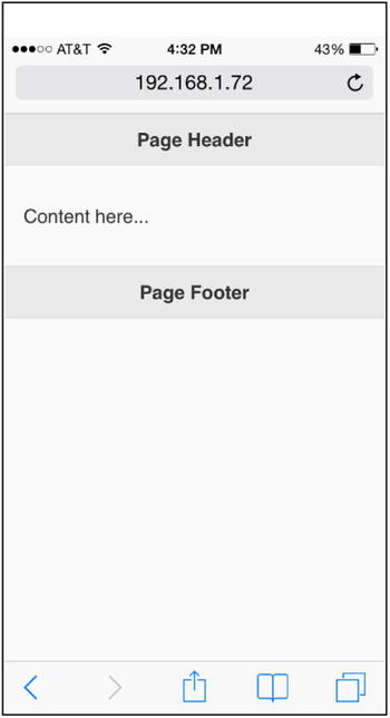
Figure 11-4. Basic page layout
Listing 11-3 shows how buttons can be added to headers and footers.
Listing 11-3. Header and footer toolbars
<!DOCTYPE html>
<html lang="en">
<head>
      <meta name="viewport" content="width=device-width, initial-scale=1">

      <link rel="stylesheet" href="styles/jquery.mobile-1.4.3.min.css" />

      <script src="scripts/jquery-2.1.0.min.js"></script>
      <script src="scripts/jquery.mobile-1.4.3.min.js"></script>
</head>

<body>
      <div data-role="page">
         <div data-role="header">
               <a href="#" data-icon="bars" data-iconpos="notext" class="ui-btn-right">linkTitle</a>
                  <h1>HR System</h1>
         </div>

         <div data-role="main" class="ui-content">
                    <p>Content here...</p>
          </div>

      <div data-role="footer" style="text-align:center;" data-position="fixed">
                <a href="#" class="ui-btn ui-icon-search ui-btn-icon-left">Search</a>
                    <a href="#" class="ui-btn ui-icon-plus ui-btn-icon-left">Add</a>
                    <a href="#" class="ui-btn ui-icon-bars ui-btn-icon-left">More</a>
         </div>
      </div>
</body>
</html>
How It Works
For the header, use data-icon="bars" data-iconpos="notext" class="ui-btn-right" to display a bar icon on the right side.
For the footer, use data-position="fixed" to display the footer at the bottom of the device screen.
Three instances of the anchor element with the classes ui-btn, ui-icon-iconName, and ui-btn-position are used to display three buttons with icons. You need to specify ui-btn-position—without it, the icons won’t be displayed.
The following sections explain the classes and data attributes used in this recipe.
Positioning
To position a footer on a page, use the data-position attribute:
- inline—Headers and footers are in line with the content. For example, if inline is set for the footer, the footer is displayed immediately after the content. If the content doesn’t fit in the whole screen, the footer is displayed somewhere in the middle section of the screen and not at the bottom. This is the default value for data-position.
- fixed—Headers and footers are displayed at the top and bottom of the screen, regardless of the height of the content.
By setting data-position to fixed and data-fullscreen to true, you can display the headers and footers at the top and bottom of the screen. These settings are useful for photos and for video display. You can make header and footer visible or invisible by tapping the screen.
Adding a Toolbar to the Header
To add a toolbar with buttons and icons to the header, you use the anchor (<a>) element. The first anchor element is used to display the inline button on the left section and the second anchor is used to display the inline button on the right section.
- To display text only, use:
<a href="pageDialogPanelPopupLink">linkTitle</a> - To display an icon, use:
<a href="pageDialogPanelPopupLink" data-icon="iconName">linkTitle</a> - To display an icon only, use:
<a href="pageDialogPanelPopupLink" data-icon="iconName" data-iconpos="notext">linkTitle</a> - To make it stand out by specifying a contrasting theme, use:
<a href="pageDialogPanelPopupLink" data-icon="iconName" data-iconpos="notext" data-theme="b">linkTitle</a> - To display only one icon on a right-side header, add the class ui-btn-right:
<a href="pageDialogPanelPopupLink" data-icon="iconName" data-iconpos="notext" data-theme="b" class="ui-btn-right">linkTitle</a> - To remove the circle around the icon, add the class ui-nodisc-icon.
Adding a Toolbar to the Footer
To add a toolbar with buttons and icons to the footer, use the anchor (<a>) elements. In the footer you can add as many buttons as you want. The number of buttons is limited by the space on the device’s display.
Figure 11-5 displays the page with an icon only button in the header and three buttons with icons in the footer.
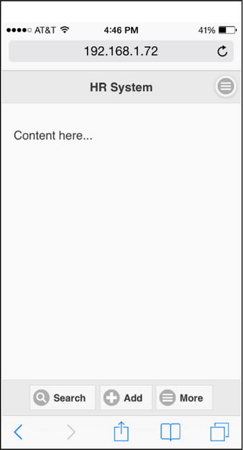
Figure 11-5. Header and footer toolbars
11-5. Navigating Among Pages
Problem
You want to navigate among pages in a mobile web application.
Solution
You can define multiple pages with a single HTML file or keep all the pages in their own HTML file. It is better to keep multiple pages that constitute one functionality of a web application in the same HTML file. This will make transitions between pages smoother. If your pages are in separate HTML files, you can pre-fetch them so that there aren’t any delays in transitioning between the pages. Listing 11-4 demonstrates the multi-page structure in an HTML file and shows how to navigate back and forth between these pages.
Listing 11-4. Page navigation
<!DOCTYPE html>
<html lang="en">
<head>
      <meta name="viewport" content="width=device-width, initial-scale=1">

      <link rel="stylesheet" href="styles/jquery.mobile-1.4.3.min.css" />

      <script type="text/javascript" src="scripts/jquery-2.1.0.min.js"></script>
      <script type="text/javascript" src="scripts/jquery.mobile-1.4.3.min.js"></script>
</head>

<body>
      <!--  Page 1 -->
      <div data-role="page" id="homePage">
         <div data-role="header">
            <h1>Home Page</h1>
         </div>

         <div data-role="main" class="ui-content">
            <a href="#detailPage" class="ui-btn ui-btn-b ui-overlay-shadow ui-corner-all ui-icon-arrow-r ui-btn-icon-right">
                  Detail Information</a>
         </div>

         <div data-role="footer" data-position="fixed">
            <h1>Page Footer</h1>
         </div>
      </div>

      <!--  Page 2 -->
      <div data-role="page" id="detailPage">
         <div data-role="header">
            <h1>Detail Page</h1>
         </div>

         <div data-role="main" class="ui-content">
             Detailed information ...<br>
             ....
             <a href="#homePage" class="ui-btn ui-btn-b ui-overlay-shadow ui-corner-all ui-icon-arrow-l ui-btn-icon-left">Back</a>
         </div>

         <div data-role="footer" data-position="fixed">
            <h1>Page Footer</h1>
         </div>
      </div>
</body>
</html>
How It Works
These are blocks of two page structures and each page is identified by its unique ID. Since these two pages are in the same HTML file, they can be called by using the syntax <a href= "#pageId">.
- <div data-role="page" id="homePage"> sets the ID of the first page.
- <div data-role="page" id="detailPage"> sets the ID of the second page.
Within the content of first page, the following link is created:
<a href="#detailPage" class="ui-btn ui-btn-b ui-overlay-shadow ui-corner-all ui-icon-arrow-r ui-btn-icon-right">Detail Information</a>
When the Detail Information button is clicked, the page with an ID set to detailPage is displayed. On the detailPage page, the following link is created:
<a href="#homePage" class="ui-btn ui-btn-b ui-overlay-shadow ui-corner-all ui-icon-arrow-l ui-btn-icon-left">Back</a>
When the Back button is clicked, the page with an ID set to homepage is displayed.
The following classes are set in this recipe:
- ui-btn creates the link as a button.
- ui-btn-b uses theme “b” (the dark theme). This version of jQuery mobile (1.4.3) has only two themes—“a” (the light theme), which is the default, and “b” (the dark theme). You can create custom themes at the following URL:
http://themeroller.jquerymobile.com/ - ui-overlay-shadow adds an overlay shadow to the button.
- ui-corner-all makes all the corners of the button rounded. Other similar classes include:
- ui-corner-tl (for a top-left rounded corner)
- ui-corner-tr (for a top-right rounded corner)
- ui-corner-bl (for a bottom-left rounded corner)
- ui-corner-br (for a bottom-right rounded corner)
- ui-corner-top (for top corners)
- ui-corner-bottom (for bottom corners)
- ui-corner-right (for right corners)
- ui-corner-left (for left corners)
- ui-icon-arrow-r adds a right-facing arrow icon. Refer to the Recipe 11-1 for the complete list of available icons.
- ui-btn-icon-right places the icon on the right section of the button.
The Detail Information button is as wide as the device display. In order to make it the same size as the text, you can add the ui-inline class. When this button is clicked, the page with an ID set to detailPage will be displayed.
The page with an ID set to detailPage has a similar structure as the anchor button, except the following two classes are different.
<a href="#homePage" class="ui-btn ui-btn-b ui-overlay-shadow ui-corner-all ui-icon-arrow-l ui-btn-icon-left">Back</a>
- ui-icon-arrow-l adds a left-facing arrow icon.
- ui-btn-icon-left places the icon on the left section of the button.
When this button is clicked, the page with an ID set to homePage will be displayed.
Figure 11-6 displays the initial page and the page users navigate to.
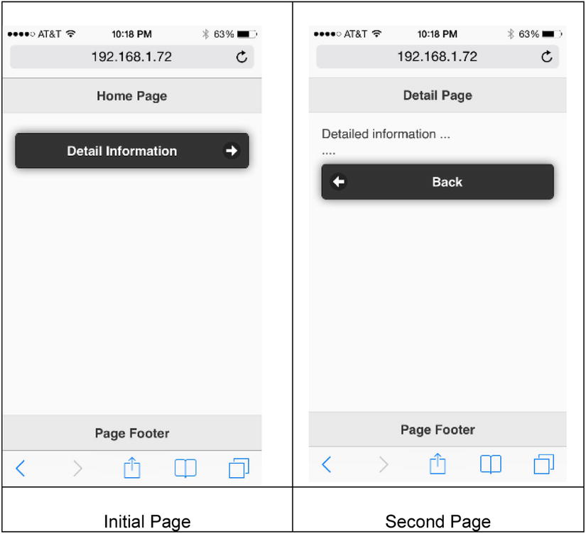
Figure 11-6. Page navigation between initial page and second page
If your pages are in two different HTML files, you can navigate between these files by using the following syntax. In this case, you don’t have to specify the page’s ID.
<a href="targetFileName.htm"....>
If you want to display the navigated page as a dialog box, you can use either of the following two ways:
- Change data-role on the second page to dialog (for example, <div data-role="dialog" id="detailPage">).
- Add data-rel="dialog" to the anchor (<a>) element. In the previous listing, you would replace the following:
<a href="#detailPage" class="ui-btn ui-btn-b ui-overlay-shadow ui-corner-all ui-icon-arrow-r ui-btn-icon-right">With:
<a href="#detailPage" class="ui-btn ui-btn-b ui-overlay-shadow ui-corner-all ui-icon-arrow-r ui-btn-icon-right" data-rel="dialog">
When the href attribute starts with #, that indicates a bookmark on the same page. You set a bookmark by setting the id attribute of an element.
Figure 11-7 displays the second page as a dialog box. You can go back to the initial page by clicking the Close icon or by clicking the Back button.
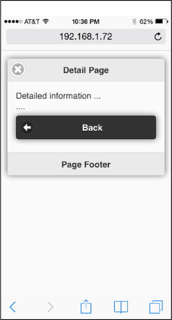
Figure 11-7. Displaying the second page as a dialog box
11-6. Applying Transition Effects to Pages and Dialog Boxes
Problem
You want to know where and how you can apply transitions and what kind of transition animations are available.
Solution
A transition can be applied to any link that opens a page or to a dialog box by using the data-transition attribute. The following is the syntax for specifying a transition:
<a href="pageDialogLink" data-transition="transitionEffectName">linkName</a>
A transition effect can be changed programmatically by using following syntax:
$(selector).data("transition", "transitionEffectName")
This will set the data-transition attribute of the selected items as the specified transitionEffectName.
The following is the list of valid transitionEffectName values: fade, flip, flow, pop, slide, slidefade, slideup, slidedown, turn, and none. The default transition is fade and none has no transition state. Listing 11-5 demonstrates the impact of the transition effect.
Listing 11-5. Transition effect created using data-transition
<!DOCTYPE html>
<html lang="en">
<head>
      <meta name="viewport" content="width=device-width, initial-scale=1">

      <link rel="stylesheet" href="styles/jquery.mobile-1.4.3.min.css" />

      <script type="text/javascript" src="scripts/jquery-2.1.0.min.js"></script>
      <script type="text/javascript" src="scripts/jquery.mobile-1.4.3.min.js"></script>

      <script>
              $(function() {
                    $("#transitionType").on("change", function(){
                            $("#lnkNavigate").data("transition", $(this).val());
                    });
              });
      </script>
</head>

<body>
      <!--  Page 1 -->
      <div data-role="page" id="homePage">
         <div data-role="header">
            <h1>Home Page</h1>
         </div>

         <div data-role="main" class="ui-content">
              <select id="transitionType">
                    <option selected>fade</option>
                    <option>flip</option>
                    <option>flow</option>
                    <option>pop</option>
                    <option>slide</option>
                    <option>slidefade</option>
                    <option>slideup</option>
                    <option>slidedown</option>
                    <option>turn</option>
                    <option>none</option>
              </select>

             <a id="lnkNavigate" href="#detailPage"  class="ui-btn ui-btn-b ui-overlay-shadow ui-corner-all ui-icon-arrow-r ui-btn-icon-right">
                  Detail Information</a>
         </div>

         <div data-role="footer" data-position="fixed">
            <h1>Page Footer</h1>
         </div>
      </div>

      <!--  Page 2 -->
      <div data-role="page" id="detailPage">
         <div data-role="header">
            <h1>Detail Page</h1>
         </div>

         <div data-role="main" class="ui-content">
             Detailed information ...<br>
             ....
             <a href="#homePage" class="ui-btn ui-btn-b ui-overlay-shadow ui-corner-all ui-icon-arrow-l ui-btn-icon-left">Back</a>
         </div>

         <div data-role="footer" data-position="fixed">
            <h1>Page Footer</h1>
         </div>
      </div>
</body>
</html>
How It Works
A select drop-down is created with all the valid transition effects. On selecting a transition effect from the drop-down, the following JavaScript code is executed:
$("#lnkNavigate").data("transition", $(this).val());
This will change the data-transition attribute of the anchor link with the ID #lnkNavigate to the transition effect selected in the drop-down. When you click the Detail Information button, the detail page is displayed with the selected transition effect. Figure 11-8 displays the initial page and the navigated to page.
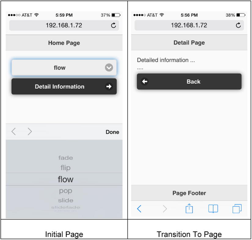
Figure 11-8. Page navigation with the selected transtion effect
11-7. Using the Pagecontainer Widget
Problem
You want to understand how pages are handled within a document (<body>) and be aware of the available methods and events for the pagecontainer widget.
Solution
The pagecontainer widget manages a collection of pages. It was introduced in version 1.4 to streamline page handling, which includes transitions, events, and so on. It replaces many page-related methods and events from previous versions.
In jQuery mobile, multiple pages can be defined within a body element with a unique ID. Only one is visible at any given time. When the HTML file is loaded, the first page in the file will be displayed. Since a complete HTML file is loaded in the browser and all pages in the HTML file are created in the DOM, moving from one page to another (transitioning) is smooth, without any delay in the loading process.
When an anchor (<A>) link is clicked to get the external page from the same web application, instead of making an HTTP call to the server to get the target page, an AJAX-based call is made to retrieve the page. In order to make AJAX-based navigation work, the click event’s default shouldn’t be prevented (eventObj.preventDefault() shouldn’t be used) and none of the following attributes should be set: data-rel="back", data-rel="external", data-ajax="false", and target.
The following is a list of commonly used methods and options:
- change—Transition to a new page. Here’s the syntax:
$( ":mobile-pagecontainer" ).pagecontainer( "change", targetPage, options);
where targetPage is the page ID in the same HTML file or an URL (for an external HTML file).
The possible values for options are:
- role—The data-role to be used for the targetPage. It can be page or dialog. If it is not specified, the data-role attribute of the targetPage is used.
- transition—The transition effect to display the target page.
- reload—If it is set to true, the page is reloaded even if it is in the DOM.
- reverse—If it is set to true, it reverses the transition effect.
The following examples show how to navigate to a different page using the change method.
For an internal page ID:
$( ":mobile-pagecontainer" ).pagecontainer( "change", "#loginErrorDialog", {
     role: "dialog", transition: "pop"
} );
For an external page:
$( ":mobile-pagecontainer" ).pagecontainer( "change", "departments.htm", {
     role: "page", transition: "fade"
} );
- getActivePage()—Used to get the currently active page. It returns a jQuery object. You can use following syntax to get the ID of the currently active page:
$( ":mobile-pagecontainer" ).pagecontainer( "getActivePage" )[0].id - load()—Used to load an external page in the DOM by using an AJAX call. The load() method won’t display the page, it will just keep it in the DOM for later use. This method is useful for loading pages before they are called for smooth transitions. The following is the syntax to load a file:
$( ":mobile-pagecontainer" ).pagecontainer( "load", "externalPage", options);
where options can have the following values:
- type—The type of the HTTP request; either GET (default) or POST.
- data—The data to send to the server.
- reload—If set to true, the page is loaded even if it exists in the DOM.
- role—The data-role to be used to display the requested page.
The following is the list of commonly used events. All event handlers have two arguments—eventObject and uiObject. uiObject contains information specific to the triggered event. The event handler for all of the following events can be set by using the following syntax:
$( ":mobile-pagecontainer" ).pagecontainer({eventName: function(eventObj, uiObj) {...} });
$(document).on("pagecontainereventName", function(eventObj, uiObj) { ... });
where the eventName options are listed in Table 11-3.
Table 11-3. Pagecontainer Events
|
Event Name |
Description |
|---|---|
|
create |
This event is triggered when pagecontainer is created. |
|
beforechange |
This event is triggered before loading the file and before transitioning to a page. |
|
beforeload |
This event is triggered before starting the load request. |
|
Load |
This event is triggered after the page is loaded and inserted into the DOM. |
|
loadfailed |
This event is triggered if the load request fails. |
|
beforetransition |
This event is triggered before transitioning to the page. |
|
beforehide |
This event is triggered, if transitioning from one page to another, before the transition starts. |
|
beforeshow |
This event is triggered before the transition animation starts. |
|
hide |
This event is triggered when the transition animation is completed. |
|
show |
This event is triggered when the transition animation is completed. |
|
transition |
This event is triggered after the show event, when the page change transition is completed. |
|
change |
This event is triggered after the change request is completed. |
|
changefailed |
This event is triggered if the change request fails. |
|
remove |
This event is triggered before the framework starts to remove external pages from the DOM. |
When a page is loaded for the first time, events are triggered in the following order:
mobileinit, create, beforechange, beforetransition, beforeshow, show, transition, change
When a page transitions to an internal page (within the same HTML file), events are triggered in the following order:
beforechange, beforetransition, beforehide, beforeshow, hide, show, transition, change
When a page transitions to an external page, events are triggered in the following order:
beforechange, beforeload, load, beforechange, beforetransition, beforehide, beforeshow, hide, show, transition, change
Displaying and Hiding the Loading Message
The loader widget can be used to display a loading message while the AJAX request is made and a response is received from the server or during the page loading and transition.
The following syntax is used to show the loading dialog:
$.mobile.loading("show", {
              text: textMessage,
              textVisible: true or false,
              theme: themeAlphabet,
              textonly: true or false,
              html: htmlString
              });
where textMessage is any text you want to show. themeAlphabet can be "a" or "b" or any other custom theme alphabet. htmlString can be any valid HTML structure, including an image. If textVisible is set to true, the textMessage is displayed under the loading spinner. If textonly is true, the loading spinner is not displayed and only the textMessage is displayed. The loading dialog can be displayed before making an AJAX call or in the beforechange event handler.
The following syntax hides the loading dialog:
$.mobile.loading("hide");
The loading dialog can be hidden in the AJAX success or error callback functions or in the change or changefailed events handler.
11-8. Creating a Dialog Box
Problem
You want to learn how to create and display a dialog box.
Solution
A dialog box is small area that’s displayed as an overlay on top of the page. It displays the status or prompts for a response from the user. The following is the syntax to set a page as a dialog:
<div data-role="page" data-dialog="true" id="myDialog">
  ...
</div>
The dialog page can be displayed by using any of the following syntax:
- A div element with a data-role set to page and a data-dialog set to true should exist in the same HTML file.
<a href="#myDialog">Show dialog</a> - An <a> element tag with a data-role set to page should exist in the same HTML file.
<a href="#myDialog" data-rel="dialog">Show dialog</a> - <a href="myDialog.htm">Show dialog</a>, where myDialog.htm is the external file that has a div element with the data-role set to page and the data-dialog set to true.
- Using the following JavaScript code:
$( ":mobile-pagecontainer" ).pagecontainer( "change", "#myDialog", {
       role: "dialog", transition: "pop"
} );
For an explanation of the pagecontainer methods, refer to the Recipe 11-7.
Closing a Dialog
If the dialog page has a header, a Close button will be displayed on the left side of header. You can change the position of the Close button by using data-close-btn attribute, as follows:
<div data-role="page" data-dialog="true" data-close-btn="right" id="myDialog">
You can also set data-close-btn to none to hide the Close button. You can set your own button using following syntax:
<a href="#" class="ui-btn" data-rel="back">anyText</a>
Listing 11-6 demonstrates an example that displays and closes a dialog page.
Listing 11-6. Dialog page.
<!DOCTYPE html>
<html lang="en">
<head>
      <meta name="viewport" content="width=device-width, initial-scale=1">

      <link rel="stylesheet" href="styles/jquery.mobile-1.4.3.min.css" />

      <script type="text/javascript" src="scripts/jquery-2.1.0.min.js"></script>
      <script type="text/javascript" src="scripts/jquery.mobile-1.4.3.min.js"></script>
</head>

<body>
      <!--  Page 1 -->
      <div data-role="page" id="homePage">
         <div data-role="header">
            <h1>Home Page</h1>
         </div>

         <div data-role="main" class="ui-content">
            <a href="#myDialog" class="ui-btn ui-btn-b ui-overlay-shadow ui-corner-all ui-icon-arrow-r ui-btn-icon-right" data-rel="dialog">
                  Display Dialog Page</a>
         </div>

         <div data-role="footer" data-position="fixed">
            <h1>Page Footer</h1>
         </div>
      </div>

      <!--  Page 2 -->
      <div data-role="page" id="myDialog" data-close-btn="right">
         <div data-role="header">
            <h1>Dialog Header</h1>
         </div>

         <div data-role="main" class="ui-content">
             Some information ...<br>
             ....<br>
             <a href="#" data-rel="back" class="ui-btn ui-btn-b ui-btn-inline ui-overlay-shadow ui-corner-all">Close</a>
         </div>

         <div data-role="footer" data-position="fixed">
            <h1>Dialog Footer</h1>
         </div>
      </div>
</body>
</html>
How It Works
The following code sets up an anchor element so that when it is clicked, a page with the ID of myDialog opens:
<a href="#myDialog" class="ui-btn ui-btn-b ui-overlay-shadow ui-corner-all ui-icon-arrow-r ui-btn-icon-right" data-rel="dialog">Display Dialog Page</a>
The data attribute data-close-btn="right" is used to create a Close button on the top-right side of the dialog page. Figure 11-9 displays the dialog box that appears when the Display Dialog Page button is clicked.
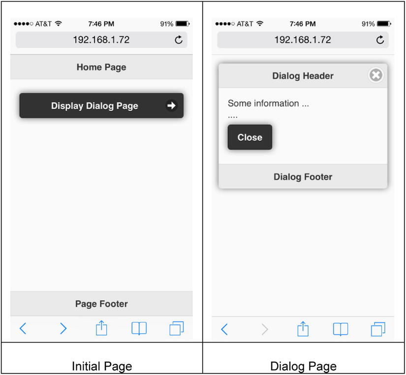
Figure 11-9. Dialog page
11-9. Creating a Navigation Box
Problem
You want to create and display a navigation box.
Solution
A navigation bar is a group of anchor elements (<a>) that are displayed as buttons in a bar. It is generally displayed in the header or the footer. The following is the syntax to create a navigation bar in the footer:
<div data-role="footer">
      <div data-role="navbar">
             <ul>
                    <li><a href="#someLink1">linkText</a></li>
                    ....
              </ul>
      </div>
</div>
You can specify up to five links within a navigation bar. If more than five links are specified, the navigation bar is displayed in multiple lines. Each button in the navigation bar takes the same amount of space. Generally, a header element (<h1>...<h6>) is not specified if a navigation bar is used in the header or the footer. If you specify the header element, the navigation bar will be displayed below the header and footer. Listing 11-7 demonstrates an example that creates and displays a navigation bar in the footer.
Listing 11-7. Navigation bar
<!DOCTYPE html>
<html lang="en">
<head>
      <meta name="viewport" content="width=device-width, initial-scale=1">

      <link rel="stylesheet" href="styles/jquery.mobile-1.4.3.min.css" />

      <script src="scripts/jquery-2.1.0.min.js"></script>
      <script src="scripts/jquery.mobile-1.4.3.min.js"></script>

      <style>
            .ui-page { background: #CFF0C5;}
      </style>
</head>

<body>
      <div data-role="page">
         <div data-role="header">
            <h1>HR System</h1>
         </div>

         <div data-role="main" class="ui-content">
            <p>Content here...</p>
         </div>

         <div data-role="footer" data-position="fixed">
              <div data-role="navbar" data-iconpos="left">
                    <ul>
                            <li><a href="#somelink1" data-icon="search">Search</a></li>
                            <li><a href="#somelink2" data-icon="plus"  class="ui-btn-active">Add</a></li>
                            <li><a href="#somelink3"  data-icon="bars">More...</a></li>
                    </ul>
              </div>
         </div>
      </div>
</body>
</html>
How It Works
Within the footer div tag, another div element is set up with the data-role set to "navbar" to create a navigation bar in the footer. Buttons in the navigation bar are created in the unordered list (<ul>) and list items (<li>) by using anchor elements. Refer to the Recipe 11-3 to learn how to use anchor elements as buttons. The following sections explain the classes and data attributes used in this recipe.
Active Link
To indicate which button is selected for the current page, you can specify the ui-btn-active and ui-state-persist classes as the following:
<li><a href="#someLink1" class="ui-btn-active ui-state-persist">linkText</a></li>
Theming
By default, a navigation bar inherits its theme from its parent container. To use a different theme, set the data-theme attribute to:
<li><a href="#someLink1" data-theme="b">linkText</a></li>
Icon
For each button, you can specify an icon by using the following syntax:
<li><a href="#somelink1" data-icon="iconName">Search</a></li>
The icons listing is provided in Figure 11-1.
Icon Positioning
By default, icons are placed on top of the text. You can specify an icon position for all buttons by using the following syntax:
<div data-role="navbar" data-iconpos="position">
where valid values of position are left, top, right, bottom, and notext.
Figure 11-10 displays the page with a navigation bar in the footer.
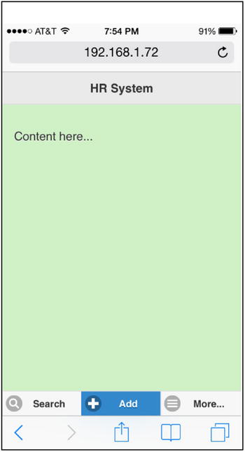
Figure 11-10. Navigation bar in the footer
11-10. Creating a Panel
Problem
You want to create and display a panel.
Solution
A panel is displayed as a split screen, with additional information about the content in the main screen. Panels can also be used to display a list of items. Some of the examples include a list of menu items in the web application, a list of employees, and so on. When you click any of the items in the panel, details about it are displayed in the main screen. Panels slide out from the left or right of the main screen. Use the following structure to set up a basic panel:
<div data-role="panel" id="panelName">
   <h1>Panel Header</h1>
   <p>Panel Content</p>
</div>
A panel must be created as a sibling of the header (data-role="header"), footer (data-role="footer"), and content (data-role="main") elements. The following is the syntax to show the panel:
<a href="#panelName">Show Panel</a>
Listing 11-8 demonstrates an example to create and display a panel.
Listing 11-8. Panel
<!DOCTYPE html>
<html lang="en">
<head>
      <meta name="viewport" content="width=device-width, initial-scale=1">

      <link rel="stylesheet" href="styles/jquery.mobile-1.4.3.min.css" />

      <script src="scripts/jquery-2.1.0.min.js"></script>
      <script src="scripts/jquery.mobile-1.4.3.min.js"></script>
</head>

<body>
      <!--  Page 1 -->
      <div data-role="page">
              <div data-role="header">
                    <h1>Page Header</h1>
              </div>

              <div data-role="panel" id="myPanel" data-display="overlay"  data-position="right" data-position-fixed="true" data-theme="b">
                    <h3>Available Options</h3>
                    <a href="#myNewPage" class="ui-btn" data-rel="close">Option 1</a>
                    <a href="#" class="ui-btn" data-rel="close">Option 2</a>
                    <a href="#" class="ui-btn" data-rel="close">Option 3</a>
                    <a href="#" class="ui-btn" data-rel="close">Option 4</a>
              </div>

              <div data-role="main" class="ui-content">
                    <p>Content here...</p>
                    <a href="#myPanel" class="ui-btn ui-btn-inline">Show Panel</a>
              </div>

              <div data-role="footer" data-position="fixed">
                    <h1>Page Footer</h1>
              </div>
      </div>

      <!--  Page 2 -->
      <div data-role="page" id="myNewPage">
         <div data-role="header">
              <h1>New Page Header</h1>
         </div>
      </div>
   </body>
</html>
How It Works
When you click the Show Panel button, the jQuery Mobile framework’s pagecontainer displays the panel with the ID myPanel. In the myPanel div element, a header is set using the <h3> element and four buttons are created using the anchor elements. The following items are displayed in the panel:
<h3>Available Options</h3>
        <a href="#myNewPage" class="ui-btn" data-rel="close">Option 1</a>
        <a href="#" class="ui-btn" data-rel="close">Option 2</a>
        <a href="#" class="ui-btn" data-rel="close">Option 3</a>
        <a href="#" class="ui-btn" data-rel="close">Option 4</a>
The following sections explain the classes and data attributes used in this recipe.
Panel Position
Panel position can be specified by setting the data-position attribute using the following syntax:
<div data-role="panel" id="panelName" data-position="panelPosition">
where panelPosition can be:
- left—Displays the panel on the left side of the screen (default).
- right—Displays the panel on the right side of the screen.
Panel Scroll Mode
Panel scroll mode can be specified by setting the data-position-fixed attribute using the following syntax:
<div data-role="panel" id="panelName" data-position-fixed="isPositionFixed">
where isPositionFixed can be:
- false—The content of the panel doesn’t scroll when the calling page scrolls (default).
- true—The content of the panel scrolls when the calling page scrolls.
Panel Display Mode
Panel display mode can be specified by setting the data-display attribute using the following syntax:
<div data-role="panel" id="panelName" data-display="displayMode">
where displayMode can be:
- reveal—Shows the panel by sliding the calling page toward the right, revealing the panel under it (default).
- overlay—The panel slides on the top of the calling page and hides part of the calling page. The panel moves on top of the calling page.
- push—The panel pushes the calling page toward the right. Both the panel and the calling page are moved.
Updating Panel Layout
If properties or contents of a displayed panel are dynamically changed, trigger the updatelayout event to display the changes using the following syntax:
$("panelName").trigger("updatelayout");
Closing the Panel
A panel can be closed by using any of these methods:
- By clicking outside the panel. To disable this behavior, you can set data-dismissible="false".
- By pressing the Esc key.
- By swiping. To disable this behavior, you can set data-swipe-close= "false".
- By adding a link or button in the panel as <a href="#newPageId" data-rel="close">Close</a>.
Theming
By default, the panel inherits its theme from its parent container. To use a different theme, set the data-theme attribute to:
<div data-role="panel" id="panelName" data-theme="b">
data-theme can also be set to none if you want to use your custom styling, as follows:
<div data-role="panel" id="panelName" data-theme="none" class="customClass">
Figure 11-11 displays the panel when the Show Panel button is clicked.
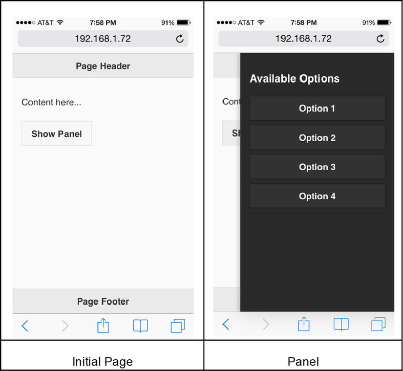
Figure 11-11. Panel
11-11. Creating a Popup
Problem
You want to create and display a popup.
Solution
Popups are used to display tooltip messages, images, map directions, list views, forms, and so on. They can be defined anywhere within the page (data-role="page"). A popup can contain any valid HTML structure, including images, text, elements of page structure (header, content, and footer), and so on. The following is the structure used to set up a basic popup:
<div data-role="popup" id="popupName">
   <p>Popup Content</p>
</div>
The following is the syntax to show the popup:
<a href="#popupName">Show Popup</a>
Both the popup and the link that displays the popup must be on the same page. Listing 11-9 demonstrates an example that creates and displays an image as a popup.
Listing 11-9. Display an image as a popup
<!DOCTYPE html>
<html lang="en">
<head>
      <meta name="viewport" content="width=device-width, initial-scale=1">

      <link rel="stylesheet" href="styles/jquery.mobile-1.4.3.min.css" />

      <script src="scripts/jquery-2.1.0.min.js"></script>
      <script src="scripts/jquery.mobile-1.4.3.min.js"></script>
</head>

<body>
      <div data-role="page">
             <div data-role="header"  data-theme="b">
                    <h1>Page Header</h1>
              </div>

              <div data-role="popup" id="popupName" class="ui-content" data-position-to="window" data-transition="flip" data-theme="b" data-overlay-theme="b" data-arrow="true">
                    <a href="#" data-rel="back" class="ui-btn ui-corner-all  ui-icon-delete ui-btn-icon-notext ui-btn-right">Close</a>

                    <img src="imagesFlower1_500.jpg">
              </div>

              <div data-role="main" class="ui-content">
                    <p>Flower</p>
                    <a href="#popupName" data-rel="popup"><img src="imagesFlower1_100.jpg"></a>
              </div>

              <div data-role="footer" data-position="fixed"  data-theme="b">
                    <h1>Page Footer</h1>
              </div>
      </div>
</body>
</html>
How It Works
A thumbnail of an image is created within an anchor element by using the following code:
<a href="#popupName" data-rel="popup"><img src="imagesFlower1_100.jpg"></a>
The data-role set to popup specifies that the target object is a popup. When the thumbnail is clicked, the following div element structure is displayed:
<div data-role="popup" id="popupName" class="ui-content" data-position-to="window"
                data-transition="flip" data-theme="b" data-overlay-theme="b" data-arrow="true">
      <a href="#" data-rel="back" class="ui-btn ui-corner-all  ui-icon-delete ui-btn-icon-notext
                ui-btn-right">Close</a>

       <img src="imagesFlower1_500.jpg">
</div>
In this code segment, a popup is set up with a Close button (to close the popup) and the actual image. The following sections explain the classes and data attributes used in this recipe.
Adding Padding
To add padding to the content of the popup, you can add the ui-content class:
<div data-role="popup" id="popupName" class="ui-content">
Popup Position
By default a popup is displayed over the clicked link. Popup position can be specified by setting the data-position-to attribute using the following syntax:
<div data-role="popup" id="popupName" data-position-to="popupPosition">
where popupPosition can be:
- origin—Displays the popup over the clicked element (default). This is preferable when showing a tooltip message.
- window—Displays the popup at the center of the window. This is ideal for showing images.
- #id —Displays the popup over the element with the id set to id.
Transitioning
By default no transition effect is used. You can specify a transition effect by setting the data-transition attribute using the following syntax:
<div data-role="popup" id="popupName" data-transition="transitionEffectName">
where transitionEffectName is any of the valid transition names listed in Recipe 11-6.
Theming
By default, a popup inherits its theme from its parent container. To use a different theme, set the data-theme attribute as follows:
<div data-role="popup" id="popupName" data-theme="b">
Adding a Shadow Effect
To add a shadow as a backdrop for the popup, you can set the data-overlay-theme as follows:
<div data-role="popup" id="popupName" data-overlay-theme="b">
Displaying Menu Items
You can display menu items for web application by setting listview as the content of the popup and linking the popup with the link specified in the navigation bar.
Adding an Arrow
You can add an arrow to the popup box by using the data-arrow attribute:
<div data-role="popup" id="popupName" data-arrow="arrowDirection">
where arrowDirection can be:
- false—No arrow is displayed.
- true—Displays the arrow in any direction.
- l—Displays the arrow on the left.
- r—Displays the arrow on the right.
- b—Displays the arrow on the bottom.
- t—Displays the arrow on the top.
You can also use multiple values as a comma-separated value with no space. For example, if you use data-arrow="l,t", the arrow will be displayed either on the left or on the top. This can be tested by changing the size of the browser window. The jQuery Mobile framework determines the direction of the arrow depending on the position of the element that’s clicked to display the popup, the position of the popup, and the size of the browser.
Closing the Popup
A popup can be closed using any of the following ways:
- By clicking outside the popup. To disable this behavior, you can set data-dismissible="false".
- By pressing the Esc key.
- By adding a button as the child element of the popup:
<a href="#" data-rel="back" class="ui-btn ui-corner-all ui-icon-delete ui-btn-icon-notext ui-btn-right">Close</a>
Figure 11-12 displays the image as a popup when a thumbnail of the image is clicked. The black border in the popup image is due to the padding (ui-content) and to the data-theme="b". The popup can be closed by clicking the Close icon on the top-right side of the popup.
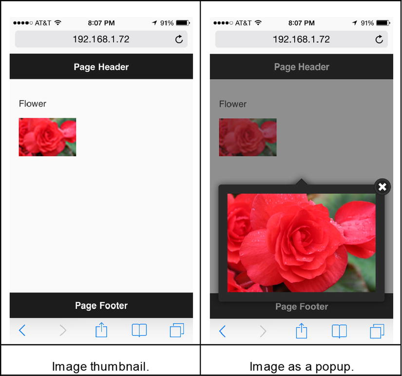
Figure 11-12. Display an image as a popup
11-12. Creating Collapsibles
Problem
You want to create a collapsible.
Solution
Collapsibles are used to expand or collapse contents. They are useful on mobile devices because of the limited screen space. They can be used to expand and collapse text content, images, or sections of data-entry forms. They are defined in the content section of the page. They contain a header element for the title for the content and a valid HTML structure. Collapsible content can be nested inside another collapsible block. The following is the structure used to set up basic collapsible content:
<div data-role="collapsible" id="collapsibleName">
      <h2>Popup Content</p>
</div>
Listing 11-10 demonstrates an example to display collapsible text content and an image.
Listing 11-10. Collapsible content
<!DOCTYPE html>
<html lang="en">
<head>
      <meta name="viewport" content="width=device-width, initial-scale=1">

      <link rel="stylesheet" href="styles/jquery.mobile-1.4.3.min.css" />

      <script src="scripts/jquery-2.1.0.min.js"></script>
      <script src="scripts/jquery.mobile-1.4.3.min.js"></script>
</head>

<body>
      <div data-role="page">
         <div data-role="header">
            <h1>Page Header</h1>
         </div>

         <div data-role="main" class="ui-content">
              <div data-role="collapsibleset">
                    <div data-role="collapsible"  data-inset="false"  data-collapsed-icon="carat-r" data-expanded-icon="carat-d"  data-iconpos="right" data-mini="true" data-content-theme="b">
                            <h2>Header 1</h2>
                            <p>Content 1</p>
                    </div>

                    <div data-role="collapsible"  data-inset="false"  data-collapsed-icon="carat-r" data-expanded-icon="carat-d"  data-iconpos="right"  data-mini="true" data-content-theme="b">
                            <h2>Flower</h2>
                            <p><img src="images/Flower1.jpg"></p>
                    </div>
              </div>
         </div>

         <div data-role="footer" data-position="fixed">
            <h1>Page Footer</h1>
         </div>
      </div>
   </body>
</html>
How It Works
Two collapsibles (that is, two div elements with a data-role set to collapsible) are grouped together by using <div data-role="collapsibleset">. In a collapsible set, only one collapsible can be expanded at a time. The collapsible can contain any valid HTML structure. In this example, collapsibles have headers (<h2>), paragraphs (<p>), and an image (<img>). The following sections explain the classes and data attributes used in this recipe.
Showing Expanded Content on Page Load
By default, collapsible content is collapsed when a page loads. You can expand it by tapping on the header. You can show the expanded content when the page loads by setting data-collapsed to false:
<div data-role="collapsible" id="collapsibleName" data-collapsed="false">
Preventing Rounded Corners
By default a collapsible block has rounded corners and there is some padding added to it. You can remove the rounded corners and the padding by setting data-inset to false:
<div data-role="collapsible" id="collapsibleName" data-inset="false">
Mini Size
You can use global CSS theme data-mini set to true to display a more compact version of the collapsible:
<div data-role="collapsible" id="collapsibleName" data-mini="true">
Grouping Collapsible Contents
You can group multiple content blocks together by wrapping them:
<div data-role="collapsibleset"></div>
Setting an Expand and Collapse Icon
You can change the default icons for expand (+) and collapse (-) by specifying the data-collapsed-icon and data-expanded-icon attributes as follows:
<div data-role="collapsible" id="collapsibleName" data-collapsed-icon="carat-r"
        data-expanded-icon="carat-d">
Changing the Icon’s Position
By default icons are displayed on the left side of the content header. You can change their position by setting the data-iconpos attribute to:
<div data-role="collapsible" id="collapsibleName" data-iconpos="right">
Theming
By default, collapsible inherits their theme from their parent containers. To use a different theme with the collapsible header, set the data-theme attribute of the wrapper as follows:
<div data-role="collapsible" id="collapsibleName" data-theme="b">
Figure 11-13 displays the collapsible set and two collapsible blocks with various types of content.
Figure 11-13. Display content and an image in collapsibles
11-13. Creating a List View
Problem
You want to know how to create a list view.
Solution
A list view displays a list of items. Generally, it is tappable to show more details of the selected item or to take some action. For example, it can be used to show a list of departments and, on tapping on a department name, another page with the list of employees in that department can be displayed. It can also display menu items (such as to search departments, add employees, and search employees), and on tapping a menu item, a new page can be displayed. A list view can be set for unordered lists (<ul>) or ordered lists (<ol>) by setting data-role to listview. The following is the syntax used to create a list view:
<ul data-role="listview">
              <li>listContent 1</li>
              <li>listContent 2</li>
              ...
</ul>
where listContent can be a text, button, link, or any valid HTML structure.
The following is the example of a list view with items that can be tapped (clicked):
<ul data-role="listview">
         <li><a href="#">Sales</a></li>
         <li><a href="#">Support</a></li>
         <li><a href="#">Marketing</a></li>
         <li><a href="#">Technology</a></li>
</ul>
This will display a list of departments that you can tap in order to perform some action. Figure 11-14 displays the list view of department names.
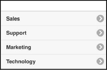
Figure 11-14. List view
Listing 11-11 demonstrates an example that displays a list view.
Listing 11-11. List view of department names
<!DOCTYPE html>
<html lang="en">
<head>
      <meta name="viewport" content="width=device-width, initial-scale=1">

      <link rel="stylesheet" href="styles/jquery.mobile-1.4.3.min.css" />

      <script src="scripts/jquery-2.1.0.min.js"></script>
      <script src="scripts/jquery.mobile-1.4.3.min.js"></script>
</head>

<body>
      <div data-role="page">
         <div data-role="header">
            <h1>Departments</h1>
         </div>

         <div data-role="main" class="ui-content">
              <ul data-role="listview" class="ui-alt-icon" data-count-theme="b" data-autodividers="true" data-inset="true"
                            data-filter="true" data-filter-theme="b" data-filter-placeholder="Search departments">

                    <li  data-icon="arrow-r">
                            <a href="#">
                                  <h3>Infrastructure</h3>
                    <p>Responsible for hardware needs of the organization.</p>
                    <p class="ui-li-aside"><strong>Pending Tickets: 6</strong></p>
                            </a>
                    </li>

                    <li data-icon="arrow-r"><a href="#">Sales <span class="ui-li-count">5</span></a></li>
                    <li data-icon="arrow-r"><a href="#">Support <span class="ui-li-count">3</span></a></li>
                    <li data-icon="arrow-r"><a href="#">Marketing <span class="ui-li-count">10</span></a></li>
                    <li data-icon="arrow-r"><a href="#">Technology <span class="ui-li-count">8</span></a></li>
              </ul>
         </div>
      </div>
   </body>
</html>
How It Works
A list view is created by setting the data-role to listview for the unordered list (<ul>) element. The items in the list view are specified within <li> elements. Within the <li> element, you have control over how items are displayed by using header elements, paragraph elements, and the class ui-li-aside. Within the <li>, you can set which action needs to be taken by setting anchor (<a>) element. The following sections explain the classes and data attributes used in this recipe.
Adding Rounded Corners and Padding
To add rounded corners and padding, set the data-inset attribute to true:
<ul data-role="listview" data-inset="true">
Changing the Icon
By default, the carat-r icon is displayed for each list view item that has a <a> link as its child node.
You can change the icon by using the data-icon attribute as follows:
<li data-icon="iconName"><a href="#">item 1</a></li>
where iconName is a valid icon name. For the list of icons, refer to the Figure 11-1.
Adding a Custom Icon or Image
To add a custom image (16x16) as an icon on the left side of the list item, use the image (<img>) element with the class ui-li-icon as follows:
<li><a href="#"><img src="imageName" class="ui-li-icon">Item 1</a></li>
For images as thumbnails, don’t specify the class ui-li-icon. Images will be scaled down to 80x80.
Making List Items Filterable
To add a filter control above the list view, you can set the data-filter attribute to true. When the user types in the text in the filter control, only those items that match the entered text will be displayed. You can set the theme of the filter control by setting data-filter-theme. You can add the placeholder text to the filter control by setting data-filter-placeholder.
<ul data-role="listview" data-filter="true" data-filter-theme="b"
          data-filter-placeholder="Search departments">
Setting List Items as Dividers
You can group list items by adding items and then specifying them as dividers by setting data-role as list-divider.
<li data-role="list-divider">groupName</li>
Grouping List Items by First Alphabet
Additional list items, with alphabets, can be added automatically to group list items by the first character of their text. This is generally used for grouping directory items.
<ul data-role="listview" data-autodividers="true">
Adding a Count Bubble
For each list view item, you can specify the count of items in that category by setting the ui-li-count attribute for the li element.
<li>listContent 1 <span class="ui-li-count">count</span></li>
The theme of the count display can be changed by setting the data-count-theme attribute:
<ul data-role="listview" data-count-theme="b">
Formatted Content
You can emphasize content by specifying it within the header element. Other text with less emphasis can be specified in a paragraph (<p>) element. To specify additional information near an icon, you can add the ui-li-aside class to the div or paragraph element. For example:
<li>
      <a href="#">
              <h3>Infrastructure</h3>
              <p>Responsible for hardware needs of the organization.</p>
              <p class="ui-li-aside"><strong>Pending Tickets: 6</strong></p>
       </a>
</li>
Theming
By default, a list view items inherits its theme from its parent container. To use a different theme, set the data-theme attribute:
<ul data-role="listview" data-theme="b">
For the icons, white sprite is used to change it to black. You can add ui-alt-icon as follows:
<ul data-role="listview" class="ui-alt-icon">
Nested Controls
You can specify list view controls as child nodes of other controls like collapsibles.
Figure 11-15 displays the list view with count bubbles and list items that are grouped.
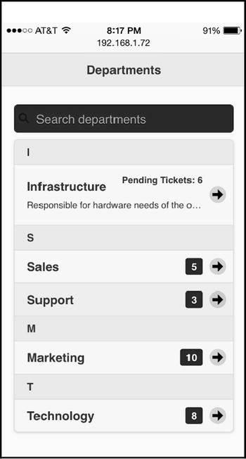
Figure 11-15. List view with grouping and count bubbles
11-14. Creating a Column Toggle Table
Problem
You want to create a column toggle table.
Solution
There are two types of tables used in mobile web applications—column toggle tables and reflow tables.
For a column toggle table, if the display width is not sufficient to display all the columns, some of the columns with less importance are hidden. The users can select and de-select columns they want to see or hide. The following is the syntax to create a column toggle table:
<table id="tableName" data-role="table" class="ui-responsive" data-mode="columntoggle">
      <!-- Column Headers -->
      <thead>
              <th>Column Header 1</th>
              <th>Column Header 2</th>
              ...
                    </thead>

      <!-- Data -->
      <tbody>
              <td>Data 11</td>
              <td>Data 12</td>
              ...
      </tbody>
      ...
</table>
Listing 11-12 displays some employee records in the column toggle table.
Listing 11-12. Column toggle table
<!DOCTYPE html>
<html lang="en">
<head>
      <meta name="viewport" content="width=device-width, initial-scale=1">

      <link rel="stylesheet" href="styles/jquery.mobile-1.4.3.min.css" />

      <script src="scripts/jquery-2.1.0.min.js"></script>
      <script src="scripts/jquery.mobile-1.4.3.min.js"></script>
</head>

<body>
      <div data-role="page">
         <div data-role="header">
            <h1>Employees List</h1>
         </div>

         <div data-role="main" class="ui-content">
              <table id="tableName" data-role="table" class="ui-responsive ui-shadow table-stroke table-stripe"
                             data-mode="columntoggle" data-column-btn-text="Select Columns"
                             data-column-btn-theme="b" data-column-popup-theme="b">
                    <!-- Column Headers -->
                    <thead>
                            <tr>
                                  <th data-priority="2">Employee ID</th>
                                  <th data-priority="1">Employee Name</th>
                                  <th data-priority="1">Department</th>
                                  <th data-priority="3">Salary</th>
                            </tr>
                    </thead>

                    <!-- Data -->
                    <tbody>
                            <tr><td>1</td><td>Jane Smith</td><td>Marketing</td><td>$95,000</td></tr>
                            <tr><td>2</td><td>Michael Jefferson</td><td>Technology</td><td>$85,000</td></tr>
                            <tr><td>3</td><td>Mary Jones</td><td>Support</td><td>$60,000</td></tr>
                    </tbody>
              </table>
         </div>
      </div>
   </body>
</html>
How It Works
Note that data-mode is set to columntoggle for the <table> element. Table column headers are specified within the <thead> element and records are specified within the <tbody> element. The column priority is specified in the column header (<th> element) by setting the data-priority attribute. The following sections explain the classes and data attributes used in this recipe.
Showing Lines Between Rows
You can add horizontal lines between each row by adding the table-stroke class:
<table id="tableName" data-role="table" class="ui-responsive table-stroke" data-mode="columntoggle">
You can set a different background color for alternate records by adding the class table-stripe:
<table id="tableName" data-role="table" class="ui-responsive table-stripe" data-mode="columntoggle">
Setting Column Priority
You can set the priority of the columns by using the data-priority attribute of the table header element as follows:
<th data-priority="dataPriorityValue">Column Header 1</th>
where dataPriorityValue can be 1 through 6 (1 is the highest priority and 6 is the lowest).
Setting the Text of the Column Chooser Button
By default the Columns... text is displayed on the column chooser button. You can change the text by setting the data-column-btn-text attribute to:
<table id="tableName" data-role="table" class="ui-responsive" data-mode="columntoggle"
              data-column-btn-text="Select Columns">
Theming
You can set the theme of the column chooser button by using the data-column-btn-theme attribute as follows:
<table id="tableName" data-role="table" class="ui-responsive" data-mode="columntoggle"
       data-column-btn-theme="b">
You can set the theme of the column chooser popup by using the data-column-popup-theme attribute as follows:
<table id="tableName" data-role="table" class="ui-responsive" data-mode="columntoggle"
       data-column-popup-theme="b">
Figure 11-16 displays the column toggle table.
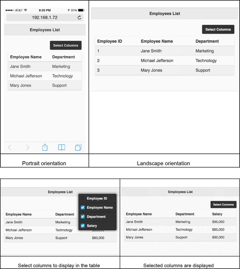
Figure 11-16. Column toggle table
11-15. Creating a Reflow Table
Problem
You want to create a reflow table.
Solution
There are two types of tables used in mobile web applications—column toggle tables and reflow tables.
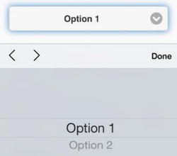
With a reflow table, the jQuery Mobile framework tries to show all the columns horizontally. The first row contains the column headers and the subsequent rows contain the data. If the display is not wide enough to show all the columns, the column headers and data are displayed vertically in the following format. This format is repeated for each record in the table.
columnHeader1: dataValue1
columnHeader2: dataValue2
....
The following is the syntax to create a reflow table:
<table id="tableName" data-role="table" class="ui-responsive" data-mode="reflow">
      <!-- Column Headers -->
      <thead>
              <th>Column Header 1</th>
              <th>Column Header 2</th>
              ...
      </thead>

      <!-- Data -->
      <tbody>
            <td>Data 11</td>
            <td>Data 12</td>
            ...
      </tbody>
      ...
   </table>
Since for data-role="table", reflow is the default table type, there is no need to specify data-mode="reflow". You can use colspan="numberOfColumns" to merge multiple cells. Listing 11-13 shows how to display a reflow table.
Listing 11-13. Reflow table
<!DOCTYPE html>
<html lang="en">
<head>
      <meta name="viewport" content="width=device-width, initial-scale=1">

      <link rel="stylesheet" href="styles/jquery.mobile-1.4.3.min.css" />

      <script src="scripts/jquery-2.1.0.min.js"></script>
      <script src="scripts/jquery.mobile-1.4.3.min.js"></script>
</head>

<body>
      <div data-role="page">
         <div data-role="header">
            <h1>Employees List</h1>
         </div>

         <div data-role="main" class="ui-content">
              <table id="tableName" data-role="table" class="ui-responsive ui-shadow table-stroke table-stripe" data-mode="reflow">
                    <!-- Column Headers -->
                    <thead>
                            <tr>
                                  <th>Employee ID</th>
                                  <th>Employee Name</th>
                                  <th>Department</th>
                                  <th>Salary</th>
                            </tr>
                    </thead>

                    <!-- Data -->
                    <tbody>
                            <tr><td>1</td><td>Jane Smith</td><td>Marketing</td><td>$95,000</td></tr>
                            <tr><td>2</td><td>Michael Jefferson</td><td>Technology</td><td>$85,000</td></tr>
                            <tr><td>3</td><td>Mary Jones</td><td>Support</td><td>$60,000</td></tr>
                    </tbody>
              </table>
         </div>
      </div>
   </body>
</html>
How It Works
The <table> element’s data-mode is set to reflow. In this mode, the jQuery Mobile framework tries to fit all the columns of a record horizontally. If there isn’t enough space, each column is displayed vertically in the format columnHeader1 columnData1. For an explanation of the classes used in this example table, refer to Recipe 11-14. Figure 11-17 displays a reflow table in the landscape and portrait orientations.
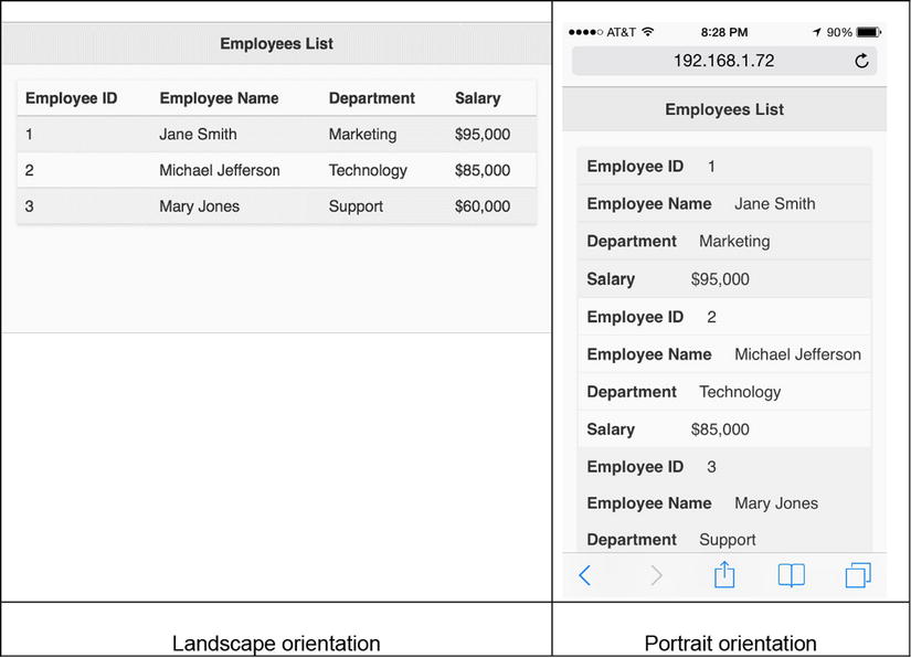
Figure 11-17. Reflow table in the landscape and portrait orientations
11-16. Creating a Grid
Problem
Solution
Grids are used to create a CSS-based layout where the columns are equal length. The following syntax is used to create a grid with three columns:
<div class="ui-grid-b">
      <div class="ui-block-a">Content 1</div>
      <div class="ui-block-b">Content 2</div>
      <div class="ui-block-c">Content 3</div>
</div>
You can customize each column by updating the CSS properties of ui-block-a through ui-block-e. A grid can be used to create a navigation bar or table-like controls. Listing 11-14 demonstrates an example that creates a grid.
Listing 11-14. Grid layout
<!DOCTYPE html>
<html lang="en">
<head>
      <meta name="viewport" content="width=device-width, initial-scale=1">

      <link rel="stylesheet" href="styles/jquery.mobile-1.4.3.min.css" />

      <script src="scripts/jquery-2.1.0.min.js"></script>
      <script src="scripts/jquery.mobile-1.4.3.min.js"></script>

      <style>
              .ui-block-a, .ui-block-b, .ui-block-c {
                    border:3px double green;
                         background-color: lightyellow;
                   }
      </style>
</head>

<body>
      <div data-role="page">
         <div data-role="header">
            <h1>Grid Layout</h1>
         </div>

         <div data-role="main">
            <div class="ui-grid-b">
              <div class="ui-block-a"><a href="#somelink1" class="ui-btn">Search</a></div>
              <div class="ui-block-b"><a href="#somelink2" class="ui-btn">Add</a></div>
              <div class="ui-block-c"><a href="#somelink3" class="ui-btn">More...</a></div>
            </div>
         </div>
      </div>
   </body>
</html>
How It Works
A three-column grid is created by using the ui-grid-b class for a div element. The three columns in the grid are specified by the classes "ui-block-a", "ui-block-b", and "ui-block-c". Within each column div element you can use any valid HTML structure. In this example, three buttons are created in the grid.
A grid can have up to five columns and any number of rows. Table 11-4 lists the five grid layouts.
Table 11-4. Grid Layouts
|
Grid CSS Class |
Number of Columns |
Columns’ CSS Classes |
|---|---|---|
|
ui-grid-solo |
One |
ui-block-a |
|
ui-grid-a |
Two |
ui-block-a | b |
|
ui-grid-b |
Three |
ui-block-a | b | c |
|
ui-grid-c |
Four |
ui-block-a | b |c | d |
|
ui-grid-d |
Five |
ui-block-a | b | c | d | e |
ui-block-a is used to identify the first column, ui-block-b is used to identify the second column, and so on. Figure 11-18 displays a grid with three columns.
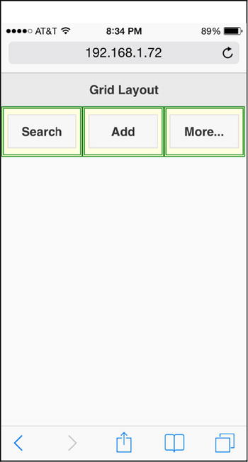
Figure 11-18. Grid layout with three columns
11-17. Creating Form and Form Controls
Problem
You want to create a form and some form controls.
Solution
Forms allow users to enter data, which is then submitted to be saved or to be processed on the server side. It is important to remember that the ID of the form and all form controls (input, select, button, and so on) must be unique across all the pages in a web site. This is because the jQuery mobile framework uses a single page navigation model and keeps pages in the DOM at the same time. The following is the list of form controls that can be used inside a form element—labels, text inputs, textareas, files, flip switches, checkboxes, radio buttons, selects, sliders, range sliders, and buttons.
The following is the basic structure of the form:
<form id="frmEmployee">
            <label for="formControl1">Employee Name:</label>
            <input type="text" id=" formControl1" name="formControl1">
            ...

             <a href="#" id="btnSubmit" class="ui-btn">Submit</a>
</form>
If an AJAX call is made to send form data to the server, then there is no need to specify action and method attributes for the form element. Listing 11-15 demonstrates an example that creates a form and its form controls.
Listing 11-15. Form with form controls