
jqWidgets Framework
jqWidgets is a JavaScript library built on the jQuery library, HTML5, and CSS3. This library is used for developing responsive web and mobile applications. It provides a range of UI widgets that are ready to use in your application with a few lines of code. All UI widgets adhere to a consistent application programming interface, which makes them easy to learn and implement. You can visit to jqWidgets web site at http://www.jqwidgets.com to access comprehensive documentation and demos and to download the library.
This chapter covers the jqWidgets plug-ins—jqxDataAdapter, jqxValidator, and jqxDragDrop. The following is the list of UI widgets that you’ll see in the recipes in this chapter:
- For data entry—Input, DateTime Input, Password Input, Masked Input, Number Input, Button, Switch Button, Button Group, Radio Button, Check Box, Combo Box, Drop-down, Listbox, Range Selector, Slider, Range Slider, Splitter, Tooltip, Progress Bar, and Rating.
- For grouping—Expander, List Menu, Panel, Tabs, and Tree.
- For tabular data displays—Grid, Data Table, and Tree Grid.
- For movable view areas—Window and Docking.
- For graphics—Chart.
- For composite controls—Calendar, Color, and Editor.
- For navigation—Menu and Navigation Bar.
At the time of this writing, the latest version is 3.4.0. For personal and non-commercial use, there is no licensing requirement.
Downloading the jqWidgets Library
- Go to http://www.jqwidgets.com/download/.
- Click the Download jqWidgets 3.4.0 button.
- Enter your first name, last name, and e-mail address in the popup form and then click Download.
- Save the file in your folder. The downloaded file name is jqwidgets-ver3.4.0.zip.
- Unzip the downloaded ZIP file into a folder (for example, into c:jqWidgetsInstall).
Installing the jqWidgets Library
There are two types of JavaScript files in the jqWidgets library:
- The consolidated JavaScript file, called jqx-all.js, is under c:jqWidgetsInstalljqwidgets and it contains the code for all the functionalities of jqWidgets plug-ins and widgets. It’s approximately 2MB. The advantage of including the complete jqWidgets library in your HTML file is that you don’t need to include any other jqWidgets JavaScript file. The disadvantage of including the complete jqWidgets library is that the 2MB file will be downloaded the first time the user accesses the page containing the reference to the jqWidgets library. Once the jqWidgets library is downloaded and cached by the browser, subsequent references to the jqWidgets won’t require downloading of the file again.
- There are also plug-ins, widgets, and functionalities specific to JavaScript. Depending on which widget, plug-ins, and functionalities you are using in your HTML code, you need to include specific JavaScript file(s). You can get the list of plug-ins and widgets and their corresponding files in the c:jqWidgetsInstallReadMe.txt file. For example, if you want to use the jqWidgets Grid with sorting capabilities, you need to include the jqxgrid.js and jqxgrid.sort.js files. The advantage of including only the JavaScript file(s) that are needed is that the user’s browser doesn’t need to download the complete JavaScript library, which is approximately 2MB.
Since the jqWidgets library is based on the jQuery library, you need to include the jQuery JavaScript file before including the jqWidgets JavaScript file(s).
The recipes in this chapter include the jqx-all.js jqWidgets library file and use the Energy Blue theme.
Copy the following folders and files from c:jqWidgetsInstalljqwidgets.
- Copy the stylesimages folder to the styles folder to your development environment’s root folder.
- Copy the jqx.base.css and jqx.energyblue.css files from the styles folder to the styles folder in your development environment’s root folder.
- Copy the jqx-all.js file from the jqwidgets folder to the scripts folder in your development environment’s root folder.
Make sure the following directory structure exists in your development root folder:
- styles folder
- images folder
- jqx.base.css
- jqx.energyblue.css
- scripts folder
- jquery-2.1.0.min.js
- jqx-all.js
The Code Template
Listing 12-1 displays the HTML file template that enables you to use the jqWidgets plug-ins and widgets.
Listing 12-1. HTML file template
<!DOCTYPE html>
<html lang="en">
<head>
      <meta charset="utf-8">
      <meta name="viewport" content="width=device-width, initial-scale=1">

      <title></title>

      <link rel="stylesheet" href="styles/jqx.base.css"/>

      <script src="scripts/jquery-2.1.0.min.js"></script>
      <script src="scripts/jqx-all.js"></script>

      <script>
              $(function () {

              });
      </script>
</head>

<body>

</body>
</html>
The viewport meta tag is used to make the web page smartphone- and tablet-friendly.
Testing Web Pages Using AJAX Calls
To test the program using AJAX call(s), use the Firefox browser to access the data file locally or deploy the web application on the web server so that you can use any of the major browsers. Chrome, Internet Explorer, and Safari browsers have security restrictions that prevent access to local files through the web page. Appendix C provides instructions for deploying web applications on the Apache Tomcat and IIS web servers.
12-1. Using Themes and CSS
Problem
You want to know how jqWidgets themes can be used, how a new theme can be created, and how default CSS properties of jqWidgets can be customized.
Solution
In order to use the jqWidgets’ theme, you first need to include the base CSS file (jqx.base.css) and then use the theme-specific CSS file. The following is the code segment to use the Energy Blue theme:
<link rel="stylesheet" href="styles/jqx.base.css"/>
<link rel="stylesheet" href="styles/jqx.energyblue.css" type="text/css"/>
To specify a theme for a widget, set the following property in the options for the widget:
theme: themeName
Table 12-1 displays the list of themes available in the jqWidgets library.
Table 12-1. jqWidgets Themes
|
Theme Name |
File Name |
|---|---|
|
Android |
jqx.android.css |
|
Arctic |
jqx.arctic.css |
|
Black |
jqx.black.css |
|
Blackberry |
jqx.blackberry.css |
|
Bootstrap |
jqx.bootstrap.css |
|
Classic |
jqx.classic.css |
|
Dark Blue |
jqx.darkblue.css |
|
Energy Blue |
jqx.energyblue.css |
|
Fresh |
jqx.fresh.css |
|
High Contrast |
jqx.highcontrast.css |
|
Metro |
jqx.metro.css |
|
Metro Dark |
jqx.metrodark.css |
|
Mobile |
jqx.mobile.css |
|
Office |
jqx.office.css |
|
Orange |
jqx.orange.css |
|
Shiny Black |
jqx.shinyblack.css |
|
Summer |
jqx.summer.css |
|
UI Darkness |
jqx.ui-darkness.css |
|
UI Le Frog |
jqx.ui-le-frog.css |
|
UI Lightness |
jqx.ui-lightness.css |
|
UI Overcast |
jqx.ui-overcast.css |
|
UI Redmond |
jqx.ui-redmond.css |
|
UI Smoothness |
jqx.ui-smoothness.css |
|
UI Start |
jqx.ui-start.css |
|
UI Sunny |
jqx.ui-sunny.css |
|
Web |
jqx.web.css |
|
Windows Phone |
jqx.windowsphone.css |
In Table 12-1, all the UI themes’ color schemes are same as the color scheme of the themes provided with the jQuery UI library. These themes are especially useful when you are developing web sites containing both jQuery UI and jqWidget widgets.
In order to view the color scheme of the standard themes provided in the jqWidgets framework and preview the effects of the theme on the widgets, go to http://jqwidgets.com/themebuilder/ and click the theme name from the “Import Colors from a Theme” section. The color schemes for the background color, border color, and text color are grouped in the following categories:
- Header areas
- Content areas
- Default state
- Active state
- Hover state
- Inputs and drop-downs
- Buttons and scrollbars
- Tooltips
The following attributes for a theme are also specified under the “Misc” category—font family, border radius, alternating color, alternating background, context menu background, focus border color, calls color, cells border color, and radio button check color.
Creating Custom Themes
You can create and use your own custom themes by performing the following steps:
- Go to http://www.jqwidgets.com/themebuilder/.
- Select any existing theme from the “Import Colors from a Theme” section (for example, Dark Blue).
- Select each theme category from the “Theme Settings” section (for example, “Header Areas”).
- Select the desired color for your custom theme for each component from the “Settings” tab (for example, for “Header Background”).
- Click Update Preview to view the impact of changes you just made.
- After you are done making all your changes:
- Enter a theme name, such as mytheme.
- Click the Get CSS button on the Get Theme tab. This will create the CSS content in the text area.
- Copy and paste the CSS content in a file under the folder styles. For example, jqx.mytheme.css.
- Add the following line to the HTML file: <link rel="stylesheet" href="styles/jqx.mytheme.css"/>.
- Set the theme property in the options as mytheme. For example, for the calendar widget, you would use following syntax:
HTML code: <div id='myCalendar'></div>
JavaScript code: $("myCalendar").jqxCalendar({theme:'mytheme' });
- If you are not done with all of the theme settings, you can save your partial work by clicking the Save link on the top-right corner of the Settings tab and then copy/paste the content in a file.
To continue your work, click the Load link and paste the content from the saved file. Then click Load Theme Settings. This will load all your previous changes.
Customizing Part of the Theme for a Widget
In order to customize a part of an UI widget, you need to modify the CSS class names that are specific to the component. For example, if you want to change the background color to light yellow for the calendar’s navigation title, you can use the following syntax:
.jqx-calendar-title-header-mytheme {
          background:lightyellow;
}
where mytheme is the theme you are using on your HTML page.
For the complete list of CSS class names for a widget, go to http://www.jqwidgets.com/jquery-widgets-documentation/. Click on the widget name in the left panel and then click Styling and Appearance.
12-2. Data Binding
Problem
You want to understand how data can be retrieved from the server in an object and used in a widget.
Solution
The jqxDataAdapter plug-in is used to get data in various formats—JavaScript array, XML, JSON, and so on—and then bind that data to the widget to display it. The following example demonstrates how jqxDataAdapter is used. Listing 12-2 displays the content of the employees.json data file. On the server side, data can be in a flat file or a program can extract the data from data sources like a database, assemble it, and return it.
Listing 12-2. Employee data (employees.json)
{
  "employees":
   [
     {"employeeId": 1, "managerId": 0, "name": "Mark Johnson", "department": "Finance", "salary": "$285,000"},
     {"employeeId": 2, "managerId": 1, "name": "Jane Smith", "department": "Marketing", "salary": "$95,000"},
     {"employeeId": 3, "managerId": 1, "name": "John Smith", "department": "Technology", "salary": "$90,000"},
     {"employeeId": 4, "managerId": 1, "name": "Brian Adam", "department": "Sales", "salary": "$72,000"},
     {"employeeId": 5, "managerId": 1, "name": "Mary Jones", "department": "Support", "salary": "$60,000"},
     {"employeeId": 6, "managerId": 3, "name": "Michael Jefferson", "department": "Technology", "salary": "$85,000"}
   ]
}
Follow these steps to bind data to a widget:
- Specify the options for the jqxDataAdapter, including the data source and the data format:
var source =
            {
                datatype: "json",
                datafields: [
                    { name: 'name', type: 'string' },
                    { name: 'department', type: 'string' },
                    { name: 'salary', type: 'string' }
                ],
                id: 'employeeId',
                url: "employees.json"
};- datatype specifies the returned data type from the server. Valid values are "array", "csv", "json", "jsonp", "local", "tsv", and "xml".
- datafields is an array that specifies the fields’ attributes (name, type, format, and map) of the data in the data file or in the local data.
- id specifies the field name that uniquely identifies the record.
- url specifies the URL for the request. It can be a data file or a web service URL.
- Instantiate jqxDataAdapter using the options specified in the previous step.
- The simplest form is var dataAdapter = new $.jqx.dataAdapter(source);
- With error and success event handler:
var dataAdapter = new $.jqx.dataAdapter(
         source,

            {
                  loadError: function(jqXHR, status, errorMsg) {
                            alert(status + ": " + errorMsg);
                   },

                   loadComplete: function() {
                           // tasks to be performed on successful data retrieval
                   }
            });
- Bind jqxDataAdapter to a jqx widget (for example, to the jqxGrid widget). Refer to Recipe 12-10 for the complete code listing and explanation.
$("#employeeGrid").jqxGrid(
            {
               source: dataAdapter,
               columns: [
                  { text: 'Name', datafield: 'name', width: 150 },
                  { text: 'Department', datafield: 'department', width: 125 },
                  { text: 'Salary', datafield: 'salary', width: 100}
               ]
            });
Use this HTML code: <div id="employeeGrid"></div>.
.jqxGrid() creates the grid widget with the following settings:
- source specifies the data source and has the value of jqxDataAdapter.
- columns specifies the mapping between data fields in the jqxDataAdapter and the column’s heading in the grid.
- width specifies the width of the cell in the grid.
For a complete list of settings for jqxDataAdapter and jqxGrid, refer to the documentation available on the jqxwidgets web site.
Table 12-2 lists the options used to set the source. source is the argument for creating jqxDataAdapter.
Table 12-2. Source Settings
|
Option Name |
Description |
|---|---|
|
url |
Specifies the URL where the request is sent. |
|
localdata |
Specifies the variable name that contains the data. |
|
type |
Specifies the request type—GET or POST. The default value is GET. |
|
data |
Specifies data that’s sent to the server. |
|
dataType |
Specifies data type of the returned data. Valid values are "array" "csv", "json", "jsonp", "local", "tsv", and "xml". |
|
root |
Specifies from where the data begins in a nested data structure. |
|
datafields |
Specifies an array of objects containing information about the fields in a record. Members of the objects are: name—Specifies the name of the field in the returned data type—Specifies the data type of the field. Valid values include "string", "int", "number", "float", "date", and "bool". format—Specifies the format in which the returned data will be converted (optional). map—Specifies the mapping between the name and the nested fields structure (optional). |
|
id |
Specifies the field name in the returned data that uniquely identifies the record. |
|
timeout |
Specifies the timeout in milliseconds after which the request is aborted. |
|
record |
Specifies the information about the record. |
|
mapChar |
Specifies the mapping character used in maps in data fields. |
|
columnDelimiter |
Specifies the character used as a column delimiter in the returned data. |
|
rowDelimiter |
Specifies the character used as a row delimiter in the returned data. |
|
values |
Specifies the foreign collection associated with the data field. |
Table 12-3 lists the options for setting jqxDataAdapter.
Table 12-3. jqxDataAdapter Settings
|
Option Name |
Description |
|---|---|
|
async |
Specifies whether the request is sent asynchronously. The default value is true. |
|
autoBind |
Specifies whether dataAdapter’s dataBind method is called. The default value is false. |
|
contentType |
Specifies the content-type of the data sent. |
|
processData |
Specifies the callback function to modify the data before it is sent to the server. |
|
formatData |
Specifies the callback function to format the data before it is sent to the server. |
|
beforeSend |
Specifies the callback function to modify jqXHR before a request is made. |
|
downloadComplete |
Specifies the callback function to process the data when the request is successful. |
|
beforeLoadComplete |
Specifies the callback function that’s executed before the returned data is fully loaded. |
|
loadComplete |
Specifies the callback function that’s executed after the returned data is fully loaded. |
|
loadError |
Specifies the callback function to handle the error when a request fails. |
|
loadServerData |
Specifies the callback function to manually handle the AJAX call. |
12-3. Data Entry and Validation of Forms
Problem
You want to know which UI widgets are available in the jqWidgets framework and their purpose
Solution
The following is the format to create a widget with predefined settings (options):
$("#widgetId").widgetName(options)
Or:
$("#widgetId").widgetName({propertyName1: propertyValue1, propertyName2: propertyValue2 ...})
widgetId is the value of the ID attribute of the HTML element (generally, it is a div or input element).
widgetName can be any of the following values:
jqxBulletChart, jqxButtons, jqxCalendar, jqxChart, jqxColorPicker, jqxComboBox, jqxDataTable, jqxDateTimeInput, jqxDocking, jqxDropDownList, jqxEditor, jqxExpander, jqxGauge, jqxGrid, jqxInput, jqxListBox, jqxListMenu, jqxMaskedInput, jqxMenu, jqxNavigationBar, jqxNumberInput, jqxPanels, jqxPasswordInput, jqxProgressBar, jqxRangeSelector, jqxRating, jqxScrollBar, jqxScrollView, jqxSlider, jqxSplitter, jqxTabs, jqxTooltip, jqxTree, jqxTreeGrid, jqxTreeMap, or jqxWindow.
options is a map object containing properties of the widget in the format:
propertyName1: propertyValue1, propertyName2: propertyValue2 . . .
The following is the syntax to get the property value:
$("#widgetId").widgetName("propertyName");
The following is the syntax to execute a method:
$("#widgetId").widgetName("methodName", argument1, argument2, ...);
The following is the syntax to register the event handler for the widget’s events:
$('#widgetId).on('eventName', function (eventObject) {
             // Event handler code
});
Listing 12-3 creates a data-entry form with validation checks using UI widgets.
Listing 12-3. Data-entry form with validation
<!DOCTYPE html>
<html lang="en">
<head>
      <meta charset="utf-8">
      <meta name="viewport" content="width=device-width, initial-scale=1">

      <title>jqWidget - Form</title>

      <link rel="stylesheet" href="styles/jqx.base.css"/>
      <link rel="stylesheet" href="styles/jqx.energyblue.css"/>

      <script src="scripts/jquery-2.1.0.min.js"></script>
      <script src="scripts/jqx-all.js"></script>

      <style>
              form {
                    border: 3px double green;
                    width: 500px;
                    padding-left: 10px;
                    padding-right: 10px;
                    padding-bottom: 10px;
                    background-color: lightyellow;
              }

              label {
                    float: left;
                    display: block;
                    width: 125px;
                    font-weight: bold;
              }

              fieldset {
                    padding: 5px;
                    border: 0px;
              }
      </style>

      <script>
              $(function () {
                    $("#switchActive").jqxSwitchButton({ theme: "energyblue", height: 25, width: 75, checked: true, onLabel: "Yes", offLabel: "No" });
                    $("#txtEmployeeName").jqxInput({ placeHolder: "Enter Employee Name"});
                    $("#hireDate").jqxDateTimeInput({ width: '100px', height: '25px', formatString: "MM/dd/yyyy" });

                    var departments = new Array("Finance", "Technology", "Support", "Sales");

                    $("#txtDepartment").jqxInput({ placeHolder: "Enter a department", height: 25, width: 200,
  minLength: 1, source: departments });

                    $("#txtEMailAddress").jqxInput();
                    $("#btnGroupGender").jqxButtonGroup({ theme: "energyblue", mode: 'radio' });
                    $("#rdoFemale").jqxRadioButton({width: 100, groupName :"Gender" });
                    $("#rdoMale").jqxRadioButton({width: 100, groupName :"Gender" });

                    $("#btnGroupExperience").jqxButtonGroup({ theme: "energyblue", mode: 'checkbox' });
                    $("#chkTechnology").jqxCheckBox({width: 100});
                    $("#chkSales").jqxCheckBox({width: 100});
                    $("#chkMarketing").jqxCheckBox({width: 100});

                    $("#txtSSN").jqxPasswordInput({ placeHolder: "Enter SSN", height: 25, width: 200});

                    $("#txtPhoneNumber").jqxMaskedInput({height: 25, width: 200, mask: '(###)###-####' });

                    $("#salary").jqxNumberInput({height: 25, width: 200, decimal:0, symbol: '$'});

                    $("[type='button']").jqxButton({theme:"energyblue"});

                    $("#btnSubmit").on('click', function (event) {

                        if ($('#frmEmployee').jqxValidator('validate')) {
                            var msg = "Form will be submitted with the following values:

";
                            msg += "Active: " + $("#switchActive").val() + "
";
                            msg += "Employee Name: " + $("#txtEmployeeName").val() + "
";
                            msg += "Hire Date: " + $("#hireDate").val() + "
";
                            msg += "Department: " + $("#txtDepartment").val() + "
";
                            msg += "EMail Address: " + $("#txtEMailAddress").val() + "
";
                            msg += "Gender: Female:" + $("#rdoFemale").jqxRadioButton('checked') +
                                          " Male:" + $("#rdoMale").jqxRadioButton('checked') + "
";
                            msg += "Experience: " + $("#btnGroupExperience").val() + "
";
                            msg += "SSN: " + $("#txtSSN").val() + "
";
                            msg += "Phone Number: " + $("#txtPhoneNumber").val() + "
";
                            msg += "Salary: " + $("#salary").val();

                            alert(msg);
                          } else {
                            alert("Please resolve validation issues.");
                          }
                    });

                    $("#btnCancel").on('click', function (event) {
                            alert("Form is cancelled.");
                    });

                    // Validator
                    $('#frmEmployee').jqxValidator({ rules: [
                                  { input: '#txtEmployeeName', message: 'The Employee Name is required.',
 action: 'keyup', rule: 'required' },
                                  { input: '#txtEMailAddress', message: 'Invalid EMail Address.', action: 'keyup', rule: 'email'},
                                  { input: '#txtSSN', message: 'Invalid SSN.', action: 'keyup', rule: 'ssn'},
                                  { input: '#txtSSN', message: 'Invalid SSN.', action: 'keyup', rule: 'required'},
                            ],
                            theme: 'energyblue'
                    });
              });
      </script>
</head>

<body>
      <h3>Employee Form</h3>
      <form id="frmEmployee">
              <fieldset>
                    <label>Active?</label>
                    <div id='switchActive'></div>
              </fieldset>

              <fieldset>
                    <label>Employee Name: </label>
                    <input type="text" id="txtEmployeeName"/><br>
              </fieldset>

              <fieldset>
                    <label>Hire Date: </label>
                    <div id='hireDate'></div>
              </fieldset>

              <fieldset>
                    <label>Department: </label>
                    <input type="text" id="txtDepartment"/><br>
              </fieldset>

              <fieldset>
                    <label>EMail Address: </label>
                    <input type="text" id="txtEMailAddress"/><br>
              </fieldset>

              <fieldset>
                    <label>Gender: </label>
                    <div id='btnGroupGender'>
                            <div id='rdoFemale'>Female</div>
                            <div id='rdoMale'>Male</div>
                    </div>
              </fieldset>

              <fieldset>
                    <label>Experience: </label>
                    <div id='btnGroupExperience'>
                            <div id='chkTechnology'>Technology</div>
                            <div id='chkSales'>Sales</div>
                            <div id='chkMarketing'>Marketing</div>
                    </div>
              </fieldset>

              <fieldset>
                    <label>SSN: </label>
                    <input type="password" id="txtSSN"/><br>
              </fieldset>

              <fieldset>
                    <label>Phone Number: </label>
                    <input type="text" id="txtPhoneNumber"/><br>
              </fieldset>

              <fieldset>
                    <label>Salary: </label>
                    <div id='salary'></div><br>
              </fieldset>

              <fieldset>
                    <input type="button" value="Submit" id='btnSubmit'/>
                    <input type="button" value="Cancel" id='btnCancel'/>
              </fieldset>
      </form>
</body>
</html>
How It Works
This code example creates widgets by specifying the HTML elements <div> and <input>, setting their ID attributes to the value of widgetId, and then creating the jqWidget using the following syntax:
$("#widgetId").widgetName(options);
Figure 12-1 displays the initial form when viewed in a browser.
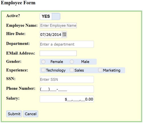
Figure 12-1. Employee data-entry form
Table 12-4 lists the data-entry field name and the name of the jqWidget that’s used to create the widget.
Table 12-4. jqWidgets Used in the Form
|
Data-Entry Field |
jqWidgetName |
|---|---|
|
Active? |
jqxSwitchButton() |
|
Employee Name |
jqxInput() |
|
Hire Date |
jqxDateTimeInput() |
|
Department |
jqxInput() |
|
E-mail Address |
jqxInput() |
|
Gender |
jqxButtonGroup() |
|
Female |
jqxRadioButton() |
|
Male |
jqxRadioButton() |
|
Experience |
jqxButtonGroup() |
|
Technology |
jqxCheckBox() |
|
Sales |
jqxCheckBox() |
|
Marketing |
jqxCheckBox() |
|
SSN |
jqxPasswordInput() |
|
Phone Number |
jqxMaskedInput() |
|
Salary |
jqxNumberInput() |
|
Submit Button |
jqxButton() |
|
Cancel Button |
jqxButton() |
Masked Fields
In this example, the following masks are used:
$("#txtPhoneNumber").jqxMaskedInput({height: 25, width: 200, mask: '(###)###-####'});

$("#salary").jqxNumberInput({height: 25, width: 200, decimal:0, symbol: '$'});
Theme
In this example, the Energy Blue theme is used by including the theme file, as so:
<link rel="stylesheet" href="styles/jqx.energyblue.css"/>
and setting the theme option to "energyblue" for the jqWidgets used in this code.
Validator
The following code defines the validation rules for the Employee Name, EMail Address, and SSN fields:
$('#frmEmployee').jqxValidator({ rules: [
                { input: '#txtEmployeeName', message: 'The Employee Name is required.',
                          action: 'keyup', rule: 'required' },
                { input: '#txtEMailAddress', message: 'Invalid EMail Address.', action: 'keyup', rule: 'email'},
                { input: '#txtSSN', message: 'Invalid SSN.', action: 'keyup', rule: 'ssn'},
                { input: '#txtSSN', message: 'Invalid SSN.', action: 'keyup', rule: 'required'},
                ],
                    theme: 'energyblue'
                });
- The input property specifies the ID of the HTML element to which the validation rule will be applied.
- The message property specifies the message to display if the validation rule is not satisfied.
- The action property specifies when to apply the validation rule.
- The rule property specifies the rule from the list of predefined rules. This example uses the required, email, and ssn rules.
Events
The following events are used in this example:
- The click event on the Submit button. When the Submit button is clicked, the event handler executes $('#frmEmployee').jqxValidator('validate'). If there is no validation rule violation, true is returned and a popup message is displayed with the entered values. Figure 12-9 displays the popup message with entered values if no validation error is found. If there is any validation rule violation, a false value is returned and the “Please resolve validation issues.” popup message is displayed.
- The click event on the Cancel button. When the Cancel button is clicked, “Form is cancelled.” popup message is displayed.
When the user clicks the Submit button without entering any data, “Please resolve validation issues.” popup message is displayed and the fields that don’t pass the validation checks are highlighted. Figure 12-2 displays the highlighted fields with validation errors.
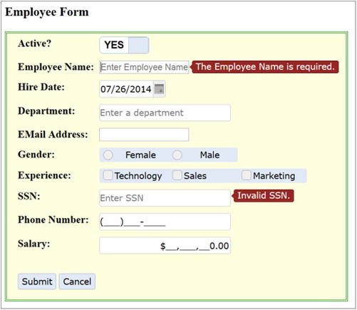
Figure 12-2. Employee data-entry form with validation errors
Figure 12-3 displays the popup calendar when the calendar icon is clicked for the Hire Date.

Figure 12-3. Popup calendar for the Hire Date
Figure 12-4 displays the Department drop-down when a partial value for the department is entered. This effect is achieved by using the following code:
var departments = new Array("Finance", "Technology", "Support", "Sales");

$("#txtDepartment").jqxInput({ placeHolder: "Enter a department", height: 25, width: 200,
                               minLength: 1, source: departments });
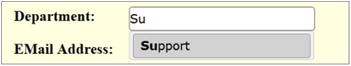
Figure 12-4. Department names drop-down
source can also be set as jqxDataAdapter if the department names are retrieved from the server using the AJAX call.
Figure 12-5 displays the message if an invalid email address is entered.
Figure 12-5. Invalid EMail Address message
Figure 12-6 displays the message if an invalid SSN is entered.
Figure 12-6. Invalid SSN message
Figure 12-7 displays the unmasked SSN if the eye icon is clicked. Since the SSN is set as the jqxPasswordInput widget, asterisks (*) are displayed in place of the actual value.
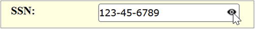
Figure 12-7. SSN value
Figure 12-8 displays the completed employee data-entry form with no invalid validation rules.
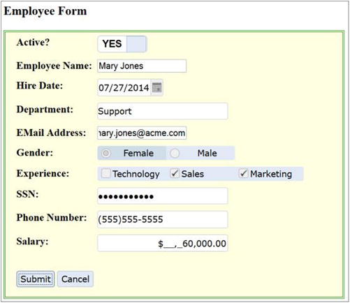
Figure 12-8. Completed employee data-entry form
Figure 12-9 displays the popup message when a completed employee data-entry form is submitted by clicking the Submit button and there is no validation error.
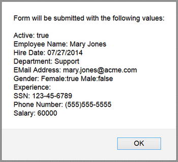
Figure 12-9. Popup message with the entered field values
12-4. Using Other Data-Entry Widgets
Problem
You want to know which other data-entry controls are available in the jqWidgets library.
Solution
This recipe covers the following input controls—combo boxes, drop-downs, listboxes, range selectors, sliders, splitters, tooltips, progress bars, and rating options.
Combo Box
Listing 12-4 creates a combo box using the local data.
Listing 12-4. Creating a combo box
<!DOCTYPE html>
<html lang="en">
<head>
      <meta charset="utf-8">
      <meta name="viewport" content="width=device-width, initial-scale=1">
      <title>jqWidget - ComboBox</title>

      <link rel="stylesheet" href="styles/jqx.base.css"/>
      <script src="scripts/jquery-2.1.0.min.js"></script>
      <script src="scripts/jqx-all.js"></script>

      <script>
              $(function () {

                   // Specify data
                   var departmentData = {
                      "departments":
                            [
                                  {"department":"Finance"},
                                  {"department":"Marketing"},
                                  {"department":"Sales"},
                                  {"department":"Support"},
                                  {"department":"Technology"}
                            ]
                   };

                    // Specify data source
                    var source = {
                            datatype: "json",
                            datafields: [{ name: 'department', type: 'string' }],
                            localdata:  departmentData
                    };

                    // Set Data Adapter
                    var dataAdapter = new $.jqx.dataAdapter(source,
                                                {
                                                      loadError: function(jqXHR, status, errorMsg) {
                                                      alert(status + ": " + errorMsg);
                                                      }
                                                });

                    // Create a jqxComboBox using Data Adapter
                    $("#departments").jqxComboBox({ source: dataAdapter, displayMember: "department",
                       valueMember: "department", selectedIndex: 0, width: '200px', height: '25px' });

                    // 'Select' event handler.
                    $('#departments').on('select', function (event) {
                       var args = event.args;
                       var item = $("#departments").jqxComboBox('getItem', args.index);

                       $("#selectedDepartmentMsg").html('<strong>Selected Department:</strong> ' + item.label);
                    });
              });
      </script>
</head>

<body>
    <div id="departments"></div><br>
    <div id="selectedDepartmentMsg"></div>
</body>
</html>
How It Works
In Listing 12-5, a combo box is created using the following code:
HTML code: <div id=departments></div>
JavaScript code:
$("#departments").jqxComboBox({ source: dataAdapter, displayMember: "department", valueMember: "department", selectedIndex: 0, width: '200px', height: '25px' });
- source is dataAdapter, which contains contents from departmentData.
- displayMember specifies which dataField in the dataAdapter is used to display the value on the screen.
- valueMember specifies which dataField in the dataAdapter is used as a value if an item is selected.
- selectedIndex specifies which item index is selected by default.
- width specifies the width of the widget.
- height specifies the height of the widget.
Figure 12-10 displays the combo box with values from departmentsData.
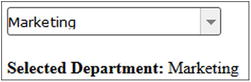
Figure 12-10. Combo box with the department name
Using AJAX Calls
If you want to make an AJAX call to get the data instead of using local data, you can set the source as follows:
// Specify data source
var source = {
        datatype: "json",
        datafields: [{ name: 'department', type: 'string' }],
        url: "departments.json"
};
Listing 12-5 displays the content of the departments.json file.
Listing 12-5. Contents of the departments.json file
{
  "departments":
   [
     {"department":"Finance"},
     {"department":"Marketing"},
     {"department":"Sales"},
     {"department":"Support"},
     {"department":"Technology"}

   ]
}
Drop-downs
Drop-downs contain a list of selectable items.
HTML code:
<div id='departments'></div>
JavaScript code:
To create a drop-down, use this code:
$("#departments").jqxDropDownList({ source: dataAdapter, displayMember: "department",
                                    valueMember: "department", selectedIndex: 0 });
Refer to the code in Listing 12-5 to set the dataAdapter.
To get the selected value, use this code:
var item = $("#departments").jqxDropDownList('getSelectedItem').value;
$("#selectedDepartmentMsg").html('<strong>Selected Department:</strong> ' + item);
Figure 12-11 displays the drop-down with the department names.
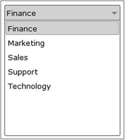
Figure 12-11. Drop-down of the department names
Listboxes
Listboxes contain a list of selectable items. Multiple values can be selected.
HTML code:
<div id='jqxlistbox'></div>
JavaScript code:
To create the listbox, use this code:
$("#departments").jqxListBox({ source: dataAdapter, displayMember: "department",
                               valueMember: "department"});
Refer to the code in Listing 12-5 to set the dataAdapter.
To get the selected value:
var item = $("#departments").jqxListBox('getSelectedItem').value;
$("#selectedDepartmentMsg").html('<strong>Selected Department:</strong>' + item);
Figure 12-12 displays the listbox with the department names.
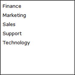
Figure 12-12. Listbox
Range Selectors
Range selectors are used to select a number range or a date range.
HTML code:
<div id="ageSelector">
       <div id="ageSelectorContent"></div>
</div>
JavaScript code:
To create the range selector, use this code:
$("#ageSelector").jqxRangeSelector({width: 300, height: 50, min: 20, max: 70, range: { from: 35, to: 50 }});
To get the range values, use this code:
$("#ageSelector").jqxRangeSelector("getRange").from;
$("#ageSelector").jqxRangeSelector("getRange").to;
Figure 12-13 displays the range selector for age.
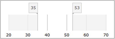
Figure 12-13. Range selector
Sliders
Sliders are used to select a value from a range of values.
HTML code:
<div id='mySlider'></div>
To create the slider, use this code:
var initialValue = 12;
$("#mySlider").jqxSlider({min:1, max:20, step:1, value: initialValue, mode: 'fixed' });
To get the selected value, use this code:
$("#mySlider").jqxSlider('value'),
Figure 12-14 displays the slider widget.

Figure 12-14. Slider widget
Splitters
Splitters are used to divide a container display area into two or more panels by moving split bar(s).
HTML code:
<div id='cpuUtilizationThreshold' style="background-color: #FFFFAF">
    <div id="firstPanel" class="adjust" style="background-color: lightgreen;"></div>
    <div id="secondPanel" class="adjust" style="background-color: lightyellow;"></div>
</div>
To create the splitter, use this JavaScript code:
$("#cpuUtilizationThreshold").jqxSplitter({ width: 300, height: 60, panels: [{ size: '100'}] });
To get the selected value, use this JavaScript code:
$("#cpuUtilizationThreshold").jqxSplitter("panels")[panelIndex].size;
Where panelIndex is the index number of the panel.
Figure 12-15 displays the splitter widget.
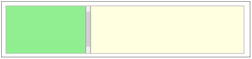
Figure 12-15. Splitter widget
Tooltips
Tooltips are used to display popup informative messages when the users hover the mouse over an HTML element.
HTML code:
<input type="text" id="txtCreditCardCCV" placeholder="CCV">
To create the tooltip, use this JavaScript code:
$("#txtCreditCardCCV").jqxTooltip({ position: 'right',
content: 'MasterCard/Visa: 3 Digits on the back of the card.<br>American Express: 4 Digit Number in the front.' });
Figure 12-16 displays the tooltip.
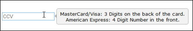
Figure 12-16. Tooltip
Progress Bars
Progress bars are used to display progress of an operation.
HTML code:
<div id='paymentProcessingStatus'></div>
To create the progress bar, use this JavaScript code:
$("#paymentProcessingStatus").jqxProgressBar({ width: 250, height: 25, value: 35 });
Figure 12-17 displays the progress bar.
Figure 12-17. Progress bar
Ratings
This input option enables users to choose a rating.
HTML code:
<div id='userReview'></div>
To create the rating with four stars, use this JavaScript code:
$("#userReview").jqxRating({ width: 350, height: 35, value: 4});
To get the selected value, use this JavaScript code:
$("#userReview").jqxRating('value'),
Figure 12-18 displays the rating.
Figure 12-18. Rating
12-5. Displaying Content Using the Expander Widget
Problem
You want to display content with the header by using the expander widget.
Solution
The following jQuery syntax is used to create the expander widget:
$("#widgetId").jqxExpander(options);
where options is the map object with jqxExpander-specific parameterName and parameterValue pairs.
Listing 12-6 creates the expander widget.
Listing 12-6. Creating an expander
<!DOCTYPE html>
<html lang="en">
<head>
      <meta charset="utf-8">
      <meta name="viewport" content="width=device-width, initial-scale=1">
      <title>jqWidget - Expander</title>

      <link rel="stylesheet" href="styles/jqx.base.css"/>
      <script src="scripts/jquery-2.1.0.min.js"></script>
      <script src="scripts/jqx-all.js"></script>

      <script>
              $(function () {
                    $("#departments").jqxExpander({ width: 200, height: 200});
              });
      </script>
</head>

<body>
      <div id='departments'>
              <!--  Header -->
              <div>Departments</div>

              <!--  Content -->
              <div style="padding:10px">
                    Finance<br>
                    Marketing<br>
                    Sales<br>
                    Support<br>
                    Technology
              </div>
      </div><br>

      <div id="msg" style="color:green"></div>
</body>
</html>
How It Works
In Listing 12-6, the expander is created by using the following HTML code:
<div id='departments'>
         <div>Header</div>
        <div>Content ...</div>
</div>
JavaScript code:
$("#departments").jqxExpander({ width: 200, height: 200});
- width specifies the width of the widget.
- height specifies the height of the widget.
Figure 12-19 displays the department names in the expander widget.
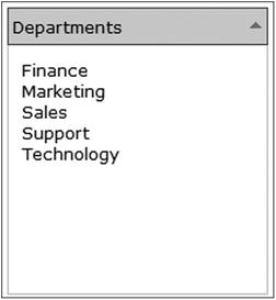
Figure 12-19. Department names are listed in the expander widget
Figure 12-20 displays the collapsed expander widget when the up arrow icon is clicked. It can be expanded by clicking the down arrow icon.
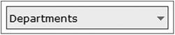
Figure 12-20. Collapsed expander widget
12-6. Displaying a Collection of Nested Lists Using the Listmenu Widget
Problem
You want to display nested lists using the listmenu widget.
Solution
The following jQuery syntax is used to create the listmenu widget:
$("#widgetId").jqxListMenu(options);
where options is the map object with jqxListMenu-specific parameterName and parameterValue pairs.
Listing 12-7 demonstrates an example to display the nested list using the listmenu widget.
Listing 12-7. Display nested lists
<!DOCTYPE html>
<html lang="en">
<head>
      <meta charset="utf-8">
      <meta name="viewport" content="width=device-width, initial-scale=1">
      <title>jqWidget - ListMenu</title>

      <link rel="stylesheet" href="styles/jqx.base.css"/>
      <script src="scripts/jquery-2.1.0.min.js"></script>
      <script src="scripts/jqx-all.js"></script>

      <style>
              label {float:left; display:block; width: 100px; font-weight: bold; }
      </style>

      <script>
              $(function () {
                    $('#list').jqxListMenu({ width: 300, enableScrolling: false, showHeader: true,
                                           showBackButton: true });
              });
      </script>
</head>

<body>
<ul id="list" data-role="listmenu">
    <li>Technology
        <ul data-role="listmenu">
            <li>John Smith
                <ul data-role="listmenu" style="width: 225px">
                      <li style="background-color: white;">
                            <div style="text-align:center"><img src="images/man.jpg" width="50%"><br><br><br></div>
                            <label>Name:</label> John Smith<br>
                            <label>Hire Date:</label> June 12th, 2003<br>
                            <label>Salary:</label>$90,000
                    </li>
                </ul>
            </li>
            <li>Michael Jefferson
                <ul data-role="listmenu"  style="width: 225px">
                      <li style="background-color: white;">
                            <div style="text-align:center"><img src="images/man.jpg" width="50%"><br><br><br></div>
                            <label>Name:</label> Michael Jefferson</br>
                            <label>Hire Date:</label> August 20th, 2008</br>
                            <label>Salary:</label>$85,000
                    </li>
                </ul>
            </li>
        </ul>
    </li>

    <li>Finance
        <ul data-role="listmenu">
            <li>Mark Johnson
                <ul data-role="listmenu" style="width: 225px">
                      <li style="background-color: white;">
                            <div style="text-align:center">
                            <img src="images/man.jpg" width="50%"><br><br><br></div>
                            <label>Name:</label> Mark Johnson<br>
                            <label>Hire Date:</label> October 14th, 1999<br>
                            <label>Salary:</label> $285,000
                    </li>
                </ul>
            </li>
        </ul>
    </li>
</ul>
</body>
</html>
How It Works
In Listing 12-7, a listmenu is created by using the following HTML code:
<ul id="list" data-role="listmenu">
                      <li>Item 1
                            <ul data-role="listmenu">
                                    <li>SubItem 1
                                          <ul data-role="listmenu">
                                                  <li>SubItem 1 Details</li>
                                          </ul>
                                    </li>
...
                            </ul>
                      </li>
...
</ul>
JavaScript code:
$('#list').jqxListMenu({ width: 300, enableScrolling: false, showHeader: true,
                       showBackButton: true });
- width specifies the width of the widget.
- enableScrolling specifies if scrolling is allowed or not.
- showHeader specifies if the header is displayed or not.
- showBackButton specifies if the back button is displayed on the header or not.
Figure 12-21 displays the first list. When a department name is clicked, all the employees in the selected departments are displayed. When an employee name is clicked, employee details are displayed.
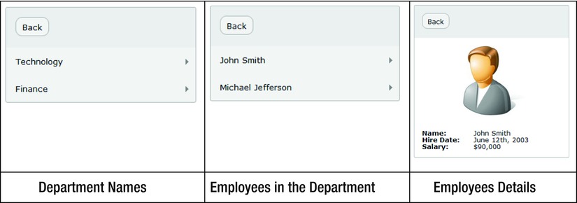
Figure 12-21. Displays the department names and selected employee’s details
12-7. Displaying Content Using the Panel Widget
Problem
You want to create panels to display other widgets or HTML elements.
Solution
The following jQuery syntax is used to create the panel widget:
$("#widgetId").jqxPanel(options);
where options is the map object with jqxPanel-specific parameterName and parameterValue pairs.
Listing 12-8 demonstrates an example to display content within the panel widget.
Listing 12-8. Displaying content in a panel
<!DOCTYPE html>
<html lang="en">
<head>
      <meta charset="utf-8">
      <meta name="viewport" content="width=device-width, initial-scale=1">
      <title>jqWidget - Panel</title>

      <link rel="stylesheet" href="styles/jqx.base.css"/>
      <script src="scripts/jquery-2.1.0.min.js"></script>
      <script src="scripts/jqx-all.js"></script>

      <script>
              $(function () {
                    $("#departments").jqxPanel({ width: 250, height: 250});
              });
      </script>
</head>

<body>
    <div id='departments' style="font-size: 13px; font-family: Verdana; float: left;">
        <div style='margin: 10px;'>
            <h3>Departments</h3></div>
        <!--Content-->
        <div style='white-space: nowrap;'>
            <ul>
                <li>Finance<ol><li>Mark Johnson</li></ol></li><br>
                <li>Marketing<ol><li>Jane Smith</li></ol></li><br>
                <li>Sales<ol><li>Brian Adam</li></ol></li><br>
                <li>Support<ol><li>Mary Jones</li></ol></li><br>
                <li>Technology<ol><li>John Smith</li><li>Michael Jefferson</li></ol></li>
            </ul>
        </div>
    </div>
</body>
</html>
How It Works
In Listing 12-8, a panel is created by using the following HTML code:
<div id='departments'>
        <h3>Departments</h3></div>
        <divContent... </div>
</div>
JavaScript code:
$("#departments").jqxPanel({ width: 250, height: 250});
- width specifies the width of the widget.
- height specifies the height of the widget.
Figure 12-22 displays department names and employees within the department by using the panel widget.

Figure 12-22. Panel widget
12-8. Displaying Content Using the Tabs Widget
Problem
You want to create tabs to display content in different sections.
Solution
The following jQuery syntax is used to create the tabs widget:
$("#widgetId").jqxTabs(options);
where options is the map object with jqxTabs-specific parameterName and parameterValue pairs.
Listing 12-9 creates tabs to display content in multiple sections.
Listing 12-9. Displaying employee details in the tabs
<!DOCTYPE html>
<html lang="en">
<head>
      <meta charset="utf-8">
      <meta name="viewport" content="width=device-width, initial-scale=1">
      <title>jqWidget - Tabs</title>

      <link rel="stylesheet" href="styles/jqx.base.css"/>
      <script src="scripts/jquery-2.1.0.min.js"></script>
      <script src="scripts/jqx-all.js"></script>

     <script>
                    var employeeData = {
        "employees":
          [
             {"employeeId": 1, "managerId": 0, "name": "Mark Johnson", "department": "Finance", "salary": "$285,000"},
             {"employeeId": 2, "managerId": 1, "name": "Jane Smith", "department": "Marketing", "salary": "$95,000"},
             {"employeeId": 3, "managerId": 1, "name": "John Smith", "department": "Technology", "salary": "$90,000"},
             {"employeeId": 4, "managerId": 1, "name": "Brian Adam", "department": "Sales", "salary": "$72,000"},
             {"employeeId": 5, "managerId": 1, "name": "Mary Jones", "department": "Support", "salary": "$60,000"},
             {"employeeId": 6, "managerId": 3, "name": "Michael Jefferson", "department": "Technology", "salary":"$85,000"}
         ]
       }

              function getData() {
                            var items = [];

                            items.push( "<tr><th>Employee Name</th><th>Department</th><th>Salary</th></tr>" );

                            $.each(employeeData.employees, function( i, item ) {
                            items.push( "<tr><td>" + item.name + "</td><td>" + item.department + "</
                            td><td>" + item.salary + "</td></tr>" );
                            });

                            $("#allEmployees").empty();
                            $("#allEmployees").append("<table border='0' width='50%''>" + items.join("") + "</table>");
              }

              $(function () {
                    $('#departmentEmployees').jqxTabs({ width: 750, height: 250 });

                    $('#departmentEmployees').on('selected', function (event) {
                            var item = event.args.item;
                            var selectedHeader = $('#departmentEmployees').jqxTabs('getTitleAt', item);
                            $("#msg").html("Seleted tab: " + selectedHeader);

                            if (selectedHeader == "All Employees") {
                                  getData();
                            }
                    });

                    $("#msg").html("Seleted tab: " + $("li:first-child").text());
              });
       </script>
</head>

<body>
    <div id='departmentEmployees'>
        <ul style='margin-left: 20px;'>
            <li>Finance</li>
            <li>Marketing</li>
            <li>Sales</li>
            <li>Support</li>
            <li>Technology</li>
            <li>All Employees</li>
        </ul>

        <!-- Content for 1st Tab -->
        <!-- Content can have any valid html structure / element -->
        <div>Mark Johnson</div>

        <!-- Content for 2nd Tab -->
        <div>Jane Smith</div>

        <!-- Content for 3rd Tab -->
        <div>Brian Adam</div>

        <!-- Content for 4th Tab -->
        <div>Mary Jones</div>

        <!-- Content for 5th Tab -->
        <div>
            John Smith<br>
            Michael Jefferson
        </div>

        <!-- Content for 6th Tab -->
        <div id="allEmployees"></div>
    </div><br>

    <div id="msg"></div>
</body>
</html>
How It Works
In Listing 12-9, tabs are created by using the following HTML code:
<div id='departmentEmployees'>
        <ul>
              <li>Tab 1</li>
              <li>Tab 2</li>
              ...
        </ul>

        <div>Tab 1 Content ...</div>
        <div>Tab 2 Content ...</div>
         ...
</div>
JavaScript code:
$('#departmentEmployees').jqxTabs({ width: 750, height: 250 });
- width specifies the width of the widget.
- height specifies the height of the widget.
When the All Employees tab is clicked, the following code is executed to retrieve the data from the server and to build the HTML string:
$.getJSON(url, function (data) {

        var items = [];

        items.push( "<tr><th>Employee Name</th><th>Department</th><th>Salary</th></tr>" );

        $.each( data.employees, function( i, item ) {
              items.push( "<tr><td>" + item.name + "</td><td>" + item.department + "</td><td>" +
               item.salary + "</td></tr>" );
        });

        $("#allEmployees").empty();
        $("#allEmployees").append("<table border='0' width='50%''>" + items.join("") + "</table>");
});
Figure 12-23 displays the employees list when a department name tab is selected.
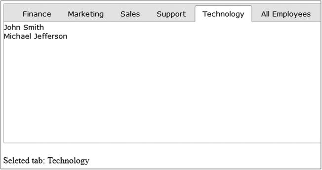
Figure 12-23. Employees list in department tabs
Figure 12-24 displays all the employees’ details when the All Employees tab is selected.
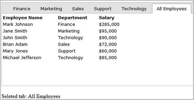
Figure 12-24. Displaying the employees details
12-9. Displaying Hierarchical Content Using the Tree Widget
Problem
You want to create the tree structure to display hierarchical content.
Solution
The following jQuery syntax is used to create the tree widget:
$("#widgetId").jqxTree(options);
where options is the map object with jqxTree-specific parameterName and parameterValue pairs.
Listing 12-10 displays hierarchical content in the tree structure.
Listing 12-10. Display employees within a department using the tree widget
<!DOCTYPE html>
<html lang="en">
<head>
      <meta charset="utf-8">
      <meta name="viewport" content="width=device-width, initial-scale=1">
      <title>jqWidget - Tree</title>

      <link rel="stylesheet" href="styles/jqx.base.css"/>
      <script src="scripts/jquery-2.1.0.min.js"></script>
      <script src="scripts/jqx-all.js"></script>

      <script>
              $(function () {
                    $('#departments').jqxTree({ height: '300px', width: '300px' });
              });
    </script>
</head>

<body>
   <div id='departments'>
        <ul>
            <li item-expanded='true'>Departments
              <ul>
                  <li>Finance<ul><li>Mark Johnson</li></ul></li>
                  <li>Technology<ul><li>John Smith</li><li>Michael Jefferson</li></ul></li>
                  <li>Sales<ul><li>Brian Adam</li></ul></li>
                  <li>Support<ul><li>Mary Jones</li></ul></li>
                  <li>Marketing<ul><li>Jane Smith</li></ul></li>
              </ul>
            </li>
        </ul>
    </div>
</body>
</html>
How It Works
In Listing 12-10, the tree widget is created by using the following HTML code:
<div id='departments'>
        <ul>
              <li item-expanded='true'>Root Node
                      <ul>
                            <li>Child Node 1
                                <ul><li>Content</li>...</ul>
                             </li>
                             ...
                       </ul>
              </li>
        </ul>
</div>
JavaScript code:
$('#departments').jqxTree({ height: '300px', width: '300px' });
- width specifies the width of the widget.
- height specifies the height of the widget.
Figure 12-25 displays Departments as the root node and the department names as the child nodes.
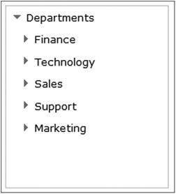
Figure 12-25. Department names are displayed as tree nodes
Figure 12-26 displays the list of employees when a department name is expanded.
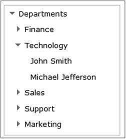
Figure 12-26. Employees list in the department nodes
12-10. Displaying Tabular Data Using the Grid Widget
Problem
You want to create a grid to display tabular data.
Solution
The following jQuery syntax is used to create the grid widget:
$("#widgetId").jqxGrid(options);
where options is the map object with jqxGrid-specific parameterName and parameterValue pairs.
Listing 12-11 demonstrates an example to display tabular data using the grid widget.
Listing 12-11. Display employees records using the grid widget
<!DOCTYPE html>
<html lang="en">
<head>
      <meta charset="utf-8">
      <meta name="viewport" content="width=device-width, initial-scale=1">
      <title>jqWidget - Grid</title>

      <link rel="stylesheet" href="styles/jqx.base.css"/>
      <script src="scripts/jquery-2.1.0.min.js"></script>
      <script src="scripts/jqx-all.js"></script>

      <script>
          var employeeData = {
           "employees":
            [
             {"employeeId": 1, "managerId": 0, "name": "Mark Johnson", "department": "Finance", "salary": "$285,000"},
             {"employeeId": 2, "managerId": 1, "name": "Jane Smith", "department": "Marketing", "salary": "$95,000"},
             {"employeeId": 3, "managerId": 1, "name": "John Smith", "department": "Technology", "salary": "$90,000"},
             {"employeeId": 4, "managerId": 1, "name": "Brian Adam", "department": "Sales", "salary": "$72,000"},
             {"employeeId": 5, "managerId": 1, "name": "Mary Jones", "department": "Support", "salary": "$60,000"},
             {"employeeId": 6, "managerId": 3, "name": "Michael Jefferson", "department": "Technology", "salary":"$85,000"}
            ]
          }

              $(function () {
                    var source =
                            {
                                  datatype: "json",
                                  datafields: [
                                          { name: 'name', type: 'string' },
                                          { name: 'department', type: 'string' },
                                          { name: 'salary', type: 'string' }
                                  ],
                                  id: 'employeeId',
                                  localdata: employeeData
                            };

                    var dataAdapter = new $.jqx.dataAdapter(
                                                        source,
                                                          {
                                                                loadError: function(jqXHR, status, errorMsg) {
                                                                      alert(status + ": " + errorMsg);
                                                                },

                                                                loadComplete: function() {
                                                                      // tasks to be performed on successful data retrieval
                                                                }
                                                        });

                    $("#employeeGrid").jqxGrid(
                            {
                                  width: 375,
                                  source: dataAdapter,
                                  columnsresize: true,
                                  columns: [
                                          { text: 'Name', datafield: 'name', width: 150 },
                                          { text: 'Department', datafield: 'department', width: 125 },
                                          { text: 'Salary', datafield: 'salary', width: 100, align: 'right', cellsalign: 'right' }
                                  ]
                    });
              });
      </script>
</head>

<body>
      <div id='jqxWidget'>
              <div id="employeeGrid"></div>
      </div>
</body>
</html>
How It Works
In Listing 12-11, a grid widget is created by using the following HTML code:
<div id="employeeGrid"></div>
JavaScript code:
$("#employeeGrid").jqxGrid(
        {
              width: 375,
              source: dataAdapter,
              columnsresize: true,
              columns: [
                      { text: 'Name', datafield: 'name', width: 150 },
                      { text: 'Department', datafield: 'department', width: 125 },
                      { text: 'Salary', datafield: 'salary', width: 100, align: 'right', cellsalign: 'right' }
              ]
});
- width specifies the width of the widget.
- source specifies the data source. In this case it is a dataAdapter, which is populated with the data from employeeData.
- columnsresize specifies if the user is allowed to resize the columns or not.
- columns is the collection of column objects. Each object contains:
- text specifies the column heading.
- datafield is the name of the field in the dataAdapter.
- width specifies the column width.
- align specifies the alignment of the columns’ heading.
- cellsalign specifies the alignment of the data.
Figure 12-27 displays employees’ details in the grid widget.
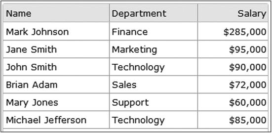
Figure 12-27. Employees’ details in the grid widget
Using AJAX Calls
If you want to make an AJAX call to get the data instead of using local data, you can set the source as follows:
var source =
        {
              datatype: "json",
              datafields: [
                      { name: 'name', type: 'string' },
                      { name: 'department', type: 'string' },
                      { name: 'salary', type: 'string' }
              ],
              id: 'employeeId',
              url: "employees.json"
        };
Listing 12-2 contains content of the employees.json file.
12-11. Displaying Tabular Data Using the Data Table Widget
Problem
You want to create a data table to display tabular data.
Solution
The following jQuery syntax is used to create the data table widget:
$("#widgetId").jqxDataTable(options);
where options is the map object with jqxDataTable-specific parameterName and parameterValue pairs.
Listing 12-12 demonstrates an example to display tabular data using the data table widget.
Listing 12-12. Display employees records using the data table widget
<!DOCTYPE html>
<html lang="en">
<head>
      <meta charset="utf-8">
      <meta name="viewport" content="width=device-width, initial-scale=1">
      <title>jqWidget - DataTable</title>

      <link rel="stylesheet" href="styles/jqx.base.css"/>
      <script src="scripts/jquery-2.1.0.min.js"></script>
      <script src="scripts/jqx-all.js"></script>

      <script>
           var employeeData = {
           "employees":
            [
             {"employeeId": 1, "managerId": 0, "name": "Mark Johnson", "department": "Finance", "salary": "$285,000"},
             {"employeeId": 2, "managerId": 1, "name": "Jane Smith", "department": "Marketing", "salary": "$95,000"},
             {"employeeId": 3, "managerId": 1, "name": "John Smith", "department": "Technology", "salary": "$90,000"},
             {"employeeId": 4, "managerId": 1, "name": "Brian Adam", "department": "Sales", "salary": "$72,000"},
             {"employeeId": 5, "managerId": 1, "name": "Mary Jones", "department": "Support", "salary": "$60,000"},
             {"employeeId": 6, "managerId": 3, "name": "Michael Jefferson", "department": "Technology", "salary": "$85,000"}
            ]
           }

              $(function () {
                    // Set Data Source
                    var source = {
                            datatype: "json",
                            datafields: [
                                  { name: 'name', type: 'string' },
                                  { name: 'department', type: 'string' },
                                  { name: 'salary', type: 'string' }
                            ],
                            id: 'employeeId',
                            localdata: employeeData
                    };

                    var dataAdapter = new $.jqx.dataAdapter(source);

                    // Static data can also be used in place of getting data at the runtime
                    $("#employeeTable").jqxDataTable({
                            source: dataAdapter,
                            sortable: true,
                            columns: [
                                  { text: 'Name', datafield: 'name', width: 150 },
                                  { text: 'Department', datafield: 'department', width: 125 },
                                  { text: 'Salary', datafield: 'salary', width: 100, align: 'right', cellsalign: 'right' }
                            ]
                    });
              });
      </script>
</head>

<body>
      <div id='jqxWidget'>
              <div id="employeeTable"></div>
      </div>
</body>

</html>
How It Works
In Listing 12-12, a data table widget is created by using the following HTML code:
<div id="employeeTable"></div>
JavaScript code:
$("#employeeTable").jqxDataTable({
        source: dataAdapter,
        sortable: true,
        columns: [
              { text: 'Name', datafield: 'name', width: 150 },
              { text: 'Department', datafield: 'department', width: 125 },
              { text: 'Salary', datafield: 'salary', width: 100, align: 'right', cellsalign: 'right' }
        ]
});
- source specifies the data source. In this case it is a dataAdapter, which is populated with the data from employeeData.
- sortable specifies if the user is allowed to sort the data by clicking at the column header or not.
- columns is the collection of column objects. Each object contains the following:
- text specifies the column heading.
- datafield is the name of the field in the dataAdapter.
- width specifies the column width.
- align specifies the alignment of the columns’ heading.
- cellsalign specifies the alignment of the data.
Figure 12-28 displays employees’ details in the data table widget.
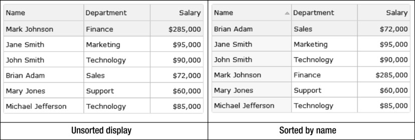
Figure 12-28. Employees’ details in the data table widget
12-12. Displaying Hierarchical Data Using the Tree Grid Widget
Problem
You want to create a tree grid to display hierarchical data.
Solution
The following jQuery syntax is used to create the tree grid widget:
$("#widgetId").jqxTreeGrid(options);
where options is the map object with jqxTreeGrid-specific parameterName and parameterValue pairs.
Listing 12-13 displays hierarchical data using the tree grid widget.
Listing 12-13. Display employees records using the tree grid widget
<!DOCTYPE html>
<html lang="en">
<head>
      <meta charset="utf-8">
      <meta name="viewport" content="width=device-width, initial-scale=1">
      <title>jqWidgets - TreeGrid</title>

      <link rel="stylesheet" href="styles/jqx.base.css"/>
      <script src="scripts/jquery-2.1.0.min.js"></script>
      <script src="scripts/jqx-all.js"></script>

      <script>
           var employeeData = {
           "employees":
            [
             {"employeeId": 1, "managerId": 0, "name": "Mark Johnson", "department": "Finance", "salary": "$285,000"},
             {"employeeId": 2, "managerId": 1, "name": "Jane Smith", "department": "Marketing", "salary": "$95,000"},
             {"employeeId": 3, "managerId": 1, "name": "John Smith", "department": "Technology", "salary": "$90,000"},
             {"employeeId": 4, "managerId": 1, "name": "Brian Adam", "department": "Sales", "salary": "$72,000"},
             {"employeeId": 5, "managerId": 1, "name": "Mary Jones", "department": "Support", "salary": "$60,000"},
             {"employeeId": 6, "managerId": 3, "name": "Michael Jefferson", "department": "Technology", "salary": "$85,000"}
            ]
           }

              $(function () {
                    // Set the data source
                    var source = {
                            datatype: "json",
                            datafields: [
                                  { name: 'employeeId', type: 'int' },
                                  { name: 'managerId', type: 'int' },
                                  { name: 'name', type: 'string' },
                                  { name: 'department', type: 'string' },
                                  { name: 'salary', type: 'string' }
                              ],
                hierarchy:
                {
                    keyDataField: { name: 'employeeId' },
                    parentDataField: { name: 'managerId' }
                },
                id: 'employeeId',
                localdata: employeeData
            };

            // Get the data
            var dataAdapter = new $.jqx.dataAdapter(source);

            // Create Tree Grid with the data
            $("#employeesTreeGrid").jqxTreeGrid({
                width: 355,
                source: dataAdapter,
                columns: [
                  { text: 'Employee Name', dataField: 'name', width: 175 },
                  { text: 'Department', dataField: 'department', width: 100 },
                  { text: 'Salary', dataField: 'salary', width: 80, align: 'right', cellsalign: 'right'}
                ]
            });
        });
    </script>
</head>
<body>
    <div id="employeesTreeGrid"></div>
</body>
</html>
How It Works
In Listing 12-13, a tree grid widget is created by using the following HTML code:
<div id="employeesTreeGrid"></div>
JavaScript code:
$("#employeesTreeGrid").jqxTreeGrid( {
        width: 355,
        source: dataAdapter,
        columns: [
              { text: 'Employee Name', dataField: 'name', width: 175 },
              { text: 'Department', dataField: 'department', width: 100 },
              { text: 'Salary', dataField: 'salary', width: 80, align: 'right', cellsalign: 'right'}
        ]
});
- width specifies the width of the widget.
- source specifies the data source. In this case it is a dataAdapter, which is populated with the data from employeeData.
- columns is the collection of column objects. Each object contains the following:
- text specifies the column heading.
- datafield is the name of the field in the dataAdapter.
- width specifies the column width.
- align specifies the alignment of the columns’ heading.
- cellsalign specifies the alignment of the data.
Figure 12-29 displays employees’ details in the tree grid widget.
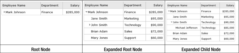
Figure 12-29. Employees’ details in the tree grid widget
12-13. Displaying HTML Elements Within a Window
Problem
You want to create a window on the web page to display a group of related HTML elements or another web page.
Solution
The following jQuery syntax is used to create the window widget:
$("#widgetId").jqxWindow(options);
where options is the map object with jqxWindow-specific parameterName and parameterValue pairs.
Window can be created as a model window to block users from interacting with the underlying interface. It is draggable and resizable.
Listing 12-14 displays HTML contents within the window widget.
Listing 12-14. Display images in the window widget
<!DOCTYPE html>
<html lang="en">
<head>
      <meta charset="utf-8">
      <meta name="viewport" content="width=device-width, initial-scale=1">
      <title>jqWidget - Window</title>

      <link rel="stylesheet" href="styles/jqx.base.css"/>
      <script src="scripts/jquery-2.1.0.min.js"></script>
      <script src="scripts/jqx-all.js"></script>

      <script>
              $(function () {
                    $("#jqxwindow ").jqxWindow({ height:150, width: 750});
              });
      </script>
</head>

<body>
      <div id='jqxWidget'>
              <div id='jqxwindow'>
                    <div>Flowers</div>
                    <div>
                            <img src="images/Flower_1.jpg" height="80%">
                            <img src="images/Flower_2.jpg" height="80%">
                            <img src="images/Flower_3.jpg" height="80%">
                            <img src="images/Flower_4.jpg" height="80%">
                            <img src="images/Flower_5.jpg" height="80%">
                    </div>
              </div>
         </div>
</body>
</html>
How It Works
In Listing 12-14, the window widget is created by using the following HTML code:
<div id='jqxwindow'>
        <div>Header</div>
        <div>HTML Elements as the content</div>
</div>
JavaScript code:
$("#jqxwindow ").jqxWindow({ height:150, width: 750});
- width specifies the width of the widget.
- height specifies the height of the widget.
Figure 12-30 displays images in a window widget.
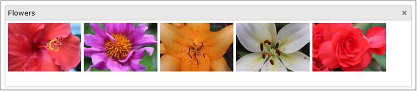
Figure 12-30. Images in a window widget
To display another web page within the window widget, you can use the <iframe> HTML element.
12-14. Viewing Contents in Multiple Dockable Windows
Problem
You want to create multiple windows on a web page that can be dragged, docked, and closed.
Solution
The following jQuery syntax is used to create the docking widget:
$("#widgetId").jqxDocking(options);
where options is the map object with jqxDocking-specific parameterName and parameterValue pairs.
Windows are draggable and resizable.
Listing 12-15 displays HTML contents in the docking widget.
Listing 12-15. Display departments’ and employees’ in the docakable windows
<!DOCTYPE html>
<html lang="en">
<head>
      <meta charset="utf-8">
      <meta name="viewport" content="width=device-width, initial-scale=1">
      <title>jqWidget - Docking</title>

      <link rel="stylesheet" href="styles/jqx.base.css"/>
      <script src="scripts/jquery-2.1.0.min.js"></script>
      <script src="scripts/jqx-all.js"></script>

      <script>
              $(function () {
                    $("#docking").jqxDocking({ width: 250});
              });
    </script>
</head>

<body>
    <div id="docking">
        <div>
            <div id="technology">
                <div>Technology</div><div>John Smith<br>Michael Jefferson</div>
            </div>

            <div id="finance">
                <div>Finance</div><div>Mark Johnson</div>
            </div>

            <div id="marketing">
                <div>Marketing</div><div>Jane Smith</div>
            </div>

           <div id="sales">
                <div>Sales</div><div>Brian Adam</div>
            </div>

            <div id="support">
                <div>Support</div><div>Mary Jones</div>
            </div>
        </div>
    </div>
</body>
</html>
How It Works
In Listing 12-15, a docking widget is created by using the following HTML code:
<div id="docking">
        <div>
              <div id="dockingId1">
                      <div>Header 1</div><div>Content 1</div>
              </div>

              <div id="dockingId2">
                      <div>Header 2</div><div>Content 2</div>
              </div>
              ...
        </div>
</div>
JavaScript code:
$("#docking").jqxDocking({ width: 250});
- width specifies the width of the widget.
Figure 12-31 displays the department name and the employees’ names in the department in the docking widget. Each department can be dragged to a different position or closed.
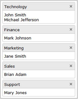
Figure 12-31. Departments’ and employees’ names listed in the dockable windows widget
12-15. Creating Charts
Problem
You want to create charts by using chart widget.
Solution
The following jQuery syntax is used to create the tree grid widget:
$("#widgetId").jqxChart(options);
where options is the map object with jqxChart-specific parameterName and parameterValue pairs.
Listing 12-16 demonstrates an example to display HTML contents in the window widget.
Listing 12-16. Display departments and employees in docakable windows
<!DOCTYPE html>
<html lang="en">
<head>
      <meta charset="utf-8">
      <meta name="viewport" content="width=device-width, initial-scale=1">
      <title>jqWidget - Chart</title>

      <link rel="stylesheet" href="styles/jqx.base.css"/>
      <script src="scripts/jquery-2.1.0.min.js"></script>
      <script src="scripts/jqx-all.js"></script>

      <script>
             var dataAdapter;

             var precipitationData = {
                     "precipitation":
                             [
                                { "Month": "January", "Chicago": 3, "Los Angeles": 5, "New York": 5},
                                { "Month": "February", "Chicago": 3, "Los Angeles": 6, "New York": 4},
                                { "Month": "March", "Chicago": 4, "Los Angeles": 4, "New York": 5},
                                { "Month": "April", "Chicago": 4, "Los Angeles": 2, "New York": 5},
                                { "Month": "May", "Chicago": 6, "Los Angeles": 1, "New York": 5},
                                { "Month": "June", "Chicago": 6, "Los Angeles": 1, "New York": 5},
                                { "Month": "July", "Chicago": 4, "Los Angeles": 1, "New York": 6},
                                { "Month": "August", "Chicago": 4, "Los Angeles": 1, "New York": 5},
                                { "Month": "September", "Chicago": 4, "Los Angeles": 1, "New York": 5},
                                { "Month": "October", "Chicago": 4, "Los Angeles": 2, "New York": 4},
                                { "Month": "November", "Chicago": 4, "Los Angeles": 2, "New York": 5},
                                { "Month": "December", "Chicago": 3, "Los Angeles": 4, "New York": 5}
                            ]
                    }

              function getOptions(chartType) {
                    // Set Chart Settings
                    var options = {
                            title: "Precipitation Monthly Graph",
                            description: "[ Year 2013 ]",
                            padding: { left: 5, top: 5, right: 5, bottom: 5 },
                            titlePadding: { left: 90, top: 0, right: 0, bottom: 10 },
                            source: dataAdapter,
                            categoryAxis: {
                            dataField: 'Month',
                            showGridLines: false
                    },
                    colorScheme: 'scheme01',
                    seriesGroups:
                    [
                            {
                                  type: chartType,
                                  columnsGapPercent: 30,
                                  seriesGapPercent: 0,
                                  valueAxis:
                                 {
                                           minValue: 0,
                                           maxValue: 15,
                                           unitInterval: 1,
                                           description: '(in inches)'
                                  },
                                  series: [
                                           { dataField: 'Chicago', displayText: 'Chicago, IL'},
                                           { dataField: 'Los Angeles', displayText: 'Los Angeles, CA'},
                                           { dataField: 'New York', displayText: 'New York, NY'}
                                  ]
                             }
                          ]
                    };

                    return(options);
              }

               $(function () {
             // Set Data Source
             var source =
             {
                 datatype: "json",
                 datafields: [
                     { name: 'Month', type: 'string' },
                     { name: 'Chicago', type: 'int' },
                     { name: 'Los Angeles', type: 'int' },
                     { name: 'New York', type: 'int' }
                 ],
                 localdata: precipitationData
             };

             dataAdapter = new $.jqx.dataAdapter(source);

            // Create Chart
            $('#chartContainer').jqxChart(getOptions($("#chartType").val()));

            $("#chartType").on("change", function() {
               $('#chartContainer').jqxChart(getOptions($("#chartType").val()));
            });
        });
    </script>
</head>

<body>
      <label>Chart Type:</label>
              <select id="chartType">
                    <option value="column" selected="selected">Column</option>
                    <option value="line">Line</option>
                    <option value="stackedcolumn">Stacked Column</option>
              </select><br><br><br>

      <div id='chartContainer' style="width:600px; height: 400px"></div>
</body>
</html>
How It Works
Each record in the precipitation record has the month name and precipitation level for three major cities: Chicago, Los Angeles, and New York. In Listing 12-16, the following HTML code creates the chart widget:
<div id='chartContainer' style="width:600px; height: 400px"></div>
JavaScript code:
$('#chartContainer').jqxChart(getOptions($("#chartType").val()));
- The getOptions() function returns the chart options.
- $("#chartType").val() contains the value of the chart selected by the user from the drop-down. The possible values are column, line, and stackedcolumn.
The following is the list of main options set in the function getOptions():
- title specifies the title of the chart.
- description specifies the second line of the chart header after the title.
- source specifies the data source. In this example, data source is dataAdapter, which contains the data from precipitationData.
- categoryAxis’s dataField specifies which data field from the dataAdapter is used for X axis.
- type specifies type of the chart. Some of the chart types include column, line, stackedcolumn, and pie.
- valueAxis specifies the properties for the Y axis.
- series specifies the data to be displayed on the Y axis, the mapping of data fields in dataAdapter, and the text to be displayed on the chart.
Figure 12-32 displays a column chart showing the monthly level of precipitation for the three cities in 2013.
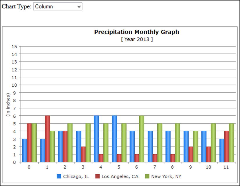
Figure 12-32. Column chart
Figure 12-33 displays a line chart of precipitation levels for the three cities in 2013.
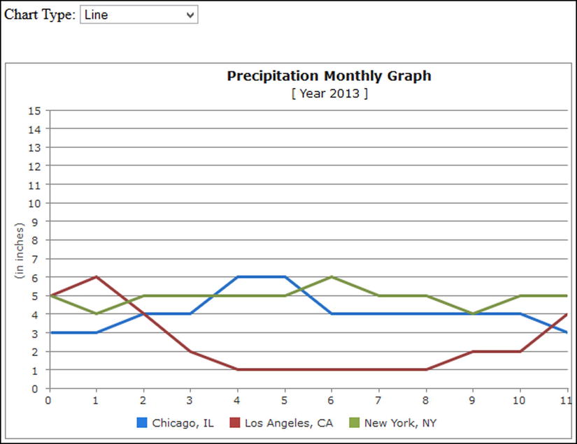
Figure 12-33. Line chart
Figure 12-34 displays a stacked column chart of monthly precipitation levels for the three cities in 2013.
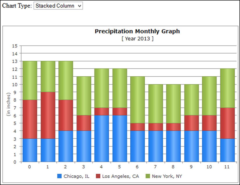
Figure 12-34. Stacked column chart
12-16. Creating a Calendar
Problem
You want to create a calendar that can be used in applications like appointment schedulers.
Solution
The following jQuery syntax is used to create the calendar widget:
$("#widgetId").jqxCalendar(options);
where options is the map object with jqxCalendar-specific parameterName and parameterValue pairs.
Listing 12-17 creates a calendar widget.
Listing 12-17. Create a calendar widget
<!DOCTYPE html>
<html lang="en">
<head>
      <meta charset="utf-8">
      <meta name="viewport" content="width=device-width, initial-scale=1">
      <title>jqWidget - Calendar</title>

      <link rel="stylesheet" href="styles/jqx.base.css"/>
      <script src="scripts/jquery-2.1.0.min.js"></script>
      <script src="scripts/jqx-all.js"></script>

      <script>
              $(function () {
                    $("#appointmentCalendar").jqxCalendar({ width: '250px', height: '250px'});

                    $('#appointmentCalendar').on('valuechanged', function (event) {
                            var date = event.args.date;
                            $("#msg").html("Selected Date: " + date.toDateString());
                    });
              });
      </script>
</head>

<body>
      <div id='jqxWidget'>
              <div id='appointmentCalendar'></div>
      </div><br>
      <div id="msg"></div>
</body>
</html>
How It Works
In Listing 12-17, a calendar widget is created by using the following HTML code:
<div id='appointmentCalendar'></div>
JavaScript code:
$("#appointmentCalendar").jqxCalendar({ width: '250px', height: '250px'});
- width specifies the width of the widget.
- height specifies the height of the widget.
An event handler is registered for the calendar widget for the event valuechanged. When a date is selected from the widget, this event handler is executed and it gets the selected date using the following code:
var date = event.args.date;
To get the value as a date object, use $('#appointmentCalendar').jqxCalendar('value'). The date object can be converted to a string by using the toDateString() method.
Figure 12-35 displays the calendar widget. Users can scroll through the months and years and select a date.
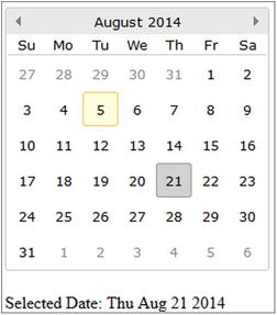
Figure 12-35. Calendar widget
12-17. Creating a Color Picker
Problem
You want to create a color picker.
Solution
The following jQuery syntax is used to create the color picker widget:
$("#widgetId").jqxColorPicker(options);
where options is the map object with jqxColorPicker-specific parameterName and parameterValue pairs.
Listing 12-18 creates a color picker widget.
Listing 12-18. Create a color picker widget
<!DOCTYPE html>
<html lang="en">
<head>
      <meta charset="utf-8">
      <meta name="viewport" content="width=device-width, initial-scale=1">
      <title>jqWidget - Color</title>

      <link rel="stylesheet" href="styles/jqx.base.css"/>
      <script src="scripts/jquery-2.1.0.min.js"></script>
      <script src="scripts/jqx-all.js"></script>

      <script>
              var defaultColor = "257D91";

              $(function () {
                    $("#colorPicker").jqxColorPicker({ color: defaultColor, colorMode: 'hue', width: 220, height: 220});

                    $("#dropDownButton").jqxDropDownButton({ width: 150, height: 22});
                    $('#dropDownButton').val("#" + defaultColor);
                    $('#dropDownButton').css('background-color', "#" + defaultColor);

                    $("#colorPicker").on('colorchange', function (event) {
                            $('#dropDownButton').val("#" + event.args.color.hex);
                            $('#dropDownButton').css('background-color', "#" + event.args.color.hex);
                    });
              });
      </script>
</head>

<body>
      <div style="margin: 3px; float: left;" id="dropDownButton">
              <div style="padding: 3px;">
                    <div id="colorPicker"></div>
              </div>
    </div>
</body>
</html>
How It Works
In Listing 12-18, a color picker widget is created by using the following HTML code:
<div id="colorPicker"></div>
JavaScript code:
var defaultColor = "257D91";
$("#colorPicker").jqxColorPicker({ color: defaultColor, colorMode: 'hue', width: 220, height: 220});
- color specifies the default color selected in the color picker.
- colorMode specifies the color mode of the color picker. Valid values are hue and saturation.
- width specifies the width of the widget.
- height specifies the height of the widget.
An event handler is registered for the color picker widget for the colorchange event. When a new color is selected from the widget, this event handler is executed The event handler gets the selected color and then sets the value and the background color of the drop-down widget by using the following code:
$('#dropDownButton').val("#" + event.args.color.hex);
        $('#dropDownButton').css('background-color', "#" + event.args.color.hex);
Figure 12-36 displays the color picker widget from which users choose a color.

Figure 12-36. Color picker widget
12-18. Creating an Editor Widget
Problem
You want to create an editor widget.
Solution
The following jQuery syntax is used to create the editor widget:
$("#widgetId").jqxEditor(options);
where options is the map object with jqxEditor-specific parameterName and parameterValue pairs.
Listing 12-19 demonstrates an example to create the editor widget. In the editor widget, the user can enter text or data, format it, align it, change the font name and font size, and perform other basic functions of an editor.
Listing 12-19. Display departments and employees in docakable windows
<!DOCTYPE html>
<html lang="en">
<head>
      <meta charset="utf-8">
      <meta name="viewport" content="width=device-width, initial-scale=1">
      <title>jqWidget - Editor</title>

      <link rel="stylesheet" href="styles/jqx.base.css"/>
      <script src="scripts/jquery-2.1.0.min.js"></script>
      <script src="scripts/jqx-all.js"></script>

      <script>
              $(function () {
                    $('#editor').jqxEditor({height: "600px",width: "800px"});
              });
      </script>
</head>
<body>
    <textarea id="editor"></textarea>
</body>
</html>
How It Works
In Listing 12-19, the following HTML code creates the editor widget:
<textarea id="editor"></textarea>
JavaScript code:
$('#editor').jqxEditor({height: "600px",width: "800px"});
- width specifies the width of the widget.
- height specifies the height of the widget.
Figure 12-37 displays the editor widget. Users can use it to enter text or data and perform basic editing and formatting operations.
Figure 12-37. Editor widget
12-19. Creating a Menu
Problem
You want to create the menu widget.
Solution
The following jQuery syntax is used to create the menu widget:
$("#widgetId").jqxMenu(options);
where options is the map object with jqxMenu-specific parameterName and parameterValue pairs.
Listing 12-20 demonstrates an example to create the menu widget.
Listing 12-20. Display menu items
<!DOCTYPE html>
<html lang="en">
<head>
      <meta charset="utf-8">
      <meta name="viewport" content="width=device-width, initial-scale=1">
      <title>jqWidget - Menu</title>

      <link rel="stylesheet" href="styles/jqx.base.css"/>
      <script src="scripts/jquery-2.1.0.min.js"></script>
      <script src="scripts/jqx-all.js"></script>

      <script>
              $(function () {
                    // Create Menu
                    $("#jqxMenu").jqxMenu({ width: '150', mode: 'vertical'});
              });
      </script>
</head>

<body>
      <div id='jqxWidget'>
              <div id='jqxMenu'>
                    <ul>
                            <li><a href="#">Home</a></li>

                            <li>Department
                                  <ul>
                                          <li><a href="#">Search Department</a></li>
                                          <li><a href="#">Add Department</a></li>
                                  </ul>
                            </li>

                            <li>Employee
                                  <ul>
                                          <li><a href="#">Search Employee</a></li>
                                          <li><a href="#">Add Employee</a></li>
                                  </ul>
                            </li>

                            <li>Organization Chart</li>

                            <li><a href="#">Help</a></li>
                      </ul>
              </div>
      </div>
</body>
</html>
How It Works
In Listing 12-20, the following HTML code creates the menu widget:
<div id='jqxMenu'>
        <ul>
              <li><a href="#">Menu Item 1</a></li>

              <li>Menu Item 2
                      <ul>
                            <li><a href="#">Submenu Item 1</a></li>
                            <li><a href="#"> Submenu Item 2</a></li>
                      </ul>
              </li>
              ...
        </ul>
</div>
JavaScript code:
$("#jqxMenu").jqxMenu({ width: '150', mode: 'vertical'});
- width specifies the width of the widget.
- mode specifies the display mode for the menu. The valid values are horizontal, vertical, and popup.
Figure 12-38 displays the menu widget with menu items and nested submenu items.
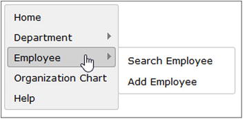
Figure 12-38. Menu widgets
12-20. Creating a Navigation Bar
Problem
You want to create the navigation bar widget.
Solution
The following jQuery syntax is used to create the navigation bar widget:
$("#widgetId").jqxNavigationBar(options);
where options is the map object with jqxNavigationBar-specific parameterName and parameterValue pairs.
Listing 12-21 demonstrates an example to create a navigation bar widget.
Listing 12-21. Create a navigation bar
<!DOCTYPE html>
<html lang="en">
<head>
      <meta charset="utf-8">
      <meta name="viewport" content="width=device-width, initial-scale=1">
      <title>jqWidget - NavigationBar</title>

      <link rel="stylesheet" href="styles/jqx.base.css"/>
      <script src="scripts/jquery-2.1.0.min.js"></script>
      <script src="scripts/jqx-all.js"></script>

      <script>
              $(function () {
                    // Create Navigation Bar
                    $("#navigationBar").jqxNavigationBar({ width: 200, height: 200});
              });
      </script>
</head>

<body>
    <div id='navigationBar'>
        <div>Finance</div>
        <div>Mark Johnson</div>

        <div>Marketing</div>
        <div>Jane Smith</div>

        <div>Sales</div>
        <div>Brian Adam</div>

        <div>Support</div>
        <div>Mary Jones</div>

        <div>Technology</div>
        <div>
              John Smith<br>
              Michael Jefferson
        </div>
    </div>
</body>
</html>
How It Works
In Listing 12-21, the following HTML code creates a navigation bar widget:
<div id='navigationBar'>
        <div>Navigation Bar Header 1</div>
        <div>Content 1</div>

        <div>Navigation Bar Header 2</div>
        <div>Content 2</div>

        ...
</div>
JavaScript code:
$("#navigationBar").jqxNavigationBar({ width: 200, height: 200});
- width specifies the width of the widget.
- height specifies the height of the widget.
Figure 12-39 displays the departments’ names and employees in the navigation bar widget.
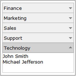
Figure 12-39. Departments and employees in the dockable windows widget
Summary
This chapter covered recipes for creating rich user interface widgets using the jqWidgets framework. The jqWidgets library provides a range of options to fine-tune presentation and functionalities of the widgets. The dataAdapter object is used in some of the recipes to bind backend server data with the UI widgets. You also learned how to use themes to implement a consistent look and feel for the user interface across all the pages on the web site. A complete custom theme can be created or part of the existing theme can be updated to meet your requirements. The chapter covered the following categories of widgets:
- For data entry—Input, Switch Button, DateTime Input, Password Input, Masked Input, Button Group, Radio Button, Checkbox, Button, Validator, Combo box, Drop-Down, Listbox, Range Selector, Slider, Splitter, Tooltip, Progress Bar, and Rating.
- For content grouping—Expander, Listmenu, Panel, Tabs, and Tree.
- For tabular/hierarchical data displays—Grid, Data Table, and Tree Grid.
- For movable view areas—Window and Docking.
- For graphics—Chart.
- For containers—Calendar, Color Picker, and Editor.
- For navigation—Menu and Navigation Bar.