
Basic HTML5 and CSS3
A-1. Using HTML5
In this section of the appendix, I cover the features of HTML5 that are relevant to creating data entry forms and graphics for effects and animations. These concepts are useful for enhancing the recipes in this book.
Previous versions of HTML specifications had a limited number of tags and developers had to use same the tag for various purposes. One of the examples is use of <div> tag for menus, navigations, sidebars, and placeholders. With HTML5 there are tags for each specific purpose. For example, there is <footer>, <article>, <section>, and <nav>. In HTML5, the name of the tag reveals its purpose.
Developers used to have to write many lines of code to achieve and repeat simple tasks. These basic tasks are now integrated into HTML5 so that, by using the proper tags and attributes, you can achieve the same effects without writing specialized code. HTML5 has rich set of graphics and multimedia tags and that makes it a perfect candidate for writing Rich Internet Applications (RIA).
HTML5 is supported to a great extent by the following widely used browsers—Chrome 34, Firefox 29, Safari 5.1 (Windows)/7.0 (MacOS), and Internet Explorer 11.
You can go to http://html5test.com/ to see the list of HTML5 features supported by your browser and to compare its HTML5 compliance rating with other browsers.
Code Structure
The following shows the basic code structure of HTML5 pages:
<!DOCTYPE html>
<html>
<head>
   <meta charset="UTF-8">
</head>
<body>
   Page Content...
</body>
</html>
Structural Elements
Table A-1 lists commonly used structural elements in HTML5.
Table A-1. Structural Elements
|
Element |
Description |
|---|---|
|
<header> |
Contains the header for a page or a section in the page. |
|
<nav> |
Contains a list of navigation links. |
|
<section> |
Specifies a section in the page. |
|
<article> |
Specifies content in a page. |
|
<aside> |
Specifies additional information related to the content in the <article>. |
|
<footer> |
Contains the footer for a page or a section in the page. |
Input Types and Attributes
Refer to Listing A-1 for an example of some of the new input types and validation features in HTML5.
Listing A-1. HTML5 code to create forms with validation and placeholders
<!DOCTYPE html>
<html>
<head>
   <meta charset="UTF-8">
   <title>HTML5 Form</title>
   <script src="scripts/jquery-2.1.0.min.js"></script>
   <style>
       label {
          float:left;
          display:block;
          width: 75px;
       }
   </style>

   <script>
       $(function() {
          $("#personalInfoForm").on("submit", function(eventObj) {
eventObj.preventDefault();

// Ajax call to process the form
alert("Form is being processed...");
          });
       });
   </script>
</head>
<body>
   <form id="personalInfoForm">
       <strong>Registration Form</strong><br><br>
       <label>Name:</label><input type="text" required autofocus><br>
       <label>EMail:</label>
       <input type="email" placeholder="[email protected]"><br>
       <label>SSN:</label>
       <input type="text" pattern="d{3}-d{2}-d{4}" title="999-99-9999"
             placeholder="999-99-9999" required>

       <br><br><input type="submit" value="Register">
   </form>
</body>
</html>
This code requires jQuery library. Make sure that the jquery-2.1.0.min.js file exists in the scripts folder.
If the Name textbox is left blank or an invalid email address is entered for the EMail textbox and the Register button is clicked, a validation error message will be displayed. As shown in the Figure A-1, a message will be displayed if the Register button is clicked and the validation rules are not satisfied.
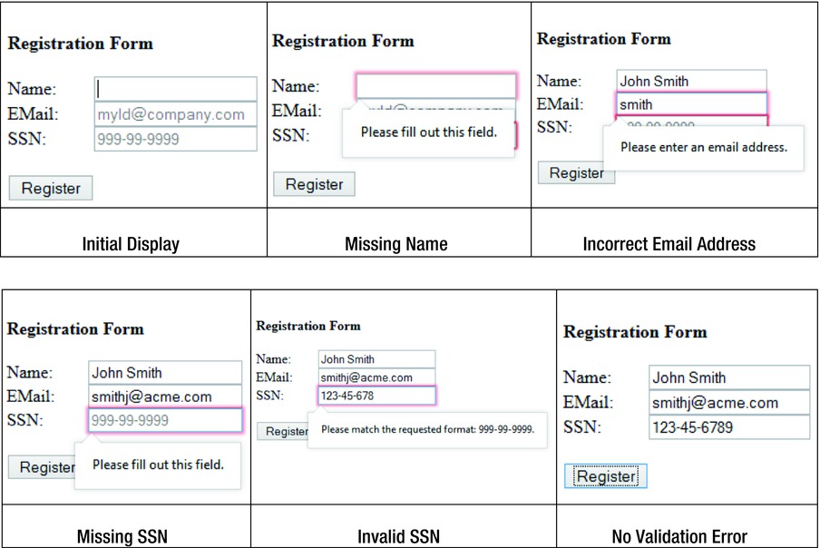
Figure A-1. Registration page in the Firefox browser
In the Apple Safari web browser, this code doesn’t work. Validation error messages are different in different browsers. Table A-2 lists the validation error messages for this example in the Windows operating system.
Table A-2. Validation Error Messages
|
Firefox (29.0.1) |
Internet Explorer (11.0.3) |
Google Chrome (34.0) |
|---|---|---|
|
Please fill out this field. |
This is a required field. |
Please fill out this field. |
|
Please enter an email address. |
You must enter a valid email address. |
Please include an @ in the email address. smith is missing an @. |
|
Please match the requested format: 999-99-9999. |
You must use this format: 999-99-9999 |
Please match the requested format. 999-99-9999 |
In HTML5, there are many built-in validation features. In the previous specifications of HTML, the same effects were achieved either by writing validation routines or by using third-party JavaScript libraries. Some of the commonly used new input types for forms in the HTML5 are:
- Color:
Syntax: <input id="txtColor" type="color">
Figure A-2 displays the color selection palette based on the above code. This works in the Firefox and Chrome browsers only.
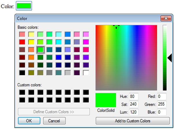
Figure A-2. Color selection palette
- Date
Syntax: <input id="txtDate" type="date">
Figure A-3 displays the date picker control based on the above code. This works in the Chrome browser only.
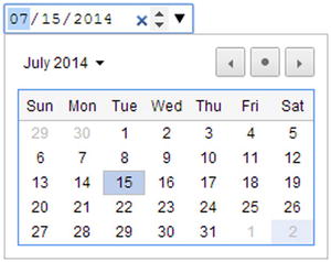
Figure A-3. Date picker control
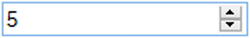
- Number
Syntax: <input id="txtNumber" type="number">
Figure A-4 displays the number spinner control based on the above code. This works in the Firefox, Chrome, and Safari browsers.
Figure A-4. Number spinner control
where minValue and maxValue are numbers.
Figure A-5 displays the number range control based on the above code. This works in the Firefox, Chrome, Safari, and Internet Explorer browsers.
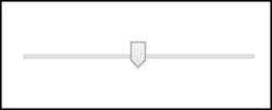
Figure A-5. Number range control
Other new input types not shown here include datetime, month, search, tel, time, url, and week.
Graphics Using Canvas
In HTML5, the <canvas> element is used to draw graphics at runtime. The canvas has (0, 0) coordinates in the top-left corner of the specified canvas rectangle.
Listing A-2 demonstrates an example using HTML5, CSS, and JavaScript to draw a simple rectangle on the canvas.
Listing A-2. Creating a basic shape on the canvas
<!DOCTYPE html>
<html>
<head>
   <meta charset="UTF-8">
   <script src="scripts/jquery-2.1.0.min.js"></script>

   <style>
canvas {
   margin-top: 100px;
   margin-left: 100px;
   border:3px solid green;
       }
   </style>

   <script>
$(function(){
   var canvasElement = document.getElementById("myCanvas");
   var canvasContext = canvasElement.getContext("2d");

   canvasContext.fillStyle = "gray";
   canvasContext.fillRect(25, 25, 50, 50);
});
   </script>
</head>

<body>
   <canvas id="myCanvas" width="200" height="200"></canvas>
</body>
</html>
This code requires the jQuery library. Make sure that the jquery-2.1.0.min.js file exists in the scripts folder.
In the HTML code, the <canvas> folder creates the placeholder for the canvas. The CSS code defines the position and border of the canvas. The JavaScript code gets the reference of the canvas by using the following code. Before you draw anything on the canvas, you need to get the canvas context.
var canvasElement = document.getElementById("myCanvas");
var canvasContext = canvasElement.getContext("2d");
The fill style is set as a solid color—"gray"—and then a rectangle is drawn by using the coordinates (25, 25). The width is 50 pixels and the height is 50 pixels. Use the stroke() method to draw the border. Use the fill() method to fill the shape with the color or gradient specified by the fillStyle property.
The following is the list of common tasks that you can perform on the canvas:
- Draw a line:
canvasContext.moveTo(x1, y1); // First coordinate
canvasContext.lineTo(x2, y2); // Second coordinate
canvasContext.stroke(); - Draw a circle:
// x1,y1 – center coordinate
canvasContext.arc(x1, y1, radius, 0, 2*Math.PI);
canvasContext.stroke(); - Draw a rectangle:
// x1, y1 – top left coordinate
canvasContext.rect(x1, y1, width, height);
canvasContext.stroke(); - Fill a shape with a solid color:
canvasContext.fillStyle= "colorName";
where colorName can be the name of a color (such as grey) or a hex value of the color (such as #ff0000).
- Fill a shape with the linear gradient:
// (x1,y1) and (x2, y2) defines the direction of the gradient
var gradient = canvasContext.createLinearGradient(x1, y1, x2, y2);
// colorName1 and colorName2 defines the start and end color transition
gradient.addColorStop(0,"colorName1");
gradient.addColorStop(1,"colorName2");
canvasContext.fillStyle = gradient;
canvasContext.fill();
A-2. Using CSS3
A cascading stylesheet (CSS) is used to specify the theme, style, and layout of the web pages. CSS3 is the latest standard specification for CSS. Display styles can be applied to various elements of the web page at various levels.
Advantages of Using CSS
The following are some of the advantages of using CSS:
- Centralized location for presentation aspect of the web application. Provides a consistent look and feel for the website. The theme of the whole website can be changed by updating a CSS file and without modifying any of the HTML.
- Styles can be specified at a global level or at the element level, which gives you greater control over how you display an element on the web page.
The following is the syntax to specify CSS properties:
   cssSelector {
      cssProperty1:cssValue1;
   cssProperty2:cssValue12;
...
   }
or as an attribute of the HTML element:
style = "cssProperty1:cssValue1; cssProperty2:cssValue12;... "
Table A-3 lists the CSS selectors’ syntax.
Table A-3. CSS Selectors’ Syntax
|
cssSelector |
Syntax |
Examples |
|---|---|---|
|
HTML element tag |
htmlTag |
div, p, table, tr, td, input |
|
Class name |
.className |
Any user-defined className, such as evenRow and oddRow |
|
HTML element ID |
#id |
<input id="firstName"> (In CSS, it is specified as #firstName.) |
|
HTML element state |
:stateName |
:link, :hover |
CSS Box Model
Figure A-6 displays the box model, which demonstrates the location of the margin, border, and padding in relation to the HTML element.
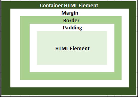
Figure A-6. Box model
The following is a list of CSS properties that set the width of padding, border, and margin of the HTML element with respect to its container HTML element. The top, bottom, left and right margins, as well as the border and padding properties can be set individually or together with one declaration.
- Padding CSS properties—padding, padding-top, padding-bottom, padding-left, and padding-right.
- Border CSS properties—border-width, border-top-width, border-bottom-width, border-left-width, and border-right-width.
- Margin CSS properties—margin, margin-top, margin-bottom, margin-left, and margin-right.
Types of Styles
There are three ways to specify CSS—inline, as an internal stylesheet, and as an external stylesheet. Inline is the least recommended way of using CSS. This form of CSS definition should be used only for quick testing and for verification. All CSS items should be in a single location and not scattered all over the HTML page.
Inline Style
Listing A-3 shows how inline CSS is used.
Listing A-3. Using the inline style
<!DOCTYPE html>
<html lang="en">
<head>
   <meta charset="UTF-8">
   <title>Inline Style</title>
</head>
<body>
   <p style="color:red; text-decoration:underline; margin-left:30px">Test Message</p>
</body>
</html>
Figure A-7 displays the web page segment using the inline style.
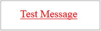
Figure A-7. Text display using the inline style
Internal Stylesheet
Refer to the Listing A-4 to see how internal CSS is used in an HTML file.
Listing A-4. Using an internal stylesheet
<!DOCTYPE html>
<html lang="en">
<head>
   <meta charset="UTF-8">
   <title>Internal Style</title>
   <style>
       p {
          background-color:teal;
          color:white;
          margin-left:30px
       }
   </style>
</head>
<body>
   <p>Paragraph styling using internal style sheet.</p>
<body>
</html>
Figure A-8 displays the web page segment with the internal style.
Figure A-8. Text display using the internal style
External Stylesheet
Refer to Listing A-5 to see how external CSS is used in the HTML page.
Listing A-5. Using an external stylesheet
File Name: myWebApp.css
   p {
       background-color:teal;
       color:white;
       margin-left:30px;
   }

File Name: ExternalStyleSheet.htm
   <!DOCTYPE html>
   <html lang="en">
   <head>
       <meta charset="UTF-8">
       <title>External Style Sheet</title>
       <link rel="stylesheet" type="text/css" href="myWebApp.css">
   </head>
   <body>
       <p>Paragraph styling using external stylesheet.</p>
   <body>
   </html>
Figure A-9 displays the web page segment with the external stylesheet
Figure A-9. Text display using an external stylesheet
This is the preferred way to use a stylesheet in your web application. This approach keeps the style and the content separate. The same external CSS file can be used in multiple HTML pages to get the consistent look and feel across your whole website. You can change the look of your entire website by updating only one file.
Cascading Styles
If more than one style is used for an HTML element, all the styles will cascade into the final style and will be applied to the HTML element using the following priority order (lowest to highest):
- Browser setting
- External stylesheet
- Internal stylesheet
- Inline style
Examples
Rounded Button with Drop Shadow Using CSS
Refer to Listing A-6 to see how to create a rounded button with a drop shadow using CSS and without using a graphics file.
Listing A-6. Creating a rounded button with a drop shadow using CSS
<!DOCTYPE html>
<html lang="en">
<head>
   <meta charset="UTF-8">
   <title>Rounded button with drop-shadow</title>
   <style>
       body { background-color: lightyellow; }

       .rounded-corners {
          -moz-border-radius: 10px;
              -webkit-border-radius: 10px;
              -khtml-border-radius: 10px;
              border-radius: 10px;

          -webkit-box-shadow: 0 1px 2px rgba(0,0,0,.2);
              -moz-box-shadow: 0 1px 2px rgba(0,0,0,.2);
              box-shadow: 0 1px 2px rgba(0,0,0,.2);

              text-shadow: 0 1px 1px rgba(0,0,0,.3);

          background-color: orange;
          width:100px;
          height:30px;
       }
   </style>
</head>
<body>
   <button class="rounded-corners">Submit</button><br/>
</body>
</html>
Figure A-10 displays the rounded button with a drop shadow.
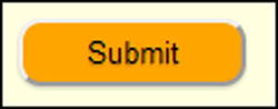
Figure A-10. Rounded button with a drop shadow
The CSS property opacity makes the HTML element opaque. Its value ranges from 0 to 1, where 0 is completely transparent and 1 is no transparency. Figure A-11 displays the same button shown in Figure A-10 after adding 0.5 opacity to the .rounded-corners CSS class.
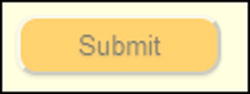
Figure A-11. Rounded button with a drop shadow and opacity
Button with Gradient, Hover, and Active Effects Using CSS
Refer to Listing A-7 to see how to create a rounded button with a drop shadow, transparency, a hover effect, and an active effect using CSS and without using a graphics file.
Listing A-7. Creating a rounded button with a drop shadow, transparency, a hover effect, and an active effect using CSS
<!DOCTYPE html>
<html lang="en">
<head>
   <meta charset="UTF-8">
   <title>Gradient, hover and active effects </title>
   <style>
       body { background-color: lightyellow; }

       .btnBase {
          -moz-border-radius: 10px;
-webkit-border-radius: 10px;
-khtml-border-radius: 10px;

-webkit-box-shadow: 0 1px 2px rgba(0,0,0,.2);
-moz-box-shadow: 0 1px 2px rgba(0,0,0,.2);
box-shadow: 0 1px 2px rgba(0,0,0,.2);

text-shadow: 0 1px 1px rgba(0,0,0,.3);

border-radius: 10px;
background-color: orange;
width:100px;
height:30px;
       }

       .btn {
          color: #fef4e9;
          border: solid 1px #da7c0c;
          background: #f78d1d;
          background: -webkit-gradient(linear, left top, left bottom,
   from(#faa51a), to(#f47a20));
          background: -moz-linear-gradient(top,  #faa51a,  #f47a20);
       }

       .btn:hover {
          color: #000000;
          background: -webkit-gradient(linear, left top, left bottom,
   from(#f47a20), to(#FFFFFF));
          background: -moz-linear-gradient(top,  #f47a20,  #FFFFFF);
       }

       .btn:active {
             background: #f47c20;
background: -webkit-gradient(linear, left top, left bottom,
       from(#119FF8), to(#15AEF0));
background: -moz-linear-gradient(top,  #119FF8,  #15AEF0);
       }
   </style>
</head>
<body>
   <button class="btnBase btn">Submit</button><br/>
</body>
</html>
Figure A-12 displays the rounded button with the drop shadow and opacity set to 0.5 in the Firefox, Chrome, and Safari browsers.
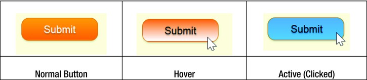
Figure A-12. Button with hover and active events effects
The gradient and active button effects don’t work in Internet Explorer.