
We'll pick up right where we left off with our data table. If you'd like to save your basic example, just save a copy of the file. Then follow these steps to customize the appearance of your data grid:
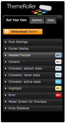
- Head over to http://jqueryui.com/themeroller where we'll take a look at the Themeroller. In the left column, you'll find the controls for selecting a predefined theme or creating a custom theme, and the wide right column contains samples of several different types of widgets.

- Click on the Gallery tab in the left column, and you'll see that you have dozens of choices of pre-built Themeroller themes to choose from. As you click on different samples, you'll see the sample widgets in the right column update to reflect that style. I usually like to get started by selecting a prebuilt theme that's reasonably close to the color scheme or appearance that I want, then I flip to the Roll Your Own tab to tweak it to suit my needs. For this example, I'm going to start with the Cupertino style.
After flipping to the Roll Your Own tab, you'll see that there are settings for fonts, colors, corners, headers, and so on. Make whatever adjustments you'd like to get the theme looking just the way you'd like. Feel free to play and experiment. If you go too far and get to something you don't like, it's easy to flip back to the Gallery tab and select the prebuilt theme again, stripped of any of your customizations, then start again.
Keep in mind that any of your customizations will be lost if you re-select a prebuilt theme. Once you get something you like, be sure to move on to step 3 to save it.
- Once you've got your theme set up just the way you'd like, click on the Download Theme button.
- You'll find yourself on the Build Your Download page, which might seem a little confusing. Note that jQuery UI is so large and has so many different features on offer, the developers realize that forcing everyone to download the entire thing would be overkill. If you only wanted to use one widget, there'd be no need for downloading all the other widgets and effects. This page lets you pick and choose different components of jQuery UI so that you don't have to download more than you need.
Since we're only here for a theme, we can go ahead and click on the Deselect all components link near the top of the page.
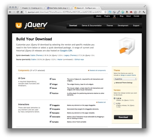
- Then, we'll leave the Theme and Version settings at their defaults and click on the Download button to download a ZIP file.
- Unzip the file and take a look inside. You'll see that even though we got the simplest download we could, we still have quite a few files.

- We've got a
cssfolder that contains our theme folder with a CSS file and images inside it. We've also got adevelopment-bundlefolder, an HTML file, and ajsfolder that contains jQuery and a jQuery UI file.All we need out of all of this is our theme. Copy your theme folder to the styles directory of your own project. My theme folder is named
cupertinosince that's the theme I chose. If you selected a different theme, your theme folder will be called something else. It will be easy to find, though, as it will be the only folder inside thecssfolder.
- We've got a
- Next, we'll attach our theme CSS file to our HTML file. Inside the
<head>section, attach your theme CSS file before thedemo_table.cssfile we attached in the previous example.<link rel="stylesheet" href="styles/cupertino/jquery-ui-1.8.16.custom.css"/> <link rel="stylesheet" href="styles/demo_table.css"/>
- Now, unfortunately, our theme CSS file doesn't quite have all the styles we'll need for a nicely styled data grid. After all, the jQuery UI developers have no way of knowing all the different types of widgets and plugins people will want to use, so there's no possible way they could cover every single case. Luckily, DataTables plugin author Allan Jardine has already done some nice work for us in this area and has provided a CSS file with the styles we'll need to get our themed data grid looking its best.
You can read up on styling the DataTables plugin in the documentation Allan Jardine has made available at http://datatables.net/styling/.
Back inside the DataTables plugin files, look inside the
cssfolder inside themediafolder to find thedemo_table_jui.cssfile. Copy that to your own styles folder and update your<link>tag to link to this version of thedemo_table.cssinstead as follows:<link rel="stylesheet" href="styles/cupertino/jquery-ui-1.8.16.custom.css"/> <link rel="stylesheet" href="styles/demo_table_jui.css"/> - Now we just have to make a small update to our JavaScript code. We have to tell the
dataTable()method that we want to use jQuery UI. Head back into yourscripts.jsfile and we'll add a pair of curly brackets and pass a key/value pair to enable jQuery UI styling for our data table:$(document).ready(function(){ $('#book-grid').dataTable({ 'bJQueryUI': true }); });If you refresh the page in the browser now, you'll see that the data grid is now using a style that's consistent with the widgets we saw on the jQuery UI Themeroller page:

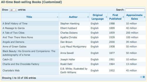
- However, you'll notice that the color scheme for the table rows is still lavender.
- Let's make some adjustments to the color scheme. Open
demo_table_jui.css. There are just a couple of lines to update. First, we'll find line 281 where the colors for the zebra-striping for the table are defined and update those to the colors we'd like to use as follows:tr.odd { background-color: #f1f7fb; } tr.even { background-color: white; }I'm going with a pale blue for odd rows and white for even rows to match the Cupertino style I selected earlier. Feel free to choose colors that match your own chosen theme.
- Next, we'll change the color scheme for the currently sorted row. You'll find the CSS for the sorted odd rows at line 380. I'm going to change mine to a medium blue as follows:
tr.odd td.sorting_1 { background-color: #d6e7f4; } - And finally, we can find the CSS for the sorted even row at line 392. I'm going to change this to a light blue.
tr.even td.sorting_1 {
background-color: #e4eff8;
}
You can select your own colors that coordinate with your own chosen theme.
Now, if you refresh the page in the browser, you'll see that the zebra-striping pattern of the table fits with our Themeroller theme.
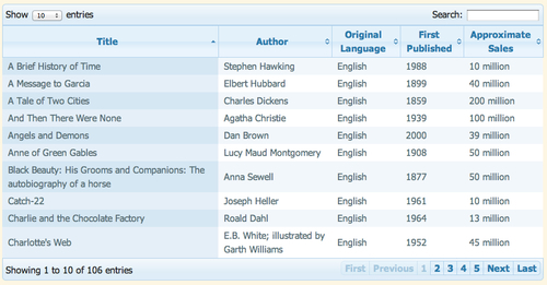
- Next up, we'll take a look at making a couple of other customizations to the data grid. First, let's change those simple next and previous pagination buttons into numbers. We'll pass another key/value pair to the
dataTablemethod to replace the buttons with pagination numbers as follows:$(document).ready(function(){ $('#book-grid').dataTable({ 'sPaginationType': 'full_numbers', 'bJQueryUI': true }); });Note
Remember to separate each key/value pair with a comma, but not to place a comma after the last key/value pair.
- If you refresh the page in the browser, you'll see that the simple buttons have been replaced by pagination numbers as shown in the following screenshot:
- We might decide that for this particular data table, the search function doesn't make sense. The DataTables plugin offers a way for us to disable individual features. To disable the search box filtering, we'll pass another key/value pair as follows:
$(document).ready(function(){
$('#book-grid').dataTable({
'sPaginationType': 'full_numbers',
'bJQueryUI': true,
'bFilter': false
});
});
Refresh the page in the browser and you'll see that the search box is gone.
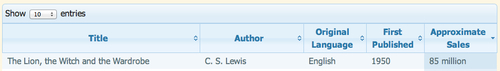
- You've probably noticed that by default, the DataTables plugin is sorting our table by the first column in ascending order, from A to Z. That might be fine in some cases, but in this case since we're listing the all-time best-selling books, we probably want to sort the table to show the books with the highest sales first. We'll pass in a new key/value pair to specify which column should be used for the default sort and which direction the sort should go.
$(document).ready(function(){
$('#book-grid').dataTable({
'sPaginationType': 'full_numbers',
'bJQueryUI': true,
'bFilter': false,
'aaSorting': [[4, 'desc']]
});
});
The key we're using is called
'aaSorting', and the value is the column number and sort direction inside two sets of square brackets. Don't forget that JavaScript starts counting at 0, not 1. So the fifth column in our table is actually column 4. Then, we want the highest number at the top, so we pass'desc'for descending order.Refresh the page in the browser and you'll see that the books are now in order from highest sales to lowest sales. Note also that this default sort order doesn't affect your site visitor's ability to sort the table by any of the other columns in any order they'd like. The site visitor can still interact with your table. We're just re-defining the default view in a way that makes the most sense for the data we're presenting.
What just happened?
We took our basic data grid and took it a step further by customizing the appearance and behavior of the plugin. We learned how to use the jQuery UI Themeroller to create a custom theme for our data grid. Then we learned how to replace the simple pagination buttons with page numbers, disable searching the table, and how to set a default sort for the data grid.