
Follow these steps to take advantage of the styling options made possible by the Uniform plugin:
- We'll get started with a basic HTML file and associated files and folders, just like we set up in Chapter 1, Designer, Meet jQuery. For this example, in the body of the HTML document, we're going to set up a simple form with examples of each type of hard-to-style form element. Get started with a
<form>tag:<form id="pretty-form" action="#"> </form>
- Then, inside our form we'll add our form elements. We'll start off with a
selectdrop down:<fieldset> <legend>Select your favorite juice</legend> <p> <label for="juice">Favorite Juice</label> <select id="juice" name="juice"> <option>Select one</option> <option value="orange">Orange Juice</option> <option value="grape">Grape Juice</option> <option value="grapefruit">Grapefruit Juice</option> <option value="cranberry">Cranberry Juice</option> <option value="tomato">Tomato Juice</option> <option value="pineapple">Pineapple Juice</option> <option value="apple">Apple Juice</option> </select> </p> </fieldset>
We're following all the same rules we followed for the last form, making sure the form works properly and is accessible.
Exactly what this
<select>looks like will depend on your browser and operating system, but here's how mine looks in Chrome on Mac OSX: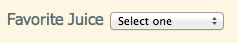
- Next, we'll add a file input.
<fieldset>
<legend>Fruit Picture</legend>
<p>
<label for="fruit-photo">Upload a photo of your favorite fruit</label>
<input type="file" id="fruit-photo" name="fruit-photo"/>
</p>
</fieldset>
Hard to believe this innocent-looking little tag could be the source of so much styling headache, but there you are. Here's how it looks in Chrome on Mac OSX:

- Next up, let's add a few checkboxes as follows:
<fieldset>
<legend>Which hot beverages do you enjoy?</legend>
<ul>
<li>
<input type="checkbox" name="hot-bevs[]" id="hot-coffee">
<label for="hot-coffee">Coffee</label>
</li>
<li>
<input type="checkbox" name="hot-bevs[]" id="hot-chocolate">
<label for="hot-chocolate">Hot Chocolate</label>
</li>
<li>
<input type="checkbox" name="hot-bevs[]" id="hot-tea">
<label for="hot-tea">Tea</label>
</li>
</ul>
</fieldset>

- And then some radio buttons.
<fieldset>
<legend>Select your favorite soft drink</legend>
<ul>
<li>
<input type="radio" name="soft-drinks" id="soda"/>
<label for="soda">Soda</label>
</li>
<li>
<input type="radio" name="soft-drinks" id="sparkling-water"/>
<label for="sparkling-water">Sparkling water</label>
</li>
<li>
<input type="radio" name="soft-drinks" id="iced-tea"/>
<label for="iced-tea">Iced Tea</label>
</li>
<li>
<input type="radio" name="soft-drinks" id="lemonade"/>
<label for="lemonade">Lemonade</label>
</li>
</ul>
</fieldset>

- And the last thing we'll add to our form is just a few easily styleable elements, so that we can learn how to style these to match our Uniform styles:
<fieldset>
<legend>Some other stuff about me</legend>
<p>
<label for="name">My name</label>
<input type="text" id="name" name="name"/>
</p>
<p>
<label for="about-me">About me</label>
<textarea rows="10" cols="40" id="about-me" name="about-me"></textarea>
</p>
</fieldset>
<p class="buttons">
<input type="submit"/>
<input type="reset"/>
</p>

What just happened?
Now we've got our unstyled form set up. Exactly what our form looks like will depend on your browser and operating system. We followed all the rules established earlier in this chapter for setting up a correct and accessible form. Except this time, we've included some difficult-to-style form elements. Let's take a look now at how we can use the Uniform plugin — to get our form looking consistent across as many browsers as possible.
Styling the unstylable
If you want to take a little time out and try writing some CSS to style these form elements, you'll see that there's not much that touches them. Some of them don't seem to be affected by CSS at all, and when they are, it's not always in the way that you'd expect. No wonder these form fields give everyone so much trouble. JQuery to the rescue.