47. Font Size Matters
When you read the chapter entitled “How to Craft Your Presentation,” I hope you will consider carefully whether you need slides at all and, if you do use slides, whether those slides should have any words on them. Assuming that you have decided you are using slides, and that the slides have words, make sure you use a font that’s large enough for people to see. The font should be big enough for people to read it without strain. It’s not just older people who need fonts to be big; younger people also complain when fonts are too small to read.
Some fonts can be the same size but look bigger because of their x-height. The x-height is literally the height of the lowercase letter x in the font family. Different fonts have different x-heights, and as a result, some fonts look larger than others, even though they are the same point size.
Figure 47.1 shows how font size and x-height are measured.
Figure 47.1. How font size and x-height are measured
Some newer font families, such as Tahoma and Verdana, have been designed with large x-heights so they are easier to read on a screen. Figure 47.2 shows different font families that are all the same point size. Some look bigger, however, because of their larger x-height.
Figure 47.2. A large x-height can make a font look larger.
How Big Should the Font Be?
How big the font needs to be depends in large part on how far your audience is from the screen. There is an actual formula (see http://www.hf.faa.gov/webtraining/visualdisplays/Text/size1a.htm) for calculating the size the letters should be. It’s based on the distance the viewer is from the screen. It’s a complicated formula, so I’ve provided the link to it, but not the details of the formula.
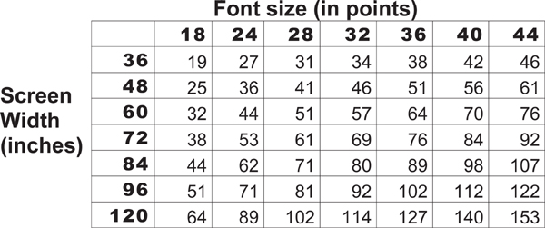
A more “usable” set of guidelines is by Dave Paradi from ThinkOutsideTheSlide.com. Figure 47.3 is a table from Dave’s Web site that shows how big your font should be for comfortable viewing, based on how far your audience is from the screen.
Figure 47.3. How big your font should be in relation to screen size and distance from the screen.
The assumptions for the table are that
• People have visual acuity of at least 20/40.
• You are using a slide with a 4:3 aspect ratio (most screens and monitors).
• The slide fills the screen.
To use the table, find the intersection of your screen size and the font you are using. The number at that intersection is the maximum number of feet from the screen that someone should be in order to comfortably read text.


