
50. Red and Blue Together Are Hard on the Eyes
When lines or text of different colors are projected or printed, the depths of the lines may appear to be different. One color may jump out, whereas another color appears recessed. This effect is called chromostereopsis. The effect is strongest with red and blue, but it can also happen with other colors; for example, red and green. These color combinations can be hard and tiring to look at or read. Figure 50.1 shows some examples of chromostereopsis.
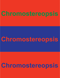
Figure 50.1. Chromostereopsis can be hard on the eyes.
..................Content has been hidden....................
You can't read the all page of ebook, please click here login for view all page.