Chapter 4
Exploratory Data Analysis
Package(s): LearnEDA, e1071, sfsmisc, qcc, aplpack, RSADBE
Dataset(s): memory, morley, InsectSprays, yb, sample, galton, chest, sleep, cloud, octane, AirPassengers, insurance, somesamples, girder
4.1 Introduction: The Tukey's School of Statistics
Exploratory Data Analysis, abbreviated and also simply referred to as EDA, combines very powerful and naturally intuitive graphical methods as well as insightful quantitative techniques for analysis of data arising from random experiments. The direction for EDA was probably laid down in the expository article of Tukey (1962), “The Future of Data Analysis”. The dictionary meaning of the word “explore” means to search or travel with the intent of some kind of useful discovery, and in similar spirit EDA carries a search in the data to provide useful insights. EDA has been developed to a very large extent by the Tukey school of statisticians.
We can probably refer to EDA as a no-assumptions paradigm. To understand this we recall how the model-based statistical approaches work. We include both the classical and Bayesian schools in the model-based framework, see Chapters 7 to 9. Here, we assume that the data is plausibly generated by a certain probability distribution, and that a few parameters of such a distribution are unknown. In a different fashion, EDA places no assumptions on data-generating mechanism. This approach also gives an advantage to the analyst of making an appropriate guess of the underlying true hypothesis rather than speculating on it. The classical methods are referred by Tukey as “Confirmatory Data Analysis”. EDA is more about attitude and not simply a bundle of techniques. No, these are not our words. More precisely, Tukey (1980) explains “Exploratory data analysis is an attitude, a flexibility, and a reliance on display, NOT a bundle of techniques, and should be so taught.”
The major work of EDA has been compiled in the beautiful book of Tukey (1977). The enthusiastic reader must read the thought-provoking sections “How far have we come?” which is there in almost all the chapters. Mosteller and Tukey (1977) have further developed regression methods in thisdomain. Most of the concepts of EDA detailed in this chapter have been drawn from Velleman and Hoaglin (1984). Hoaglin, et al. (1991) extend further the Analysis of Variance method in this school of thought. Albert's R package LearnEDA is useful for the beginner. Further details about this package can be found at http://bayes.bgsu.edu/EDA/R/Reda.html. From a regression modeling perspective, Part IV, Rousseeuw and Leroy (1987) offer very useful extensions.
In this chapter, we focus on two approaches of EDA. The preliminary aspects are covered in Section 4.2. The first approach is the graphical methods. We address several types of graphical methods here of visualizing the data. Those graphical methods omitted are primarily due to space restrictions and the author's limitations. These visualization techniques are addressed in Section 4.3. The quantitative methods of EDA are taken up in Section 4.4. Finally, exploratory regression models are considered in Section 4.5. Sections 4.3 and 4.4 form the second approach.
4.2 Essential Summaries of EDA
A reason for writing this section is that the summary statistics of EDA are often different from basic statistics. The emphasis is, more often than not, on summaries such as median, quartiles, percentiles, etc. Also, we define here a few summaries which we believe useful to gain insight into exploratory analyses. The concept of median, quartiles, and Tukey's five numbers, have already been illustrated in Section 2.3. A useful concept associated with each datum is depth, which is defined next.
Depth for a datum ![]() is denoted by
is denoted by ![]() . We will denote the median by
. We will denote the median by ![]() . By definition, depth of median is
. By definition, depth of median is ![]() . We note that though in general the letter
. We note that though in general the letter ![]() stands for derivative, and we use the same for depth, there is not really any room for confusion. The ideas are illustrated using a simple program:
stands for derivative, and we use the same for depth, there is not really any room for confusion. The ideas are illustrated using a simple program:
> x <- c(13,17,11,115,12,7,24)
> tab <- cbind(order(x),x[order(x)],c(1:7),c(7:1),pmin(c(1:7), c(7:1)))
> colnames(tab) <- c("x_label","x_order","Position_from_min",
+ "Position_from_max","depth")
> tab
     x_label x_order Position_from_min Position_from_max depth
[1,]       6       7                 1                 7     1
[2,]       3      11                 2                 6     2
[3,]       5      12                 3                 5     3
[4,]       1      13                 4                 4     4
[5,]       2      17                 5                 3     3
[6,]       7      24                 6                 2     2
[7,]       4     115                 7                 1     1
In the above output, the second line of R code arranges the sample in increasing order, with the first column returning to their positions in the original sample using the order function. The third and fourth columns give their positions from minimum and maximum respectively. The fifth and last columns obtain the minimum of the positions from the minimum and maximum values using the pmin function, and thus return the depth of the sample values.
We begin with an explanation of hinges. The hinges are what everyone sees as the connectors between the door and its frame. In the past there would be three hinges to fix the door. The center one is at the middle of the length of the frame, and the other two hinges at the positions of one- and three-quarters of the height of the frame. Thus, if we assume the data as arranged in increasing (or decreasing) order along the height of the frame, the median is then the middle hinge, whereas 25% of the observations are below the lower hinge and 25% above the upper hinge. We naturally ask for the difference between the quartiles and hinges. Hinges are technically calculated from the depth of the median, whereas quartiles are not. Throughout this chapter, the lower-, middle-, and upper- hinges will be respectively denoted by ![]() ,
, ![]() , and
, and ![]() . From the output of the previous table, it is clear that the lower and upper hinges are the averages of 11 and 12, equal to 11.5, and average of 17 and 24, equal to 20.5, respectively.
. From the output of the previous table, it is clear that the lower and upper hinges are the averages of 11 and 12, equal to 11.5, and average of 17 and 24, equal to 20.5, respectively.
The Tukey's five numbers form one of the most important summaries in EDA. These five numbers are the minimum, lower hinge, median, upper hinge, and maximum. The five numbers are computed using the fivenum function, as seen earlier in Section 2.3.
Five number inter-difference, abbreviated as fnid, is defined as the consecutive differences of the five numbers, viz., {lower hinge – minimum}, {median – lower hinge}, {upper hinge – median}, and {maximum – upper hinge}. The five number inter-difference gives a fair insight into how the sample is spread out. It is easy to define a new function, which gives us the fnid using the diff operator: fnid <- function(x) diff(fivenum(x)).
As a quantitative measure of skewness, we introduce Bowley's relative measure of skewness based on Tukey's five numbers, to be called Bowley-Tukey measure of skewness, as follows:

These concepts are illustrated in the next example of Memory Recall Times.
4.3 Graphical Techniques in EDA
4.3.1 Boxplot
The boxplot is essentially a one-dimensional plot, sometimes known as the box-and-whisker plot. The boxplot may be displayed vertically or horizontally, without any value changes in the information conveyed. Box and whiskers are two important parts here. The boxplot is always based on three quantities. The top and bottom of the box are determined by the upper and lower quartiles, and the band inside the box is the median. The whiskers are created according to the purpose of the analyses and defined according to the convenience of the experimenter and in line with the goals of the experiment. If complete representation of the data is required, then the whiskers are produced by connecting the end points of the box with the minimum and maximum value of the data. The rational of box and whiskers is that the quartiles divide the dataset into four parts, with each part containing one-quarter of the sample. The middle line of the box, the box, and the whiskers hence give an appropriate visual representation of the data.
If the goal is to find the outliers, also known as extreme values, below ![]() and above
and above ![]() percentiles, the ends of the whiskers may be defined as data points which respectively gives us these percentile points. All observations below the lower whisker and those above the upper whisker may be treated as outliers. Some of the common choices of the cut-off percentiles are
percentiles, the ends of the whiskers may be defined as data points which respectively gives us these percentile points. All observations below the lower whisker and those above the upper whisker may be treated as outliers. Some of the common choices of the cut-off percentiles are ![]() = 0.02 and 0.09, and
= 0.02 and 0.09, and ![]() = 0.98 and 0.91 respectively. Sometimes such percentiles may be based on the inter-quartile range IQR.
= 0.98 and 0.91 respectively. Sometimes such percentiles may be based on the inter-quartile range IQR.
The role of NOTCHES. Inference for significant difference between medians can be made based on a boxplot which exhibit notches. The top and bottom notches for a dataset is defined by
A useful interpretation for notched boxplots is the following. If the notches of two boxplots do not overlap, we can interpret this as strong evidence that the medians of the two samples are significantly different. For more details about notches, we refer the reader to Section 3.4 of Chambers, et al. (1983).
4.3.2 Histogram
The histogram was invented by the eminent statistician Karl Pearson and is one of the earliest types of graphical display. It goes without saying that its origin is earlier than EDA, at least the EDA envisioned by Tukey, and yet it is considered by many EDA experts to be a very useful graphical technique, and makes it to the list of one of the very useful practices of EDA. The basic idea is to plot a bar over an interval proportional to the frequency of the observations that lie in that interval. If the sample size is moderately good in some sense and the sample is a true representation of a population, the histogram reveals the shape of the true underlying uncertainty curve. Though histograms are plotted as two-dimensional, they are essentially one-dimensional plots in the sense that the shape of the uncertainty curve is revealed without even looking at the range of the ![]() -axis. Furthermore, the Pareto chart, stem-and-leaf plot, and a few others may be shown as special cases of the histogram. We begin with a “cooked” dataset for understanding a range of uncertainty curves.
-axis. Furthermore, the Pareto chart, stem-and-leaf plot, and a few others may be shown as special cases of the histogram. We begin with a “cooked” dataset for understanding a range of uncertainty curves.
A few fundamental questions related to the creation of histograms need to be asked at this moment. The central idea is to plot a bar over an interval. All the intervals together need to cover the range of the variables. For example, the number of intervals for the five histograms above are respectively 11, 6, 11, 6, and 10. How did R decide the number of intervals? The width of each interval for these histograms are respectively 0.5, 50, 1, 1, and 0.1. What is the basis for the width of the intervals? The reader may check them out with length(hist$counts) and diff(hist$breaks). The intervals are also known as bins. Let us denote the number of intervals by ![]() and the width of the bin by
and the width of the bin by ![]() . Now, if we know either the number of the interval or the bin width, the other quantity may be easily obtained with the formula:
. Now, if we know either the number of the interval or the bin width, the other quantity may be easily obtained with the formula:
where the argument ![]() denotes the ceiling of the number. However, in practice we do not know either the number of bins or their width. The
denotes the ceiling of the number. However, in practice we do not know either the number of bins or their width. The hist function offers three options for the bin width/number based on the formulas given by Sturges, Scott, and Freedman-Diaconis:
where ![]() is the number of observations and
is the number of observations and ![]() is the sample standard deviation. The formulas 4.5–4.7 are respectively specified to the
is the sample standard deviation. The formulas 4.5–4.7 are respectively specified to the hist function with breaks=“Sturges”, breaks=“Scott”, and breaks=“FD”. The other options include directly specifying the number of breaks with a numeric, say breaks=10, or through a vector breaks=seq(-10,10,0.5).
4.3.3 Histogram Extensions and the Rootogram
The histogram displays the frequencies over the intervals and for moderately large number of observations, it reflects the underlying probability distribution. The boxplot shows how evenly the data is distributed across the five important measures, although it cannot reveal the probability distribution in a better way than a boxplot. The boxplot helps in identifying the outliers in a more apparent way than the histogram. Hence, it would be very useful if we could bring together both these ideas in a closer way than look at them differently for outliers and probability distributions. An effective way of obtaining such a display is to place the boxplot along the x-axis of the histogram. This helps in clearly identifying outliers and also the appropriate probability distribution.
The R package sfsmisc contains a function histBxp, which nicely places the boxplot along the x-axis of the histogram.
Generally, in histograms, bar height varies more in bins with long bars than in bins with short bars. In frequency terms, the variability of the counts increases as their typical size increases. Hence, a re-expression can approximately remove the tendency for the variability of a count to increase with its typical size. The rootogram arises on taking the re-expression as the square root of the frequencies. This observation is important towards an understanding of the transformations.
4.3.4 Pareto Chart
The Pareto chart has been designed to address the implicit questions answered by the Pareto law. The common understanding of the Pareto law is that “majority resources” is consumed by a “minority user”. The most common of the percentages is the 80–20 rule, implying that 80% of the effects come from 20% of the causes. The Pareto law is also known as the law of vital few, or the 80–20 rule. The Pareto chart gives very smart answers by completely answering how much is owned by how many. Montgomery (2005), page 148, has listed the Pareto chart as one of the seven major tools of Statistical Process Control.
R did not have any function for this plot and neither was there any add-on package which would have helped the user until 2004. However, one R user posed this question to the “list” in 2001 and an expert on the software promptly prepared exhaustive codes over a period of about two weeks. The codes are available at https://stat.ethz.ch/pipermail/r-help/2002-January/018406.html. The Pareto chart can be plotted using pareto.chart from the R package qcc. We will use Wingate's program and assume here that the reader has copied the codes from the web mentioned above and compiled it in the R session.
The Pareto chart contains three axes on a two-dimensional plot only. Generally, causes/users are arranged along the horizontal axis and the frequencies of such categories are conveyed through a bar for each of them. The bars are arranged in a decreasing order of the frequency. The left-hand side of the vertical axis denotes the frequencies. The cumulative frequency curve along the causes are then simultaneously plotted with the right-hand side of the vertical axis giving the cumulative counts. Thus, at each cause we know precisely its frequency and also the total issues up to that point of time.
4.3.5 Stem-and-Leaf Plot
Velleman and Hoaglin (1984) describe the basic idea of stem-and-leaf display by allowing the digits of the data values to do the sorting into numerical order and then display the same. The steps for constructing stem-and-leaf are given in the following:
- 1. Select an appropriate pair of adjacent digits positioned in the data and split each observation between the adjacent digits. The digits selected on the left-hand side of the data are called leading digits.
- 2. Sort all possible leading digits in ascending order. All possible leading digits are called stems.
- 3. Write the first digit of each data value beside its stem value. The first digit is referred to as the leaf.
In Step 2, all possible stems are listed irrespective of whether they occur in the given dataset or not. The stem function from the base package will be useful for obtaining stem-and-leaf plots.
Multiple histograms and boxplots were obtained on the same graphical device. Thus, to compare two stem-and-leaf plots, there is a need for a similar display arrangement. The infrastructure will now be discussed. Tukey has indeed enriched the EDA in ways beyond the discussion thus far. An important technique invented by Prof Tukey is the modification of the stem-and-leaf plot and this technique is available from the aplpack package in the stem.leaf.backback function. This technique will be illustrated through the two examples discussed previously.
If the trailing digits for stems are few, the interpretation of the stem-and-leaf plot becomes simpler. However, if there are a large number of trailing digits for a stem, it is inconvenient to interpret the display. Suppose that the stem is the integer 1 and there are nearly 15 observations among the trailing digits. This means that the stem part will have 15 numbers besides it, which will obscure the display. In an informal way, Prof Tukey suggests that such stems be further divided into sub-stems. The question is then how do we identify those sub-stems, which are part of neither the leading digits nor the trailing digits. Typically, the digits would be one of the ten integers 0 to 9. The notation for the sub-stems suggested by Prof Tukey is to identify the digits by the first letters of their spellings. Thus 2 (two) and 3 (three) will be denoted by t, 4 (four) and 5 (five) by f, 6 (six) and 7 (seven) by s. A convention for the digits 0, 1, 8, and 9 is the denote 0 (zero) and 1 (one) by the star symbol *, and 8 (eight) and 9 (nine) by the period “.”.
4.3.6 Run Chart
The run chart is also known as the run-sequence plot. In the run chart, the data value is simply plotted against its index number. For example, if ![]() is the data, plot
is the data, plot ![]() against their index
against their index ![]() . The run charts can be plotted in R using the function
. The run charts can be plotted in R using the function plot.ts, which is very commonly used in time-series analysis.
In certain ways, the graphical methods are useful for univariate data. The next technique is more useful for dealing with paired/multivariate data.
4.3.7 Scatter Plot
The reader is most certainly familiar with this very basic format of plots. Whenever we have paired data and there is a belief that the variables are related, its only natural to plot them against one other. Such a display is, of course, known as the scatter plot or the x-y plot. There is a subtle difference between them, see Velleman and Hoaglin (1984). We will straightaway start with examples.
The scatter plot will be later extended to multivariate data with more than two variables through an idea known as matrix of scatter plots. See Sections 12.4 and 14.2.
4.4 Quantitative Techniques in EDA
We discuss here two important methods of quantitative techniques in EDA. For advance concepts of quantitative techniques, refer to Hoaglin, et al. (1991). The methods described and demonstrated will lay a firm foundation towards the methods described in that book. The first method here is fairly simple, and the second one is more detailed.
4.4.1 Trimean
Trimean is a measure of location and is the weighted average of the median and two other quartiles. Since median is a measure of location, we may intuitively expect the trimean to be more robust than the median as well as the mean. If ![]() are the lower, middle (median), and upper quartiles, the trimean is defined by
are the lower, middle (median), and upper quartiles, the trimean is defined by
The last part of the above equation suggests that the trimean can be viewed as the average of median and average of the lower and upper quartiles. Weisberg (1992) summarized trimean as “a measure of the center (of a distribution) in that it combines the median's center values with the mid-hinge's attention to the extremes.” In fact, we can even replace the lower and upper quartiles in the above expression by the corresponding hinges and then derive the trimean as a weighted average of the median and the hinges. That is,
As the hinges, the three of them, are obtained using the Tukeys' five numbers function fivenum, it is straightforward to obtain the trimean using either the quartiles (consider using the quantile function) or the hinges. The next small R session defines the required function in TM and TMH, and we also show that hinges and quartiles need not be equal.
> TM <- function(x) {
+   qs <- quantile(x,c(0.25,0.5,0.75))
+   return(as.numeric((qs[2]+(qs[1]+qs[3])/2)/2))
+                   }
> TMH <- function(x) {
+   qh <- fivenum(x,c(0.25,0.5,0.75))
+   return((qh[2]+(qh[1]+qh[3])/2)/2)
+                     }
> TM(iris[,2]); TMH(iris[,2])
[1] 3.02
[1] 2.65
> ji4 <- jitter(iris[,4])
> quantile(ji4,c(0.25,0.75))
 25
0.29 1.80
> fivenum(ji4)[c(2,4)]
[1] 0.289 1.797
The functions are simple to follow and hence it is left to the reader to figure it out.
4.4.2 Letter Values
We have mentioned how EDA is about attitude, data driven stories, etc. Since the emphasis in EDA is on data, it makes a whole lot of sense to understand each “datum” as much as possible. Some natural examples of useful datum are minimum, maximum, etc. Median is also a useful datum when the size of data is odd. Recall that by definition, see Section 4.2, depth of a datum is the minimum of the position of the datum from either end of the batch. We can see from the outputs of Section 4.2 that the minimum and maximum values, also called extremes, have a depth of 1, the second largest and second smallest have a depth of 2, and so on. Thus, two observations, namely, the ![]() and
and ![]() ordered observations in ascending order have depth
ordered observations in ascending order have depth ![]() .
.
The median splits the data into two equal halves. The upper and lower hinges do that to the upper and lower halves dataset what median does to the entire collection, that is, the hinges give us quarters of the dataset. We have seen earlier that the depth of the median, for a sample of size ![]() is
is ![]() . It is fairly easy to see that the depth of the hinges is therefore
. It is fairly easy to see that the depth of the hinges is therefore
where ![]() indicates the integer part of
indicates the integer part of ![]() .
.
The next step is to define the half dividers of quarters, which results in eight equal divisions of the dataset. They are referred to as eights for simplicity, and we denote the eights by ![]() . Furthermore, the depth of eights is given by
. Furthermore, the depth of eights is given by
The concept will now be illustrated from Velleman and Hoaglin.
Note that the measures such as hinges and eights are not the depth values, but are the values of the variable associated with the corresponding depth. Median, hinges, eights! Where to stop exactly will be a very legitimate question for any practitioner. Furthermore, depending on the size of the dataset, the eights may be 3.5 or even 3000. This question is what is precisely answered by letter values.
Letter values continue the division process further into sixteens, thirty-seconds, and so on until we reach the depth of a datum which will be equal to 1. Thus, we would have arrived at some of the most meaningful data division process. Velleman and Hoaglin (1984) suggest denoting the further letters, beyond eights, as ![]() , and so on. Yes, we clarify here what to do with these eights, sixteens, etc. Recall that in Section 2 and in Subsection 4.3.1 we suggested extending measures of central tendency, dispersion, and skewness based on hinges. Similarly, we can generalize measures based on each of the letter values generated. Thus, we have further concepts such as midhinges, mideights, etc. These measures are referred to as midsummaries. Similarly, we can define measures of dispersion based on the ranges between the measures which lead to H-spread, E-spread, D-spread, etc.
, and so on. Yes, we clarify here what to do with these eights, sixteens, etc. Recall that in Section 2 and in Subsection 4.3.1 we suggested extending measures of central tendency, dispersion, and skewness based on hinges. Similarly, we can generalize measures based on each of the letter values generated. Thus, we have further concepts such as midhinges, mideights, etc. These measures are referred to as midsummaries. Similarly, we can define measures of dispersion based on the ranges between the measures which lead to H-spread, E-spread, D-spread, etc.
We close this subsection with the use of function lval from the LearnEDA package developed by Prof Jim Albert.
Now, we are prepared for exploratory regression models!
4.5 Exploratory Regression Models
The scatter plot helps to identify the relationship between two variables. If the scatter plot indicates a linear relationship between two variables, we would like to quantify the relationship between them. A rich class of the related confirmatory models will be taken in Part IV. In this section we will develop the exploratory approach for quantifying the relationship and hence we call these models Exploratory Regression Models. For the case of single input variables, also known as covariates, the output can be modeled through a resistant line and this development will be carried out in the next subsection 4.5.1, and the extension for two variables will be taken in subsection 4.5.2.
4.5.1 Resistant Line
We have so far seen EDA techniques handle reliable summaries in the form of median, mid-summaries, etc., and very powerful graphical displays such as histogram, Pareto chart, etc. We also saw how the x-y plots help in understanding the relationship between two variables. The reader would appreciate some EDA technique which models the relationship between two variables. Particularly, regression models of the form
are of great interest. Equation 4.11 is our first regression model. Theanswer to problems of this kind are provided by the resistant line. Here, the term ![]() is referred to as the intercept term,
is referred to as the intercept term, ![]() as the slope term, while
as the slope term, while ![]() is the error or noise.
is the error or noise.
The motivation and development of the resistant line is very intuitive and extends in a natural way to employ the use of median, quartiles, hinges, etc. From a mathematical point of view, the slope term ![]() measures the changes in the output
measures the changes in the output ![]() for unit change in the input
for unit change in the input ![]() , whereas
, whereas ![]() is the intercept term. This rate of change is obtained by dividing the data into three regions.
is the intercept term. This rate of change is obtained by dividing the data into three regions.
We describe the resistant line mechanism by the following steps. The reader should follow the steps in Figure 4.13 too. A useful figure explaining the steps of resistant line modeling may be found in Figure 6 titled “Understanding the resistant line” of Tattar (2013). The initial estimate of the parameters are obtained through the following steps.
- The x-y plot is divided into three regions, containing an equal number of data points, according to the
 -values only.
 - In the right-hand region find the median of
 values and also that of
  , denote them as
  and
and  , and obtain the pair
  .
. - Repeat the exercises for the middle and left regions to obtain the points
 and
and  .
.
We note from the construction in Figure 4.13 that ![]() ,
, ![]() and
and ![]() need not correspond to any of the paired data
need not correspond to any of the paired data ![]() . Refer to Chapter 5 of Velleman and Hoaglin for more details.
. Refer to Chapter 5 of Velleman and Hoaglin for more details.
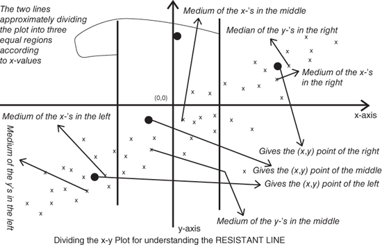
Figure 4.13 Understanding The Construction of Resistant Line
The purpose of obtaining the triplets of the ordered pair ![]() is to put ourselves in the position where we can estimate the slope and intercept of the model given by Equation 4.11. We first estimate the slope, denoted by
is to put ourselves in the position where we can estimate the slope and intercept of the model given by Equation 4.11. We first estimate the slope, denoted by ![]() , using the pair of points
, using the pair of points ![]() . Define
. Define
We then use the estimated value of ![]() in the model and average over the three possible vital data points to obtain an estimate of the
in the model and average over the three possible vital data points to obtain an estimate of the ![]() value, denoted by
value, denoted by ![]() . Thus,
. Thus,
The initial estimate of ![]() and
and ![]() need improvization. Using the initial estimates, the residuals are obtained for the fitted model:
need improvization. Using the initial estimates, the residuals are obtained for the fitted model:
The slope and intercept terms are now obtained for the paired data ![]() and denoted by
and denoted by ![]() . The residuals for the
. The residuals for the ![]() iteration of the slope and intercept will be denoted by
iteration of the slope and intercept will be denoted by ![]() , and for
, and for ![]() , the slope and intercept terms are updated with
, the slope and intercept terms are updated with ![]() and
and ![]() .
.
Let us put the theory of the resistant line behind us and see it in action during the following examples.
For two factors, or covariates, an extension of the resistant line model 4.11, will be next considered.
4.5.2 Median Polish
For the AD5 dataset, we had height of the parent as an input variable and the height of the child as the output. Under the hypothetical case that we have groups for the height of father and mother as two different treatment variables, the resistant line model 4.11, in a very different technical sense, needs to be extended as follows:
where ![]() and
and ![]() represent the two groups of height for the father and mother. The groups here may be something along the lines of Low, Medium, and High. In the study of Experimental Designs, Chapter 13, this model is occasionally known as the two-way model. In EDA, the solution for obtaining the parameters
represent the two groups of height for the father and mother. The groups here may be something along the lines of Low, Medium, and High. In the study of Experimental Designs, Chapter 13, this model is occasionally known as the two-way model. In EDA, the solution for obtaining the parameters ![]() ,
, ![]() , and
, and ![]() are given by the Median Polish algorithm. A slight technical difference needs to be pointed out for the use of median polish and resistant line models. Here, the input variables are categorical in nature and not continuous. This means that if we still need to understand the height of the child as a variable dependent on the height of the mother and of the father, the latter two variables need to be categorized into bins, say short (less than 5 feet), average (5–6 feet), and tall (greater than 6 feet).
are given by the Median Polish algorithm. A slight technical difference needs to be pointed out for the use of median polish and resistant line models. Here, the input variables are categorical in nature and not continuous. This means that if we still need to understand the height of the child as a variable dependent on the height of the mother and of the father, the latter two variables need to be categorized into bins, say short (less than 5 feet), average (5–6 feet), and tall (greater than 6 feet).
To explain the median polish algorithm, we need to examine the dataset first.
Now that we know the data structure, called the two-way table, the median polish algorithm is given next, which will help in estimating the row and column effects.
- 1. Compute the row medians of a two-way table and augment it to the right-hand side of the table. Subtract the row median in the respective rows of the table.
- 2. Take the median of the row medians as the initial total effect value of the row effect. Similar to the original elements of the table, subtract the initial total effect value from the row medians.
- 3. Compute the column medians of the original columns for the matrix in the previous step and append it to the bottom. Subtract from the data matrix the corresponding column medians.
- 4. Similar to Step 2, obtain the median of the column medians and add to the initial total effect value. Remove the current total effect median from each element of the column medians.
- 5. Repeat the four steps above until convergence of either the row or the column medians.
The medpolish function from the MASS package can be used to fit the median polish model. This will be illustrated in a continuation of the girder experiment.
4.6 Further Reading
We had mentioned Tukey's (1962) article “The Future of Data Analysis” as one of the starting points which may have led to the beginning of EDA. Tukey had the strong belief that data analysis must not be overwhelmed by model assumptions and they should have an effect on how you describe them. This belief and further work at the Bell Telephone Laboratories culminated in Tukey (1977). There is a lot of simplicity in Tukeys work, such that for small datasets we do not even need a calculator. A paper and pencil will help us to a great enough extent and depth. An advanced course to Tukey (1977) is available in Mosteller and Tukey (1977). In this book, EDA techniques for regression problems are discussed.
In the year 1991, Hoaglin, et al. produced a volume with EDA methods for Analysis of Variance (ANOVA). Hoaglin, et al. (1985) is another edited volume which is useful for exploring tables, shapes, and trends. In fact, many such ideas are described in Rousseeuw and Leroy (1987) for robust regression. We also make good use of Velleman and Hoaglin (1984), which has many Fortran programs for EDA techniques. The main reason for restating this is the fact that a user can import Fortran programs in R and use them easily again.
EDA is about any method which is exploratory in nature. Thus, many of the multivariate statistical analysis techniques are considered as EDA techniques. As an example, many experts consider Principal Component Analysis, Factor Analysis, etc. as EDA techniques. Martinez and Martinez (2005) and Myatt (2007) are two recent books which accept this point of view. We will see the multivariate techniques in Chapters 14 and 15.
We need to mention that Frieden and Gatenby (2007) have developed EDA methods using Fisher information. This is an important facet, as the Fisher information is very important and we introduce this concept in Chapter 7.
4.7 Complements, Problems, and Programs
Problem 4.1 Let
xbe a numeric vector. Create a new function, saydepth, which will have a serial number as an argument, between1:length(x), and its output should return the depth of the datum.Problem 4.2 Obtain the EDA summaries as in
fivenum,IQR,fnid, andmadfor the datasets considered in Section 4.3. Note your observations based on the summaries and then investigate whether or not these notes are visible in the corresponding figures.Problem 4.3 The part B of Figure 4.4, see Example 4.5, clearly shows the presence of outliers for the number of dead insects for insecticides
CandD. Identify the outlying data points. Remove the outlying points, and then check if any more potential outliers are present.Problem 4.4 Provide summary and descriptive statistics for the cooked dataset in Example 4.6, and interpret the results as provided by the histograms.
Problem 4.5 The number of intervals for the five histograms in Figure 4.5 can be seen as 11, 6, 11, 6, and 10. How do you obtain these numbers through R?
Problem 4.6 Create a function which generates a histogram with the intervals according to the percentiles of the data vector.
Problem 4.7 The histograms seen in Section 4.3 give a horizontal display. At times, a vertical display is preferable. Using the tips from the web http://stackoverflow.com/questions/11022675/rotate-histogram-in-r-or-overlay-a-density-in-a-barplot, obtain the vertical display of a histogram.
Problem 4.8 Imposing histograms on each other helps in comparison of similar datasets, as seen in Example 4.7. Repeating the technique for the Youden-Beale experiment, what will be the conclusion for the two virus extracts?
Problem 4.9 Explore the different choices of breaks given in Formulas 4.5 – 4.7 for the different histogram examples.
Problem 4.10 Using the R function
pareto.chartfrom theqccpackage, obtain the Pareto chart for the causes and frequencies, as in Example 4.10, and compare the results with Figure 4.9.Problem 4.11 Using the
stem.leaf.backbackfunction, compare the averages of the two virus extracts for the Youden-Beale experiment, as discussed in Example 4.2. Similarly, compare the stem-and-leaf displays for the recall of pleasant and unpleasant memories of Example 4.4.Problem 4.12 Create an R function, say
trimean, for computing trimean, as given in Equation 4.8. Apply the new function for datasets of your choices considered in the chapter.Problem 4.13 Obtain the letter values for three datasets in Example 4.13 using
lvaland check if the median comparisons can be extended through them.Problem 4.14 Fit resistant line models for the six pairs of data discussed in Example 4.17. Validate the correlations as implied by the scatter plots in Figure 4.12.
Problem 4.15 For the datasets available in the files
rocket_propellant.csvandtoluca_company.dat, build the resistant line models. In the former file, the input variable isAge_of_Propellant, while in the latter file it isLot_Size. The output variables in these respective files areShear_StrengthandLabour_Hours.