
Chapter 11. Designing Advanced Reports
In the previous chapter, you learned to create simple reports—nicely formatted printouts that arrange information inside a single table. Simple reports are a great way to create a hard copy that has more polish than a datasheet printout. As you learned in the previous chapter, simple reports give you the fine-grained formatting you need to highlight important columns and values, and they handle long text fields gracefully, without wasting space or chopping off part of the data.
Simple reports are a great Access tool, but they’re still, well, simple. Their structure is their main limitation. No matter how you format or arrange your data in a simple report, Access always presents it as a table. In the real world, you may want your printed data to take other forms. You may want to transform your data into customer invoices, class attendance lists, or mailing labels. All these reports perform the same task—they take the data in a table, and then arrange it on the printed page—but you can’t create any of them with a plain-vanilla report and its simple tabular structure.
In this chapter, you’ll see how to create a variety of more specialized reports that take the concepts you learned in the last chapter, and extend them with a few new tricks. Along the way, you’ll take a look at Design view, you’ll learn how to add pictures and shapes and tell Access where to break pages in long printouts. You’ll also see how to use grouping to analyze data and calculate subtotals.
Improving Reports in Design View
Design view is the secret to setting your reports free. As you learned in the previous chapter, Design view is another way of looking at your report. Unlike in Layout view, in Design view you don’t see any report data. Instead, you see a blueprint that tells Access how to create the report. Using this blueprint, you can do things that just aren’t possible in any other view.
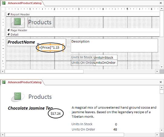
Consider the simple report with the list of products that you created in the previous chapter. If you switch to Design view, you see what makes this report tick (Figure 11-1). To get to Design view, right-click the tab title, and then choose Design view.
Note
The odd grid of lines and dots you see in Design view is intended to help you line up different parts of your report when you aren’t using a layout table. As you’ll see, it’s often important to place report elements in precise positions when using Design view.
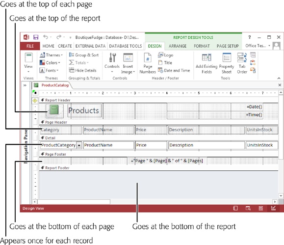
The Design View Sections
The secret to mastering Design view is understanding its five different sections. Although you can leave some sections blank, every report includes them in exactly the same order:
Report Header. Appears once at the beginning of your report, on the first page. This section is where you add titles, logos, and your own personal byline.
Page Header. Appears just under the report header on the first page, and at the top of each subsequent page. It’s the place to add page numbers, and you can also use it for column headers in simple, tabular reports like the product catalog.
Detail. Appears once immediately after the page header, and it’s the heart of all reports. The trick is that the Detail section is repeated once for each record in your report. In a simple tabular report, this section represents a single row.
Page Footer. Appears at the bottom of each page. If you don’t use the page header for page numbers, this section provides your other option.
Report Footer. Appears once at the very end of the report. You can use it to print summary information, copyright statements, the date of printing, and so on.
The content in these sections looks a fair bit different from what you see in other views, because Design view doesn’t show the live data. Instead, it includes placeholders where Access inserts the necessary information each time it runs the report. When you run the product report, for example, Access grabs the values from the ProductCategoryID, ProductName, Price, and Description fields and then shuffles them into the matching boxes.
You’ll need a bit of time before you’re comfortable manipulating the content in Design view. First, you need to learn that you can adjust each section’s size. This ability makes sense, because different reports allocate different amounts of space to each region. Figure 11-2 shows how this works.

Tip
If you don’t want to use a section, you can resize it almost out of existence. Look at the report footer section in Figure 11-1. It’s there, but vanishingly small, because this report doesn’t use the footer. Alternatively, you can delete the header and footer section. Just right-click the report surface (in Design view), and then choose Page Header/Footer to remove the page header and page footer sections, or Report Header/Footer to remove the report header and footer sections. Click these commands again to make these sections reappear, but without any content (you need to fill that in yourself).
Understanding Controls
Design view gives you a different perspective for your report. Access represents everything in your report with controls: graphical widgets that have text, pictures, and formatting. Each control is a distinct element. You can change what it looks like, or you can drag it to a different position (although you may need to pull it out of its layout table first, as described on Moving Fields Out of a Layout).
Figure 11-3 points out the controls in the product catalog report. You don’t see all the controls, because not all the columns fit into view at once.

Note
Something may strike you as a little odd in Figure 11-3. Namely, several text box controls look more like label controls. As you’ll learn later in this chapter, reports use label controls for text that never changes and use text box controls for text that does (based on the current date, the current record, the current page, and so on).
To get a little more comfortable in Design view, play around with a simple report. (If you don’t have a report handy, you can download the Boutique Fudge database with the examples for this chapter; see the Missing CD page at www.missingmanuals.com/cds/access2013mm.) Here are some tasks to try out:
Drag the controls in the report header and page footer sections from one place to another.
Change the size of a control in the report header or page footer section by dragging the black border that appears around it.
Rearrange the columns by dragging the column headers around the page header section, or by dragging the fields around the Detail section. When you move a column, Access automatically arranges the other columns around it. Access works the same way when you rearrange the columns in Layout view.
Select a control, and then change its formatting by using the ribbon’s Report Design Tools | Format→Font section. This method works with the elements in the page header and footer sections as well as the column headers and individual fields.
When you’re finished making a change, right-click the tab title, and then choose another view (like Report view, Layout view, or Print Preview) to see what your printed report will look like. When you close your report, Access prompts you to save the changes you’ve made.
You should be able to do everything you did to customize a report in Layout view by using Design view. Of course, Layout view is easier to use for most of these tasks. But as you’ll see in the following section, Design view gives you more freedom to break out of the typical report table and arrange your data however you want.
Moving Fields Out of a Layout
In a simple report, Access groups all the fields into something called a layout. The layout is actually a specialized container that lets you easily work with groups of fields. It provides several indispensable conveniences that you saw in Chapter 10:
When you move a column to a new position, Access rearranges all the other columns accordingly.
When you widen a column, Access bumps all the following columns out of the way. Similarly, when you shrink a column, the following columns move to fill the extra space.
Without a layout, you couldn’t move your columns around as quickly. Every time you wanted to make a change in one column, you’d need to painstakingly reposition every other column. In a report with several dozen fields, this process adds up to a major headache.
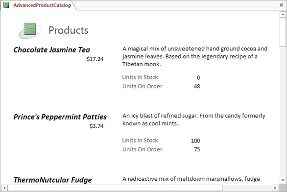
Although layouts are small miracles of convenience, they’re also a bit of a straitjacket if you want to arrange your data differently. Suppose you want to take the product catalog report and make it look less like an inventory list and more like a retail publication, as shown in Figure 11-4. You can’t do this with a layout, because your fields are always locked into a tight tabular structure. You can only get this result if you take your fields out of their layout table, and then arrange them by hand.
Note
Don’t get confused between layouts and Layout view. A layout is a container that arranges a bunch of controls. Layout view is a way to look at your report and change various aspects of it. You can use Layout view even if you don’t use any layout containers.
In the following steps, you’ll learn how to transform the layout-based product catalog into the table-free version shown in Figure 11-4. You’ll begin in Layout view, where you can remove the fields from their layout. Then you’ll switch into Design view to customize the arrangement of your fields. (Word of advice: Once you know your way around Design view, you’ll probably get the job done quicker by creating a new, layout-free report from scratch in Design view, as described on Creating a Report from Scratch (in Design View).)
Switch to Layout view (right-click the tab title and then choose Layout View).
You can remove fields in Design view, but the results aren’t as pleasant. When you remove a field from a layout in Layout view, Access automatically bumps it aside and gives it a little space of its own. But when you remove a field in Design view, Access leaves it in its original position. You end up with controls that are bunched up on top of each other, which makes them very difficult to arrange.
Select the entire table.
It’s neater and easier to remove all of a layout’s fields at once than to remove them one by one. To liberate the entire report at once, click any value in your report; a tiny four-way-arrow icon appears next to the top-left corner of your layout table. Click that icon to select the entire table.
Right-click the now-selected table and choose Layout→Remove Layout.
The Layout submenu provides three choices:
Tabular puts fields into a column-based arrangement, which is what you already have.
Stacked puts fields one on top of the other, which takes up more space but is nicer for certain types of data (for example, tables with just a few fields that contain a lot of text).
Remove Layout, the final option, puts the control in your hand, letting you create any arrangement you can imagine.
Right-click the tab title, and then choose Design view.
You could arrange your fields in Layout view, but most people find this tricky because Layout view shows several records at a time. Instead, you’ll probably have an easier time arranging them by using the section templates in Design view.
Make the Detail section larger by dragging down the bottom edge (as shown in Figure 11-2).
In a simple report, you need exactly one row to fit your record. But when you create a custom arrangement, you almost always need more space.
Drag the text box control for each field to the right place in the Detail section, and then resize it to the right size.
It may take some rearranging before you finally get all the boxes in the right places. Since the information isn’t in a layout table anymore, Access doesn’t automatically move information out of the way. Instead, you need to arrange everything by hand and make sure no two fields overlap.
In the Page Header section, select a column header for one of the fields in the Detail section. Either press Delete to remove it, or drag it down into the Detail section.
It makes no sense to include a column header at the top of a page when your field isn’t a part of the table any longer. If the data is fairly self-explanatory, you don’t need a caption at all. However, you could also drag the column header into the Detail section, and place it next to the corresponding data, so it acts like a caption. The report in Figure 11-4 keeps the captions for the UnitsInStock and UnitsOnOrder fields.
If you haven’t already, select each field, and then apply the formatting you want.
You can format the data in Design view in much the same way you do in Layout view. Just select the field, and then use the ribbon’s Report Design Tools | Format→Font section. Hold down Shift if you want to select (and then format) several controls at a time.
When you’re finished, switch to Layout view or Report view to see the result of your changes. Figure 11-5 shows the final arrangement for the revamped product catalog report shown in Figure 11-4.

Adding More Controls
In the previous example, you used your knowledge of controls to unshackle the fields in your report. However, text boxes with field values aren’t the only type of control you can use. Access reports also support labels, pictures, buttons, and other graphical gizmos that can jazz up the dullest report. Some of the reasons you may add more controls include:
To add more text information, like subtitles, disclaimers, explanatory notes, the company name, and so on
To draw separating lines between regions in the Detail section
To draw additional borders around important content
To pop a logo into the header or footer (The automatic logos you learned about on Building a Report in Layout View are limited to the report header.)
You can easily add a few more controls to your report. Just find the right button on the ribbon. When your report is in Design view, you’ll find one-stop shopping in the Report Design Tools | Design tab, as shown in Figure 11-6.

Some of these controls—like text boxes, checkboxes, and other editing controls—are really intended for use in forms and aren’t much use in a report. Others, like buttons and hyperlinks, can trigger useful actions when combined with a dash of macro code (as you’ll see in Chapter 15). But right now, you’ll want to use only a few controls:
The label control holds small or large amounts of fixed text. For example, all the column headers with the field names are labels.
The text box control holds a dynamic expression—in other words, text that can change.
The line control lets you draw vertical, horizontal, and even diagonal lines. It’s handy when you want to separate content graphically, and borders alone don’t give you the effect you want.
The rectangle control lets you draw formatted rectangles around other controls to help content stand out.
The page break control lets you split the Detail section into separate pages—exactly where you want. It’s useful when there’s a large amount of information in the Detail section, or when you’re printing forms that need to wind up on separate pages (like invoices for different customers).
Note
Although Access has controls for pictures, rectangles, and lines, it doesn’t have the Clip Art features you find in other Office applications. So don’t look around for fancy shapes and word art—you won’t find them.
Once you’ve picked the control you want, you can add it your report, as shown in Figure 11-7.

If you’re adding a label, you’ll want to set the text that appears inside. Once you add the label, the cursor appears inside so you can enter some text. If you want to edit the text in a label later on, click once to select the label, and then pause until the mouse pointer changes into a text pointer (known to techies as an I-beam). Then, click again in the label to start editing its text.
Note
When you add a new label, Access may pop up an exclamation-mark icon. If you hover over the exclamation mark, you see a warning that tells you your label isn’t linked to any other control (like a text box with the value of a field). Don’t worry; if you’re just adding a basic title or some unchanging bit of text, this situation is exactly what you want.
If you’re adding a rectangle, you probably want to set both the line color and the background fill color (using the Shape Outline and Shape Fill buttons in the Report Design Tools | Format→Control Formatting section). If you put two controls in the same place, then Access stacks the control that you added most recently on top of the control you added first. To move a control into the background, select it, and then choose Report Design Tools | Arrange→Sizing & Ordering→Send to Back.
You can also give some controls (especially text boxes and labels) a transparent background, so the content underneath them shows through. To try it out, select the control and choose Report Design Tools | Format→Control Formatting→Shape Fill→Transparent.
Creating a Report from Scratch (in Design View)
So far, you’ve tried your hand at modifying a simple report by using Design view. But if you don’t want to use a layout table, then it’s easier to start out in Design view and build your report there. When you build a report in Design view, Access doesn’t automatically add your fields to a layout, as it does in Layout view.
To create a report in Design view, you simply need to create a new, blank report, and then add all the controls you need to the appropriate sections. The following steps walk you through the process:
Choose Create→Reports→Report Design.
This action creates a new, blank report, and then opens it in Design view.
Choose Report Design Tools | Design→Tools→Add Existing Fields.
The Field List pane appears at the right of the window.
In the Field List pane, click the “Show all tables” link.
Access lists all the tables that are in your database in the Field List pane.
Expand the table you want to use by clicking the plus sign (+) next to it.
Now Access shows all the fields that are in that table.
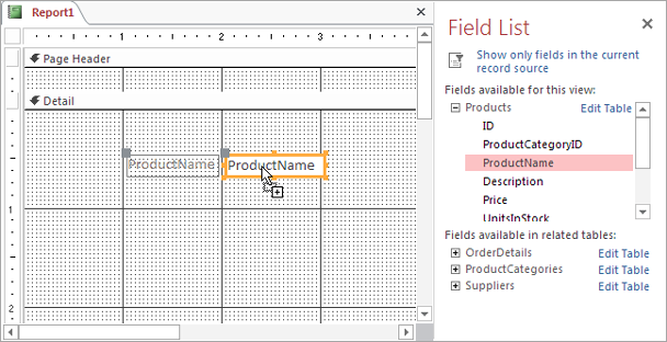
Drag the fields you want to show in your report from the Field List into the Detail section.
Each time you drop a field onto your report, Access adds two controls: a label that shows the field name and a text box that displays the field data (see Figure 11-8).
Move the field to the right place, and then resize it to the right size.
Resizing is a bit tricky at first, because you’re working with two linked controls. If you drag either piece, the other moves along with it. Figure 11-9 shows how to move just the caption or just the field value.
If you don’t want the label at all, just select it, and then press Delete.
Add additional content (like page numbers or miscellaneous text and pictures).
The Report Design Tools | Design→Controls section lets you insert a wide range of different controls (Adding More Controls). The Report Design Tools | Design→Header/Footer section lets you add image and text content that repeats at the top or bottom of every page (Building a Report in Layout View).
Apply any formatting you want to your controls.
The Report Design Tools | Format→Font section has the commands you need to change the typeface, text size, and colors, while the Report Design Tools | Format→Control Formatting section has the commands needed to add borders around a control or to change the background color.
You can format field values and field captions separately—just make sure you select the right part before you click the formatting command.
Tip
You can use conditional formatting to make certain values stand out, just like you did in Layout view (Conditional Formatting).
If you want to use a report header or footer, right-click a blank space on the design surface, and then choose Report Header/Footer.
This action makes the report header and report footer sections appear. You can then add controls to these sections. If you decide you don’t need the report header and footer, right-click the design surface and choose Report Header/Footer again.
You can also delete the page header and footer sections by right-clicking the design surface, and then choosing Page Header/Footer.
Resize the Detail section so it doesn’t have extra space at the bottom.
The Detail section starts out being quite large. If you don’t shrink it to fit your content, you’ll end up with a considerable amount of blank space between each record in your report.
Save your report.
You can save your report at any time by choosing File→Save, or you can close your report, at which point Access prompts you to save it.

The Report Wizard
Creating a report in Design view is a labor of love. Adding and arranging the controls you need takes time. Since the average Access fanatic is about as patient as a caffeine junkie in New York City traffic, Microsoft decided to add a shortcut for quickly generating different types of reports. That shortcut is the Report Wizard.
Note
The Report Wizard lets you more easily create a report that doesn’t use a layout, provided you like the preset options it gives you for arranging controls. If you want to create a simple report that uses a layout (as you did in Chapter 10), you don’t have to use the Report Wizard—you can create the report you need in one step (Report Basics).
The Report Wizard asks a few basic questions, and then creates the corresponding report. You can then tweak it to your heart’s content in Design view. Here’s how it works:
Choose Create→Reports→Report Wizard.
The Report Wizard’s first step appears.
From the drop-down list, choose the table you want to use.
In the Available Fields list, the wizard shows all the fields in your table.
You’ll probably recognize this window, because it’s exactly the same as the one you use to start building a query with the Query Wizard.
Add the fields you want to include, as shown in Figure 11-10. When you’re finished, click Next.
You can choose fields from more than one table, provided these tables are related.
If your report uses the fields from just one table, skip ahead to the next step. If your report uses fields from more than one related table, you need to answer an additional question about how you want to organize your data. One you’ve chosen, click Next.
You can organize your report by using the parent table or the child table. For example, if you’ve created a report that combines data from the Product and ProductCategory tables, you can organize your report by ProductCategory (the parent) or Product (the child). Here’s the difference:
By the parent table creates a report that uses grouping. For example, you can use this approach to create a list of products grouped by product category. Don’t choose this option yet; you’ll learn more about grouping on Report Grouping.
By the child table creates a standard report that looks like one big table. For example, it creates a list of products with the product category fields added next to every row. Right now, this simple option is a good choice. Later on, you’ll learn how you can add grouping to save some space.
The next step asks you if you want to add any grouping. For now, click Next to create a report without grouping.
You’ll learn how to use grouping in a report on Report Grouping.
Choose the field (or fields) you want to use to sort your report results and then click Next.
You can sort your results by a combination of four fields, but usually one is enough to get them in the order you want.
Choose a layout option for your report (Figure 11-11).
Your layout options include:
Columnar puts each field on a separate row, one after the other. The name is a little misleading—essentially your report has two columns. The first column holds the field caption, and the second column shows the field data. Both columns are in the Detail section.
Tabular uses invisible layout tables that you explored in Chapter 10. Access transforms each field into a separate column. The field labels are in the Page Header section, while the field data is the Detail section.
Justified packs the information into the smallest space possible. One row could include several fields. The name “justified” refers to the fact that the data fills the entire width of the page with no spaces. Where one fields ends, the next begins. All the report content is crammed into the Detail section.
If you want to turn the page on its side, then choose Landscape orientation, and then click Next.
Landscape orientation lets you fit wide tables or large amounts of information, but it includes fewer rows per page.
Enter the name for your report.
When the Report wizard finishes, it immediately saves your report.
Choose “Preview the report” if you want to look at the finished product in Print Preview mode, or “Modify the report’s design” if you want to change it in Design view first. Then, click Finish.
Access saves your report, and then opens it in Print Preview mode or Design mode, depending on your choice.


As you can see, the Report wizard really isn’t that flexible. It supports only a few types of layouts, and it doesn’t let you tailor how Access arranges different fields. However, it may give you a good starting point (and even if it doesn’t, it’s a worthwhile way to explore report layout in Design view).
The Label Wizard
If you have a table with address information (like customer homes, business locations, or suspected UFO sites), Access has another wizard to offer you. The Label Wizard pulls address information out of any table you want and uses it to print handy mailing labels.
To make this work, you just need to buy a few sheets of label paper from your favorite office supply store. Label paper varies—some types pack the information in very tightly, so you can print out dozens of return addresses at once, while others use larger labels for putting the mailing address on a letter or package. But no matter what type of label paper you pick, it has a standard Avery number that tells Access everything it needs to know about the labels’ size, and how they’re arranged. You give Access the Avery number, and then it can create a report that puts the address information in the correct place. All you have to do is print, peel, and stick.
Note
If you have a database that stores information about people, you may have thought about using Access reports to build form letters and other documents. Getting Access to cooperate isn’t all that easy. Instead, you’ll do better using a real word-processing program like Word. Word includes a mail merge feature that can extract data from an Access database, and then use it to generate any document you want.
To create a batch of labels, here’s what you need to do:
In the navigation pane, select the table with the address information.
It doesn’t actually need to be address information. If you want to print employee nametags or product stickers, or you just have an insatiable urge to label mysterious items around the house, you can place that data on your labels instead.
Tip
If you need to create labels using the information in more than one table, you’ll need to create a join query (Joining Tables in a Query), and then select that before you launch the Label Wizard.
The Label Wizard starts. The first step asks you to pick the type of label paper you’re using (Figure 11-12).
If your label paper is one long roll (as opposed to individual sheets), choose Continuous instead of “Sheet feed.”
Unless you have a printer from the dark ages of computer printing, you’re unlikely to use this option.
Find the label that has the same product number as your label paper. Double-check that the dimensions Access shows make sense.
Normally, the product number is the Avery number, which is what most people use. (You should have no trouble finding the Avery number on the front of a package of label paper.) However, if your label paper uses a different numbering system, then pick the company that made the paper from the “Filter by manufacturer” list.
Click Next.
The next step of the wizard asks you to choose the formatting for your label text (Figure 11-13).
Pick the font, text size, and the font color you want and then click Next.
Of course, you can change these details in Design view after the fact, but it’s better to get them right from the beginning. Usually, you should keep the font size that Access recommends—this size fits a good four to six lines of text in your label (depending on the label type).
In the next step, you get to pick the fields that Access should place on the label.
To add the first line to your table, find the fields you need in the “Available fields” list and then double-click them.
Add the fields in the order you want them to appear (FirstName, LastName, Street, City, and so on). As you pick fields, Access inserts a special placeholder in the “Prototype label” box. It adds the code {FirstName} to show you where it’ll place the value from the FirstName field.
It’s up to you to add the spacing you want between these fields. (Usually, you just want spaces and commas.) Figure 11-14 shows how.
In the “Prototype label” box, click the second line. Now, repeat step 7 to add fields to this line.
Repeat this step until you’ve added all the fields you need, each on the appropriate line.
Click Next.
The final step of the wizard appears. Here’s where you pick the sort order, choose a report name, and create your report.
Optionally, pick a field to use to sort the labels, and then click Next.
The sort order may or may not be important to you. (It could help you match a label up with a letter, if the letters are also in the same sorted order. But it doesn’t make a difference if you’re preparing a mass mailing that’s the same for every person.)
Often, people don’t use sorting but do use filtering (Filtering and Sorting a Report) to get just some labels (like all the customers living in a specific city).
If you use sorting, Access will arrange your labels from left to right, and then down the page.
Enter your report’s name.
When the Label Wizard finishes, it immediately saves your report.
Choose “See the labels as they will look printed” if you want to look at the finished product in Print Preview mode, or “Modify the label design” if you want to change it in Design view first. Then, click Finish.
Access saves your report, and then opens it in Print Preview mode (Figure 11-15) or Design mode, depending on your choice. If you open it in Design mode, then you can add extra touches. (You could place a company logo in the corner of the address, and so on.)


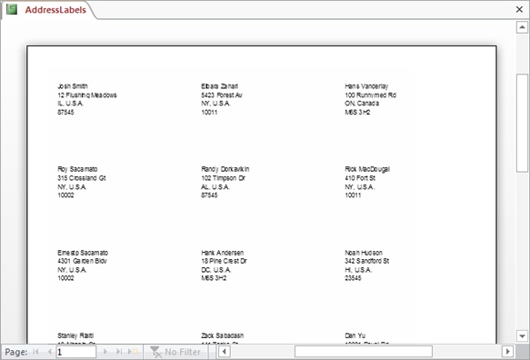
The label report is really just an ordinary Access report, like the kind you’ve learned about throughout this chapter. The Detail section contains a template that defines how Access places the fields for a single label, and that template is copied across the form.
The only difference between label reports and ordinary reports is that label reports use multiple columns. That way, the Detail section (which represents the label) can be copied from right to left across the width of the page, and then down the page. This method gives you a tightly packed grid of labels. (Usually, the Detail section is copied in one direction only: down the page.)
You can create your own report that also uses multiple columns to put records in a grid. You simply need to open your report in Design view, make sure your Detail section is very narrow, and then choose Report Design Tools | Page Setup→Page Layout→Columns. This pops open a window where you can set the number of columns, and the space between them. You can also choose whether Access lays out your records from top to bottom and then left to right, or from left to right and then top to bottom. Either way, check the Print Preview to make sure everything fits nicely on the page.
Fine-Tuning Reports with Properties
As you’ve already learned, you can most easily tweak your report’s controls with the ribbon buttons. However, although the ribbon is packed full of useful features, it doesn’t have everything. Behind the scenes, each control has a host of low-level settings, known as properties. Many of these settings are obscure, and people rarely use them. Some are known only to a small number of antisocial Access junkies. But a few are genuinely useful, because they provide features that you can’t reach anywhere else in Access. To hunt down and change these settings, you need the Property Sheet.
Note
The Properties window is occasionally useful for report writing, but it becomes much more important when you tackle forms in Part 4 and add code in Part 5.
To show the Property Sheet in Design view, choose Report Design Tools | Design→Tools→Property Sheet. The Property Sheet appears at the window’s right side (Figure 11-16).
The Property Sheet lets you fine-tune a single report item at a time. You choose the item by selecting it on the design surface or by choosing it from the drop-down list at the top of the Property Sheet. If you want to tweak a specific control, it’s usually easier to click to select it on the design surface. The drop-down list is sorted alphabetically by name, and Access doesn’t always use the most intuitive names. Sometimes the names match the underlying field (like ProductCategoryID), and sometimes they don’t (like Text3).

Most controls have a similar set of properties. To help get around this intimidating long list, the Property Sheet divides it into the following tabs:
Format contains the options you’ll change most often, including the font, color, borders, and margins.
Data identifies where the control gets its information. For the controls in the Detail section, this tab identifies the linked field’s name. Usually, you don’t need to change these settings on your own.
Event lets you attach Visual Basic code that springs into action when something specific happens. You’ll learn much more about code in Part 5.
Other includes the Name property, which defines the control name, and a few miscellaneous properties that are more relevant with forms.
All shows the whole shebang.
Tip
To get a quick one-sentence description of a mysterious property, click to select it in the Property Sheet, and then, at the bottom of the Access window, look for the descriptive text that appears in the status bar.
Interestingly, controls aren’t the only thing you can change in the Property Sheet. You can also adjust report settings (at the top of the Property Sheet, choose Report in the drop-down list), which identify where the data comes from and how you can view or edit the report. And you can tweak settings that are specific to a particular section (like ReportHeader, ReportFooter, PageHeaderSection, PageFooterSection, and Detail), which include page break details and additional formatting.
Of course, it’s one thing to know that there are a bunch of settings you can change, and another thing entirely to know what settings are worth tweaking. The Property Sheet is cluttered with a lot of properties that aren’t worth your time. In the next section, you’ll consider a table (Table 11-1) that lists the most useful properties in reports.
Modifying Common Properties
If you’re still a little overwhelmed by the Property Sheet, try the following steps. They walk you through the process of making a change:
Select a control on the design surface.
Its properties appear in the Property Sheet.
Click the Format tab, and then scroll down the list until you find the Back Color setting.
The Back Color setting determines the color that appears for the control background, behind the text.
Click the Back Color box. An ellipsis (…) button appears in the box. Click it.
A small window of color choices pops open. Access divides colors into two sections: theme colors, which vary based on the theme you choose for your report (Formatting a Report), and standard colors, which never change.
If you don’t want to use one of the theme colors or standard colors, click More Colors at the bottom of the color window. A Colors window opens, where you can build a custom color by specifying the exact portion of red, green, and blue you want in it (using numbers from 0 to 255).
Choose a color.
The new color appears immediately.
You can also use this technique to set the background for an entire section of the report. From the drop-down list in the Property Sheet, just choose a section like ReportHeader or Detail, and then follow these steps.
Note
If you change the background color of a report section, make sure you also change it for all the controls on that part of the report, or they’ll have white boxes around them. You can select all the controls you want to change at once by dragging a selection box around them, or you can just hold down Shift, and then click each one. Then, head to the Property Sheet to make your batch change.
In this example, you could change the background color more easily using the ribbon. However, you can change many properties in the Property Sheet that have no equivalent in the ribbon. Table 11-1 lists a few useful examples, all of which you find in the Format tab.
PROPERTY | DESCRIPTION | |
Text box | Can Grow | If you set Can Grow to Yes, Access expands the field vertically to fit its content. Can Grow is switched on for all fields when you create a simple tabular report, but it’s not necessarily on for other types of reports that you generate with the Report wizard. When it’s not switched on, Access chops down long content to fit the available space. |
Text box | Hide Duplicates | If you set Hide Duplicates to Yes and several adjacent rows have the same value, Access shows the field value in the first row only. Access leaves the column blank in the following rows. This feature works best if your field has lots of repeated values, and you’ve sorted the report using this field so duplicate values are grouped together. For example, you might use Hide Duplicates for a Category field in a list of products, so you see each category name just once. |
Report | Default View | Determines what view your report starts in when you open it by double-clicking its name in the navigation pane. Ordinarily, you start in Report view. |
Report | Page Header and Page Footer | The standard setting, All Pages, places the header and footer on every page. Alternatively, you can choose to leave out the page header or page footer on pages that include the report header or report footer. |
PageHeadeSection, PageFooterSection, ReportHeader, ReportFooter, and Text box | Display When | Ordinarily, these sections appear onscreen and in the final printout. Alternatively, you can choose to include them in either the onscreen representation or the printout, but not both. |
Detail | Force New Page | Ordinarily, this property is set to None, and Access packs in as much information as possible before moving to the next page. Alternatively, you can use Before Section to start each record on a new page. The other Force New Page options are intended for use with grouping (Report Grouping). |
Detail | Keep Together | If set to Yes, Access never splits the Detail section over a page break in a printout. If there isn’t enough room for a complete record left on a page, Access skips straight to the next page and resumes printing the next year. |
Expressions
Earlier in this chapter, you learned how to add a label and set its text. But if you look at the controls on a typical report, you’ll quickly notice that they don’t all use ordinary text. Consider the date or page number information (which appears in the top-right corner of a simple report). Both these details appear in ordinary label controls, but the text looks distinctly different. It starts with an equal (=) sign, which indicates the presence of an expression.
Expressions let text boxes and other controls show dynamic values. No one wants to type in a specific date in a report, because you’d be forced to update it every time you want to make a printout. Instead, you use an expression like =Date(), which tells Access to grab the current date from the computer clock and display that.
Expressions aren’t new. You learned about them with queries on Defining a Calculated Field. However, until now you probably didn’t realize that they’re equally at home in reports. You can add your own expressions to a report to display dynamic data, or perform calculations based on other fields.
Suppose you want to improve the wedding list by combining the first and last names into a compact one-line display. As you learned on Defining a Calculated Field, the & symbol is the ticket for fusing together pieces of text. Here’s the expression you need:
=FirstName & " " & LastName
Note
Refer to Chapter 7 (starting on Defining a Calculated Field) for an overview of expressions, the different types of calculations you can perform, and the different functions you can use with them.
You can’t enter an expression into a label control, because a label is limited to fixed, unchanging text. Instead, you need to use the text box control. (Access also uses the text box control to display most fields.)
Once you’ve added the text box to the design surface, click to select it. The mouse pointer changes into the text pointer. Click again to edit the text, and then enter your expression exactly, remembering to start with the equal sign (Figure 11-17).
Normally, when there’s numeric information in a report, Access uses the number formatting that’s defined for your table. However, when you’re using a calculated expression, Access shows the result as an ordinary number, even if you want two decimal places and a currency symbol. To fix the formatting, select the text box that contains the expression, and choose the format you want (like Currency) from the Report Design Tools | Format→Number→Format list. (You can also change the format by using the Format property in the Property Sheet.)
Grouping
Grouping is an indispensable tool for making sense of large volumes of data by arranging them into smaller groups. You can then perform calculations on each individual group. Consider a list of orders in the Boutique Fudge database. Depending on how you want to group your data, you can consider whether chocolate milk outsells chocolate beer, whether customers in New York crave more cocoa than those in Alabama, and so on.
You have three ways to use grouping to analyze information in a report:
Use grouping with a query. In this case, your report doesn’t include any details. Instead, it features calculated sums, averages, maximums, or minimums form the underlying query. You don’t need any fancy reporting mojo to pull this off—just create a totals query with grouping (as described on Totals Queries), and then use that query to build a report.
Use report grouping. This way, you can organize large volumes of information into subgroups. You still see all the details, but you can use subtotals and other calculations. You can also add multiple grouping levels to pull out buried trends.
Use subreports. This way has the same effect as report grouping. The only difference is that you create your report in two distinct pieces.
Note
Subreports are largely a holdover from old versions of Access. In Access 2013, the grouping features are so good that you really don’t need subreports. In this book, you’ll focus on getting the most from report grouping, and you’ll bypass subreports.
Report Grouping
To create groups, switch to Layout view or Design view. Then, find the field you want to use for grouping. For example, if you want to group a product list by product category, you need to group on the ProductCategoryID field. (Or, if you’ve added a related field to your report from the ProductCategories table, like CategoryName, you can use that instead—it’s the same thing.)
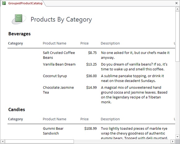
To apply your grouping, right-click the field you want to use for grouping and then select Group On. Access sorts your results by that field, and then groups them. Figure 11-18 and Figure 11-19 show two reports that group products by category.
Note
If you’ve created a lookup, Access is smart enough to do the right thing and use the descriptive field, rather than the linked field, for sorting. ProductCategoryID uses a lookup that displays the matching product name, rather than the underling category ID number that no one really cares about. When you right-click the ProductCategoryID field and choose Group On, Access actually uses the CategoryName field for sorting.
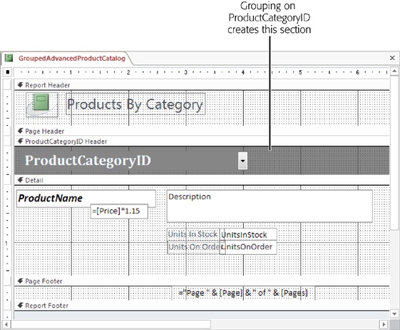
Grouping works by adding more sections to your report. If you group using the ProductCategoryID field, your report gains a new section named ProductCategoryID Header, which Access places just above the Detail section (see Figure 11-20). This group header includes information about the grouping—in this case, the product category. The Detail section has the data for each record that’s placed in the group.
Note
As you’ll see later, you can actually add multiple levels of grouping. When you do, Access adds one group header for each level.
When you use grouping, it may not make sense to keep your column headers in the page header section. That’s because every group header interrupts your table. Often, you’re better off placing the column headers at the bottom of the group header, so they appear at the beginning of every group (not at the top of every page). Figure 11-18 uses this approach. (Figure 11-19 doesn’t need to, because it doesn’t use any headers at all.) Unfortunately, to use this more attractive arrangement, you need to remove your fields from their automatic layout (Moving Fields Out of a Layout).

Fine-Tuning with the “Group, Sort, and Total” Pane
Once you have your grouping in place, you have many more options:
You can add an extra layer of sorting that sorts each subgroup.
You can perform summary calculations for each group.
You can force page breaks to occur at the start of each new group.
You can most easily add any of these features with the “Group, Sort, and Total” pane. To show it in Design view, choose Report Design Tools | Design→Grouping & Totals→Group & Sort. Or, in Layout view, choose Report Layout Tools | Design→Grouping & Totals→Group & Sort.
The “Group, Sort, and Total” pane appears at the bottom of the window. Figure 11-21 shows what you’ll see if you examine the products-by-category report from Figure 11-19.

The following sections describe your options in the “Group, Sort, and Total” pane:
Sort by
Chooses the field that’s used for sorting. In Figure 11-22, fields are sorted by CategoryName, and then grouped by ProductCategoryID.

Group on
Chooses the field that’s used for grouping. This option lets you switch up your grouping in a flash.
With a on Top / From Smallest to Largest
Changes the sort order. The exact wording depends on the data type, but you can sort alphabetically for text, numerically for numbers, or chronologically for dates.
By Entire Value
Tells Access to create a separate group for every different value in the grouped field. If you’re grouping by ProductCategoryID, this option ensures that Access places each category in a distinct group. In some situations, this approach creates too many groups, making it difficult to perform any analysis (and wasting reams of paper). In cases like that, you need a way to create larger groups that include more records. If you’re grouping products by price, or orders by date, then you may prefer to group a range of values, as shown in Figure 11-23.

With … Totaled
Subtotals is the most popular grouping feature. Subtotals let you compare how different groups stack up to one another. The “Group, Sort, and Total” pane lets you perform calculations using any numeric fields for your subtotals (Figure 11-24).

Depending on what you’re trying to accomplish, you can count values, add them, calculate averages, or determine maximum and minimum values in a group. You can place this information into a header that appears at the beginning of each group or into a footer that follows at the end. Finally, you can top your report off with a final grand total that adds up all the subgroups.
With Title
Click this section to add a fixed title that appears in the category header, at the beginning of each category section. Of course, you can add a title on your own by inserting a label in Design view, but this option provides a convenient shortcut.
With a Header Section / With a Footer Section
You can apply a header at the beginning of each group, and a footer at the end. Once you add these sections, you can place any content you want in them by using Design view. You’ll use them most often to display information about the entire group, show subtotals, or draw separating lines with the line control (Adding More Controls).
Keep Group Together on One Page
This setting helps you prevent orphaned category headers. In the product catalog example, this option makes sure you don’t wind up with a group title like Beverages at the bottom of a page, and all the matching products on the following page.
Ordinarily, Access doesn’t prevent awkward page breaks. Instead, it simply tries to fill each page. If this isn’t what you want, then you have two other choices. You can choose to make sure the entire group is always placed on the same page (assuming it’s less than one page long), or you can choose to make sure the header and at least one record are kept together on the same page.
One option the “Group, Sort, and Total” pane doesn’t offer you is forcing a new page break at the beginning of each group. To accomplish this, you need to switch to Design view, select the group header section, and then, in the Format section Property Sheet, look for the Force New Page setting. Set it to Before Section to force a page break at the beginning of each new section, or After Section to force the page break at the end of the section. (You don’t see a difference between these two settings unless you’re using a report header and footer. If you have a report header and you use Before Section, you end up with a page break between the report header and the first section.)
Note
You don’t see Force New Page setting’s effect in Layout view, Report view, or Design view. It appears only when you use the Print Preview feature, or when you actually print your report.
In many scenarios, you’ll want a group to start on a new page. This stipulation makes sense when printing the class list shown in Figure 11-25. In this case, the Force New Page setting lets you avoid putting two attendance lists on the same page.

Multiple Groups
Your reports aren’t limited to a single group. In fact, you can add as many levels of sorting and grouping as you want, to slice and dice your data into smaller, more tightly focused subgroups.
To add another level of grouping, just right-click the field you want to use, and then click Group On. This adds it to the list in the “Group, Sort, and Total” pane. (You can also add additional levels of sorting by right-clicking a field, and then choosing a sort command. If you began by sorting and grouping your products into categories, you could sort each category by product name.)
When you have more than one group in the “Group, Sort, and Total” pane, it’s important to make sure they’re applied in the right order. For example, if you want to create a list of all the items that each customer has ordered, you need to group first by order (to group together all the items in each order) and then by customer (to assemble all the orders made by each customer). If you group first by customer and then by order, you’ll get a nonsensical report that attempts to subdivide each order into customer-specific groups. And unless your business lets customers join together to make orders, this arrangement is meaningless.
To change the order of your groups, select one of the grouping levels in the “Group, Sort, and Total” pane and then click the up or down arrow button to move it (Figure 11-26). To remove a grouping level altogether, select it and then press Delete.


Each group you add can have a header and footer section and its own set of totals. You add these ingredients by using the “Group, Sort, and Total” pane—just select the appropriate grouping level, click More, and then change the various options, as described in the previous section.
When you have more than one level of grouping, you can hide some of your information so you see just the totals. In Layout view, simply choose Report Layout Tools | Format→Grouping & Totals→Hide Details. If you use this technique on the example in Figure 11-27, Access hides the line-by-line order details, and all you’ll see is the total for each order.
Tip
The invoice example creates a report that prints invoices for all the orders in your database. However, you can use filtering (Filtering and Sorting a Report) to filter down the results to a specific order or customer.