
8. Understanding Colors and Channels
What You’ll Do
Work with 8-, 16-, and 32-Bit Images
Understand the Various Color Modes
Use the Replace Color Adjustment
Use the Stroke and Fill Commands
Use Auto Contrast and Auto Color
Use Levels Adjustment Commands
Use Curves and Color Adjustments
Use Hue, Saturation, and Vibrance
Use Channel Mixer and Gradient Map
Use Photo Filter and Shadows/Highlights
Use the Invert and Equalize Commands
Use the Threshold and Posterize Adjustments
Use the Black & White Adjustment
Introduction
In the world of design, color is one of the most important elements. When you’re creating a brochure, advertisement, or banner using Adobe Photoshop, good use of color attracts the attention of the viewer. It also helps draw the elements of your design into one cohesive unit. Color is a strong motivator and is used in all aspects of our daily life.
Since color is so important to design, Photoshop lets you use industry-standard color sets, or you can create and save your own customized color panels. You can also color-correct a photograph by removing the color entirely or selectively removing colors from portions of the image. In addition, Photoshop gives you ways to select areas based on color, and then fill those areas with any color you choose.
Not only is it important to understand how color is used, it’s also important to understand how Photoshop manages color information and that’s where the Channels panel comes into the picture. Channels are where color information is stored. The number of channels in an image is based on its color mode, or color model, such as RGB (Red, Green, and Blue) or CMYK (Cyan, Magenta, Yellow, and Black). A firm understanding of channels and color modes, and their function in Photoshop, will go a long way in helping you control and manage color.
When adjusting your image, you can use various commands—Auto Contrast and Color, Curves, Color Balance, Brightness/Contrast, and Desaturate, just to name a few. You can also use the Match Color and Selective Color adjustments to further fine-tune your image. Photoshop also provides a Photo Filter adjustment, as well as a Shadows and Highlights adjustment to correct those overexposed or underexposed images. With all of the commands and adjustments available, the real dilemma will be, where do you begin?
Working with 8-, 16-, and 32-Bit Images
It’s all about the numbers, and that’s a fact. The number of colors available for displaying or printing each pixel in an image is called bit depth—also known as pixel depth or color depth. A higher bit depth means more available colors and more accurate color representation in an image. A bit depth setting of 2 bits displays 4 colors, 4 bits displays 16 colors, 8 bits displays 256 colors, 16 bits displays 32,768 colors, and 24 bits and 32 bits both display 16.7 million colors. Most digital images currently use 8 bits of data per channel. For example, an RGB image with 8 bits per channel is capable of producing 16.7 million (a 24-bit RGB image: 8 bits x 3 channels) possible colors per pixel. While that may seem like a lot of color information, when it comes to color correction and adjustment, it isn’t.
In response to Photoshop users needing more control, Photoshop supports 16-bit and now 32-bit—known as High Dynamic Range (HDR)—images. High Dynamic Range images with 32 bits per channel have a more extended dynamic range than lower bit depth images. Dynamic Range describes the ability of a channel to capture maximum information from the black to white and dark and bright areas of an image. An 8-bit channel image has a dynamic range of 250:1 (per channel), similar to the dynamic range of printed paper or a computer display. A 16-bit channel image has a dynamic range of 65,000:1, and a 32-bit channel image has a dynamic range of over 200,000:1. The greater dynamic range translates into better control over an image when making fine color and contrast adjustments using Levels and Curves (shown below). Working with HDR images is very similar to using raw files and applying exposure changes after the fact. Photographers can capture the full dynamic range of a scene with multiple exposures and merge the files into a single image.


Changing Bits Per Channel
The ability to work with 32-bit images is relatively new in Photoshop, and initially you had a limited use of adjustments and filters. However, in Photoshop many more adjustments and filters have become available for 32-bit images, such as Hue/Saturation, Levels, Gaussian Blur, Add Noise, Smart Sharpen, Channel Mixer, and more.
When adjusting the color or contrast of an image, first convert a standard 8-bit image to 16 bits, and then make your corrections. This helps prevent loss of color information, and banding between light and dark shades. Once all the color/contrast adjustments have been made, you can (if necessary) convert the image back to 8 bits. It’s that simple. You can change an image’s bit depth by displaying the image, clicking the Image menu, pointing to Mode, and then clicking 8 Bits/Channel, 16 Bits/Channel, or 32 Bits/Channel.
When you convert a 32-bit image to 8 or 16 bits per channel, if you choose to merge your layers before changing the bit depth, Photoshop opens the HDR Toning dialog box to let you make exposure and contrast corrections so the image retains the dynamic range you want. The Exposure and Gamma option lets you manually adjust brightness and contrast. Drag the Exposure slider to adjust the gain and drag the Gamma slider to adjust the contrast. The Highlight Compression option automatically adjusts highlight values to fit within the range for 8- or 16-bit images. The Equalize Histogram option automatically preserves image contrast. The Local Adaptation option adjusts the tonality (local brightness regions) in the image. Drag the Radius slider to specify the size of the local brightness regions and then drag the Threshold slider to specify the distance between tonal values before they are included in the brightness region. If you want to reuse these settings in the future, you can save them, and then load them again as needed.
Viewing 32-Bit Images
The dynamic range of HDR images exceeds the display capabilities of standard monitors. When you view a 32-bit HDR image, the highlights and shadows may look dark or washed out. To correct the problem, Photoshop allows you to adjust 32-bit preview options so 32-bit images display properly on your monitor. The preview options are stored in the image file, so each file retains its own settings. To set preview options, open a 32-bit HDR image, click the View menu, and then click 32-Bit Preview Options. In the 32-bit Preview Options dialog box, select the preview settings you want (described earlier in this topic), and then click OK.
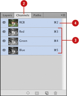
Working with the Channels Panel
The Channels panel is Photoshop’s storage locker for color and selection information. For example, when you open an RGB image, the Channels panel displays color channels of red, green, and blue. When you open a CMYK image, the color channels are cyan, magenta, yellow, and black. These primary color channels are defined as the native color channels of the image. The Channels panel can also contain spot color channels and selection masks. In addition to color information and selection masks, the Channels panel contains a composite channel. The composite, when selected, lets you view the full-color image in the document window. Selecting any of the individual native color channels changes the active view of the image to display the selected color channel. The Channels panel stores color information using shades of gray, and each color channel is capable of displaying 256 gradations from black to white. A zero-value pixel displays as black, and a 255-value pixel displays as white. The darker the shade of gray, the less of the selected ink color is used to create the visible colors within the image.
Work with the Channels Panel
![]() Open a color document.
Open a color document.
![]() Select the Channels panel.
Select the Channels panel.
![]() Click on the individual channels to view the native color channels of the active document.
Click on the individual channels to view the native color channels of the active document.
![]() Click the composite channel to view the full-color image.
Click the composite channel to view the full-color image.
See Also
See “Creating Spot Color Channels” on page 212 for more information on using the Channels panel.
See “Using Channels to Create and Store Selections” on page 100 for more information on using channels.
Working with Color Modes
Color modes define the colors represented in the active document. Although you can change the color mode of a document, it is best to select the correct color mode at the start of the project. Photoshop’s color modes are Bitmap, Grayscale, Duotone, Indexed Color, RGB (Red, Green, and Blue), CMYK (Cyan, Magenta, Yellow, and Black), Lab, and Multichannel. See “Selecting Color Modes and Resolution” on page 13 for information on the best use for each color mode. The number of channels in an image depends on its color mode. For example, a CMYK image contains at least four channels, one for each color.
Color modes determine the number of colors, the number of channels, and the file size of an image. For example, an RGB image has at least three channels (like a printing plate), one for red, green, and blue color information. Color modes not only define the working color space of the active document, they also represent the color space of the output document. It’s the document output (print, press, or monitor) that ultimately determines the document color mode. Color modes do not just determine what colors the eye sees; they represent how the colors are mixed, and that’s very important because different output devices use different color mixes.
Therefore, when selecting a color mode, know the file format of the document and where it will be used. An image taken with a digital camera and then opened in Photoshop would most likely be in the RGB color mode. An image displayed on a monitor would be RGB, or possibly Indexed Color. A photograph scanned on a high-end drum scanner would most likely be in the CMYK color mode. An image being sent to a 4-color press would be CMYK, too. If you were creating a Photoshop document from scratch, the color mode you choose should represent the eventual output destination of the document, such as on a web page, to an inkjet printer, or a 4-color press.
Switching Between Color Modes
Unfortunately, images do not always arrive in the correct format. For example, you take several photographs with your digital (RGB) camera, but the images are being printed on a 4-color (CMYK) press, or you want to colorize a grayscale image. Changing color modes is a snap, but changing the color mode of an image isn’t the problem. The problem is what happens to the digital color information when you change color modes. For example, if you open an RGB image with the intent of sending it out to a 4-color press (CMYK), the smartest course of action is to remain in the RGB color mode through the processing of the image, and then convert the image into the CMYK mode at the end. The reason has to do with how Photoshop moves between those two color spaces. For example, if you move a color-corrected CMYK image into the RGB color mode, and then back to CMYK, the colors shift because Photoshop rounds color values during the change process. On top of that, a CMYK image is 25% larger than an RGB image, and the RGB color mode represents the color space of your monitor, not a printing press. It is impossible to view subtractive CMYK color on an RGB device. If, however, the image originally came to you as a color-corrected CMYK image, then stay in and work inside that color mode.
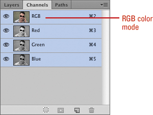
Understanding the RGB Color Mode
The RGB color mode is probably the most widely used of all the color modes. RGB generates color using three 8-bit channels: 1 red, 1 green, and 1 blue. Since each channel is capable of generating 256 steps of color, mathematically, that translates into 16,777,216 possible colors per image pixel. The RGB color mode (sometimes referred to as Additive RGB) is the color space of computer monitors, televisions, and any electronic display. This also includes cell phones and mobile devices. RGB is considered a device-dependent color mode. Device-dependent means that the colors in images created in the RGB color mode will appear differently on various devices. In the world of computer monitors and the web, what you see is very seldom what someone else sees; however, understanding how Photoshop manages color information goes a long way to gaining consistency over color.
Convert an Image to RGB Color
![]() Open an image.
Open an image.

![]() Click the Image menu, point to Mode, and then click RGB Color.
Click the Image menu, point to Mode, and then click RGB Color.
Photoshop converts the image into the RGB color mode.
Understanding the CMYK Color Mode
The CMYK color mode is the color mode of paper and press. Printing presses (sometimes referred to as a 4-color press) convert an image’s colors into percentages of CMYK (Cyan, Magenta, Yellow, and Black), which eventually become the color plates on the press. One at a time, the plates apply color to a sheet of paper, and when all 4 colors have been applied, the paper contains an image similar to the CMYK image created in Photoshop. The CMYK color mode can take an image from a computer monitor to a printed document. Before converting an image into the CMYK mode, however, it’s important to understand that you will lose some color saturation during the conversion. The colors that will not print are defined as being out of gamut. To view the areas of an RGB image that will lose saturation values, click the View menu, and then click Gamut Warning. Photoshop will mask all the areas of the image that are out of gamut.
Convert an Image to CMYK Color
![]() Open an image.
Open an image.

![]() Click the Image menu, point to Mode, and then click CMYK Color.
Click the Image menu, point to Mode, and then click CMYK Color.
Photoshop converts the image into the CMYK color mode.

See Also
See “Using Curves and Color Adjustments” on page 216 for more information on adjusting the color of an image.
Understanding the Grayscale Color Mode
The Grayscale color mode utilizes an 8-bit pixel (8 on/off light switches) to generate 1 black, 1 white, and 254 shades of gray. Although scanning and working on old black and white images might seem the obvious reason to use the Grayscale color mode, the speed and power of Photoshop, combined with faster computer systems, has prompted most photo restorers to switch to the RGB color space because of its greater versatility and ability to generate millions of colors (or shades of gray). Yet despite the move to RGB, the Grayscale color mode is still used extensively with black and white images, where file size is a consideration (grayscale images are two-thirds smaller than RGB images), and when output to rag-style papers, such as newsprint, fail to produce the detailed information available with RGB.
Convert an Image to Grayscale
![]() Open an image.
Open an image.

![]() Click the Image menu, point to Mode, and then click Grayscale.
Click the Image menu, point to Mode, and then click Grayscale.
The image is automatically converted into the Grayscale color mode.
Did You Know?
You can colorize a grayscale image. Convert the image into the RGB mode, and then select a color, brush, and brush size on the Options bar. The trick is to change the blending mode of the brush on the Options bar to Color. Then, as you paint on the image, the selected color will replace the original grays.
Understanding the Bitmap Color Mode
Bitmap images consist of two colors: black and white. Bitmap images are sometimes referred to as 1-bit images. Think of a bitmap as a light switch with two positions, on and off. Each pixel in a bitmap image is either on or off, black or white. Because they are only 1 bit, the file size of a bitmap image is typically very small. Bitmap images have limited use, but often are employed for black and white ink drawings, line art, sketches, and for creating halftone screens.
Convert an Image to Bitmap
![]() Open an image.
Open an image.
![]() Click the Image menu, point to Mode, and then click Bitmap.
Click the Image menu, point to Mode, and then click Bitmap.
Important
Before converting an image into a bitmap, it must first be in the Grayscale color mode.
![]() Enter a value for Output Resolution.
Enter a value for Output Resolution.
![]() Click the Use list arrow, and then select from the available options:
Click the Use list arrow, and then select from the available options:
♦ 50% Threshold. Converts pixels with gray values above the middle gray level (128) to white and below to black. The result is a high-contrast, black-and-white image.
♦ Pattern Dither. Converts an image by organizing the gray levels into geometric patterns of black and white dots.
♦ Diffusion Dither. Converts pixels with gray values above the middle gray level (128) to white and below to black using an errordiffusion process. The result is a grainy, film-like texture.
♦ Halftone Screen. Simulates the effect of printing a grayscale image through a halftone screen.
♦ Custom Pattern. Simulates the effect of printing a grayscale image through a custom halftone screen. This method lets you apply a screen texture, such as a wood grain, to an image.
![]() Click OK.
Click OK.


Understanding the Indexed Color Mode
The Indexed Color mode gives you two advantages. You can create images as small as grayscale (8-bit pixels), and you get color instead of shades of gray. Its small file size and ability to generate color make it a winning color mode for images displayed on web pages, as well as graphics used in computer-generated presentations. Its one drawback is the number of colors generated; Indexed Color images generate a maximum of 256 colors (the same number as the steps of gray in a grayscale image). The good news is that you get to choose the colors. When you convert an image into the Indexed Color mode, Photoshop creates a color lookup table (CLUT) to store the image’s color information. When a color in the image cannot be found in the lookup table, Photoshop substitutes the closest available color.
Convert an Image to Indexed Color
![]() Open an image.
Open an image.
![]() Click the Image menu, point to Mode, and then click Indexed Color.
Click the Image menu, point to Mode, and then click Indexed Color.
![]() Select from the following Indexed Color Mode options:
Select from the following Indexed Color Mode options:
♦ Palette. Click the list arrow to choose from the available color panels, or click Custom and create your own palette.
♦ Colors. Select the number of colors for the lookup table (3 to 256).
♦ Forced. Force the lookup table to hold specific colors. Black and White adds a pure black and a pure white to the color table; Primaries adds red, green, blue, cyan, magenta, yellow, black, and white; web adds the 216 web-safe colors; and Custom allows you to specify your own colors.
♦ Transparency. Select the check box to preserve transparent areas of the image (if there are no transparent areas, this option is disabled).
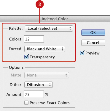
![]() Select from the following options:
Select from the following options:
♦ Matte. Click the list arrow to fill transparent areas of the original image with a specific color.
♦ Dither. Click the list arrow, and then select a pixel-mixing (dither) scheme. Dithering helps transitional areas of the image (shadows, light to dark) appear more natural.
♦ Amount. If the Dither option is selected, the Amount instructs Photoshop how much color information to use in the dithering process (1% to 100%).
♦ Preserve Exact Colors. Select the check box to hold exact color measurements in the lookup table.
![]() Click OK.
Click OK.


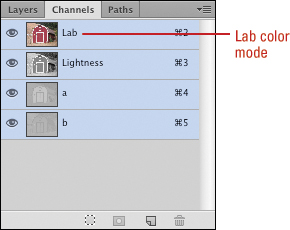
Understanding the Lab Color Mode
The Lab color mode is an old color measuring system. Created in France, its purpose was to measure color based on visual perception. Since personal computers had not been created at that time, the Lab mode is not based on a particular computer or operating system, and so Lab color is device independent. The Lab mode measures color using a lightness channel, an “a” channel (red to green), and a “b” channel (blue to yellow). Lab Color works well for editing images obtained from Stock Photos, moving images between operating systems (Photoshop Mac to Photoshop Win), and for printing color images to PostScript Level 2 or 3 devices. Because of its ability to separate the gray tones of an image into an individual channel (lightness), the Lab color mode is excellent for sharpening, or increasing the contrast of an image without changing its colors. Just convert the original RGB image to Lab color, select the Lightness channel, and perform sharpening or Levels and Curves adjustments directly to the channel.
Convert an Image to Lab Color
![]() Open an image.
Open an image.

![]() Click the Image menu, point to Mode, and then click Lab Color.
Click the Image menu, point to Mode, and then click Lab Color.
Photoshop converts the image into the Lab color mode.
Did You Know?
You can use the Lab color mode to archive RGB color images. Since the Lab color space is device-independent, and RGB is device-dependent, archiving RGB images in the Lab color mode stabilizes the image’s color information and insures color accuracy, no matter what editing application is used.
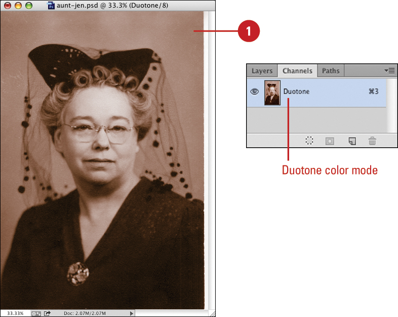
Understanding the Duotone Color Mode
The Duotone Color mode converts a grayscale image into a monotone (1-color), duotone (2-color), tritone (3-color), or quadtone (4-color) image using 1 to 4 custom inks. Duotones are frequently used to increase the tonal depth of a grayscale image. For example, most printing presses produce 50 levels of gray per color. By converting an image into a duotone, and using black and a mid-gray value, the press can produce a grayscale image with more dynamic range. A more common method for employing the Duotone color mode is to create an image with an overall color cast, for example, by converting the grays in the image to a sepia tone. If you’re uncertain how to create the proper color mix for a duotone image, Photoshop comes equipped with dozens of sample duotone, tritone, and quadtone color presets.
Convert an Image to Duotone
![]() Open an image. Click the Image menu, point to Mode, and then click Duotone.
Open an image. Click the Image menu, point to Mode, and then click Duotone.
Important
Before converting an image into a duotone, it must be in the Grayscale color mode.
![]() To use a duotone preset, click the Preset list arrow, and then select the preset you want.
To use a duotone preset, click the Preset list arrow, and then select the preset you want.
♦ You can also save, load, or delete a preset by clicking the menu options to the right of the preset menu.
![]() Click the Type list arrow, and then select from the following options:
Click the Type list arrow, and then select from the following options:
♦ Monotone. Uses one color to generate image tone (limited dynamic range).
♦ Duotone. Uses two colors to generate image tone (better dynamic range for B&W images).
♦ Tritone. Uses three colors to generate image tone.
♦ Quadtone. Uses four colors to generate image tone.
![]() Click the Overprint Colors button to adjust how the colors will display when the inks are printed.
Click the Overprint Colors button to adjust how the colors will display when the inks are printed.
![]() Click OK.
Click OK.

Using Multichannel Color Mode
The Multichannel color mode is a specialized mode that converts the original color channels into shades of gray, with the grays based on the luminosity values of the original image. The original channels are converted into spot colors. Since Multichannel mode is used almost exclusively by the printing industry, converting a CMYK image into Multichannel color mode produces Cyan, Magenta, Yellow, and Black spot channels, and converting an RGB image into Multichannel mode produces Cyan, Magenta, and Yellow spot channels, minus the Black channel. In both instances, converting to Multichannel Color mode causes the loss of the Composite channel.
Use the Multichannel Color Mode
![]() Open an image.
Open an image.

![]() Click the Image menu, point to Mode, and then click Multichannel.
Click the Image menu, point to Mode, and then click Multichannel.
Photoshop converts the image into the Multichannel mode.

Important
Images converted to the Multichannel mode must be saved in the DCS 2.0 format (Desktop Color Separations). The DCS 2.0 format generates a separate file for each of the image’s spot colors.
See Also
See “Preparing an Image for the Press” on page 438 for more information on saving an image in the DCS 2.0 format.
Using the Replace Color Adjustment
Photoshop’s Replace Color command lets you create a selection based on image color, and replace that color selection with any other color. The Replace Color adjustment accomplishes this by giving you access to the three components of color: Hue, Saturation, and Brightness. Hue gives you the ability to change the image’s actual color, Saturation controls the amount of color, and Brightness determines how bright the color is based on its Hue and Saturation.
Use the Replace Color Adjustment
![]() Open a color document.
Open a color document.
![]() Click the Image menu, point to Adjustments, and then click Replace Color.
Click the Image menu, point to Adjustments, and then click Replace Color.
![]() Select the Localized Color Clusters check box if you want to limit your color selection to a specific area on the active document, using the Selection eyedroppers to select, add, or subtract colors.
Select the Localized Color Clusters check box if you want to limit your color selection to a specific area on the active document, using the Selection eyedroppers to select, add, or subtract colors.
![]() Click the Color box to select a specific color for the selection.
Click the Color box to select a specific color for the selection.
![]() Drag the Fuzziness slider to increase or decrease the sensitivity of the eyedropper tools.
Drag the Fuzziness slider to increase or decrease the sensitivity of the eyedropper tools.
![]() Click the Selection or Image option to toggle between a view of the selection mask and the active image (white areas of the mask represent selected areas).
Click the Selection or Image option to toggle between a view of the selection mask and the active image (white areas of the mask represent selected areas).
![]() Drag the Hue, Saturation, and Lightness sliders to change the selected areas.
Drag the Hue, Saturation, and Lightness sliders to change the selected areas.
![]() Select the Preview check box to view the changes in the active document.
Select the Preview check box to view the changes in the active document.
![]() Click OK.
Click OK.

Working with the Color Panel
Photoshop not only lets you select virtually any colors you desire, it also lets you store those colors for future use. For example, you create a color scheme for a recurring brochure and you want a way to save those colors, or you’re working on an Internet graphic and you need a web-safe color panel. Whatever your color needs, Photoshop stands ready to meet them. The Color panel gives you access to Photoshop’s color-generation tools. This single panel lets you create colors using 6 different sliders, 2 spectrum color selectors, a grayscale ramp, and an option that lets you create a color ramp for the current foreground and background colors. If you need more room to work in the Color panel, you can resize it (New!).
Work with the Color Panel
![]() Select the Color panel.
Select the Color panel.
![]() Click the Color Options button.
Click the Color Options button.
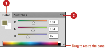
![]() Select from the following Color Sliders:
Select from the following Color Sliders:
♦ Grayscale. Creates a single slider going from white (0) to black (100).
♦ RGB. Creates three sliders (red, green, and blue). Each slider has a possible value from 0 to 255.
♦ HSB. Creates three additive sliders (hue, saturation, and brightness). Each slider has a possible value from 0 to 255.
♦ CMYK. Creates four subtractive sliders (cyan, magenta, yellow, and black). Each slider has a possible value from 0 to 100.
♦ Lab. Creates three sliders (L, a, and b). The L slider has a possible value from 0 to 100, and the a, b sliders have a possible value from -128 to 127.
♦ Web Color. Creates three sliders (red, green, and blue). Each slider has a possible hexadecimal value from 00 to FF.
![]() Click the Color Options button, and then select from the following Spectrums or Ramps:
Click the Color Options button, and then select from the following Spectrums or Ramps:
♦ RGB. Converts the lower portion of the Color panel to the RGB spectrum. Clicking anywhere in the spectrum changes the active color.
♦ CMYK. Converts the lower portion of the Color panel to the CMYK spectrum. Clicking anywhere in the spectrum changes the active color.
♦ Grayscale. Converts the lower portion of the Color panel to a grayscale ramp. Clicking anywhere in the ramp changes the active color.
♦ Current Colors. Converts the lower portion of the Color panel to a color ramp, using the current foreground and background colors. Clicking anywhere in the ramp changes the active color.
![]() To restrict the color ramp to only web-safe colors, click the Color Options button, and then click Make Ramp Web Safe.
To restrict the color ramp to only web-safe colors, click the Color Options button, and then click Make Ramp Web Safe.

![]() To change a color using the Adobe Color Picker, double-click a color box, select a color using the color range or color mode options, and then click OK.
To change a color using the Adobe Color Picker, double-click a color box, select a color using the color range or color mode options, and then click OK.
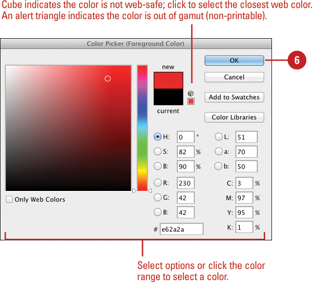
You can choose colors using four color models: HSB, RGB, Lab, and CMYK.
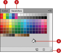
Working with the Swatches Panel
Photoshop not only lets you select virtually any colors you desire, it also lets you store those colors in the Swatches panel. Where the Color panel lets you select virtually any color you need, the Swatches panel lets you save and use specific colors that you use often. By default, the Swatches panel holds over 100 predefined color swatches, and has the ability to save as many user-defined swatches as you desire. You can also load saved custom swatches (ACO) or ones from HTML, CSS, or SVG files (New!), web content. If a color on a swatch is not exactly what you want or you no longer need it, you can change or delete it.
Add a Color Swatch to the Swatches Panel
![]() Select the Swatches panel.
Select the Swatches panel.
![]() Click the Swatches Options button, and then choose from the predefined color swatches.
Click the Swatches Options button, and then choose from the predefined color swatches.

![]() Click the Append button to add the selected color swatch to the panel.
Click the Append button to add the selected color swatch to the panel.
Add Colors to the Swatches Panel
![]() Select the Color panel, and then drag the sliders or enter values to create a new color swatch.
Select the Color panel, and then drag the sliders or enter values to create a new color swatch.
![]() Select the Swatches panel.
Select the Swatches panel.
![]() Drag the lower right corner to expand its size beyond the range of the available colors.
Drag the lower right corner to expand its size beyond the range of the available colors.
![]() Move the cursor just below the last swatch color until it resembles a paint bucket.
Move the cursor just below the last swatch color until it resembles a paint bucket.
![]() Click once, name the color, and then click OK.
Click once, name the color, and then click OK.
![]() Select a color, and then change the following:
Select a color, and then change the following:
♦ Foreground. Change the color by clicking on any color in the Swatches panel.
♦ Background. Change the color by holding down the Ctrl (Win) or ![]() (Mac) key, and then clicking on any color in the Swatches panel.
(Mac) key, and then clicking on any color in the Swatches panel.
♦ Delete. Hold down the Alt (Win) or Option (Mac) key (your cursor will turn into a pair of scissors), and then click the color in the Swatches panel.

Save Customized Swatches
![]() Select the Swatches panel.
Select the Swatches panel.
![]() Create a customized swatch panel by adding and/or deleting colors from an existing panel.
Create a customized swatch panel by adding and/or deleting colors from an existing panel.
![]() Click the Swatches Options button, and then click Save Swatches.
Click the Swatches Options button, and then click Save Swatches.
![]() Enter a name in the Save As box.
Enter a name in the Save As box.
![]() Click the Save In (Win) or Where (Mac) list arrow, and then select a location to store the swatch.
Click the Save In (Win) or Where (Mac) list arrow, and then select a location to store the swatch.
When you save swatches in the Color Swatches folder (default location), your customized swatches appear at the bottom of the Swatches Options menu.
![]() Click Save.
Click Save.
The swatch file is saved with the ACO extension.

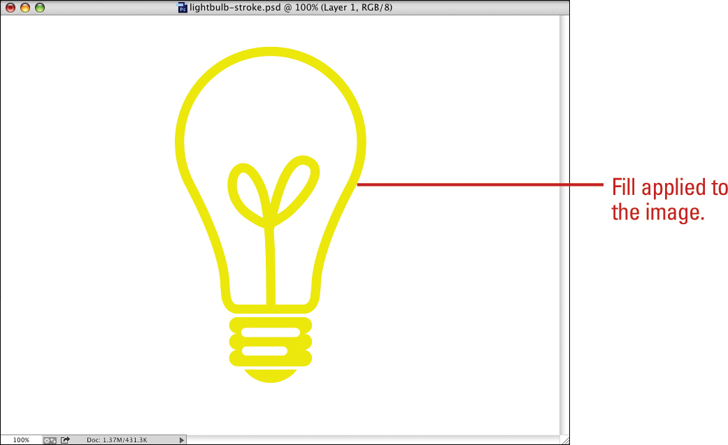
Using the Stroke and Fill Commands
Photoshop gives you many choices when it comes time to add or modify the colors of a document—paintbrushes, airbrushes, and drawing tools, just to name a few. Two little-used but powerful tools are the Stroke and Fill Commands. Both the Stroke and Fill commands work with selection tools. For example, you may want to create a unique stroke around an object, or fill a specific area of a document with a color or pattern. If that’s the case, then the Stroke and Fill commands are the best and fastest ways to perform those operations.
Create a Stroke
![]() Create a selection using any of Photoshop’s selection tools, or really get fancy and make a selection from one of Photoshop’s Shape drawing tools.
Create a selection using any of Photoshop’s selection tools, or really get fancy and make a selection from one of Photoshop’s Shape drawing tools.
Timesaver
To further control the process, perform the stroke (or fill) operations within a new layer.
![]() Click the Edit menu, and then click Stroke.
Click the Edit menu, and then click Stroke.
![]() Enter a Width value (1 to 250) for the stroke.
Enter a Width value (1 to 250) for the stroke.
![]() Click the Color box, and then select a color (the color box defaults to the foreground color).
Click the Color box, and then select a color (the color box defaults to the foreground color).
![]() Select a location option (Inside, Center, or Outside) for the stroke of the selection marquee.
Select a location option (Inside, Center, or Outside) for the stroke of the selection marquee.
![]() Click the Mode list arrow, and then select a blending mode.
Click the Mode list arrow, and then select a blending mode.
![]() Enter an Opacity percentage value (1% to 100%) for the stroke.
Enter an Opacity percentage value (1% to 100%) for the stroke.
![]() Select the Preserve Transparency check box to protect any transparent image areas (if there are no transparent areas, this option is disabled).
Select the Preserve Transparency check box to protect any transparent image areas (if there are no transparent areas, this option is disabled).
![]() Click OK.
Click OK.

![]() Click the Edit menu, and then click Fill.
Click the Edit menu, and then click Fill.
![]() Click the Use list arrow, and then select a fill option:
Click the Use list arrow, and then select a fill option:
♦ Foreground Color, Background Color, Color, Content-Aware, Pattern, History, Black, 50% Gray, or White.
![]() For the Pattern option, click the Custom Pattern list arrow, and then select a pattern from the library. Click the Settings button to select another library.
For the Pattern option, click the Custom Pattern list arrow, and then select a pattern from the library. Click the Settings button to select another library.
![]() Click the Mode list arrow, and then select a blending mode.
Click the Mode list arrow, and then select a blending mode.
![]() Enter an Opacity value (1% to 100%) for the stroke.
Enter an Opacity value (1% to 100%) for the stroke.
![]() Select the Preserve Transparency check box to protect any transparent image areas (disabled, if there are no transparent areas).
Select the Preserve Transparency check box to protect any transparent image areas (disabled, if there are no transparent areas).
![]() For the Pattern option, select the Scripted Patterns check box to specify how to apply the pattern, click the Script list arrow, and then select a fill pattern.
For the Pattern option, select the Scripted Patterns check box to specify how to apply the pattern, click the Script list arrow, and then select a fill pattern.
![]() Click OK.
Click OK.


Did You Know?
You can use the Fill command for more than filling an area with a solid color or unique pattern. For example, selecting a sepia color, and changing the Fill Blending mode to Color, tints the selected area with sepia, creating an old-style, sepia-toned image. Experiment with the Fill blending modes to create unique image effects.
Creating Spot Color Channels
When you work in the world of service bureaus and printing presses, there are certain things you must do to create an accurate printed document. The color mode of the image will be CMYK, and the output of the document will most likely be in a format designed to create color plates, such as DCS 2.0 (Desktop Color Separations). In addition, you may want to apply a spot color to the image. Spot colors instruct a printer to apply a specific color to a specific portion of a document. For example, you may want to create a book cover jacket, and you want the author’s name in a specific Pantone Blue, or you may want to apply a varnish to a portion of a brochure. Whatever the case, you will need to create a spot color channel.
Create a Spot Color Channel
![]() Open a document.
Open a document.
![]() If the document is not in the CMYK format, click the Image menu, point to Mode, and then click CMYK to convert it.
If the document is not in the CMYK format, click the Image menu, point to Mode, and then click CMYK to convert it.
![]() Create a selection, defining the area for the spot color. Use any of Photoshop’s selection tools, including the Type Mask tool.
Create a selection, defining the area for the spot color. Use any of Photoshop’s selection tools, including the Type Mask tool.
![]() Select the Channels panel.
Select the Channels panel.
![]() Click the Channels Options button, and then click New Spot Channel.
Click the Channels Options button, and then click New Spot Channel.
![]() Click the Color box, and then select a color.
Click the Color box, and then select a color.
If you need a specific press color, such as one from the Pantone Matching System, click the Color Libraries button in the Color Picker, select from the available color sets, and then click OK.
The Name box displays the name of the selected color.
![]() Enter a Solidity value (0% to 100%) to view the spot color at a specific opacity (Solidity does not affect press output).
Enter a Solidity value (0% to 100%) to view the spot color at a specific opacity (Solidity does not affect press output).
![]() Click OK.
Click OK.


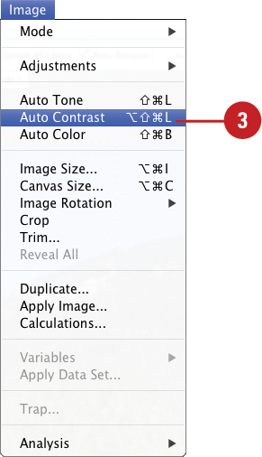
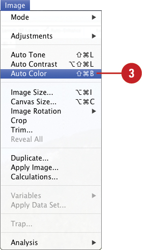
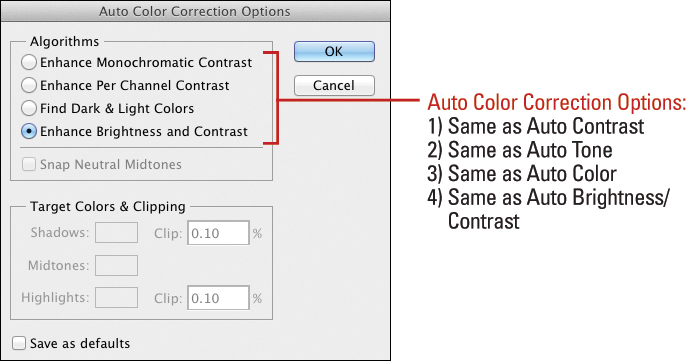
Using the Auto Contrast and Auto Color Commands
The Auto Contrast command adjusts the tonality of the image without impacting color. The Auto Color command adjusts the tonality and color of the image by ignoring channels and looking directly at the composite image. The automatic color commands receive their adjustment cues from information within the active image, including any erroneous color information. For example, if the image contains a large border (typically white), the auto commands will factor that information into the correction of the image. It’s best to correct any dust or scratch problems and crop out any borders before applying the Auto Contrast and Auto Color commands.
Use the Auto Contrast Command
![]() Open an image.
Open an image.
![]() To apply the auto command to only a selected area, use any of the selection tools to create the selection you want.
To apply the auto command to only a selected area, use any of the selection tools to create the selection you want.
![]() Click the Image menu, and then click Auto Contrast.
Click the Image menu, and then click Auto Contrast.
Important
Use the Auto buttons (Levels, Contrast, Color) as a good starting point or if you do not understand how to manually control the image using powerful adjustments, such as Levels and Curves.
Use the Auto Color Command
![]() Open an image.
Open an image.
![]() To apply the auto command to only a selected area, use any of the selection tools to create the selection you want.
To apply the auto command to only a selected area, use any of the selection tools to create the selection you want.
![]() Click the Image menu, and then click Auto Color.
Click the Image menu, and then click Auto Color.
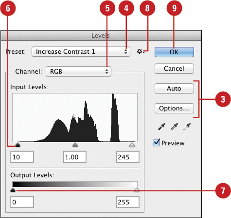
Using Levels Adjustment Commands
Through interactive feedback using a Histogram, the Levels adjustment gives you live information about the tonal values in the active image. It’s an excellent tool to perform overall tonal adjustments and some color correction. The Auto Tone command on the Image menu or Auto button in the Levels dialog box is considered a quick-fix color adjustment which, in some cases, works just as well as manually correcting color. In fact, it includes smoother histograms. However, the average photo usually has more than one simple problem, so it’s usually best to manually adjust an image. Since the Auto Tone command or Auto button relies solely on information contained within the actual image—information that is sometimes inaccurate—it’s usually best to correct the image manually or use a preset level. For example, you can use a preset level to make the midtones brighter or darker, or increase the contrast.
Adjust Levels
![]() Open an image.
Open an image.
![]() Click the Image menu, point to Adjustments, and then click Levels.
Click the Image menu, point to Adjustments, and then click Levels.
![]() To adjust levels automatically, click Auto. Continue with manual adjustments, or skip to Step 9.
To adjust levels automatically, click Auto. Continue with manual adjustments, or skip to Step 9.
♦ Options. Click Options to specify how Auto works.
Timesaver
Click the Image menu, and then click Auto Tone.
![]() To use preset mix levels, click the Preset list arrow, and then select the preset you want.
To use preset mix levels, click the Preset list arrow, and then select the preset you want.
![]() Click the Channel list arrow, and then select the composite channel.
Click the Channel list arrow, and then select the composite channel.
![]() Drag the Input Levels sliders to adjust the brightness level.
Drag the Input Levels sliders to adjust the brightness level.
![]() Drag the Output Levels sliders to adjust the level of ink sent to the output device (printer).
Drag the Output Levels sliders to adjust the level of ink sent to the output device (printer).
![]() To save settings, click the Preset Options button, click Save Preset, type a name, and then click Save.
To save settings, click the Preset Options button, click Save Preset, type a name, and then click Save.
![]() Click OK.
Click OK.
Using the Exposure Adjustment
Photoshop’s Exposure adjustment is primarily designed for performing tonal adjustments to 32-bit High Dynamic Range (HDR) images, but it works with 8-bit and 16-bit images as well. The Exposure adjustment changes an image using a linear color space (gamma 1.0), not the image’s current color space. When used with HDR images, it gives you the ability to draw out details of the image that otherwise might be completely lost within the shadows and highlights.
Use the Exposure Adjustment
![]() Click the Image menu, point to Adjustments, and then click Exposure.
Click the Image menu, point to Adjustments, and then click Exposure.
![]() Click the Preset list arrow, and then select the preset you want, or select from the following options.
Click the Preset list arrow, and then select the preset you want, or select from the following options.
♦ Exposure. Adjusts the highlight end of the image’s tonal scale with little effect in the extreme shadows.
♦ Offset. Darkens the shadows and midtones with little effect on the highlights.
♦ Gamma Correction. Adjusts the image gamma, using a simple power function. Similar to adjusting the midpoints in an image’s brightness.
![]() Use the eyedroppers to adjust only the image’s luminance values, not all the color channels, as you would with Levels or Curves.
Use the eyedroppers to adjust only the image’s luminance values, not all the color channels, as you would with Levels or Curves.
♦ Black. Sets the Offset, shifting the point you click to pure black.
♦ White. Sets the Exposure, shifting the point you click to pure white.
♦ Midtone. Sets the Gamma, shifting the point you click to middle gray.
![]() Select the Preview check box to view changes to the active image.
Select the Preview check box to view changes to the active image.
![]() To save settings, click the Preset Options button, click Save Preset, type a name, and then click Save.
To save settings, click the Preset Options button, click Save Preset, type a name, and then click Save.
![]() Click OK.
Click OK.

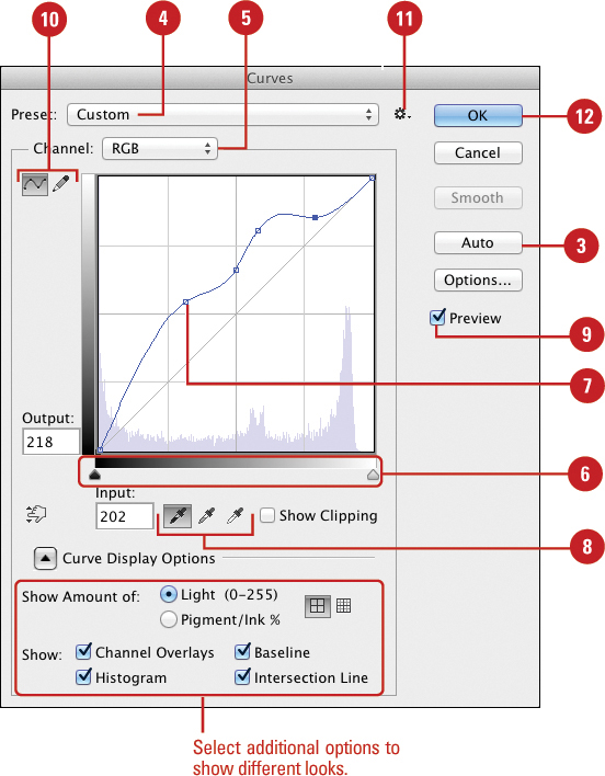
Using Curves and Color Adjustments
The Curves adjustment lets you adjust tonal ranges in the image without changing image exposure. Curves is an excellent adjustment method for lightening the dark shadows of an image to bring out detail, or for creating special effects like solarization. To make it easy to use, Photoshop provides presets to use and save. The Color Balance adjustment lets you change the highlight, shadows, and midtones of an image separately. The Color Balance dialog box performs linear adjustments to color; therefore, it’s a good tool for correcting common tonal problems, such as those caused by using film balanced for daylight indoors and getting a green cast to the image. The Brightness/Contrast adjustment changes an image by an overall lightening or darkening of the image pixels. While good for special effects, its linear way of changing an image’s brightness and contrast do not lend themselves well to photo restoration. Curves and Levels are much better for this type of work.
Use the Curves Adjustment
![]() Open an image.
Open an image.
![]() Click the Image menu, point to Adjustments, and then click Curves.
Click the Image menu, point to Adjustments, and then click Curves.
![]() To adjust automatically, click Auto. Continue with manual adjustments, or skip to Step 11.
To adjust automatically, click Auto. Continue with manual adjustments, or skip to Step 11.
![]() To use a preset, click the Preset list arrow, and then select one.
To use a preset, click the Preset list arrow, and then select one.
![]() Click the Channel list arrow, and then select the composite channel.
Click the Channel list arrow, and then select the composite channel.
![]() Drag the Black and White sliders to adjust tonal values.
Drag the Black and White sliders to adjust tonal values.
![]() Click on the diagonal line to add an edit point, and then drag up or down to increase or decrease the tonal values of the active image.
Click on the diagonal line to add an edit point, and then drag up or down to increase or decrease the tonal values of the active image.
![]() Use the Eyedropper tools to select tonal values directly in the image.
Use the Eyedropper tools to select tonal values directly in the image.
![]() Select the Preview check box to view changes to the image.
Select the Preview check box to view changes to the image.
![]() Click the curve option to adjust the curve by adding points or click the pencil option to draw a curve.
Click the curve option to adjust the curve by adding points or click the pencil option to draw a curve.
![]() To save settings, click the Preset Options button, click Save Preset, type a name, and then click Save.
To save settings, click the Preset Options button, click Save Preset, type a name, and then click Save.
![]() Click OK.
Click OK.
![]() Click the Image menu, point to Adjustments, and then click Color Balance.
Click the Image menu, point to Adjustments, and then click Color Balance.
![]() Drag the CMYK to RGB sliders to adjust the color.
Drag the CMYK to RGB sliders to adjust the color.
![]() Click a Tone Balance option.
Click a Tone Balance option.
![]() Click OK.
Click OK.

Use the Brightness/Contrast Adjustment
![]() Open an image.
Open an image.
![]() To isolate a portion of the image before using the Brightness/Contrast adjustment, use any of the selection tools to select the areas you want to be adjusted.
To isolate a portion of the image before using the Brightness/Contrast adjustment, use any of the selection tools to select the areas you want to be adjusted.
![]() Click the Image menu, point to Adjustments, and then click Brightness/Contrast.
Click the Image menu, point to Adjustments, and then click Brightness/Contrast.
![]() To adjust automatically, click Auto. Continue with manual adjustments, or skip to Step 7.
To adjust automatically, click Auto. Continue with manual adjustments, or skip to Step 7.
![]() Drag the Brightness slider left to decrease the brightness values or right to increase the values of the colors in the active image.
Drag the Brightness slider left to decrease the brightness values or right to increase the values of the colors in the active image.
![]() Drag the Contrast slider to the left to decrease the color steps or right to increase it in the image.
Drag the Contrast slider to the left to decrease the color steps or right to increase it in the image.
![]() If you prefer the CS2 method for Brightness/Contrast, select the Use Legacy check box.
If you prefer the CS2 method for Brightness/Contrast, select the Use Legacy check box.
![]() Click OK.
Click OK.

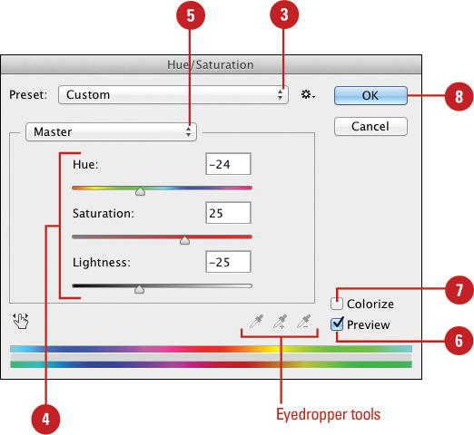
Adjusting Hue and Saturation
The Hue/Saturation adjustment gives you individual control over an image’s Hue, Saturation, and Brightness, and its Colorize option lets you apply an overall color cast to an image, similar to a duotone effect. Hue gives you the ability to change the image’s actual color, Saturation controls the amount of color, and Brightness determines how bright the color is based on its Hue and Saturation. The Desaturate command removes all the color from an image, which preserves the Hue and Brightness values of the pixels, and changes the Saturation value to zero. The result is a grayscale image.
Adjust Hue/Saturation
![]() Open an image.
Open an image.
![]() Click the Image menu, point to Adjustments, and then click Hue/Saturation.
Click the Image menu, point to Adjustments, and then click Hue/Saturation.
![]() To use preset levels, click the Preset list arrow, and then select a preset, such as Cyanotype, Sepia, or Red Boost.
To use preset levels, click the Preset list arrow, and then select a preset, such as Cyanotype, Sepia, or Red Boost.
![]() Drag the Hue, Saturation, and Lightness sliders to adjust levels.
Drag the Hue, Saturation, and Lightness sliders to adjust levels.
![]() Click the Edit list arrow, select a color, and then click inside the active image with the eyedropper tools to adjust the Hue/Saturation.
Click the Edit list arrow, select a color, and then click inside the active image with the eyedropper tools to adjust the Hue/Saturation.
![]() Select the Preview check box to see how your image looks.
Select the Preview check box to see how your image looks.
![]() Select the Colorize check box to tint with the foreground color.
Select the Colorize check box to tint with the foreground color.
![]() Click OK.
Click OK.
Did You Know?
You can Desaturate an image. Open the image, click the Image menu, point to Adjustments, and then click Desaturate.
You can Desaturate selected areas of an image using the Sponge tool. Click the Sponge tool, click Desaturate on the Options bar, and then drag to slowly remove color from the image.
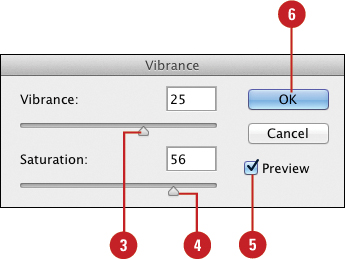
Adjusting Vibrance
Vibrance adjusts the saturation so clipping is reduced as colors approach full saturation. You can adjust vibrance of an adjustment layer in the Adjustments panel or for the image layer in the Vibrance dialog box. Drag the Vibrance slider to the right to apply more adjustment to less saturated colors and prevent clipping; drag the Saturation slider to the right to apply the same amount of adjustment. Drag either slider to the left to decrease saturation.
Adjust Vibrance
![]() Open an image.
Open an image.
![]() Click the Image menu, point to Adjustments, and then click Vibrance.
Click the Image menu, point to Adjustments, and then click Vibrance.
![]() Drag the Vibrance slider to adjust levels.
Drag the Vibrance slider to adjust levels.
![]() Drag the Saturation slider to adjust levels.
Drag the Saturation slider to adjust levels.
![]() Select the Preview check box to see how your image looks.
Select the Preview check box to see how your image looks.
![]() Click OK.
Click OK.
Using the Selective Color Adjustment
The Selective Color adjustment is designed to give you the ability to add or subtract specific amounts of cyan, magenta, yellow, and black inks. This is an excellent tool for making adjustments to an image based on a color proof, or for adding/subtracting certain primary colors based on information supplied by your printer. You can adjust color values for CMYK (Cyan, Magenta, Yellow, and Black), specify a color using a percentage of the color’s total ink, and change an existing color using an absolute value of 1% to 100%.
Use the Selective Color Adjustment
![]() Open an image.
Open an image.
![]() Click the Image menu, point to Adjustments, and then click Selective Color.
Click the Image menu, point to Adjustments, and then click Selective Color.
![]() Click the Colors list arrow, and then click the specific color to adjust.
Click the Colors list arrow, and then click the specific color to adjust.
![]() Drag the Cyan, Magenta, Yellow, and Black sliders to the right or left to decrease or increase the color values.
Drag the Cyan, Magenta, Yellow, and Black sliders to the right or left to decrease or increase the color values.
![]() Click the Relative option to change the selected color using a percentage of the color’s total ink.
Click the Relative option to change the selected color using a percentage of the color’s total ink.
![]() Click the Absolute option to change the existing color using an absolute value of 1% to 100%.
Click the Absolute option to change the existing color using an absolute value of 1% to 100%.
![]() Select the Preview check box to view changes to the active image.
Select the Preview check box to view changes to the active image.
![]() To save settings, click the Preset Options button, click Save Preset, type a name, and then click Save.
To save settings, click the Preset Options button, click Save Preset, type a name, and then click Save.
![]() Click OK.
Click OK.

Using the Channel Mixer Adjustment
The Channel Mixer adjustment is a great way to adjust individual color channels, or for making an image conversion to black and white. The Channel Mixer adjustment modifies the selected output channel by blending it with a mix of the existing image color channels. Since color channels record information using shades of gray, you’re essentially adding or subtracting grayscale information, not color information like when you use the Selective Color adjustment. That’s what makes the Channel Mixer adjustment ideal for converting images into grayscale. To the make it easy to use, Photoshop provides presets to use and save.
Use the Channel Mixer Adjustment
![]() Open an image.
Open an image.
![]() Click the Image menu, point to Adjustments, and then click Channel Mixer.
Click the Image menu, point to Adjustments, and then click Channel Mixer.
![]() To select a set of preset mix levels, click the Preset list arrow, and then select the preset you want.
To select a set of preset mix levels, click the Preset list arrow, and then select the preset you want.
![]() Click the Output Channel list arrow, and then select from the available output channels.
Click the Output Channel list arrow, and then select from the available output channels.
![]() Drag the Source Channels sliders right or left to increase or decrease the colors in the active image.
Drag the Source Channels sliders right or left to increase or decrease the colors in the active image.
![]() Drag the Constant slider left or right to adjust the grayscale output of the active image.
Drag the Constant slider left or right to adjust the grayscale output of the active image.
Dragging to the left adds more black to the image; dragging to the right adds more white.
![]() Select the Monochrome check box to convert the colors of the image into shades of gray.
Select the Monochrome check box to convert the colors of the image into shades of gray.
![]() Select the Preview check box to view changes to the active image.
Select the Preview check box to view changes to the active image.
![]() To save settings, click the Preset Options button, click Save Preset, type a name, and then click Save.
To save settings, click the Preset Options button, click Save Preset, type a name, and then click Save.
![]() Click OK.
Click OK.

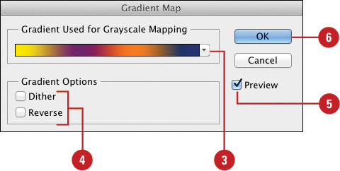
Using the Gradient Map Adjustment
The Gradient Map adjustment replaces the tonal values of the image with the colors supplied by a gradient. It’s a great tool for generating special color effects. In addition, the Gradient Map adjusts the active image’s colors to the colors of the selected gradient, taking the shadows of the image and mapping them to one end point of the gradient, and the highlights to the other point. You can also specify options to dither or reverse the color gradient. Select the Preview check box to preview your changes in the document window.
Use the Gradient Map Adjustment
![]() Open an image.
Open an image.
![]() Click the Image menu, point to Adjustments, and then click Gradient Map.
Click the Image menu, point to Adjustments, and then click Gradient Map.
![]() Click the Gradient Used for Grayscale Mapping list arrow to adjust the gradient.
Click the Gradient Used for Grayscale Mapping list arrow to adjust the gradient.
![]() Select or clear the Dither or Reverse check boxes for the Gradient Options.
Select or clear the Dither or Reverse check boxes for the Gradient Options.
![]() Select the Preview check box to view changes to the active image.
Select the Preview check box to view changes to the active image.
![]() Click OK.
Click OK.

Using the Photo Filter Adjustment
The Photo Filter adjustment lets you apply a specific filter or color to an image. Applying the Photo Filter adjustment to an image is similar to placing a colored filter in front of a camera lens. Photographers use filters to help correct color problems associated with unique lighting conditions like early morning sunlight or indoor fluorescent lighting. You can use Photoshop’s Photo Filter adjustments to get the same results using color, density, and luminosity options.
Use the Photo Filter Adjustment
![]() Open an image.
Open an image.
![]() Click the Image menu, point to Adjustments, and then click Photo Filter.
Click the Image menu, point to Adjustments, and then click Photo Filter.
![]() Click the Filter option, click the Filter list arrow, and then select from the available color filter options.
Click the Filter option, click the Filter list arrow, and then select from the available color filter options.
![]() Click the Color option to select a user-defined color filter.
Click the Color option to select a user-defined color filter.
![]() Drag the Density slider left or right to adjust the intensity of the filter effect on the active image.
Drag the Density slider left or right to adjust the intensity of the filter effect on the active image.
The higher the value, the greater the effect.
![]() Select the Preserve Luminosity check box to preserve the color of the image highlights.
Select the Preserve Luminosity check box to preserve the color of the image highlights.
![]() Select the Preview check box to view changes to the active image.
Select the Preview check box to view changes to the active image.
![]() Click OK.
Click OK.


Using the Invert and Equalize Commands
The Invert command reverses the colors and tonal values to their opposite values, in effect, creating a negative. The Equalize command exaggerates contrast between similar color values. It’s useful in finding stray pixels in a seemingly solid color, or to produce a special color effect.
Use the Invert Command
![]() Open an image.
Open an image.

![]() Click the Image menu, point to Adjustments, and then click Invert.
Click the Image menu, point to Adjustments, and then click Invert.
The brightness values of each image channel are reversed, creating a negative color or grayscale image.
Use the Equalize Command
![]() Open an image.
Open an image.

![]() Click the Image menu, point to Adjustments, and then click Equalize.
Click the Image menu, point to Adjustments, and then click Equalize.
The brightness values of the image pixels are distributed in a way that more accurately represents the entire range of brightness levels from white to black.
Using the Threshold and Posterize Adjustments
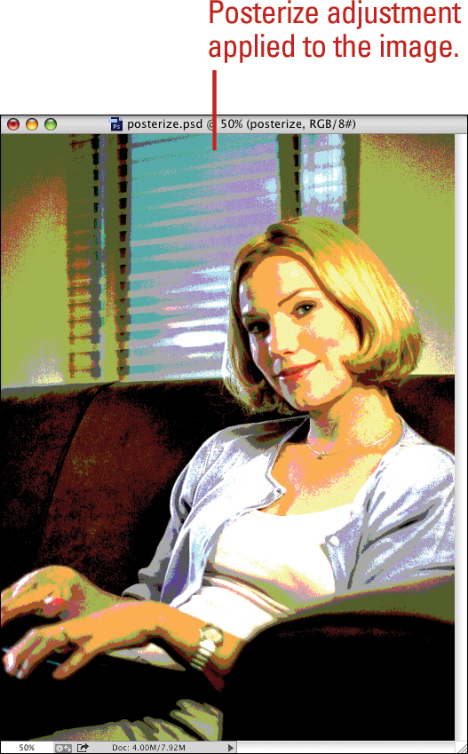
The Threshold adjustment reduces an image into only black and white pixels, based on their original brightness levels. It’s useful for locating the darkest and lightest pixels in an image, or for creating some great-looking black and white special effects. The Posterize adjustment creates a simpler image by reducing the number of colors. It’s useful for creating an image with a clip art look, or for reducing the number of colors in preparation for output to the web.
Use the Threshold Adjustment
![]() Open an image.
Open an image.
![]() Click the Image menu, point to Adjustments, and then click Threshold.
Click the Image menu, point to Adjustments, and then click Threshold.
![]() Drag the Threshold slider to the right or left to change the point at which black and white are defined.
Drag the Threshold slider to the right or left to change the point at which black and white are defined.
For example, setting the threshold slider to a value of 75 creates an image where all pixels with a brightness value of 75 or less are black, and all pixels with a value of 76 or higher are white.
![]() Click OK.
Click OK.


Use the Posterize Adjustment
![]() Open an image.
Open an image.
![]() Click the Image menu, point to Adjustments, and then click Posterize.
Click the Image menu, point to Adjustments, and then click Posterize.
![]() Drag the slider to select a Levels value (2 to 255) to define the number of colors used.
Drag the slider to select a Levels value (2 to 255) to define the number of colors used.
Lower values produce less colors and more visual contrast.
![]() Click OK.
Click OK.

Using the HDR Toning Adjustment
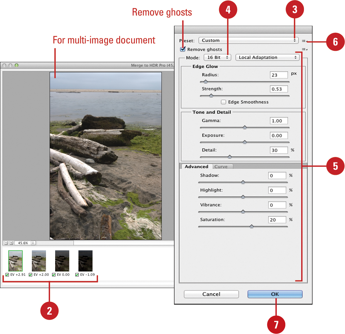
With HDR Pro, you can go beyond the capture capabilities of your camera by combining multiple images into a single HDR (High Dynamic Range) image that preserves the tonal quality of the images. You can use the HDR Toning command on the Adjustments menu to specify how you want to merge images, map tones, and style the output. You can have Photoshop automatically align the merging images and remove any ghosting due to people moving or misalignment during consecutive shots, or you can do it manually. If you don’t have multiple images, you can use the HDR Toning command with a single image to simulate the toning mapping process to create the look of an HDR-processed image. You can even use HDR Pro along with Photomerge—an image stitching feature—for high-quality panoramic images. To help you get started with the image files you want to change, you can use the Auto-Stack Panorama/HDR files option in Adobe Bridge or the Merge To HDR Pro command in the Mini Bridge panel from within Photoshop.
Access Files in Mini Bridge for HDR Toning Adjustments
![]() Click the File menu, and then click Browse in Mini Bridge.
Click the File menu, and then click Browse in Mini Bridge.
♦ If prompted in the Mini Bridge panel, launch or reconnect to Adobe Bridge.
![]() Navigate to the location with the files you want to use.
Navigate to the location with the files you want to use.
![]() Select the files you want to adjust in HDR toning.
Select the files you want to adjust in HDR toning.
![]() Right-click the selected files, point to Photoshop, and then click Merge to HDR Pro.
Right-click the selected files, point to Photoshop, and then click Merge to HDR Pro.
Photoshop brings the selected images into the program, and then opens them up in the Merge to HDR Pro dialog box.
Go to the next page for information on using the HDR Toning adjustment options.

Use HDR Toning Adjustment Options
![]() Use the Merge to HDR Pro command in the Mini Bridge to create a multi-image document or open a single image document.
Use the Merge to HDR Pro command in the Mini Bridge to create a multi-image document or open a single image document.
♦ If you opened a single image document, click the Image menu, point to Adjustments, and then click HDR Toning.
![]() If you opened a multi-image document, do any of the following:
If you opened a multi-image document, do any of the following:
♦ Images. Deselect the check boxes to exclude an image.
♦ Remove ghosts. Select to remove ghost images.
![]() Click the Preset list arrow, and then select the preset you want, such as Flat, Photorealistic high or low contrast, Monochromatic artistic, and Surrealistic.
Click the Preset list arrow, and then select the preset you want, such as Flat, Photorealistic high or low contrast, Monochromatic artistic, and Surrealistic.
![]() Click the Mode list arrow, and then select a bit depth for the image.
Click the Mode list arrow, and then select a bit depth for the image.
![]() Click the Method list arrow, and then select from the available options (vary based on the method):
Click the Method list arrow, and then select from the available options (vary based on the method):
♦ Exposure. Adjusts the highlight end of the image’s tonal scale.
♦ Gamma. Adjusts the image gamma, using a simple power function. Similar to adjusting the midpoints in an image’s brightness.
![]() To save settings, click the Preset Options button, click Save Preset, type a name, and then click Save.
To save settings, click the Preset Options button, click Save Preset, type a name, and then click Save.
![]() Click OK.
Click OK.
♦ If a multi-image document, Photoshop creates a merged document for which you can adjust the toning with the slider at the bottom of the document window.

Using the Shadows/Highlights Adjustment
The Shadows/Highlights adjustment lets you quickly correct the problems associated with the underexposed and overexposed areas of an image such as deep shadows or bright highlights. In addition, the Shadows/Highlights adjustment makes quick work out of images that have really dark shadows or overexposed areas by adjusting the problem areas without changing the midtones in the image. For example, the adjustment works well to correct subjects photographed with the light source coming from behind (backlit, or subjects shot in bright, overhead light. However, this type of adjustment will not work on images in the CMYK color mode.
Use the Shadows/Highlights Adjustment
![]() Open an image.
Open an image.
![]() Click the Image menu, point to Adjustments, and then click Shadows/Highlights.
Click the Image menu, point to Adjustments, and then click Shadows/Highlights.
![]() If necessary, select the Show More Options check box to display Adjustments options.
If necessary, select the Show More Options check box to display Adjustments options.
![]() Drag the Shadows Amount, Tonal Width, and Radius sliders right or left to adjust the shadow areas of the active image.
Drag the Shadows Amount, Tonal Width, and Radius sliders right or left to adjust the shadow areas of the active image.
![]() Drag the Highlights Amount, Tonal Width, and Radius sliders right or left to adjust the highlight areas of the active image.
Drag the Highlights Amount, Tonal Width, and Radius sliders right or left to adjust the highlight areas of the active image.
![]() Drag the Adjustments Color Correction and Midtone Contrast sliders left or right to decrease or increase the color saturation values of the adjusted areas of the image.
Drag the Adjustments Color Correction and Midtone Contrast sliders left or right to decrease or increase the color saturation values of the adjusted areas of the image.
![]() Enter values from 0% to 50% in the Black Clip and White Clip boxes to indicate how much of the shadow and highlight values will be clipped in the new image. Greater values produce images with more contrast.
Enter values from 0% to 50% in the Black Clip and White Clip boxes to indicate how much of the shadow and highlight values will be clipped in the new image. Greater values produce images with more contrast.
![]() Select the Preview check box to view changes to the active image.
Select the Preview check box to view changes to the active image.
![]() Click OK.
Click OK.

Using the Black & White Adjustment
The Black & White adjustment allows you to convert a color image to grayscale. During the adjustment process you can control how individual colors (Reds, Yellows, Greens, Cyans, Blues, and Magentas) are converted. You can also apply a tint to the grayscale image by adjusting the hue and saturation, in a similar way to using the Channel Mixer. If you’re not sure how or where to start, you can use the Auto button to set grayscale values based on maximizing the distribution of gray values.
Use the Black & White Adjustment
![]() Open an image.
Open an image.
![]() Click the Image menu, point to Adjustments, and then click Black & White.
Click the Image menu, point to Adjustments, and then click Black & White.
![]() To select a set of preset mix levels, click the Preset list arrow, and then select the preset you want.
To select a set of preset mix levels, click the Preset list arrow, and then select the preset you want.
![]() To set auto adjustments, click Auto. Continue with manual adjustments, or skip to Step 8.
To set auto adjustments, click Auto. Continue with manual adjustments, or skip to Step 8.
![]() Drag the Reds, Yellows, Greens, Cyans, Blues, and Magentas sliders to the desired levels.
Drag the Reds, Yellows, Greens, Cyans, Blues, and Magentas sliders to the desired levels.
♦ Alt+click (Win) or Option+click (Mac) a color box to reset a slider to its initial setting.
![]() To adjust the tint, select the Tint check box, and then adjust the Hue and Saturation.
To adjust the tint, select the Tint check box, and then adjust the Hue and Saturation.
![]() To save settings, click the Preset Options button, click Save Preset, type a name, and then click Save.
To save settings, click the Preset Options button, click Save Preset, type a name, and then click Save.
![]() Click OK.
Click OK.


Using the Match Color Adjustment
The Match Color adjustment lets you select colors in the image, and then match and change them—using Luminance, Color Intensity, and Fade sliders—to another image. The Match Color adjustment will only work on images in the RGB Color mode. Match Color is a great tool to help you get that consistent look you’ll need when you need to match colors between images.
Use the Match Color Adjustment
![]() Open an image.
Open an image.
![]() Click the Image menu, point to Adjustments, and then click Match Color.
Click the Image menu, point to Adjustments, and then click Match Color.
![]() Drag the various sliders (Luminance, Color Intensity, and Fade) to adjust the image.
Drag the various sliders (Luminance, Color Intensity, and Fade) to adjust the image.
![]() Select the Neutralize check box to automatically remove any color cast in the active image.
Select the Neutralize check box to automatically remove any color cast in the active image.
![]() Click the Source list arrow, and then select another image or layer for matching the color in the Destination Image.
Click the Source list arrow, and then select another image or layer for matching the color in the Destination Image.
If you select a portion of an image before entering the Match Color dialog box, you can choose whether to use the selection in the source or the target document to calculate the color match.
![]() Click Save Statistics to save the current adjustment, or click Load Statistics to load adjustments made to other images.
Click Save Statistics to save the current adjustment, or click Load Statistics to load adjustments made to other images.
![]() Select the Preview check box to view changes to the active image.
Select the Preview check box to view changes to the active image.
![]() Click OK.
Click OK.
