Chapter Seven: Working with HTML5 Pack Extensions in Dreamweaver CS5
Shortly after the release of Dreamweaver CS5 (and the entire new Creative Suite), Adobe came out with the Dreamweaver HTML5 Pack that provides limited, but very useful, new tools for developing HTML5 and its style sheet partner, CSS3. HTML5 is emerging as a browsing environment that, with the support of Apple, Google, and others, allows Web designers to embed video more easily, detect browsers and enable different features for different environments, and easily generate additional effects like rounded corners and transition durations.
In this chapter, I’ll show you how to install and use the HTML5 Pack to implement some pretty substantial features it adds to Dreamweaver CS5. Those features are only available in browsing environments that support HTML5 and CSS3, but the list of those environments is already significant, and it’s growing. I’ll include notes on how to build in alternatives for visitors who do not have HTML5 supported in their browsers.
Arguably the most powerful tool in the HTML5 Pack is the ability to define Media Queries—a feature supported in the HTML5/CSS3 emerging standards. Media Queries identify the medium (browsing environment) of a visitor to a Web page, and present different page designs customized for the particular browser. So, for example, you can create one version of your page for a standard laptop computer or desktop, a second version for an iPad, and a third for an iPhone. This is done by creating alternative style sheets (CSS) for each medium. I’ll show you how to use the new Multiscreen Preview in the HTML5 Pack, and walk you through the process of not just previewing how your pages will look in different media but also customizing the look for each browsing environment.
#42 Installing HTML5 Pack
The first step is to install the HTML Pack extension. This is a Dreamweaver extension, and like all Adobe Creative Suite extensions, you can find it by searching the Adobe Dreamweaver Exchange (www.adobe.com/cfusion/exchange/index.cfm?event=productHome&exc=3&loc=en_us). Or, just jump to this URL: http://labs.adobe.com/downloads/html5pack.html.
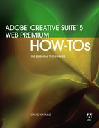
With the extension downloaded, choose Command > Manage Extensions in Dreamweaver CS5 (this extension only works with CS5). The Adobe Extension Manager CS5 opens. Click Install at the top of the Extension Manager and navigate to the .zxp extension file you just downloaded. Click Select, and the extension will install (Figure 42a). You can use the scrollbar on the right to read a description of the extension after you install it.
Figure 42a. Installing the HTML5 Pack extension.
#43 Creating New Pages with HTML5 Layouts
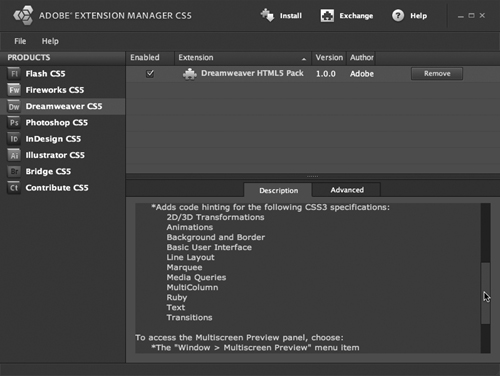
The HTML5 Pack includes two new HTML layouts: the HTML5 Three Col Fix Header and the HTML5 Two Col, Fixed Header Right. These layouts are similar to their evolutionary predecessors, the Three Column Fixed, Header and Footer Layout, and the 2 Column Fixed, Right Sidebar, Header and Footer Layouts that ship with Dreamweaver CS5. Despite their truncated names, the HTML5 layouts do include footers (Figure 43a).
Figure 43a. Two new HTML5 layouts.
So, when you generate a new page using one of these two new layouts, you won’t see anything different in Design view. The differences are in the coding. And, while our book is generally eschewing excursions into code or Code view, it’s helpful to be aware of what’s under the hood here.
For example, the layouts use the Article element—used to demarcate an independent entry in a blog, newspaper, or other online publication (Figure 43b). So, when you edit and clone this section of the layout, you’re implementing the Article element, to which you can assign a CSS style.
Figure 43b. Examining HTML5 coding in Split view.

And the header element (tag) in HTML4 has been renamed the hgroup element in HTML5 (in both cases, the tag/element represents the header for a section); that change is reflected in the code for the HTML5 layouts.
#44 Using Multiscreen Preview
Web designers have always had to aim at a moving target. Unlike print design, which creates layouts that will appear in the same size magazine, newspaper, billboard, and so forth, Web designers have had to guess at the browser, operating system, monitor size, font support, and color veracity. The burgeoning of handheld devices, and Apple’s opposition to device-independent development, has multiplied the challenge.
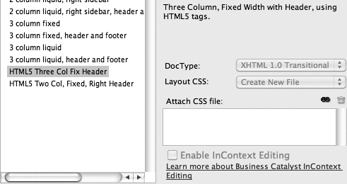
In that light, the Multiscreen Preview feature in the HTML5 Pack is an impressive and quite substantial addition to Dreamweaver CS5. It allows you to preview your open page in three versions: phone (320 pixels wide by 300 pixels high), tablet (768 × 300), and desktop (1108 × 300). To view your open page in all three environments, click the Multiscreen Preview button (which is added to the Document toolbar when you install the HTML5 Pack), or choose Window > Multiscreen Preview (Figure 44a).
Figure 44a. Previewing an open Web page for phone, tablet, and desktop displays.
You can edit the displays of all three of the views in Multiscreen Preview by clicking the Viewport Sizes button at the top of the Multiscreen Preview. The Viewport sizes dialog opens, and you can enter values for other preview sizes.
#45 Enabling Media Queries
Previewing how your Web page will look in various viewing environments is great for alerting you to issues that viewers will encounter looking at your Web page in a pad or tablet. But then what? The solution is Media Queries, a new feature supported in HTML5/CSS3 browsing environments.
In many cases, pages that work fine in desktop mode work fine in tablets as well. The iPad, for example, displays 1024 pixels width, wide enough for most Web pages (which I consistently suggest be designed at 960 pixels wide).
Phones present more of a challenge. Let’s walk through an example that you can adjust to solve most display issues for phones. The iPhone display is 480 pixels (with the phone turned sideways). In this set of steps, we’ll take the HTML5_twoColFixRtHdr.css file that provides formatting for the HTML5 Two Col, Fixed Header Right layout.
Follow these steps to create a version of that layout that will display well on iPhones:
- Create a new Web page using the HTML5 Two Col, Fixed Header Right layout. Choose Create New File from the Layout CSS pop-up menu so that a separate (external) CSS (style sheet) file is generated. You’ll be working with that external CSS file to customize your page. Save the page.
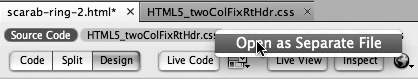
- Note in the associated files tab at the top of your open Web page that the associated CSS file is HTML5_twoColFixRtHdr.css. In the associated files tabs list, Control-click (Mac) or right-click (Windows) on the HTML5_twoColFixRtHdr.css file and choose Open as Separate File from the context menu (Figure 45a).
Figure 45a. Opening a CSS file attached to a Web page.
- When the HTML5_twoColFixRtHdr.css opens, choose File > Save As, and save the file as HTML5_twoColFixRtHdr-iPhone.css.
- Return to your open HTML page in the open page’s tab bar. It’s fine to view your open page in Design view. Later you can customize the page with your own content; for now, we’ll develop a style sheet based on the template content.
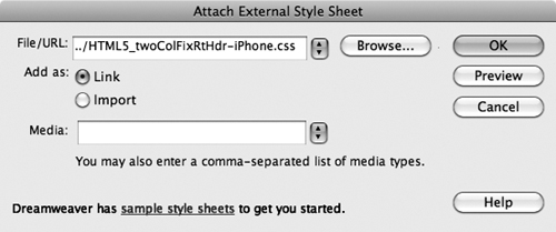
- Use the Attach Style Sheet (link) icon at the bottom of the CSS Styles panel to attach your new style sheet (HTML5_twoColFixRtHdr-iPhone.css) to the page (Figure 45b). With the All tab (not the Current tab) selected at the top of the panel, select the original style sheet (HTML5_twoColFixRtHdr.css) in the CSS Styles panel, and click the Unlink Style Sheet icon at the bottom of CSS Styles panel to detach that style sheet. We want to work with just the iPhone version of the page for now.
Figure 45b. Attaching a style sheet to an open page to customize the iPhone display.
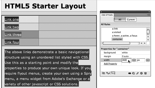
- There are a number of approaches we could take to tweak the style sheet to display properly on an iPhone, without the viewer having to use a horizontal scrollbar. A simple solution (and one you can adapt) is to redefine the widths of all CSS styles to 460 pixels (we’ll factor in 20 extra pixels to take into account additional pixels that might be hidden in margins, padding, and other hard-to-detect elements). Change the widths of all the CSS styles that contain widths to 460 pixels: .container; .content; and aside (Figure 45c).
Figure 45c. Redefining the widths of all layout styles to fit into a 480-pixel display (with 20 pixels of wiggle room factored in).
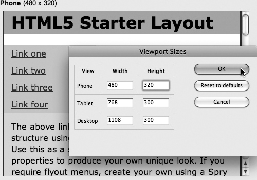
- Now it’s time to test the iPhone style sheet in Multiscreen Preview. Click the Multiscreen Preview button, and then in the Multiscreen Preview window, click Viewport Sizes. Change the Phone dimensions to 480 Width and 320 Height (Figure 45d). Click OK, and examine your page now with the special iPhone style attached. The page displays without a horizontal scrollbar in the Phone window.
Figure 45d. Defining an iPhone preview screen.
- Next, click the Add Media Queries button to open the Add Media Queries dialog. For the Small (Phone) Target Screen, set Max Width to 480, and use the file navigation icon to navigate to the HTML5_twoColFixRtHdr-iPhone.cssCSS file. For the Medium (Tablet), set Maximum width to 1024 (to match an iPad). For both the Medium and Large (Desktop) target screen sizes, choose the HTML5_twoColFixRtHdr.css style sheet. Click OK to generate Media Query code.
- A final step before previewing: Change the widths in the Viewport Sizes dialog to 480 for Phone and 1024 for Pad.
- Examine and test how your page will open in all three environments.
#46 Adding CSS3 Attributes with Code Hints
Ideally, new CSS3 attributes, like the ability to define the radius of rounded corners or the ability to define durations for effects, would be easy to assign and define in the CSS Styles panel and the CSS Rule Definition dialog. This has been implemented in the HTML5 Pack for Media Queries, which is arguably the most powerful and dynamic innovation in HTML5/CSS3.
Most other innovations in HTML5 and CSS3 are not yet implemented in the same kind of WYSIWG way—you can’t implement most new CSS features without resorting to coding. But the HTML5 Pack does provide help with code hinting for those new CSS attributes.
I’ll focus on one widely used effect, rounded corners, to illustrate how this works, and point you toward resources to apply this approach to dozens of new CSS3 features.
To create a rounded-corner box Class style, follow these steps:
- For this exercise, we’ll create a new style sheet called css3-styles.css. Choose File > New, and then choose CSS from the Page Type area in the New Document dialog. Save the file as css3-styles.css.
- At the insertion point, begin entering the code for a rounded corner style:
.border_rounded-blue {
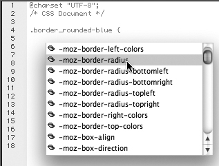
- Press Return/Enter. As you do, Dreamweaver’s Code Hints appear; they include sets of code hints that begin with
–mozfor Firefox or–webkitfor Safari (Figure 46a). Scroll down the list of hints until you get to this:-moz-border-radius
Figure 46a. Choosing from CSS3 code hints.
- Select that code, press Return/Enter, or double-click), and enter
: 5px;
- Press Return/Enter, and this time scroll down the list of code hints for CSS3 until you get to this:
-Webkit-border-radius
- Select that code, press Return/Enter, and type
: 5px;
- Press Return/Enter and type
border: 2px solid blue;
padding: 5px;
width: auto;
}
You’ve created a blue, rounded-corner border with a radius of five pixels with the help of CSS3 code hints in the HTML5 Pack.
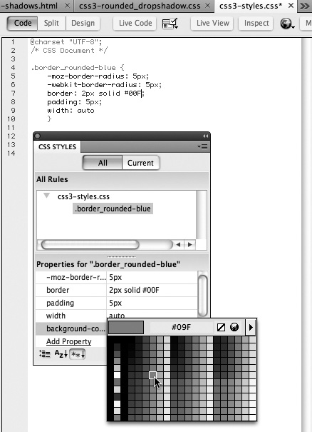
Not all of the attributes in CSS3 styles appear in the CSS Styles panel. Again, this is a shortcoming in the HTML5 Pack. But you can use the CSS Styles panel to edit some of the CSS attributes in styles that include CSS3 features. For instance, you can edit the Firefox (but not Safari) radius as well as the border, padding, and width attributes of the rounded-corner style created in the previous steps right in the CSS Styles panel. And you can add other attributes, like background color (Figure 46b).
Figure 46b. Adding a background color to a rounded-corner box in the CSS Styles panel.
Finally, here’s how to apply the new CSS3 style to a Web page:
- Open the Web page in Dreamweaver, and click the Attach Style Sheet icon at the bottom of the CSS Styles panel to attach the style sheet (in the previous exercise, that would be css3-styles.css).
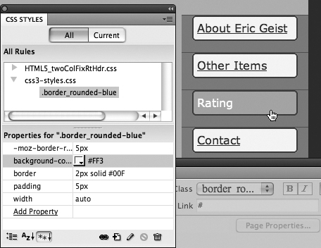
- Select an image or text (or any other object, like an embedded video), and choose the rounded-corner Class style from the Class pop-up in the Properties inspector (Figure 46c). The effect can be observed in Live view.
Figure 46c. Testing an applied CSS Class style with rounded corners in Live view. The CSS Styles panel displays most of the CSS attributes for the rounded corners.
- Apply the Class style to as many selected objects as you wish.