
Chapter Five: Adding Effects and Interactivity with Spry and JavaScript
JavaScript programming works with CSS styles to enable animation and interactivity in Web sites. Here are some examples: A visitor scrolls over an area of the page, and another area of the page changes to display new content; a visitor clicks on a menu, and a submenu opens up; or a panel expands and collapses on a mouse click.
You’ll learn to generate all three of those interactive elements in this chapter, and through the course of being introduced to various examples, you’ll learn the method and system for enabling interactivity in your Web site.
Dreamweaver CS5 incorporates a set of animation and interactivity tools that use the Ajax set of tools. Ajax applications generate animation or interactivity by combining and assigning attributes to HTML (Web-page coding), CSS (style sheets), and JavaScript (which is generated by Dreamweaver).
Before diving into Ajax-based interactivity and animation, I’ll expose you to an interesting way to embed live data in a Web page. Live data is data supplied by an external source and displayed in a Web page. This is in contrast to static Web pages, where the content is actually in the page itself. Dreamweaver CS5 makes a lightweight but accessible and useful version of live data available through Spry Data displays. These displays present data from an HTML table saved at a separate Web page.
And, so, in the course of this chapter, you’ll also learn how to create a basic table. Tables were originally developed for presenting data in rows and columns on Web pages. Later, they evolved into an awkward but widely implemented technique for laying out pages. Today, CSS styles have replaced tables as the standard technique for page design, but tables are still useful for storing data (for a full exploration of page design with CSS, see Chapter 2, “Designing Web Pages in Dreamweaver with CSS Styles”).
#29 Creating a Spry Data Source Table
The easiest and most accessible way to create a Spry data source is to define and populate a table that lists all the information you want to display in the Spry data display. The Spry data display you generate on a separate Web page will be attractive and accessible. The Spry data display table does not have to be attractive because it will only be seen and used by whoever updates it.
Data tables are generally organized into columns that reflect fields and rows that reflect specific items (referred to as “records” in database terminology). So, for example, a product database might include fields like Item, Price, Description, and Image (the last being a photo of the product). In such a table, each row would hold information for a specific product.
To create a Spry data source table, follow these steps:
- Create a new HTML page (choose File > New to open the New Document dialog, choose Blank Page from the category list on the left, choose HTML / None as the page type, and click Create).
- Save the page (assign a filename like data01.html to help you remember that this is the page that holds your Spry data source table).
- Choose Insert > Table to open the Table dialog. In the Columns box, enter the number of fields (columns) required to organize your data.
- Leave the Rows box set to the default number. You can easily add rows to your table as you enter new items into it.
- Leave the Border set to 1.
- Set Table Width to 100% to create the most convenient layout to enter data.
- Set Cell Padding to 6 to make the table data more readable (cell padding provides a buffer between the different rows and columns of data).
- In the Header area of the dialog, select Top. This provides automatic formatting for your column headings.
- You can enter a caption to improve accessibility if the table will be used by people with visual handicaps.
- After you complete the Table dialog (Figure 29a), click OK to generate the table.
Figure 29a. Defining a table to use as a Spry data source.

- With the table generated, enter column headings (field names) in the top row of the table.
- Populate the Spry data source table with information for your database. Use a separate row for each item.
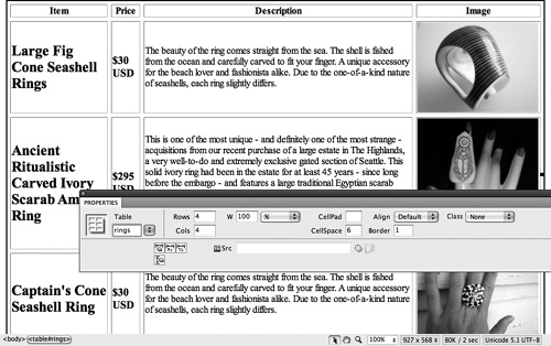
- The last and important step in creating a Spry data source table is to name the table using the Table box in the Properties inspector. To do this, select the table by clicking on the table border. In the Table box, enter a name for your table. Avoid spaces or nonalphanumeric characters (Figure 29b).
Figure 29b. Data table with field names, data, and a table name.
#30 Generating a Spry Data Display
You can insert a Spry data display in any existing Web page, or you can create a new Web page and use the entire page to display the Spry data display. The only trick is that you must have first created a Spry data source (if you haven’t done that, jump back to #29, “Creating a Spry Data Source Table”).
To generate the Spry data display, follow these steps:
- Choose Insert > Spry > Spry Data Set. The Spry Data Set wizard launches.
- In the Select Data Type pop-up menu, choose HTML.
- Click the Browse button in the Specify Data File area and navigate to and select the file you created with the Spry data source table. Your data table displays in the preview area.
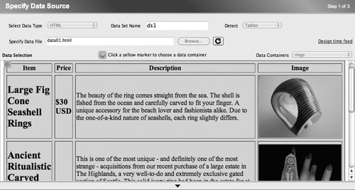
- From the Data Containers pop-up menu, choose the specific table with your data (Figure 30a).
Figure 30a. Choosing a data table to embed as a Spry data display.
- With the data source defined, click the Next button in the Spry Data Set wizard. Normally, there is no reason to change the default options in step 2 of the wizard. However, if you are comfortable with database management concepts, you can use the Type pop-up menu to change the way data is recognized, and you can sort rows. After examining the settings in step 2, click Next.
- The final step in the Spry Data Set wizard allows you to choose from four different layouts to display your data. Each layout option includes a thumbnail illustration and a description. Choose one of the layout options. (The fifth option, Do Not Insert HTML, voids the whole point of the wizard and is for programmers who want to define custom data presentation.)
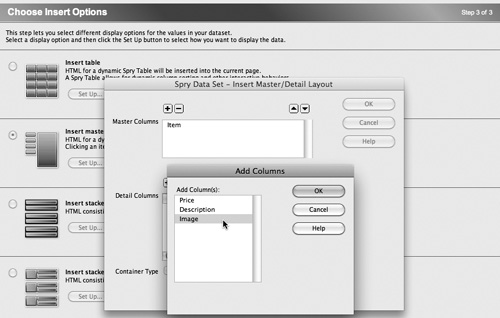
- With a layout selected, click the Set Up button associated with your choice. Each layout includes customized and different Set Up options, but they all boil down to the ability to add, delete, or change the order of display of columns. Use the Add, Delete, Up, and Down arrows to adjust the displays (Figure 30b).
Figure 30b. Adding a column to the Master Column display in the Insert Master/Detail Layout.
- After adjusting layout options, if desired, click Done in the Spry Data Set wizard to generate the Spry Data Set layout.
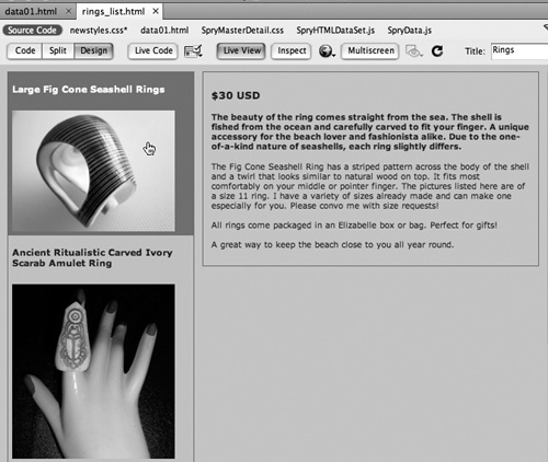
You can preview the Spry Data display in Live view: choose View > Live View (Figure 30c).
Figure 30c. Previewing a Spry Data display in Live view.
#31 Generating and Formatting Spry Menu Bars
Menu bars, which display submenus when they are hovered over, are a useful and appealing page element. Menu bars allow several menu options to be accessed from a clean, uncluttered main menu. The interactivity they provide when a visitor hovers over a menu option adds energy and dynamism to your page.
The Spry widget for inserting Menu Bar widgets allows you to generate menu bars with two levels of submenus. That means a user can click on a menu option that will in turn reveal a submenu with a new set of options, choose one of those options, and pick from yet a second submenu.
To generate a Menu Bar widget, you must first save the page in which you plan to insert the widget. Then choose Insert > Spry> Spry Menu Bar. The Spry Menu Bar dialog appears, and you can choose between a horizontal or vertical menu bar. Click OK in the Spry Menu Bar dialog to generate the Menu Bar widget.
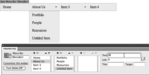
The menu bar that is generated is generic with four menu items (Item 1, Item 2, Item 3, and Item 4). You can customize basic menu bar properties like the display menu name and the link target in the Properties inspector.
To edit the content and links for a selected menu bar, choose menu items (initially labeled Item 1, Item 2, etc.) or submenu items (initially labeled Item 1.1, Item 1.2, etc.) in the Properties inspector.
With an item (or subitem) selected, you can enter text in the active Text field of the Properties inspector that will appear in the menu. In the Link box, you can enter the link that will open when the item is clicked.
Use the Title box in the Properties inspector to enter accessibility text (this text will appear in a browser window when a user hovers over the menu option). Leave the Target box blank to open the link in the same browser window or enter _blank to open the link in a new browser window.
You can use the plus and minus icons above the menu or submenu (or sub-submenu) columns to add or delete new menu items. Use the Move Item Up or Move Item Down icon to change the order of menu items (Figure 31a).
Figure 31a. The Properties inspector for menu bars.
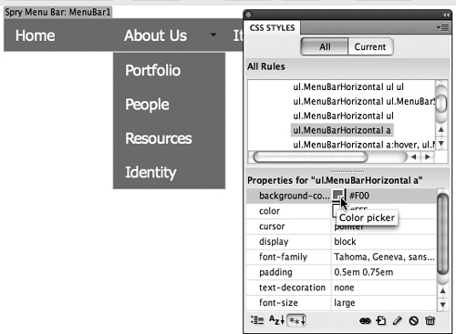
To edit the styles associated with a Menu Bar widget, expand the menu bar style sheet in the CSS Styles panel. This style sheet will be named SpryMenuBarHorizontal.css, or SpryMenuBarVertical.css if you created a vertical menu bar. Every menu bar generates at least a dozen CSS styles. Selecting one of these Class styles in the top part of the CSS Styles panel allows you to edit properties for that style in the bottom half of the CSS Styles panel.
To change the background or text color for the menu bar, select the style ul.MenuBarHorizontal a (or for a vertical menu bar, select the style ul.MenuBarVertical a). With the style selected in the CSS Styles panel, use the background-color swatch box in the bottom half of the CSS Styles panel to choose a new background color and use the Color swatch to change font color (Figure 31b).
Figure 31b. Examining and editing menu styles in the CSS Styles panel.
When you save the page in which the Spry menu bar is embedded, the style sheet file associated with the menu bar updates. Test your Spry menu bar in Live view.
#32 Defining and Populating Spry Tabbed Panels
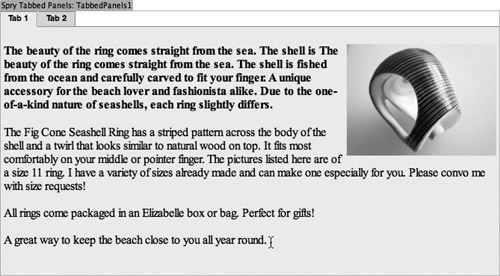
Tabbed panels transform a single Web page into a series of tabbed panels that look like distinct Web pages to a visitor. Tabbed panels are one way to create an easily navigable Web site. To create a set of tabbed panels for an open Web page, choose Insert > Spry > Tabbed Panels. A generic set of two tabbed panels appears in the Document window. Save your page—always required before inserting Spry widgets.
To change the title of a tab, click on the tab and enter a new name. To enter content in a tabbed panel, click a tab. The selected tab displays a blue outline. Click in the Content area below the tab and enter content for that tab. Tab content can be anything you would place on a regular Web page, including text and images (Figure 32a).
Figure 32a. Entering content into a tabbed panel.
You can add (or delete) tabbed panels for a selected tabbed panel in the Properties inspector. To select an entire tabbed panel as opposed to a single tab, click the border of the entire tabbed panel. When you do this, the Tabbed Panels Properties inspector allows you to add panels by clicking the plus icon in the Panels section of the Properties inspector.
To change the name of a tabbed panel, double-click the current label (for example, Tab 1) and type a new label.
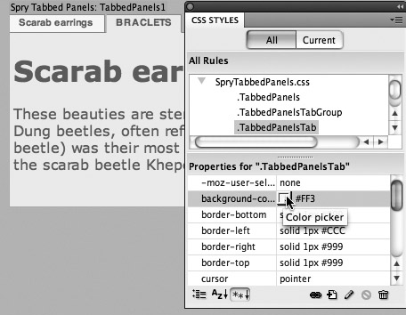
To format elements of the tab like background and text color, select the CSS Styles panel (choose Window > CSS Styles) and view the styles for SpryTabbedPanels.css. When you expand this CSS file in the CSS Styles panel, a set of Class styles appears in the CSS Styles panel. In the lower part of the CSS Styles panel, you can change the properties of any style you select in the top part of the panel. The sidebar “Using the CSS Styles Panel to Format Tabbed Panels” explains how to edit frequently changed elements of a panel style. Feel free to experiment with other properties.
For example, to change background color for nonselected tabs, click the .Tabbed PanelsTab style in the CSS Styles panel, and then choose a background color from the background-color property (Figure 32b).
Figure 32b. Changing the background color for nonselected tabs.
#33 Creating Collapsible Panels
Spry collapsible panels are handy ways to present optional information in a Web page. These panels have a clickable tab and a content area that displays or hides when a visitor clicks the tab.
The Web page that I use to check my bank balance, for example, has a number of clickable spots on the page where I can get explanations for terms or see additional detail. This information might not be necessary for a visitor and would in many cases clutter the page. But when presented in a collapsible panel, such information is handy but doesn’t take up space.
To insert a Spry collapsible panel, first save your page, and then choose Insert > Spry > Spry Collapsible Panel. In the Document window, click and drag to select the default text, “tab,” and enter a new label for the collapsible panel. Visitors will see this label in their browser window. Clicking this tab label in a browser toggles between displaying and hiding the panel. In the Content area of the collapsible panel, delete the “Content” default text and enter new page content. That page content can be anything you would put on a regular Web page.
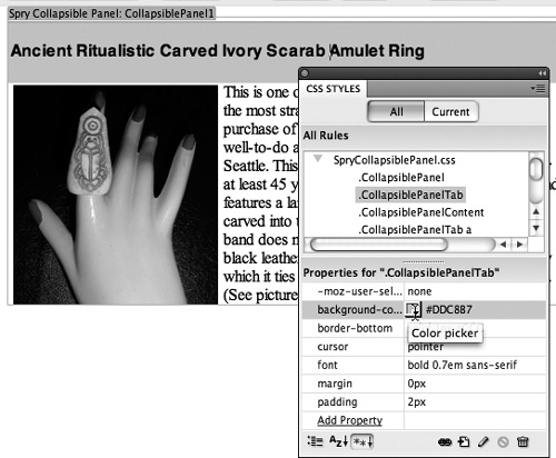
As you can with other Spry widgets, you can edit basic features of the Collapsible Panel widget in the Properties inspector (see the sidebar “Hide or Display Spry Collapsible Panels?”). To format elements of the widget like background and text color, select the CSS Styles panel (choose Window > CSS Styles) and view the styles for the SpryCollapsiblePanel.css sheet by expanding that style sheet. The main property of a collapsible panel that you will need to edit in the CSS Styles panel is the background color for the tab. You can edit the actual tab text in Design view, but to edit the background of the collapsible panel tab, edit the background-color property of the .CollapsiblePanelTab style (Figure 33a).
Figure 33a. Formatting the background of a Spry collapsible panel.
#34 Defining Spry Tooltips
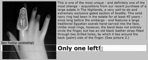
Spry tooltips generate pop-up text that appears when a visitor hovers over an image or selected text on a Web page. To create a Spry tooltip, click to place your cursor at an insertion point where the tooltip text will appear (don’t type the tooltip trigger text first; creating the trigger text is part of the Tooltip properties that you define later).
With an image selected, or your text insertion point where the trigger text for the tooltip will appear, choose Insert > Spry > Spry Tooltip. A box with some default text appears. Replace the text “Tooltip trigger goes here” with the text that you want to trigger the tooltip. Replace the text that says “Tooltip content goes here” with the text that will appear in the tooltip (Figure 34a).
Figure 34a. Previewing tooltip content.
Tooltip properties usually are fine without changing the default settings, but they can be adjusted in the Properties inspector. The Horizontal and Vertical Offset boxes define how far to offset the tooltip text (to the right and down, respectively). The Show Delay and Hide Delay boxes allow you to enter values (in seconds) for how long you want to wait to display tooltip text after the trigger text is hovered over and how long to wait after the trigger text is no longer hovered over to hide the tooltip.
The Blind and Fade options generate effects that are not appropriate for displaying useful, readable tooltip text, and the Hide on Mouse Out check box is not operative. The Follow mouse check box moves tooltip text as a user’s mouse moves within the trigger text.
#35 Inserting a Spry Accordion Widget
Spry Accordion widgets are one more interactive, dynamic way to make a page with a lot of content more inviting. The widget creates horizontal regions on a Web page that can be expanded or collapsed (just one is expanded at any one time).
To insert a Spry accordion, first save your page, and then choose Insert > Spry > Accordion. By default, a two-part accordion is created with Label 1 and Content 1 on top, and Label 2 and Content 2 on the bottom. Click and drag to select the default text (“Label 1”) and insert your own. This is what visitors will see before they expand the accordion. In the Content area, enter anything you might include in a normal full Web page.
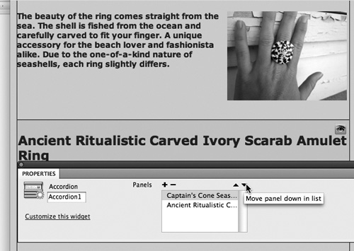
To add or delete Spry accordion sections, use the Add Panel or Remove Panel icon in the Properties inspector. Use the Move Panel Up list and Move Panel Down List icons to rearrange the order of your panels (Figure 35a).
Figure 35a. Moving a Spry accordion panel down in the list in the Properties inspector.
#36 Opening a Browser Window with JavaScript
They’re often called pop-ups—those little browser windows that open when you load a page in your browser or when you activate the window by some action on the Web page. In Dreamweaver’s terminology, they are referred to as browser windows, which is actually an accurate description of what most people call pop-ups.
With the Web page that will open in a new browser window prepared and saved (see the sidebar “Before You Start”), follow these steps to define the window:
- In the tag bar, at the bottom of Design view, select the
<body>tag. From the Behaviors panel, click the plus button and choose Open Browser Window from the list of behaviors. - In the “URL to display” field, navigate to or enter the Web page that will open in the new browser window.
- Use the Window width and Window height fields to define the size of the browser window. The display options available in the Attributes section of the Open Browser Window dialog are generally not enabled—the new browser window that pops up is usually displayed without features like a navigation toolbar or status bar. So, leave these options deselected (Figure 36a).
Figure 36a. Defining pop-up browser window attributes.
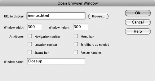
- Enter a name in the Window name field, and then click OK in the Open Browser Window dialog.
Test your new browser window behavior by opening the page that launches it in a browser.
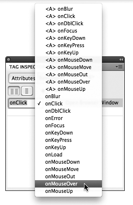
You can change the triggering effect for a Behavior in the first column pop-up menu in the Behaviors panel (Figure 36b).
Figure 36b. Defining onClick as the trigger to open a new browser window.
#37 Applying Effects
Effects like blinds, fades, or highlighting can be applied to almost any element on a Web page, including an image or a link.
Effects include the following:
• Appear/Fade makes the selected object appear or fade away.
• Blind creates a window blind-like effect that hides and reveals the object.
• Grow/Shrink makes the object bigger or smaller.
• Highlight changes the background color of the object.
• Shake moves the object from left to right.
• Slide moves the object up or down.
• Squish makes the object vanish into the upper-left corner of the page.
To apply an effect to a selected object, choose Effect from the Behaviors panel menu, and then choose one of the available effects (Figure 37a).
Figure 37a. Defining a Grow/Shrink effect.
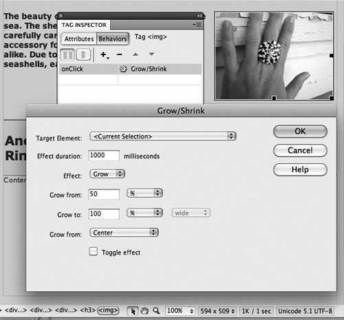
Each effect has its own dialog with its own features.
Deleting behaviors can be confusing and frustrating. This is one of the tasks my students most often call me over to their workstations to help them with. So, let me demystify that process.
Deleting a behavior involves two steps—finding the behavior in the Behaviors panel, and then deleting it. The first step is the hard part. The trick to locating a behavior in the Behaviors panel is to first select the object to which the behavior is associated. Only then will the behavior be easy to find in the Behaviors panel. Once you select the behavior in the Behaviors panel, click the minus (Remove Event) icon to delete the behavior.
What about events that are not attached to any object on a page but instead are attached to the actual page? These behaviors can be the hardest to find. But you can see them in the Behaviors panel if you click the <body> tag in the Tag Selector bar at the bottom of the Document window. Events that launch when a page is loaded or exited will likely be associated with the <body> tag.
Objects can have multiple behaviors attached to them. In that case, you must figure out which behavior you want to delete from the description in the Event (right) column of the Behaviors panel.