
7. Typographic Design
Lesson overview
In this lesson, you’ll learn how to do the following:
Use guides to position text in a composition.
Make a clipping mask from type.
Merge type with other layers.
Preview fonts.
Format text.
Flow text along a path.
Control type and positioning using advanced features.

This lesson will take less than an hour to complete. To get the lesson files used in this chapter, download them from the web page for this book at adobepress.com/PhotoshopCIB2023. For more information, see “Accessing the lesson files and Web Edition” in the Getting Started section at the beginning of this book.
As you work on this lesson, you’ll preserve the start files. If you need to restore the start files, download them from your Account page.

PROJECT: PODCAST EPISODE GRAPHICS
Photography © Andrew Faulkner
Photoshop provides powerful, flexible text tools so you can add type to your images with great control and creativity.
About type
A Photoshop type layer consists of vector-based shapes that describe the letters, numbers, and symbols of a typeface. Many typefaces are available in more than one format. The TrueType format is widely used, and the OpenType format is preferred by professionals (see “OpenType in Photoshop” on page 191, later in this lesson).
![]() Note
Note
If some fonts installed on your computer aren’t available in Photoshop, check to see if they are PostScript Type 1 fonts, which are an old font format that is no longer supported. Consider licensing OpenType versions of those fonts, which may be available as Adobe Fonts.
Photoshop preserves the vector-based character outlines, so type renders at the full resolution of the Photoshop document as you edit, scale, or resize type layers. However, the pixel dimensions of the document limit how sharp type can be. As you magnify a document, jagged type edges appear sooner in a document with smaller pixel dimensions, such as in low-resolution graphics designed for websites.
Getting started
In this lesson, you’ll work on a design that represents an episode of a podcast series about typography. You’ll start with the artwork you created in Lesson 6: The episode artwork has a model, her shadow, and the blue background. You’ll add and stylize type for the episode artwork, including warping the text.
![]() Note
Note
Though this lesson starts where Lesson 6 left off, use the 07Start.psd file. We’ve included a path and a sticky note in the start file that won’t be in the 06Working.psd file you saved.
You’ll start the lesson by viewing an image of the final composition.
-
Start Photoshop, and then simultaneously hold down Ctrl+Alt+Shift (Windows) or Command+Option+Shift (macOS) to restore the default preferences. (See “Restoring default preferences” on page 5.)
-
When prompted, click Yes to delete the Adobe Photoshop Settings file.
-
Choose File > Browse In Bridge to open Adobe Bridge.
 Note
NoteIf Bridge is not installed, you’ll be prompted to download and install it. See page 3 for more information.
-
In the Favorites panel on the left side of Bridge, click the Lessons folder, and then double-click the Lesson07 folder in the Content panel.
-
Select the 07End.psd file. Increase the thumbnail size to see the image clearly by dragging the thumbnail slider to the right.
You’ll apply the type treatment in Photoshop to finish the episode artwork. All of the type controls you need are available in Photoshop, so you don’t have to switch to another application to complete the project.
![]() Note
Note
If Photoshop displays a dialog box telling you about the difference between saving to Cloud Documents and On Your Computer, click Save On Your Computer. You can also select Don’t Show Again, but that setting will deselect after you reset Photoshop preferences.
-
Double-click the 07Start.psd file to open it in Photoshop.
-
Choose File > Save As, rename the file 07Working.psd, and click Save.
-
Click OK in the Photoshop Format Options dialog box.
-
Choose Graphic and Web from the Workspace Switcher in the options bar.
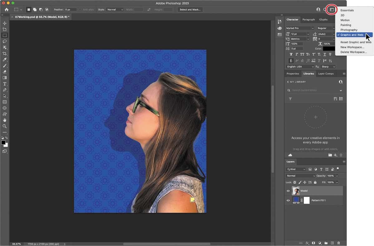
The Graphic and Web workspace displays the Character and Paragraph panels that you’ll use in this lesson, along with the Glyphs and Layers panels. The Tools panel may look different than it has in other lessons, because the Graphic and Web workspace includes a customized Tools panel.
Creating a clipping mask from type
A clipping mask is an object or a group of objects whose shape masks other artwork so that only areas within the clipping mask are visible. In effect, you are clipping the artwork to the visible pixels of the layer. In Photoshop, you can create a clipping mask from shapes or letters. In this exercise, you’ll use letters as a clipping mask to allow an image in another layer to show through.
Adding guides to position type
You’ll be adding multiple type layers that need to line up on the canvas. To simplify alignment, you’ll start by adding nonprinting guides to help position the type.
Choose View > Fit On Screen to see the whole canvas clearly.
 Tip
TipThe View > Actual Size command makes the Photoshop ruler match a real-world ruler. Actual Size works best with print documents, not documents measured in pixels.
Choose View > Rulers to display rulers along the left and top borders of the document window.
If the rulers aren’t displaying in inches, right-click (Windows) or Control-click (macOS) the rulers, and choose Inches.
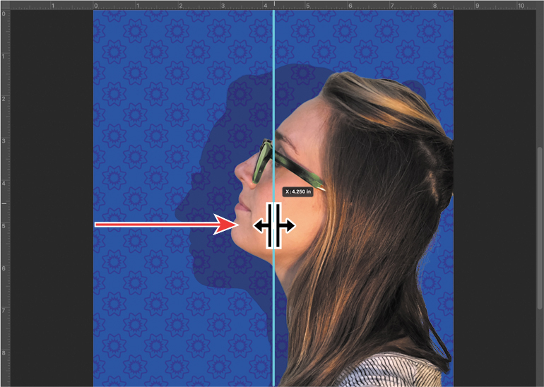
Drag a vertical guide from the left ruler to the center of the document (4.25").
TipIf you find it difficult to position the vertical ruler guide exactly at 4.25", holding down Shift will snap the guide to the 4.25" ruler tick mark.
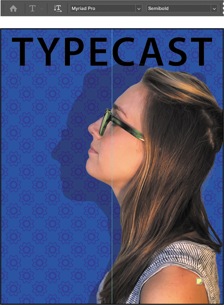
Adding point type
Now you’re ready to add type to the composition. You can enter point type (short text anchored to a point) or paragraph type (multiple lines that can recompose as you resize their text container) First, you’ll create point type.
-
In the Layers panel, select the Pattern Fill 1 layer.
-
Select the Horizontal Type tool (
 ), and, in the options bar, do the following:
-
Choose a serif typeface, such as Minion Pro Regular, from the Font Family pop-up menu.
-
Type 115 pt for the Size, and press Enter or Return.
-
Click the Center Text button.
-
-
In the Character panel, change the Tracking value to 50.
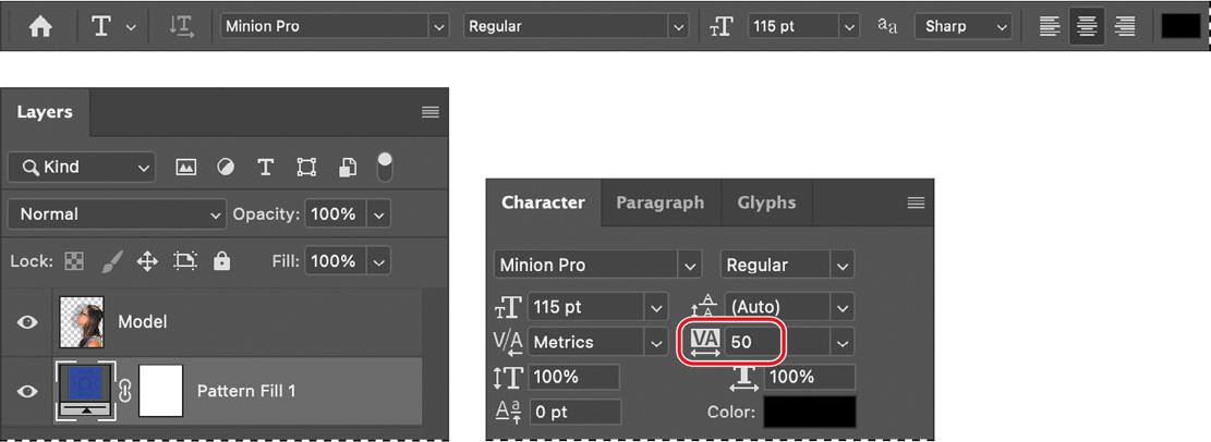
The Tracking value specifies the overall space between letters, which affects the density in a line of text.
-
Position the pointer over the center guide you added to set an insertion point, roughly where the guide crosses the edge of the model’s shadow, click, and then type TYPECAST in all capital letters. Then click the Commit Any Current Edits button (
 ) in the options bar.
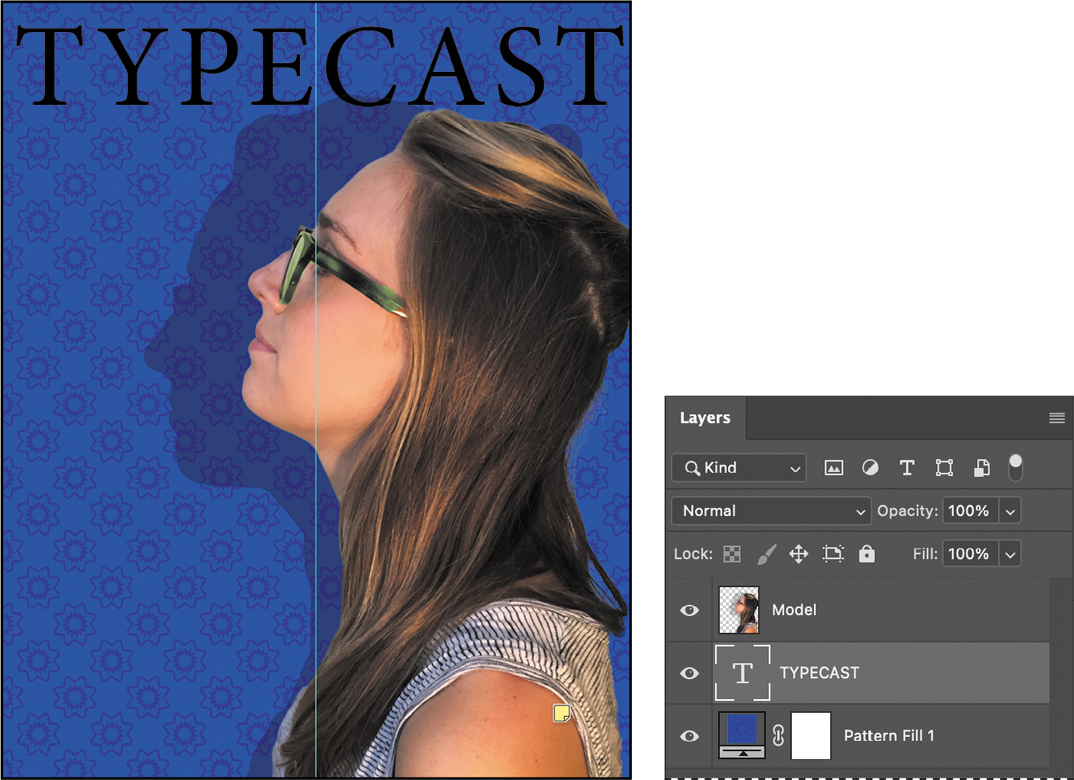 Note
NoteAfter you type, you must commit your editing in the layer by clicking the Commit Any Current Edits button, switching to another tool or layer, or clicking away from the text layer. You cannot commit to current edits by pressing Enter or Return; doing so would create a new line of type.
The word “TYPECAST” is added, and it appears in the Layers panel as a new type layer named TYPECAST. You can edit and manage the type layer as you would any other layer. You can add or change the text, change the orientation of the type, apply anti-aliasing, apply layer styles and transformations, and create masks. You can move, restack, and copy a type layer, or edit its layer options, just as you would for any other layer.
The text is big enough, but not modern enough, for this design. Try a different font:
-
Double-click the “TYPECAST” text to edit it.
-
Open the Font Family pop-up menu in the options bar. Hover the pointer over the font list, either with the mouse or using arrow keys.
TipWhen a type layer is selected in the Layers panel, the Properties panel displays type settings—another place you can change type options such as the font.
When the pointer is over a font name, Photoshop temporarily applies that font to the selected text so you can preview the font in context.
-
Select Myriad Pro Semibold or a similar font, and then click the Commit Any Current Edits button (
) in the options bar. NoteIf a lesson in this book uses a font that isn’t installed on your system, you may be able to install it from Adobe Fonts as part of your Creative Cloud subscription: In Photoshop, choose Type > More from Adobe Fonts. (Some educational or organizational Creative Cloud plans might not include Adobe Fonts.)
That’s much more appropriate.
-
If needed, use the Move tool to drag the “TYPECAST” text to adjust its position close to the top of the design.
-
Choose File > Save to save your work so far.
Making a clipping mask and applying a shadow
You added the letters in black, the default text color. However, you want the letters to appear to be filled with a texture from an image, so you’ll use the letters to make a clipping mask that will allow another image layer to show through.
In the Layers panel, make sure the TYPECAST layer is selected.
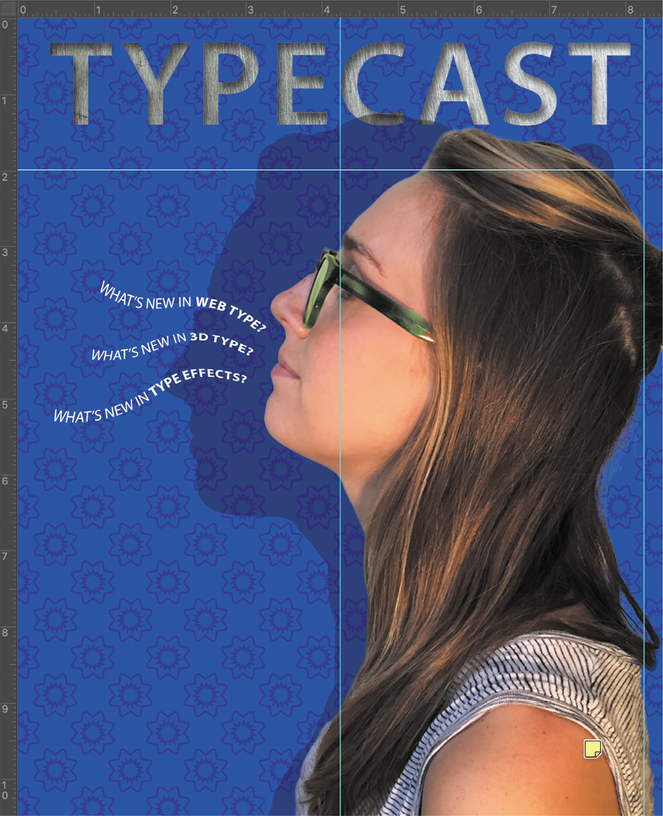
Choose File > Place Embedded, navigate to the Lesson07 folder, and double-click the Metal.tif file. It appears with a bounding box so that you can scale it or move it into place.
With the bounding box still active, drag the Metal layer up until it’s aligned with the top of the canvas. Then press Enter or Return to finish placing the file.
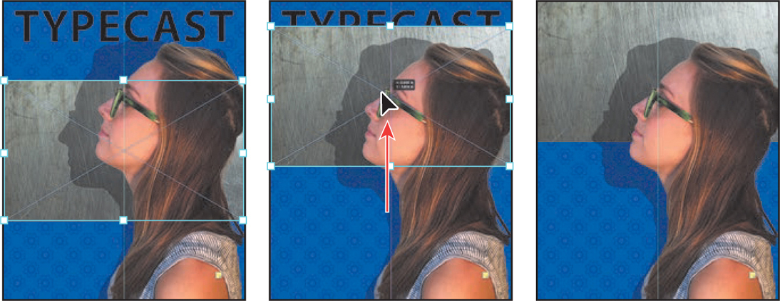
With the Metal layer selected, choose Create Clipping Mask from the Layers panel menu (
 ). Tip
You can also create a clipping mask by holding down the Alt (Windows) or Option (macOS) key and clicking between the Metal and TYPECAST type layers. Or, choose Layer > Create Clipping Mask when the Metal layer is selected.

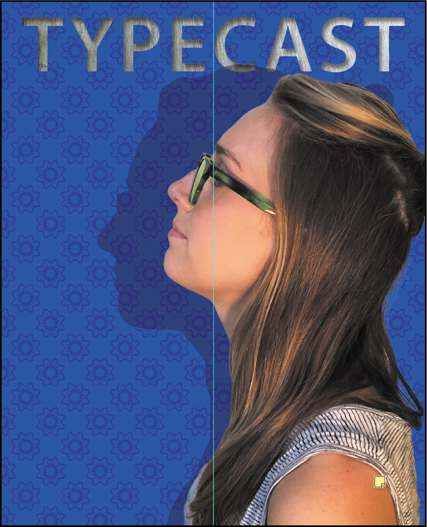
Creating a clipping mask lets the metal texture show through the “TYPECAST” letters of the next layer back. A small arrow in the Metal layer and the underlined type layer name indicate the clipping mask is applied.
Next, you’ll add an inner shadow to give the letters depth.
Select the TYPECAST layer. Then, click the Add A Layer Style button (
 ) at the bottom of the Layers panel, and choose Inner Shadow from the pop-up menu.
In the Layer Style dialog box, make sure the Blend Mode is set to Multiply, Opacity is set to 48%, Distance to 18, Choke to 0, and Size to 16. If the Preview option is enabled, you can see how changing the options affects the layer. Then click OK.
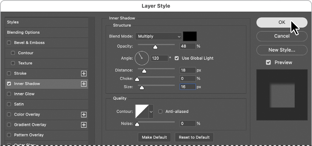
The Inner Shadow option adds a sense of dimension to the title text.
Choose File > Save to save your work so far.
Creating type on a path
In Photoshop, you can create type that follows along a path that you draw with a pen or shape tool. The direction the type flows depends on the order in which anchor points were added to the path. When you use the Horizontal Type tool to add text to a path, the letters are perpendicular to the baseline of the path. If you change the location or shape of the path, the type moves with it.
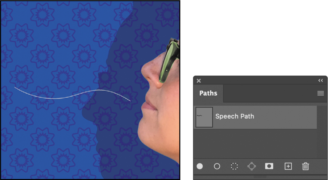
You’ll create type on a path to make it look as if questions are coming from the model’s mouth. We’ve already created the path for you; we stored it in the Paths panel.
-
In the Layers panel, select the Model layer.
-
Choose Window > Paths to show the Paths panel.
-
In the Paths panel, select Speech Path to make it active and visible.
The path appears to be coming out of the model’s mouth.
-
Select the Horizontal Type tool.
-
In the options bar, click the Right Align Text button.
-
In the Character panel, select the following settings:
-
Font Family: Myriad Pro
-
Font Style: Regular
-
Font Size (
 ): 14 pt
 -
Tracking (
 ): −10
 -
Color: White
-
All Caps (
 )
)
-
-
Move the Horizontal Type tool over the path. When a small slanted line appears across the I-bar, click near the end of the path closest to the model’s mouth, and type What’s new in 3D type?.
NoteThe path won’t print or export because it isn’t a shape layer—it exists only in the Paths panel. But the text on the path is a type layer, so the type will print and export.
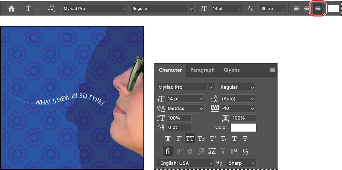
As you type on the path, the text is added from the right because Right Align Text was selected in step 5.
-
With the Horizontal Type too, select “3D type?” and change its font style to Bold. Click the Commit Any Current Edits button (
) in the options bar.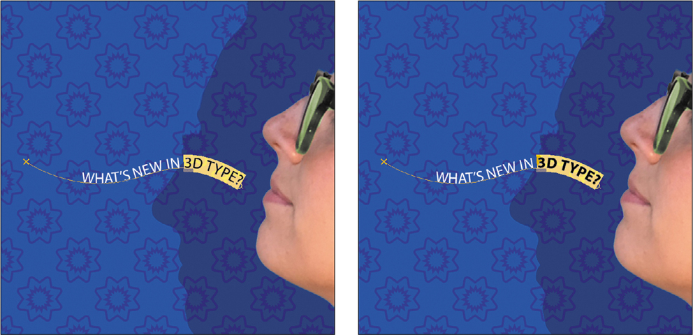
-
In the Layers panel, select the What’s new in 3D type? layer, choose Duplicate Layer from the Layers panel menu, and click OK.
NoteWhen you position a type tool over a character that has alternate glyphs available, a grid may appear containing alternates you can select from (see the sidebar on page 190). If the alternate glyphs get in your way, disable Enable Type Layer Glyph Alternates in the Type panel of the Preferences dialog box.
You can’t see the duplicate text layer yet, because it’s exactly on top of the original text layer. But the Layers panel shows that the duplicate layer has the word “copy” at the end of the layer name. You’ll move the copy away from the original.
-
Choose Edit > Free Transform Path. Rotate the path approximately 15 degrees, and then shift the path up above the first path and a little to the right, as in the figure below. Click the Commit Transform button in the options bar.
-
With the Type tool, select “3D” in the upper copy of the text layer, and replace it with web. Click the Commit Any Current Edits button in the options bar.
When you edit the characters on a text layer, the layer name automatically updates to match. (The layer name will not update if you edited the layer name to differ from the actual text on the layer.)
![]() Note
Note
If you can’t remember how to rotate using a transform bounding box, position the pointer near the outside of the transform bounding box until the pointer changes to a rotate icon (an arc with two arrows), and drag.

-
Repeat steps 9–11, replacing the words “3D type” with type effects. Rotate the left side of the path about −15 degrees, and move it below the original path.
-
Choose File > Save to save your work so far.
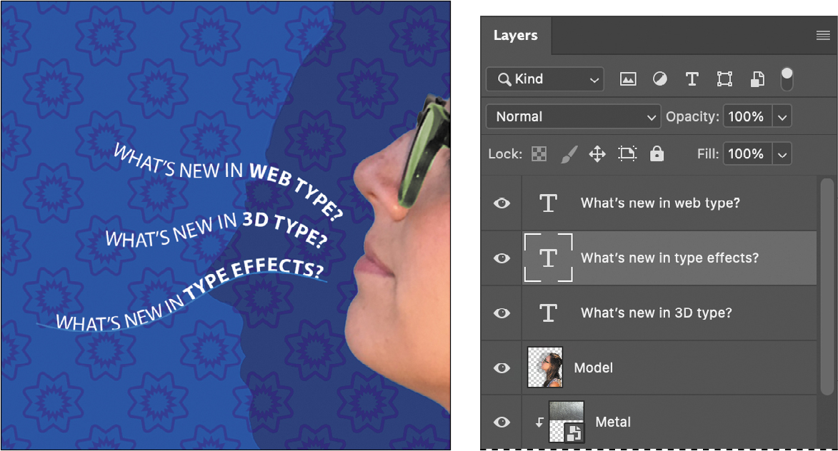
Warping point type
The text on a curvy path is more interesting than straight lines would be, but you’ll warp the text to make it more playful. Warping lets you distort type to conform to a variety of shapes, such as an arc or a wave. The warp style you select is an attribute of the type layer—you can change a layer’s warp style at any time to change the overall shape of the warp. Warping options give you precise control over the orientation and perspective of the warp effect.
-
If necessary, zoom or scroll to move the visible area of the document window so that the sentences to the left of the model are in the center of the screen.
-
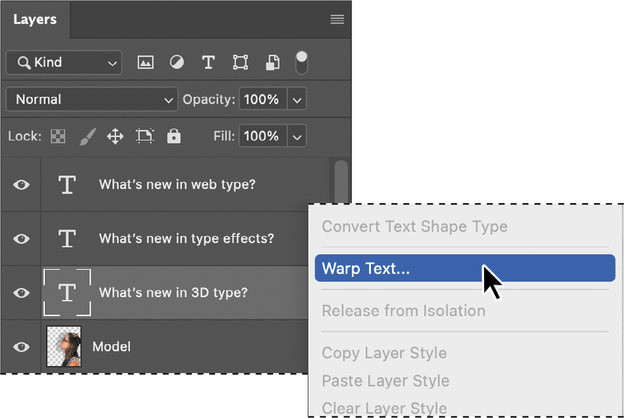
Right-click (Windows) or Control-click (macOS) the What’s new in 3D type? layer in the Layers panel, and choose Warp Text from the context menu.
NoteIf you don’t see the Warp Text command on the context menu, right-click/Control-click the layer or layer name, not the layer thumbnail.
-
In the Warp Text dialog box, choose Wave from the Style menu, and select the Horizontal option. Specify the following values: Bend, +33%; Horizontal Distortion, −23%; and Vertical Distortion, +5%. Then click OK.
TipDo you want to simulate type wrapping around a beverage can? With a type layer selected, choose Edit > Transform > Warp, then choose Cylinder from the Warp pop-up menu in the options bar.
The Bend slider specifies how much warp is applied. Horizontal Distortion and Vertical Distortion determine the perspective of the warp.
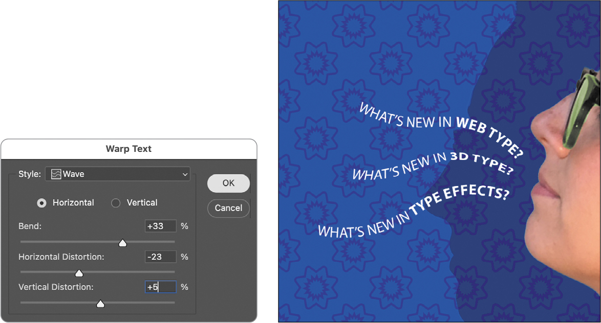
The words “What’s new in 3D type?” appear to float like a wave on the design.
-
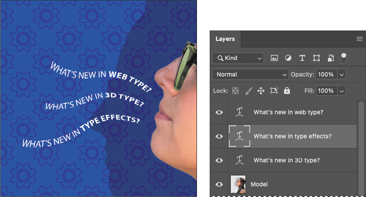
Repeat steps 2 and 3 to warp the other two text layers you typed on a path. Feel free to try different settings.
-
Save your work.
Designing paragraphs of type
All of the text you’ve added so far has been point type because it’s a single line. However, many designs call for full paragraphs of text. You can add paragraph type and apply paragraph styles. You don’t have to switch to a dedicated page layout program for sophisticated paragraph type controls.
Using guides for positioning
You will add paragraphs to the design. First, you’ll add some guides to the work area to help you position the paragraphs.
-
If necessary, zoom or scroll so that you can see the entire top half of the document.
-
Drag a guide from the left vertical ruler, placing it approximately 1/4" from the right edge of the canvas.
-
Drag a guide down from the top horizontal ruler, placing it approximately 2" from the top of the canvas.
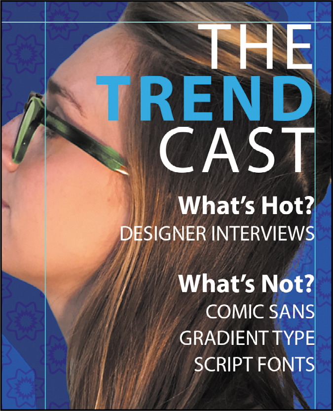
Adding paragraph type from a sticky note
You’re ready to add the text. In a real-world design environment, the text might be provided to you in a word-processing document or the body of an email message, which you could copy and paste into Photoshop. Or you might have to type it in. Another easy way to add a bit of text is for the copywriter to attach it to the image file in a sticky note, as we’ve done for you here.
Position the Move tool near the edge of the yellow sticky note in the lower-right corner of the image window, and when it appears as a black pointer only (
 ), double-click to open the Notes panel. Tip
You create notes using the Note tool, which is hidden when the Graphics and Web workspace is active. You can find the Note tool quickly by choosing Edit > Search. However, if you want to collect comments from multiple people, it may be easier to use the cloud-based Share for Review online comment feature (choose File > Share for Review).

All nine lines of the text should be selected; if they aren’t, click in the note text and choose Select > All. Choose Edit > Copy, and close the Notes panel.
TipIn step 4, the reason you press Shift is to make sure you create a new type layer. If you don’t press Shift, the Horizontal Type tool might instead select text in the nearby text layer containing the “TYPECAST” headline.
Select the Model layer. Then, select the Horizontal Type tool (
).Position the pointer where the guides intersect at about 1/4" from the right edge and 2" from the top of the canvas. Hold down the Shift key as you start to drag a text box down and to the left. Then release the Shift key, and continue dragging until the box is about 4 inches wide by 6 inches high. The new text layer is created in front of the Model layer that was selected (above the Model layer in the Layers panel).
Choose Edit > Paste to add the text from the note.
NoteIf the text isn’t visible, make sure the new type layer is above the Model layer in the Layers panel.
Select the first three lines (“The Trend Cast”), and then apply the following settings in the Character panel:
Font Family: Myriad Pro (or another sans serif font)
TipIf you paste text and it includes unwanted formatting, you can instead choose the Edit > Paste Without Formatting command in Photoshop to remove all formatting from the pasted text.
Font Style: Regular
Font Size (
): 70 ptLeading (
 ): 55 pt
Tracking (
): 50Color: White
With the text still selected, click the Right Align Text button in the options bar or Paragraph panel.
Select just the word “Trend,” and change the Font Style to Bold.

You’ve formatted the title. Now you’ll format the rest of the text.
Select the rest of the text you pasted. In the Character panel, select the following:
Font Family: Myriad Pro
Font Style: Regular
Font Size: 22 pt
Leading: 28 pt
NoteLeading (pronounced “ledding”) determines the vertical space between lines.
Tracking: 0
Deselect All Caps (
)
The text looks good, but it’s all the same. You’ll make the headlines stand out more.
Select the “What’s Hot?” text, change the following in the Character panel, and then press Enter or Return:
Font Style: Bold
Font Size: 28 pt
Repeat step 10 for the “What’s Not!” subhead.
Select the word “TREND.” Then, in the Character panel, change the text color to blue. We used R=0, G=174, B=239 (or #00aeef in hexadecimal RGB).
Click the Commit Any Current Edits button in the options bar.
Save your changes.
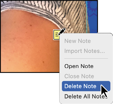
Finishing up
Now, you’ll clean up a bit before saving the finished project.
![]() Tip
Tip
Want a design to have a familiar look, but not with the exact font that look is known for? Try Font Similarity. Choose a font in the Font Family menu in either the Type tool options bar or the Character panel. You’ll see options at the top of the font list; click the Show Similar Fonts button.

The font list will now show the 20 most similar fonts available either on your system or from Adobe Fonts.
With the Move tool, right-click (Windows) or Control-click (macOS) near the top-left corner of the yellow note icon, and choose Delete Note from the context menu; click Yes to confirm that you want to delete the note.
Hide the guides: Choose View > Show > Guides to deselect the command. Then choose View > Fit on Screen to get a nice look at your work.
TipThe keyboard shortcut for hiding and showing guides (View > Show > Guides) is Ctrl+; (Windows) or Command+; (macOS).
Choose File > Save.
Congratulations! You’ve added and stylized all of the type. Now that the design is ready to go, you’ll export a copy to upload to the podcast service.
Choose File > Export > Export As, choose JPG from the Format menu, leave the rest of the settings as they are, and click Export. Change the filename to 07Upload.jpg, make sure it will be saved into the Lesson07 folder, and click Save.
Close the document window and save any changes.

Review answers
1 Text in Photoshop consists of vector-based shapes that describe the letters, numbers, and symbols of a typeface. When you add type to an image in Photoshop, the characters appear on a text layer at the same resolution as the image file. As long as it’s a type layer, Photoshop preserves the type outlines so that the text remains sharp when you scale or resize type, save a Photoshop PDF file, or print the image to a high-resolution printer.
2 You can create point type or paragraph type. Point type is anchored to a point created where you click a type tool. Paragraph type can contain multiple lines that can recompose as you resize their text container; you create it by dragging a type tool.
3 A clipping mask is an object or group that masks another layer using its visible pixels — you see only the areas of the layer that match up with the visible pixels of the clipping mask. To use a text layer as a clipping mask, make sure the layer you want to reveal is directly above the text layer, select the layer you want to show through the letters, and apply the Create Clipping Mask command (found on the Layer menu, the Layers panel menu, or the layer’s context menu).