
Appendix B. Sustainable Point Analysis
B.2 Elements of Aging Infrastructure Analysis
B.4 Metrics for Measuring Aging Infrastructures
B.5 Effect of Different Failure Rate Curve Shapes
B.7 Applying Economic Analysis
B.1 INTRODUCTION
Sustainable point analysis is a statistically based method for studying the aging, condition deterioration, and condition improvement options for a large set of T&D equipment (or for that matter, any other type of equipment). It is based upon a fundamental concept that some people find surprising or even counterintuitive:
Any large set of equipment in which units that fail are replaced by new units will eventually reach a sustainable point after which average equipment age, annual failure rate, and service and replacement costs will be roughly the same from year to year.
In other words, any set of poles, structures, transformers, cutouts, vaults, breakers –any collection of equipment where failed units are replaced with new or rebuilt units – will deteriorate only to a point. From there onward, its overall situation will remain stable, with the same average condition, the same expected failure rate, the same reliability impacts, and the same expected repair and maintenance costs every year, unless the equipment owners change their operating, repair and replacement policies, maintenance practices, or the type of equipment used.

Figure B.1 The concept of the sustainable point. In this example, a group of transformers – perhaps 1,000 – are installed in the same year, and average age that year is zero. Over time as they spend time in service, the average age increases. Some fail and are replaced, so the average age of units remaining in service does not increase by exactly one year per year. Here, average age gradually increases until a sustainable point average age of 50.0 years is reached, but this takes far longer than 50 years, as can be seen. Similarly, the average failure rate for the entire set, and all other statistics for it, will reach a stable value at the sustainable point, too.
It can to reach this sustainable point. Figure B.1 illustrates the key characteristics of overall aging trend exhibited by nearly any set of equipment. When a group of, say 1,000 poles or 1,000 transformers is installed, its average age is zero (all new). Neglecting initial flaws (infant mortality) the average failure rate is as low as it will ever be: it will slowly increase over time. The age of these units increases as they remain in service. But the wear and tear of service slowly eats away at their condition. A few units experience more stress or are weaker than others and fail early after only a few years. They are replaced with new units, which are of “zero” age, and those new units bring down the average age of the group just a bit from where it would otherwise have been. Thus, ten years after installation, the average age of the entire set is not exactly 10.00 years, because there have been a few replacements that are newer – average age is perhaps only 9.98 years. The average failure rate will be just a bit less than if all were exactly ten years old, because it is a combination of the failure rate for the ten-year-old units and the newer replacements.
The newer, replacement units begin to age, too. They are “behind” the original units in their race to their end of service life, but are aging just as fast – every year they stay in service they all get a year older, etc. The whole group, old and new, continues to age, with the average age increasing and the average condition deteriorating every year. Units fail and are replaced, etc., always with new units that bring down the average age of the group compared to if none had failed, and improve the average failure rate compared to that of the oldest units.
But at some point the original units – and perhaps even some of the early replacements – age and fail to the point where there aren’t very many of them left: so many years have passed that, even at a very low failure rate, many have already failed and been replaced. All the original units that are left are so deteriorated that they are failing at a high rate – so high that a lot of replacements are being made – enough that the number of new (zero age) units added each year counterbalances the continued aging of the remaining old units. From thereon, the equipment group is essentially at a stable point. (For the reader who cannot picture this, or wishes to see this, the bulk of this chapter will look at quantitative examples, which will make this and other points much clearer.)
Theoretically there are no exceptions. Regardless, for most operating electric and gas utilities the sustainable point is not directly of great practical value: despite the utility’s “aged infrastructure” and the problems it creates, the sustainable point is still far in the utility’s future and represents a condition-reliability-cost point that is much worse than today’s, and completely unacceptable to it. And that is, surprisingly, part of the reason the sustainable point is so important:
Things will get worse. If the utility’s T&D infrastructure is not at the sustainable point, then it is still trending toward that point: average age, reliability problems, and repair and replacement costs will continue to rise every year, slowly but inexorably. Analysis of the sustainable point and the trends toward it, based on historical and equipment data, provides useful information, on “how bad it will get and how soon we’ll get there.”
The sustainable point can be moved. But the sustainable point is not a function of the equipment alone. It is also affected by the utility’s operating, maintenance, repair, and replacement policies and procedures. Changes in the utility’s focus and procedures can both move the sustainable point and change the rate of increase of those reliability and cost problems – and sometimes even reverse them.
An Effective Tool for Management of Aging Infrastructures
Thus, the sustainable point does have some practical value to an operating electric or gas utility, mostly as an analysis and decision-making tool: it provides a powerful, effective foundation for analysis and optimization of strategies for dealing with aging infrastructures and the costs and reliability problems they create.
More accurate analysis. Statistical and pattern inference methods that assess utility asset, operating, and historical data are more accurate and effective if built around “sustainable point” equations. The knowledge that the system being studied will eventually asymptotically approach some sustainable point – even if that point is not known in advance – provides an “analytical fulcrum” with significant advantages: statistical fitting error is often cut in half. Patterns that otherwise might not be found are. Overall, the analysis of condition, failure and deterioration trends, and the expected improvement due to various mitigation methods, are all greatly improved.
Better decisions. Planning methods based on moving the sustainable point by changing inspection, service, maintenance, refurbishment, replacement, operating, or other policies, turn out to be particularly effective for studying various strategies and approaches to handling an aging equipment inventory. A utility can evaluate the effectiveness, in both the short-term and long-term, of various approaches to “fixing” its problems. In many cases, optimization can be applied to provide practical solutions to maximize results.
Damage from external causes. Most T&D equipment is so robust that in the presence of only deterioration from normal service, equipment lifetime will be many decades. But a utility’s planners must account for and anticipate the effects of “external damage” due to storms, earthquakes, floods, and similarly intense if infrequent natural events. While the cumulative effect of wear and tear of service is, ultimately, the bigger effect, external damage is a significant issue that can affect decisions and policies on equipment service, repair, and replacement. Furthermore, external damage complicates analysis and identification of condition deterioration trends from within historical and equipment data. Sustainable point analysis’ “mathematical fulcrum” helps here, too. The sustainable point method leads to planning and decision methods that better distinguish and fine tune policies aimed at each of these “lifetime shortening” effects.
B.2 ELEMENTS OF AGING INFRASTRUCTURE ANALYSIS
Two Types of Data Analysis
In almost all cases where a utility, industrial equipment owner, or government agency is reviewing and analyzing an aging infrastructure it owns, the equipment has been installed over a period of many years and is therefore of many different ages. Figure B.2 shows the number of overhead service transformers installed, and the number failing for a large power delivery system in the United States, for the years 1940 to 2010. This is an example of a year by year (YY) analysis: the units are analyzed with respect to specific times and with data representing each year at that time.
Basic Sustainable Point Analysis
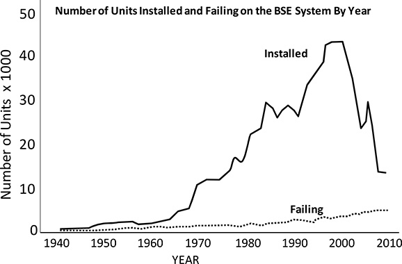
Figure B.2 Number of OH transformers installed (solid line) and failing (dotted line) in Big State Electric’s system from 1940 to 2010. Such year by year study is one type of analysis done on aging equipment sets.

Figure B.3 Failure rate curve for the set of one million OH service transformers from Figure B.1. Usually, failure rate curves are determined by synchronized installation analysis, in which equipment is analyzed on the basis of time since installation regardless of its age now – as if it were all installed in a single year.
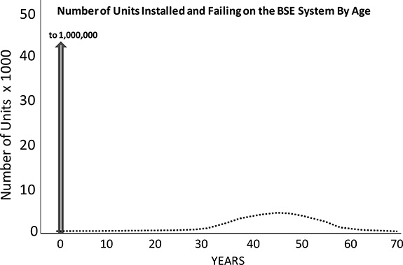
Figure B.4 Same data displayed in the year-by-year data plot in Figure B.1, represented as simultaneous installation (bottom) manner. See text for details.
However, in many cases statistical analysis needs and data review are best carried out by looking at equipment purely as a function of age, regardless of when it was installed or what age it is now, in what is called a simultaneous installation (SI) analysis. Basically, in such situations, data on each equipment unit is used to “slide” it backwards or forwards in time, until the analysis data set has been adjusted so that all units appear to have been installed in a single year. Here, trends over time are much more apparent, etc. A failure rate curve such as shown in Figure B.3 is a product of SI analysis.
Invariably, thorough analysis of an aging equipment set requires both types of analysis. Figure B.4 shows the data from Figure B.1 displayed in both manners: the bottom data set was formed by simply using time since installation to shift all data points (for both installation and failure, if it happened) for each unit. Simple manipulation of the data on failures in the bottom plot then leads directly to the failure rate curve. But regardless of the analysis approach used – YY or SI –for any set of equipment and operating conditions the sustainable age is the same.
A Year Is a Year is a Year
In almost all practical aging infrastructure studies, and in all data plots and analysis given in this book, no distinction is made of time within a year, and ages are given, and analyzed, on only a year basis. Thus, 1,000 transformers might have been installed at various times in 2004, but all were treated as of identical age. Their age is zero years (new) anytime in 2004, 1.00 year old anytime in 2005 (i.e., they are zero years of age up through December 31, 2004, and one year of age from January 1 to December 31, 2010. Beyond the reduced data and analysis needs that this approximation brings, it is most often forced on planners and engineers by the available data, which often gives only the year of purchase or installation, with no further identification as to when within a year.
This simplification in data and analysis occasionally adds a small but noticeable deviation from the results one would get using a finer, perhaps daily, reckoning of time. However, there is no loss of generality of conclusions reached, and from a practical standpoint, no loss of value in any results from a decision-making and planning standpoint. Planning decisions that are specific to times within a year can be planned using such “yearly only” analysis, for example when a utility determines it will replace 840 units in year 2012 and then schedules them during periods when forces are expected to be available and maintenance outages can most conveniently be taken.
B.3 QUANTITATIVE EXAMPLES
Examples with Equipment Installed All in One year
The examples given here all involve looking at a large body of equipment, one million units, that is all installed in a single year and thus starts out as identical in age and condition. Here, year-by-year and synchronized installation analysis are identical. Chapter 4 will look at actual utility cases where equipment was installed over many years.
These “install one million units and watch as they age and fail over the next seventy-plus years” cases simplify introducing some important characteristics of sustainable point trends, and permit comparison that provides several important lessons. And they are not completely unrealistic. An equipment manufacturer might study in detail the failure and operating history of 1,000,000 units it made and sold in, say, 1984, to try to determine the lifetime trends of its products, etc.
Example 1: Widgits with a Constant Failure Rate
In this example, 1,000,000 widgits are installed in year zero. Widgits have a 1.955% annual failure rate, regardless of age -- in other words a flat failure rate “curve” – one that does not vary with time in service.1 This is very unrealistic – almost all utility equipment has a gradually increasing failure rate over time. But a constant failure rate provides a simple starting point, creates a set of results that will be useful for comparison in subsequent examples, and actually to a very interesting practical result that will be explored before the chapter is over.
One million widgits are installed over the course of year zero. During their first year of service, 1.955% of these million units fail and are replaced with units that are, on average, a year newer. This means that at the end of one year of service, 980,450 remain in service and 19,550 units are replacements. Thus, at the end of that first year of service, the average age of the units is:
1 This particular value was picked so that a certain result works out to a certain value as will be described later.
Average age after one year = 980,450 x 1 yr + 19,550 x 0 yr = .9805 yr [B-1]
A very useful metric to track in aging infrastructure studies is the average aging rate – if and how fast the entire set of equipment grew older in a year. It becomes zero at the sustainable point. But in this first year it is rather high: this entire equipment set of 1,000,000 widgits aged by an average of .9805 year in this first year of service.
During the second year of operation, 1.955% of the 980,450 original widgits that survived through year one fail: they are replaced by 19,168 new units, leaving only 961,282 original units, each now two-years old, to go into the next year. In addition, 1.955% of the 19,550 units added the year before (382) fail, leaving 19,168 year-old units. So, there are a total of 19,550 (19,168+382) new replacements. Average age of the units in service increases again, but by not quite by as much as in year 1.
Average age = 961,282x2yr +19,168x1yr +19,550x0yr = 1.9417 years [B-2]
Increase in average age during this year = .9613 year

Figure B.5 Average age of one million widgits as a function of time after they are put into operation in year zero, with a 1.955% annual failure rate regardless of age, and where failed units are replaced with identical new units. While numbers differ, any real equipment set where failed units are replaced with new units will exhibit this general trend, with average age increasing a bit less each year until it stops when the sustainable point is reached.
After a third year of service, average age will be 2.8842 years; an increase of only .9425years. Each year thereafter the original set of units is depleted by more failures, but by a bit less than the year before because there are fewer and fewer units each year that have survived so they can fail at this age. Each year, a larger portion of the units in service are replacements made at some time in the past. But regardless, each year, a total of 1.955% of one million units fail. What varies is that over time fewer are original units, and more and more are replacements, and even replacements of prior replacements.
Figure B.5 shows the average age of the units in service as a function of time after the initial installation. The equipment set starts out with an average age of zero (all one million units are new). Over time, in the manner described above, the average age increases each year, but each year by just a bit less than the year before. It is asymptotically trending toward an average age of 50.00 years – the average age associated with the sustainable point. This behavior over time is a general characteristic of any large equipment set: while the numbers might vary from one case to another, qualitatively all large groups of equipment exhibit this characteristic, with average age asymptotically approaching a “sustainable age.”
Distribution of Ages
Average age of equipment is a metric nearly always computed, tracked, and reported within utilities, even though everyone involved knows that it does not communicate all the detail needed; there are many distributions of age that could give the same average. Nonetheless, average age is a useful index and an important element in fitting statistical models to real equipment datasets.
Greater detail is provided by looking at the distribution of ages, or estimating it when actual data is not available or dependable (statistical fitting in such cases is one area where sustainable point analysis provides measureable benefits). Figures B.6 and B.7 show how the distribution of unit ages in this example changes over time. When operation begins, in year zero, the age distribution is a spike: one million units of age zero and none of any other age. After one year it consists of 19,550 units of age zero and 980,450 units that are one year old. Figure B.6 shows the distribution at year 2, with 19,550 units of age zero (given the constant failure rate this will never vary), 19,168 units of age 1.000 year, and 961,282 units of age two.
Figure B.7 compares the ten year age distribution with those at 50, 100, and 150 years. At the end of ten years the average age of the million units in service is 8.99 years: over the first decade of operation, the average age of the one million units has increased by nine years. Over those ten years of operation, 195,500 replacements were made, but of those, only 179,168 remain in service, because 16,332 of the replacements have already failed, too. This tremendous number of “replaced replacements” is unrealistic, a function of this example’s flat failure rate curve and its very high early-year failure rates.
Over time there is a complicated dynamic working within this set of one million units, with original units failing, and some replacements failing, and even a few replacements of replacements of replacements failing each year. But the net effect of the shape of the distribution of ages (Figure B.7) is quite easy to explain: every year the “spike” of original units shrinks by 1.955% of its value and moves one year farther out – what was 380,056 49 year old original units in year 49, becomes 372,626 50 year old units a year later, and leaves all other values stay the same (this is because of the constant failure rate as a function of age, and not normally seen in the real world).
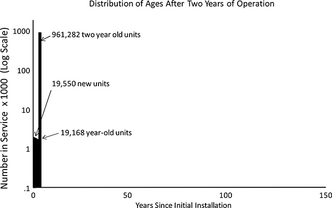
Figure B.6 Distribution of ages of the one million units in service at the end of two years.

Figure B.7 Distribution of ages for various other times after initial start up.
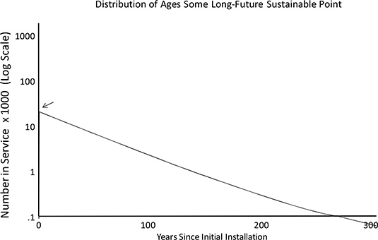
Figure B.8/ Distribution of age at the sustainable point, which is not reached for centuries (an unrealistic characteristic of the failure rate curve that does not increa with age in this example). Horizontal axis here is 300 years compared to 150 for the previous two plots.

Figure B.9 Same data as in Figure B.8 plotted in a normal rather than log scale. This is the characteristic “age profile” associated with constant failure rates. It may be blurred in actuality because all equipment was not installed in a single year, but proper analysis and data manipulation can account for that.
This trend of the spike moving out and shrinking continues forever (Figures B.8 and B.9), until the original spike of one million units eventually disappears. This does not happen in this example even after three centuries, due to the unrealistic nature of the failure rate curve used here (the distribution at 300 years looks like Figure B.7’s plot of the sustainable age distribution, but the “spike” is only 2,425 units left at year 300, there being that many units out of one million expected to last three centuries
What is Common and Generalizeable About this Example
Over time for any set of equipment, with any type of failure rate curve, there will be:
- Fewer original units left in service.
- A higher proportion of replacements are in service.
- A higher proportion of replacements of replacements in service.
And thus, all equipment sets exhibit these characteristics over time
- Average age trends a to an average “sustainable age.”
- Aging rate begins at a high rate and decreases over time.
- Even if the equipment is all installed at one time, eventually there is a wide distribution of ages of equipment: age distribution is not primarily a function of when equipment was installed.
What Is Not Common or Generalizeable
First, age distributions almost never behave as in Figure B.7, with a spike just moving to the right each year and leaving behind it the same shape of distribution year after year. Instead, most real distributions vary in shape slightly everywhere along their curve, “evolving” in shape (the next example will show this).
And finally, there is a “coincidence” in this example that is not general and should never be assumed, but which many people mistakenly see in the data presented here and which many expect, and few even insist upon, as having to always be the case. In this example, the sustainable age, 50 years, and the average failure rate, 1.955% are reciprocals:2
1/(failure rate) = sustainable age [B-3]
1/(2%) = 50 years
The authors realize that, intuitively, it might appear that this should always be how things work out. But this is almost never the case. Usually 1/(failure rate) is much greater than the sustainable age, and many engineers and managers new to aging infrastructure analysis find puzzling (this will be explained in the next example). A few almost refuse to accept it. But the fact is that the two values, average age and failure rate, are reciprocal only when failure rate is not a function of time in service, which should almost never be the case.
Example 2: A More Realistic Failure Rate Curve
In Example 1, the expected failure rate did not increase with the age of the units, which is quite unrealistic because that would mean that either deterioration is not taking place over time (never the case) or that it is but has no effect on unit reliability (again, just not ever the case). In this example failure rate does increase with age – quite dramatically in fact. The failure rate curve shown in Figure B.10 is based on actual utility data, with its values only slightly modified by the authors so that the sustainable age works out to exactly the same 50.00 years as in Example 1, which will permit several revealing comparisons later in this section.
Figure B.10 shows the failure rate for Ever-There Corporation’s Dura-Widgits, which are functionally identical to the common widgit of Example 1, but made of a breakthrough synthetic material – dried and spun fluff, reinforced with carbon fiber and then infused with a long-polymer cross-linked polyethylene epoxy. As a result they are much more robust than standard widgits, so that in their first full year of service Dura-Widgits have an expected failure rate of .0250% -- or one quarter of one tenth of one percent. Out of 1,000,000 to be installed, only 250 are expected to fail in their first year of service, as compared to 19,550 widgits in Example 1. Clearly these Dura-Widgits are a real boon for a utility – they cut replacement rate in the first year after initial installation by more than 75.
But as Dura-Widgits age their expected annual failure rate increases, at first very slightly each year but then by greater increments from year to year. The actual formula fitted and adjusted here is rather simple: the annual expected failure rate shown increases by 5.339% of its prior year’s value each year. In year two it will be 105.339% of .0250%, or .0263%. In year three it will be 105.339% of .0263% or .0277%. And so forth. Looking at Figure B.10, one can see that Dura-Widgits provide a rather dependable 70-80 years of durable service, after which failure rate begins to increase significantly.
2 Note: the failure rate should be 2% in this example: with a constant failure rate the sustainable age should be the reciprocal of the failure rate. But 1.955% is needed in this example because the analysis is done on a yearly basis as explained earlier. Not all years installed in year X were installed on the same day, etc, but they are treated that way here.
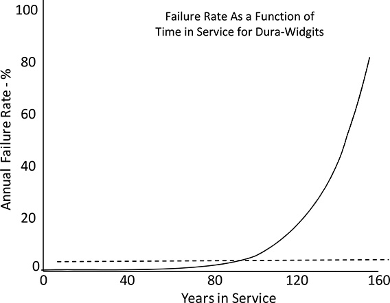
Figure B.10 Failure rate curves as a function of time in service for Dura-Widgits (solid line) as compared to Example 1’s normal widgits (dashed line). See text for details.
Aging Characteristics Caused By Typical Utility Equipment Failure Rate Curve Shapes
The failure rate curve shown in Figure B.10 is quite similar in values, escalation rate, and shape to many the authors have encountered in work with actual utility data. Despite its slowly escalating trend, its value is quite low for decades, because it starts out at a very low value.3 After 50 years of steady escalation, it has reached only one-third of a percent – still just a sixth of the value in Example
1. It reaches half a percent 8 years later, a full percent at 71 years, and finally passes Example 1’s 2.00% value in year 85. At age 100 years it reaches 4.54%, and exceeds 50.00% at 146 years. It reaches 100% at age 160, so there is no expectation at all that Dura-Widgits will last more than 160 years.
The effect that the difference in failure rate curve is dramatic, as illustrated in Figure B.11, which compares Examples 1 and 2 with respect to the number of “survivors” – original units still in service – as a function of operating time. In Example 1, the number of original units still in service drops below 900,000 in just six years – meaning more than one in ten has already failed and been replaced. By contrast in Example 2 the count of original units stays above 90% until year 61.
3 This example deliberately neglects infant mortality issues with equipment.
But as the Dura-Widgits age, their failure rate escalates. The failure rate for this example “catches up to” Example 1’s at age 85: after 85 years of service the average Dura-Widgit has an expected failure rate of 2%. Despite this, the total number of original units remaining in year 85 is still far higher than in Example 1, because failure rate was so much lower for over eight decades prior to that time. At age 85, Example 2 has 679,889 survivors, Example 1 had only 186,708.
Every year after 85 years in service, the failure rate in Example 2 increases a bit more. But the number of original units that have failed in Example 2 does not surpass that of Example 1 for another 35 years, until year 120 (both have about 95,000 original units , or just less than 10%, left in year 119).
Also worth noting is that the number of replacements in service versus the number of replacements that have been made as a function of time. At year 119, both examples have nearly the same number of original units in service (95,416 for Example 1, 95,331 for Example 2). This means that both examples have roughly 904,500 non-original units – replacements – in service. Yet at that time, the utility has replaced a total of 2,326,450 units in Example 1, compared with only 942,999 units in Example 2. After 119 years, over 96% of all replacements ever made are in service in Example 2, versus fewer than 39% in Example 1: its failure rate means that are many more replacements of replacements.
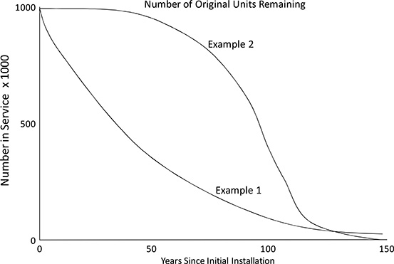
Figure B.11 Number of original units remaining as a function of years since initial installation. Note that unlike previous unit count plots this is not a log vertical scale.
Significant technically, but of little practical importance, is the fact that normal widgits actually have a much higher likelihood of lasting a long time. While the failure rate for Dura-Widgits reaches 100% at 160 years, so there is no possibility of them surviving past that age, it is so high in the two decades prior to that that only 1 out of a million is expected last to150 years. By contrast, with its straight 2% annual failure rate, Example 1 still has 51,739 of its original one million widgits left in service at 150 years.4 At the end of 300 years, it will still have nearly 2,500 original units in service.
Aging Rate in Example 2
Figure B.12 shows the average age of installed units over time for this example, comparing it to the same statistic from the previous example. Readers will naturally be curious about the oscillations, which will be discussed in a few paragraphs. For the moment, this examination will focus on what happens during the first fifty years of operation.
From the beginning of their service lives, the average age of the 1,000,000 installed Dura-Widgits increases much faster than did the average age of the normal widgits in Example 1. Far fewer Dura-Widgits fail and have to be replaced with new units each year, so there are far fewer newer units to bring down the average age. In their first full year of service, only 250 Dura-Widgits are expected to fail as compared to 19,555 in Example 1. These failed units are replaced with 250 new units of the same type. At the end of the first full year of service, there are 250 new Dura-Widgits and 999,749 that are a year old. The average age is .99975 years. Note that, with a substantially lower failure rate at this age, they aged faster than the units in Example 1: average age increased by .99975 as compared to .9805 year.
At the end of ten years, the average age of the Dura-Widgits in operation is 9.98 years, compared to 8.99 years in Example 1: after only a decade Dura-Widgits are providing a full year of additional service life. At fifty years of operation the average age of an installed Dura-Widgit is 47.24 years compared to only 31.46 years for normal widgits. Dura-Widgits provide an average of more than 15 years of additional service life over their first half century of application. No doubt Ever-there Corporation would advertise this heavily.
4 The authors say this is of little practical importance for two reasons. First, it is so far into the future, that the net present value of continued service in that timeframe is nil. More important, this analysis considers only failure from normal deterioration. Over a period of 150 years, the likelihood of a storm, forest fire, earthquake, flood, or other “external” event causing the end of life of a unit is greater than this probability of it lasting to 150 years.
Oscillations
In some cases the trends oscillate in time before settling down to the sustainable point. Oscillations are for reasons that are not, at this point, obvious. Readers and students in the authors’ seminars initially are intrigued by them to the point of being distracted from more important basic lessons of sustainable point analysis, but almost invariably dismiss them as interesting but unimportant. In fact, oscillations are very important from a practical standpoint, as they sometimes occur with cable.
The oscillations shown in Figure B.12 are exacerbated by the unrealistic nature of this example – all the equipment was installed in a single year – but oscillations do occur in real utility systems and are much more common than is often recognized. Here, while the sustainable age is 50.00 years, initially the average age initially shoots past 50 years and continues up to over 64 years (at year 81) before plunging to only slightly more than 35 years (year 125), etc. Over the next decades the average age of installed Dura-Widgit will oscillate in ever gentler increases and decreases toward a final value of 50.00 year average age.
Oscillations occur only when there is a combination of two characteristics in the equipment set. Both must be present for oscillations to occur:
a) The failure rate curve is not constant or even linear: at some point the failure rate increases rather steeply as a function of time in service.

Figure B.12 Average age of Dura-widgits (solid line) compared to standard widgits from the previous example. Both equipment sets have a sustainable point average age of 50.00 years.
b) All or a substantial portion of the units were installed over a short period of time. This is seldom the case when equipment and aging is analyzed over an entire utility system. But it is often true of the equipment in a specific sub-system or area of a system, such as all cable installed in an office park built out in the late 1960s.
Table B.1 lists typical characteristics of oscillations. The most extreme oscillation possible will exist if both of conditions listed above are in their extremes: if the failure rate “curve” is a step function and all equipment was installed in a single year. For example, suppose the failure rate “curve” is zero until past age 40, at which point it becomes 100% (all of the units fail in year 41). If one million units are installed in year 0, the average age curve (the equivalent of Figure B.8 for that example) would show a saw-tooth pattern. It would start at zero in year zero and increase at a rate of exactly 1.000 year per year up through an average age of 40 in year 40. In year 41, all units would fail and be replaced with units of zero age and the trend would start to repeat itself endlessly. Important points about oscillations are given in Table B.1
Table B.1 Key Points About Aging Trend Oscillations
|
1) Oscillations occur in real utility systems. 2) Whenever they occur they affect all aging statistics: average age, failure rates, overall operating costs, and all other age-related statistics oscillate in a related manner. 3) They are periodic about the sustainable point of the equipment set and asymptotically die down, but often only gradually. 4) The waves are not necessarily symmetrical, but can have a somewhat sharper rise than fall, or in rare cases, vice versa. 5) Some of the “asset wall” shapes of age distributions seen in actual utility systems are an oscillation (usually the first). |
Oscillations That Occur in Real Utility Systems
Figure B.13 shows data from a portion of a metropolitan utility system in the eastern United States. Several decades earlier the city government, in partnership with private investment companies, “redeveloped” a 34-block tract in an area of town that had deteriorated into largely abandoned neighborhoods of old warehouses and piecework factories. The master plan included high rise offices and condominiums, large institutional buildings like hospitals, a new police headquarters and school administration buildings and several similar government offices, a sports complex, and a convention center and three hotels.
Although total build out for the redevelopment plan took more than fifteen years, as is often the case the utility installed the bulk of its primary cable for this area in a period of slightly less than six years -- thousands of feet of new ducted UG primary cable, splices, buses and vaults, installed, if not in one year, over a relatively short span of time compared to the cable useful lifetime. As a result, the primary distribution “sub-system” in this area – comprising miles of cable and its associated equipment, and serving over 110 MW of peak demand – exhibits very definite oscillations.
Other portions of this utility’s UG cable system exhibit similar oscillations peaking in different years because they were built out at different times, and often with different periodicities because they include different types of cable and equipment. Oscillations are not seen in overall statistics for the whole utility system because there is a type of “diversity of peaks” working within the whole – different areas of the system, of different ages of initial installation, are cycling up and down at different times. Overall, the oscillations tend to cancel one another and smooth out.
Norm for small areas of most utility systems. In almost all utility systems, different areas of the system were “built out” during specific times – there are areas that developed in the 60s, in the 70s, the 80s, the 90s, and in areas where construction activity is intense now. Usually, the utility’s electrical equipment in each area is dated to that last development period: it was installed at the same time.
Figure B.13 Oscillation of failure rates and operating costs for a region of a utility system in the eastern United States served by an all UG distribution network. Trends shown are fitted and predicted data, black dots indicate actual utility operating cost data.
Oscillating failure/replacement cost behavior as shown in Figure B.13 is the and to serve that development. Thus, every such region will exhibit a certain amount of historical and predictable future oscillations in failures and operating costs. The ability to track, anticipate, plan, and manage equipment, failures and replacement on a local basis, for all localities in the system, is a key part of good aging infrastructure management.
Age Distribution in Example 2
Figure B.14 shows the distribution of ages of installed Dura-Widgits at various times during the first century of operation. At ten years, there are of 996,801 original Dura-Widgits left, and fewer than 4,000 replacements have been made to date, all of them, of course, having ages less than ten years in service. (Readers should keep in mind this plot has a vertical log scale. The slight drop in the height of the “spike” at year ten as compared to year zero is equal to the area under the curve for all nine years leading up to it.)
Nothing that is really qualitatively different happens until about year 100. Each year until then, the spike moves to the right by one year and decreases in value only slightly, but by a bit more each year. Cumulatively, over a full century, the escalation in the failure rate begins to show is effects: only 399 replacements are needed in year 10, growing to 866 in year 25, 3,062 in year 50, 9,647 in year 75, and 19,924 in year 100.
In example 1, the number of replacements needed in any year was always 19,555 per year, due to its constant 1.955% failure rate regardless of age. In this example, annual needed replacements first exceeds 19,555 in year 99 (19,690 replacements needed), even though the escalating failure rate for Dura-Widgits first exceeded 1.955% nearly 15 years earlier, at 85 years in service. At 99 years, failure rate is actually more than 4% and climbing at nearly a quarter percent per year. But as discussed earlier, it is taking time for Example 2 to “catch up” with Example 1.
Part of the reason is the distribution of ages in the two examples as they both approach 100 years in operation and the impact that has on the number of “replacements of replacements” needed In example 2, fewer than 4,000 replacement units are needed in the first decade of operation compared to 199,550 in example 1. Thus, ninety-nine years later, example 2 has only 1/50th as many units that are between 90 and 100 years of age: so there are far, far fewer old replacements that fail and need to be replaced. And while there are still many original units (over 425,000 remain at 100 years), there are simply not quite enough units, that are old enough that their failure rates all add up to greater than 2% until year 99.

Figure B.14 Distribution of ages at various points during the first 100 years of operation. As time passes the spike representing the original units moves to the right and slowly decreases in value, dragging a distribution of various ages of replacements behind it.
The Failure Curve Tipping Point: A Change in the Character
Beginning around year 100, a number of very interesting changes take place in the character of equipment aging in Example 2. By this time (year 100) the failure rate of the original units has been above 2% for fifteen years, and is now above 4%: more than one out of every 25 original units is failing each year. Failure rate will climb to over 5% by year 104 and continue to grow from there. As a result, in the following 25 years the spike representing the original units in Figure B.14 will “melt” as the number of original units drops by over an order of magnitude, from more than 425,000 in year 100 to less than 39,000 in year 125. But despite this, the total number of replacements required each year begins to drop; it peaks in year 104, at 20,424, and then decreases significantly each year, falling below 10,000 by year 125.
What the utility is seeing is the first of the oscillations: the number of failure replacements required each year is actually dropping even though there are many old units still in operation. As stated earlier, Chapter 5 will deal in detail with the oscillations and their causes and characteristics in actual utility systems. But for the moment what is happening during this very brief period after a century of operation began provides a useful lesson.
In year 104 the failure rate curve reaches a “tipping point”5 Its value exceeds its annual growth rate. As described earlier, here annual failure rate grows at a compounded rate of 5.339%. In year 104, the failure rate, which started out at only .25%, finally grows to over 5.399% (it is 5.30% in year 103 and 5.59% in year 104). The fact that this happens in year 104, and at a value of 5.339%, is entirely a function of the escalation rate and curve shape selected by the authors. But in real systems this always happens at some point. And from there on the total number of annual failures for the original equipment of this age will go down.
5 The authors apologize for using a term they don’t like themselves, but there is no better mathematical example of a tipping point than this.
There is always a “tipping point” or age of maximum failures after which the number of failures for any group of equipment continuing to age will drop. This tipping point is entirely a function of the failure rate curve shape and occurs at the point where failure rate first exceeds the annual growth rate of the failure rate curve.
Going into year 104, there are 347,687 of the original one million units still in operation. Their failure rate is 5.59%, meaning that 19,427 of them are expected to fail, leaving 328,260 to go into year 105. In year 105 the failure rate escalates to 5.89%, but it will be applied to only 328,260 units, meaning slightly fewer failures are expected to occur – just 19,320. Failures are always the product of number of units times failure rate. Prior to year 104, the latter grew more each year than the former shrank, so the net product increased each year. From year 104 on, the opposite occurs, and the total number of failures in the original set of units begins to shrink, at first slowly and then more quickly from year to year.
While the number of original units that fail is shrinking rapidly in year 104, there are still enough of them that failures among them dominate the overall failure statistics for the entire set of one million operating units, even though there are more replacements in service at this point than there are original units. This is due to the distribution of ages of the units. Even at 104 years into operation, there are still few early replacements – ones that have reached an advanced age where their failure rate, too, is above 2% and climbing rapidly. Overall, there are just not enough in this category to cause enough failures to make up for the drop in failures among the original units. As a result, from year 104 to year 125, the number of annual replacements needed for the entire population drops by a factor of more than two.
While this is happening, and because of this, the shape of the age distribution diagram shows a considerable change in character. Up to 104 years, if one neglects the spike of original units, the largest age group of equipment is always the latest replacement units – they outnumber units of any other age, except for that spike of original units. But beginning in year 105, a “hump” begins to occur in the distribution of (Figures B.15 and B.16). Prior to year 105, excepting the spike of original units, the most populous age was always zero- the new replacements. Now this is not the case. The system is on the downside of an oscillation.

Figure B.15 Starting at around 100 years of operation the character of the age distribution begins to change: the spike of original units starts to shrink rapidly and a “hump” begins to develop in the distribution of relatively newer units.

Figure B.16 Data plotted on a linear rather than log scale shows the large difference in distribution by age.
Both widgit examples started out with many units installed in a single year – of a single age. Both end up, decades later, with a wide distribution of units of all ages, nonetheless. This distribution is the result of the slow, decades-long deterioration of the original equipment set and its gradual replacement over time with newer units. Eventually, replacements fail and are replaced, etc., until the age distribution reaches that for the sustainable point, after which it does not vary.
It is worth noting that this same distribution would be reached if the units were not installed in the same year. To see this, suppose they were installed half in one year, and half ten years later. Each half would change and its distribution of ages evolve as the other (and as in the original, all-million-installed-in-one-year example), but one lags the other by ten years. One would reach its sustainable point first after which its values would not change, the second lot would reach that point ten years later, and after that point they would have an identical age distribution as compared to if they had all been installed at one time.
The point here is that the basic sustainable point behavior of an infrastructure – how it ages toward a statistical distribution – does not depend on when the equipment was installed, or the particular age distribution of that equipment in a particular base study year (e.g., 1990). It is a function only of the equipment, the way it is used, and the way it is cared for, repaired, and replaced.
As mentioned in earlier, often a utility or industrial power system owner does not care about the sustainable point – it is far into the future, what matters most is the exact characteristics, aging, and failure characteristics now, or the next few years. But such situations are never generalizeable for “big picture” planning and comparison of major differences in policy or operating procedure.
The sustainable point behavior of an infrastructure is the most generally useable characteristic of its overall potential for aging and deterioration-related problems caused by the aging.
B.4 METRICS FOR MEASURING AGING INFRASTRUCTURES
Average Age and Average Condition Are Not Highly Useful Metrics
This section will examine various measurements – metrics – that can be applied to an aging equipment set to evaluate and track its characteristics and help model and predict its future behavior and performance. As stated in the introduction, average age is not a particularly useful metric. The authors do not recommend that readers and their companies abandon use of it. Average age is so widely reported, and such an intuitive and expected measurement, that an owner pretty much has to report and track it. But not much importance should be given to it.
Table B.2 shows various numerical statistics that have been computed for Example 1 (normal Widgits) and also for Example 2 (Dura-Widgits). This section will discuss each in turn and its use in aging infrastructure analysis and modeling.
Table B.2 Statistics for Example 1 and 2 at 25, 50, and Infinite Years

Average Age
Although Examples 1 and 2 have the same average sustainable age, they have wildly different expected service lifetimes for equipment. Widgits (example 1) have an expected lifetime of 50.00 years. In any case where failure rate is constant as a function of service life then:
a) The sustainable average age and expected service age are the same.
b) Expected service lifetime and failure rate are reciprocals: 50 = 1/(2%).
The expected service life of Example 2’s Dura-Widgits is 92 years, or just over 80% more than the expected lifetime of a normal Widgit. This is actually a remarkably low value considering the very different failure rates the two systems exhibit in service.
During the first year of service, 78 times as many Widgits will fail.
During the first decade of use, 61 times as many Widgits will fail.
During the first half century, 17 times as many Widgits fail
During the first full century, 2.5 times as many Widgits fail.
Clearly, the trend over time is toward parity in failure rates, but the Dura-Widgits will never cumulatively catch up. After 320 years – exactly twice the theoretically possible maximum lifetime of a Dura-Widgit – the ratio of total replacements needed is 2.1:1. Given long enough (1,000 years), the ratio settles down to just over 1.8 – the ratio of the expected service lifetimes of the two devices. Due to the oscillations that in Example 2, there periods (between 100-125 years, etc.) where a few more Dura-Widgits fail than Widgits, but overall and on average about 80% more Widgits will fail as compared to Dura-Widgits.
Thus, two systems that have identical average ages in the long (sustainable point) run, and have expected equipment service lifetimes and failure rates that differ by a significant margin.6 This alone demonstrates only that average age is not a particularly dependable statistic for study of the long run situation.
6 Computed as: average of 180 minute outage caused for 3 customers per transformer for every failure, divided by 1,000,000 transformers times 3 customers each.
The objection the authors have to the use of average age as an infrastructure metric is that it can be very misleading. Figure B.17 repeats Figure B.12 so it is convenient to consult, and shows average age as a function of time for the two examples. The reader should consider:
1. When tracking any one set of equipment, increasing average age generally means the situation is getting worse. In Example 2 as average age increases it indicates the situation is, in some sense, getting a bit worse. As operating time passes and the Dura-Widgit infrastructure’s average age increases, operating costs and failure rate go up in company with average age. Those metrics might not increase proportionally to average age, but they increase steadily as it increases.
Given the choice, any utility would prefer to own Example 2’s equipment set when it has an average age of, say, 15 years, than when it has an average age of 45 years, etc. If a utility were considering the purchase of this equipment set, it would be willing to pay more for it if its average age were 15 years, and its failure rates and operating costs lower, than if its average age were 45 years. Here, and in just about any real-world situation, as a measure of change over time, an increase in average age indicates a deterioration in overall quality.
2. But when comparing two different types of equipment, or two different systems, average age tells one little. Example 1’s Widgits reach an average age of 25 years after 35 years of service, whereas Example 2’s Dura-Widgits reach an average age of 25 years at essentially 25 years of service. The two examples are, as evaluated by this metric, equal. Yet Widgits are failing at 22 times the rate of Dura-widgits at this point.
This is literally a textbook example, and as such rather dramatic in the contrast in draws, but in actual utility study, a change in proposed inspection, repair, or replacement policies, or a shift to a different type of equipment, might replicate in small measure the situation demonstrated here: average age will be misleading as a metric in such studies.
Average age, then, can mean one thing in some situations and another in others. It is best to avoid using such a potentially confusing metric.
7 The authors define “significant” here and elsewhere as a margin that would make or break a utility company. An increase of 80% in operating repair and replacement costs for its T&D equipment would ruin the finances of most electric utilities.
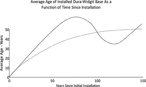
Figure B.17 Average age of Dura-Widgits (solid line) compared to standard Widgits from the previous example. Both equipment sets have a sustainable point average age of 50.00 years.

Figure B.18 Expected remaining service life as a function of years already in service.
Expected Lifetime and Expected Remaining Lifetime
Widgits have an expected service lifetime of 50 years. Dura-Widgits have an expected lifetime of 92 years. As a reasonable comparison of total value (regardless of the cost of the items) this is a useful comparison: it identifies which last longer and provides a rough idea of the ratio to the benefits one can expect.
Figure B.18 shows the change in expected remaining lifetime of an installed unit as a function of time since its installation. When new, Widgits (Example 1) have a 50-year expected lifetime, and since failure rate is not a function of time already in service, that is what a unit of any age has, too. By contrast age has a great deal to do with both the failure rate and the expected remaining lifetime of a Dura-Widgit. When new expected remaining lifetime is 92 years. After 50 years in service it has dropped to 46 years remaining (which counting time already in service, equals 96, or a four year increase in expected total lifetime given that the unit is a survivor of 50 years). If a Dura-Widgit survives 100 years of operation, it has only 12.5 years of expected lifetime left (an increase of 20 years in expected total service life given it has already survived a century). for Widgits and Dura-Widigits.
Figure B.19 compares a slightly different metric, the average remaining service lifetime for all members of the infrastructure. Again, Example 1 is a constant 50 years regardless of time: whether when new, or after ten years of operation, or 100, or at its sustainable point, the average remaining lifetime of all the units in service in Example 1 is 50 years. By contrast, the remaining lifetime of the Dura-Widgits changes over time, individually as in Figure B.18, and here, as a group. When operation begins and all one million units are new, average expected remaining lifetime is 92 years. That gradually falls as the bulk of units (those that don’t fail) age. This metric oscillates as all this examples statistics do, and reaches 50 years, the same as example 2’s at the sustainable point.
Expected remaining lifetime is a very useful value to compute and use in the management of individual or small groups of units, as will be shown elsewhere in this book. But average remaining lifetime of an entire equipment set is, again, not a terribly revealing metric: here, at the sustainable point, and at many other points in between, it gives a distorted perspective on which example is better, or rates them the same.
Average Failure Rate
Average failure rate (AFR) of an infrastructure is just the total number of failures in a year divided by the total number of units in that year. In example 1, with its unrealistic constant failure rate as a function of time in service, AFR is equal to the constant failure rate of 1.955%. In example 2, and in almost all real-world situations, average failure rate changes with time, but it is not equal to the failure rate curve value. Figure B.20 shows that for Example 2. In the first year after installation, the one million Dura-Widgits’ average failure rate is identical to the failure rate curve value for year 1: all of them are new and share the same year 0 failure rate. As time passes however, most stay in service and their failure rate increases with their age. But a few fail, and are replaced with newer units with lower failure rates than would otherwise be the case. As a result, the average failure rate for the entire set of one million units falls below that given by the failure rate curve for total time since operation began. At fifty years after operation, a good many units are replacements, with lower failure rates, and average failure rate for the entire set is .31%, as opposed to the failure rate curves value of .34% at 50 years. Over the long term, average failure rate, like all other statistics, oscillates in waves of decreasing height.

Figure B.19 Expected average remaining service lifetime of units in operation, as a function of time since operation began.

Figure B.20. For Example 1’s Widgits with their unrealistic constant failure rate over time, the Average Failure Rate is the same (dashed line). Example 2’s Dura-Widgits with their realistic failure rate curve exhibit a characteristic more like most utility equipment. After installation the average failure rate (broad solid line) is very nearly the failure rate curve’s value (thin solid line). See text for details.
Equivalent Failure Rate Age (EFRA)
After 80 years of operation, a bit more than 25% of Example 2’s one million Dura-Widgits are original units, the rest being replacements installed sometime during those 80 years. Most replacements, in fact, are rather new: the failure rate curve was so low early on that few replacements were made in the first two decades. There are few “old replacements.” In fact, the average non-original unit is a bit less than five years old: most replacements have been made only during the most recent decade.
As a result, mix of Dura-Widgits in operation is about 75% original, 80-year-old units, with the 1.6% probability of failure of units that age, and newer units – most much newer – with failure rates as much as 1/50th as low. Average age is 65 years in operation. Average failure rate is 1.174% -- 1,174 units of various ages, mostly original units but some new, too, will fail in year 80.
This average failure rate of 1.174% is equivalent to the failure rate curve’s value at 71 years. The units in operation might be an average of 64 years old but they are failing as if they are an average of 71 years old: a unit 71 years old has a failure rate of 1.174%. The entire population is failing at a rate equivalent to an age roughly 10% greater than its average age because of the non-linear shape of the failure rate curve. Its slope increases with age, and that means that as units age their failure rate increases more than proportionally.
This type of behavior is a common situation in actual utility analysis cases, because the failure rate curve for Example 2 is quite like most utility failure rate curves, which increase exponentially.
Note the complexities here, in what is, essentially, a real-world case with a very realistic failure rate curve. First, average age gives no dependable indication of failure rate trends. After 80 years of operation average equipment age is 64 years but failure rate is equivalent to units that are, on average, 71 years old. Second, and much worse, over the next 24 years, average age will improve, from 64 years to just 50 years average age, but equivalent failure rate age will continue to increase. At 104 years of operation, average age is only 50 years, but average failure rate is 2.04% -- units are failing with a rate equivalent to that of an 85-year-old unit.
This behavior is caused by the non-linearity of the failure rate curve, and because most real-world failure rate curves have a shape something like Example 2’s, this behavior is common, occurring in more than 90% of utility cases the authors have seen, in the time periods 35 to 80 years after installation depending on specifics of the case. This reason, more than any other, is why the authors do not rely on average age as an indicator in most of their aging infrastructure work. It not only tells one little useful information, it can be misleading.
SAIDI Contribution
In most utility applications, failures of the equipment being studied lead to service outages which contribute to SAIDI (System Average Interruption Duration Index) – the total time without power experienced by the average utility customer in the year. Most utilities compute SAIDI contributions for various equipment sets and parts of their infrastructure.
The one million units in these examples is a number roughly equal to the number of service transformers in use in the largest US utility systems. Calculating SAIDI values here as if they were service transformers assumes: three customers per transformer and an average outage time (that to report the outage, respond, replace the unit and restore service) of 180 minutes. Example 1’s Widgits give a constant-over-time SAIDI contribution of 3.3 minutes, or a bit less than 5% of the 75 minute SAIDI target that the authors encounter most often in their work with utilities. By contrast, new Dura-Widgits provide a negligible 10 seconds (.16 minute) rising to 36 seconds at 50 years, and giving 2 minutes at the sustainable point. Not shown in the table: at the height of the first oscillation Dura-Widgits would briefly exceed Widgits in SAIDI contribution (from year 99 to 110), peaking at 3.5 minutes contribution before plunging again at the bottom of the first oscillation (year 139) to 44 seconds.
This and similar reliability statistics are all affected by aging infrastructure failure trends, and most utility aging infrastructure management programs have to pay attention to service reliability impacts and plan to incorporate SAIDI and SAIFI targets. However, SAIDI, SAIFI, and other reliability statistic impacts are outcomes of an aging infrastructure. They often need to be analyzed and forecast for planning purposes, but are not part and parcel of the infrastructure analysis itself. More basic metrics, linked to characteristics of the equipment itself, are most useful in understanding the infrastructures’ aging and what the utility can do to manage that in its best interests.
B.5 EFFECT OF DIFFERENT FAILURE RATE CURVE SHAPES
Multiplying the Failure Rate Curve by a Constant
When failure rate is constant (Example 1) the impact of doubling or halving its values is quite simple and intuitive: double the failure rate and the sustainable age is halved and the failure rate at the sustainable point is doubled. Triple it and the sustainable age is cut to one third and the sustainable failure rate is tripled, etc. Cut it in half, and sustainable age doubles and sustainable failure rate drops by half. It’s that simple.

Figure B.21 Scaling an exponential failure rate curve has surprisingly small effect on long-term failure behavior of an infrastructure. Multiplying the entire failure rate curve by two cuts sustainable age by only about 20% and increases sustainable failure rate by less than 5%. It takes a multiplier of 16 to cut sustainable average age in half. See text for details.
The impact of scaling an exponential failure rate curve is quite different and much more complicated, as illustrated by Figure B.21. Double all values in Example 2’s failure rate curve, and sustainable age drops from 50 to just over 41 years, while failure rate at the sustainable point increases from 1 1/4 % to a bit less than 1 1/3 %.
Triple the values and those values change to 39 years and a bit more than 1 1/3 % respectively. Increase them by an order of magnitude, and they change to only 29 years and 2% respectively -- despite a tenfold increase in the curve’s values, the impact on both values (and all others) is less than twofold. With Example 2’s failure rate curve, it takes a scaling factor of sixteen to cut the sustainable point average age in half – which makes the sustainable point failure rate an average 2.3%, still not even twice the base value.
Scaling an exponential failure rate curve will affect the oscillations, too, but again, not in a linear fashion. Scaling the failure rate curve upward makes the oscillations a bit shorter in “wavelength” and a bit more dramatic in relative magnitude: doubling the curve cuts oscillation duration by about 30%. The first oscillation peaks at 71 years in this case. Its peak value is about 33% higher than the sustainable point, not 20% higher as in the base situation. Tripling the failure rate curve results in even shorter duration oscillations with higher relative peaks as compared to the sustainable values, and so forth.
There are two reasons for this very non-linear behavior, both important for aging infrastructure planners to bear in mind. First, one cannot increase failure rate beyond 100%. This fact alone assures non-linearity of results. But most important is the period leading up to reaching 100%. In this period any exponential curve has very high values: over 50%, then over 75%, and then over 90%, all in a fairly short period of time just prior to its reaching 100%. Very little equipment survives this period to make it to that final year where failure in guaranteed. Failure behavior over time and the sustainable point values are dominated by what happens in this time period.
Thus, when one scales an exponential failure rate curve as defined as Example 2, the 100% period moves forward in time and perhaps sharpens its rise somewhat (i.e., it shortens the time that it takes to go through that high-value period). The overall impact can be summarized in this way: The very low failure rates early on are increased, but they were so low that these increases make little overall impact, so the biggest impact is that the time to reach really high values near 100% moves forward a few years, resulting in a noticeable but not proportionate reduction in sustainable age and increase in overall failure rate.
Summary: The less exponential a failure rate curve, the more it is affected by scaling (multiplying by a constant). If it is a constant, its failure statistics will be linear or have an inversely linear affect. But if it is exponential, the impact will be less than proportional: the higher the order (exponential rate of increase) the less sensitive it will be to multiplying it by any particular factor. To see this point, the reader can imagine the ultimate is sharp or high-order failure rate curves, a step function. Consider a failure rate curve with a value of 0% out to 50 years and then a value of 100% afterwards. Its sustainable point and all other failure statistics it generates will not be affected at all by any multiplication.
Generally, Failure Rate Curve Impacts Don’t Add
If one takes the failure rate curves from Examples 1 and 2 and adds then together, the resulting failure rate curve begins with a value of 1.980% and increases exponentially as did Example 2’s curve. This curve gives a sustainable point failure rate value of only 2.36%, far below the 3.2% sum of the failure rates for the two examples. Adding 1.955% to Example 2’s curve increases its sustainable failure rate by only about 60% of what that 1.955% value gives alone.
As was the case with scaling, adding a constant to a highly exponential failure rate curve does not proportionally affect it, and the more exponential the curve is, the less sensitive its results will be to the addition of a scalar. The reason, again, is what this does to values at and near 100. With 1.955% added to every value, the curve still reaches a value of 100% in year 160. As values for Example 2’s curve tend toward 100%, the rate of increase is about 5% per year so 2% does not make a big increase here - the curve reaches 100% about 5 months earlier and still in year 160. Adding nearly 2% to all makes very little relative to increase the high-value parts of the curve: failure rate in year 159 is already very close to 100%, this just pushes it nearly to the limit.
Rate of Change of Average Failure Rate Age
Since average age is not a particularly useful measure, tracking its rate of change usually does not provide a good deal of meaningful information either. (The annual increase in average age was tracked in earlier figures mainly to demonstrate convergence toward the sustainable point.) Both examples started out with an annual change in average age each year just shy of 1.00 and ended up at 0.0 at their sustainable points.
Rate of change of equivalent average failure age (EFRA) as shown in Figure B.22 is much more meaningful as an indicator and predictor of it and how badly the situation is changing for the worst (or for the better). This example shows complicated behavior, but this can be forecast (it is just the result of the failure rate curve’s shape).
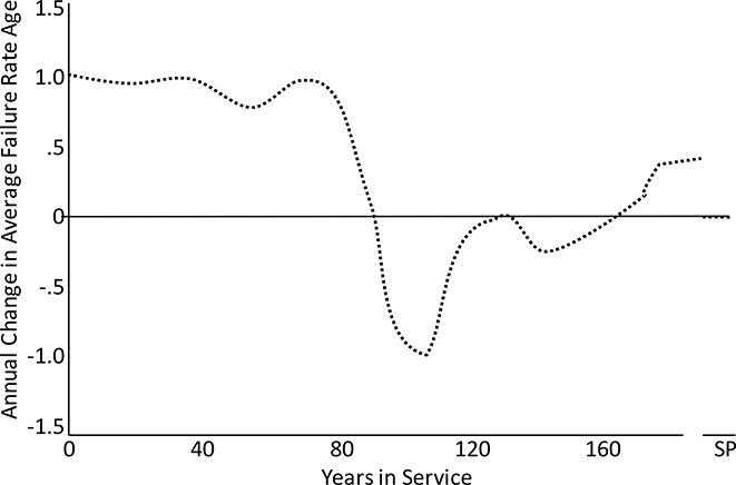
Figure B.22 Annual change in average failure rate equivalent age for Example 2 exhibits a complicated behavior including oscillations, all a function of the shape of the failure rate curve, and perhaps best shows if and how fast the situation is getting better or worse. Complicated as this may seem, trends like this are predictable.
B.6 READING AGE DISTRIBUTIONS
Invariably, everyone involved in aging infrastructure analysis, tries to find meaning in the shape of the infrastructure’s age distribution, “reading” its profiles for clues about what has happened, what is happening, and what will happen in the future. This is not always possible– sometimes the age distribution’s profile is ambiguous or even misleading without other information. Therefore it is not recommended. But people do it, so this section will review how the shape of an age distribution develops, comment on significant aspects of profiles, and draw some conclusions and recommendations.
Figure B.23 shows a plot of number service transformers by age – an age distribution plot – for a large utility delivery system is the United States. Average age is 32.5 years. Many utilities have gathered data and produced similar plots for poles, service transformers, cable, breakers, power transformers and other facilities in their system.
The two features labeled on the figure are often seen in utility infrastructure studies. These are the Age Hump - a high construction of equipment in some age bracket, and the Asset Wall, a very sharp drop in number of units at a particular age. The particular age distribution shown has an age hump in the 25-45 year range and an asset wall between 45 and 55 years. A majority of utility age distributions have one or both of these features but the timing differs: in another system or for another set of equipment types in this system, the age hump might be at 20-35 years, and the asset wall at 35 years, etc.

Figure B.23 Ages of poles in service for a utility in the United States. Average pole age is 32 years. Age humps and asset walls are features seen in the infrastructures of many utilities.
Failure Rate Curve Shape Dominates Long-Term Behavior
The shape of an age distribution – its profile – is a function of two factors:
1. The failure rate curve
2. The timing of unit installation
But the longer the period since units were installed, the more the age distribution is dominated by the failure rate curve alone: old systems do not have a memory of when the initial units were added. The longer the time since the infrastructure began (since initial installation and start up), the more the age distribution of equipment in place is dictated only by the shape of the failure rate curve: when the original units were installed, if and when there was growth, if there were storms that necessitated many replacements – none of that matters given that enough time has passed.
Given there is no growth, or that it has been a constant growth rate, eventually the failure rate curve shape is the only factor that determines the profile of the age distribution curve.
The key point here is “eventually.” This truism applies with mathematical certainty at the sustainable point, but that is usually decades beyond not just the present, but the future period of most interest to planners and management (the next 10-20 years). But those characteristics the infrastructure will have at the sustainable point are often seen, in less than complete measure, decades earlier. From a practical standpoint, it is more proper to say that the failure rate curve shape has more influence over age distribution profile than is generally recognized.
Exponential Failure Rate Curves can Create Asset Walls
Figure B.24 shows five very different failure rate curves that vary from constant (not a function of time) to a very highly exponential function of time. These five curves vary in the sustainable point average age they give, in how long the infrastructure will take to get to the sustainable point, and in a number of other factors, but all give an identical 1.24% average failure rate at the sustainable point. They are the authors’ attempt to normalize failure rate curves. Though they are very different shapes they all have, ultimately, the same cumulative effect on the equipment owners – eventually the owners will have to replace 1.24% of their equipment each year.
Figure B.25 shows the five sustainable point age distributions these curves produce. All five are normalized to 1,000,000 units – the area under the curve is the same for all five. They are completely different distributions, and the major lesson the reader should take away from these figures is that failures are due to the combination of age distribution and failure rate, and many very different combinations of each can give what are essentially identical results.

Figure B.24 Five failure rate curves that lead to the same sustainable point failure rate. Over the long run, these produce equivalent reliability results in spite of their different shapes. See text for details

Figure B.25 Distribution of ages at the sustainable point for the 1,000,000 units in service resulted from the five failure rate curve shapes shown in Figure B.6. When the units were installed does not affect these at all: each is a function of its failure rate curve only.
Understanding Why the Asset Wall Exists
The term “wall” does not refer to the rightmost vertical edge of the profile being like a wall, but to the fact that, immediately to the right of that, there is an “invisible wall” of perhaps five to twenty years duration that will not let equipment survive through to its other side. All it takes to create an asset wall is a failure rate curve that stays low for several decades (letting a lot of units survive to that point) and then climbs rapidly to levels that fail many units each year, i.e., exponential behavior.
A highly exponential curve never has a lengthy period during which failure rate increases slowly. Instead, after being quite low for years or even many decades, it starts to increase at an increasing rate, skyrocketing in only a decade or a bit more to levels that deplete a lot of units annually.
Failure rate during this “depletion period” does not have to have reach anywhere near 100%. An average failure rate of 5% for a decade depletes about half the units – make failure rate grow during this period, too, and fewer than 1 in 5 units survive. The asset wall is just a short period during which failure rate is high enough that most equipment won’t survive, that follows a long period over which most of them do. Highly exponential curves create this situation, usually right before or around their tipping point.8 It’s as simple as that.
In the long run, an exponential failure rate curve shape, alone, can create an asset wall.
Recent High Rates of Growth Will Dominate an Age Distribution
Figure B.26 compares three age distributions, all three normalized to 1,000,000 units in current operation, and all three based on the same failure rate curve (that from Chapter 5’s utility case study). These are labeled in the figure and represent:
a) 1,000,0000 units were installed 70 years earlier and replacements have been made since, so that there are a million in operation now (a case similar to Example 2).
b) Far fewer units were installed 70 years ago, and units have been added to a steadily growing system over the past 70 years, with replacements made along the way as needed. Number in operation only reached 1,000,000 this year.
c) Whatever happened in the past happened long, long ago – there are 1,000,000 units in operation and at their sustainable point.
8The “tipping point” is the point where the failure rate curve’s value exceeds its derivative.

Figure B.26 Three age distributions, each of one million units operating now, with far different past histories. See text for details.
Age distribution (b) shows the characteristic shape of an age distribution dominated by recent growth. Note that this distribution looks a good deal like the sustainable point distribution in Figure B.25 for a linear failure rate curve. It is often impossible to tell the difference between a linear failure rate and no growth and an exponential failure rate curve and recent growth based only on the age distribution’s profile shape. However, truly linear failure rate curves are nearly non-existent, so past growth is much more likely.
Age Distributions Can Be Shaped by “First Oscillation” Effects
The age distribution shown in Figure B.27 is dominated in part by an oscillation created by significant growth over a period that ended about 30 years earlier. This has created an age hump. Something similar is seen in the infrastructures of many utilities. An age hump is caused by
• Some time in the past, there was a sustained period during which a healthy amount of load growth occurred: many new units were added in this time period.
• The time since the end of that period is less than the time to the failure rate curve’s tipping point.

Figure B.27 Profile of an age distribution that is almost surely in an oscillation caused by a sustained period of customer and load growth that ended about 30 years ago (point A). When it began cannot be determined. The asset wall’s deletion period (B) means that few units survive past this period – perhaps growth began 60 years ago but early units added then have been replaced by now.

Figure B.28 Age distributions do not have a “memory” for the original units’ installation dates, etc., that goes past the asset wall’s depletion period, so the uptick in recently added units (Point C) is ambiguous. See text for detailed discussion.
Figure B.27’s age distribution shows an oscillation caused by a sustained growth period in the past.
Periods of high growth in the past can also create an asset wall.
The shape of Figure B.27 shows that the high growth period ended about 30 years earlier (point A), but one cannot determine when it started: it could have started a decade or more before point B, but that would not affect the age distribution now enough to leave an unambiguous sign, because the start of that period would be in or past the asset wall. So if there was high growth 60 years ago, and if many units were added that far back, they already have or are failing rapidly now, and thus are not in the age distribution.
The age distribution of an infrastructure loses its memory beyond the time of the asset wall.
Figure B.28 shows why an age distribution often cannot be fully “read” as to what happened in the past. The uptick in units near the Y-axis – an increase in units added over the last decade – might be because:
• The growth period that ended 30 years ago started 60 years ago. Many units added between 45 and 60 years ago have failed recently as they reach the asset wall and the uptick in recently added units is due to their replacement.
• The growth period that ended 30 years ago began 45 years ago: there was no mass of earlier units that has died as it entered the asset wall during the last ten years. The recent uptick in units added is due to recent growth.
From these age distributions alone, one cannot tell which of these situations is the case: age distribution alone does not provide unambiguous information. Similarly, taken alone, the distributions do not reveal if a large mass of units is about to fail in the next ten years – maybe there aren’t any units over about 45 years of age simple because no one added to the system 45+ years ago. Or maybe tremendous numbers of units were added back then and they all failed in the last decade – that means the huge mass of units now between 35 and 45 years of age will likely all disappear in the next decade. Without more information, one cannot tell.
To fully understand what has happened, what is happening, and what probably will happen, one needs to study both the age distribution and the failure rate curve.
B.7 APPLYING ECONOMIC ANALYSIS
Present Worth Of the Difference in Value
Clearly Example 2 has a very large technical advantage in expected service lifetimes and average failure rates over Example 1. Initially, Dura-Widgits fail only 1/75 as often as Widgits, and although their failure rate increases over time, it eventually settles down to a level of only 80% as much at its sustainable point. Dura-Widgits are simply more robust than normal Widgits.
How much is this advantage worth to a utility? The answer will depend on a host of factors unique to the specific company, and examples covering that are given in some of the final pages of this book. However, a general idea of the value of Dura-Widgits versus normal Widgits can be developed by looking at the differences in failure rates over time from a time-value of money basis. This type of analysis discounts long-term future values for very legitimate and proven reasons. Costs and savings ten or twenty years in the future are simply not as much of a concern to a business as costs and savings this year or next year. And beyond the financial issues at work, there is always uncertainty about the future. Equipment that lasts for decades may become obsolete even if it still works dependably, or may not be needed as technology or societal needs change. Again, very long-term advantages are not as important as near term.
A reasonable way to estimate the relative advantage of Dura-Widgits versus Widgits is to compute the present worth cost of replacements into the future. Using a 10% discount factor (a dollar next year is worth 90 cents today, one two years in the future is worth 81 cents today, etc.) and for the moment assuming that Widgits and Dura-Widgits cost the same, Dura-Widgits give a 1/39 total “present worth of future replacement value.” While in their first year of service they require only 1/78 as many failures as Widgits, by year 75 they require ½ as many, and by year 104 they require 1.1 times as many. But when adjusted for how important cost savings are in the future, the average is 1/39 – Dura-Widgits have a total future replacement need that is only 2.55% that of Widgits.
Is that really worth a great deal to a utility? In the real world, Dura-Widgits would very likely not cost the same – even if they were cheaper to build and ship, the manufacturer would charge more for them given their longer lifetime. Some idea of the total value can be provided in this manner.
1) Widgits have an equipment cost of $1.00 and an installation cost of $1.00.
2) Replacements have the same equipment cost but labor cost is $1.50.
3) Dura-Widgits cost $1,513 per 1,000 rather than $1,000 a piece.
These costs roughly mirror actual utility costs for service transformers, for example: installation and equipment costs are roughly equal and replacement labor is about 50% more and very often at time and a half or more, for roughly twice total labor cost.
Table B.3 Cost and Present Worth - Widgits versus Dura-Widgits
Cost Category |
Widgits |
Dura-Widgit |
|
Equipment cost, unit |
$1.00 |
$1.513 |
|
Initial installation labor |
$1.00 |
$1.00 |
|
Replacement labor |
$2.00 |
$2.00 |
|
Total installed (incl. replcmnts) |
2,995,000 |
1,588,444 |
|
Total cost (undiscounted $) |
$7,865,000 |
$2,527,839 |
|
Total cost (discounted PW$) |
$2,527,836 |
$2,527,836 |
|
Replacement cost only ( $ ) |
$5,865,000 |
$2,067,140 |
|
Replacement cost only (PW$) |
$527,836 |
$14,949 |
Table B.4 Analysis of Present Worth for Widgits and Dura-Widgits
Widgits |
Dura-Widgits |
||||||||
Year |
PWF |
Equip. |
Labor |
Total $ |
PW Total $ |
Eq Cost |
Labor |
PW $ |
PW Total $ |
0 |
100% |
$1,000,000 |
$1,000,000 |
$2,000,000 |
$2,000,000 |
$1,427,405 |
$1,000,000 |
$2,427,405 |
$2,427,405 |
1 |
90.0% |
$19,550 |
$29,325 |
$48,875 |
$43,988 |
$357 |
$375 |
$732 |
$659 |
2 |
81.0% |
$19,550 |
$29,325 |
$48,875 |
$39,589 |
$376 |
$395 |
$771 |
$624 |
3 |
72.9% |
$19,550 |
$29,325 |
$48,875 |
$35,630 |
$396 |
$416 |
$812 |
$592 |
4 |
65.6% |
$19,550 |
$29,325 |
$48,875 |
$32,067 |
$417 |
$438 |
$855 |
$561 |
5 |
59.0% |
$19,550 |
$29,325 |
$48,875 |
$28,860 |
$439 |
$462 |
$901 |
$532 |
6 |
53.1% |
$19,550 |
$29,325 |
$48,875 |
$25,974 |
$463 |
$486 |
$949 |
$504 |
7 |
47.8% |
$19,550 |
$29,325 |
$48,875 |
$23,377 |
$487 |
$512 |
$1,000 |
$478 |
8 |
43.0% |
$19,550 |
$29,325 |
$48,875 |
$21,039 |
$513 |
$539 |
$1,053 |
$453 |
9 |
38.7% |
$19,550 |
$29,325 |
$48,875 |
$18,935 |
$541 |
$568 |
$1,109 |
$430 |
10 |
34.9% |
$19,550 |
$29,325 |
$48,875 |
$17,042 |
$570 |
$598 |
$1,168 |
$407 |
11 |
31.4% |
$19,550 |
$29,325 |
$48,875 |
$15,337 |
$600 |
$630 |
$1,230 |
$386 |
12 |
28.2% |
$19,550 |
$29,325 |
$48,875 |
$13,804 |
$632 |
$664 |
$1,296 |
$366 |
13 |
25.4% |
$19,550 |
$29,325 |
$48,875 |
$12,423 |
$665 |
$699 |
$1,364 |
$347 |
14 |
22.9% |
$19,550 |
$29,325 |
$48,875 |
$11,181 |
$701 |
$736 |
$1,437 |
$329 |
15 |
20.6% |
$19,550 |
$29,325 |
$48,875 |
$10,063 |
$738 |
$775 |
$1,513 |
$312 |
16 |
18.5% |
$19,550 |
$29,325 |
$48,875 |
$9,057 |
$777 |
$817 |
$1,594 |
$295 |
17 |
16.7% |
$19,550 |
$29,325 |
$48,875 |
$8,151 |
$818 |
$860 |
$1,678 |
$280 |
Table B.3 provides an overview of the comparison on this basis. Table B.4 shows the first seventeen years of an analysis spreadsheet by year. Only the first 100 years of operation were analyzed: discounted only about the first 30 years really have any impact. The resulting break-even cost for Dura-Widgits is just over $1.51 per unit: they may be 80% as durable in the long run and have as little as 1/78 the failure rate in the short run, but those advantages are only worth a bit more than 50% per unit.
A time value of money evaluation tends to focus analysis and attention on the present and the short run, which is proper and necessary for financial planning and budgeting purposes. Such time-discounted financial analysis assumes the technical evaluation of actual events and costs for future years has been done correctly. While financial evaluation and “business-based” cases built upon it are the correct way to ultimately use the results of aging infrastructure analysis, it must be based on sound technical evaluation of the infrastructure. For now, present, short-term, and long-term behaviors will be looked at all within a purely technical analysis. Many utilities will need this for a simple business reason: looking at their aged infrastructure, as opposed to aging, they are already at the long run.
Equipment that differs in expected service lifetime by 85% (92 versus 50 years) has the same sustainable average age in service (50 versus 50 years) and will eventually require about 1/185% fewer replacements. The reason has to do with the shape of the failure rate curve. Over the very long term the difference in the two failure rate curves results in 85% fewer failures, but the distribution of when failures are likely as a function of useful service life means that the real practical impact of is much, much less for Dura-Widgits: failures when far into the future are simply not worth as much as failures sooner.
B.8 SUMMARY OF KEY POINTS
This appendix has reviewed a key concept of aging infrastructures: an equipment infrastructure kept in service by replacement or repair when it fails trends, slowly but surely over time, toward a stable sustainable point, at which the average age, the distribution of ages, the average condition and the distribution of conditions, the average failure rate and the distribution of units failing at various ages, and all operating costs remain relatively constant from year to year thereafter (see Table B.5).
Sustainable point analysis provides an unbeatable foundation for planning and decision making with regard to managing an aging infrastructure. The sustainable point is a function of both the equipment and its owner’s operating policies. Change the loading standards or operating voltages, alter the inspection, tracking, service and repair processes, implement a different refurbishment plan, or change replacement policy, and the sustainable point will move. Sustainable point analysis can thus show how revisions in operating policies and criteria can lead to changes in both the eventual sustainable point, and the annual rate of decline or improvement the utility can expect. It is thus a powerful operating and business planning tool for a utility or industrial system owner trying to optimize its bottom line. In addition, mathematically, the fact that a sustainable point has to exist is a kind of “statistical lever” that can help fit numerical models to a utility’s historical operating and equipment asset databases. Fitting error for failure rate analysis and for models of impact on utility performance is often halved using such techniques.
Table B.5 Summary of Key Points
Average Age Provides Little Useful Information and Can Be Misleading. Average age of a group or set of equipment tells planners and management next to nothing useful about the equipment’s trends or their importance to key performance indicators. Number of failures or average failure rate provides the most relevant measure. Most problems, be they service quality, reliability, or cost-related, stem from failures. Tracking that and predicting that provides the most useful data. Equivalent Failure Rate Age is the age in the failure rate curve that matches an infrastructure’s average failure rate: regardless of the mix of ages in operation, the whole is failing like a group of units of this age. As a single age-related characteristic, this is the most meaningful and useful value. Scaling and Adding to Failure Rate Curves does not proportionally change their impacts. Multiplying or adding to highly exponential failure rate curves changes the resulting failure rates and sustainable points they produce, but not in proportion to the multiplier or value added. Higher order curves are less sensitive than lower order curves. Sustainable point values are the best long-term characterization generally available of an infrastructure’s aging situation, potential, and propensity to react to changes in equipment of operating policies. Age Distribution provides more information than averages or other statistics. Failure rate curve shape alone determines long term age distribution shape. Age distributions can be read for indications of past, present, and future infrastructure behavior. Some age distributions cannot be read – some are ambiguous. Economic analysis tends to emphasize short-term aspects of aging infrastructure performance, and to focus management attention on changes in equipment or operating policies that impact the short term. Sustainable Point: In any group or set of equipment, be they transformers, breakers, tires in a fleet of trucks, or tableware used by a restaurant chain, if operating conditions are kept the same from year to year and failures and unserviceable units are always replaced by new, eventually a sustainable point will be reached, a point beyond which the average age, failure-replacement rate, and operating and replacement costs do not change, but instead stay the same from year to year thereafter. |
And finally, and perhaps most important, the concept of a sustainable point is important to managers, planners, and operating engineers at a utility. The system will not “fall off a cliff” with regard to reliability and failures in only a few years; deterioration is a slow-acting poison, if an inevitable one. The good news is that the decline will be slow and the trends predictable. The bad news is that the trends are inevitable, and that improvement methods, unless quite expensive, act no more quickly than the trends themselves. But good or bad, the sustainable point is where the system is heading, and the bottom line is that the utility can move it to a more acceptable combination of failures and costs by changing operating policies and methods.
Any equipment infrastructure asymptotically tends toward its sustainable point over time. Theoretically a system never makes it to the sustainable point, but practically, it does. Mathematically, a system will always be asymptotically moving toward that point with some tiny increment left. Practically, many real systems could be “close enough it does not matter” within a time period less than the power industry has been in existence. Rate of change toward the sustainable point is steady and continuous: as a system ages its statistics will move a bit closer toward the sustainable point each year. Nothing can stop this other than a change in fundamentals that determine the sustainable point: the type and design of the equipment, the way it is used and loaded, or the way it is inspected and serviced. Rate of change toward the sustainable point is always slow: infrastructures do not “fall off the cliff” with respect to rising reliability and cost issues: increases occur gradually from year to year. Rate of change slows as a system ages: as a system ages, the rate of change toward the sustainable point grows a bit less each year. Failure rate curves have a “tipping point” where their value first exceeds their derivative (percent change in value from year to year). This will be the point of maximum total failures – the age where the product of [amount of equipment that has made it to this age] times [failure rate for this age] is at a maximum. Generally, a utility will find that equipment cannot be made to not stay in service long after this point. Oscillations in average age, failure rate, and cost can occur when a) the failure rate increases over time (which is almost always the case) and b) the equipment was installed in a relatively short time compared to the expected lifetime of the equipment. In such situations average age, failure rate, and cost will go through a series of gradually less dramatic “swings” with a periodicity of a decade or more. Oscillations almost never occur on a system-wide basis. Oscillations are just not seen in the overall failure, age, and operating costs statistics for an entire system because the equipment was installed over many decades. Oscillations are common in isolated areas of the system where local development was built out over a relatively short period of time. |
A Practical Warning Sign of Systemic Problems
When average age increases at a log-linear rate, the shape of the distribution ages will tend to remain constant over time. This is a sign that failure is not due to deterioration. It is highly likely there is some systemic problem with the equipment, such as a poor design or installation practices, or grounds that fail very early, etc., or that there are very high rates of random external damage.
REFERENCES AND BIBLIOGRAPHY
P. F. Albrecht, and H. E. Campbell, “Reliability Analysis of Distribution Equipment Failure Data,” EEI T&D Committee Meeting, January 20, 1972.
J. B. Bowles, “Commentary-caution: constant failure rate models may be hazardous to your design,” IEEE Transactions on Reliability. Vol. 51, pp. 375-377, Sept. 2002.
R E Brown, Electric Power Distribution Reliability, Marcel Dekker, New York, 2002.
R. E. Brown and J. R. Ochoa, “Distribution System Reliability: Default Data and Model Validation,” IEEE Transactions on Power Systems, Vol. 13, pp. 704-709, May 1998
R. E. Brown, G. Frimpong, H. Willis, “Failure Rate Modeling Using Equipment Inspection Data,” IEEE Transactions on Power Systems, May 2004, p. 782, IEEE New York.
R. M. Bucci, R. V. Rebbapragada, A. J. McElroy, E. A Cheblis and S. Drller, “Failure Prediction of Underground Distribution Feeder Cables,” IEEE Transactions on Power Delivery, Vol. 9, pp. 1943-1955, Oct. 1994.
EEI Transmission and Distribution Committee, “Guide for Reliability Measurement and Data Collection,” October 1971, Edison Electric Institute, New York.
P. Gil, Electrical Power Equipment Maintenance and Testing, Marcel Dekker, New York, 1998.
Institute of Electrical and Electronics Engineers, Recommended Practice for Design of Reliable Industrial and Commercial Power Systems, The Institute of Electrical and Electronics Engineers, Inc., New York, 1990.
A. Gupta, A. Pahwa, R. E. Brown, and S. Das, “A Fuzzy Model for Over Distribution Feeders Failure Rates,” in Proc. 34th Annual North American Power Symposium, Tempe, AZ, Oct. 2002.
A. D. Patton, “Determination and Analysis of Data for Reliability Studies,” IEEE Transactions on Power Apparatus and Systems, PAS-87, January 1968.
D. T. Radmer, P. A. Kuntz, R. D. Christie, S.S. Venkata, and R. H. Fletcher, “Predicting Vegetation-Related Failure Rates For Overhead Distribution Feeders,” IEEE Transactions on Power Delivery, Vol. 17, pp. 1170-1175, Oct. 2002.
H. L. Willis, Power Distribution Planning Reference Book, Second Edition, Marcel Dekker Publishers, New York, 2004.
H. L. Willis and R. E. Brown, “Substation Asset Management,” Chapter 19 in Electric Power Substations Engineering Handbook – Second Edition, CRC Press, New York, 2007.