CHAPTER 3
Process Flow
Just-in-time does not treat each process step as independent, but, rather, sees an entire system of linked processes. Construing things in this way naturally leads to a broad view, to a view oriented toward the future, to a view that seeks optimization of the whole.
Most work is complex enough to be subdivided into tasks performed at different stages. By linking these tasks or activities together, managers create a process to accomplish work. A process is defined as “a series of actions, changes or functions bringing about a result” (American Heritage 2007, pp. 1090–91). In operations management, a process has been defined as “… what the product experiences; it consists of a collection of operations” (Robinson 1990, p. 8).
One job of an operations manager is to design a process that is both effective and efficient in accomplishing the desired work. A second job of an operations manager is to manage this process so it performs as planned. A third job of an operations manager is to improve this process so it remains effective and efficient as the market changes.
It is important that the operations manager recognizes that the effectiveness of his or her process management helps to determine the capabilities of their company. To provide customers with the product or services that they want, the manager needs to constantly identify how the process should change so that it can provide the unique service or capabilities the customer wants at minimum cost.
A process flow chart is a tool used to examine a process and to determine how to improve it to provide the capabilities desired by the customer. This tool is simply “a diagram showing the logical flow for the steps in a process” (Hill 2007, p. 195). The steps in creating a process flow chart are:
Define the process boundaries (i.e., what part of the process do we want to study?).
Determine what flow it is that we want to examine. For example, do we want to look at the cash flow, the flow of material, the flow of customers, or the flow of maintenance orders?
Create the process flow chart in the area where the work is being done (i.e., the workplace) so that it is based in reality. Do this by following a flow unit from start to finish. As it flows from activity to activity, record the waiting time and the time for each step in the process.
But, what process should the manager examine? Often, as managers we are consumed by the day-to-day activities and may forget that we are actually managing a process or part of a process. When this happens it is important for the manager to step back and ask the question “What process is being performed in all these activities?” To discover or identify the processes they are managing, managers need to ask three questions:
What are we doing? That is, what is the final result of the process, or what is my deliverable?
How are we doing it? That is, which tasks have to be performed to bring about this result or provide this deliverable?
Who are we doing this process for? That is, who takes our results or deliverables?
The simplest way to answer those questions is through the use of a SIPOC (Supplier of Input for Processes for Output to Customers) analysis. As an example, Table 3.1 shows the SIPOC analysis of a customer order for the Eis-Sahne Ice Cream Shop. The SIPOC provides a quick overview of the process. It does not have to have great detail in it, but only enough for the manager to understand where to set their process boundaries. For example, in the ensuing Eis-Sahne example, the process does not include ordering the cones from the supplier. It is quite possible that ordering supplies is seen as a separate process.
After creating the SIPOC diagram, the manager then uses the information to create a process flow chart. The process flow chart places all the activities in the sequence they are performed. This gives detailed information about each step in the process.
Table 3.1 SIPOC analysis of Eis-Sahne Ice Cream Shop
| Supplier | Inputs | Process | Outputs | Customer |
| Ice supply Co | Ice-cream cones | 1. Unload cones from truck. 2. Put cones in store room. 3. As needed, move cones to stocking point at counter. 4. Fill cone requested by customer with requested ice cream. |
Filled ice cream cone that meets retail customers’ expectations. | Individuals requesting the best flavors in the world. |
| Happy cow creamery | Frozen ice cream in 20# tubs | 1. Unload ice cream from distribution truck. 2. Put ice cream into backroom freezer. 3. Move to front display freezer, as needed. 4. Scoop ice cream into cone as requested by customer. |
Stock in backroom freezer. Correctly filled ice-cream cones. |
Counter staff restocking front. Paying customers. |
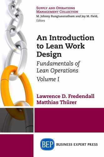
Figure 3.1 shows a picture of the work design of the Eis-Sahne Ice Cream Shop. The dashed line shows the worker movements. It shows that after the workers take an order they go to the sink to wash their hands and then they get a cone and then go to the ice-cream freezer to scoop out the ice cream. But, Figure 3.1 provides very little information about each activity.
The process flow chart does not focus on the location of the activity, but rather on the sequence of activities. The process flow chart helps the manager study the process to learn more about it. It is valuable for the manager to create the process flow chart while they are actually in the work place; the workplace is often called by its Japanese name—gemba (Imai 1997). By watching the process as they make their process flow chart, the managers may see that some customers have to stand in line to wait their turn to place an order. A triangle is then used as the symbol to show that something or someone is waiting. A triangle means that whatever is flowing through the process is waiting.
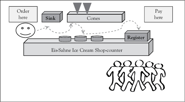
Figure 3.1 Work design of the Eis-Sahne Ice Cream Shop
If in our example of the Eis-Sahne Ice Cream Shop, the process the manager is concerned about is the process for taking and filling orders from customers, then the process boundaries are shown by having an ellipse that says “Start” before the first activity in the process as shown in Figure 3.2. The end of the process is shown by placing an “Exit,” “End” or “Stop” ellipse after the last activity in the process.
Since the manager notices that a few customers have to stand in line to place their orders after they arrive, the first activity is standing in line. This is shown by a triangle. Notice the first triangle after “Start” in Figure 3.2. It is labeled “Line to order” since customers in this line are waiting for their turn to order. Even though all customers do not wait, the triangle representing the waiting line is shown because on average some customers are waiting some amount of time. Customers or orders waiting to be processed at any activity within the process are called work-in-process (WIP) inventory. Again, in process flow charts, WIP is represented by a triangle, regardless of whether it is a physical inventory, a service, or people.
The actual activities where work is performed are shown by using rectangles or squares. In Figure 3.2 the process activities are represented by squares (e.g., “customer places order”). In the Eis-Sahne example, after the customer gives their order, the server walks to the sink to wash hands. Then the server selects the appropriate cone from the shelf and carries it to the ice-cream freezer. This carrying activity is shown by a large block arrow labeled “to ice cream” in Figure 3.2. After the server is at the ice-cream freezer with the cone, the server scoops ice cream into the cone. When the cone is filled, the server puts the filled cone into a holder next to the cash register and then gives the customer the bill. The server then takes the money, gives any change plus a receipt and thanks the customer. The customer then leaves the system, which is shown in Figure 3.2 by the “Exit” ellipse.
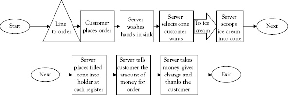
Figure 3.2 Eis-Sahne process flow chart for customer order
The validity of this process flow chart for analysis increases because it was created in the gemba. Creating a flow chart is a simple analysis, but it can reveal delays and complexity in the process as well as reveal areas of wasted motion.
When doing this type of analysis, it is very important to clearly state the process boundaries. That is why the first step discussed in the preceding example was to use an ellipse to show the “Start.” There was also an ellipse used to show the “Exit” event. The start and the exit show where the analysis begins and where it ends. By defining process boundaries, we decompose the system into smaller elements, which makes it easier to understand. As noted by Simon (1962), decomposing the system makes it easy for us to see the process.
The fact, then, that many complex systems have a nearly decomposable, hierarchic structure is a major facilitating factor enabling us to understand, to describe, and even to “see” such systems and their parts. (Simon 1962, p. 477)
As processes become more complex it becomes more important to make them explicit so that they can be understood. This is one of the first requirements in lean work design as understanding the process increases our knowledge about the process and allows the design of more effective processes (Bohn 1994). For example, in the Eis-Sahne example in Figure 3.1, a manager may question why the server had to walk to the sink and then walk to the cones. The value of using the process flow chart is to create enough understanding of the process so that we can ask these “why” questions that lead to process improvement.
As more decisions or branching occurs in the process, it requires additional symbols to represent it. For example, if there is a service process that can be single stage (i.e., single phase) or multiple stages, some customers will decide not to continue in the process and to exit the process. Meanwhile, in a manufacturing process a part or product passing an inspection station may be scrapped (i.e., it exits the process) if it does not pass inspection and may continue to the next stage of processing (which may be packaging or additional machining) if it passes inspection. Another service example could be a bank, where some customers go to the cashier and exit, while other customers leave the cashier and go to get in line to see a loan officer. This decision is shown subsequently using a diamond. Using the diamond in the process flow diagram signals to the reader of the diagram that the rate of flow is possibly changing. This is important because the rate of flow determines the workload at each step in the process.
Example: Customers arrive at the rate of 0.7/minute (see R = 0.7 customer/minute in Figure 3.3). In the first stage of the process they get into a waiting line, which has an average of 1 customer waiting (I = 1). When it is a customer’s turn to receive service A, they move to the server. The service process A takes an average of 5 minutes (T = 5 minutes). When they are through with service A, they make a decision. The decision is shown as a diamond labeled “Exit”. There is no arrow going from Service process A to the diamond, because the diamond touches the square with service process A in it. Historically, 40 percent of the customers leave the process at this point, as shown by the arrow going to the “Exit” event (i.e., the ellipse). The other 60 percent choose the second service and get in line to wait for service B. There are on average 0.6 customers in line for service B (I = 0.6) and the time for service B is 3 minutes (T = 3 minutes). All of these customers then exit as shown by the arrow to the “Exit” ellipse in Figure 3.3.
Figure 3.3 contains important information about the process. For example, the amount of inventory, on average, queuing at a station and the average arrival rate of work are shown below each step in the process. The process flow chart reveals the structure of the process. The additional information helps to quantify the structure. For example, Service Process B has an average of 0.6 people standing in line waiting for the service. Information that was not available to us in the example, (e.g., T = ??) will be calculated. How to do this calculation is explained in Chapter 4.
Figure 3.3 Example of two stage process
Figure 3.4 is a drawing of the flow of customers at a branch post office. Even without words, it is relatively easy for someone to read it and understand the basic customer flow at this post office.
Example: Customers enter at the rate of 120/hour, which is converted to 2/minute since the other data that is gathered is in minutes (e.g., at the P.O. Box, the time is 3 minutes). When customers enter, they make a decision about where to go. About 50 percent of them go to their Post Office Box (P.O. Box), while the rest enter the counter area and then make a decision about whether to get in line to be served by the Postal Clerk or to go to the counter and prepare for the postal clerk (e.g., write addresses on envelopes). Those leaving their P.O. Box decide whether to leave the post office or to go get in line for the postal clerk. So, the postal clerk line has three flows coming into it and the rate at which people arrive there is the sum of those three flows (i.e., R = 0.1 + 0.9 + 0.25 = 1.25/minute). After being served by the clerk, these customers leave the post office. There are two flows leaving the post office, one from those who left after going to their P.O. Box and the other from those who were served by the postal clerk. The total flow out of the post office is the sum of those two flows or 2/minute, which is the same rate as entered the post office. When the number entering a process is equal to the number exiting the process, the process is stable.
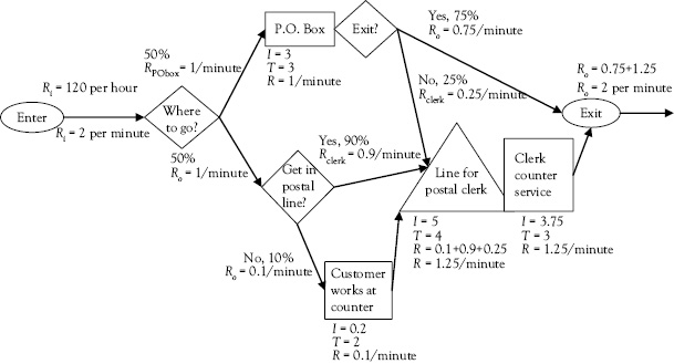
Figure 3.4 Customer process at post office
As you will have noticed, there are three main variables used to quantify the process flow chart: inventory, throughput rate, and activity or flow time. These variables are interrelated. The next chapter explains how to obtain at least two pieces of data gathered at each stage of the activity and how to calculate the third piece of data given the first two pieces of data.
References
American Heritage. 2007. The American Heritage College Dictionary. 4th ed. Boston, MA: Houghton Mifflin Co.
Bohn, R.E. 1994. “Measuring and Managing Technological Knowledge.” Sloan Management Review 36, no. 1, pp. 61–73.
Hill, A.V. 2007. The Encyclopedia of Operations Management. Eden Prairie, MN: Clamshell Beach Press.
Hino, S. 2006. Inside the Mind of Toyota: Management Principles for Enduring Growth. New York: Productivity Press.
Imai, M. 1997. Gemba Kaizen: A Commonsense, Low-Cost Approach to Management. 1st ed. New York: McGraw Hill.
Robinson, A. 1990. Modern Approaches to Manufacturing Improvement: The Shingo System. 1st ed. Springfield, MO: Progreso.
Simon, H. 1962. “The Architecture of Complexity.” Proceedings of the American Philosophical Society 106, pp. 467–82.