2
The Bits that Make Up a Style Sheet
WHAT YOU WILL LEARN IN THIS CHAPTER:
- The elements that make up a style sheet
- The type of values that are used in CSS
- How to include CSS in HTML documents
In Chapter 1 you received a taste of what CSS is capable of in Example 1-1, a web page that contains the four gas giant planets of our solar system and some facts about them. In this chapter, you look at the elements that you combine to make a style sheet.
RULES
A style sheet can be broken down into progressively smaller bits. From large to small, those pieces are:
- Style sheet
- Rule
- Selector
- Declaration
- Property
- Value
Special characters — curly braces, colons, and semi-colons — are used to mark the beginning and ending of each part, separating them from each other. The following rule shows the parts of a style sheet and the special characters that separate them.
body {
    width: 650px;
    margin: 0 auto;
    background: #000;
    color: #FFF;
    font: 12px sans-serif;
}
You can layout the rule according to your preferences; you can add line breaks and spacing to make CSS readable, sensible, and organized, or you can put everything on one line if you prefer.
Like HTML, CSS can use white space and line breaks to aid readability. In most cases the interpreter reading the CSS doesn't care how much white space appears in the style sheet or how many line breaks are used; provided you have spaces where they are required you can use one or 10. Humans, however, must often add some sort of structure to prevent eyestrain, and to increase maintainability and productivity.
The style used in this book is recommended for readability, but you may find that a different format makes more sense to you. The important thing is to be consistent — pick one style that suits you and stick to it.
Within a rule, selectors choose which elements to style in the HTML document. Your browser already applies a default style to most elements (for example, an h1 element is larger than regular text) and you only need to write CSS to change those default styles or to add styles.
SELECTORS
In CSS, a selector is the HTML element or elements to which a CSS rule is applied. Put simply, the selector tells the browser what to style. The simple selector that you saw in the previous section is called a type selector; it merely references a type of HTML element, and will style all that match. For example, a p type selector on its own will apply styles to all p elements.
As you saw in the example rule, body is written in the style sheet without the left and right angle brackets, < >, and the same applies when styling any element, just swap body with the element you wish to style. This rule applies the CSS properties: width, margin, background, color, and font to the <body> element. I talk more about what these properties do in later chapters, but you might be able to guess what they do just by their names.
Grouping Selectors
When more than one selector appears in the same rule, they are said to be grouped. You can group multiple selectors together in a single rule by providing a comma after each selector; the result is that a rule applies to more than one selector at a time, as shown in the following code.
You group selectors so that you don't have to repeat the same declarations for each selector. Consider grouping if two or more selectors repeat all or the majority of their declarations.
For readability it is recommended that each selector goes on its own line.
DECLARATIONS
Declarations are enclosed within curly braces to separate them from selectors. In the rule shown previously, each line after body between the curly braces ({ and }) is a separate declaration. A declaration is composed of a property name, a colon, and, depending on the property, one or more values.
A colon is used to separate the property from the value, and the property appears before the colon. In our example selector (shown in the “Rules” section) width is a property and 650px is the value associated with it. A declaration always ends with a semi-colon.
VALUES
While the values for some properties can be quite simple, for example, just a single number in the case of the z-index property that you will learn about later, CSS can become quite complex in terms of what it allows a property's value to be. So far, you have only seen a small number of the potential types of values that you see in CSS. In the coming sections I discuss each of the different types of values used in CSS in greater detail, beginning with keyword values.
Keywords
A keyword value is a named value; for example, red, green, and blue are CSS keywords. Color keywords can be used on any property that accepts a color value.
The keywords in the following code are bold, and left. bold, when used with the font-weight property, provides the browser with instructions for how to render the text of a caption element, and left is a keyword that when used with the text-align property tells the browser how text is to be aligned.
caption {
    margin-bottom: 10px;
    font-size: 14px;
    font-weight: bold;
    text-align: left;
}
Many types of keywords are used in CSS, and sometimes a single keyword can apply different styles depending on the property or element on which it is used. The auto keyword, for example, is used by CSS to apply some default style or behavior, and although in both of the following examples its meaning is the same, the resulting effect is different. Try the auto keyword in the following Try It Out.
TRY IT OUT Adding Auto Width to a Table
To see the effects of the auto keyword as applied to a <table> element, follow these steps.
- Enter the following HTML-compliant markup.
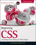
<!DOCTYPE html PUBLIC “-//W3C//DTD HTML 4.01//EN” “http://www.w3.org/TR/html4/strict.dtd”> <html lang=“en”> <head> <meta http-equiv=“Content-Type” content=“text/html; charset=utf-8”> <title>Example 2-1</title> <style type=“text/css”> table { width: auto; background: black; color: white; } </style> </head> <body> <h1>How will this table react to auto width?</h1> <table> <caption>Jupiter Facts</caption> <tbody> <tr> <th>Distance from the Sun</th> <td>78,412,020 km</td> </tr> <tr> <th>Equatorial Radius</th> <td>71,492 km</td> </tr> <tr> <th>Volume</th> <td>1,425,500,000,000,000 km<sup>3</sup></td> </tr> <tr> <th>Mass</th> <td>1,898,700,000,000,000,000,000,000,000 kg</td> </tr> </tbody> </table> </body> </html> - Save the preceding markup as example_2-1.html, and then load it into a browser. Figure 2-1 shows width: auto; applied to the <table> element.
How It Works
In Figure 2-1, you can see that the table expands only enough to accommodate the text within it.
When width: auto; is applied to a <table> element, it invokes a different mechanism for width measurement than when it is applied to a <div> element. In the next Try It Out, see what happens when auto width is applied to a <div> element.
TRY IT OUT Applying Auto Width to a Div
To see the effects of the auto keyword as applied to a <div> element, follow these steps.
- Enter the following document:
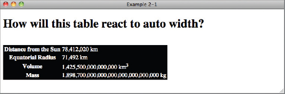
<!DOCTYPE html PUBLIC “-//W3C//DTD HTML 4.01//EN” “http://www.w3.org/TR/html4/strict.dtd”> <html lang=“en”> <head> <meta http-equiv=“Content-Type” content=“text/html; charset=utf-8”> <title>Example 2-2</title> <style type=“text/css”> div { width: auto; background: black; color: white; } </style> </head> <body> <h1>How will this div react to auto width?</h1> <div> <h2>Jupiter</h2> <p>Jupiter is the fifth planet from the Sun and the largest planet within the Solar System. The Romans named the planet after the god Jupiter. It is a gas giant with a mass two and a half times the mass of all the other planets in our Solar System combined.</p> </div> </body> </html> - Save the preceding markup as example_2-2.html. Figure 2-2 shows width: auto; applied to the <div> element.
How It Works
All elements with a width property have an auto value by default, but not all elements behave the same way when auto width is applied. The <table> element, for instance, only expands horizontally to accommodate its data, which is a method called shrink-to-fit. A <div> element, on the other hand, expands horizontally as far as there is space, which is called expand-to-fit.
I've added a background for each element in Examples 2-1 and 2-2 so that you can see its width. The border outlines the edges of each element, showing exactly how much space each element occupies. You learn more about how width works in Chapter 8.
Keywords always invoke some special, predefined behavior. Another example I can present is with the CSS border property: A border may take three separate keywords that define how it appears when the browser renders it:
border: thin solid black;
This example defines a property with three keyword values: thin, solid, and black. Each value refers to a different characteristic of the border's appearance: thin refers to its measurement, solid to its style, and black to its color.
Sometimes you need to include content from a style sheet, or referencing a file path, or including a font name that has spaces in its name, or referencing an HTML element's attribute value. To accomplish these tasks, CSS supports a type of value called strings.
Strings
A string is any sequence of characters. For example, “Hello, World” is a string. As in most programming languages, strings in CSS are enclosed within either single or double quotation marks. Strings may contain text, numbers, symbols — any type of character.
 Note A string is what is known as a data type. Other examples of data types are integers and real numbers. An integer can be a positive or negative number, but it can only be a whole number without decimal places. Real numbers are like integers, but they can have decimal places.
The purpose of data types is to tell us where we can use different types of values. For example, we can't use a string or a real number if a property requires an integer as a value.
One use of strings in CSS is to specify a font that contains spaces in its name.
font-family: ‘Times New Roman’, Times, serif;
Font faces with spaces in the name are enclosed with quotations to keep the program that interprets CSS from getting confused. The quotes act as marking posts for where the font face's name begins and ends.
The following Try It Out shows the result of using a string as a value for the font-family property.
TRY IT OUT Change the Font of a Heading
- Type in the following document:
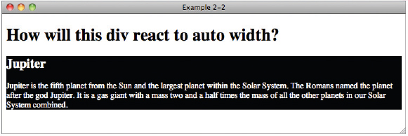
<!DOCTYPE html PUBLIC “-//W3C//DTD HTML 4.01//EN” “http://www.w3.org/TR/html4/strict.dtd”> <html lang=“en”> <head> <meta http-equiv=“Content-Type” content=“text/html; charset=utf-8”> <title>Example 2-3</title> <style type=“text/css”> body { font: 12px sans-serif; } h1 { font-family: ‘Times New Roman’, Times, serif; } </style> </head> <body> <h1>Gas Giants</h1> <p>Information about the 4 gas planets in our solar system.</p> </body> </html> - Save the preceding markup as example_2-3.html. Figure 2-3 shows the output.
How It Works
The first rule in the CSS sets the font-family of all text in the <body> element to your browser's default sans-serif font. In the second rule you set the font of the <h1> element by setting the CSS font-family property to Times New Roman if that font is installed on your computer, falling back to Times if it is not, and finally to the browser's default serif font if neither Times New Roman or Times fonts are available.
Length and Measurement
There are two kinds of lengths used in CSS: relative and absolute. Absolute lengths are not dependent on any other measurement. An absolute measurement retains its length regardless of the environment (operating system, browser, or screen resolution of a computer monitor) in which it is applied. Relative lengths, on the other hand, depend on the environment in which they're used, such as the computer monitor's screen resolution or the size of a font.
Absolute measurements are defined based on real-world units such as inches, centimeters, points, and so on. These measurements have been used for centuries in the print industry, and one would be accustomed to finding them on a ruler.
Absolute Measurement
CSS supports a variety of real-world measurements. Each absolute length unit supported by CSS is defined in the following table.
| UNIT ABBREVIATION | DESCRIPTION |
| in | Inches |
| cm | Centimeters |
| mm | Millimeters |
| pt | Points, 1 point is equal to 1/72nd of an inch |
| pc | Picas, 1 pica is equal to 12 points |
Absolute lengths are not intended for the computer screen; they are intended for where a physical measurement is necessary. For example, printing a document requires real-word measurements. You cover print styles in Chapter 15. For now you will not be using absolute measurements.
Relative Measurement
Relative measurement is better suited for the purpose of onscreen layout. The following table defines the four types of relative measurement that CSS allows.
| UNIT ABBREVIATION | DESCRIPTION |
| em | Length relevant to the nearest font size. |
| ex | The x-height of the relevant font (height of the letter x). |
| px | Pixels, relative to the viewing device, for example, a computer monitor. |
| % | Percentage measurement; how percentage length is calculated depends on what property it is being applied to. |
The em and ex units are measured relative to the font size of a document, pixels use the real pixels of the monitor's screen resolution, and percentage measurement depends on what property it is being applied to. In the coming sections you explore each type of relative measurement in greater detail.
Note While pixels are defined in the CSS documentation as an absolute measurement, in reality the size of each pixel depends on a number of factors, most importantly the environment's screen resolution.
For this reason I will treat pixels as a relative unit of measurement in this book.
Pixel Measurements
As you may have guessed from the discussion in this chapter about absolute measurements, pixels, the px measurement, are measured relative to the computer monitor's settings. This measurement depends on the resolution of the user's monitor. For instance, a 1px measurement viewed at a resolution of 800 x 600 is larger than a 1px measurement viewed at a resolution of 1024 x 768.
Pixel measurements are most useful on the screen; for print it is often better to use absolute measurements or other relative units. I discuss this issue further in Chapter 15.
Try setting the size of text using pixel values yourself in the following Try It Out.
TRY IT OUT Change the Size of a Heading with Pixels
To see how font sizes in absolute units work, follow these steps.
- Enter the following markup into your text editor.
<!DOCTYPE html PUBLIC “-//W3C//DTD HTML 4.01//EN” “http://www.w3.org/TR/html4/strict.dtd”> <html lang=“en”> <head> <meta http-equiv=“Content-Type” content=“text/html; charset=utf-8”> <title>Example 2-4</title> <style type=“text/css”> body { font: 12px sans-serif; } h1 { font-family: ‘Times New Roman’, Times, serif; font-size: 46px; } </style> </head> <body> <h1>Gas Giants</h1> <p>Information about the 4 gas planets in our solar system.</p> </body> </html> - Save the document as example_2-4.html, and load it into your favorite browser. When you load Example 2-4 into a browser, you should see something like Figure 2-4.
How It Works
In this example you set the font size of the <body> element and the <h1> element in pixel units by using the CSS font-size property.
Measurement Based on the Font Size
Measurement in em is one of three favored relative measurements for onscreen layout, for most measurements alongside pixels and percentages. A measurement that is relative to the font size allows for designs that scale up and down gracefully with the user's font size preferences.
All modern browsers provide a mechanism for scaling the font size up or down to the user's preference. This causes the size of an em to change as well, so any values based on em units will also change.
Try setting the size of text using em values yourself in the following Try It Out.
TRY IT OUT Change the Size of a Heading with Em Values
- Type in the following document:
<!DOCTYPE html PUBLIC “-//W3C//DTD HTML 4.01//EN” “http://www.w3.org/TR/html4/strict.dtd”> <html lang=“en”> <head> <meta http-equiv=“Content-Type” content=“text/html; charset=utf-8”> <title>Example 2-5</title> <style type=“text/css”> body { font: 12px sans-serif; } h1 { font-family: ‘Times New Roman’, Times, serif; font-size: 2em; } </style> </head> <body> <h1>Gas Giants</h1> <p>Information about the 4 gas planets in our solar system.</p> </body> </html> - Save the preceding markup as example_2-5.html. Figure 2-5 shows the output.
How It Works
The first rule is applied to the <body> element, and sets the default size of all text in the document to 12px. Then you set the font size of the <h1> element by using the CSS font-size property to 2em, or 2 times the size of regular text.
Percentage Measurements
Percentage measurements are always dependent on something else; therefore, percentage measurements are also a form of relative measurement. Specifically, they are relative to another element's measurement, whether it's an inherited font size or the width or height of a containing element. Exactly which element the percentage measurement is relative to depends on a number of factors, including the property and/or value you're using a percentage measurement for, as well as the other CSS applied to the document.
Measurements Based on the Height of the Lowercase Letter “x”
The ex measurement, also known as x-height, is (like the em) based on the font size. However, the ex measurement is relative to the height of the lowercase letter “x”. The ex measurement is another unit of measurement derived from typography. This can be inconsistent across different fonts, so it is best avoided when designing for display on a computer monitor, and for print style sheets you will most commonly use em or pt values.
Because it's a presentational language, most of CSS is affected in some way by length and units of measurement. The fundamental unit for all measurements when you design for display on a computer monitor is the pixel, because computers display images in pixels. You can define lengths relative to font sizes, using em units as the most practical and consistent solution. Absolute lengths, on the other hand, are better suited for print because of the multitude of inconsistencies that occur when absolutes are used for presentations on a computer monitor. In the next section, I continue the discussion of CSS property values with a look at how CSS interprets numbers.
Numbers
CSS allows numbers as values for several properties. Two types of numbers are accepted by CSS: integers and real numbers. Like strings, integers and real numbers are data types and are often used in CSS for the measurement of length. Integers are whole numbers without a decimal value. Real numbers can have a decimal value which increases the precision of measurements in CSS. You can usually use either type of number anywhere a number is a valid value, but in some cases it doesn't make sense — pixel values cannot be more precise than an integer, for example, there is no such things as 0.5px.
In CSS, numbers may be preceded by a plus (+) or minus (-) to indicate that the number is positive or negative respectively. Although some properties, for example, font-size, do not accept negative values, many do. As you can see in the following example, one property that allows negative values is the margin property.
TRY IT OUT Setting a Negative Margin
To see what happens when the margin property has a negative value, follow these steps.
- Enter the following markup:
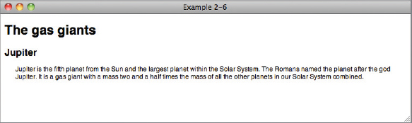
<!DOCTYPE html PUBLIC “-//W3C//DTD HTML 4.01//EN” “http://www.w3.org/TR/html4/strict.dtd”> <html lang=“en”> <head> <meta http-equiv=“Content-Type” content=“text/html; charset=utf-8”> <title>Example 2-6</title> <style type=“text/css”> body { font: 12px sans-serif; } h2 { margin-left: -20px; } div { padding-left: 20px; } </style> </head> <body> <h1>The gas giants</h1> <div class=“planet jupiter”> <h2>Jupiter</h2> <p>Jupiter is the fifth planet from the Sun and the largest planet within the Solar System. The Romans named the planet after the god Jupiter. It is a gas giant with a mass two and a half times the mass of all the other planets in our Solar System combined.</p> </div> </body> </html> - Save the markup that you entered as example_2-6.html, and load it into your favorite browser. You should see something similar to Figure 2-6.
How It Works
From Figure 2-6, you can see that the text in the div has been shifted to the right by 20px by giving the padding-left property a value of 20px, but the heading has been shifted back to the left by using a negative value for margin-left. You learn more about how the margin property works in Chapter 8.
Colors
CSS has a number of options for specifying colors, ranging from a 216-color, Web-safe palette to the full range of colors available in the RGB format, a total of 16,777,216 colors! More specifically, those options are as follows:
- Color keywords: These enable you to specify a color by its name. There are only a small number of keywords available compared to the millions that you can use with other color value types.
- Hexadecimal: This enables you to specify a color by a special hexadecimal number.
- Shorthand hexadecimal: This is a shortened representation of hexadecimal numbers; it is limited to a special 216-color, Web-safe palette.
- RGB values: These enable you to specify a color via a Red, Green, Blue representation, which provides access to millions of colors.
- RGB percentage: This option is the same as RGB but uses percentages.
- RGBA (RGB with alpha channel): The RGB palette is used with the addition of an alpha channel to specify transparency.
Each method is a means of accomplishing the same thing: specifying a color. You can use these methods to specify text color, border color, or background color. Next, you see what each of these methods looks like when used in the context of a style sheet rule.
Color Keywords
The first method for specifying color, mentioned previously, is to use a color keyword. This is the most intuitive method because all you need to do is reference the name of the color itself. Here are some examples:
div {
   color: black;
    background-color: red;
    border: thin solid orange;
}
This rule applies to any <div> element contained in the document. I have specified that each <div> element should have black text, a red background, and a thin, solid orange border around the element. In this example, black, red, and orange are color keywords, so a color keyword is simply the name of the color.
Note A complete table of CSS-supported color keywords is available in Appendix D.
Hexadecimal Colors
Hexadecimal refers to a numbering scheme that uses 16 characters as its base, expressed in a combination of letters and numbers. A hexadecimal system uses 0-9 for the first 10 digits and A-F to represent the remaining 6 digits. Letter A corresponds to the decimal number 10, B to 11, C to 12, and so on up to 15, which is represented by F. Therefore 10 in hex is equivalent to 16 in decimal, and FFF in hex is the equivalent of 255 in decimal.
Hexadecimal values are another way of expressing an RGB value. For instance, #FFFFFF refers to white, which is expressed in RGB as 255, 255, 255.
In CSS, hexadecimal colors are included just as RGB or color keywords are, as shown in the following example.
div {
    color: #000000;
    background-color: #FF0000;
    border: thin solid #FFA500;
}
#000000 is the hexadecimal representation of black; the same as RGB 0, 0, 0 or simply the black color keyword. #FF0000 is a hexadecimal representation of red, or RGB 255, 0, 0, or the red color keyword. Finally, #FFA500 is a hexadecimal representation of orange, or RGB 255, 165, 0, or the orange color keyword.
Short Hexadecimal
When a hexadecimal value is made up of 3 pairs of duplicated values you can use a shorthand notation of the value which uses only a single value for each pair. For example, the hexadecimal value for white is #FFFFFF. This is 3 pairs of FF and can therefore be shortened to #FFF.
div {
    background-color: #FAB;
}
In this example, #FAB is equivalent to #FFAABB which fans of the 1960s British TV series Thunderbirds in particular may be interested to know is a rather vivid shade of pink!
RGB Colors
RGB stands for Red, Green, and Blue. These are the primary colors used to display the color of pixels on a computer monitor. When you use these three colors in various combinations, it is possible to create every color of the rainbow. Many computer monitors are capable of displaying millions of colors: 16,777,216 colors, in fact. CSS RGB color is specified using a special three-number syntax, with each one representing a color channel. This first number is red, the second green, and the third blue:
body {
    background-color: rgb(128, 128, 128);
}
This produces the same color as the CSS color keyword gray. Equal amounts of all three channels form a variation of gray, where 0, 0, 0 is black and 255, 255, 255 is white.
RGB values may also be represented using percentages:
body {
    background-color: rgb(50%, 50%, 50%);
}
This also produces the same color as the CSS color keyword gray.
The URI
CSS uses a special term — URI (Universal Resource Indicator) — when the location of a resource or data file must be specified. URIs are most often used in CSS for two purposes:
- The inclusion of style sheets
- The inclusion of background images
The URI is referenced using a special method, as shown in the following example:
.jupiter {
    background-image: url(jupiter.jpg);
}
The url( ) syntax is used to enclose the URI of the file being referenced. In this example, jupiter.jpg must exist in the same directory as the style sheet. If the style sheet is named mystyle.css and it's located at www.example.com/styles/mystyle.css, the mypicture.jpg file must also exist in the styles directory, where its path is www.example.com/styles/mypicture.jpg. The complete, absolute path or the shortened relative paths are both acceptable references to the file. I address this topic again in Chapter 7, where I discuss the background property and the syntax it allows.
INCLUDING CSS IN A DOCUMENT
CSS is very flexible regarding how you call it in a document. You can include CSS in a document in four ways:
- CSS can be included in a document by using embedded style sheets, which are included between <style> and </style> tags directly in an HTML document. These tags must appear between the <head> and </head> tags.
<style type=“text/css”> body { font: 12px sans-serif; } </ style > - CSS can be included in its own document and linked to an HTML document by using the <link> element. Note that as the link element can be used for more than just referencing CSS files, such as linking to RSS feeds for the current site, it is important to include rel=“stylesheet” so that the browser knows what we want it to do.
<link rel=“stylesheet” type=“text/css” href=“example_1-1.css”>
- CSS can be imported from within either an embedded or linked style sheet by using an @import rule.
<style type=“text/css”> @import url(example_1-1.css); </ style > - CSS declarations can be applied directly to an element in an HTML document by using inline styles with the style attribute.
<body style=“font: 12px sans-serif;”>
So far, you have used embedded style sheets and linked style sheets. I recommend that you continue to use these unless you have a reason not to. There are benefits to the import method for more advanced authors of CSS, but disadvantages as well, which are beyond the scope of this book to discuss.
Under no circumstances can I recommend that you use style attributes directly on HTML elements. This approach removes many of the benefits of CSS, such as being able to style multiple elements with a single rule, and also makes your CSS harder to organize and manage as you will see in Chapter 4 when we discuss specificity.
Including an Embedded Style Sheet
To embed a style sheet in to your document simply add a <style type=“text/css”></style> element to the <head> element of your document. Inside the <style> tags add CSS in the same way that you have done throughout this chapter.
Embedded style sheets are very useful for development and debugging. When you are working on a page, including CSS directly in the document removes browser cache issues, whereas a linked style sheet may be stored by your browser and not updated when you refresh the page.
They are not recommended when your site is live; however, there are benefits to linking to external style sheets, which we will discuss next.
Linking to External Style Sheets
External style sheets are the preferred method of CSS inclusion in a web document, as a single style sheet can be shared by multiple pages on a website and can be cached by the user's browser. Caching frees the user, who no longer needs to download the website's style sheet on every page, leading to faster page load times and less bandwidth used per page request.
Here's a demonstration of the <link> element method:
<link rel=“stylesheet” type=“text/css” href=“example_1-1.css”>
The following attributes are required to use the <link> element for linking to a CSS document:
- rel: Defines the relation between the external document and the current document. In this case, the relation is that the external document is the style sheet for the calling document.
- type: Refers to the MIME type of the external file. For CSS this is always text/css.
- href: Like the anchor tag, <a>, href stands for hyperlink reference. It accepts an absolute or relative path to the style sheet document.
An absolute path means the complete path to the file. For instance, www.example.com is an absolute path. A relative path triggers the application to find the CSS file relative to the requesting document. So if the example file's URL is www.example.com/example.html and the CSS document is stored in the stylesheets directory as stylesheet.css, the relative path included in <link> is stylesheets/stylesheet.css and the full absolute path to the document is www.example.com/stylesheets/stylesheet.css.
When you are serving your site from a web server rather than just a folder on your computer, it is recommended that you use an absolute path starting from after your domain name, i.e., /stylesheets/stylesheet.css.
THE IMPORTANCE OF GOOD HTML
Although this book is about CSS, we cannot ignore HTML. While all of the CSS in this book is used with HTML 4.01, they will also work without alteration with HTML written to other standards, for example, HTML5 or XHTML standards, such as XHTML 1.0.
Regardless of which flavor of HTML that you choose to use it cannot be stressed enough how important good, valid markup is to achieving consistent rendering across browsers. While valid markup is not an absolute guarantee that you will not encounter rendering problems, your markup is a good place to check first if you do. You can make use of the W3C markup validator at http://validator.w3.org/ or your IDE may have validation tools built in.
Doctypes and Quirks Mode
The most important thing to ensure in HTML documents is that you have used a valid modern doctype. Any of the strict doctypes that are HTML 4.01 or above or any version of XHTML listed at www.w3.org/QA/2002/04/valid-dtd-list.html will be suitable.
The reason that you must use a valid doctype is that if you don't, modern browsers will use a rendering mode know as Quirks Mode. The reason for this is to allow for older code to render as it was intended, on the assumption that if the code author was following the recommended standards, then they would have included a valid doctype.
Quirks mode changes the way CSS works, for example, widths of elements are calculated differently, as are the styles applied to content in tables. This makes it difficult to write CSS that works as you expect in all browsers and greatly increases the amount of time you will need for testing.
EXERCISES
- Name the different components that make up a CSS rule.
- What's the difference between when width: auto; is applied to a <table> as opposed to a <div> element?
- Complete the sequence: Declaration, Property, ___________
- Convert the color RGB(234, 123, 45) to hexadecimal.
- What is the shortened hexadecimal notation of #FFFFFF?
- If I have a style sheet located at www.example.com/stylesheet.css, and a web page located at www.example.com/index.html, what markup would I include in index.html to include stylesheet.css via a relative path?
 WHAT YOU LEARNED IN THIS CHAPTER
Throughout this chapter, you learned about the bits and pieces that make CSS work. To recap, in this chapter you learned the following:
| TOPIC | KEY CONCEPTS |
| Elements of a style sheet | Style sheets are made up of rules; rules are made up of selectors and declarations; declarations are made up of properties and values. |
| Values | Can be keywords, lengths, colors, strings, integers, real numbers, or URIs. |
| Including CSS in documents | Style sheets can be embedded in documents, which is useful while developing, or linked to and included in external files, which is good practice in production. |