7
Background Colors and Images
WHAT YOU WILL LEARN IN THIS CHAPTER:
- How to use the background-color property to set a background color
- How to use the background-image property to specify a background image
- How to use the background-repeat property to control background tiling
- How to use the background-position property to control how the background is positioned
- How to use the background-attachment property to control whether the background scrolls with the page or remains fixed in place with respect to the view port
- How to use the background shorthand property to combine all the separate background properties into a single property
Backgrounds play a large role in CSS design and are often the bread and butter of the overall aesthetic presentation of a web page. This chapter begins the discussion of background properties by exploring the background-color property.
BACKGROUND COLORS
The background-color property is used to specify a solid background color. The following table shows the possible values for the background-color property.
| PROPERTY | VALUE |
| background-color | <color> | transparent Initial value: transparent |
The background-color property allows any of the color values supported by CSS that I covered in chapter 2, such as a color keyword, an RGB value, or a hexadecimal, or short hexadecimal value. It may also be given the transparent keyword, which indicates that no color should be used. This is straightforward, so let's Try It Out right away. The following exercise applies the background-color property to a style sheet.
TRY IT OUT Applying a Background Color
To see the background-color property in action, follow these steps.
- Enter the following markup:
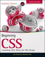
<!DOCTYPE html PUBLIC “-//W3C//DTD HTML 4.01//EN” “http://www.w3.org/TR/html4/strict.dtd”> <html lang=“en”> <head> <meta http-equiv=“Content-Type” content=“text/html; charset=utf-8”> <title>Example 7-1</title> <style type=“text/css”> body { background-color: #000; color: #FFF; } </style> </head> <body> <h1>Recipes for Cheese</h1> <p class=“intro”>Cheese is a remarkably versatile food, available in literally hundreds of varieties with different flavors and textures.</p> </body> </html> - Save the preceding CSS and markup as example_7-1.html. This example results in the rendered output in Figure 7-1.
In Example 7-1, you applied the background-color property to the body element, with a short hexadecimal value of #000, making the background black. A color of #FFF, which represents white, is also specified, to ensure that the text is readable against the background color.
 NOTE It is good practice to specify a color when you set a background-color as it helps to ensure that any text within the element you're applying the styles to will be readable. You should also always set a background and text color, even if they are white and black, on the body element of documents, to ensure that your text will display as you expect—don't rely on browser defaults.
In the next section I discuss the background-image property.
BACKGROUND IMAGES
As you probably guessed, the background-image property enables you to provide an image for the background. The following table outlines the values available for the background-image property.
| PROPERTY | VALUE |
| background-image | <uri> | none Initial value: none |
The background-image property allows you to reference a URL, which is indicated by the <uri> notation in the preceding table, or a keyword of none. When you specify a background image, by default the image tiles across the entire area available to it, that is the area encompassing the content and padding of the element being styled. In the following Try It Out, you try the background-image property for yourself. The images and source code for this and all the other examples in this book can be found online at www.wrox.com.
TRY IT OUT Applying a Background Image
Example 7-2
To see the background-image property in action, follow these steps.
- Enter the following markup:
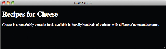
<!DOCTYPE html PUBLIC “-//W3C//DTD HTML 4.01//EN” “http://www.w3.org/TR/html4/strict.dtd”> <html lang=“en”> <head> <meta http-equiv=“Content-Type” content=“text/html; charset=utf-8”> <title>Example 7-2</title> <style type=“text/css”> body { background-image: url(bg-page.png); } </style> </head> <body> <h1>Recipes for Cheese</h1> <p class=“intro”>Cheese is a remarkably versatile food, available in literally hundreds of varieties with different flavors and textures.</p> <div class=“recipe”> <h2>Welsh Rarebit</h2> <p class=“intro”>Welsh Rarebit is a savory dish made from melted cheese, often Cheddar, on toasted bread, and a variety of other ingredients such as mustard, egg, or bacon. Here is one take on this classic.</p> <ol> <li>Lightly toast the bread</li> <li>Place on a baking tray, and spread with butter.</li> <li>Add the grated Cheddar cheese and 2 tablespoons of beer to a saucepan. Place the saucepan over a medium heat, and stir the cheese continuously until it has melted. Add a teaspoon of wholegrain mustard and grind in a little pepper. Keep stirring.</li> <li>When thick and smooth, pour over each piece of toast spreading it to the edges to stop the toast from burning.</li> <li>Place under the grill for a couple of minutes or until golden brown.</li> </ol> </div> </body> </html> - Save the preceding CSS and markup as example_7-2.html. This example results in the output in Figure 7-2.
How It Works
In Example 7-2, you applied the background-image property with a <uri> value, which outputs the tiled background of a light grey square.
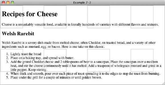
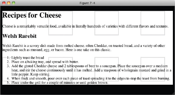
Interestingly, the background image is applied to the entire document, not just the area that the <body> element takes up, as you can see in Figure 7-3.
This is because all background properties applied to the body element are considered to be applied to the html element, unless the <html> element also has a background property of any type set. This can allow some interesting effects, as you can see in Figure 7-4.
NOTE One good use for background images is for sprites. If your site used several small icons (for example, a magnifying glass icon next to a search field or the appropriate flag next to each item in a list of countries), you can combine them into one image with plenty of empty space between each one. You can then use the background-image property in combination with the background-repeat and background-position properties, which you will look at next, to show the icon that you need in each circumstance.
Done right, this can have the benefit of making your site load faster for your users, as they will only have to download one image instead of many.
For a great article on using sprites see www.alistapart.com/articles/sprites.
As you saw with the background-image property, the image is tiled by default. In the next section, I describe how to control tiling with the background-repeat property.
CONTROLLING HOW BACKGROUND IMAGES REPEAT
The background-repeat property is used to control how an image is tiled, or if it is tiled at all. The following table shows the values for the background-repeat property.
| PROPERTY | VALUE |
| background-repeat | repeat | repeat-x | repeat-y | no-repeat Initial value: repeat |
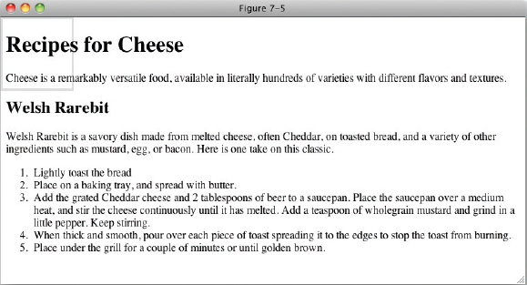
As you saw in the last section, by default, a background is tiled vertically and horizontally. The background-repeat property offers control over this. The repeat-x keyword limits tiling to the horizontal or x-axis, and the repeat-y keyword limits tiling to the vertical or y-axis. As you have already seen, the default keyword of repeat tiles the image in both the x-axis and the y-axis. The no-repeat keyword turns off tiling altogether, and the background image will be displayed only once, as demonstrated in the following code.

<!DOCTYPE html PUBLIC “-//W3C//DTD HTML 4.01//EN”
    “http://www.w3.org/TR/html4/strict.dtd”>
<html lang=“en”>
<head>
    <meta http-equiv=“Content-Type” content=“text/html; charset=utf-8”>
    <title>FIGURE 7-5</title>
    <style type=“text/css”>
        body {
            background-image: url(bg-page.png);
            background-repeat: no-repeat;
        }
    </style>
</head>
<body>

<h1>Recipes for Cheese</h1>

<p class=“intro”>Cheese is a remarkably versatile food, available in literally
hundreds of varieties with different flavors and textures.</p>

<div class=“recipe”>

    <h2>Welsh Rarebit</h2>

    <p class=“intro”>Welsh Rarebit is a savory dish made from melted cheese, often
    Cheddar, on toasted bread, and a variety of other ingredients such as mustard,
    egg, or bacon. Here is one take on this classic.</p>

    <ol>
        <li>Lightly toast the bread</li>
        <li>Place on a baking tray, and spread with butter.</li>
        <li>Add the grated Cheddar cheese and 2 tablespoons of beer to a saucepan.
        Place the saucepan over a medium heat, and stir the cheese continuously
        until it has melted. Add a teaspoon of wholegrain mustard and grind in
        a little pepper. Keep stirring.</li>
        <li>When thick and smooth, pour over each piece of toast spreading it to
        the edges to stop the toast from burning.</li>
        <li>Place under the grill for a couple of minutes or until golden
        brown.</li>
    </ol>

</div>

</body>
</html>
code snippet /chapter7/figure_7-5.html
This CSS and markup results in the output you see in Figure 7-5.
Now let's see how the background-repeat property is used to tile a background image in one direction only.
TRY IT OUT Controlling Background Repetition
Example 7-3
To see the background-repeat property in action, follow these steps.
- Enter the following markup:
<!DOCTYPE html PUBLIC “-//W3C//DTD HTML 4.01//EN”
    “http://www.w3.org/TR/html4/strict.dtd”>
<html lang=“en”>
<head>
    <meta http-equiv=“Content-Type” content=“text/html; charset=utf-8”>
    <title>Example 7-3</title>
    <style type=“text/css”>
        body {
            background-image: url(bg-page.png);
            background-repeat: repeat-x;
        }
    </style>
</head>
<body>

<h1>Recipes for Cheese</h1>

<p class=“intro”>Cheese is a remarkably versatile food, available in literally
hundreds of varieties with different flavors and textures.</p>

<div class=“recipe”>

    <h2>Welsh Rarebit</h2>

    <p class=“intro”>Welsh Rarebit is a savory dish made from melted cheese, often
    Cheddar, on toasted bread, and a variety of other ingredients such as mustard,
    egg, or bacon. Here is one take on this classic.</p>

    <ol>
        <li>Lightly toast the bread</li>
        <li>Place on a baking tray, and spread with butter.</li>
        <li>Add the grated Cheddar cheese and 2 tablespoons of beer to a saucepan.
        Place the saucepan over a medium heat, and stir the cheese continuously
        until it has melted. Add a teaspoon of wholegrain mustard and grind in
        a little pepper. Keep stirring.</li>
        <li>When thick and smooth, pour over each piece of toast spreading it to
        the edges to stop the toast from burning.</li>
        <li>Place under the grill for a couple of minutes or until golden
        brown.</li>
    </ol>

</div>

</body>
</html>
- Save the preceding CSS and markup as example_7-3.html.This example results in the rendered output in Figure 7-6.
How It Works
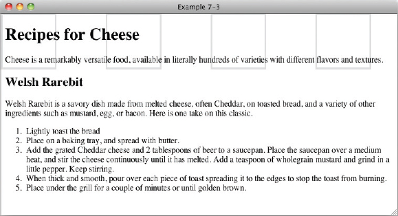
In Example 7-3, you used the background-repeat property to tile the background image in only the horizontal, or x-axis. The image no longer tiles in the vertical, or y-axis, so it appears as a single ‘row’ of images.
In the next section, I discuss the background-position property.
POSITIONING BACKGROUND IMAGES
The background-position property, as its name implies, allows you to control the placement of the background. The following table shows the values for the background-position property.
| PROPERTY | VALUE |
| background-position | [ [ <percentage> | <length> | left | center | right ] [ <percentage> | <length> | top | center | bottom ]? ] | [ [ left | center | right ] || [ top | center | bottom ] ] | inherit Initial value: 0% 0% |
At first glance, this property looks a little complicated; in truth, it isn't all that complex. The notation boils down to this: The property allows one value that applies the same value to both the horizontal and vertical background position, or two values that express the horizontal and vertical position of the background separately. Square brackets are used to group the values. The following is the first subgrouping of values within the first grouping:
[<percentage> | <length> ]{1,2}
The first grouping indicates that the value may be a percentage or length value. Either one or two values may be provided.
The second subgrouping is preceded by a vertical bar, which indicates another possibility for the value:
| [ [top | center | bottom] || [left | center | right] ]
The second grouping indicates that either one or two keyword values may be provided. If two values are provided, it may be any keyword from the first grouping combined with any of the keywords from the second grouping. In addition, any of the keyword values can be mixed with either a <length> or <percentage> value.
The following code demonstrates some possible values for the background-position property.
<!DOCTYPE html PUBLIC “-//W3C//DTD HTML 4.01//EN”
    “http://www.w3.org/TR/html4/strict.dtd”>
<html lang=“en”>
<head>
    <meta http-equiv=“Content-Type” content=“text/html; charset=utf-8”>
    <title>FIGURE 7-7</title>
    <style type=“text/css”>
        body {
            background-image: url(bg-page.png);
            background-repeat: no-repeat;
            background-position: bottom right;
        }
    </style>
</head>
<body>

<h1>Recipes for Cheese</h1>

<p class=“intro”>Cheese is a remarkably versatile food, available in literally
hundreds of varieties with different flavors and textures.</p>

<div class=“recipe”>

    <h2>Welsh Rarebit</h2>

    <p class=“intro”>Welsh Rarebit is a savory dish made from melted cheese, often
    Cheddar, on toasted bread, and a variety of other ingredients such as mustard,
    egg, or bacon. Here is one take on this classic.</p>

    <ol>
        <li>Lightly toast the bread</li>
        <li>Place on a baking tray, and spread with butter.</li>
        <li>Add the grated Cheddar cheese and 2 tablespoons of beer to a saucepan.
        Place the saucepan over a medium heat, and stir the cheese continuously
        until it has melted. Add a teaspoon of wholegrain mustard and grind in
        a little pepper. Keep stirring.</li>
        <li>When thick and smooth, pour over each piece of toast spreading it to
        the edges to stop the toast from burning.</li>
        <li>Place under the grill for a couple of minutes or until golden
        brown.</li>
    </ol>

</div>

</body>
</html>
code snippet /chapter7/figure_7-7.html
This CSS and markup results in the output you see in Figure 7-7.
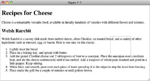
In Figure 7-7, you see what the background-position property with two values looks like. In this case, the background image (including the white space that is part of the image that allows for the spacing between the tiles) is positioned to the bottom right of the document. This figure shows what happens when both values are of the same ilk (that is, both length values both percentage values, or both keyword values).
Mixing Background Position Values
What happens when you mix length with percentage or percentage with a keyword? This question is answered by the example in the following code.
<!DOCTYPE html PUBLIC “-//W3C//DTD HTML 4.01//EN”
    “http://www.w3.org/TR/html4/strict.dtd”>
<html lang=“en”>
<head>
    <meta http-equiv=“Content-Type” content=“text/html; charset=utf-8”>
    <title>FIGURE 7-8</title>
    <style type=“text/css”>
        body {
           background-image: url(bg-page.png);
           background-repeat: no-repeat;
           background-position: right 100%;
        }
    </style>

</head>
<body>

<h1>Recipes for Cheese</h1>

<p class=“intro”>Cheese is a remarkably versatile food, available in literally
hundreds of varieties with different flavors and textures.</p>

<div class=“recipe”>

    <h2>Welsh Rarebit</h2>

    <p class=“intro”>Welsh Rarebit is a savory dish made from melted cheese, often
    Cheddar, on toasted bread, and a variety of other ingredients such as mustard,
    egg, or bacon. Here is one take on this classic.</p>

    <ol>
        <li>Lightly toast the bread</li>
        <li>Place on a baking tray, and spread with butter.</li>
        <li>Add the grated Cheddar cheese and 2 tablespoons of beer to a saucepan.
        Place the saucepan over a medium heat, and stir the cheese continuously
        until it has melted. Add a teaspoon of wholegrain mustard and grind in
        a little pepper. Keep stirring.</li>
        <li>When thick and smooth, pour over each piece of toast spreading it to
        the edges to stop the toast from burning.</li>
        <li>Place under the grill for a couple of minutes or until golden
        brown.</li>
    </ol>

</div>

</body>
</html>
code snippet /chapter7/figure_7-8.html
This CSS and markup results in the output you see in Figure 7-8.

 Warning If at least one value is not a keyword, then the first value represents the horizontal position and the second represents the vertical position
That is to say, when you use two keywords it's obvious which one applies to the horizontal positioning and which one applies to the vertical positioning based on the keyword name (left and right are horizontal, top and bottom are vertical) so they can be specified in any order and the browser will understand what that means. However, this is not necessarily the case when using one or two length/percentage values, so you have to specify them in order
Repeating a Background Image and Controlling Its Position
What happens when the background is tiled and a position is set? You see an example of positioning a tiled background with a length measurement in the following example.
<!DOCTYPE html PUBLIC “-//W3C//DTD HTML 4.01//EN”
    “http://www.w3.org/TR/html4/strict.dtd”>
<html lang=“en”>
<head>
    <meta http-equiv=“Content-Type” content=“text/html; charset=utf-8”>
    <title>FIGURE 7-9</title>
    <style type=“text/css”>
        body {
           background-image: url(bg-page.png);
           background-repeat: repeat-x;
           background-position: bottom right;
        }
    </style>
</head>
<body>

<h1>Recipes for Cheese</h1>

<p class=“intro”>Cheese is a remarkably versatile food, available in literally
hundreds of varieties with different flavors and textures.</p>

<div class=“recipe”>

    <h2>Welsh Rarebit</h2>

    <p class=“intro”>Welsh Rarebit is a savory dish made from melted cheese, often
    Cheddar, on toasted bread, and a variety of other ingredients such as mustard,
    egg, or bacon. Here is one take on this classic.</p>

    <ol>
        <li>Lightly toast the bread</li>
        <li>Place on a baking tray, and spread with butter.</li>
        <li>Add the grated Cheddar cheese and 2 tablespoons of beer to a saucepan.
        Place the saucepan over a medium heat, and stir the cheese continuously
        until it has melted. Add a teaspoon of wholegrain mustard and grind in
        a little pepper. Keep stirring.</li>
        <li>When thick and smooth, pour over each piece of toast spreading it to
        the edges to stop the toast from burning.</li>
        <li>Place under the grill for a couple of minutes or until golden
        brown.</li>
    </ol>

</div>

</body>
</html>
code snippet /chapter7/figure_7-9.html
This CSS and markup results in the output you see in Figure 7-9.
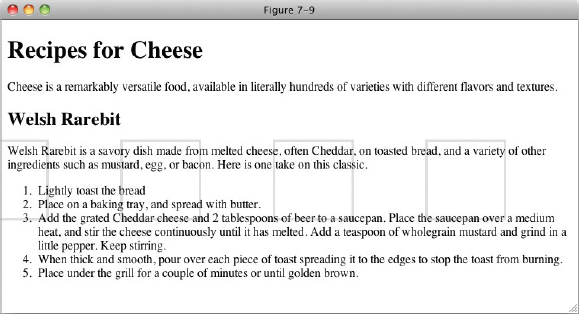
In Figure 7-9, you see how specifying a background position affects the tiling of a background image. When both axes are tiled, the position that you specify determines where the image tiling begins. Note that tiling happens in both directions: left to right and right to left, top to bottom and bottom to top.
Controlling Position with the Center Keyword
The center keyword has an interesting side effect. Background images are positioned at the center point of the container from the center of point of the image, not the edge of the image as we have seen previously. This means that our background image, with its white space to add a space between tiles, will actually be positioned slightly to the right rather than slightly to the left as would be the case if it had been positioned relative to the left hand edge. The following code illustrates this effect.
<!DOCTYPE html PUBLIC “-//W3C//DTD HTML 4.01//EN”
    “http://www.w3.org/TR/html4/strict.dtd”>
<html lang=“en”>
<head>
    <meta http-equiv=“Content-Type” content=“text/html; charset=utf-8”>
    <title>FIGURE 7-10</title>
    <style type=“text/css”>
        body {
           background-image: url(bg-page.png);
           background-repeat: no-repeat;
           background-position: center center;
        }
    </style>
</head>
<body>

<h1>Recipes for Cheese</h1>

<p class=“intro”>Cheese is a remarkably versatile food, available in literally
hundreds of varieties with different flavors and textures.</p>

<div class=“recipe”>

    <h2>Welsh Rarebit</h2>

    <p class=“intro”>Welsh Rarebit is a savory dish made from melted cheese, often
    Cheddar, on toasted bread, and a variety of other ingredients such as mustard,
    egg, or bacon. Here is one take on this classic.</p>

    <ol>
        <li>Lightly toast the bread</li>
        <li>Place on a baking tray, and spread with butter.</li>
        <li>Add the grated Cheddar cheese and 2 tablespoons of beer to a saucepan.
        Place the saucepan over a medium heat, and stir the cheese continuously
        until it has melted. Add a teaspoon of wholegrain mustard and grind in
        a little pepper. Keep stirring.</li>
        <li>When thick and smooth, pour over each piece of toast spreading it to
        the edges to stop the toast from burning.</li>
        <li>Place under the grill for a couple of minutes or until golden
        brown.</li>
    </ol>

</div>

</body>
</html>
code snippet /chapter7/figure_7-10.html
This CSS and markup results in the output you see in Figure 7-10.
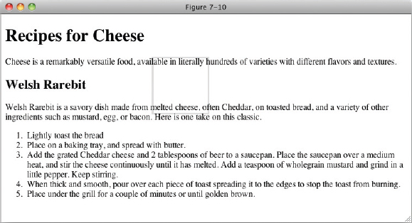
In Figure 7-10 you used the center keyword instead of a length measurement. When the tiling is along the x-axis, one center keyword centers the tiled images along the y-axis, and the other center keyword causes the tiling of each image to begin with the center of the image, rather than the left border of the image. This result is the same in every browser.
In the next section, I describe how to control the background-position when the page is scrolled with the background-attachment property.
FIXING A BACKGROUND IMAGE IN PLACE
You can use the background-attachment property to control whether a background image scrolls with the content of a web page (when scroll bars are activated because that content is larger than the browser window). The following table outlines the possible values for the background-attachment property.
| PROPERTY | VALUE |
| background-attachment | scroll | fixed Initial value: scroll |
NOTE IE 6 supports the fixed keyword only if applied to the <body> element; all other browsers support the fixed keyword as applied to any element.
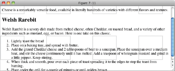
The background-attachment property provides one very cool effect. By default, the background image scrolls with the content of the web page; this is the behavior of the background-attachment: scroll; declaration, as you can see in Figure 7-11.
If the fixed keyword is provided, the background image remains in place while the page scrolls. The following code shows an example of this scenario.
<!DOCTYPE html PUBLIC “-//W3C//DTD HTML 4.01//EN”
    ”http://www.w3.org/TR/html4/strict.dtd“>
<html lang=“en”>
<head>
    <meta http-equiv=“Content-Type” content=“text/html; charset=utf-8”>
    <title>FIGURE 7-12</title>
    <style type=“text/css”>
        body {
            background-image: url(bg-page.png);
            background-attachment: fixed;
        }
    </style>
</head>
<body>

<h1>Recipes for Cheese</h1>

<p class=“intro”>Cheese is a remarkably versatile food, available in literally
hundreds of varieties with different flavors and textures.</p>

<div class=“recipe”>

    <h2>Welsh Rarebit</h2>

    <p class=“intro”>Welsh Rarebit is a savory dish made from melted cheese, often
    Cheddar, on toasted bread, and a variety of other ingredients such as mustard,
    egg, or bacon. Here is one take on this classic.</p>

    <ol>
        <li>Lightly toast the bread</li>
        <li>Place on a baking tray, and spread with butter.</li>
        <li>Add the grated Cheddar cheese and 2 tablespoons of beer to a saucepan.
        Place the saucepan over a medium heat, and stir the cheese continuously
        until it has melted. Add a teaspoon of wholegrain mustard and grind in
        a little pepper. Keep stirring.</li>
        <li>When thick and smooth, pour over each piece of toast spreading it to
        the edges to stop the toast from burning.</li>
        <li>Place under the grill for a couple of minutes or until golden
        brown.</li>
    </ol>

</div>

</body>
</html>
code snippet /chapter7/figure_7-12.html
This CSS and markup results in the output you see in Figure 7-12.
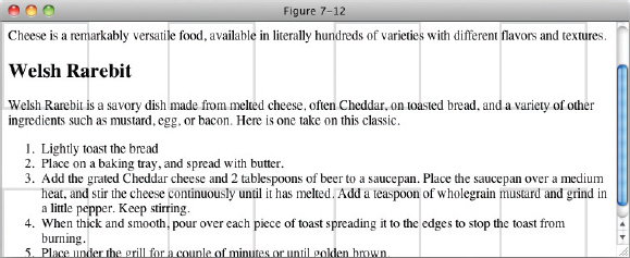
NOTE When the fixed keyword is provided, the background image's position is offset relative to the viewport, no matter what element the background image is applied to.
In the next section, I describe how to simplify the plethora of separate background properties into just one property using the background shorthand property.
BACKGROUND SHORTHAND
Like the shorthand properties I introduced in previous chapters, the background property combines each of the individual background properties into a single property. The following table outlines the values allowed by the background property.
| PROPERTY | VALUE |
| background | <‘background-color’> || <‘background-image’> || <‘background-repeat’> || <‘background-attachment’> || <‘background-position’> Initial value: n/a |
With the background property, you can specify anywhere from one to five separate background properties. An example of how the background property combines different background properties appears in the following code.
<!DOCTYPE html PUBLIC “-//W3C//DTD HTML 4.01//EN”
    “http://www.w3.org/TR/html4/strict.dtd”>
<html lang=“en”>
<head>
    <meta http-equiv=“Content-Type” content=“text/html; charset=utf-8”>
    <title>FIGURE 7-13</title>
    <style type=“text/css”>
        body {
            background: #CCC url(bg-page.png) repeat-x fixed top right;
        }
    </style>
</head>
<body>

<h1>Recipes for Cheese</h1>

<p class=“intro”>Cheese is a remarkably versatile food, available in literally
hundreds of varieties with different flavors and textures.</p>

<div class=“recipe”>

    <h2>Welsh Rarebit</h2>

    <p class=“intro”>Welsh Rarebit is a savory dish made from melted cheese, often
    Cheddar, on toasted bread, and a variety of other ingredients such as mustard,
    egg, or bacon. Here is one take on this classic.</p>

    <ol>
        <li>Lightly toast the bread</li>
        <li>Place on a baking tray, and spread with butter.</li>
        <li>Add the grated Cheddar cheese and 2 tablespoons of beer to a saucepan.
        Place the saucepan over a medium heat, and stir the cheese continuously
        until it has melted. Add a teaspoon of wholegrain mustard and grind in
        a little pepper. Keep stirring.</li>
        <li>When thick and smooth, pour over each piece of toast spreading it to
        the edges to stop the toast from burning.</li>
        <li>Place under the grill for a couple of minutes or until golden
        brown.</li>
    </ol>

</div>

</body>
</html>
code snippet /chapter7/figure_7-13.html
This CSS and markup results in the output you see in Figure 7-13.
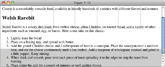
In Figure 7-13, you see how to use the background shorthand property to combine the five separate background properties, background-color, background-image, background-repeat, background-attachment, and background-position into just one single background property. Using the background property, you can include all five properties, or any combination of the other properties, in any order.
EXERCISES
- What are two properties that you can use to specify a background color in a web page?
- What declaration causes a background image to be tiled only along the x-axis?
- What keyword value can you use to turn off tiling of a background image?
- If you wanted to offset an image ten pixels from the left and ten pixels from the top, what declaration would you use?
- If you wanted a background image to scroll with the document, what declaration would you use?
- When a background image is said to be “fixed,” what HTML element is the background image position relative to?
- Write a declaration that contains all five background properties in one.
 WHAT YOU LEARNED IN THIS CHAPTER
The CSS background properties provide a fine-grained control over the presentation of backgrounds in a web document, which allows interesting aesthetic possibilities. To recap, in this chapter you learned the following:
| TOPIC | KEY CONCEPTS |
| background-color | Specifying a solid background color using the background-color property |
| gradient | Creating gradient color effects with the gradient property |
| background-image | How to use an image as a background with the background-image property |
| background-repeat | Controlling how background images repeat with the background-repeat property |
| background-position | How to offset the position of a background image using the background-position property |
| background-attachment | How to fix a background image to the browser window instead of scrolling with the page using the background-attachment property |
| background | How the background shorthand property can be used to write more concise CSS by combining background properties into one declaration |