11
Positioning
WHAT YOU WILL LEARN IN THIS CHAPTER:
- The position property and the four types of positioning that CSS has to offer: static, relative, absolute, and fixed
- The offset properties top, right, bottom, and left, and how these are used to deliver an element to a specific position in a web document
- The z-index property and how this property is used to layer the elements of a document
This chapter examines the various properties that CSS provides to position elements in a document. Positioning can be thought of as layering, in that the various elements of a page can be layered on top of others and given specific places to appear in the browser's window.
Like floating elements, positioning offers some unique characteristics that allow behavior you might not always expect. This chapter begins the discussion of positioning with none other than the position property.
INTRODUCTION TO POSITIONING
The position property is used to give elements different types of positioning. Positioning gives you the ability to dictate with precision where in a document you want an element to appear. You can choose whether an element appears relative to a container element, or relative to the browser window. You can layer elements one on top of another.
The following table outlines the position property and its values, and the four offset properties, top, right, bottom, and left, and their possible values.
In the next section, I begin the discussion of positioning with absolute positioning.
Absolute Positioning
Absolute positioning allows you to render an element to a particular place in a document. The best way to grasp this concept is to see a demonstration of it in action, as shown in the following code:

<!DOCTYPE html PUBLIC “-//W3C//DTD HTML 4.01//EN”
    “http://www.w3.org/TR/html4/strict.dtd”>
<html lang=“en”>
<head>
    <meta http-equiv=“Content-Type” content=“text/html; charset=utf-8”>
    <title>FIGURE 11-1</title>
    <style type=“text/css”>
        body {
           width: 600px;
           margin: 1em auto;
        }

        h1 {
            float: left;
            margin-top: 0.2em;
        }

        .navigation {
            float: right;
        }

        .navigation li {
            display: inline;

        }

        .navigation a {
                margin-left: 0.5em;
                padding: 0.5em;
                border: 1px solid #CCC;
        }

        .navigation ul a {
            display: block;
        }
    </style>
</head>
<body>

<h1>Recipes for Cheese</h1>

<ul class=“navigation”>
    <li><a href=“#”>Home</a></li>
    <li>
        <a href=“#”>Recipes</a>
        <ul>
            <li><a href=“#”>Snacks</a></li>
            <li><a href=“#”>Meals</a></li>
            <li><a href=“#”>Desserts</a></li>
        </ul>
    </li>
    <li><a href=“#”>Suggestions</a></li>
</ul>

</body>
</html>
code snippet /chapter11/figure_11-1.html
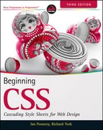
The result is shown in Figure 11-1.
In the code for Figure 11-1, you can see that I have added a sub-list to the navigation that you first saw in Chapter 9. The rule with selector .navigation ul a applies display: block; to the links inside the sub-list, so that they appear vertically. The sub-list has the default static position and has broken our layout, but this is a great example of where absolute positioning is useful. Let's add a little more CSS:
<!DOCTYPE html PUBLIC “-//W3C//DTD HTML 4.01//EN”
    “http://www.w3.org/TR/html4/strict.dtd”>
<html lang=“en”>
<head>
    <meta http-equiv=“Content-Type” content=“text/html; charset=utf-8”>
    <title>FIGURE 11-2</title>
    <style type=“text/css”>
        body {
            width: 600px;
            margin: 1em auto;
        }

        h1 {
            float: left;
            margin-top: 0.2em;
        }

        .navigation {
            float: right;
        }

        .navigation li {
            display: inline;
        }

        .navigation a {
            margin-left: 0.5em;
            padding: 0.5em;
            border: 1px solid #CCC;
        }

        .navigation ul {
            position: absolute;
            top: 20px;
            left: 40px;
        }

        .navigation ul a {
            display: block;
        }
    </style>
</head>
<body>

<h1>Recipes for Cheese</h1>

<ul class=“navigation”>
    <li><a href=“#”>Home</a></li>
    <li>
        <a href=“#”>Recipes</a>
        <ul>

            <li><a href=“#”>Snacks</a></li>
            <li><a href=“#”>Meals</a></li>
            <li><a href=“#”>Desserts</a></li>
        </ul>
    </li>
    <li><a href=“#”>Suggestions</a></li>
</ul>

</body>
</html>
code snippet /chapter11/figure_11-2.html
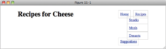
In Figure 11-2, you see what the document looks like when I add position: absolute;, top: 20px;, and left: 40px; to the sub-list.
A number of things have happened here.
- The list has been taken out of the document flow (that is, it no longer takes up space in the document or influences the positioning of other elements).
- It has been positioned 20px from the top and 40px from the left of the top left-hand corner of the viewport. By default, all absolutely positioned elements are positioned relative to the viewport.
- It has been given a position on the z-axis; in other words, it appears above other elements, in this case the h1. I'll cover this in more detail later in the chapter.
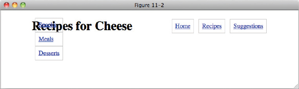
bottom and right work in the same way; however in their case, the bottom edge of the positioned element is positioned relative to the bottom of the viewport and the right-hand edge to the right of the viewport, as you can see in Figure 11-3.
It is important to note that the list is positioned relative to the viewport as it appears when you first load the page — it will scroll with the rest of the content, as you can see in Figure 11-4, in which more content has been added.
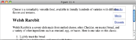
In Figure 11-4, you can see that when you scroll down, the boxes stay where they were initially positioned when the page was loaded up.
You can modify what element is used as the point of reference for absolutely positioned elements. The rules are pretty simple: If an absolutely positioned element is contained within another element that has a position other than static, then that element is used as the point of reference for positioned elements. One common way to change the point of reference for positioned elements is to give the containing element a “relative” position, and that is the topic of the next section.
Relative Positioning
Relative positioning is very similar to the default static positioning; elements to which relative positioning is applied do not leave the document flow. There are three differences between relative positioning and static positioning:
- Elements with a relative position can be used as a point of reference for elements nested within them that are absolutely positioned.
- The position of a relatively positioned element can be adjusted using the offset properties.
- A relatively positioned element can have a position on the z-axis.
To observe how a relatively positioned element can be used as a point of reference for absolutely positioned descendant elements, I'll continue in the following Try It Out with the navigation example. In the navigation example, you don't want the sub-list positioned relative to the viewport, but instead relative to the list element that it is a child of. I'll demonstrate how a relatively positioned element can be used as a point of reference for absolutely positioned descendant elements in the following Try It Out.
TRY IT OUT Positioning Sub-Navigation
To position the sub-navigation list using position: absolute; and position: relative;, follow these steps.
- Enter the following markup:
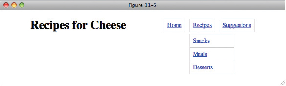
<!DOCTYPE html PUBLIC “-//W3C//DTD HTML 4.01//EN” “http://www.w3.org/TR/html4/strict.dtd”> <html lang=“en”> <head> <meta http-equiv=“Content-Type” content=“text/html; charset=utf-8”> <title>Example 11-1</title> <style type=“text/css”> body { width: 600px; margin: 1em auto; } h1 { float: left; margin-top: 0.2em; } .navigation { float: right; } .navigation li { position: relative; display: inline; } .navigation a { margin-left: 0.5em; padding: 0.5em; border: 1px solid #CCC; } .navigation ul { position: absolute; top: 2em; left: 0; width: 8em; padding: 0; } .navigation ul a { display: block; } </style> </head> <body> <h1>Recipes for Cheese</h1> <ul class=“navigation”> <li><a href=“#”>Home</a></li> <li> <a href=“#”>Recipes</a> <ul> <li><a href=“#”>Snacks</a></li> <li><a href=“#”>Meals</a></li> <li><a href=“#”>Desserts</a></li> </ul> </li> <li><a href=“#”>Suggestions</a></li> </ul> </body> </html> - Save the preceding CSS and markup as example_11-1.html. This example results in the output in Figure 11-5.
How It Works
In Figure 11-5, you can see that with the addition of a position: relative; declaration to the li elements in the navigation list, the sub-navigation list is now positioned relative to its container li instead of the viewport. top: 2em; shifts it from the top of the container li to just below it and left: 0; positions it to the left hand edge. You will note that other than providing a point of reference for the absolutely positioned element that position: relative; has had no effect on any of the li elements.
 NOTE When no position is defined for any of an element's ancestors, all elements are positioned relative to the browser's viewport by default. If an element does have a relative, absolute, or fixed position and is the ancestor of an element with absolute positioning, that element is used as the point of reference for the absolutely positioned element.
Applying Offset Positioning to Relatively Positioned Elements
The position of elements with relative positioning can be adjusted using combinations of the four offset properties, top, right, bottom, and left. For example, the top and left properties can be used to adjust the position of a relatively positioned element. This works similarly to the margin property that you saw in Chapter 8 with one important difference — the space reserved by the element is not changed or moved within the document. This will be made clearer with the following example:
<!DOCTYPE html PUBLIC “-//W3C//DTD HTML 4.01//EN”
    “http://www.w3.org/TR/html4/strict.dtd”>
<html lang=“en”>
<head>
    <meta http-equiv=“Content-Type” content=“text/html; charset=utf-8”>
    <title>FIGURE 11-6</title>
    <style type=“text/css”>
        body {
           width: 600px;
           margin: 1em auto;
        }

        h1 {
           float: left;
           margin-top: 0.2em;
        }

        .navigation {
           float: right;
        }

        .navigation li {
           display: inline;
        }

        .navigation a {
           margin-left: 0.5em;
           padding: 0.5em;
           border: 1px solid #CCC;
        }

        .intro {
           clear: both;
        }

        .recipe {
           border: 1px solid #CCC;
        }

        .recipe h2 {
           position: relative;
           top: 75px;
           left: -50px;
        }
    </style>
</head>
<body>

<h1>Recipes for Cheese</h1>

<ul class=“navigation”>
    <li><a href=“#”>Home</a></li>
    <li><a href=“#”>Recipes</a></li>
    <li><a href=“#”>Suggestions</a></li>
</ul>

<p class=“intro”>Cheese is a remarkably versatile food, available in literally
hundreds of varieties with different flavors and textures.</p>

<div class=“recipe”>

    <h2>Welsh Rarebit</h2>

    <p class=“intro”>Welsh Rarebit is a savory dish made from melted cheese, often
    Cheddar, on toasted bread, and a variety of other ingredients such as mustard,
    egg, or bacon. Here is one take on this classic.</p>

    <ol>
        <li>Lightly toast the bread</li>
        <li>Place on a baking tray, and spread with butter.</li>
        <li>Add the grated Cheddar cheese and 2 tablespoons of beer to a saucepan.
        Place the saucepan over a medium heat, and stir the cheese continuously
        until it has melted. Add a teaspoon of wholegrain mustard and grind in
        a little pepper. Keep stirring.</li>
        <li>When thick and smooth, pour over each piece of toast spreading it to
        the edges to stop the toast from burning.</li>
        <li>Place under the grill for a couple of minutes or until golden
        brown.</li>
    </ol>

</div>

</body>
</html>
code snippet /chapter11/figure_11-6.html
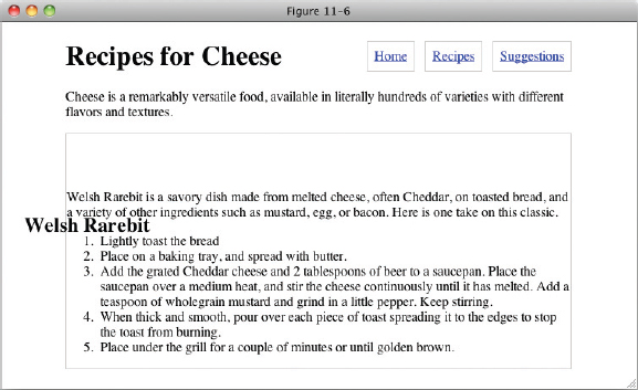
In Figure 11-6, you see what happens when the offset properties top and left are applied to a relatively positioned h2 element. Just as with absolute positioning the relatively positioned element appears above statically positioned content, but the top: 75px; and left: -50px; declarations move the h2 relative to its original starting position, and the space that it would normally take up in the document still remains.
A recap of relative positioning:
- Relative positioning is just like static positioning, in that the elements remain in the normal document flow, but that's where the similarities end.
- Relatively positioned elements can be used as a point of reference for absolutely positioned elements.
- Relatively positioned elements can accept combinations of the four offset properties, top and left, top and right, bottom and left, and bottom and right. The browser will ignore combinations of the offset properties beyond those mentioned here. For example, you can't combine the top and bottom offset properties on the same relatively positioned element.
- Relatively positioned content can be stacked and layered along the z-axis (more on this later in this chapter).
In the next section, I continue the concept of positioning with fixed positioning, which is similar to absolute positioning, in that the element leaves the normal flow of the document, but unlike absolute positioning, the context of a fixed positioned element cannot be altered by nesting the element in a relatively positioned element or another absolutely positioned element. Fixed position elements are always positioned relative to the browser's viewport, and remain in that position, even if the document is scrolled.
Fixed Positioning
Fixed positioning is used to make an element remain in the same fixed position, even if the document is being scrolled. Alas, IE 6 does not support fixed positioning, so the examples that follow will not work in IE 6. My advice is to accept this limitation and not utilize fixed position content in IE 6; however, Appendix B has links to resources that will allow you to emulate its affect.
Elements with a fixed position are always positioned relative to the viewport, regardless of whether they are contained in an element with relative or absolute positioning applied. Here is an example of fixed positioning:
<!DOCTYPE html PUBLIC “-//W3C//DTD HTML 4.01//EN”
    “http://www.w3.org/TR/html4/strict.dtd”>
<html lang=“en”>
<head>
    <meta http-equiv=“Content-Type” content=“text/html; charset=utf-8”>
    <title>FIGURE 11-7</title>
    <style type=“text/css”>
        body {
            width: 600px;
            margin: 1em auto;
        }
        #header {
            position: fixed;
            width: 600px;
            margin: 0 auto;
        }

        h1 {
            float: left;
            margin-top: 0.2em;
        }

        .navigation {
            float: right;
        }

        .navigation li {
            display: inline;
        }

        .navigation a {
            margin-left: 0.5em;
            padding: 0.5em;
            border: 1px solid #CCC;
        }
    </style>
</head>
<body>

<div id=“header”>

    <h1>Recipes for Cheese</h1>

    <ul class=“navigation”>
        <li><a href=“#”>Home</a></li>
        <li><a href=“#”>Recipes</a></li>
        <li><a href=“#”>Suggestions</a></li>

    </ul>

</div>

<p class=“intro”>Cheese is a remarkably versatile food, available in literally
hundreds of varieties with different flavors and textures.</p>

<div class=“recipe”>

    <h2>Welsh Rarebit</h2>

    <p class=“intro”>Welsh Rarebit is a savory dish made from melted cheese, often
    Cheddar, on toasted bread, and a variety of other ingredients such as mustard,
    egg, or bacon. Here is one take on this classic.</p>

    <ol>
        <li>Lightly toast the bread</li>
        <li>Place on a baking tray, and spread with butter.</li>
        <li>Add the grated Cheddar cheese and 2 tablespoons of beer to a saucepan.
        Place the saucepan over a medium heat, and stir the cheese continuously
        until it has melted. Add a teaspoon of wholegrain mustard and grind in
        a little pepper. Keep stirring.</li>
        <li>When thick and smooth, pour over each piece of toast spreading it to
        the edges to stop the toast from burning.</li>
        <li>Place under the grill for a couple of minutes or until golden
        brown.</li>
    </ol>

</div>

</body>
</html>
code snippet/chapter11/figure_11-7.html
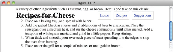
In Figure 11-7, you can see how fixed position is similar to absolute positioning — both remove the positioned element from the normal document.
For this to be a useful technique, you will have to reserve space for the positioned content, which you'll do in the following exercise.
TRY IT OUT Using Fixed Positioning
To position the page header so it remains in place even when the page scrolls, follow these steps.
- Enter the following markup:
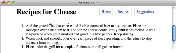
<!DOCTYPE html PUBLIC “-//W3C//DTD HTML 4.01//EN” “http://www.w3.org/TR/html4/strict.dtd”> <html lang=“en”> <head> <meta http-equiv=“Content-Type” content=“text/html; charset=utf-8”> <title>Example 11-2</title> <style type=“text/css”> body { width: 600px; margin: 1em auto; padding-top: 3em; } #header-wrapper { position: fixed; top: 0; left: 0; width: 100%; padding-bottom: 0.5em; background: #FFF; } #header { width: 600px; margin: 0 auto; } h1 { float: left; margin-top: 0.2em; } .navigation { float: right; } .navigation li { display: inline; } .navigation a { margin-left: 0.5em; padding: 0.5em; border: 1px solid #CCC; } </style> </head> <body> <div id=“header-wrapper”> <div id=“header”> <h1>Recipes for Cheese</h1> <ul class=“navigation”> <li><a href=“#”>Home</a></li> <li><a href=“#”>Recipes</a></li> <li><a href=“#”>Suggestions</a></li> </ul> </div> </div> <p class=“intro”>Cheese is a remarkably versatile food, available in literally hundreds of varieties with different flavors and textures.</p> <div class=“recipe”> <h2>Welsh Rarebit</h2> <p class=“intro”>Welsh Rarebit is a savory dish made from melted cheese, often Cheddar, on toasted bread, and a variety of other ingredients such as mustard, egg, or bacon. Here is one take on this classic.</p> <ol> <li>Lightly toast the bread</li> <li>Place on a baking tray, and spread with butter.</li> <li>Add the grated Cheddar cheese and 2 tablespoons of beer to a saucepan. Place the saucepan over a medium heat, and stir the cheese continuously until it has melted. Add a teaspoon of wholegrain mustard and grind in a little pepper. Keep stirring.</li> <li>When thick and smooth, pour over each piece of toast spreading it to the edges to stop the toast from burning.</li> <li>Place under the grill for a couple of minutes or until golden brown.</li> </ol> </div> </body> </html> - Save the preceding CSS and markup as example_11-2.html. This example results in the output in Figures 11-8 and 11-9.
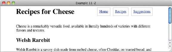
How It Works
In Figure 11-8 and Figure 11-9, you can see that with the addition of a position: fixed; declaration to the element with id header-wrapper, the page heading and navigation become fixed to the viewport.
top: 0; and left: 0; are applied to fix header-wrapper to the top left of the viewport, while width: 100%; and background: #FFF; ensure that it takes up the full width of the screen and has a solid white background to prevent other content showing through.
To reserve space in the document for the fixed content, padding is applied to the top of the body element with padding-top: 3em;. The amount of padding required is determined by the height of the content being positioned. It is best to be conservative and allow for a little more than you think. By using em units, you can be confident that if the text is resized that there will still be enough space reserved, and your fixed position element will not cover any content before the page is scrolled.
Finally, the element with the id of header is centered using width: 600px; and margin: 0 auto;.
As you can see in Figure 11-9, even when you scroll down the page, the content remains in place.
In the next section, I discuss how you can control layering of positioned elements with the z-index property.
THE Z-AXIS AND THE Z-INDEX PROPERTY
The z-index property is used to control layering of positioned elements along an invisible z-axis, which you might imagine as an invisible line coming out of the computer screen. The following table outlines the z-index property and its possible values.
| PROPERTY | VALUE |
| z-index | auto | <integer> Initial value: auto |
The z-index property controls elements' positions along the invisible z-axis, if those elements are positioned relative, absolute, or fixed. To explain how this works, I'll use the following markup with a few basic styles to make things clear:
<!DOCTYPE html PUBLIC “-//W3C//DTD HTML 4.01//EN”
    “http://www.w3.org/TR/html4/strict.dtd”>
<html lang=“en”>
<head>
    <meta http-equiv=“Content-Type” content=“text/html; charset=utf-8”>
    <title>FIGURE 11-10</title>
    <style type=“text/css”>
        div {
             width: 100px;
             height: 100px;
             border: 1px solid #000;
             font-size: 25px;
             text-align: center;
        }

        .z1 {
             background: #CC5;
        }

        .z2 {
             background: #CCF;
        }

        .z3 {
             width: 50px;
             height: 50px;
             background: #FCC;
        }

        .z4 {
             background: #5CC;
        }
      </style>
</head>
<body>

<div class=“z1”>1</div>

<div class=“z2”>
    2
    <div class=“z3”>
        3
    </div>
</div>

<div class=“z4”>4</div>

</body>
</html>
code snippet /chapter11/figure_11-10.html
This will look like Figure 11-10.
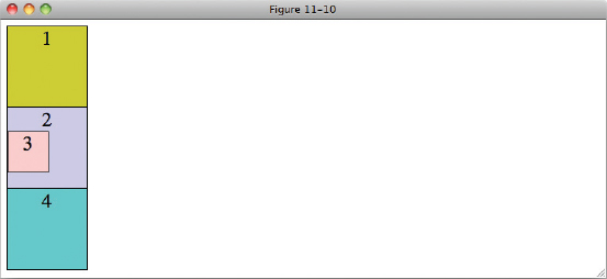
In Figure 11-10, the content is positioned much as you might expect. Each of the div elements is one after each other in order, with the nested div with class z3 inside the div with class z2. Now I'll add absolute positioning with the default z-index value of auto:
<!DOCTYPE html PUBLIC “-//W3C//DTD HTML 4.01//EN”
    “http://www.w3.org/TR/html4/strict.dtd”>
<html lang=“en”>
<head>
    <meta http-equiv=“Content-Type” content=“text/html; charset=utf-8”>
    <title>FIGURE 11-11</title>
    <style type=“text/css”>
        div {
            position: absolute;
            z-index: auto;
            width: 100px;
            height: 100px;
            border: 1px solid #000;
            font-size: 25px;
            text-align: center;
        }

       .z1 {
            top: 10px;
            left: 50px;
            background: #CC5;
        }

        .z2 {
            top: 70px;
            left: 120px;
            background: #CCF;
        }

        .z3 {
            top: -10px;
            left: -30px;
            width: 50px;
            height: 50px;
            background: #FCC;
        }

        .z4 {
            top: 90px;
            left: 30px;
            background: #5CC;
        }
    </style>
</head>
<body>

<div class=“z1”>1</div>

<div class=“z2”>
    2
    <div class=“z3”>
        3
    </div>
</div>

<div class=“z4”>4</div>

</body>
</html>
code snippet /chapter11/figure_11-11.html
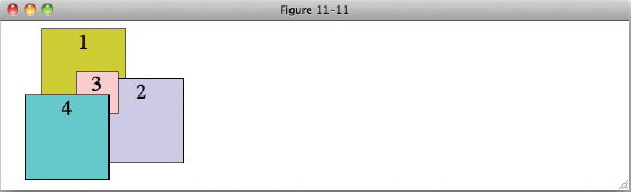
In Figure 11-11, you can see that positioned elements with the default z-index value of auto are layered over each other in order, with the first element in the source order on the bottom and each subsequent positioned element, including nested positioned elements, appearing above the previous positioned element.
You can change this stacking order using an integer value for the z-index property:
<!DOCTYPE html PUBLIC “-//W3C//DTD HTML 4.01//EN”
    “http://www.w3.org/TR/html4/strict.dtd”>
<html lang=“en”>
<head>
    <meta http-equiv=“Content-Type” content=“text/html; charset=utf-8”>
    <title>FIGURE 11-12</title>
    <style type=“text/css”>
        div {
            position: absolute;
            z-index: auto;
            width: 100px;
            height: 100px;
            border: 1px solid #000;
            font-size: 25px;
            text-align: center;
        }

        .z1 {
            top: 10px;
            left: 50px;
            background: #CC5;
        }

        .z2 {
            top: 70px;
            left: 120px;
            background: #CCF;
        }

        .z3 {
            z-index: 1;
            top: -10px;
            left: -30px;
            width: 50px;
            height: 50px;
            background: #FCC;
        }

        .z4 {
            top: 90px;
            left: 30px;
            background: #5CC;
        }
    </style>
</head>
<body>

<div class=“z1”>1</div>

<div class=“z2”>
    2
    <div class=“z3”>
        3
    </div>
</div>

<div class=“z4”>4</div>

</body>
</html>
code snippet /chapter11/figure_11-12.html
The result is shown in Figure 11-12.
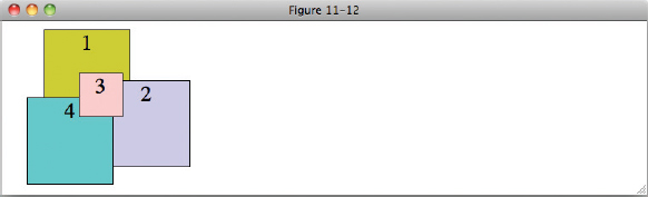
In Figure 11-12 I have added a z-index value of 1 to the div with class z3. This has had the effect of creating what is known as a stacking context, and positions the div above the other div elements with a value of auto. Only elements with an integer value z-index create stacking contexts, and to explain what that means in the next example, first I will apply an integer z-index to the fourth div:
<!DOCTYPE html PUBLIC “-//W3C//DTD HTML 4.01//EN”
    “http://www.w3.org/TR/html4/strict.dtd”>
<html lang=“en”>
<head>
    <meta http-equiv=“Content-Type” content=“text/html; charset=utf-8”>
    <title>FIGURE 11-13</title>
    <style type=“text/css”>

        div {
            position: absolute;
            z-index: auto;
            width: 100px;
            height: 100px;
            border: 1px solid #000;
            font-size: 25px;
            text-align: center;
        }

        .z1 {
            top: 10px;
            left: 50px;
            background: #CC5;
        }

        .z2 {
            top: 70px;
            left: 120px;
            background: #CCF;
        }

        .z3 {
            z-index: 1;
            top: -10px;
            left: -30px;
            width: 50px;
            height: 50px;
            background: #FCC;
        }

        .z4 {
            z-index: 3;
            top: 90px;
            left: 30px;
            background: #5CC;
        }
    </style>
</head>
<body>

<div class=“z1”>1</div>

<div class=“z2”>
    2
    <div class=“z3”>
        3
    </div>
</div>

<div class=“z4”>4</div>

</body>
</html>
code snippet /chapter11/figure_11-13.html
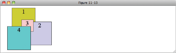
As you might expect, the fourth div in Figure 11-13 is now above the second and third div elements, as it has a z-index value of 3 compared to their values of auto and 1, respectively.
Now I'm going to add z-index values to the remaining div elements: 1 to z1, and 2 to z2. I'll also increase the z-index of z3 to 4, one higher than the z-index of z4.
<!DOCTYPE html PUBLIC “-//W3C//DTD HTML 4.01//EN”
    “http://www.w3.org/TR/html4/strict.dtd”>
<html lang=“en”>
<head>
    <meta http-equiv=“Content-Type” content=“text/html; charset=utf-8”>
    <title>FIGURE 11-14</title>
    <style type=“text/css”>
        div {
            position: absolute;
            z-index: auto;
            width: 100px;
            height: 100px;
            border: 1px solid #000;
            font-size: 25px;
            text-align: center;
        }

        .z1 {
            z-index: 1;
            top: 10px;
            left: 50px;
            background: #CC5;
        }

        .z2 {
            z-index: 2;
            top: 70px;
            left: 120px;
            background: #CCF;
        }

        .z3 {
            z-index: 4;
            top: -10px;
            left: -30px;
            width: 50px;
            height: 50px;
            background: #FCC;
        }

        .z4 {
            z-index: 3;
            top: 90px;
            left: 30px;
            background: #5CC;
        }
    </style>
</head>
<body>

<div class=“z1”>1</div>

<div class=“z2”>
    2
    <div class=“z3”>
        3
    </div>
</div>

<div class=“z4”>4</div>

</body>
</html>
code snippet /chapter11/figure_11-14.html
Figure 11-14 might not be what you expected! Although z1 and z2 are layered in the order specified by their z1 values, the fourth div is still positioned above the third div, even though it has a lower value.
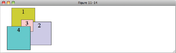
This is the stacking context in action. Because the div with class z2 is an absolutely positioned element with an integer z-index value, it creates a new stacking context. All elements within a stacking context are first layered according to the context, and then by their z-index value within the context. No elements within a stacking context will appear above the z-index of the element that created the context.
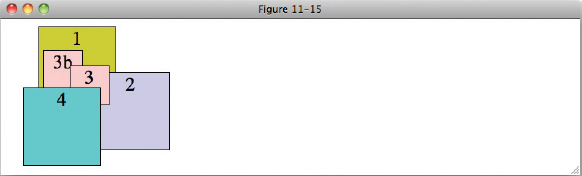
Within a static context, positioned elements behave as if elements outside of the context don't exist for stacking purposes, that is we can add another div element to the element with the class of z2 and specify the order of stacking with respect to the element with the class of z3, but not with any of the elements outside of z2:
<!DOCTYPE html PUBLIC “-//W3C//DTD HTML 4.01//EN”
    “http://www.w3.org/TR/html4/strict.dtd”>
<html lang=“en”>
<head>
    <meta http-equiv=“Content-Type” content=“text/html; charset=utf-8”>
    <title>FIGURE 11-15</title>
    <style type=“text/css”>
        div {
            position: absolute;
            z-index: auto;
            width: 100px;
            height: 100px;
            border: 1px solid #000;
            font-size: 25px;
            text-align: center;
        }

        .z1 {
            z-index: 1;
            top: 10px;
            left: 50px;
            background: #CC5;
        }

        .z2 {
            z-index: 2;
            top: 70px;
            left: 120px;
            background: #CCF;
        }

        .z3 {
            z-index: 99;
            top: -10px;
            left: -30px;
            width: 50px;
            height: 50px;
            background: #FCC;
        }

        .z3b {
            z-index: 1;
            top: -30px;
            left: -65px;
            width: 50px;
            height: 50px;
            background: #FCC;
        }

        .z4 {
            z-index: 3;
            top: 90px;
            left: 30px;
            background: #5CC;
        }
    </style>
</head>
<body>

<div class=“z1”>1</div>

<div class=“z2”>
    2
    <div class=“z3”>
        3
    </div>
    <div class=“z3b”>
        3b
    </div>
</div>

<div class=“z4”>4</div>

</body>
</html>
code snippet /chapter11/figure_11-15.html
In Figure 11-15, you can see this in action. The new div element is positioned behind its sibling as it has a lower z-index value. The third div is still not positioned above the div with the class of z3, despite having a much higher z-index value of 99.
NOTE It is easy to get to the point where you have to specify very large z-index values if you don't carefully keep control — as each new element must be placed above another, values go from 10 or less, to hundreds and then thousands! It is best to rely on management of z-index values than just having a free-for-all over which content appears on top. If you are working with other people to develop a site, decide from the start what content needs to appear on top and determine values accordingly. Remember that elements inside a stacking context are isolated from the z-index values outside the context, so you can start back at 1.
There is a good reason to keep z-index values below 100. Assistive technologies such as the speech recognition software Dragon NaturallySpeaking insert elements into the page which show the user the text that the software has recognized. These elements have a z-index of 100, so positioning content above this could interfere with your users' ability to browse your site.
The IE 6/IE 7 z-index Bug
IE 6 and IE 7 support the z-index property but with a bug that was fixed for IE 8. Positioned elements with a z-index value of auto are given a z-index value anyway, starting at 0 and increasing by 1 for each positioned element in order. This means that every positioned element generates a stacking context, as you can see in Figure 11-16 when you look at the code I showed you for Figure 11-12 in IE 6:
<!DOCTYPE html PUBLIC “-//W3C//DTD HTML 4.01//EN”
    “http://www.w3.org/TR/html4/strict.dtd”>
<html lang=“en”>
<head>
    <meta http-equiv=“Content-Type” content=“text/html; charset=utf-8”>
    <title>FIGURE 11-16</title>
    <style type=“text/css”>
        div {
            position: absolute;
            z-index: auto;
            width: 100px;
            height: 100px;
            border: 1px solid #000;
            font-size: 25px;
            text-align: center;
        }

        .z1 {
            top: 10px;
            left: 50px;
            background: #CC5;
        }

        .z2 {
            top: 70px;
            left: 120px;
            background: #CCF;
        }

        .z3 {
            z-index: 1;
            top: -10px;
            left: -30px;
            width: 50px;
            height: 50px;
            background: #FCC;
        }

        .z4 {
            top: 90px;
            left: 30px;
            background: #5CC;
        }
    </style>
</head>
<body>

<div class=“z1”>1</div>

<div class=“z2”>
    2
    <div class=“z3”>
        3
    </div>
</div>

<div class=“z4”>4</div>

</body>
</html>
code snippet /chapter11/figure_11-16.html
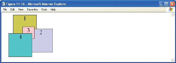
Even though only the div with the class of z3 has an integer z-index value, all of the positioned div elements have a stacking context in IE 6 and IE 7, so the third div is not stacked above the fourth as it would be in all other browsers, but within the stacking context of the second div.
Unfortunately, there is no solution to this problem, other than to be aware of the limitations that positioning has in these browsers. Most of the time when you nest positioned elements you will also want to take advantage of a new stacking context as well, so fortunately this is not as big an issue as it may seem.
EXERCISES
- What is the default value of the top, right, bottom, and left properties?
- What are offset properties used for?
- If the <body> element has a sole child that is positioned absolutely, what point of reference is used for its positioning?
- If the <body> element has a sole child that is positioned relatively, with an id name of relative-element, and that relatively positioned element has a child that is absolutely positioned, what point of reference is used for the absolutely positioned element?
- If the element from Exercise 4, relative-element, has a fixed position child, what point of reference is used for its positioning?
- You have five elements that are all absolutely positioned siblings, but no z-index is specified for any of them. In what order will they be stacked?
 WHAT YOU LEARNED IN THIS CHAPTER
In this chapter, you saw the power of positioning in web design. Positioning offers web designers solutions to challenges both simple and complex. In this chapter, you learned the following:
| TOPIC | KEY CONCEPTS |
| Absolute positioning | Absolute positioned elements are positioned relative to the viewport, by default. |
| Relative positioning | Relative positioning allows you to change the point of reference used for absolute positioning. In addition, the four offset properties can be used on relatively positioned content to adjust its position with respect to its static origin. |
| Fixed positioning | Fixed position elements remain in the same place when a document is scrolled, and fixed position elements are always positioned relative to the viewport. |
| z-index | By default, elements are stacked in ascending order, but this layering can be controlled with the z-index property. |