15
Styling for Print
WHAT YOU WILL LEARN IN THIS CHAPTER:
- The benefits of print style sheets
- Applying styles based on media types
- Controlling page breaks
- The content property in print
You can use a specific style sheet to style content for print. In Chapter 2, you saw the differences between length units used for a computer screen and length units used for print. This is one of the key reasons that separate style sheets for print exist. Specifying measurements designated for computer screens, such as pixel units, can potentially be inconsistent in printed documents, whereas real-world, absolute length units, such as inches, centimeters, points, and so on are ideally suited for print.
BENEFITS OF PRINT STYLE SHEETS
A style sheet written explicitly for print enables developers to exclude irrelevant portions of a web document from the printed version. For example, no document navigation is required in a printed version. Additionally, because color documents have some expense associated with them, depending on the type of printer and what type of ink or toner the printer uses, it is also often better to exclude background images or other aspects of the design that result in greater consumption of expensive ink or toner. For these reasons, print versions of web documents are often simplified to simple black and white productions of the original document. Only foreground images relevant to the document are retained. In fact browsers, by default, strip out all background images and background color; to print these, the user must specifically enable them before printing.
CSS provides several properties for controlling the presentation of paged media, such things as where page breaks occur, the size of the page margins, and the size of the page itself. At the time of this writing, a sparse selection of those properties is actually implemented in current browsers, and there is no sign that browsers are going to improve any time soon.
APPLYING STYLES BASED ON MEDIA
In order to print in CSS, you need a way of differentiating styles intended for print from styles intended for the computer screen. CSS can apply to a variety of documents, not just HTML, and CSS can be used on a variety of different devices and media.
To target different media, you use the media attribute, which is applied to the <link/> element, or the <style> element. Or, from within a style sheet, you can target different media using @media rules. You see examples of these later in this section. First, let's examine the different types of media that CSS can theoretically be applied to. The different types of media are outlined in the following table.
| MEDIA | PURPOSE |
| all | Suitable for all devices |
| braille | Intended for Braille tactical feedback devices |
| embossed | Intended for paged Braille printers |
| handheld | Intended for handheld devices |
| Intended for presentation to a printer (in a browser, use print preview to view the print style sheet.) | |
| projection | Intended for projected presentations |
| screen | Intended for presentation on a color computer screen |
| speech | aural | Intended for presentation to a speech synthesizer (called aural in CSS 2, changed to speech in CSS 2.1) |
| tty | Intended for media using a fixed-pitch character grid (such as teletypes, terminals, or portable devices with limited display capabilities) |
| tv | Intended for television (low resolution, low color, limited scrollability) |
The default value is all.
 NOTE Only screen, print, and all values are widely supported in desktop browsers.
As you can see in the preceding table, CSS can target a wide variety of media types. For this chapter, you need only be concerned with the screen, print, and all media. Each medium can be supplied as a value to the media attribute. For example, if you wanted a style sheet to apply only to styles presented in a PC or Mac browser, or smartphone browsers such as those on iPhone or Android devices, you would add the attribute media= “screen” to either the <link /> or <style> elements:
<style type=“text/css” media=“screen”></style>

<link rel=“stylesheet” type=“text/css” href=“print.css” media=“print”>
The following Try It Out shows the media attribute in action.
TRY IT OUT Applying Styles for Print
To use a direct child selector, follow these steps.
- Enter the following markup:
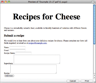
<!DOCTYPE html PUBLIC “-//W3C//DTD HTML 4.01//EN” “http://www.w3.org/TR/html4/strict.dtd”> <html lang=“en”> <head> <meta http-equiv=“Content-Type” content=“text/html; charset=utf-8”> <title>Example 15-2</title> <style type=“text/css” media=“print”> label { float: left; display: block; width: 3cm; } input { width: 7cm; border: none; border-bottom: 1px solid #000; } textarea { display: block; width: 10cm; height: 6cm; margin-top: 1cm; border-bottom: 1px solid #000; } form div { overflow: hidden; margin: 0.5cm 0; } .submit { display: none; } </style> </head> <body> <h1>Recipes for Cheese</h1> <p class=“intro”>Cheese is a remarkably versatile food, available in literally hundreds of varieties with different flavors and textures.</p> <div class=“content”> <h2>Submit a recipe</h2> <p class=“intro”>We would love to hear from you about your delicious recipes for cheese. Please complete our form (all fields required) or email us at <a href=“mailto:[email protected]”>[email protected]</a>.</p> <form method=“post” action=“”> <div> <label for=“submit-name”>Name</label> <input type=“text” name=“name” id=“submit-name”> </div> <div> <label for=“submit-email”>Email</label> <input type=“text” name=“email” id=“submit-email”> </div> <div> <label for=“submit-recipe-name”>Recipe Name</label> <input type=“text” name=“recipe-name” id=“submit-recipe-name”> </div> <div> <label for=“submit-ingredients”>Ingredients</label> <textarea name=“ingredients” id=“submit-ingredients” rows=“5” cols=“50”></textarea> </div> <div> <label for=“submit-recipe”>Recipe</label> <textarea name=“recipe” id=“submit-recipe” rows=“5” cols=“50”></textarea> </div> <div class=“submit”> <input type=“submit” value=“Send recipe”> </div> </form> </div> </body> </html> - Save the preceding CSS and markup as example_15-1.html. This example results in the output in Figure 15-1.
- In your browser menu, select the print command, and, when given the option, select preview. This will show you what the page will look like when it is printed, and is a much cheaper way to test than to print each page out every time you make a change. You will see output similar to that in Figure 15-2.


How It Works
In Example 15-1, you applied your styles to print only by adding a media attribute with a value of print to your style element.
In Figure 15-1 you can see that the page in our browser just has the browser default styling; but for print, shown in Figure 15-2, you have used a variety of familiar properties to position the form labels and give your input and textarea elements styles that you would expect in a printed document.
You have also hidden the div that contains the submit input because this is content that does not make sense outside of a web browser.
CONTROLLING STYLES FOR MEDIA WITHIN A STYLE SHEET
Another way to target styles for a particular media type is the @media rule. This is used within a style sheet to enclose rules where you can make style sheet adjustments based on medium, for example:
@media print {
    h1 {
        font-size: 50pt;
        text-align: center;
    }
}
You can see that a new syntax is enclosing the two rules that refer to the body element; these are the @media rules. The top @media rule applies to onscreen display, and the bottom @media rule applies to print display.
NOTE It is widely thought that most people find sans-serif fonts more readable on screen but serif fonts more readable in print. This is why most websites use a sans-serif font for body copy whereas most books and newspapers are printed with a serif font.
In the following Try It Out, you review @media rules.
TRY IT OUT Applying Styles for Print
To use a direct child selector, follow these steps.
- Enter the following markup:
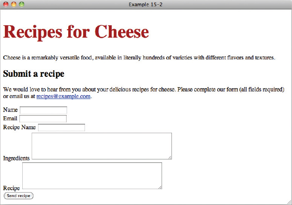
<!DOCTYPE html PUBLIC “-//W3C//DTD HTML 4.01//EN” “http://www.w3.org/TR/html4/strict.dtd”> <html lang=“en”> <head> <meta http-equiv=“Content-Type” content=“text/html; charset=utf-8”> <title>Example 15-2</title> <style type=“text/css”> @media screen { h1 { font-size: 3em; color: #A00; } } @media print { h1 { font-size: 50pt; text-align: center; } } </style> </head> <body> <h1>Recipes for Cheese</h1> <p class=“intro”>Cheese is a remarkably versatile food, available in literally hundreds of varieties with different flavors and textures.</p> <div class=“content”> <h2>Submit a recipe</h2> <p class=“intro”>We would love to hear from you about your delicious recipes for cheese. Please complete our form (all fields required) or email us at <a href=“mailto:[email protected]”>[email protected]</a>.</p> <form method=“post” action=“”> <div> <label for=“submit-name”>Name</label> <input type=“text” name=“name” id=“submit-name”> </div> <div> <label for=“submit-email”>Email</label> <input type=“text” name=“email” id=“submit-email”> </div> <div> <label for=“submit-recipe-name”>Recipe Name</label> <input type=“text” name=“recipe-name” id=“submit-recipe-name”> </div> <div> <label for=“submit-ingredients”>Ingredients</label> <textarea name=“ingredients” id=“submit-ingredients” rows=“5” cols=“50”></textarea> </div> <div> <label for=“submit-recipe”>Recipe</label> <textarea name=“recipe” id=“submit-recipe” rows=“5” cols=“50”></textarea> </div> <div class=“submit”> <input type=“submit” value=“Send recipe”> </div> </form> </div> </body> </html> - Save the preceding CSS and markup as example_15-2.html. This example results in the output in Figure 15-3.
- In your browser menu, select the print command, and, when given the option, select preview. You will see output similar to that in Figure 15-4.
How It Works
In Example 15-2, you applied separate styles to screen and print using @media rules.
In Figure 15-3 you can see that the page in our browser shows that the font-size: 3em; and color: #A00; declarations have been picked up, making the h1 larger and dark red in color. This is because this rule is itself wrapped in an @media screen rule.
In Figure 15-4, you will see that the same h1 element has not been made red by the previous rule, but that the font-size: 50pt; and text-align: center; declarations have been picked up, making the h1 even larger and the text centered. This rule is wrapped in an @media screen rule, meaning that the styles will only apply in print.
In the next section, I describe how to control page breaks in printed content.
CONTROLLING PAGE BREAKS
Two print properties, or paged media properties, as they are referred to by the W3C, that all popular browsers have in common are page-break-before and page-break-after. These properties are outlined in the following table.
| PROPERTY | VALUE |
| page-break-before | auto | always | avoid | left | right Initial value: auto |
| page-break-after | auto | always | avoid | left | right Initial value: auto |
The page-break-before and page-break-after properties dictate where a page break should be made depending on where an element appears in a document.
NOTE The only keywords reliably supported across all browsers are always and auto.
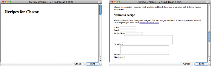
A value of always for page-break-before and page-break-after means that a page break must occur before or after the selected block level elements generated box (for example, the following declaration will force a page break after the element, as you will see in Figure 15-5 when you apply the following rule):

<!DOCTYPE html PUBLIC “-//W3C//DTD HTML 4.01//EN”
    “http://www.w3.org/TR/html4/strict.dtd”>
<html lang=“en”>
<head>
    <meta http-equiv=“Content-Type” content=“text/html; charset=utf-8”>
    <title>Figure 15-5</title>
    <style type=“text/css” media=“print”>
        h1 {
            page-break-after: always;
        }
    </style>
</head>
<body>

<h1>Recipes for Cheese</h1>

<p class=“intro”>Cheese is a remarkably versatile food, available in literally
hundreds of varieties with different flavors and textures.</p>

<div class=“content”>

    <h2>Submit a recipe</h2>

    <p class=“intro”>We would love to hear from you about your delicious recipes
    for cheese. Please complete our form (all fields required) or email us at
    <a href=“mailto:[email protected]”>[email protected]</a>.</p>

    <form method=“post” action=“”>
        <div>
            <label for=“submit-name”>Name</label>
            <input type=“text” name=“name” id=“submit-name”>
        </div>
        <div>
            <label for=“submit-email”>Email</label>
            <input type=“text” name=“email” id=“submit-email”>
        </div>
        <div>
            <label for=“submit-recipe-name”>Recipe Name</label>
            <input type=“text” name=“recipe-name” id=“submit-recipe-name”>
        </div>
        <div>
            <label for=“submit-ingredients”>Ingredients</label>
            <textarea name=“ingredients” id=“submit-ingredients” rows=“5”
            cols=“50”></textarea>
        </div>
        <div>
            <label for=“submit-recipe”>Recipe</label>
            <textarea name=“recipe” id=“submit-recipe” rows=“5”
            cols=“50”></textarea>
        </div>
        <div class=“submit”>
            <input type=“submit” value=“Send recipe”>
        </div>
    </form>

</div>

</body>
</html>
code snippet /chapter15/figure_15-5.html
In the style sheet that you see in Figure 15-5, you apply the declaration page-break-after: always; to the h1 element, forcing a page break after the h1 so that subsequent content appears on a new page.
The page-break-before property works the same way as page-break-after, but it forces a page break before an element.
THE CONTENT PROPERTY
The content property is a way for us to insert content into a page using CSS. This content is not strictly part of the page, so it is not accessible to most assistive technology such as screen readers, which read out the content of pages. While it has applications beyond print that are outside of the scope of this book, it has one particular use which warrants its inclusion here.
NOTE All major browsers except for IE 6 support the content property.
There is one interesting trick you can use when printing web pages that makes use of the content property that I will cover in brief.
One of the main drawbacks of printing web pages is that, by default, the URLs of any links are lost to us; for example:
<h1><a href=“/”>Recipes for Cheese</a></h1>
This results in Figure 15-6

You can guess from the style of the heading that this is a link, but there is no way other than going back to the site in your browser of knowing where the link goes. With a little bit of CSS magic, you can fix this problem:
<!DOCTYPE html PUBLIC “-//W3C//DTD HTML 4.01//EN”
    “http://www.w3.org/TR/html4/strict.dtd”>
<html lang=“en”>
<head>
    <meta http-equiv=“Content-Type” content=“text/html; charset=utf-8”>
    <title>FIGURE 15-7</title>
    <style type=“text/css” media=“print”>
        a:link:after,
        a:link:after {
          content: “ (http://example.com“ attr(href) ”) ”;
        }
    </style>
</head>
<body>

<h1><a href=“/”>Recipes for Cheese</a></h1>

<p class=“intro”>Cheese is a remarkably versatile food, available in literally
hundreds of varieties with different flavors and textures.</p>

<div class=“content”>

    <h2>Submit a recipe</h2>

</div>

</body>
</html>
code snippet /chapter15/figure_15-7.html
This results in Figure 15-7.
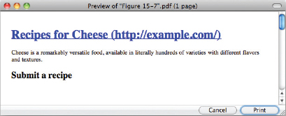
As you can see, the text is now followed by the URL of the link. This makes use of the :after pseudo-class, which allows us to insert content using the content property. attr(href) takes the href property from our link and uses it in the content. We prefix it with the domain our site is hosted on (here I've used http://example.com), and added some brackets to separate the link from the main text.
Don't worry if this is hard to understand; this is code that you can copy and paste to your own print style sheets. I hope it will encourage you to delve deeper into CSS to find further useful tricks.
EXERCISES
- Which media values apply to desktop browsers?
- Write the opening tag for the <style> element, targeting the styles to print.
- What does the page-break-before property do?
- Write a sample style sheet that includes three rules; the first rule applies to all media types, the second rule applies to onscreen layout, and the third applies to print.
 WHAT YOU LEARNED IN THIS CHAPTER
In this chapter, I showed you what is possible with advanced CSS selectors. You learned the following:
| TOPIC | KEY CONCEPTS |
| Applying styles for a specific media type | Use the media property on style and link elements, or the @media rule within style sheets. |
| Controlling page breaks when printing | You can use page-break-before and page-break-after to specify where page breaks should be made. |
| Inserting content with CSS | Use the content property to add content such as the URLs for links when printing. |