8
The Box Model: Controlling Margins, Borders, Padding, Width, and Height
WHAT YOU WILL LEARN IN THIS CHAPTER:
- The box model
- Setting margins
- Setting padding
- Setting borders
- Setting width and height
- Specifying minimum and maximum width and height
- Determining how overflowing content behaves
In this chapter, I discuss one of the most important concepts in CSS-based web design, the box model. The box model is a set of rules that dictate how width, height, padding, borders, and margin are measured on HTML elements. We'll start with an overview of what the box model is.
OVERVIEW
The CSS box model is a collection of properties that define the amount of space around an element, its dimensions, its margins, its borders, and padding between the content of the element and the borders. In Figure 8-1, you see a diagram of the box model.
In Figure 8-1 you see what the different components that come together to make the box model look like. Around the outside of an element is space called the margin, inside of the margin is the border, inside of the border is the padding, and inside of the padding is the content of the element.
In the coming sections, I pick apart the various properties that comprise the box model in CSS, beginning with margin.
MARGINS
The margin property applies space outside the box, between the box and the browser window, or between the box and the other elements in the document. The following table shows the various margin properties.
| PROPERTY | VALUE |
| margin | [ <length> | <percentage> | auto ] {1,4} |
| margin-top margin-right margin-bottom margin-left |
<length> | <percentage> | auto |
The margin property is a shorthand property for the four individual margin properties, margin-top, margin-right, margin-bottom, and margin-left.
 Note Box model shorthand properties are always specified in a clockwise order, from the top: top, right, bottom, and left.
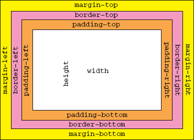
margin Property with Four Values
The following code shows a comparison between individual margin properties.
<!DOCTYPE html PUBLIC “-//W3C//DTD HTML 4.01//EN”
    “http://www.w3.org/TR/html4/strict.dtd”>
<html lang=“en”>
<head>
    <meta http-equiv=“Content-Type” content=“text/html; charset=utf-8”>
    <title>FIGURE 8-2</title>
    <style type=“text/css”>
        .intro {
            margin-top: 70px;
            margin-left: 100px;
            margin-bottom: 50px;
            margin-right: 100px;
        }
    </style>
</head>
<body>

<h1>Recipes for Cheese</h1>

<p class=“intro”>Cheese is a remarkably versatile food, available in literally
hundreds of varieties with different flavors and textures.</p>

<div class=“recipe”>

    <h2>Welsh Rarebit</h2>

    <p class=“intro”>Welsh Rarebit is a savory dish made from melted cheese, often
    Cheddar, on toasted bread, and a variety of other ingredients such as mustard,
    egg, or bacon. Here is one take on this classic.</p>

    <ol>
        <li>Lightly toast the bread</li>
        <li>Place on a baking tray, and spread with butter.</li>
        <li>Add the grated Cheddar cheese and 2 tablespoons of beer to a saucepan.
        Place the saucepan over a medium heat, and stir the cheese continuously
        until it has melted. Add a teaspoon of wholegrain mustard and grind in
        a little pepper. Keep stirring.</li>
        <li>When thick and smooth, pour over each piece of toast spreading it to
        the edges to stop the toast from burning.</li>
        <li>Place under the grill for a couple of minutes or until golden
        brown.</li>
    </ol>

</div>

</body>
</html>
code snippet /chapter8/figure_8-2.html
This CSS and markup results in the output you see in Figure 8-2.
As you can see, there is a 70px margin above the intro paragraph, 100px left and right margins, and there is a 50px margin between the intro paragraph and the next heading.
The four declarations in the .intro rule could be combined into one as follows:
margin : 70px 100px 50px 100px;
margin Property with Three Values
In Figure 8-2, you saw an example of specifying margin using four values, but because the left and right margin values are the same, you can also specify only three values for the margin shorthand property. The same declaration can be written as:
margin : 70px 100px 50px;
 WARNING Box model shorthand properties with three values always follow the convention top, right and left, bottom.
The first value is the top value as usual, the second is the value for both left and right margins, and the third is the value for the bottom margin. It is common to want equal left and right margins, and this makes it easy to do, especially if you need to change the value later as you won't forget the other.
WARNING Because it can be easy to confuse the order in which values in the three value form should come, you won't see it used as much as the four or two value versions.
Although, as mentioned, there is a benefit to using the three value form, I recommend against its use for this reason.
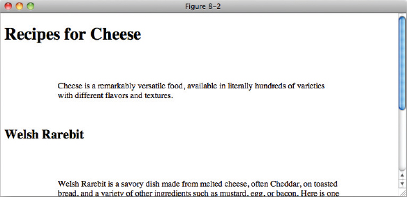
margin Property with Two Values
The margin shorthand property also supports two values. When two values are specified, the first value refers to the top and bottom sides, and the second value refers to the right and left sides. This is demonstrated in Figure 8-3.

<!DOCTYPE html PUBLIC “-//W3C//DTD HTML 4.01//EN”
    “http://www.w3.org/TR/html4/strict.dtd”>
<html lang=“en”>
<head>
    <meta http-equiv=“Content-Type” content=“text/html; charset=utf-8”>
    <title>FIGURE 8-3</title>
    <style type=“text/css”>
        .intro {
            margin: 50px 100px;
        }
    </style>
</head>
<body>

<h1>Recipes for Cheese</h1>

<p class=“intro”>Cheese is a remarkably versatile food, available in literally
hundreds of varieties with different flavors and textures.</p>

<div class=“recipe”>

    <h2>Welsh Rarebit</h2>

    <p class=“intro”>Welsh Rarebit is a savory dish made from melted cheese, often
    Cheddar, on toasted bread, and a variety of other ingredients such as mustard,
    egg, or bacon. Here is one take on this classic.</p>

    <ol>
        <li>Lightly toast the bread</li>
        <li>Place on a baking tray, and spread with butter.</li>
        <li>Add the grated Cheddar cheese and 2 tablespoons of beer to a saucepan.
        Place the saucepan over a medium heat, and stir the cheese continuously
        until it has melted. Add a teaspoon of wholegrain mustard and grind in
        a little pepper. Keep stirring.</li>
        <li>When thick and smooth, pour over each piece of toast spreading it to
        the edges to stop the toast from burning.</li>
        <li>Place under the grill for a couple of minutes or until golden
        brown.</li>
    </ol>

</div>

</body>
</html>
code snippet /chapter8/figure_8-3.html
This CSS and markup results in the output you see in Figure 8-3.
Note Box model shorthand properties with two values always follow the convention top and bottom, right and left — for example, margin: 15px 10px;.
margin Property with One Value
You can specify just one value for the margin property, which simultaneously sets all four sides of an element's margin to the same value.
margin : 50px;
Margin Collapsing
In CSS, margin collapsing occurs when the top or bottom margin of one element comes into contact with the top or bottom margin of another element. Only vertical margins collapse, horizontal margins do not. The concept is simple: when two margins are collapsed, the distance between the two boxes will use whichever margin value is greater. Margin collapsing is demonstrated in the following code.
<!DOCTYPE html PUBLIC “-//W3C//DTD HTML 4.01//EN”
    “http://www.w3.org/TR/html4/strict.dtd”>
<html lang=“en”>
<head>
    <meta http-equiv=“Content-Type” content=“text/html; charset=utf-8”>
    <title>FIGURE 8-4</title>
    <style type=“text/css”>
        .h1 {
            margin-bottom: 100px;
        }

        .intro {
            margin-top: 100px;
        }
    </style>
</head>
<body>

<h1>Recipes for Cheese</h1>

<p class=“intro”>Cheese is a remarkably versatile food, available in literally
hundreds of varieties with different flavors and textures.</p>

</body>
</html>
code snippet /chapter8/figure_8-4.html
This CSS and markup results in the output you see in Figure 8-4.
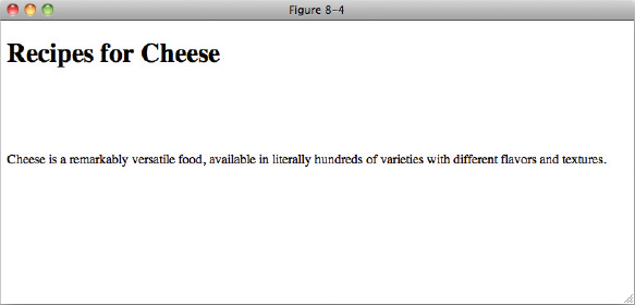
In Figure 8-4, you see the most common form of margin collapsing; the top margin of one element comes into contact with the bottom margin of another element. When this happens, the element with the bigger margin wins.
Margin collapsing also happens when an element is contained inside of another element. It doesn't matter where the two margins come into contact, even an element inside of another element will margin collapse with its parent if the two margins come into contact. An example of this appears in the following code.
<!DOCTYPE html PUBLIC “-//W3C//DTD HTML 4.01//EN”
    “http://www.w3.org/TR/html4/strict.dtd”>
<html lang=“en”>
<head>
    <meta http-equiv=“Content-Type” content=“text/html; charset=utf-8”>
    <title>FIGURE 8-5</title>
    <style type=“text/css”>
        h2 {
            margin-top: 50px;
        }

        .recipe {
            margin-top: 50px;
        }
    </style>
</head>
<body>

<h1>Recipes for Cheese</h1>

<p class=“intro”>Cheese is a remarkably versatile food, available in literally
hundreds of varieties with different flavors and textures.</p>

<div class=“recipe”>

    <h2>Welsh Rarebit</h2>

    <p class=“intro”>Welsh Rarebit is a savory dish made from melted cheese, often
    Cheddar, on toasted bread, and a variety of other ingredients such as mustard,
    egg, or bacon. Here is one take on this classic.</p>

    <ol>
        <li>Lightly toast the bread</li>
        <li>Place on a baking tray, and spread with butter.</li>
        <li>Add the grated Cheddar cheese and 2 tablespoons of beer to a saucepan.
        Place the saucepan over a medium heat, and stir the cheese continuously
        until it has melted. Add a teaspoon of wholegrain mustard and grind in
        a little pepper. Keep stirring.</li>
        <li>When thick and smooth, pour over each piece of toast spreading it to
        the edges to stop the toast from burning.</li>
        <li>Place under the grill for a couple of minutes or until golden
        brown.</li>
    </ol>

</div>

</body>
</html>
code snippet /chapter8/figure_8-5.html
This CSS and markup results in the output you see in Figure 8-5.
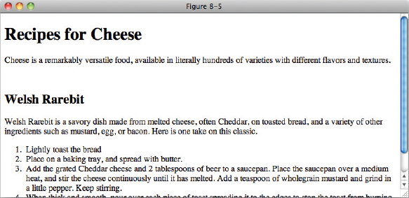
In Figure 8-5, you see how margin collapsing works between a parent and child element. If a child's margin comes into direct contact with the margin of a parent, the margins collapse. Like the example in Figure 8-4 that contained adjacent sibling margins collapsing, the larger margin is the winning margin. The winning margin is always applied to the parent element, and the child element's margin always collapses. In this scenario, margin collapsing can be stopped if you prevent the two margins from coming into contact with one another. You can prevent the two margins from coming into contact with one another by applying padding or a border to the parent element. An example of this appears in the following snippet.
<!DOCTYPE html PUBLIC “-//W3C//DTD HTML 4.01//EN”
    “http://www.w3.org/TR/html4/strict.dtd”>
<html lang=“en”>
<head>
    <meta http-equiv=“Content-Type” content=“text/html; charset=utf-8”>
    <title>FIGURE 8-6</title>
    <style type=“text/css”>
        h2 {
            margin-top: 50px;
        }

        .recipe {
            margin-top: 50px;
            border-top: 1px solid #000;
        }
    </style>
</head>
<body>

<h1>Recipes for Cheese</h1>

<p class=“intro”>Cheese is a remarkably versatile food, available in literally
hundreds of varieties with different flavors and textures.</p>

<div class=“recipe”>

    <h2>Welsh Rarebit</h2>

    <p class=“intro”>Welsh Rarebit is a savory dish made from melted cheese, often
    Cheddar, on toasted bread, and a variety of other ingredients such as mustard,
    egg, or bacon. Here is one take on this classic.</p>

    <ol>
        <li>Lightly toast the bread</li>
        <li>Place on a baking tray, and spread with butter.</li>
        <li>Add the grated Cheddar cheese and 2 tablespoons of beer to a saucepan.
        Place the saucepan over a medium heat, and stir the cheese continuously
        until it has melted. Add a teaspoon of wholegrain mustard and grind in
        a little pepper. Keep stirring.</li>
        <li>When thick and smooth, pour over each piece of toast spreading it to
        the edges to stop the toast from burning.</li>
        <li>Place under the grill for a couple of minutes or until golden
        brown.</li>
    </ol>

</div>

</body>
</html>
code snippet /chapter8/figure_8-6.html
This CSS and markup results in the output you see in Figure 8-6.
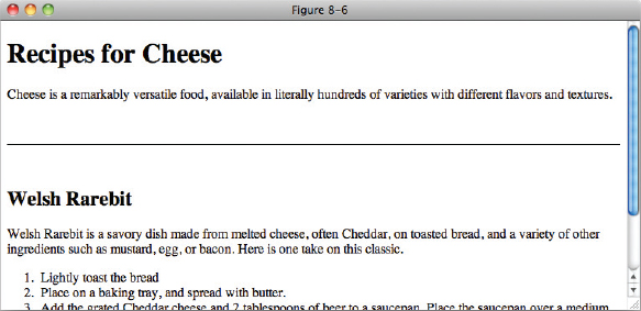
In Figure 8-6, you see how to stop margin collapsing from happening. You must give the parent element a border or padding to prevent the top and bottom margin of the child element from coming into contact with the top and bottom margin of the parent element.
Horizontally Aligning Elements with the margin Property
The margin property has one other useful function: It can be used to center or align elements. An example of this concept appears in the following code.
<!DOCTYPE html PUBLIC “-//W3C//DTD HTML 4.01//EN”
    “http://www.w3.org/TR/html4/strict.dtd”>
<html lang=“en”>
<head>
    <meta http-equiv=“Content-Type” content=“text/html; charset=utf-8”>
    <title>FIGURE 8-7</title>
    <style type=“text/css”>
        h1 {
            width: 200px;
            margin-right: auto;
        }

        .intro {
            width: 200px;
            margin-right: auto;
            margin-left: auto;
        }

        .recipe {
            width: 200px;
            margin-left: auto;
        }
    </style>
</head>
<body>

<h1>Recipes for Cheese</h1>

<p class=“intro”>Cheese is a remarkably versatile food, available in literally
hundreds of varieties with different flavors and textures.</p>

<div class=“recipe”>

    <h2>Welsh Rarebit</h2>

    <p class=“intro”>Welsh Rarebit is a savory dish made from melted cheese, often
    Cheddar, on toasted bread, and a variety of other ingredients such as mustard,
    egg, or bacon. Here is one take on this classic.</p>

    <ol>
        <li>Lightly toast the bread</li>
        <li>Place on a baking tray, and spread with butter.</li>
        <li>Add the grated Cheddar cheese and 2 tablespoons of beer to a saucepan.
        Place the saucepan over a medium heat, and stir the cheese continuously
        until it has melted. Add a teaspoon of wholegrain mustard and grind in
        a little pepper. Keep stirring.</li>
        <li>When thick and smooth, pour over each piece of toast spreading it to
        the edges to stop the toast from burning.</li>
        <li>Place under the grill for a couple of minutes or until golden
        brown.</li>
    </ol>

</div>

</body>
</html>
code snippet /chapter8/figure_8-7.html
This CSS and markup results in the output you see in Figure 8-7.
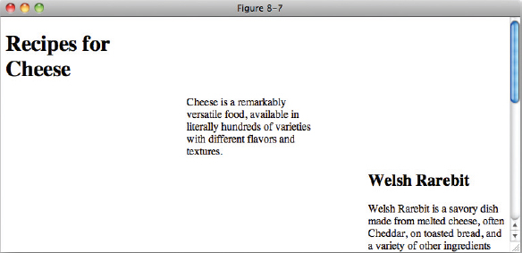
In Figure 8-7, you see a technique used to align elements in a document via the combination of the auto keyword with the left or right margin of an element. The margin that is specified must be either the left or the right margin, because the auto keyword is ignored when applied to the top or bottom margin.
ALIGNING ELEMENTS IN IE QUIRKS RENDERING MODE
Every modern browser today supports the DOCTYPE switch, a method of selecting the rendering mode of your browser based on the Document Type Declaration that appears at the top of an HTML document. If you structure your documents like the examples you see here in this book, you'll never encounter quirks rendering mode, but if you are working with legacy websites that must maintain backward compatibility with the Web of yesterday, chances are you'll encounter a quirks mode site sooner or later.
If you encounter quirks mode, you'll also discover that some CSS features don't work in quirks mode, but do work in standards mode. Aligning an element using the auto keyword in conjunction with the margin property is one such quirks mode incompatibility. In IE, this feature is only implemented in standards mode.
There is a workaround due to a bug in IE, using the text-align property on an element with values of left, center and right as appropriate.
The following Try It Out shows you how to center a page with the margin property.
TRY IT OUT Center a Page with the margin Property
To see the margin property in action, follow these steps.
- Enter the following markup:
<!DOCTYPE html PUBLIC “-//W3C//DTD HTML 4.01//EN” “http://www.w3.org/TR/html4/strict.dtd”> <html lang=“en”> <head> <meta http-equiv=“Content-Type” content=“text/html; charset=utf-8”> <title>Example 8-1</title> <style type=“text/css”> body { width: 600px; margin: 1em auto; } </style> </head> <body> <h1>Recipes for Cheese</h1> <p class=“intro”>Cheese is a remarkably versatile food, available in literally hundreds of varieties with different flavors and textures.</p> <div class=“recipe”> <h2>Welsh Rarebit</h2> <p class=“intro”>Welsh Rarebit is a savory dish made from melted cheese, often cheddar, on toasted bread, and a variety of other ingredients such as mustard, egg, or bacon. Here is one take on this classic.</p> <ol> <li>Lightly toast the bread</li> <li>Place on a baking tray, and spread with butter.</li> <li>Add the grated cheddar cheese and 2 tablespoons of beer to a saucepan. Place the saucepan over a medium heat, and stir the cheese continuously until it has melted. Add a teaspoon of wholegrain mustard and grind in a little pepper. Keep stirring.</li> <li>When thick and smooth, pour over each piece of toast spreading it to the edges to stop the toast from burning.</li> <li>Place under the grill for a couple of minutes or until golden brown.</li> </ol> </div> </body> </html> - Save the preceding CSS and markup as example_8-1.html. This example results in the output in Figure 8-8.
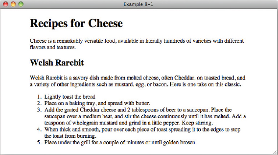
In Example 8-1, you set the margin of the body element to have values of 1em for top and bottom and auto for left and right. Combined with a width this has the consequence of centering the body with the document.
In the next section I discuss the box model properties that control borders.
BORDERS
Borders appear between the margin and padding in the box model depicted in Figure 8-1. Borders put lines around boxes. Applying borders usually makes the other box model properties easier to see. The following sections examine each border property.
border-width
The border-width properties all control the width of a box border in some fashion. The following table outlines each border-width property.
| PROPERTY | VALUE |
| border-top-width border-right-width border-bottom-width border-left-width |
<border-width> Initial value: medium |
| border-width | <border-width> {1,4} Initial value: medium |
| A <border-width> value refers to one of the following: thin | medium | thick | <length> | |
The individual border-top-width, border-right-width, border-bottom-width, and border-left-width properties exist for setting the width of the individual sides of a box. Each of these properties can be combined into the single border-width shorthand property.
Borders aren't allowed to have percentage values; however, they are capable of accepting any length measurement supported by CSS (em, pixel, centimeter, and so on). In addition to length units, the border width may also be specified using one of three keywords: thin, medium, and thick. These are rarely (if ever) used in professional code, however.
Most commonly the border-width properties will be given a length value in pixels. An example of this concept appears in the following snippet.
<!DOCTYPE html PUBLIC “-//W3C//DTD HTML 4.01//EN”
    “http://www.w3.org/TR/html4/strict.dtd”>
<html lang=“en”>
<head>
    <meta http-equiv=“Content-Type” content=“text/html; charset=utf-8”>
    <title>FIGURE 8-9</title>
    <style type=“text/css”>
        .intro {
            border-top-width: 1px;
            border-right-width: 3px;
            border-bottom-width: 5px;
            border-left-width: 7px;
            border-style: solid;
        }
    </style>
</head>
<body>

<h1>Recipes for Cheese</h1>

<p class=“intro”>Cheese is a remarkably versatile food, available in literally
hundreds of varieties with different flavors and textures.</p>

</body>
</html>
code snippet /chapter8/figure_8-9.html
This CSS and markup results in the output you see in Figure 8-9.
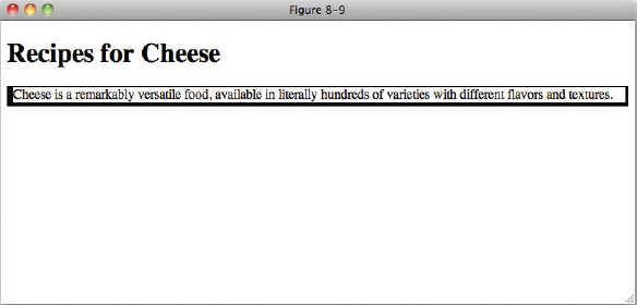
This could also be expressed as:
border-width : 1px 3px 5px 7px;
Three-value, two-value, and one-value shorthand syntax is also supported.
In the next section I discuss the border-style property, and how it is used to change the style of border.
border-style
You use the border-style property to specify the style of border to be used. The border-style property is very similar to the border-width property presented in the previous section in that it uses an identical syntax to specify the style of border to be used for each side of the box. The following table outlines the border-style family of properties.
| PROPERTY | VALUE |
| border-style A <border-style> value refers to one of the following: none | hidden | dotted | dashed | solid | double | groove | ridge | inset | outset |
<border-style> {1,4} Initial value: none |
| border-top-style border-right-style border-bottom-style border-left-style |
<border-style> Initial value: none |
Like the border-width property, the border-style property is also a shorthand property, which combines the individual border-top-style, border-right-style, border-bottom-style, and border-left-style properties into the single border-style property. The following code shows the rendered representation of some of the border-style keywords.
<!DOCTYPE html PUBLIC “-//W3C//DTD HTML 4.01//EN”
    “http://www.w3.org/TR/html4/strict.dtd”>
<html lang=“en”>
<head>
    <meta http-equiv=“Content-Type” content=“text/html; charset=utf-8”>
    <title>FIGURE 8-10</title>
    <style type=“text/css”>
        body {
            border-width: 3px;
            border-top-style: ridge;
            border-right-style: dashed;
            border-bottom-style: dotted;
            border-left-style: double;
        }
    </style>
</head>
<body>

<h1>Recipes for Cheese</h1>

<p class=“intro”>Cheese is a remarkably versatile food, available in literally
hundreds of varieties with different flavors and textures.</p>

</body>
</html>
code snippet /chapter8/figure_8-10.html
This CSS and markup results in the output you see in Figure 8-10.
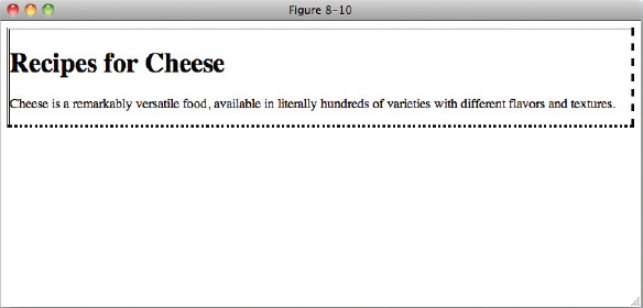
Like the border-width property, the border-style property can accept up to four values to specify the style for each side of the box:
border-style : ridge dashed dotted double;
As is the case for the margin and border-width properties, the shorthand is specified as top, right, bottom, and left, and border-style also supports the three-value, two-value, and one-value shorthand syntax as the border-width and margin properties.
border-color
The border-color property is yet another shorthand property. Like the border-style and border-width properties, you can use border-color to control how a border is styled. The border-color property, as you may have guessed, specifies the border color for each side of the box. The following table outlines the border-color family of properties.
Note IE 6 and IE 7 do not support the transparent keyword as applied to border color; in IE, the transparent keyword is rendered black.
Like border-style, margin, and border-width, the border-color property can accept up to four values. This property accepts a <color> value, meaning that it can accept a color keyword, a hexadecimal value, a short hexadecimal value, or an RGB value; any color value accepted by the color property is also acceptable to the border-color properties.
WARNING When the border-color property is not specified, the border-color is the same color as specified for the color property, i.e., the text color.
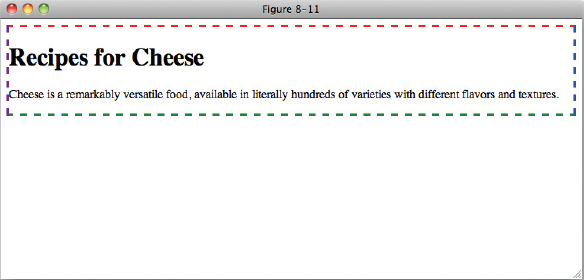
The following code shows an example of the border-color keywords.
<!DOCTYPE html PUBLIC “-//W3C//DTD HTML 4.01//EN”
    “http://www.w3.org/TR/html4/strict.dtd”>
<html lang=“en”>
<head>
    <meta http-equiv=“Content-Type” content=“text/html; charset=utf-8”>
    <title>FIGURE 8-11</title>
    <style type=“text/css”>
        body {
            border-width: 3px;
            border-style: dashed;
            border-top-color: red;
            border-right-color: blue;
            border-bottom-color: green;
            border-left-color: purple;
        }
    </style>
</head>

<body>
<h1>Recipes for Cheese</h1>

<p class=“intro”>Cheese is a remarkably versatile food, available in literally
hundreds of varieties with different flavors and textures.</p>

</body>
</html>
code snippet /chapter8/figure_8-11.html
This CSS and markup results in the output you see in Figure 8-11.
Now that you've seen an overview of what is possible with borders, the upcoming sections discuss the border shorthand properties.
Border Shorthand Properties
The border-top, border-right, border-bottom, border-left, and border properties combine the border-width, border-style, and border-color properties into single properties for each side of the box, or all sides of the box. The following table outlines the possible values for these five properties.
| PROPERTY | VALUE |
| border-top border-right border-bottom border-left |
<border-width> || <border-style> || <color>border-right |
| border | <border-width> || <border-style> || <color> |
The notation for the border-top, border-right, border-bottom, border-left, and border properties indicates that one to three values are possible; each value refers to a border-width value, a border-style value, and a border-color value. The following code demonstrates the border shorthand property.
<!DOCTYPE html PUBLIC “-//W3C//DTD HTML 4.01//EN”
    “http://www.w3.org/TR/html4/strict.dtd”>
<html lang=“en”>
<head>
    <meta http-equiv=“Content-Type” content=“text/html; charset=utf-8”>
    <title>FIGURE 8-12</title>
    <style type=“text/css”>
        body {
            border: 3px dashed red;
        }
    </style>
</head>
<body>

<h1>Recipes for Cheese</h1>

<p class=“intro”>Cheese is a remarkably versatile food, available in literally
hundreds of varieties with different flavors and textures.</p>

</body>
</html>
code snippet /chapter8/figure_8-12.html
This CSS and markup results in the output you see in Figure 8-12.
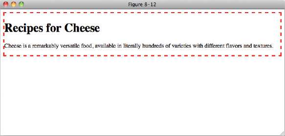
In Figure 8-12, you see the use of the border shorthand property, which specifies the border for all four sides of the box at once.
Unlike the margin shorthand property, the border property may only be used to specify all four sides of the box at once. If you want a different style, or width, or color for the different sides, you'll need to use the individual shorthand properties.
In the following Try It Out, you recap what is possible with CSS border properties.
TRY IT OUT Adding a Border around Content
To see the border property in action, follow these steps.
- Enter the following markup:
<!DOCTYPE html PUBLIC “-//W3C//DTD HTML 4.01//EN” “http://www.w3.org/TR/html4/strict.dtd”> <html lang=“en”> <head> <meta http-equiv=“Content-Type” content=“text/html; charset=utf-8”> <title>Example 8-2</title> <style type=“text/css”> body { width: 600px; margin: 1em auto; border: 1px solid #666; } </style> </head> <body> <h1>Recipes for Cheese</h1> <p class=“intro”>Cheese is a remarkably versatile food, available in literally hundreds of varieties with different flavors and textures.</p> <div class=“recipe”> <h2>Welsh Rarebit</h2> <p class=“intro”>Welsh Rarebit is a savory dish made from melted cheese, often cheddar, on toasted bread, and a variety of other ingredients such as mustard, egg, or bacon. Here is one take on this classic.</p> <ol> <li>Lightly toast the bread</li> <li>Place on a baking tray, and spread with butter.</li> <li>Add the grated cheddar cheese and 2 tablespoons of beer to a saucepan. Place the saucepan over a medium heat, and stir the cheese continuously until it has melted. Add a teaspoon of wholegrain mustard and grind in a little pepper. Keep stirring.</li> <li>When thick and smooth, pour over each piece of toast spreading it to the edges to stop the toast from burning.</li> <li>Place under the grill for a couple of minutes or until golden brown.</li> </ol> </div> </body> </html> - Save the preceding CSS and markup as example_8-2.html. This example results in the output in Figure 8-13.
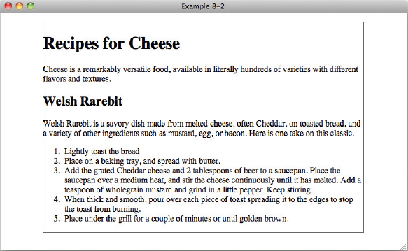
How It Works
In Example 8-2, you built on Example 8-1 by adding a border property on the body element.
In the next section, you examine box padding.
PADDING
Padding is the space between the content of an element and its borders, as has been mentioned briefly in previous examples. Refer to the diagram in Figure 8-1 to see where padding appears in the box model. The following table shows the various padding properties.
| PROPERTY | VALUE |
| padding | [ <length> | <percentage> ] {1,4} |
| padding-top padding-right padding-bottom padding-left |
<length> | <percentage> |
Like margin, border-width, border-style, and border-color, the padding property is a shorthand property, meaning that it is a simplified representation of the other padding properties, padding-top, padding-right, padding-bottom, and padding-left. In the preceding table, the square brackets are used to group the values. In this context, the padding property can accept either a length or a percentage value, and can have one to four space-separated values. We've seen this same effect with margins and borders, so let's Try It Out.
TRY IT OUT Adding Padding to a Layout
To see the padding property in action, follow these steps.
- Enter the following markup:
<!DOCTYPE html PUBLIC “-//W3C//DTD HTML 4.01//EN” “http://www.w3.org/TR/html4/strict.dtd”> <html lang=“en”> <head> <meta http-equiv=“Content-Type” content=“text/html; charset=utf-8”> <title>Example 8-3</title> <style type=“text/css”> body { width: 600px; margin: 1em auto; border: 1px solid #666; padding: 10px; } </style> </head> <body> <h1>Recipes for Cheese</h1> <p class=“intro”>Cheese is a remarkably versatile food, available in literally hundreds of varieties with different flavors and textures.</p> <div class=“recipe”> <h2>Welsh Rarebit</h2> <p class=“intro”>Welsh Rarebit is a savory dish made from melted cheese, often cheddar, on toasted bread, and a variety of other ingredients such as mustard, egg, or bacon. Here is one take on this classic.</p> <ol> <li>Lightly toast the bread</li> <li>Place on a baking tray, and spread with butter.</li> <li>Add the grated cheddar cheese and 2 tablespoons of beer to a saucepan. Place the saucepan over a medium heat, and stir the cheese continuously until it has melted. Add a teaspoon of wholegrain mustard and grind in a little pepper. Keep stirring.</li> <li>When thick and smooth, pour over each piece of toast spreading it to the edges to stop the toast from burning.</li> <li>Place under the grill for a couple of minutes or until golden brown.</li> </ol> </div> </body> </html> - Save the preceding CSS and markup as example_8-3.html. This example results in the output in Figure 8-14.
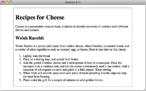
How It Works
In Example 8-3, you added a padding property on the body element, adding space between the content and the border in your new layout.
In Figure 8-14, you see that the padding property is similar to the margin property. The main differences with the padding property are as follows:
- The padding area is the area between the inside edge of the border and the outer edge of the content.
- The auto keyword has no effect with the padding property.
- The padding property cannot accept a negative value (the margin property can).
- There is no collapsing padding; only margins can collapse.
In the next section, I examine the different length properties supported by CSS.
SETTING DIMENSIONS
CSS 1 introduced the width and height properties as part of the CSS box model. CSS 2 expands on those properties, providing minimum and maximum dimensions when variable lengths are involved, as is the case with percentage width and height values.
The following sections examine each of CSS's dimension properties individually.
width
The width property is a pretty simple property; it sets the width of an element. According to the CSS box model diagram presented in Figure 8-1, width is the space measured from inside padding edge to inside padding edge. The following table outlines the width property and its possible values.
| PROPERTY | VALUE |
| width | <length> | <percentage> | auto initial value: auto |
The width property accepts a length unit, which is indicated in the preceding table with the <length> notation. You've already seen the width property in use in your examples so far. In the following code, you see a simple example of the width property using a length unit.
<!DOCTYPE html PUBLIC “-//W3C//DTD HTML 4.01//EN”
    “http://www.w3.org/TR/html4/strict.dtd”>
<html lang=“en”>
<head>
    <meta http-equiv=“Content-Type” content=“text/html; charset=utf-8”>
    <title>FIGURE 8-15</title>
    <style type=“text/css”>
        body {
            width: 600px;
        }
    </style>

</head>
<body>

<h1>Recipes for Cheese</h1>

<p class=“intro”>Cheese is a remarkably versatile food, available in literally
hundreds of varieties with different flavors and textures.</p>

</body>
</html>
code snippet /chapter8/figure_8-15.html
This CSS and markup results in the output you see in Figure 8-15.
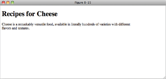
When you apply a width to an element, you must also take into account the borders and padding as part of the overall horizontal area that the element will occupy, as well as the space between elements determined by their margins.
In the next section, I talk about the height property.
height
Like the width property, the height property sets the amount of space between the top-inside padding edge and the bottom-inside padding edge. The following table outlines the height property and its possible values.
| PROPERTY | VALUE |
| height | <length> | <percentage> | auto initial value: auto |
The height property works in the same way as the width property, but is less commonly used as most web pages are designed to scroll vertically, and setting a fixed height causes some strange effects, as you will see in the following snippet.
<!DOCTYPE html PUBLIC “-//W3C//DTD HTML 4.01//EN”
    “http://www.w3.org/TR/html4/strict.dtd”>
<html lang=“en”>
<head>
    <meta http-equiv=“Content-Type” content=“text/html; charset=utf-8”>
    <title>FIGURE 8-16</title>
    <style type=“text/css”>
        body {
            width: 600px;
            height: 75px;
            border: 1px solid #666;
        }
    </style>
</head>
<body>

<h1>Recipes for Cheese</h1>

<p class=“intro”>Cheese is a remarkably versatile food, available in literally
hundreds of varieties with different flavors and textures.</p>

</body>
</html>
code snippet /chapter8/figure_8-16.html
This CSS and markup results in the output you see in Figure 8-16.
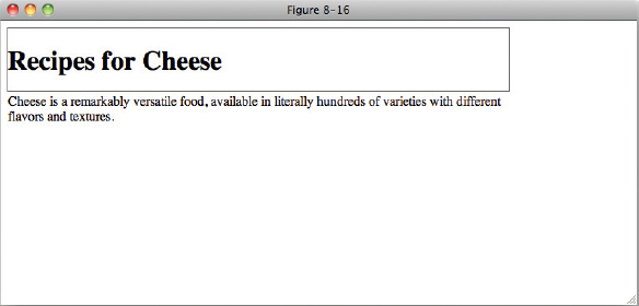
As you can see, specifying a fixed height causes content larger than that height to overflow outside of the container, in this case the body element. You will most commonly see this when a height has been specified, but the same applies to width if a container contains an element, such as an image, that is wider than it; part of the image would appear outside of the container.
The exception to this rule is IE 6, which will expand a container to fit the size of its content.
I'll cover overflowing content and the quirks of IE 6 in more detail later in this chapter.
The next section continues the discussion of dimensions with auto values for width and height.
auto Values for width and height
By default, width and height properties have an auto value. So, when you do not specify a width or height, the value is the auto keyword. The meaning of the auto keyword changes depending on the type of element that it is applied to. When used on a <div> element, the element spans all the horizontal space available to it and expands vertically to accommodate any content inside of it, including text, images, or other boxes. Elements with this behavior are called block elements. Some examples of block elements are <div>, <p>, <h1> through <h6>, <form> and <ul> elements.
The <table> element is an example of an element where the auto value has a different meaning than as, for example, that applied to a block element. Unlike block-level elements, <table> elements don't take up all the horizontal space available to them. Instead, they only take up as much room as needed based on the content they contain. In other words, they take the vertical expanding behavior of block-level elements and apply that to their width too.
Percentage Measurements
When a percentage measurement is used, the size that the percentage is based on is the parent element of the element the percentage width is applied to.
For example, an element with a width value of 50% that has a parent with a width value of 600px will have a computed width of 300px.
In the next section, I describe what happens to the box model when IE is in quirks mode.
Quirks Mode width and height in Internet Explorer
As I mentioned earlier in this chapter, IE is a very different browser in quirks rendering mode.
When discussing width, I said that the horizontal space taken up by an element was equal to width + padding + border + margin. IE in quirks mode behaves a little differently by including padding and border sizes in the width value, so that adding padding and borders actually makes the content area smaller, and the space taken up by the element is equal to width + margin. While there are ways to normalize this across browsers, it requires that you make all browsers behave like IE in quirks mode rather than fixing this problem and so is beyond the scope of this book. I provide a link to documentation on this problem in Appendix B.
Minimum and Maximum Dimensions
The min-width, max-width, min-height, and max-height properties define minimum and maximum boundaries when it is necessary to constrain a width or height from expanding or contracting past a certain point. In a variable width design, where you design content to adapt to multiple screen resolutions, it is sometimes helpful to define where you want the document to stop stretching or stop contracting. For instance, if you have designed primarily with an 800 × 600 or 1024 × 768 screen resolution in mind, a user viewing your website at 1600 × 1200 pixels may see the content stretched pretty thin if an auto keyword or percentage values are used to define the width. This is where the CSS properties min-width, max-width, min-height, and max-height come into play.
min-width and min-height
The min-width property defines a lower-size constraint on an element. The available values for the min-width property are outlined in the following table.
| PROPERTY | VALUE |
| min-width | <length> | <percentage> |
| min-height | initial value: 0 |
Note IE 6 and less do not support the min-width or min-height properties.
The min-width and min-height properties define when an element should stop shrinking to fit the user's window or its content. Consider the example in the following code.
<!DOCTYPE html PUBLIC “-//W3C//DTD HTML 4.01//EN”
    “http://www.w3.org/TR/html4/strict.dtd”>
<html lang=“en”>
<head>
    <meta http-equiv=“Content-Type” content=“text/html; charset=utf-8”>
    <title>FIGURE 8-17</title>
    <style type=“text/css”>
        body {
            min-width: 1000px;
            min-height: 250px;
            border: 1px solid #666;
        }
    </style>
</head>

<body>

<h1>Recipes for Cheese</h1>

<p class=“intro”>Cheese is a remarkably versatile food, available in literally
hundreds of varieties with different flavors and textures.</p>

</body>
</html>
code snippet /chapter8/figure_8-17.html
This CSS and markup results in the output you see in Figure 8-17.
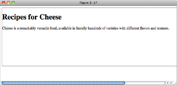
Figure 8-17 demonstrates that when the browser window or containing element becomes narrower than 1000 pixels, the <body> stops shrinking and a scroll bar appears across the bottom of the browser window, and if the content is less than 500px in height, the <body> will expand to the min-height value.
min-width and min-height in IE 6
IE 6 does not support the min-width or min-height properties, but support for these properties was introduced in IE 7.0.
Instead width and height behave just like the min-width and min-height properties in other browsers. Elements with a width or height value applied will always expand to the size of their content, even if the content is bigger than the width or height value. Using conditional comments as explained in Chapter 2 (and see Appendix B for links to more techniques to target IE 6) you can exploit this by providing a min-width or min-height to more modern browsers and a width or height property to IE 6.
max-width and max-height
In contrast to the min-width property, the max-width and max-height properties are used to set an upper constraint for width and height for elements.
| PROPERTY | VALUE |
| max-width | <length> | <percentage> | none |
| max-height | initial value: none |
Note As is the case for min-width and min-height, IE 6.0 does not support the max-width or max-height properties.
The max-width and max-height properties allow you to define a maximum length if the area available to the element becomes larger. Consider the example in the following snippet.
<!DOCTYPE html PUBLIC “-//W3C//DTD HTML 4.01//EN”
    “http://www.w3.org/TR/html4/strict.dtd”>
<html lang=“en”>
<head>
    <meta http-equiv=“Content-Type” content=“text/html; charset=utf-8”>
    <title>FIGURE 8-18</title>
    <style type=“text/css”>
        body {
            width: 600px;
            max-height: 100px;
            border: 1px solid #666;
        }

        .intro {
            max-width: 200px;
        }
    </style>
</head>
<body>

<h1>Recipes for Cheese</h1>

<p class=“intro”>Cheese is a remarkably versatile food, available in literally
hundreds of varieties with different flavors and textures.</p>

</body>
</html>
code snippet /chapter8/figure_8-18.html
This CSS and markup results in the output you see in Figure 8-18.
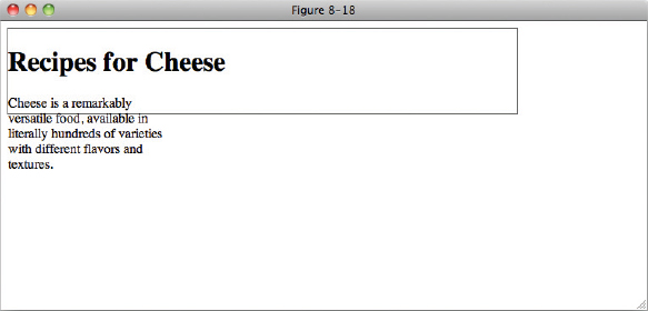
Figure 8-18 demonstrates that when the browser window or containing element becomes taller than 100 pixels, the <body> element will remain at 100 pixels in height and remaining content will overflow, and if the content of an element with the class of intro is wider than 200px it will wrap or overflow its container.
In the next section, I discuss the overflow property.
OVERFLOWING CONTENT
The CSS overflow property exists to manage content that is susceptible to dimensional constraints, where the content could possibly overflow the boundaries of those dimensional constraints. The following table outlines the overflow property and its possible values.
| PROPERTY | VALUE |
| overflow | visible | hidden | scroll | auto initial value: visible |
The two most common uses of the overflow property are to hide content when more content than space is available, or to apply scroll bars so that the extra content can be accessed. By default, the value of the overflow property is the visible keyword, the effects of which you have seen in previous examples. These figures show that when the width and height specified are smaller than the content allows, the content overflows the edges of the box containing it. It is possible to control that overflow by causing scroll bars to appear, or the overflowing content to be invisible.
The following code demonstrates two of the possible values for the overflow property.
<!DOCTYPE html PUBLIC “-//W3C//DTD HTML 4.01//EN”
    “http://www.w3.org/TR/html4/strict.dtd”>
<html lang=“en”>
<head>
    <meta http-equiv=“Content-Type” content=“text/html; charset=utf-8”>
    <title>FIGURE 8-19</title>
    <style type=“text/css”>
        body {
            width: 600px;
        }

        h1 {
            width: 50px;
            overflow: hidden;
        }

        .recipe {
            height: 200px;
            overflow: auto;
        }
    </style>
</head>
<body>

<h1>Recipes for Cheese</h1>

<p class=“intro”>Cheese is a remarkably versatile food, available in literally
hundreds of varieties with different flavors and textures.</p>

<div class=“recipe”>

    <h2>Welsh Rarebit</h2>

    <p class=“intro”>Welsh Rarebit is a savory dish made from melted cheese, often
    Cheddar, on toasted bread, and a variety of other ingredients such as mustard,
    egg, or bacon. Here is one take on this classic.</p>

    <ol>
        <li>Lightly toast the bread</li>
        <li>Place on a baking tray, and spread with butter.</li>
        <li>Add the grated Cheddar cheese and 2 tablespoons of beer to a saucepan.
        Place the saucepan over a medium heat, and stir the cheese continuously
        until it has melted. Add a teaspoon of wholegrain mustard and grind in
        a little pepper. Keep stirring.</li>
        <li>When thick and smooth, pour over each piece of toast spreading it to
        the edges to stop the toast from burning.</li>
        <li>Place under the grill for a couple of minutes or until golden
        brown.</li>
    </ol>

</div>

</body>
</html>
code snippet /chapter8/figure_8-19.html
This CSS and markup results in the output you see in Figure 8-19.
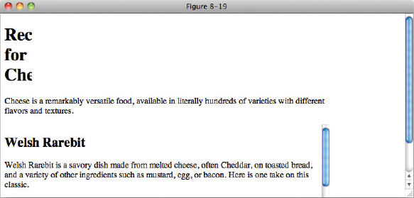
In Figure 8-19, you can see that even though the h1 text wraps when it is wider than 50 pixels, words that are longer than this width are cropped; the content is hidden. Also the element with the class of recipe scrolls when it's height is more than 200 pixels. The difference between the auto and the scroll keywords is that scroll will always display scroll bars, even if the content is smaller than the specified width or height. auto will only show scroll bars when they are necessary.
Overflowing Just the X or Y axis
Like the overflow property, overflow-x and overflow-y control overflow content, but they also allow users to control the overflowing content with a scroll bar: only a vertical scroll bar for the overflow-y property, and only a horizontal scroll bar for the overflow-x property. Each property accepts the same values as the overflow property, as in the following table.
| PROPERTY | VALUE |
| overflow-x | visible | hidden | scroll | auto initial value: visible |
| overflow-y | visible | hidden | scroll | auto initial value: visible |
Note IE 6 and IE 7 only support the overflow-x and overflow-y properties when in standards compliant mode.
EXERCISES
- From left to right, what are the seven box model properties that make up the left, center, and right sides of a box?
- How do you left-, center-, and right-align a block-level box (using the standard method)?
- When the margin shorthand property has four values, what side of the target element does each value apply margin to, in order?
- What are the three keyword values of the border-width property?
- If the border-color shorthand property has three values, what side of the target element does each value apply to, in order?
- Name the shorthand properties that encompass the border-width, border-style, and border-color properties.
- Describe briefly the two situations in which margin collapsing occurs?
- What are the four keywords of the overflow property?
 WHAT YOU LEARNED IN THIS CHAPTER
In this chapter, I discussed how the box model works in CSS. To recap, in this chapter you learned the following:
| TOPIC | KEY CONCEPTS |
| margin, border, padding | How to apply the box model to page elements with margins, borders, and padding properties |
| Width, height | How to specify the width and height of elements, and how content is displayed by default if it is larger than its container |
| overflow | How to control how content is displayed when it is larger than its container |