Introducing CSS—the Language of Web Design
Building a website with HTML (Hypertext Markup Language) is only half the story. HTML controls the structure of a web page, using tags such as <p> for paragraphs, <img> for images, and <input> for form elements. This structural role has become even more important with the introduction of semantic elements, such as <article> and <nav>, in HTML5. But HTML says nothing about how the page should look. That’s the role of Cascading Style Sheets (CSS). Even default styles are controlled internally by the browser’s own CSS.
Instead of applying styles directly to individual elements, the most common—and efficient—way of using CSS is to create the styles in a separate file. At first, this separation of style information from the content of a web page seems counterintuitive. But it has the following significant advantages:
- Less-cluttered HTML code, making it easier to read and maintain
- Changing the look of multiple pages across a site by editing a single file
- Greater control over the way page elements look
 Tip CSS stands for Cascading Style Sheets, but most web designers say “CSS is. . .” rather than “CSS are. . .” This is because they’re referring to CSS as a technology and not to individual style sheets.
In the early days of web design, the only way to style elements was with HTML tags, such as <font> and <center>, and attributes, such as align and size, which needed to be applied to each element individually. Styling web pages like this not only limited the range of design options, but it also meant you needed to make changes to each element individually. With an external style sheet, you make the change in just one place, and it’s automatically applied to all matching elements on every page. It’s a blueprint for the website’s design. Update the blueprint, and the site updates immediately.
In this chapter, you’ll learn about the following:
- A brief history of CSS
- The current state of CSS
- Choosing the tools to help you work with CSS
- How to write style rules and apply them to your web pages
- Using browser-specific prefixes for CSS3
- How to avoid common beginner mistakes
In the beginning, the Web was simple. The first-ever public web page (see Figure 1-1) consisted of plain, unadorned text. Headings were in large, bold type; links were blue and underlined—and that was it.
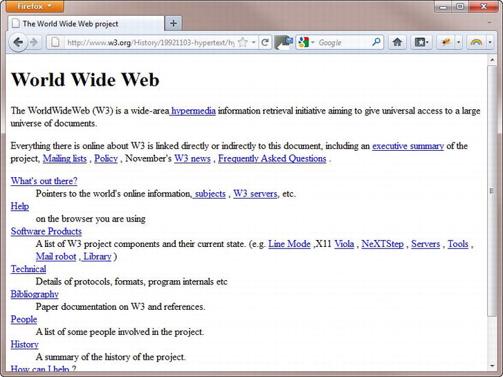
Figure 1-1. The first-ever web page contained just text and links
Note The original, which was created toward the end of 1990, no longer exists, but you can see a copy at www.w3.org/History/19921103-hypertext/hypertext/WWW/TheProject.html.
The lack of images and any attempt at styling the page seem odd to us now, but the Web’s origins lie in the scientific community, not with artists or graphic designers. It didn’t take long before people other than scientists began to demand the ability to include images. Once images began to brighten up web pages, designers began to use their imagination to invent new uses for existing tags. Most notably, the <table> tag, which was intended to display scientific data in tabular form, was adapted to provide a grid structure for page layout. HTML was being stretched beyond its limits. Tags such as <h4> were no longer used for low-level subheadings, but to display small, bold text. The <blockquote> tag, often nested several levels deep, became a way to indent objects, rather than to highlight a quotation from another source. Document structure was thrown to the wind, making it difficult and expensive to maintain web pages or adapt them for other uses, such as printed materials.
The answer was to restore HTML to its original purpose—marking up the structure of the document—and create a new markup language, CSS, devoted to styling the look of a web page. The body responsible for drawing up agreed standards for the Web, the World Wide Web Consortium (W3C), published the first version of this language (CSS1) at the end of 1996, but it wasn’t an instant success.
Why Designers Took So Long to Embrace CSS
According to the W3C, the CSS specification was drawn up in response to “pressure from authors for richer visual control.” The demand for better control of web pages was certainly there, but browsers in the late 1990s implemented CSS very poorly or not at all. Only the very brave or foolhardy adopted CSS in the early stages. Nevertheless, the W3C published CSS2 in 1998. CSS2 retained all the features of CSS1 and added some new ones.
Those brave enough to embrace CSS ended up banging their heads on their keyboards in frustration. The specification was a statement of what the W3C thought browsers ought to do. The reality was completely different. Neither of the main browsers, Netscape Navigator or Microsoft Internet Explorer (IE), had good support for CSS. However, Microsoft put a huge effort into improving its browser, sparking off what became known as the browser wars. By the time IE 6 was released in 2001, it supported most of CSS, and won the battle for market share.
With Netscape in terminal decline, adventurous designers began to use CSS in earnest, but IE 6 was far from perfect. Worse, Microsoft sat on its laurels and made no effort to improve CSS support in IE 6 until it began to see its market share eroded by new browsers, such as Firefox, Safari, and Opera. Microsoft’s response eventually emerged in the form of IE 7 in 2006. IE 8, which followed in 2009, finally offered support for the whole of CSS2.1 (an updated version of CSS2). In the meantime, the rest of the browser market had already started supporting the next generation of standards, CSS3.
Understanding the Different Versions of CSS
Because no two browsers ever managed to implement the full CSS2 specification, the W3C issued a revised specification called CSS2.1 in 2002. However, it took a further nine years before CSS2.1 finally received the formal seal of approval in June 2011. Coincidentally, the first part of CSS3—the Color module—became a formal recommendation on the same day as CSS2.1. To speed up the development and adoption of CSS3, the W3C has divided the specification into some 50 modules. Work on some of them is already at an advanced stage. Others are only ideas, and don’t yet have any formal proposals.
Tip For an up-to-date list of CSS3 modules and their status, visit www.w3.org/Style/CSS/current-work.
The CSS3 Color module expands the type of color formats that you can use in websites to include HSL (hue, saturation, lightness) and alpha transparency. The following year, the Media Queries module also became a formal recommendation. Media queries serve different styles to devices depending on screen width and orientation. Other modules at an advanced stage of development—and widely supported by browsers—at the time of writing include Backgrounds and Borders, and Multi-column Layout. The Background and Borders module makes it easy to add multiple backgrounds to page elements, and to create rounded corners and drop shadows without the need for images. There’s also strong support for embedding web fonts.
All the main browser makers now seem committed to implementing CSS3 features as quickly as possible, and the pace at which new versions of browsers are released has rapidly accelerated. This means there’s no need to wait for a particular module to gain formal approval. You can begin using many parts of CSS3 in your designs right now. One of the best places to get up-to-date information on which features are supported is the website at http://caniuse.com (see Figure 1-2).

Figure 1-2. The support tables at caniuse.com provide up-to-date information about CSS3
Web designers and developers tend to upgrade their browsers much more frequently than other users, who might not even have the freedom to update because of policies imposed by the system administrators at their place of work or study. Choosing whether to use a feature is a decision that only you can make as the designer. If it’s important to you that your design looks identical in all browsers, you’ll be limited to whatever is supported by the lowest common denominator among your target browsers. However, most people use only one browser, so they won’t see the difference—as long as you make sure that the design looks acceptable even in older browsers. Also, many people are now used to seeing websites look different on mobile phones and tablets, so the overall design is more important than pixel-perfect uniformity.
Note CSS3 builds on the previous versions, preserving existing features and adding new ones. CSS doesn’t trigger an error if you use a feature the browser doesn’t recognize. Browsers silently ignore CSS properties and values that they don’t support.
So, How Do I Use CSS?
You normally style web pages by creating an external file called a style sheet, which contains a series of rules identifying which parts of the page you want to affect and how they should look. Like HTML, CSS is written as plain text. You don’t need anything more sophisticated than a text editor, such as Notepad or TextEdit, to start writing CSS. However, if you’re using an HTML editor to build your web pages, you’ll almost certainly find that it provides you with code hints or other features, such as code coloring, to help create your style rules. Adobe Dreamweaver (www.adobe.com/products/dreamweaver) and Microsoft Expression Web (www.microsoft.com/expression/products/overview.aspx?key=web), both offer pop-up code hints similar to those shown in Figure 1-3.
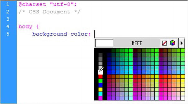
Figure 1-3. Using CSS code hints in Dreamweaver
There are also dedicated CSS editors. Among the most popular are Style Master for Windows and Mac (www.westciv.com/style_master/), Espresso for Mac (http://macrabbit.com/espresso/), and Top Style for Windows only (http://svanas.dynip.com/topstyle/index.html).
Note Your choice of editor is unimportant. This book is strictly software and operating system neutral.
How Do I Write a Style Rule?
Creating a style rule is simple. Figure 1-4 shows the different parts that make up a style rule.
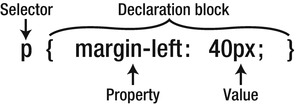
Figure 1-4. The anatomy of a style rule
Let’s take a look at each part in turn:
- Selector: This tells the browser where you want to apply the rule. Figure 1-4 uses a type selector (sometimes called a tag selector), which redefines the default style of an HTML tag. This example redefines the style of all <p> tags—in other words, paragraphs. You’ll learn about other selectors in the next chapter.
- Declaration block: This begins with a left curly brace and ends with a right curly brace. You put your style declarations between these braces. Each declaration consists of a property followed by a colon (:) and value, and ends with a semicolon (;).
- Property: This is one of the properties defined in the CSS specification. Most have intuitive names. The property in Figure 1-4 affects the left margin of the element being styled. Property names are not case-sensitive, but they are normally written entirely in lowercase.
- Value: This is the value you want to apply to the property. Some properties have a fixed list of values that you can choose from. Others let you specify the value yourself. The example in Figure 1-4 sets the value of the left margin to 40 pixels.
The declaration block in Figure 1-4 contains only one property/value pair, but you can define any number of properties in the same declaration block.
Tip Strictly speaking, you can leave out the semicolon after the last declaration in a block or if the block contains only one property/value pair. But you should get into the habit of always using a semicolon because you might forget to insert it when later adding extra declarations to the same block. A missing semicolon in the middle of a block is a common cause of CSS failing to work as expected.
Using Browser-specific Prefixes for CSS3 Properties
At the time it was introduced, IE 6 was considered an excellent browser, but it had some terrible bugs that continued to frustrate designers more than 10 years after its release. To avoid a similar situation with CSS3, browser makers have decided to prefix the names of new or experimental properties with the browser-specific identifiers listed in Table 1-1.
Table 1-1. The Main Browser-specific Prefixes for CSS3 Properties
| Prefix | Browsers |
|---|---|
| -moz- | Firefox |
| -ms- | Internet Explorer |
| -o- | Opera |
| -webkit- | Google Chrome, Safari |
For example, when creating a CSS gradient, you need to use three browser-specific prefixes in addition to the standard property like this:
div {
   background-image: -moz-linear-gradient(#C24704, #FFEB79);
   background-image: -o-linear-gradient(#C24704, #FFEB79);
   background-image: -webkit-linear-gradient(#C24704, #FFEB79);
   background-image: linear-gradient(#C24704, #FFEB79);
}
This might look like a waste of time and effort because the values for the browser-specific versions are identical to the standard property. However, some browsers implemented CSS3 gradients and flexible box layout before the specifications stabilized, and they used different syntax to define the values. Using prefixes like this ensures that incorrect syntax in one browser doesn’t affect the way your pages look in other browsers. As noted earlier, browsers ignore properties that they don’t recognize. So, Firefox ignores properties prefixed with -ms-, -o-, and -webkit-. The other browsers do likewise, applying only their own prefix. By placing the version without a prefix last, the normal rules of the cascade ensure that all browsers implement the standard property as soon as it’s supported.
The CSS3 support tables at caniuse.com (see Figure 1-2) indicate which properties and browser versions require these browser-specific prefixes.
Tip If the syntax changes, you should normally update only the value for the standard property. The prefixed value will be used by browsers that implemented an earlier syntax. When a CSS property finally stabilizes, you can drop the browser-specific prefixes unless your target browsers still need them.
Formatting CSS for Ease of Maintenance
Browsers don’t care how you format your style rules. As long as you separate each property from its value by a colon, put a semicolon after the value, and surround declaration blocks with curly braces, the browser ignores any whitespace in your style sheet. However, a consistent layout makes your CSS easier to maintain.
Figure 1-4 uses whitespace to make the rule easier to read, but the following is just as valid:
p{margin-left:40px;}
Spreading everything out even more like this is also acceptable:
p {
    margin-left : 40px ;
}
However, the following will not work because spaces are not permitted in property names or values:
p {
    margin - left : 40 px;
}
Caution Although CSS ignores whitespace in style declarations, you cannot put spaces in property names. Nor can there be any whitespace in the value between a number and the unit of measurement. Accidentally putting a space between 40 and px renders the rule invalid and prevents it from working.
Style sheets can run to hundreds of lines, so it’s often a good idea to add comments to your style sheets to remind you what a particular rule or set of rules is for. Anything between /* and */ is treated as a comment in CSS and is ignored by the browser. For example:
/* This is a CSS comment */
Comments can be spread over more than one line like this:
/* This is a CSS comment that is spread over multiple lines.
   The browser ignores everything until the end of this line. */
Comment tags can also be used to disable part of your CSS temporarily. This is a useful technique when experimenting with new ideas or troubleshooting problems. Just put the opening /* and closing */ comment tags around the section that you want to disable. You can disable a single declaration or a whole section at a time. For example, this disables the color and background-color properties in the following rule:
body {
    font-family: Arial, Helvetica, sans-serif;
    /* color: #000;
    background-color: #FFF; */
}
Just remove the comment tags to restore the rules.
Caution Comments cannot be nested. As soon as the browser encounters the first */ closing tag, it treats everything else as CSS until it finds another /* opening tag.
Why Are They Called “Cascading” Style Sheets?
The cascade in CSS refers to the way that rules are added together and applied cumulatively. Think of the cascade in the literal sense of a waterfall or a river. As a river flows from the mountains to the sea, it starts off as a tiny trickle, but as more water is added through tributaries, it becomes bigger and more powerful. Yet the water in that original trickle is still part of the whole.
CSS works in a similar way. You can create a style rule that trickles down through the whole page. For example, it’s common to set the background and text colors in a rule for the body of the page. But lower down, new rules can be added that affect the font or size of the text in paragraphs or headings without changing the color or background. And just like a river can break into a delta as it reaches the sea, you can break the CSS cascade into different strands, so that a sidebar looks different from the main content or footer of the page.
This might sound mysterious at the moment, but all should become clear by the end of this book. The important things to remember are these:
- Styles trickle down: A style rule applied to the <body> affects everything inside the page unless something else overrides it.
- Styles are cumulative: Most property values are inherited, so you need apply only new ones.
- Inherited styles can be overridden: When you want to treat an element or section of the page differently, you can create more detailed style rules and apply them selectively.
In most cases, the order of your style rules doesn’t matter. However, the cascade plays an important role when there’s a conflict between rules. As a basic principle, style rules that appear lower down in a style sheet or <style> block override any previous rules in the case of a direct conflict. Chapter 2 describes in more detail how to determine which rule takes precedence.
Most of the time, you should create style rules in an external style sheet attached to the web page. But styles can also be defined in:
- A <style> block
- A style attribute
I’ll cover each way of adding styles, but let’s begin with the most important—external style sheets.
This is the most common and effective way of using CSS. The styles in external style sheets affect all pages to which they’re linked. Typically an external style sheet is used for an entire site or subsection of a site, making it easy to update multiple pages by editing only one file. What’s more, the browser caches the style sheets, so they need to be downloaded only once regardless of how many pages are viewed in your site. This speeds up the display of subsequent pages and reduces bandwidth usage. You can link more than one style sheet to a page.
Create your style rules in a separate file, and save the file with the file name extension .css. An external style sheet can be anywhere within your website, but the normal practice is to put all style sheets in a dedicated folder called styles or css.
You attach an external style sheet in the <head> section of your web page using a <link> tag or a CSS @import rule. A <link> tag looks like this:
<link href="css/basic.css" rel="stylesheet">
In HTML5, the <link> tag requires two attributes:
- href This is the path to the external style sheet.
- rel This tells the browser that the file is a style sheet. Note that the value stylesheet is written as one word. This attribute also accepts the value alternate stylesheet, but it’s of little practical value because browsers give no obvious indication of a choice of styles, and the user needs to select the alternate styles manually on each page.
To validate in HTML 4.01 and XHTML 1.0, you also need to add type="text/css" in a <link> tag. The type attribute was dropped in HTML5 because CSS is the only type of style sheet used in web pages.
If you’re using an HTML editor, such as Dreamweaver or Expression Web, the <link> tag is created automatically when you select the option to attach a style sheet.
The alternative to using a <link> tag is to use a CSS @import rule. This technique was frequently used in the past to hide styles from older browsers that didn’t support @import. All current browsers now support @import, so there’s no real advantage in using it to link a style sheet directly to a web page. However, I have included it here so you know what it’s for if you come across it in an existing site. The @import rule goes inside an HTML <style> block in the <head> of the page like this:
<style>
@import url(css/basic.css);
</style>
The location of the style sheet is specified by putting it between the parentheses of url(). The path to the style sheet can optionally be enclosed in quotes.
The main purpose of @import is to import styles from one style sheet into another. This can be useful when you organize your rules in several style sheets. Instead of linking each style sheet separately to your web pages, you can link just one, which then imports the rules from the other style sheets. If you do this, the @import rule must come before any other style rules in the external style sheet. Also, because it’s in an external style sheet, you don’t wrap it in an HTML <style> block. The following code shows how you might import rules into one external style sheet from another:
@import url(another.css);
/* Other style rules */
body {
    font-family: Arial, Helvetica, sans-serif;
    color: #000;
    background-color: #FFF;
}
Caution An external style sheet must not contain anything other than CSS style rules or CSS comments. You cannot mix HTML, JavaScript, or anything else in a style sheet. If you do, your styles won’t work.
Using a <style> Block
Using an HTML <style> block limits the style rules to the current page, so this technique should not be used for styles that will be applied to multiple pages. One exception is when you’re planning your site’s design. Many designers prefer to work in a single page to refine their ideas before moving the styles to an external style sheet. Because they’re embedded in the page, these are known as embedded styles.
To create a <style> block, you write the style rules in exactly the same way as in an external style sheet, and wrap them in a pair of HTML <style> tags. For valid HTML 4.01 and XHTML 1.0, the opening tag must contain type="text/css" like this:
<style type="text/css">
/* Style definitions go here */
</style>
You can omit type="text/css" from the opening tag in HTML5.
In HTML 4.01 and XHTML 1.0, a <style> block can only be in the <head> of the page. HTML5 relaxes this restriction, and introduces the concept of scoped styles in <style> blocks in the body of a page. A scoped <style> block in HTML5 applies highly localized styles to the current element and all the element’s children (other elements nested inside it).
The idea of allowing scoped styles inside the body of the page is controversial because it violates the principle of separating content from presentation. However, one scenario where scoped styles could be useful is with prestyled components or widgets, such as calendars or date-pickers that you want to drop into a page without needing to update the site’s main style sheet.
When using scoped styles, the <style> block must come before everything else inside the HTML element to which the styles apply. The opening <style> tag requires the scoped attribute like this:
<div class="calendar">
<style scoped>
/* These styles apply only to the calendar widget */
table {
    font-size: 11px;
    background-color: teal;
}
</style>
    <table>
        <tr>. . . </tr>
    </table>
</div>
Note At the time of this writing, only the development version of Chrome supports scoped styles.
Applying a Style Directly to an HTML Element
This goes in the opening tag of an HTML element, so it applies to that element alone. This is known as creating an inline style and should be avoided because it’s the least efficient way to apply CSS. As with all rules, there is an exception: some email programs, notably Microsoft Outlook, don’t understand style rules unless they’re applied this way.
Inline styles use the same properties and values as CSS rules that you put in an external style sheet or a <style> block. However, you don’t need a selector (the HTML tag itself acts as the selector), and the curly braces are replaced by quotes. For example, you might create the following style rule for <h1> tags:
h1 {
    font-family: Arial, Helvetica, sans-serif;
    color: #900;
}
The equivalent inline style looks like this:
<h1 style="font-family: Arial, Helvetica, sans-serif; color: #900;">Heading with an Inline Style</h1>
Learning to Write CSS Well
The basics of writing a style rule are simple, but CSS can also be infuriatingly complex. The simplicity of CSS lies in the limited number of properties you need to remember. The complexity lies in the fact that you can combine the properties in an infinite number of ways.
My advice is not to rush. I learned CSS by adding or changing one property at a time and viewing the results in a browser. It was a slow, tedious process, but it helped me understand the interaction of the different properties. Once you appreciate the trickle-down, cumulative effect of the cascade, you’ll be amazed at the power of CSS. The time spent will be repaid many times over in increased efficiency and easier maintenance of your websites.
Don’t succumb to the temptation to skip ahead to later chapters until you have read at least Parts I and II and the first two chapters of Part III.
Test Your CSS Early in Several Browsers
Don’t design for just one browser. Get into the habit of checking your design at an early stage in several browsers—and preferably on different operating systems, including mobile devices. Spotting a problem early on makes it easy to troubleshoot. Not everyone will be viewing your sites in the most up-to-date browsers. If you don’t have access to older browsers, ask friends, colleagues, or online forums for help in checking your sites. Also consider using an online browser capture service such as BrowserCam (www.browsercam.com) or Adobe BrowserLab (https://browserlab.adobe.com/en-us/index.html).
Use Browser Developer Tools to Inspect Your CSS
All the main browsers have built-in panels that let you inspect the styles not only of your own site but of any public website, giving you a useful insight into how CSS works. In Google Chrome, Safari, or Firefox, right-click the element you want to inspect, and select Inspect Element from the context menu. This opens the developer tools with the underlying HTML element highlighted and all the style rules that have been applied to it (see Figure 1-5). Similar tools can be accessed in IE 8 and later by pressing F12, and in Opera by selecting Tools  Advanced Opera Dragonfly.

Figure 1-5. The Developer Tools panel in Chrome
In the initial stages, you’ll find the amount of information overwhelming, but you can toggle individual rules on and off or edit them to see what effect your changes have. Style definitions that have been overridden are displayed with a strikethrough line. Studying your own pages, as well as sites that you admire, greatly increases your understanding of CSS.
Tip To gain access to the developer tools in Safari, you need to open the Preferences panel from the Edit menu in Windows or the Safari menu in Mac OS X. In the Advanced tab, select the Show Develop menu in menu bar check box.
Summary
This chapter has given you a brief overview of the development of CSS and the advantages of separating styling information from the HTML markup that controls the structure of your web pages. Locating style rules in one or more external files allows you to apply changes instantly throughout a website rather than needing to update each element and page individually. You can also embed styles in a <style> block in the <head> of the page; and HTML5 introduces the concept of scoped styles for an individual element and its children. Inline styles apply to a single element only, and should be avoided, except for HTML email.
Style rules consist of a selector followed by one or more property/value pairs wrapped in curly braces. The selector identifies the element(s) to which you want the style to apply. In the next chapter, you’ll learn about the basic selectors supported by all browsers, including IE 6.