Specifying Sizes, Colors, and Files
In the preceding chapter, you used a keyword to set the value of the cursor property. Many CSS properties use predefined keywords, but sizes, colors, and the location of files need to be specified individually. This chapter describes the units of measurement and the syntax used to specify colors and files. CSS3 introduces several new units of measurement, which are only gradually being implemented by browsers, so you need to use them with caution.
In this chapter you’ll learn about the following:
- Which units of measurement to use for visual browsers and printers
- Understanding the difference between physical pixels and CSS pixels
- Specifying colors by name
- Which color formats are supported in CSS
- Setting color transparency
- Specifying the location of files, such as background images
This chapter contains a lot of dry, factual information; but it’s essential reading for working with CSS. Fortunately, it’s relatively short. It should also act as a handy reference.
Specifying Size and Other Units of Measurement
In CSS, values not expressed as a keyword take one of the following forms:
- Integer
- Number
- Length
- Percentage
- Angle (CSS3)
- Time (CSS3)
Numeric Values
Using numeric values is straightforward. Some properties expect an integer—in other words, a whole number. Others accept either a whole number or a decimal value. The CSS2.1 specification makes no distinction, and refers to both cases as number. CSS3 explicitly states when only an integer is accepted. In some cases, the range is limited or only positive numbers can be used.
Numbers must not contain spaces or the thousands separator. Decimal fractions use a decimal point (dot). You can’t use a comma as the decimal point, as is common in some European countries.
Length
The CSS specifications use the term length to refer to vertical and horizontal measurements. The CSS3 Values and Units module introduces several new units of measurement, as well as a function that allows the browser to calculate a length value. These new features are not supported by all browsers, so I’ll describe them separately to avoid confusion.
Length Units Supported by All Browsers
Table 3-1 lists the length units in CSS2.1 that are supported by all browsers.
Table 3-1. CSS2.1 Length Units
| Type | Unit | Description |
|---|---|---|
| Relative Units | ||
| em | Height of the current font | |
| ex | Half an em in most browsers | |
| Absolute Units | ||
| px | Pixels (1/96 of an inch or 0.265 mm) | |
| in | Inches (2.54 centimeters) | |
| cm | Centimeters (0.394 in) | |
| mm | Millimeters (0.039 in) | |
| pt | Points (1/72 of an inch or 0.353 mm) | |
| pc | Picas (12 points or 4.233 mm) |
Length units are classified as either relative or absolute. A relative unit is not a fixed size, but is relative to another length. The relative units in CSS2.1 take their value from the current font size. But CSS3 introduces units that are relative to the browser viewport. An absolute unit is anchored to a physical measurement, such as an inch or centimeter.
There must be no space between the number (which can include a decimal fraction) and the unit. The unit of measurement is optional after 0. For example, the following values are correct:
0.5em
300px
0px
0
The last two examples, 0px and 0, mean the same. Most experienced designers omit the px (or other length unit) but it’s perfectly valid to include it. The following examples are incorrect and will not work:
0.5 em
300 px
0 px
Although no unit is required after zero, browsers are likely to interpret the px in the final example as garbage and ignore the style definition.
An em is a unit of measurement borrowed from typography. The name originates from the width of the letter M; but in CSS it means the height of the current font, usually including whitespace above and below. So, with a 16-pixel font, one em equals 16 pixels; with a 24-pixel font, it’s 24 pixels, and so on. Specifying the width or height of an element in ems adjusts its size in proportion to the size of the font.
 Caution Using em to specify font size can result in ever shrinking text because nested elements inherit the size from their parents, resulting in a multiplier effect. For example, if you set the font size of unordered lists to 0.75em (the equivalent of 12px), the text in a nested list is 0.75 times the size of its parent—in other words, 9px. At the next level, the text shrinks even further (see Figure 3-1).
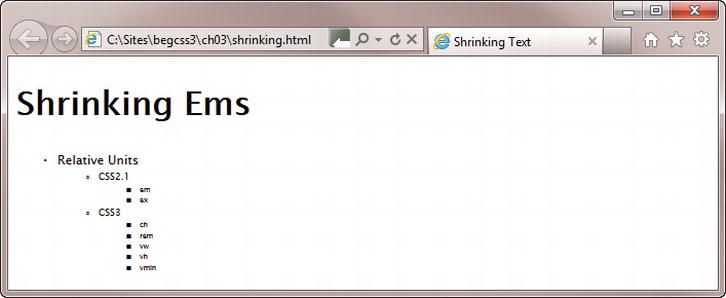
Figure 3-1. Using em to set the font size can have unexpected results with nested elements
To avoid this multiplier effect with em, you need to reset the size for nested lists to 1em like this:
ul {
    font-size: 0.75em;
}
ul ul {
    font-size: 1em;
}
As Figure 3-2 shows, this sets the text in the nested lists to the same size as the previous list, thereby preventing it from shrinking.
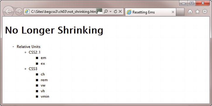
Figure 3-2. The nested lists now use the same font size as the top level list
You can examine the HTML and CSS for Figures 3-1 and 3-2 in shrinking.html and not_shrinking.html in the ch03 folder.
Note The CSS3 rem unit described later in this chapter offers a much simpler solution to this problem.
The ex unit is meant to be equivalent to the height of a lowercase X in the current font. However, most browsers treat this unit as half an em. It’s rarely used.
Of the absolute units, pixels are the only ones that should be used for onscreen display. The other units are intended for use in print style sheets (see Chapter 16).
Originally, pixels were classified as relative units because their size was considered to be relative to the viewing device. However, changes in technology resulted in the need to redefine how pixels are interpreted, as explained in the sidebar “Physical and CSS Pixels.”
PHYSICAL AND CSS PIXELS
In digital imaging, a pixel is the smallest element of a picture that can be represented or controlled (the term is a contraction of “picture” and “element”). Over the years, screen resolutions have improved, cramming more and more dots into the same physical space. As a result, physical pixels have become smaller and smaller. One of the most dramatic changes was the development of the retina display for the iPhone and iPad, which squeezes four pixels into the space where there had previously been only one.
If browsers interpreted pixel units of measurement literally, you would need a magnifying glass to view web pages on high pixel-density screens. Fortunately, that doesn’t happen. The CSS specification defines what it calls a reference pixel, which aims to standardize how pixel values are displayed when viewed at arm’s length. At a distance of 28 inches (71 cm), a reference pixel (or CSS pixel, as it’s more commonly called) is equivalent to 1/96 inch (0.26 mm). When displayed on a device that’s intended to be viewed at a greater distance—a projector, for example—the device is expected to scale up pixel measurements proportionately.
The long and short of it is that using pixels as the unit of measurement should result in roughly the same size, regardless of the physical pixel density of the screen.
Many designers, particularly those who come from a print background, instinctively use points to specify font sizes. A common assumption is that pixels and points are interchangeable. However, both CSS2.1 and CSS3 define a pixel as being equal to 0.75pt.
Table 3-2 lists the new length units introduced in CSS3. They are all classified as relative units.
Table 3-2. CSS3 Length Units
| Unit | Relative to |
|---|---|
| ch | The width of the character 0 (zero) in the current font |
| rem | The font size of the root element |
| vw | The viewport’s width |
| vh | The viewport’s height |
| vmin | The viewport’s width or height, whichever is smaller |
| vmax | The viewport’s width or height, whichever is larger |
At the time of this writing, the only unit in Table 3-2 with widespread support is rem. It has been available since Firefox 3.6, Chrome 6, Safari 5, IE 9, Android 2.1, and iOS 4.0. It’s very similar to the em unit in that it’s equivalent to the height of a font. The difference is that it remains relative to the font size of the root element—in other words, the page’s default font size. This avoids the multiplier effect that can result in ever-shrinking text when specifying font sizes in em units. With rem units, the scaling is always proportionate to the same value.
The following style rule in rem.html produces the same output as Figure 3-2 in browsers that support the rem unit:
ul {
    font-size: 0.75rem;
}
The vw, vh, vmin, and vmax units are similar to percentages in that 100vw equals the full width of the viewport, 100vh equals the full height, and 100vmin equals the shorter of the two. When the height or width of the viewport is resized, lengths specified with these units are scaled proportionately. IE 9 implemented an early draft of the specification, in which vmin was called vm. IE 10 uses vmin. Chrome 20 and Safari 6 also support vw, vh, and vmin. The W3C added vmax to the specification as an afterthought. At the time of this writing, it's not supported by any browser.
Firefox is currently the only browser that supports ch correctly.
Using the calc() Function to Compute Length Values
The situation frequently arises in fluid or flexible layouts where you want to combine absolute values with relative ones. For example, you might want an element to fill 70 percent of the horizontal space, but to have a 10-pixel margin on either side. Because you have no idea how wide the browser viewport will be, it’s impossible to know how much horizontal space remains alongside. The CSS3 calc() function is designed to solve such problems.
The calc() function supports the following arithmetic operators:
- + (add)
- - (subtract)
- / (divide)
- * (multiply)
- mod (modulo division)
Note Modulo division produces the remainder of a division. For example, the result of 7 mod 2 is 1. Normally, the operator for modulo division is %, but it was decided to use mod to avoid confusion with percentages.
To calculate the width available alongside the element in the preceding example, CSS3 allows you to specify the value like this:
calc(30% - 20px)
The calc() function is supported in IE 9+ and Firefox 16+. Chrome 19+ and Safari 6 support it on an experimental basis with a browser-specific prefix (-webkit-calc()).
Percentages
Values specified as percentages use a number immediately followed by the percentage sign (%). There must be no space between the number and %. Percentages are always relative to another value, normally the size of the parent element. Browsers are capable of handling percentages to several decimal places.
Angles
Angles are used only with CSS3 properties, such as transform. Table 3-3 lists the accepted units.
Table 3-3. Angle Units in CSS3
| Unit | Meaning |
|---|---|
| deg | Degrees |
| grad | Gradians (1/400 of a turn) |
| rad | Radians |
| turn | Turns (360 degrees) |
As with all other units of measurement, there must be no space between the number and unit.
Browsers convert angles to the range 0–360°. For example -90deg is the same as 270deg.
Time
Time units are used only with CSS3 properties. There are just two units, as shown in Table 3-4.
Table 3-4. Time Units in CSS3
| Unit | Meaning |
|---|---|
| s | Seconds |
| ms | Milliseconds (1/1,000 of a second) |
Again, there must be no space between the number and the unit.
Caution When specifying a zero value for an angle or time, you must include the unit of measurement, for example, 0deg, 0s. The only time you can omit the unit after zero is with lengths and percentages.
CSS offers the following options for setting color values:
- Color keywords
- Hexadecimal notation
- RGB (red, green, blue) format
- HSL (hue, saturation, lightness) format (CSS3)
- RGBA (red, green, blue with alpha transparency) format (CSS3)
- HSLA (hue, saturation, lightness with alpha transparency) format (CSS3)
CSS3 defines the 16 basic color keywords shown in Figure 3-3. The names are case-insensitive.
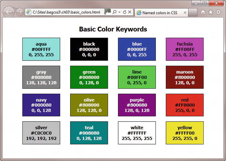
Figure 3-3. The basic color keywords with hexadecimal and RGB equivalents
The CSS2.1 specification also includes orange (#FFA500, RGB 255, 165, 0), but it has been dropped from the list of basic color keywords in CSS3. However, it’s a moot point, because the CSS3 Color module has extended the definition of nearly 150 color keywords from the Scalable Vector Graphics (SVG) specification to embrace their use in CSS. The SVG color keywords are widely supported by current browsers, so they should be safe to use in your style sheets.
Tip The basic and extended color keywords together with their hexadecimal and RGB equivalents are in basic_colors.html and extended_colors.html in the ch03 folder.
CSS3 also introduces the keyword currentColor, which acts as a variable. It inherits the value of the parent’s color property. So, if color is set to red in the parent element, currentColor is also red. The currentColor keyword is supported by the latest versions of all browsers, but it is not supported by IE 8 or earlier.
Using Hexadecimal Notation
The most common way of representing color in web design is to use the hexadecimal notationfor red, green, and blue (RGB) values. Using hexadecimal numbers allows you to select 256 shades of each value, representing more than 16 million colors. Most graphics and HTML editing programs generate the hexadecimal number for you automatically when you use a color picker or eyedropper tool. If you don’t have access to your graphics program (for example, when traveling), you can use online utilities such as www.colorpicker.com or http://kuler.adobe.com.
When using hexadecimal notation, remember the following:
- The color value must begin with the hash or pound sign (#). Omitting the # is a common cause of errors.
- You can use six-digit or three-digit hexadecimal values (see the sidebar “Shorthand Hexadecimal Values” for an explanation of the difference).
- Don’t mix up the letter O with 0 (zero) or lowercase L with the number 1. The only letters permitted in hexadecimal values are A–F.
- The letters A–F in a hexadecimal value are case-insensitive. It doesn’t matter whether you use uppercase or lowercase, or even a mixture of the two.
SHORTHAND HEXADECIMAL VALUES
Hexadecimal color values are normally expressed using six digits. The first pair represents the red component of the color; the second pair represents the green component, and the final pair the blue component. In CSS, if all three components contain a pair of identical digits, you can shorten each pair to a single digit. For example, the hexadecimal value for fuchsia is #FF00FF, which contains three pairs of identical digits, so it can be shorted to #F0F. However, #008080 (teal) cannot be shortened, because only the first pair of digits is identical.
As well as using hexadecimal notation to represent RGB values, you can use the rgb() function in a style sheet. You specify the red, green, and blue values as a comma-separated list inside the parentheses.
The rgb() function accepts the values either as numbers in the range 0–255 or as percentages. For example, you can specify red in either of the following ways:
rgb(255, 0, 0)
rgb(100%, 0%, 0%)
As with hexadecimal notation, you can normally get the correct values from a graphics program’s color picker.
A new feature in CSS3 is the ability to specify colors using hue, saturation, and lightness. This color format is favored by many graphic designers because it’s more intuitive than the RGB model. Hue is represented by an angle on a color circle, with red at the top (0 degrees), green one-third of the way round the circle in clockwise direction (120 degrees), and blue two-thirds of the way round (240 degrees). Saturation represents the intensity of the color, making it duller or brighter. And lightness makes the color darker or lighter. See www.w3.org/TR/css3-color/#hsl-color for examples.
You specify a color using HSL format with the hsl() function, which takes three comma-separated values, as follows:
- Hue expressed as a number between 0 and 360: This is the angle of the color on the color circle. Browsers are expected to adjust out-of-range numbers, so −120 should be interpreted as 240 (blue).
- Saturation expressed as a percentage: 0% is a shade of gray, and 100% is full saturation.
- Lightness expressed as a percentage: 0% is black, 50% is normal, and 100% is white.
The following example represents red:
hsl(0, 100%, 50%)
Creating Transparent Colors with the RGBA and HSLA Formats
The CSS3 Color module extends the RGB and HSL formats to allow you to set the opacity of the color using alpha transparency. To specify a color with alpha transparency, use the rgba() or hsla() function.
Both functions take four comma-separated values. The first three values are the same as for rgb() and hsl(). The fourth value sets the level of transparency, and must be a number between 0 (completely transparent) and 1 (completely opaque). The following examples create semitransparent red:
rgba(255, 0, 0, 0.5)
rgba(100%, 0%, 0%, 0.5)
hsla(0, 100%, 50%, 0.5)
Setting the alpha transparency of a color not only reduces the color intensity, but it also allows any background to show through. The background becomes more visible the closer the fourth value is to 0.
Note All browsers except IE 6–8 support rgba(), hsl(), and hsla().
Specifying Background Images and Other Files
A small number of properties, such as background-image and list-style-image, require the URL of the file you want to use. To specify the location of a file, enter the path between the parentheses of url(). You can use either an absolute path or a relative one. The file path can be optionally enclosed in single or double quotes. Whitespace between the parentheses and the file path is also permitted.
The following examples are all valid:
url(../../images/grand_canyon.jpg)
url(/images/grand_canyon.jpg)
url("http://www.example.com/images/grand_canyon.jpg")
url( "/images/grand_canyon.jpg" )
url('../../images/grand_canyon.jpg')
url(  '../../images/grand_canyon.jpg'  )
If using a relative file path, the location should be relative to the style sheet.
Note The CSS3 Image Values and Replaced Content module proposes an image() function to specify clipped portions of an image and fallback images, but no browser yet implements it.
Summary
This chapter has provided a comprehensive overview of how to specify CSS property values with units of measurement, as well as colors, and file locations. The CSS specifications refer to horizontal and vertical measurements as “length.” The units of measurement listed in Table 3-1 are supported by all browsers, but you should take care when using any of the measurements in Tables 3-2, 3-3, and 3-4 because they’re not supported in older browsers, including IE 6–8. When using a value with a unit of measurement, make sure there is no space between the number and the unit.
The new features in the CSS3 Color module, including setting alpha transparency with the rgba() and hsla() functions, are supported in all current browsers except IE 6–8.
You’ve now covered the essential basics of CSS. In Part II, you get down to more practical aspects of using CSS to improve the look of your web pages.