For years, tables were the only way to build a grid structure to lay out web pages. Thankfully, tables are no longer necessary—or indeed recommended—for page layout. Normally, they should be used only for the display of data that needs to be presented in a grid format—timetables, price lists, sports results, and so on. That’s the focus of this chapter: styling tables that contain data.
There are no plans to add any new features to tables in CSS3. However, using the CSS3 selectors described in the preceding chapter makes it considerably easier to style tables without the need for extra markup in the HTML.
In this chapter, you’ll learn about the following:
- Styling borders around tables and individual cells
- Adjusting the space between table cells and inside them
- Moving the position of the table caption
- Suppressing the display of empty cells
- Preventing columns from exceeding a fixed width
- Controlling the horizontal and vertical alignment of content in table cells
Before diving into the details of styling tables with CSS, it’s important to understand the basic structure of tables and how browsers lay out the various components.
In HTML 4.01 and XHTML 1.0, you can add a border to the table, give it a width, and adjust the space around the data by adding the border, width, cellpadding, and cellspacing attributes to the opening <table> tag. In HTML5, only the border attribute is valid and, if used, its value must either be an empty string or 1.
Removing the width, cellpadding, and cellspacing attributes from the <table> tag produces only the bare bones of a data table like the one in basic_table.html, which looks like this:
<table border="1">
    <tr>
        <td>Row 1-1</td>
        <td>Row 1-2</td>
    </tr>
    <tr>
        <td>Row 2-1</td>
        <td>Row 2-2</td>
    </tr>
</table>
Setting the border attribute to 1 puts a 1px border around the whole table and each individual cell, producing the effect of a raised double border around each cell. Because there’s no width, cellspacing, or cellpadding, the table collapses around the content, as shown in Figure 14-1.
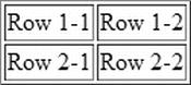
Figure 14-1. A basic table with border
This minimalist layout not only looks ugly; it’s difficult to read if there are more than a handful of data cells. However, CSS gives you greater control over horizontal and vertical spacing than cellpadding and cellspacing. It also offers better options for controlling the borders of table elements, so it’s usually advisable to omit the border attribute from the opening <table> tag.
First, though, let’s continue exploring how tables are structured and laid out.
In addition to <td> tags, you can use <th> tags to indicate that a cell is a row or column header. The table in header_cells.html contains <th> tags in the first row and in the first cell of each subsequent row. By default, browsers center the text in <th> tags and display it in a bold font, as shown in Figure 14-2.
Figure 14-2. Text in header cells is normally bold and centered
The <caption> tag displays a caption for the table. The tag must come immediately after the opening <table> tag like this (the code is in caption.html):
<table>
    <caption>Regional Sales Results</caption>
    <tr>
By default, browsers display the caption above the table, as in Figure 14-3, but you can use the CSS caption-side property to move it under the table, as described later in this chapter.
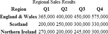
Figure 14-3. By default, table captions are displayed above the table
 Caution The <caption> element must come immediately after the opening <table> tag, even if you want to display the caption below the table.
HTML tables are constructed as a series of table rows rather than columns. The column structure is simply implied by the cells stacked on top of one another in each row. However, you can also define columns in the HTML markup by adding one or more <colgroup> elements immediately after the table caption. If the table doesn’t have a caption, the <colgroup> elements come immediately after the opening <table> tag. A <colgroup> can optionally contain <col> elements to identify individual columns.
The <colgroup> and <col> elements are not displayed. They’re used purely to identify column groups or individual columns for layout and styling. In HTML 4.01 and XHTML 1.0, you can use the align, valign, and width attributes in both tags to control the horizontal and vertical alignment and width of all cells within a column group or column. However, these attributes are no longer valid in HTML5.
Note All browsers—even as far back as IE 4—support <colgroup> and <col>. Although they’ve been around for a long time, these elements are rarely used. I’ve included them here because they occupy a position in the order browsers construct tables, as described in “How Browsers Lay Out Tables” later in this chapter.
You specify the number of columns in the group with the span attribute. So, let’s say you have a five-column table, and you use the first column for labels and the remaining columns for data, you could style the column groups using classes like this:
<colgroup span="1" class="labelcol">
<colgroup span="4" class="datacol">
Alternatively, you can list individual columns using <col> tags inside <colgroup> tags like this:
<colgroup>
    <col class="labelcol">
    <col class="oddcol">
    <col class="evencol">
    <col class="oddcol">
    <col class="evencol">
</colgroup>
The <col> tag also accepts the span attribute, so you can apply the same class to multiple adjacent columns. The following example applies the datacol class to the three middle columns of a table:
<colgroup>
    <col class="labelcol">
    <col span="3" class="datacol">
    <col class="lastcol">
</colgroup>
The number of columns in the table must be the same as specified in the <colgroup> and <col> tags.
Tip In modern browsers, you can use the :nth-child() and related pseudo-classes (see Chapter 13) to style table columns without the need for <colgroup> and <col>. However, they can be useful for styling table columns in older browsers that don’t support CSS3 selectors.
Defining Table Header and Footer Rows
Immediately after the column definitions, you can define table header and footer rows. The table header comes first and consists of one or more table rows enclosed in a pair of <thead> tags. The table footer follows the table header and consists of one or more table rows inside a pair of <tfoot> tags.
The principal advantage of using <thead> and <tfoot> is that browsers add the header and footer rows at the top and bottom of each page when printing a long table. Although it seems counterintuitive, the <tfoot> section normally comes before the main body of the table. You’ll see how this works in the next section.
Grouping Table Rows into Sections
To divide a table into horizontal sections, you can wrap one or more rows in pairs of <tbody> tags. The table in table_sections.html uses <tbody> tags to separate a company’s sales report into sections. It also has table header and footer rows like this:
<table>
<thead>
<tr>
<th>Period</th>
<th>Results</th>
<th>Amount</th>
</tr>
</thead>
<tfoot>
<tr>
<th>Period</th>
<th>Results</th>
<th>Amount</th>
</tr>
</tfoot>
<tbody id="q1">
<tr>
<td>Q1</td>
<td>Sales</td>
<td>$4.5m</td>
</tr>
<tr>
<td> </td>
<td>Expenditure</td>
<td>$4.1m</td>
</tr>
</tbody>
<tbody id="q2">
<tr>
<td>Q2</td>
<td>Sales</td>
<td>$4.9m</td>
</tr>
<tr>
<td> </td>
<td>Expenditure</td>
<td>$4.7m</td>
</tr>
</tbody>
</table>
The <tbody> tags divide the table into sections that can be styled independently. The screenshot on the left of Figure 14-4 shows the table with some simple styles added. Note how the <tfoot> section is displayed at the bottom of the table, even though it comes before either of the <tbody> sections. This is not the result of the CSS styles. You can verify this by commenting out the styles in the <head> of the page. The <tfoot> section is still at the bottom of the table, as shown on the right of Figure 14-4.
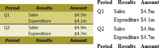
Figure 14-4. Dividing the table into sections allows you to apply different styles
That excursion into the lesser known table elements was intended as a prelude to help you understand how browsers assemble tables in six stages, as follows:
- Table
- Column groups
- Individual columns
- Row groups
- Individual rows
- Individual cells
To show how tables are rendered, layout_order.html progressively adds styles to the whole table, followed by a group of two columns, a single column within that group, a group of two rows, an individual row within that group, and finally two individual cells (see Figure 14-5).
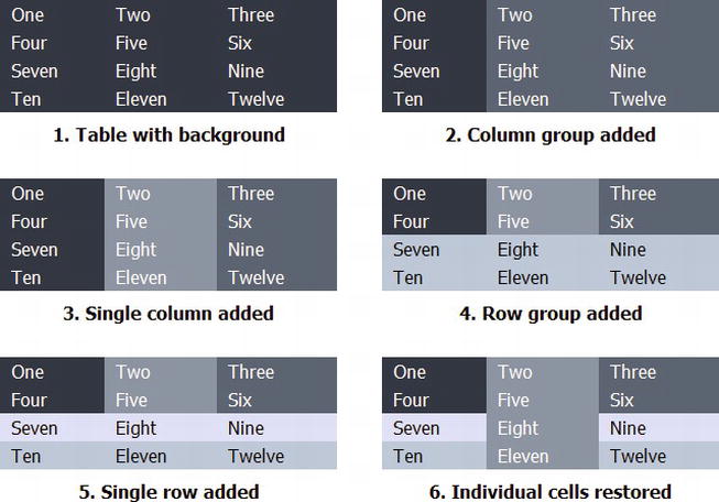
Figure 14-5. Table elements are layered on top of each other in a specific order
Each style, apart from the one applied to the individual cells, uses a lighter shade of gray, which should make it obvious that it’s being painted on top of the previous one and obscuring it.
Tip If you keep this six-stage process in mind, it will help you understand why a background style is being applied in a particular way—or more often, why a style isn’t working as expected. All browsers work this way, so you don’t need to worry about anomalies with older browsers.
Styling Tables with CSS
CSS has five properties dedicated to controlling the structure of tables. These are listed in Table 14-1. Also listed are text-align and vertical-align, which are frequently used with tables.
Table 14-1. CSS Table Properties
| Property | Initial Value | Inherited | Description |
|---|---|---|---|
| border-collapse | separate | Yes | By default, the table and each cell have independent borders. Borders are merged by setting the value of this property to collapse. |
| border-spacing | 0 | Yes | Controls the spacing between table cells. Horizontal and vertical spacing can be controlled independently. |
| caption-side | top | Yes | Determines whether the table caption is displayed above or below the table. |
| empty-cells | show | Yes | If set to hide, turns off the display of borders and backgrounds associated with empty table cells. |
| table-layout | auto | No | If set to fixed, the width of each column is set in the column definitions or first row. |
| text-align | left | Yes | Controls the horizontal alignment of content in table cells. With right-to-left languages, the default is right. |
| vertical-align | middle | No | Controls vertical alignment in table cells. |
All the properties in Table 14-1 are fully supported by all browsers in widespread use, including IE 8. Earlier versions of Internet Explorer support them with some minor exceptions.
When you use CSS to add a border to a table, the border affects only the table, and not the cells inside. You can control each border independently, using the same border properties described in Chapter 9. The styles in double_border.html define the table border like this (see Figure 14-6):
Figure 14-6. With CSS, you can use any border style for a table; the cells are not affected
table {
    border: #000 double 10px;
}
In fact, you don’t need to declare a border or use the same style on every side. The styles in different_borders.html add a top and bottom border like this (see Figure 14-7):
Figure 14-7. Tables can have different style borders or none at all on each side
table {
    border-top: #000 double 10px;
    border-bottom: #999 solid 5px;
}
For that extra special table, you can even use a border image. You apply it in exactly the same way as to any other element (see Chapter 9 for details). The styles in border-image.html add a default double border, and then use the border-image shorthand property with browser-specific prefixes like this:
table {
    border: 24px double #4B8896;
    -moz-border-image: url(images/frame1.png) 24 round;
    -o-border-image: url(images/frame1.png) 24 round;
    -webkit-border-image: url(images/frame1.png) 24 fill round;
    border-image: url(images/frame1.png) 24 fill round ;
}
Browsers that support border images render the table as shown in Figure 14-8.
Figure 14-8. You can even use a border image for a table
Because adding a table border with CSS has no effect on the table cells, you need to create a separate style for the cells. This gives you the freedom to choose a different color and/or style for the cell borders. The style rules in cell_borders.html add a 1px solid red border to all table cells like this:
td {
    border: #F00 solid 1px;
}
As you can see in Figure 14-9, the border around each cell is separate from the table border, and there is a small gap between each cell.
Figure 14-9. By default, there is a space between each cell border
Eliminating the Space Between Cells
To eliminate the gap between cell borders, use border-collapse, which accepts just two values, namely:
- collapse This merges adjacent borders within a table.
- separate This is the default setting, which leaves a small gap between table cells. To create a gap larger than the default, you need to use border-spacing, which is described later in this chapter.
In border-collapse.html, the table and cells are styled like this:
table {
    border: #000 solid 5px;
    border-collapse: collapse;
}
td {
    border: #F00 solid 1px;
}
As Figure 14-10 shows, the gap between the cells is not only eliminated, but the border around each cell is just 1px thick, and there’s no red border sandwiched between the outer cells and the table border. Because the table border is wider, it hides the outer borders of adjacent cells. But if the cell borders are the same width as the table border, the table border is hidden.
Figure 14-10. Using border-collapse creates single borders around the cells
Tip The border-collapse property follows strict rules to decide how to merge adjacent borders. The basic principle is that only the wider border is displayed. See www.w3.org/TR/CSS2/tables.html#border-conflict-resolution for the full rules governing how borders are merged.
Adding Borders to Columns and Rows
As long as border-collapse is set to collapse, you can define borders for table columns and rows. Most browsers support borders on all table elements, including <tr>, <tbody>, <thead>, <tfoot>, <col>, and <colgroup>, as well as <th> and <td>. However, IE 6 and IE 7 support borders only on individual table cells. As a result, the most reliable cross-browser solution is to apply a right border to table cells to create a border on table columns, and to apply a bottom border on table cells to add a border to table rows. If the table border is the same color or wider, the border of the last column or row merges with the table border. For example, column_borders.html adapts the file from one of the exercises in Chapter 13 to add a 1px border to the table and a 1px right border to the <th> and <td> cells like this:
table {
    border-collapse: collapse;
    margin-left: 35px;
    background-color: #DED68B;
    border: 1px solid #514F33;
}
th, td {
    padding: 5px 10px;
    text-align: center;
    white-space: nowrap;
    border-right: 1px solid #514F33;
}
The border color is the same as the background color of the <th> cells. Figure 14-11 shows the result.
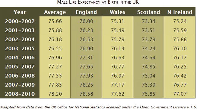
Figure 14-11. Adding a right-border to table cells is a cross-browser way of adding borders to columns
Although IE 6 doesn’t support the alternate background colors, it renders the borders correctly, as Figure 14-12 shows.
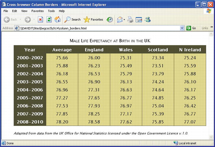
Figure 14-12. Even older browsers support border-collapse
Switching the border from the right to the bottom of each cell creates row borders, as shown in Figure 14-13 (the code is in row_borders.html):
Figure 14-13. Adding a border to the bottom of each cell creates cross-browser row borders
Applying Other Styles to Columns
The CSS table model is described as being row primary because you specify rows explicitly in the HTML markup. Columns are derived from the cells in each row. Although the HTML <colgroup> and <col> elements allow you to specify column groups and individual columns, neither is required.
If you decide to specify column groups and columns in the HTML markup, you need to be aware that columns accept only four styles, namely:
- background
- border
- width
- visibility
For borders on columns and column groups, border-collapse must be set to collapse.
When used for <colgroup> or <col>, the only legal value for visibility is collapse. According to the specification, this hides the column and reduces the width of the table by the column’s width. However, this is currently implemented correctly only by IE 8+ and Opera 11 + .
To demonstrate the use of visibility with columns, the HTML markup in column_collapse.html identifies the six columns in a table like this:
<colgroup span="1">
<colgroup>
    <col id="avg">
    <col id="eng">
    <col id="wales">
    <col id="scot">
    <col id="ni">
</colgroup>
The styles then hide the second and fourth columns like this:
#avg, #wales {
    visibility: collapse;
}
Figure 14-14 shows the result in IE 9. The columns are correctly hidden, and the width of the table has been reduced accordingly. Recent versions of Opera produce the same result. Firefox 14 removes the columns correctly, but leaves the outlines of two empty columns on the right. Chrome 21 and Safari 6 ignore the visibility property on columns.
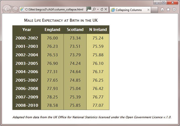
Figure 14-14. Modern versions of Internet Explorer correctly hide columns
Note Setting visibility to collapse on a column doesn’t affect the way the :nth-of-type() pseudo-class applies the background color to alternate table cells. The cells are still there. They’re just not displayed.
Using the visibility Property with Table Rows
The visibility property can also be used with table rows. As with <colgroup> and <col>, the only legal value is collapse. The styles in row_collapse.html hide the third row like this:
tr:nth-child(3) {
    visibility: collapse;
}
IE 9, Firefox 14, and Opera 12 hide the row and close the gap. However, Chrome 21 and Safari 6 leave the ugly gap shown in Figure 14-15.
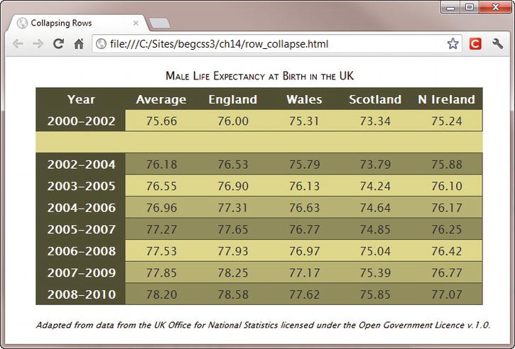
Figure 14-15. WebKit-based browsers don’t handle the visibility property correctly on tables
IE 8 doesn’t hide the row because it doesn’t support the :nth-child() pseudo-class, but it works correctly if you use an ID selector instead. Interestingly, when you use an ID selector, IE 6 and IE 7 handle the visibility property more gracefully than Chrome and Safari. They simply ignore it, and display the row as normal.
Adjusting the Space Between Table Cells
The CSS equivalent of the HTML cellspacing attribute is border-spacing, which is mutually exclusive with border-collapse. If you want to control the spacing between cells, border-collapse must be set to separate or omitted altogether (it’s the default way of displaying tables).
Unlike cellspacing, which adds the same amount of space around all sides of each cell, border-spacing lets you specify different values for horizontal and vertical spacing. If you supply one value, it applies to both axes. However, if you supply two values, the first is applied to horizontal spacing, and the second to vertical spacing.
Tip Setting border-spacing to 0 is not the same as setting border-collapse to collapse. The spacing between the cells is eliminated, but the borders don’t merge.
The style for the table in border-spacing.html looks like this:
table {
    border: #000 solid 5px;
    border-spacing: 30px 10px;
}
In most browsers, this produces the result shown in Figure 14-16. The exceptions are IE6 and IE7, which don’t support border-spacing at all. Also, Safari and Chrome incorrectly double the vertical spacing between the two <tbody> sections.
Figure 14-16. You can adjust the horizontal and vertical spacing between cells independently
Adjusting Horizontal and Vertical Space Inside Table Cells
If you’re wondering what the CSS equivalent of cellpadding is, there isn’t one. You just use the ordinary padding property, which gives you complete control over the padding in every table cell, and you can have different amounts of padding on each side. It’s important to remember that table rows are always as high as the tallest cell; and columns normally expand to accommodate the widest cell.
To demonstrate how padding works in table cells, the styles in padding_cells.html applies a different amount of padding to each side like this:
td {
    border: #F00 solid 1px;
    padding: 5px 10px 20px 15px;
}
However, the second cell in the third row is styled like this:
tr:nth-child(3) > td:nth-child(2) {
    padding: 40px;
}
This adds considerably more padding than to other cells. As Figure 14-17 shows, this increases the height of the entire row, as well as the width of the column. The extra height also affects the top padding in the cells on either side but does not apply the same value as in the center cell.
Figure 14-17. A larger amount of padding in one cell affects other cells in the same row and column
Controlling the Position of the Table Caption
By default, the caption appears above the table, but you can move it underneath using the caption-side property, which accepts two values:
- bottom Puts the caption under the table.
- top Puts the caption above the table. This is the default value.
In the original CSS2 draft, there were two other values: left and right. However, Firefox was the only browser to offer support, so they were removed from the final specification.
All mainstream browsers, including IE 8, support caption-side. It’s not supported in IE 6 or IE 7.
Because the caption is an integral part of the table, you can define the caption-side property in the style rule for the table or in a separate rule for the caption itself. The caption inherits its text color and width from the table. You can style a caption like any other text element, giving it a color and font properties of its own.
Tip Most browsers support giving a caption a margin to distance it from the table. However, some WebKit-based browsers have problems with margins on captions, so it’s safer to use padding.
The empty-cells property is supported by all browsers currently in widespread use, but not by IE 6 and IE 7. It accepts the following values:
- hide Prevent the display of an empty cell’s borders and backgrounds.
- show Draw borders and backgrounds on every cell, even if it contains no content. This is the default setting.
An empty cell is defined as a cell that contains absolutely nothing or one that has the visibility property set to hidden. However, setting the visibility of a cell to hidden also prevents the display of its borders and background, even when empty-cells is set to show.
Caution Many HTML editors, such as Dreamweaver, automatically insert the HTML entity for a nonbreaking space ( ) into empty table cells. CSS regards this as content, even though nothing appears in the cell when viewed in a browser. For a cell to be treated as empty it must not contain anything other than new lines and whitespace between the opening and closing <td> or <th> tags.
To demonstrate how this property works, empty-cells.html contains four identical tables in which the second row contains only empty cells, while the visibility property of the middle cell in the third row has been set to hidden.
As expected, the content, background color, and borders of the cell in the third row are not displayed. However, the treatment of the empty row depends on whether it has any borders and on the setting for border-collapse. As Figure 14-18 shows, the empty row is completely hidden only when border-collapse is set to collapse and there are no borders around the cells. In all other cases, a small gap is left in place of the empty row. This behavior is consistent across all browsers in widespread use. In the case of border-collapse: separate, this is correct. The specification says that empty cells are “transparent through the cell, row, row group, column and column group backgrounds, letting the table background show through.” However the double border in the third table appears to be incorrect.
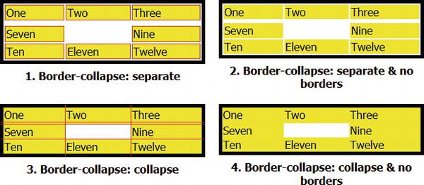
Figure 14-18. The use of cell borders affects the way browsers treat empty cells
Controlling the Width of a Table
Tables are designed to wrap around their content, expanding and contracting depending on the size of the widest cell in each column and the tallest cell in each row. Although HTML 4.01 and XHTML 1.0 permit the width attribute on many table elements, it rarely has the desired effect. If an oversized element is placed in a table cell, the width attribute is ignored. In HTML5, the width attribute has been removed from all table elements in favor of using CSS.
But how can the CSS width property prevail in the face of the willful nature of table elements? On its own, it can’t. But it can in combination with the table-layout property which accepts two values:
- auto This is the default way tables behave, expanding to accommodate the widest element.
- fixed The width of each column is fixed. In HTML5, the size is determined by the width of each cell in the first table row. In HTML 4.01 and XHTML 1.0, the width attribute of <colgroup> or <col> elements, if specified, takes precedence.
The table-layout property is supported by all browsers in current use, including IE 6.
EXERCISE: FIXING COLUMN WIDTHS
In this exercise, you’ll fix the width of the cells in the first row of a table. You’ll then use a browser’s developer tools to examine the effect of table-layout. The width of one column is deliberately narrow to demonstrate what happens with fixed-width tables.
Use as your starting point table-layout_begin.html in the ch14 folder. The finished files are table-layout_end.html and table-layout_ie6.html.
- Load the page into a browser to see how the table is displayed. The styles set the table width to 500px. The cells in the first row each contain a single number, but the second row contains more text. Because the cells in the first row don’t have a declared width and table-layout hasn’t been set, the cells automatically adjust to accommodate their content, as shown in Figure 14-19.
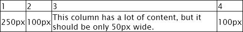
Figure 14-19. By default, table cells automatically adjust their width to the size of their content
- Set the width of each cell in the first row using the :first-child and :nth-child() pseudo-classes like this:
           tr:first-child > td:first-child {
               width: 50%;
           }
           tr:first-child > td:nth-child(2) {
               width: 20%;
           }
           tr:first-child > td:nth-child(3) {
               width: 10%;
           }
           tr:first-child > td:nth-child(4) {
               width: 20%;
} - Save the page, and test the table again in a modern browser. The columns no longer expand automatically, but are controlled by the widths assigned to the first row of cells, as shown in Figure 14-20.
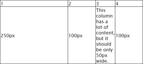
Figure 14-20. The columns are taking their width from the cells in the first row
- Use your browser’s developer tools to check the actual width of the third column. In Safari or Chrome, right-click the column, and select Inspect Element from the context menu. Then select the <td> markup for one of the column’s cells in the panel that opens. Because the column’s width has been set to 10% and the table is 500px wide, it should be 50px wide. But as Figure 14-21 shows, the column is actually 68px wide in Chrome. It might be slightly different in another browser, but in all browsers, the width of each column has been adjusted automatically to accommodate the long words in the third column.
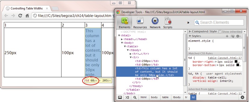
Figure 14-21. The table has automatically adjusted the width to make sure the text fits
- Amend the table style rule to set table-layout to fixed:
           table {
               width: 500px;
               border-collapse: collapse;
               border: 1px solid #000;
               table-layout: fixed;
} - Save the page, and test the table again. This time, the third column is exactly 50px wide, but the longer words protrude into the fourth column (see Figure 14-22).
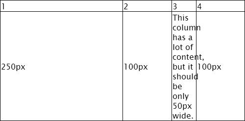
Figure 14-22. The columns are now the correct width, but long text overflows into the next column
- To deal with the overflow, amend the style for table cells like this:
           td {
               border-right: 1px solid #000;
               border-bottom: 1px solid #000;
               overflow: auto;
} - Save and test the page in several browsers. Some add a horizontal scrollbar to the bottom of the cell. Firefox and Opera just let the content spill out as before.
- Change the style rule for table cells to deal with the overflow more elegantly:
           td {
               border-right: 1px solid #000;
               border-bottom: 1px solid #000;
               overflow: hidden;
               text-overflow: ellipsis;
} - Test the page again. All browsers shorten the overflow with an ellipsis (see Figure 14-23).
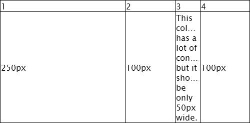
Figure 14-23. The long text is replaced by an ellipsis
Instead of an ellipsis, you could break the long words with word-wrap: break-word (see “Breaking Overflow Text” in Chapter 4). The draft CSS3 Text module also proposes a hyphens property that can be set to auto to automate hyphenation, but at the time of this writing, support is still experimental. However, the main focus of this exercise is not on dealing with overflow text. Instead, it’s designed to show that fixed column widths are not affected by the size of their content. When using table-layout: fixed, you need to make sure your columns are wide enough.
To learn more about table and column widths, continue this exercise by adding padding to the style rule for the table cells, and then checking the table width with the browser’s developer tools. Also increase the width of the table cells’ right border. In both cases, the table width remains unchanged. Unlike the ordinary box model, padding and borders are included inside the width of table elements.
Older browsers don’t understand the :nth-child() pseudo-class. If you need to use table-layout: fixed with IE 8 or older versions of Internet Explorer, add the width attribute to the opening tag of each table cell in the first row. You can examine the code in table-layout_ie6.html in the ch14 folder. As the filename suggests, fixed table layout works even in IE 6.
Tip The preceding exercise used child combinators in step 2 only to demonstrate that the cells in the first row control column widths. You can achieve the same effect with just td:first-child, td:nth-child(2), and so on.
Adding Scrollbars to Table Cells
Tables are designed for the presentation of data, so it should rarely, if ever, be necessary to add scrollbars to a table cell. However, as noted in the preceding exercise, setting the overflow property to auto doesn’t work on some browsers. In the event that you need to add scrollbars to a table cell, nest a <div> inside the table cell and set the overflow property of the <div> to auto. It’s the content of the table cell that needs to scroll, not the table cell itself.
Controlling the Horizontal and Vertical Alignment of Table Cells
By default, browsers align the content of table cells on the left and vertically in the middle. To control the horizontal alignment, use the text-align property. When used with table cells, it takes exactly the same values as for text, namely:
- left
- center
- right
- justify
Not surprisingly, you control the vertical alignment inside table cells with the vertical-align property. However, when used with table cells, vertical-align accepts only the following values:
- top
- middle
- bottom
- baseline
The first three are self-explanatory, but baseline needs a little explanation. Setting vertical-align to baseline aligns the first line of content with the baseline of the tallest similarly aligned content in the same row. The meaning should become clear from Figure 14-24, which shows the effect of using baseline for the fourth and fifth columns in vertical-align.html. The baseline of the smaller text in the fourth column is aligned with the baseline of the larger text in the next column.
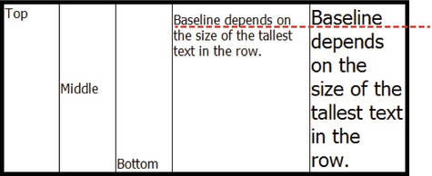
Figure 14-24. There are four options for vertical alignment in table cells
The baseline value affects only the first line of content in a cell, and is determined independently for each row.
That covers the theoretical side of styling tables with CSS. To end this chapter, let’s put that knowledge to practical use by styling a data table.
EXERCISE: STYLING A WEATHER CHART
In this exercise, you’ll add some styles to a table containing weather data. Some of the selectors are supported only by modern browsers, but the styles still improve the look of the table even in IE 8 and older browsers. Use as your starting point weather_begin.html and styles/weather_begin.css in the ch14 folder. The finished table is in weather_end.html and styles/weather_end.css. Listing 14-1 shows the HTML markup for the first two rows of the table.
Listing 14-1. Weather Data Table
<table>
<caption>
Average Weather in Southern England, 1971–2000
</caption>
<tr>
<th></th>
<th>Max Temp<br>
[°C]</th>
<th>Min Temp<br>
[°C]</th>
<th>Days of<br>
Air Frost</th>
<th>Sunshine<br>
[hours]</th>
<th>Rainfall<br>
[mm]</th>
<th>Rain >= 1mm [days]</th>
</tr>
<tr>
<th>Jan</th>
<td>7.0</td>
<td>1.4</td>
<td>10.4</td>
<td>53.1</td>
<td>79.0</td>
<td>13.0</td>
</tr>
<!-- Other rows omitted -->
</table>
The table contains a caption, and the first row consists of <th> table headers. The first cell of each subsequent row is also a <th> element, but the remaining data cells use <td> tags.
- Load the page into a browser. As Figure 14-25 shows, the table is unstyled apart from the font.
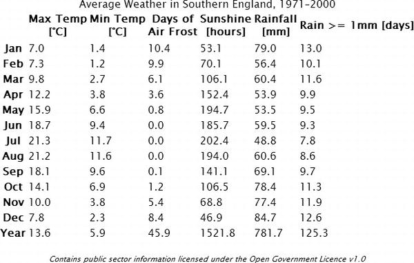
Figure 14-25. The table needs a touch of style
- To make it easy to apply different styles to the main headings and the rest of the data, wrap the first row in a pair of <thead> tags like this:
<thead>
<tr>
<th></th>
<th>Max Temp<br>[°C]</th>
<th>Min Temp<br>[°C]</th>
<th>Days of<br>Air Frost</th>
<th>Sunshine<br>[hours]</th>
<th>Rainfall<br>[mm]</th>
<th>Rain >= 1mm [days]</th>
</tr>
</thead>
- Wrap the remaining table rows in a pair of <tbody> tags:
</thead>
<tbody>
<tr>
<th>Jan</th>
<!-- Many lines omitted -->
<td>125.3</td>
</tr>
</tbody>
</table>
- In the style sheet, add the following rule to give the table a width, set its borders to collapse, and reduce the size of the font:
table {
width: 650px;
border-collapse: collapse;
font-size: 14px;
}
- Move the caption to the bottom of the table, give it some padding to move it away from the bottom row, render it as small caps, and increase its font size like this:
caption {
caption-side: bottom;
padding-top: 1em;
font-variant: small-caps;
font-size: 18px;
}
- Give the table headers a top and bottom border (see Figure 14-26). Although modern browsers allow you to apply borders directly to the <thead> element, use a descendant selector to apply the borders to the individual <th> cells to keep older browsers happy.
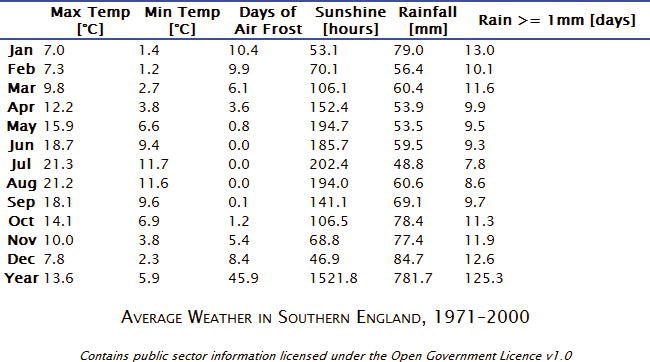
Figure 14-26. The caption has moved and the top headings have borders
thead th {
border-top: 2px #35478C solid;
border-bottom: 2px #35478C solid;
}
- The first cell in all the data rows is a <th> element. So, use the :first-child pseudo-class to give the first column a width of 7%, left-align the text, and add some padding like this:
th:first-child {
width: 7%;
text-align: left;
padding-left: 10px;
}
- Each column has a <th> cell in the first row, so you can set the width of the other columns with a simple type selector. This has lower specificity than th:first-child, so the style won’t affect the first column. Also give the header cells some padding on the top and bottom. Add the following rule to the style sheet:
th {
width: 15.5%;
padding: 5px 0;
}
- The decimal fractions in the data cells need to be lined up vertically. CSS currently doesn’t have a way to line up the decimal point. But each number has a single digit after the decimal point, so you can right-align the cells and add a large amount of right padding to make the data look centered, as shown in Figure 14-27. Add the following style:
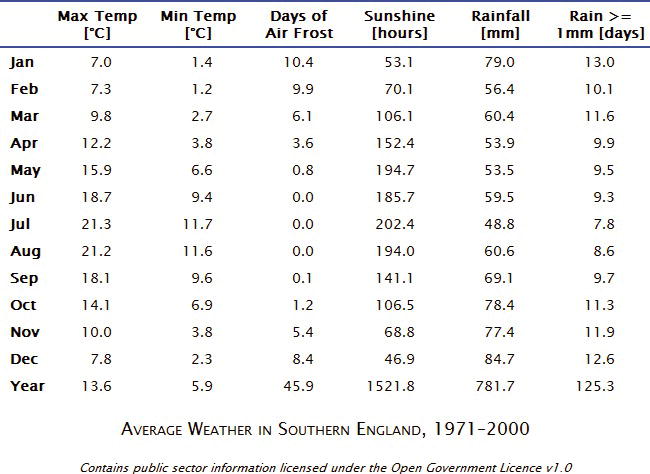
Figure 14-27. The data is neatly aligned in each column
td {
text-align: right;
padding: 5px 35px 5px 0;
}
- Give the table rows in the <tbody> section alternate background colors using the :nth-child() pseudo-class.
tbody tr:nth-child(odd) {
background-color: #FFEDD2;
}
tbody tr:nth-child(even) {
background-color: #D8CCBA;
}
- For older browsers, use one of the colors for the whole <tbody>. Although you’re using the same color, you can’t use a group selector because browsers ignore the entire style rule if they don’t recognize one of the selectors. So, add this after the styles you have just entered:
tbody {
background-color: #FFEDD2;
}
- As a final touch, add a rule to change the background color of a row when the mouse pointer hovers over it:
tbody tr:hover {
background-color: #F4F1EC;
}
- Save the style sheet, and test the table in a modern browser. It’s now styled like Figure 14-28.
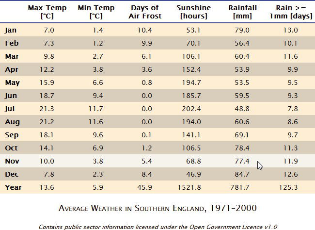
Figure 14-28. The table now looks much more visually attractive and easier to read
The hover effect isn’t intended to work on touch screens. (Have you ever tried hovering your finger over your mobile phone or tablet?) In my tests, nothing happens if you tap a row on an iPad. On an Android tablet, though, the row does change color.
In IE 8 and older browsers, the table doesn’t have alternate colored rows, but the columns are evenly spaced and the data is correctly aligned. IE 6 doesn’t support the :first-child pseudo-class, so the first column is the same width as the others, and the text isn’t left-aligned, but the table is presentable.
Summary
If you’ve been using the HTML cellspacing attribute, the border-collapse and border-spacing properties offer much greater control over the horizontal and vertical spacing between cells. There’s no direct equivalent of cellpadding, but table cells handle padding in the same way as the CSS box model, giving you the freedom to adjust it independently on each side of a cell. Other advantages of styling tables with CSS include the ability to style all of a table’s internal and external borders independently, to move the caption below the table, and to hide empty cells.
You can also control the width of columns by setting the table-layout property to fixed. This fixes the width of each column according to the width of the cells in the first table row. However, it’s important to remember that borders and padding are not added to the overall width of a table.
The CSS3 :nth-child() and related pseudo-classes discussed in Chapter 13 make it considerably easier to style columns without the need to declare them as <colgroup> and <col> elements in the HTML markup. You can also use these pseudo-classes to assign different backgrounds to alternate rows and/or columns.
In the next chapter, we’ll look at using pseudo-elements to add generated content to elements in your web pages. The original idea of generated content was to enhance numbered sequences, but it has been adapted to an increasing range of interesting visual effects.