
One of the main drawbacks of website design has always been the strict rectangular layout imposed by the box model. The CSS Transforms module (http://dev.w3.org/csswg/css3-transforms/) seeks to give designers greater freedom by making it possible to shift, rotate, scale, and skew elements. Originally, there were three separate modules: for two- and three-dimensional transforms, and for scalable vector graphics (SVG). These have been merged into a single module, which is currently only a working draft. However, browsers have made significant progress with two-dimensional transforms. They’re supported by all mainstream browsers except IE 8 and earlier.
A simple example of a 2D transform is scaling down and rotating an image in its normal state, and restoring its normal size and orientation on hover. When this happens with just a transform, the change is instantaneous. The CSS Transitions module (http://dev.w3.org/csswg/css3-transitions/) offers a simple way to smooth the change from one state to another over a specified duration. CSS transitions can be applied to a wide range of properties, and are supported by all mainstream browsers except IE 9 and earlier.
In this chapter, you’ll learn about the following:
- Using 2D transform functions to move, rotate, scale, and skew elements
- Preventing touch-screen devices from activating the :hover pseudo-class
- Understanding which properties are animatable
- Controlling the duration and speed of a transition
- Setting up a sequence of transitions
- Creating a rollover image without JavaScript
Browser Support for 2D Transforms and Transitions
Most mainstream browsers have supported 2D transforms and transitions for several years with browser-specific prefixes. The exception is Internet Explorer. IE 8 and earlier support neither. IE 9 introduced support for 2D transforms with the -ms- prefix. IE 10 added support for transitions.
The W3C announced in June 2012 that browsers could start using unprefixed properties for both transforms and transitions. The first versions to do so are IE 10, Firefox 16, and Opera 12.50. At the time of this writing, WebKit-based browsers still require browser-specific prefixes.
 Note The source files for this chapter contain the browser-specific properties in separate rules for testing in older browsers. The unprefixed properties are lower down the styles, so they override the browser-specific ones.
There are just two properties for 2D transforms, as described in Table 20-1.
Table 20-1 . Properties for Two-Dimensional Transforms
| Property | Initial Value | Description |
|---|---|---|
| transform | none | Specifies how the element is to be transformed. Takes as its value a space-separated list of transform functions (see Table 20-2). |
| transform-origin | 50% 50% | Specifies the anchor point of the transform. Takes one or two lengths, percentages, or keywords representing the horizontal and vertical positions, respectively. If only one value is given, the vertical position defaults to center. |
Note The properties in Table 20-1 are also used for 3D transforms. This chapter discusses them only in the context of 2D transforms.
The transform property expects one or more 2D transform functions as its value. The functions are described in detail in the following sections.
By default, a transform originates from the center of the element. So, an element rotates around its center. When you scale an element, it expands or shrinks in all directions. You can change the anchor point from which the transform originates using the transform-origin property.
The transform-origin property takes one or two values. If both values are set, the first one specifies the horizontal position of the anchor point, and the second specifies the vertical position. The values can be lengths, percentages, or keywords.
Lengths and percentages are measured from the top-left corner of the element’s border box (see Figure 6-1 in Chapter 6).
Percentages are relative to the width and height of the element’s border box. In the case of a table, percentages are relative to the table and its caption (if any).
Valid keywords for the horizontal position are left, center, and right. Keywords for the vertical position are top, center, and bottom.
If only one value is given for transform-origin, it’s used for the horizontal position. The vertical position defaults to center.
The transform and transform-origin properties are not inherited, so if you want child elements to use the same value as their parent, you can set their value to the inherit keyword.
The draft CSS Transforms module lists ten 2D transform functions. Some affect only one axis. Others affect the X and Y axes simultaneously. X and Y normally refer to the horizontal and vertical axes, respectively, but as explained later in this chapter this is not always the case. The functions are described in Table 20-2.
Table 20-2. Two-Dimensional Transform Functions
| Function | Description |
|---|---|
| translateX() | Moves the element along the X axis by the specified length or percentage. |
| translateY() | Moves the element along the Y axis by the specified length or percentage. |
| translate() | Moves the element from its default position. Takes two comma-separated lengths or percentages. The first value represents the horizontal offset and the second the vertical offset. If only one value is given, the element is moved only horizontally. |
| rotate() | Rotates the element around its anchor point by the specified angle. |
| scaleX() | Scales the element along the X axis by the specified scaling factor. |
| scaleY() | Scales the element along the Y axis by the specified scaling factor. |
| scale() | Scales the element. Takes one or two numbers as the scaling factor. If one number is given, both axes are scaled by the same multiplier. If two comma-separated numbers are given, the first applies to the X axis and the second to the Y axis. |
| skewX() | Skews the element along the X axis by the specified angle. |
| skewY() | Skews the element along the Y axis by the specified angle. |
| matrix() | Specifies a 2D transform using a transform matrix of six values. |
Although six of the function names use a mixture of lowercase and uppercase, all names are case-insensitive.
Note The functions in Table 20-2 do not use browser-specific prefixes. The prefixes are applied only to the transform and transform-origin properties. For example, to scale an element in WebKit-based browsers, use -webkit-transform with the unprefixed scale() function.
Changing an Element’s Position with translate()
The translate() function and its single-axis counterparts translateX() and translateY() have a similar effect as relative positioning. They move an element from its default position without affecting the position of surrounding elements. Used in combination with other transform functions, they can move an element at the same time as scaling, rotating, or skewing it.
Note In geometry, translate means moving every point of an object a constant distance in a specified direction.
To move an element horizontally, use the transform property, and set its value to translateX() with a length or percentage between the parentheses. A positive length or percentage moves the element to the right. A negative one moves it to the left. For example in translate_1.html, there’s a <div> that contains two images alongside each other. Both images are 400px wide and are surrounded by a 10px margin. The second image is moved 25% of its width—in other words, 100px—to the left (see Figure 20-1) by the following style:
img:last-child {
    transform: translateX(-25%);
}

Figure 20-1. The second image is moved 25% of its width to the left, and overlaps the first image
Note The examples assume the browser window is wide enough to display both images alongside each other.
In translate_2.html, the image is moved 50px down the page using translateY() like this:
img:last-child {
    transform: translateY(50px);
}
As Figure 20-2 shows, moving the image vertically doesn’t affect the position of the following paragraph. The image overlaps the text, obscuring it.
Figure 20-2. The image overlaps the following paragraph when moved vertically
There are two ways to move an element along both axes. One is to use both translateX() and translateY() separated by a space like this (the code is in translate_3.html):
img:last-child {
    transform: translateY(25px) translateX(-50px);
}
This moves the second image 25px down and 50px to the left, as shown in Figure 20-3.
Figure 20-3. The image is moved both horizontally and vertically
The alternative—and much simpler—way is to use the translate() function with two arguments: the first for the horizontal axis, and the second for the vertical axis like this (the code is in translate_4.html):
img:last-child {
    transform: translate(-50px, 25px);
}
This produces exactly the same result as Figure 20-3.
Note When using translate(), the values must be in the correct order: horizontal followed by vertical. The individual translateX() and translateY() functions can be in either order because there’s no ambiguity.
However, the following styles in translate_5.html won’t work as you might expect:
img:last-child {
    transform: translateX(-50px);
    transform: translateY(25px);
}
Although both declarations are using different functions, the normal rules of the cascade apply. The second value overrides the first one, so the image is moved only vertically.
Caution All transforms that apply to an element must be specified as a space-separated list in the same style declaration. Otherwise, the last declaration overrides any previous ones.
To rotate an element, use the transform property and set its value with the rotate() function, which takes an angle as its argument. You can express the angle using degrees, radians, gradians, or turns (see Table 3-3 in Chapter 3). Degrees and turns are the easiest to use. One turn is equal to 360°.
Note CSS degrees follow compass bearings with 0° pointing straight up with the angle increasing in a clockwise direction. Using polar coordinates in browser-specific gradient functions, as described in Chapter 19, was an exception and was eliminated in the final specification.
In rotate_1.html, two images are rotated clockwise using degrees and the equivalent turn like this:
img:first-child {
    transform: rotate(18deg);
}
img:last-child {
    transform: rotate(.05turn);
}
Caution There must be no space between the number and the deg or turn units of measurement.
As Figure 20-4 shows, both images are rotated at the same angle and are clipped when they overflow the browser viewport.
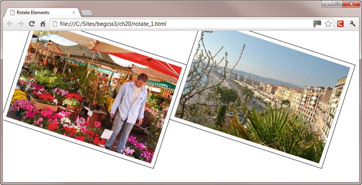
Figure 20-4. Rotating an element close to the edge of the page can result in it being partially obscured
You can use a negative value to rotate an element counterclockwise. For example, the styles in rotate_2.html use a negative angle and the equivalent positive value to rotate the images in the opposite direction like this:
img:first-child {
    transform: rotate(-18deg);
}
img:last-child {
    transform: rotate(342deg);
}
The values –18° and 342° have the same meaning, so both images are displayed at the same angle, as shown in Figure 20-5.

Figure 20-5. You can use a negative angle to rotate an element counterclockwise
Changing the Anchor Point with transform-origin
By default, 2D transforms originate from the center of an element. With translate(), translateX(), and translateY(), it makes no difference where the movement is calculated from. The result is always the same. However, with the other transform functions, it can make a significant difference. The images in Figures 20-4 and 20-5 are rotated around their center points. But you can change the anchor point using transform-origin.
The styles in rotate_3.html rotate both images at the same angle (–18°), but around different anchor points like this:
img {
    /* Other styles omitted */
    transform: rotate(-18deg);
}
img:first-child {
    transform-origin: right top;
}
img:last-child {
    transform-origin: left bottom;
}
As Figure 20-6 shows, the angle remains the same, but the result is very different.

Figure 20-6. The images are rotated the same amount around different anchor points
It’s not just images that can be rotated. You can rotate any element, including text. When rotating a heading, it’s best to set the anchor point with transform-origin to the top-left corner. This is because headings stretch across all available horizontal space unless you give them a fixed width. As a result, the rotated heading ends up in the middle of the page.
The order in which you use the transform functions is also important. In rotate_4.html, an <h1> heading is moved 215px down the page using translateY() before being rotated counterclockwise through a quarter turn around its top-left corner like this:
h1 {
    transform: translateY(215px) rotate(-.25turn);
    transform-origin: left top;
}
Using the transform property to move the heading results in a gap being left where it originally was. So, the images <div> is given a negative top margin and a positive left margin to move it up and to the right to make room for the rotated heading.
#images {
    margin-left: 50px;
    margin-top: -50px;
}
Figure 20-7 shows the result.
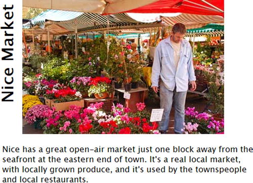
Figure 20-7. You can also rotate text
However, in rotate_5.html, the order of the transform functions is reversed like this:
h1 {
    transform: rotate(-.25turn) translateY(215px);
    transform-origin: left top;
}
This produces the result shown in Figure 20-8.
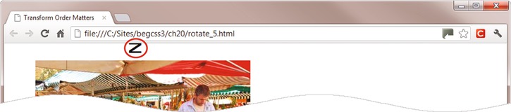
Figure 20-8. Reversing the order of the transform functions produces a completely different result
At first sight, this seems completely nonsensical. The heading has been rotated around its top-left corner, but instead of being moved vertically, it has shifted horizontally. It’s not a bug. See the sidebar “Understanding the Local Coordinate System” for an explanation.
UNDERSTANDING THE LOCAL COORDINATE SYSTEM
In normal circumstances, the X axis increases horizontally to the right and the Y axis increases vertically downward. However, the transform functions establish a local coordinate system. This means that when you rotate an element, the X and Y axes are also rotated by the same angle.
In the example in rotate_5.html, the heading is rotated and moved like this:
transform: rotate(-.25turn) translateY(215px);
The rotate() function not only flips the heading a quarter turn counterclockwise, but it also flips all coordinates associated with the heading by the same amount. As a result, the heading’s Y axis is flipped 90° counterclockwise. So, when translateY() is applied, the heading moves 215px to the right rather than down (see Figure 20-8). Although this appears counterintuitive, it’s actually moving along the Y axis in the local coordinate system. To move the heading down the page after rotating it, you need to use translateX() instead like this (the code is in rotate_6.html):
transform: rotate(-.25turn) translateX(-215px);
The length is negative because the heading needs to move 215px to the left along the X axis in the local coordinate system.
Deciding whether to move an element before rotating it is a matter of choice. Just remember that once an element has been rotated, its X and Y axes have also changed.
To scale an element, use the transform property and set its value with the scaleX(), scaleY(), or scale() functions. The first two functions take a number as their sole argument, and use it as a scaling factor for the X or Y axis, respectively. For example, scale_1.html contains three identical headings in a large bold font. The first one is rendered at its normal size, but the second one is scaled to half its normal width, and the third one to half its normal height. By default, scaling is done from the center of an element, so transform-origin is set to left to anchor the headings in their original position:
h1 {
    font-family:"Arial Black", Gadget, sans-serif;
    font-size:48px;
    margin: 5px;
    transform-origin: left;
}
#horizontal {
    transform: scaleX(.5);
}
#vertical {
    transform: scaleY(.5);
}
Figure 20-9 shows the result. The horizontally scaled text looks okay, but the vertically scaled text has jagged edges.

Figure 20-9. Scaling text horizontally and vertically
Note It’s the text box that’s scaled, not just the font size. If you scale a paragraph of text horizontally, the text is not reflowed.
The scale() function accepts one or two arguments. If you pass it a single number, the same scaling factor is applied to both axes. If you pass it two numbers separated by a comma, the first is used as the scaling factor for the X axis and the second for the Y axis.
In scale_2.html, two 400px wide images are scaled to two-thirds of their normal size like this:
.scaleimg {
    /* Other styles omitted */
    transform: scale(0.66);
}
As Figure 20-10 shows, the images are reduced in size, but they still occupy their normal space, leaving a wide gap all around them. This happens even if you remove the width and height attributes from the <img> tags in the HTML markup.
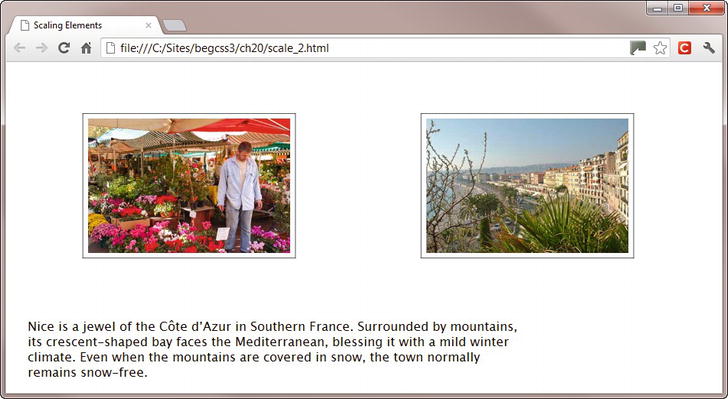
Figure 20-10. Scaling images reduces their size, but not the amount of space they occupy
You can’t use the scale() function if you want to remove the space around images that have been scaled down. Instead, you need to adjust the width and height attributes in the HTML. You can then use scale() to restore them to their normal size when hovered over. For example, in scale_3.html, the images have been resized in the HTML like this:
<img src = "images/nice_market.jpg" alt = "Flower market in Nice" width = "268" height = "178" ←
class = "scaleimg">
<img src = "images/nice_seafront.jpg" alt = "Nice seafront" width = "268" height = "178" ←
class = "scaleimg">
This removes the extraneous space, as shown in Figure 20-11.
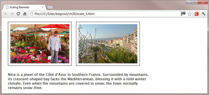
Figure 20-11. The images have been resized in the HTML markup
The images are scaled up to their original size when hovered over, and to prevent them partially disappearing offscreen, the anchor points are set like this:
.scaleimg:first-child {
    transform-origin: left top;
}
.scaleimg:last-child {
    transform-origin: right top;
}
.scaleimg:hover {
    transform: scale(1.5);
}
As Figure 20-12 shows, the left image is restored to its full size when the mouse pointer is over it.
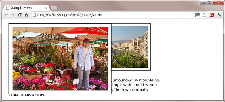
Figure 20-12. The image is scaled up when hovered over
When you mouse away from the image, it returns to its reduced size. The change in size in both directions is instantaneous, which can be rather jarring. However, as you’ll learn later in this chapter, you can scale the image smoothly over a specified duration using a CSS transition.
Caution Tapping the image on a touch screen scales it up in the same way as hovering over it. However, it doesn’t return to its smaller size until you tap another element that uses the :hover pseudo-class. As Figure 20-12 shows, the example in scale_3.html obscures the text. When scaling elements, make sure they’re in a position where they won’t obscure important content. Alternatively, use the solution in the following section to disable scaling on touch screens.
Preventing Elements from Being Scaled on Touch Screens
The simple way to prevent elements from being scaled on touch screens is to test for the JavaScript ontouchstart event. If the event exists, you know that the page has been loaded into a touch-screen device. You can then use JavaScript to add an extra class name to the images and create a style rule that prevents them from being scaled.
This extra style rule has been added in scale_4.html:
.noscale.scaleimg:hover {
    transform: scale(1);
}
This sets the scale of elements with both the noscale and scaleimg classes to 1 when hovered over. In other words, the element remains unscaled.
Alternatively, if no other transform functions are being used, you could set the value to none:
.noscale.scaleimg:hover {
    transform: none;
}
At the foot of the page is the following script block:
<script>
if ('ontouchstart' in window) {
    function noScale(scale, noscale) {
        var images = document.getElementsByClassName(scale);
        for (var i = 0, len = images.length; i < len; i++) {
            images[i].className = scale + ' ' + noscale;
        }
    }
noScale('scaleimg', 'noscale'),}
</script>
The script begins by checking whether the ontouchstart event exists. If it doesn’t, the rest of the script is ignored. It then defines a function called noScale(), which takes two arguments. The first is the class name assigned to elements that are being scaled. The second is the class name you want to add to prevent scaling on touch screens. The last line of the script executes the function by passing the two class names to it.
If you want to use different class names, just change the arguments passed to the noScale() function.
On a touch-screen device, the images remain unscaled when tapped. But on all other devices that support CSS transforms, they’re scaled up and down on mouseover and mouseout.
Table 20-2 doesn’t contain a transform function to flip elements horizontally or vertically, but you can achieve the same effect by passing negative values to scaleX(), scaleY(), and scale(). Setting the value to -1 preserves the original size, but flips the element on the relevant axis. To demonstrate the effect, scale_5.html contains the following styles, which are applied to identical <div> elements:
#horizontal {
    transform: scaleX(-1);
}
#vertical {
    transform: scaleY(-1);
}
#shrinkflip {
    transform: scale(-.5);
}
The value of transform-origin is not set, so the elements are flipped around their center, producing the result in Figure 20-13. The final <div> is flipped and scaled down along both axes, which produces the same effect as scaling it down and rotating it 180°.

Figure 20-13. Setting the scaling factor to a negative number flips the element around the relevant axis
To skew an element, use the transform property and set its value by passing an angle as the argument to skewX() or skewY(). With skewX(), a positive angle skews the element to the left, and a negative angle skews it to the right. With skewY(), a positive angle skews the element vertically and rotates it in a clockwise direction. A negative angle rotates it in an anticlockwise direction.
The following example is in skew.html (see Figure 20-14):
#horizontal {
    transform: skewX(-30deg);
}
#vertical {
    transform: skewY(20deg);
}

Figure 20-14. When objects are skewed, it also affects any text inside them
As the angle increases toward 90°, the object becomes more and more distorted until it disappears completely at exactly 90°. At 180°, there is no distortion whatsoever.
Note An earlier draft of the specification had a skew() function, but it was removed in March 2012 because elements are normally skewed only along one axis. Use only skewX() or skewY(). Although you can use both in the same style rule, they have a tendency to cancel out one another.
Transforming Elements with the matrix() Function
The matrix() function specifies a 2D transform in the form of a transformation matrix (http://en.wikipedia.org/wiki/Transformation_matrix). The function requires six arguments, all of which are numbers separated by commas.
Tip Unless you’re an expert in linear algebra (and I most certainly am not), you can forget about the matrix() function. Although it allows you to combine multiple transforms in a single operation, everything that the matrix() function does can be achieved using the individual transform functions described in the preceding sections. However, read on if you’re curious as to how it works.
The last two arguments always specify the number of pixels you want to move (translate) the element along the horizontal and vertical axes, respectively. The first four arguments control other transforms.
In most cases, the first and fourth arguments are the scaling factors for the horizontal and vertical axes, respectively. The second argument usually controls the angle of vertical skew, while the third one controls horizontal skew. All four arguments are used in combination to rotate the element. What makes using the matrix() function complicated is the need to convert angles of skew and rotation using trigonometric functions.
Let’s start with a simple example. In translate_4.html, the translate() function moves an image 50px left and 25px down (see Figure 20-3) like this:
img:last-child {
    transform: translate(-50px, 25px);
}
To do the same with the matrix() function, the equivalent style in matrix_1.html looks like this:
img:last-child {
    transform: matrix(1, 0, 0, 1, -50, 25);
}
The first and fourth arguments indicate a scaling factor of 1. In other words, the element retains its original size. The second and third arguments are set to zero, indicating that the element isn’t skewed.
Note When using the browser-specific -moz-transform property with Firefox 15 and earlier, you need to add px as the unit of measurement to the last two arguments passed to the matrix() function.
The styles in scale_4.html use the scale() function like this:
.scaleimg:hover {
    transform: scale(1.5);
}
.noscale.scaleimg:hover {
    transform: scale(1);
}
The equivalent styles in matrix_2.html achieve the same effect with the matrix() function:
.scaleimg:hover {
    transform: matrix(1.5, 0, 0, 1.5, 0, 0);
}
.noscale.scaleimg:hover {
    transform: matrix(1, 0, 0, 1, 0, 0);
}
The fifth and sixth arguments are set to zero, so the image doesn’t move. But you can combine scale and translate transforms in the matrix() function by using nonzero values for the last two arguments.
Setting the first and fourth arguments of the matrix() function to a negative value flips an element in the same way as passing a negative value to scaleX(), scaleY(), or scale(). The following styles in matrix_3.html produce the same results as scale_5.html and Figure 20-13:
#horizontal {
    transform: matrix(-1, 0, 0, 1, 0, 0);
}
#vertical {
    transform: matrix(1, 0, 0, -1, 0, 0);
}
#shrinkflip {
    transform: matrix(-.5, 0, 0, -.5, 0, 0);
}
So far, all the numbers passed as arguments are straightforward. They’re simply the scaling factor and the number of pixels you want to move the element. However, to skew an element, you need to calculate the tangent of the angle using the trigonometric tan() function. Unfortunately, CSS doesn’t support tan(), so you need to work it out yourself either using a scientific calculator or an online resource, such as www.rapidtables.com/calc/math/Tan_Calculator.htm.
The horizontal example in skew.html uses skewX() like this:
#horizontal {
    transform: skewX(-30deg);
}
The tangent of –30° is -.58, so the equivalent in matrix_3.html is this:
#horizontal {
    transform: matrix(1, 0, -.58, 1, 0, 0);
}
The vertical example uses an angle of 15°, the tangent of which is .27. So, the equivalent in matrix_4.html is:
#vertical {
    transform: matrix(1, .27, 0, 1, 0, 0);
}
These settings produce the same results as Figure 20-14.
Caution Although the scaling factors and translate coordinates are in the order horizontal/vertical, the order of the skew tangents is reversed. The second argument is for the vertical skew, and the third for the horizontal skew.
To rotate an element, the first four arguments to the matrix() function are as follows:
- The cosine of the angle of rotation
- The sine of the angle of rotation
- The inverse value of argument 2 (negative if 2 is positive, and vice versa)
- The same as argument 1
Tip There are calculators for cosine and sine at www.rapidtables.com/calc/math/Cos_Calculator.htm and www.rapidtables.com/calc/math/Sin_Calculator.htm.
In rotate_4.html, an <h1> heading was moved 215px along its vertical axis and then rotated through 90° counterclockwise using the following styles:
h1 {
    transform: translateY(215px) rotate(-.25turn);
    transform-origin: left top;
}
The cosine of –90° is 0 and the sine is -1, so the equivalent style using the matrix() function in matrix_5.html looks like this:
h1 {
    transform: matrix(0, -1, 1, 0, 0, 215);
    transform-origin: left top;
}
This produces the same result as Figure 20-7.
Note Although the translate arguments come last in the matrix() function, it’s clear that the heading is moved before it’s rotated. Otherwise, the heading would have moved along the Y axis in the local coordinate system.
Animating Property Values with CSS Transitions
When the value of a property changes—such as on hovering over an element—the change is instantaneous. When you mouse over a link, the speed of the change isn’t really important. But when an image is scaled up on hover, as in one of the examples earlier in this chapter, the sudden jump is jarring.
CSS transitions overcome this problem by animating a smooth change between one state and another over a specified duration. For example, you can scale and rotate the image over a period of one second. When you move the mouse away from the image, the transition is reversed, returning to its original state over the same duration. Transitions can be applied to all elements including the ::before and ::after pseudo-elements.
You define a transition using the properties listed in Table 20-3.
Table 20-3. CSS Transition Properties
| Property | Initial Value | Description |
|---|---|---|
| transition-property | all | Specifies the name(s) of the CSS properties to which the transition is to be applied. |
| transition-duration | 0s | Specifies how long the transition should take in seconds (s) or milliseconds (ms). Negative values are not allowed. |
| transition-timing-function | ease | Describes the pace of change using easing or stepping keywords or functions. |
| transition-delay | 0s | Defines when the transition should start measured in seconds or milliseconds. A positive value delays the start. A negative value initiates the transition immediately, but part-way through its cycle at the point it would have reached after the specified offset. |
| transition | Shorthand property that sets all four values in a single declaration. |
The properties in Table 20-3 are not inherited. If you want an element to use the same value as its parent, you can use the inherit keyword.
Choosing Which Properties to Animate
The transition-property property accepts the keyword all or a comma-separated list of properties you want to animate. Only those properties listed in Table 20-4 can be animated.
Table 20-4. Animatable CSS Properties
| Property Names | ||
|---|---|---|
| background-color | column-gap * | min-width |
| background-position | column-rule-color * | opacity |
| background-size * | column-rule-width * | outline-color |
| border-bottom-color | column-width * | outline-offset |
| border-bottom-width | crop | outline-width |
| border-left-color | font-size | padding-bottom |
| border-left-width | font-size-adjust * | padding-left |
| border-right-color | font-stretch | padding-right |
| border-right-width | font-weight | padding-top |
| border-spacing | height | right |
| border-top-color | left | text-decoration-color * |
| border-top-width | letter-spacing | text-indent |
| border-top-left-radius * | line-height | text-shadow |
| border-top-right-radius * | margin-bottom | top |
| border-bottom-right-radius * | margin-left | transform * |
| border-bottom-left-radius * | margin-right | transform-origin * |
| bottom | margin-top | vertical-align |
| box-shadow * | marker-offset * | visibility |
| clip | max-height | width |
| color | max-width | word-spacing |
| column-count * | min-height | z-index |
* Supported by Firefox and under consideration for inclusion in the specification.
Unless you want to apply different transition effects to individual properties, it’s best to use the keyword all. Alternatively, you can omit transition-property altogether because all is the default value.
Caution The list of animatable properties in Table 20-4 doesn’t include shorthand properties, such as border, margin, or padding. You need to animate the individual properties.
Specifying the Duration of the Transition
You specify the duration of the transition with the transition-duration property, which expects a single duration or comma-separated list of durations. Times can be set in seconds (s) or thousandths of a second (ms).
If you specify just one value, the same duration applies to all properties being transitioned. If you supply multiple durations, they’re applied to the properties in the same order as they’re listed in transition-property. In the following example, all transitions take half a second:
transition-property: color, width, height;
transition-duration: .5s;
However, in the next example, color changes over half a second, while width and height take a full second to transition to the next state.
transition-property: color, width, height;
transition-duration: .5s, 1s, 1s;
The number of values doesn’t need to match. If transition-duration has more values than transition-property, the excess durations are ignored. If there are fewer, the browser cycles through them again. Take the following example:
transition-property: left, width, top, height;
transition-duration: 2s, 1s;
In this case, there are only two values for transition-duration, so the transition of the left property takes two seconds, while width changes over one second. The browser then cycles through the durations again, using two seconds for top and one second for height. If you add another property to transition-property, the browser continues the cycle, and uses a two-second duration.
Caution If you want a property to change instantly, you must use 0s or 0ms. Omitting the unit of measurement with a duration is invalid and causes the style to be ignored.
Setting the Pace of the Transition
The transition-timing-function property controls how intermediate values are calculated during the transition. The property accepts one or more of the following values as a comma-separated list:
- ease Starts slow, speeds up, and slows toward the end.
- linear Transitions at an even pace throughout.
- ease-in Starts slow and speeds up.
- ease-out Starts fast and slows toward the end.
- ease-in-out Similar to ease, but slower at each end.
- cubic-bezier() Specifies a custom transition using a cubic-bézier curve.
- step-start The change takes place at the beginning of the duration.
- step-end The change takes place at the end of the duration.
- steps() The change takes place in the specified number of equal steps.
As with transition-duration, a single value is applied to all transitions. If you specify multiple values as a comma-separated list, they’re applied in the same order to the individual properties listed in transition-property. Excess values are ignored, and if you specify fewer transition-timing-function values than properties, the browser cycles through them.
The first five keywords in the preceding list are constants for easing functions based on a cubic-bézier curve. If you’ve used Flash, you’ll be familiar with the concept of easing, which varies the pace of a transition (or tween, as it’s called in Flash). The cubic-bezier() function allows you to customize the pace. It takes four arguments like this:
cubic-bezier(x1, y1, x2, y2)
Both x1 and x2 must be in the range 0–1. The y1 and y2 values can exceed that range.
Tip There’s a CSS cubic-bezier builder at www.roblaplaca.com/examples/bezierBuilder. It not only generates a cubic-bézier curve, but it also shows how it compares in action with the predefined constants.
The steps() function takes two arguments: the number of discrete steps in the transition and the keyword start or end. If you omit the second argument, it defaults to end. To demonstrate how the function and the related step-start and step-end constants work, step.html has four identical <div> elements with a light gray background color. The :hover pseudo-class changes the background color to a very dark gray, as shown in Figure 20-15.

Figure 20-15. Each square changes color at a different pace
The page contains the following style rules:
div {
    /* Other styles omitted */
    background-color: #CCC;
    transition-duration: 5s;
}
div:hover {
    background-color: #333;
}
#steps1 {
    transition-timing-function: steps(5, start);
}
#steps2 {
    transition-timing-function: steps(5, end);
}
#steps3 {
    transition-timing-function: step-start;
}
#steps4 {
    transition-timing-function: step-end;
}
The transition-duration property is set to a deliberately long five seconds. The first two <div> elements use the steps() function to change the color in five discrete steps. However, the timing is affected by the second argument. The first <div> uses start, so the color immediately changes to the first intermediate shade. In the next <div>, the second argument is end. As a result, the color doesn’t change until the first second has passed.
The last two <div> elements use the step-start and step-end constants. The first changes color immediately on mouseover and mouseout. The last one doesn’t change unless the mouse pointer is held over it for the full five seconds. When you mouse away from the <div>, it doesn’t revert to light gray until five seconds have passed.
By default, transitions start immediately, but you can use the transition-delay property to delay the whole or part of a transition. Like the other transition properties, it accepts a single time value or a comma-separated list of values. A single value applies to all properties being transitioned. A list of values is applied to properties in the same order as they’re listed in transition-property.
Delaying a property’s transition by the same amount as the previous property’s duration creates a sequence of changes. For example, the styles in transition-delay.html change the background color, width, and height of a box on hover like this:
#box1 {
    width: 100px;
    height: 100px;
    background-color: #F00;
    margin: 10px;
    transition-property: background-color, width, height;
    transition-duration: 1s;
    transition-delay: 0s, 1s, 2s;
}
#box1:hover {
    background-color: #006;
    width: 150px;
    height: 150px;
}
The #box1 style rule sets the duration for each transition to one second, but transition-delay has three values. As a result, the transition on background-color starts as soon as you hover over the box, and it takes one second to change from red to navy blue. The width transition is delayed by one second, so it waits until the color has finished changing before gradually making the box 50px wider. The height transition is delayed by two seconds, so it starts making the box taller only after the other transitions have completed. So, although transition-duration is 1s, the overall sequence takes three seconds.
Figure 20-16 shows the three phases of the transition. Notice that the top-left corner of the box remains fixed throughout each phase and that the text moves down when the box increases in height. Unlike the example in Figure 20-12, there’s no need to use the transform-origin property, and the text is not obscured. However, the browser needs to reflow the page layout continuously, which is more processor intensive than using the scale() transform function and could affect battery consumption on a mobile device.
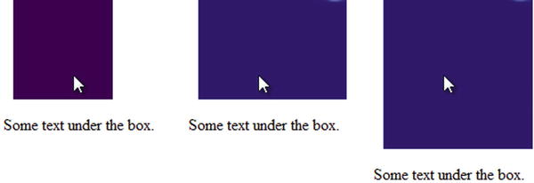
Figure 20-16. Each transition is delayed to execute in sequence
Note It’s generally recommended to define the transition properties in the style rule that governs the element in its normal state. Doing so allows you to apply the same values to all transitions that affect the element even if they’re triggered in different ways, such as a different pseudo-class or by JavaScript.
When you move the mouse away at the end of the sequence, the delays are executed in the same order. First the color changes back to red, the width begins to shrink one second later, and finally the height is reduced.
The sequence is abandoned if you move the mouse away before the end, but the order of returning to the original state is the same as before. In other words, the color changes first, followed by the width.
The transition-duration property also accepts negative values. This starts the transition immediately, but as though it had already started at the specified offset. Take the following example:
transition-property: width;
transition-duration: 1s;
transition-delay: -500ms;
If the transition changes width from 100px to 200px, it starts at the point that would have been reached over half a second—in other words, about 150px (the actual value depends on the pace of the transition).
Changing the Reverse Transition
As the example in transition-delay.html in the preceding section demonstrates, transition delays are executed in the same order when the element returns to its normal state. In many cases, this is unlikely to cause a problem. But if you want to run a sequence of transitions in reverse, it’s quite easy to do.
All that’s needed is to define transition-delay in two places:
- The timings for the forward sequence go in the style rule that define the state after the transition, for example in the :hover pseudo-class.
- The timings for the reverse sequence go in the style rule that defines the element’s normal state.
The styles in reverse_sequence.html adapt the previous example like this:
#box1 {
    width: 100px;
    height: 100px;
    background-color: #F00;
    margin: 10px;
    transition-property: background-color, width, height;
    transition-duration: 1s;
    transition-delay: 2s, 1s, 0s;
}
#box1:hover {
    background-color: #006;
    width: 150px;
    height: 150px;
    transition-delay: 0s, 1s, 2s;
}
The original timings have been copied into the :hover pseudo-class, but they have been reversed in the #box1 style rule. When you hover over the box, the transition-delay timings in the pseudo-class override those in #box1. So, the sequence of transitions remains the same as before. However, when you move the mouse pointer away from the box, the :hover pseudo-class no longer applies, and the timings in the #box1 style take precedence. As a result, the height starts changing immediately, the width follows one second later, and finally the color fades to red.
Tip The same technique applies to timing-duration. For example, setting a two-second duration in the :hover pseudo-class and a one-second duration in the normal state results in a slow transition when you hover over an element, but a rapid one when you move the mouse pointer away.
Instead of using the individual properties, you can define a transition in a single declaration with the transition shorthand property. For a single property, just list the values separated by spaces. For example, the following applies a one-second linear transition to background-color, delayed by a quarter of a second:
transition: background-color 1s 250ms linear;
When using the transition shorthand, the first time value is treated as transition-duration. The second one represents transition-delay. If you don’t want to delay the transition, use only one time value because the default value for transition-delay is 0s.
Tip To jump to the end state immediately after a delay, use a single time value equal to the length of the delay, and set the timing function to step-end.
To apply the same transition values to all properties, just set the values you want to change from the initial values listed in Table 20-3. For example, if you want all properties to transition over half a second without a delay, this is all you need:
transition: 500ms;
Alternatively, if you want to make it clear that all properties are affected, include the all keyword:
transition: all 500ms;
In both cases, the default ease timing function will be used.
To apply different values to each property, use multiple shorthand definitions separated by commas. For example, the #box1 style in reverse_sequence.html can be rewritten like this (the code is in transition.html):
#box1 {
    width: 100px;
    height: 100px;
    background-color: #F00;
    margin: 10px;
    transition: background-color 1s 2s,
            width 1s 1s,
            height 1s;
}
This defines a one-second transition delayed by two seconds for background-color, a one-second transition delayed by one second for width, and a one-second transition executed immediately for height.
Note It’s not necessary to put each shorthand definition on a separate line, but it makes the style easier to read.
Using CSS Transitions with Images
After all that theory, let’s take a look at some practical examples of using CSS transforms and transitions.
Creating a Rollover Image Without JavaScript
A rollover image reveals a different image when you hover over it. You can create a variation of this technique using a combination of CSS positioning, a transition, and the opacity property, which is described in the sidebar “Opacity and Alpha Transparency.”
OPACITY AND ALPHA TRANSPARENCY
Chapter 3 described how to create semitransparent colors with the rgba() and hsla() color formats, which take as their fourth value a number representing the degree of alpha transparency. The number must be in the range 0–1, with 0 representing fully transparent and 1 fully opaque.
The opacity property also controls the degree of transparency, but it affects the whole element. It takes a single value in the same range and with exactly the same meaning as rgba() and hsla().
To demonstrate the effect, opacity.html sets the background color and border of one <div> in rgba() format with 30% alpha transparency. Another <div> has opacity set to the same amount like this:
#alpha {
    background: rgba(255,255,255, 0.3);
    border-color: rgba(217,79,17,0.3);
}
#opacity {
    opacity: .3;
}
As Figure 20-17 shows, both <div> elements are transparent, but the text in the <div> on the left is unaffected, whereas in the one on the right it has been faded along with the background and border.
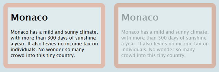
Figure 20-17. Opacity (right) affects the entire element
Instead of swapping the image source with JavaScript, this technique relies on superimposing one image on top of another and using the opacity property and a transition to fade out the front image when hovered over. In fade_image.html, there are two images of the same size alongside each other inside a <div> like this:
<div id = "images">
    <img src = "images/nice_market.jpg" alt = "Flower market in Nice" width = "400" height = "266" ←
    class = "frontimg">
    <img src = "images/nice_seafront.jpg" alt = "Nice seafront" width = "400" height = "266">
</div>
The first image is assigned the class frontimg, which has the following styles:
.frontimg {
    position: absolute;
    transition: opacity 500ms linear;
    opacity: 1;
}
.frontimg:hover {
    opacity: 0;
}
The class makes the image absolutely positioned. As explained in Chapter 11, absolute positioning removes an element from the document flow and floats it on a separate layer in front of the normal content. If you don’t set any offsets, the element occupies the same position as it would in the normal flow. As a result, the second image is hidden behind the first one. They have the same dimensions, so the rest of the page is unaffected.
The other properties create a half-second linear transition and set the normal opacity to 1 (fully opaque). The :hover pseudo-class changes the level of opacity to 0 (fully transparent).
When you hover over the image, it fades to reveal the other image underneath (see Figure 20-18). Although you can’t see the front image after the fade, it’s still there, so you’re still hovering over it until you move the mouse pointer away. Then the front image fades back.
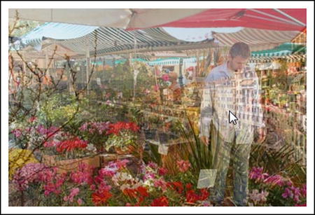
Figure 20-18. Hovering over the front image triggers a cross-fade to reveal the image behind
A simple variation on the technique in the previous section uses the translateX() transform function to move the front image far enough to the left to hide it offscreen. The styles in slide_image.html look like this:
.frontimg {
    position: absolute;
    transition: 1s linear;
}
.frontimg:hover {
    transform: translateX(-442px);
}
This creates a linear transition to slide the front image to the left over one second, revealing the other image behind it (see Figure 20-19).
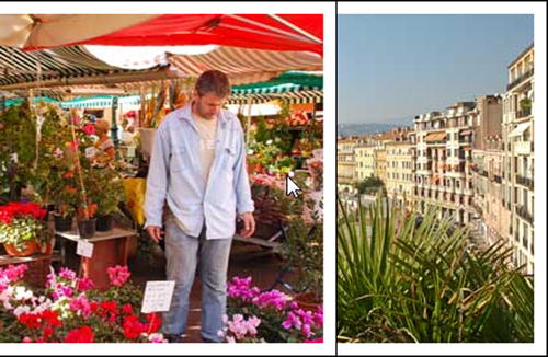
Figure 20-19. The front image slides offscreen when hovered over
EXERCISE: SCALING AND ROTATING IMAGES SMOOTHLY
The example in scale_3.html earlier in this chapter scaled up images when hovered over. But there were two problems: the instant change in state was jarring, and the following text was hidden. With the help of transitions and advanced selectors, you can fix both problems.
Use scale_transition_begin.html in the ch20 folder as your starting point. The finished version is in scale_transition_end.html.
The styles in both pages have been split into two sections. The first section contains the browser-specific prefixes needed for older browsers. The second section contains the standard transform properties. If you need the browser-specific versions, uncomment the first section. For brevity, the following instructions use only the standard properties.
- Rotate the two images by adding the transform property to the :first-child and :last-child pseudo-classes and setting its value with the scale() function. Rotate the first image 6° counterclockwise and the other image the same amount clockwise like this:
           .scaleimg:first-child {
               transform-origin: left top;
               transform: rotate(-6deg);
           }
           .scaleimg:last-child {
               transform-origin: right top;
               transform: rotate(6deg);
} - Add a transition to the scaleimg class using ease-in-out and a duration of one second. There’s no need to set any properties for the transition because it will apply to all of them.
           .scaleimg {
               margin: 10px;
               padding: 10px;
               background-color: #FFF;
               border: 1px solid #000;
               transition: ease-in-out 1s;
} - Save the page and test it in a browser that supports transforms and transitions. The transition is smooth, but the left image remains tucked behind the other image when scaled up, as shown in Figure 20-20. This is because the images overlap slightly as a result of being rotated in their normal state. The scaled-up image is not rotated because the transform property in the :hover pseudo-class is lower down the styles and overrides the values in the :first-child and :last-child rules.
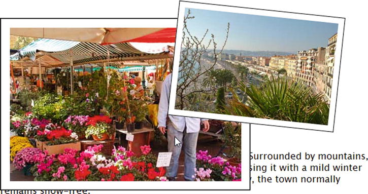
Figure 20-20. The left image disappears behind the other one when scaled up
- To overcome this problem, you need to make the images relatively positioned and give them a z-index. Amend the scaleimg class like this:
.scaleimg {
margin: 10px;
padding: 10px;
background-color: #FFF;
border: 1px solid #000;
               transition: ease-in-out 1s;
               position: relative;
               z-index: 1;
} - To make sure the hovered image is in front, give the :hover pseudo-class a z-index of 2:
           .scaleimg:hover {
               transform: scale(1.5);
               z-index: 2;
} - Test the page again. In some browsers, the left image remains behind the other one right until the end of the transition when it suddenly pops to the front. This is because z-index must be an integer. The gap between 1 and 2 is too small for a smooth transition. Change the z-index in the :hover pseudo-class to 10. This produces a much smoother effect in both directions.
- To solve the problem of the text being obscured, you need to add a top margin to the paragraph when the images are being hovered over. The images are in a <div> with the ID images, so you can use the adjacent sibling combinator (see Chapter 13) to add a transition and the top margin like this:
           #images + p {
               transition: 1s ease-in-out;
           }
           #images:hover + p {
               margin-top: 100px;
           }
When you hover over an image, it scales and rotates smoothly and the text glides down the page. Moving the mouse pointer away returns text and images to their normal positions.
Summary
CSS transforms and transitions break up the angular and static layout of web pages by moving, rotating, scaling, and skewing elements, and creating a smooth transition from one state to another. In this chapter, I used the :hover pseudo-class to trigger transitions, but you can also use JavaScript to add and remove a class to change an element’s properties. If you have defined a transition in a style that governs the element’s normal state, the browser will transition smoothly between the start and end values.
In the next chapter, we’ll look at more complex animations using CSS keyframes.