![]()
For many years, web designers—frustrated by the narrow range of web-safe fonts—have been demanding the ability to embed different fonts in their web pages. It’s hard to believe, but Internet Explorer (IE) 4 was the first browser to support embedded fonts way back in 1997. Two main factors prevented other browsers from following suit: IE used a proprietary technology for web fonts; and font foundries were concerned about fonts being downloaded and reused without paying license fees.
The situation began to change rapidly after 2008–2009, when all major browsers finally offered support for CSS @font-face rules that specify the location of font files. This sparked the creation of many new fonts designed specifically for embedding in web pages. At the same time, font foundries began to relax their attitude toward embedded fonts. Not every font is available for embedding in web pages, but you now have a much wider range to choose from.
In this chapter, you’ll learn about the following:
- Which font formats are necessary for cross-browser compatibility
- Checking whether a font’s license allows it to be used in a website
- How to specify the location of font files with @font-face
- Specifying bold and italic fonts
- Restricting the range of characters downloaded by the browser
- How to adjust the relative size of fallback fonts
Using web fonts rather than images for text has several advantages, the most important being that it makes the text content immediately accessible to assistive technology for the blind and search engines. If the text needs to be changed, you just change it in the HTML rather than creating a new image.
Adding Web Fonts to Your Sites
To add nonstandard fonts to your web pages: you can either use a font hosting service to deliver the fonts from a content distribution network (CDN), or you can store the font files on your own web server.
Most fonts are protected by copyright, so you can’t upload font files to your website without first checking the license and seeing if there are any restrictions on its use. Even if you have paid for a font, you cannot assume that you have the right to use it in a website. It might be restricted to use on your local computer. Having said that, there are hundreds of fonts that you can use—and many of them are available free of charge.
Font hosting services, such as Typekit (https://typekit.com/), Fontdeck (http://fontdeck.com/), WebINK (www.extensis.com/en/WebINK), and Google web fonts (www.google.com/webfonts), offer a wide range of web fonts. Google offers more than 500 fonts free of charge, but most other font hosting services charge an annual subscription or scaled fees depending on the number of visitors to your sites. The hosting service should provide detailed instructions of how to use the fonts. Normally, all you need to do is to include a link to the CDN in your web pages and add the font name at the beginning of the relevant font stack(s) in your style sheet. Other advantages include:
- A wide choice of fonts from a single source.
- No need to worry about licensing issues; the hosting service handles them for you.
- Reduced bandwidth consumed by your web server.
A potential drawback is that the CDN might be down or network latency might result in a delay in the fonts being loaded.
Storing Fonts on Your Own Server
The alternative is to store the font files on your own web server. This increases the amount of bandwidth consumed when someone accesses your web pages, but it gives you greater control. There’s no danger of the fonts not being rendered if the CDN is down or if you forget to renew your font hosting subscription.
If you choose to store the fonts on your own server, you need to handle all the technical and licensing details yourself. It’s not particularly difficult, but there are some oddities to which you need to be alert. The main problems are the need to supply multiple formats for cross-browser compatibility, and the way that embedded fonts handle bold and italic.
The rest of this chapter is devoted to these issues.
Choosing the Right Font Formats
Fonts come in a variety of formats. Table 5-1 lists the main formats and the browsers that support them.
Table 5-1. Font Formats and Browser Support
| Format | Extension | Support |
|---|---|---|
| Embedded Open Type (EOT) | .eot | IE 4+ |
| TrueType (TTF) & OpenType (OTF) | .ttf, .otf | IE 9 +, Firefox 3.5+, Chrome 4+, Opera 10+, iOS4.2+ |
| Web Open Font Format (WOFF) | .woff | IE 9+, Firefox 3.6+, Chrome 5+, Safari 5.1+, Opera 11+ |
| Scalable Vector Graphics (SVG) | .svg | Chrome 17+, Safari 5+, Opera 11.6+, iOS 3.2+, Android 3+ |
It’s expected that WOFF will become the dominant format. It has the backing of many font foundries, and was adopted as a candidate recommendation by the W3C in August 2011. However, for cross-browser support, you’ll also need EOT and TTF, and possibly SVG. Internet Explorer supports TTF and OTF only if the font’s embedding permissions are set to installable.
![]() Tip Font Squirrel (www.fontsquirrel.com) offers a wide range of web fonts that are free for commercial use. Most are supplied as an @font-face kit, which contains all formats needed for cross-browser compatibility. The companion Fontspring site (www.fontspring.com) performs a similar service for commercial fonts.
Tip Font Squirrel (www.fontsquirrel.com) offers a wide range of web fonts that are free for commercial use. Most are supplied as an @font-face kit, which contains all formats needed for cross-browser compatibility. The companion Fontspring site (www.fontspring.com) performs a similar service for commercial fonts.
Checking the License
Although most modern browsers support OpenType and TrueType fonts, many font foundries expressly forbid embedding them in web pages. So, it’s important to check the license. Because each font designer, foundry, and distributor has different rules regarding the use of fonts, it’s impossible to give blanket advice in a book. Check with the supplier. If in doubt, don’t use the font in your website. Using a font in violation of the license could turn into an expensive mistake.
The Font Squirrel and Fontspring websites have a prominent link to the license that applies to each font, so you can check its conditions before deciding whether to download it. Many fonts on the Font Squirrel site use the SIL Open Font License (http://scripts.sil.org/OFL), which allows the font to be used and redistributed freely as long as it is not sold separately. All web fonts used in this chapter come under this license. Other fonts are governed by individual licenses that impose simple requirements, such as adding an acknowledgment and link to the font creator’s website in your style sheet.
Embedding Fonts with @font-face
Before you can use a web font in your styles, you need to tell the browser where to find the necessary font files with an @font-face rule.
Basic Syntax
An @font-face rule is made up of what the CSS specification calls descriptors, which define the location and style characteristics of the font. The basic syntax looks like this:
@font-face {
    font-family: font_name;
    src: location [format];
}
The font-family descriptor defines the name of the web font. You can choose any name you want. If it contains spaces, the name must be wrapped in quotes. If you choose the name of a font that already exists on a user’s computer, the font specified in the @font-face rule takes precedence.
The src descriptor tells the browser where to find the font files. Specify multiple values for different font formats as a comma-separated list.
You can try to load a local version of the font if it exists on the user’s system by inserting the font’s full name or Postscript name between the parentheses after local(). The required name differs according to the font and operating system, so the CSS specification recommends using both.
However, the normal practice is to load the font files from your web server. You specify the location by inserting the path between the parentheses after url(), as described in “Specifying Background Images and Other Files” in Chapter 3. The files must be located on the same domain as the website.
After the location, you can add an optional format() declaration, using one of the format strings listed in Table 5-2.
Table 5-2. Font Format Strings
| Font Format | Format String |
|---|---|
| EOT | "embedded-opentype" |
| TrueType | "truetype" * |
| OpenType | "opentype" * |
| WOFF | "woff" |
| SVG Font | "svg" |
* The truetype and opentype font strings are regarded as synonymous.
“Bulletproof” @font-face Syntax
Although the basic @font-face syntax is fairly straightforward, browser bugs complicate the situation. Thanks to the efforts of Paul Irish and other talented web developers, a “bulletproof” workaround has been devised. It involves using two src descriptors like this:
@font-face {
    font-family: 'My Font';
    src: url('myfont.eot'),
    src: url('myfont.eot?#iefix') format('embedded-opentype'),
         url('myfont.woff') format('woff'),
         url('myfont.ttf') format('truetype'),
         url('myfont.svg') format('svg'),
}
The first src descriptor takes just the path to the EOT font file. The second src descriptor consists of a comma-separated list of font file locations, each with a format() declaration. The list begins with the path to the EOT file again, but with ?#iefix appended to it. The order of the remaining formats isn’t important, but it’s recommended to list WOFF next.
The need for two src descriptors for EOT is because of a bug in IE 8 and earlier, which fail to load the font if more than one format is listed. Adding ?#iefix tricks older versions of IE into treating the rest of the descriptor as a query string, so the font is loaded correctly. However, the bug was fixed in IE 9, which is why you need a separate src descriptor for EOT. It’s messy, but it works.
If you’re not worried about older browsers seeing the web fonts, you can use just the WOFF format like this:
@font-face {
    font-family: 'My Font';
    src: url('myfont.woff') format('woff'),
}
A potentially confusing aspect of embedding web fonts is that the font-family property in an @font-face rule identifies only a single font, not the whole family with its bold, italic, and other versions, such as expanded or condensed. If you want the other versions of the same family, you need to create separate @font-face rules for each one. You can either give each font face a different name, or you can reuse the same name and specify its characteristics using extra descriptors.
Using Different Names
The Aurulent Sans font (www.fontsquirrel.com/fonts/Aurulent-Sans) designed by Stephen G. Hartke is available in four styles: regular, italic, bold, and bold italic. To demonstrate what happens when you use different names for the fonts, different.css in the ch05/styles folder contains the following style rules:
@font-face {
    font-family: 'AurulentSans Regular';
    src: url('fonts/AurulentSans-Regular-webfont.eot'),
    src: url('fonts/AurulentSans-Regular-webfont.eot?#iefix') format('embedded-opentype'),
         url('fonts/AurulentSans-Regular-webfont.woff') format('woff'),
         url('fonts/AurulentSans-Regular-webfont.ttf') format('truetype'),
         url('fonts/AurulentSans-Regular-webfont.svg') format('svg'),
}
@font-face {
    font-family: 'AurulentSans Bold';
    src: url('fonts/AurulentSans-Bold-webfont.eot'),
    src: url('fonts/AurulentSans-Bold-webfont.eot?#iefix') format('embedded-opentype'),
         url('fonts/AurulentSans-Bold-webfont.woff') format('woff'),
         url('fonts/AurulentSans-Bold-webfont.ttf') format('truetype'),
         url('fonts/AurulentSans-Bold-webfont.svg') format('svg'),
}
body {
    font-family: 'AurulentSans Regular', sans-serif;
}
.bold {
    font-family: 'AurulentSans Bold', sans-serif;
}
The @font-face rules assign different names to the regular and bold versions of the font. The body selector applies the regular font to all text, and the bold class uses the bold font.
![]() Note I’ve used a class for bold text to show what happens if the browser can’t find the correct font weight.
Note I’ve used a class for bold text to show what happens if the browser can’t find the correct font weight.
This style sheet is attached to different.html, which contains the following HTML markup in the <body> of the page:
<h1>The Lobster Quadrille</h1>
<h1 class="bold">The Lobster Quadrille</h1>
<p>"Will you walk a little faster?" said a whiting to a snail.</p>
<p><b>"Will you walk a little faster?" said a whiting to a snail.</b></p>
<p class="bold">"Will you walk a little faster?" said a whiting to a <b>snail</b>.</p>
The page contains the same level 1 heading twice and the same paragraph three times. Figure 5-1 shows how Chrome 21 on Windows renders the page.
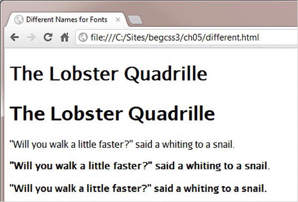
Figure 5-1. Chrome synthesizes bold text
Normally, browsers render <h1>, <b>, and <strong> elements in bold. It’s clear from Figure 5-1 that Chrome has attempted to do so with the first heading and the second paragraph. However, if you compare the two headings, there’s a marked difference between the synthesized bold and the genuine bold font. The difference isn’t quite so clear between the second and third paragraphs, although the synthesized version results in the text being marginally wider. Internet Explorer and Opera also synthesize bold text.
However, if you view the same page in Safari 5.1, there’s no attempt to synthesize bold text. As Figure 5-2 shows, it renders both the first heading and the second paragraph using the regular version of the font.

Figure 5-2. Safari 5.1 does not synthesize bold text
Safari 6 and Firefox handle the fonts yet another way. They not only synthesize the bold text, but they also double the effect when they encounter <b> tags in text that’s rendered in the genuine bold font. Look closely at the word “snail” in the third paragraph in Figure 5-3. The font is heavier than the rest of the sentence.

Figure 5-3. Firefox not only synthesizes bold text, it doubles the effect with <b> tags
In this example, I’ve used only bold text, but all browsers handle italic the same way. If a genuine italic face isn’t found, all except older versions of Safari render a synthetic version.
Figure 5-4 shows the difference between synthetic and genuine italic in Firefox.
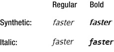
Figure 5-4. Comparison of synthetic and genuine italic in Firefox
Failure to synthesize bold and italic in older versions of Safari was an incorrect interpretation of the specification, as explained in the side bar “To Synthesize or Not to Synthesize.”
TO SYNTHESIZE OR NOT TO SYNTHESIZE
The draft CSS3 Fonts module specifies a new font-synthesis property, which controls whether a browser is allowed to synthesize bold or italic. The property accepts the following values:
- none: All synthetic faces are disallowed.
- weight: Synthetic bold is allowed.
- style: Synthetic italic is allowed.
The default value is weight style, which allows the browser to synthesize both bold and italic. At the time of this writing, no browser has yet implemented the font-synthesis property.
The use of a class for bold type in the preceding example was purely for demonstration purposes. The styles in different2.css assign the bold and italic faces like this:
/* Omitted: four @font-face rules defining regular, bold, italic, and bold italic fonts. */

body {
    font-family: 'AurulentSans Regular', sans-serif;
}
/* Headings and bold text */
h1, h2, h3, h4, h5, h6, b, strong {
    font-family: 'AurulentSans Bold', sans-serif;
}
/* Regular italic */
i, em {
    font-family: 'AurulentSans Italic', sans-serif;
}
/* Bold italic */
b i, h1 i, strong em {
    font-family: 'AurulentSans BoldItalic', sans-serif;
}
The first three rules use type selectors to redefine the look of the body, headings, and bold and italic elements. Defining the rule for bold italic is slightly more problematic, because it depends on how elements are nested. This example uses descendant selectors for <i> tags nested inside <b> or <h1> elements, and for <em> nested inside <strong>. However, if the tags are nested the other way round, the descendant selectors need to be reversed.
The HTML markup inside the <body> of different2.html looks like this:
<h1>The Lobster <i>Quadrille</i></h1>
<p>"Will you walk a little <i>faster</i>?" said a whiting to a snail.</p>
<p><b>"Will you walk a little <i>faster</i>?" said a whiting to a snail.</b></p>
Figure 5-5 shows how the page is rendered in Firefox 14 (left) and IE 9 (right).
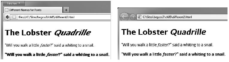
Figure 5-5. Firefox 14 doubles the italic even when the correct face is used
What appears to be happening in Firefox is that it applies the correct font, but also synthesizes the italic, resulting in double italic. This is clearly a bug that will hopefully be eliminated in a later version.
Using Different Names with Descriptors
The alternative way of using @font-face is to create a family of fonts by using the same value for font-family in each rule and describing the font’s characteristics with font-weight and font-style.
The values for the font-weight and font-style descriptors are the same as for the similarly named properties described in Chapter 4. The default for both is normal, so you need to include the descriptor in an @font-face rule only if you want to use a different value.
The styles in same_name.css look like this:
@font-face {
    font-family: 'Aurulent Sans';
    src: url('fonts/AurulentSans-Regular-webfont.eot'),
    src: url('fonts/AurulentSans-Regular-webfont.eot?#iefix') format('embedded-opentype'),
         url('fonts/AurulentSans-Regular-webfont.woff') format('woff'),
         url('fonts/AurulentSans-Regular-webfont.ttf') format('truetype'),
         url('fonts/AurulentSans-Regular-webfont.svg') format('svg'),
}
@font-face {
    font-family: 'Aurulent Sans';
    src: url('fonts/AurulentSans-Bold-webfont.eot'),
    src: url('fonts/AurulentSans-Bold-webfont.eot?#iefix') format('embedded-opentype'),
         url('fonts/AurulentSans-Bold-webfont.woff') format('woff'),
         url('fonts/AurulentSans-Bold-webfont.ttf') format('truetype'),
         url('fonts/AurulentSans-Bold-webfont.svg') format('svg'),
    font-weight: bold;
}
@font-face {
    font-family: 'Aurulent Sans';
    src: url('fonts/AurulentSans-Italic-webfont.eot'),
    src: url('fonts/AurulentSans-Italic-webfont.eot?#iefix') format('embedded-opentype'),
         url('fonts/AurulentSans-Italic-webfont.woff') format('woff'),
         url('fonts/AurulentSans-Italic-webfont.ttf') format('truetype'),
         url('fonts/AurulentSans-Italic-webfont.svg') format('svg'),
    font-style: italic;
}
@font-face {
    font-family: 'Aurulent Sans';
    src: url('fonts/AurulentSans-BoldItalic-webfont.eot'),
    src: url('fonts/AurulentSans-BoldItalic-webfont.eot?#iefix') format('embedded-opentype'),
         url('fonts/AurulentSans-BoldItalic-webfont.woff') format('woff'),
         url('fonts/AurulentSans-BoldItalic-webfont.ttf') format('truetype'),
         url('fonts/AurulentSans-BoldItalic-webfont.svg') format('svg'),
    font-weight: bold;
    font-style: italic;
}
body {
    font-family: 'Aurulent Sans', sans-serif;
}
Each @font-face rule uses 'Aurulent Sans' as the value for font-family, and—with the exception of the first one—uses font-weight and/or font-style to describe the font’s characteristics. The first rule defines the regular font, so the descriptors default to normal.
The HTML markup in same_name.html is identical to different2.html. Figure 5-6 shows how it’s rendered by Firefox 14.
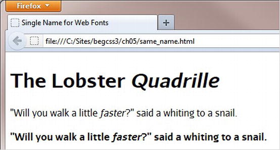
Figure 5-6. The double italic effect in Firefox is eliminated by building a font family with descriptors
Building a font family like this with descriptors not only simplifies your subsequent CSS and HTML markup, but it also eliminates the double italic effect in Firefox. So, if you’re planning to use web fonts for the main text in a website, this is the better way to use @font-face. However, if you plan to use web fonts only for special effects on a limited number of elements, using different names for each font face makes your styles easier to understand. Neither method is inherently superior to the other.
![]() Note You can also use the font-stretch descriptor in an @font-face rule to specify a condensed or expanded version of a font. It accepts the following values: normal, ultra-condensed, extra-condensed, condensed, semi-condensed, semi-expanded, expanded, extra-expanded, and ultra-expanded.
Note You can also use the font-stretch descriptor in an @font-face rule to specify a condensed or expanded version of a font. It accepts the following values: normal, ultra-condensed, extra-condensed, condensed, semi-condensed, semi-expanded, expanded, extra-expanded, and ultra-expanded.
Specifying a Range of Characters
Embedding web fonts increases the download size of your web pages, so it’s important to use them only where it makes a significant improvement to the design. You can also limit the range of characters that a browser downloads, which can be particularly useful when dealing with nonalphabetic languages such as Chinese or Japanese, or if you want only a small number of symbols from a larger font.
You control the range of characters in an @font-face rule with unicode-range, which expects one or more Unicode ranges as a comma-separated list. A Unicode range always begins with U+ followed by one of the following formats:
- A hexadecimal number representing a single code point, for example U+A5 (¥).
- Two hexadecimal numbers separated by a hyphen representing a consecutive range, for example U+590-5ff represents the code range for Hebrew.
- A range where trailing ? characters represent any single digit, for example U+30?? represents the code range for Japanese hiragana and katakana.
![]() Note The hexadecimal digits in a Unicode range are case-insensitive. U+A5 and U+a5 have the same meaning.
Note The hexadecimal digits in a Unicode range are case-insensitive. U+A5 and U+a5 have the same meaning.
At the time of this writing, unicode-range is supported by the latest versions of all browsers except Firefox and Opera. The styles in range.html contain the following @font-face rule to define a font called Limelight Quotes, which uses unicode-range to select only left and right double quotes from the Limelight font (www.fontsquirrel.com/fonts/limelight) designed by Eben Sorkin.
@font-face {
    font-family: 'Limelight Quotes';
     src: url('styles/fonts/Limelight-webfont.eot'),
     src: url('styles/fonts/Limelight-webfont.eot?#iefix') format('embedded-opentype'),
         url('styles/fonts/Limelight-webfont.woff') format('woff'),
         url('styles/fonts/Limelight-webfont.ttf') format('truetype'),
         url('styles/fonts/Limelight-webfont.svg#LimelightRegular') format('svg'),
    unicode-range: U+201c-d;
}
.quote {
    font-family: 'Limelight Quotes', serif;
    font-size: 150%;
}
![]() Tip There’s a list of Unicode code points at http://en.wikipedia.org/wiki/List_of_Unicode_characters.
Tip There’s a list of Unicode code points at http://en.wikipedia.org/wiki/List_of_Unicode_characters.
The quotes in the main heading in the page are wrapped in <span> tags and assigned the quote class like this:
<h1><span class="quote">“</span>Turtle Soup<span class="quote">”</span></h1>
Figure 5-7 shows the result in Chrome.
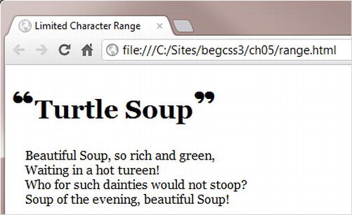
Figure 5-7. Browsers that support unicode-range download only the quotes, not the full font
The problem with using unicode-range is that it’s not currently supported by Firefox or Opera, so those two browsers download the entire font rather than the characters you want. However, British web developer Drew McLellan has devised a crafty technique to prevent Firefox and Opera from downloading the whole font (http://24ways.org/2011/unicode-range). It involves creating a second @font-face rule that specifies a local font as the source of the same font-family descriptor like this:
@font-face {
    font-family: 'Limelight Quotes';
    src: local(Georgia);
    unicode-range: U+270C;
}
In the second @font-face rule, unicode-range specifies an obscure symbol that will never be used in your page. Firefox and Opera treat the second rule as overriding the first, but other browsers simply add the new unicode-range value to the existing one. But because the font is local, there’s nothing to download, so the rule is harmless. Figure 5-8 shows the result in Firefox.

Figure 5-8. The second @font-face rule prevents Firefox from downloading the web font
Adjusting Relative Font Sizes
When building a font stack, it’s difficult to find fallback fonts that have exactly the same proportions as your first-choice font. To increase legibility, the CSS3 Fonts module provides the font-size-adjust property, which adjusts the font size so that the height of lowercase letters is the same regardless of the font used.
Figure 5-9 demonstrates the effect of using font-size-adjust in Firefox, which at the time of this writing is the only browser that supports it.

Figure 5-9. Using font-size-adjust changes the size of fallback fonts to match the first choice
The first row displays three fonts at 9px without adjustment: a web font called Nobile (www.fontsquirrel.com/fonts/Nobile) designed by Vernon Adams, Verdana, and generic sans-serif. Verdana is a good match as a fallback font for Nobile, but the generic sans-serif is much smaller, making it difficult to read. The second row uses font-size-adjust to change the aspect ratio of each font to match that of Nobile. A font’s aspect ratio is defined as being equal to the height of a lowercase “x” divided by font size. Changing the aspect ratio of the generic sans-serif text in the second row with font-size-adjust makes it easier to read. It also occupies a similar amount of vertical space as the other fonts.
Finding the aspect ratio of a font is done by trial and error using two identical characters at a large size surrounded by a border. The styles in aspect_ratio.html in the ch05 folder look like this:
body {
    font-family: Nobile, Verdana, sans-serif;
}
span {
    border: 1px solid red;
    font-size: 200px;
}
.adjust {
    font-size-adjust: 0.5;
}
The Nobile font is defined by @font-face rules in an external style sheet. The <body> of the page contains the following HTML:
<p><span>b</span><span class="adjust">b</span></p>
Both letters are wrapped in <span> tags that add a one-pixel red border around them. The second <span> is modified by the adjust class, which sets font-size-adjust to 0.5.
Figure 5-10 shows what aspect_ratio.html looks like in Firefox.
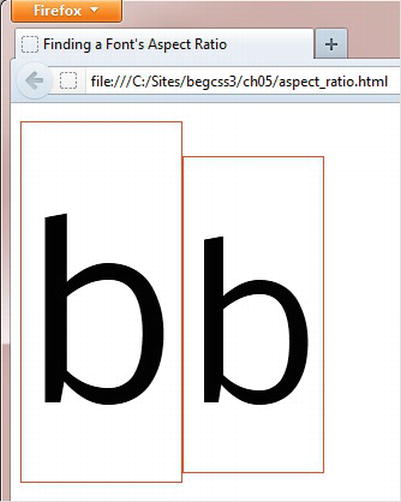
Figure 5-10. You need to change the value of font-size-adjust until both borders are equal in height
Because Nobile has a higher aspect ratio, the second border isn’t as tall as the first. To find the font’s aspect ratio, you need to change the value of font-size-adjust in the adjust class and refresh the page in the browser until both borders are the same height. In the case of Nobile, this happens when font-size-adjust is set to 0.57. So, that’s its aspect ratio.
Although finding the aspect ratio of your first-choice font involves a little guesswork, it’s easy enough to do, and it’s a one-time operation. All that’s necessary is to add font-size-adjust to the same style rule as your font stack, and set its value to the aspect ratio of the first font like this:
body {
    font-family: Nobile, Verdana, sans-serif;
    font-size-adjust: 0.57;
}
Adding font-size-adjust to your styles won’t make any difference to the look of your normal text—as long as you use the correct aspect ratio for the first font in your font stack. However, it ensures that the relative size of the text remains constant if a fallback font is used.
Summary
Now that web fonts are widely supported by browsers, using images for typographic effects should soon become a thing of the past. Fonts increase the size of the download, but that’s often compensated by no longer needing to use images. However, just because you can embed web fonts with @font-face, don’t go overboard. Mixing a large number of different fonts on a page can destroy the design.
If you plan to use a web font for the main text, use the same name for font-family and specify bold and italic faces with the font-weight and font-style descriptors. Although most browsers synthesize bold and italic, using the correct font faces produces better results. To minimize the download burden on users, don’t forget that you can limit the range of characters with unicode-range.
That concludes Part II. In the next part, we’ll take an in-depth look at page layout with CSS.