The CSS transitions covered in the preceding chapter create simple animations that smooth changes in an element’s properties from one state to another. But they’re limited to the transition between two points. The only influence you have over what happens between those points lies in the choice of timing function. The CSS Animations module (http://dev.w3.org/csswg/css3-animations/) goes much further by allowing you to define keyframes that specify what an element’s properties should be at each stage of the animation. As with transitions, it’s left up to the browser to work out how to animate a smooth change from one keyframe to the next. So, you need to create keyframes only for significant changes. But you have finer control over reverse transitions, and you can specify how many times the animation should run or make it repeat endlessly.
In spite of their power, CSS animations aren’t designed for heavy graphic manipulation. Consider using HTML5 video and canvas, or WebGL instead. The principal value of CSS animations is the ability to create more complex transitions than those described in Chapter 20. For example, a CSS transition can change an element’s background from one color to another, but you can’t make it go through a series of color changes. CSS animations make that sort of complex transition possible.
In this chapter, you’ll learn how to do the following:
- Define animation keyframes
- Add an animation to page elements
- Control the duration and number of iterations of an animation
- Highlight an element by fading in a background color and fading it out again
- Choose the direction of alternate iterations
- Pause an animation
- Control how properties are displayed before and after an animation
- Add multiple animations to an element
 Tip CSS animations have many similarities with CSS transitions. You’ll find this chapter easier to follow if you have read the section on CSS transitions in the previous chapter.
Browser Support for CSS Animations
WebKit-based browsers and Firefox began supporting animations (with browser-specific prefixes) at an early stage, but Internet Explorer and Opera didn’t support animations until IE 10 and Opera 12.0.
The W3C announced in June 2012 that browsers no longer need to use browser-specific prefixes for animation properties. The first versions to support unprefixed properties are IE 10, Firefox 16, and Opera 12.5. At the time of this writing, no announcement has been made about WebKit-based browsers.
Note The source files for this chapter contain both the browser-specific syntax and the standard syntax in separate style rules.
Creating a CSS animation is a two-stage process. Unlike CSS transitions, where all the properties are defined in the element’s style rules, you create the keyframes separately. This has the advantage that you can define a set of keyframes and apply the same animation to different elements.
The keyframes describe the state of properties at each stage of the animation. Optionally, they also specify the timing function (similar to transition-timing-function) that controls the pace of the transition between each stage.
You define a set of keyframes using @keyframes followed by the name you want to give the animation. All the rules for the keyframes go inside a pair of curly braces. For example, to define the keyframes for an animation called highlight:
@keyframes highlight {
    /* Keyframe definitions */
}
Note The browser-specific prefix for older browsers goes after the @ mark. For example, older WebKit-based browsers use @-webkit-keyframes.
Inside the curly braces, style blocks define the state of the animated properties at each stage. Each style block has a keyframe selector indicating the percentage along the duration of the animation that the keyframe represents. The selector for the starting keyframe can be either 0% or the keyword from. The selector for the ending keyframe can be either 100% or to. All other selectors must be percentages.
Caution If you use a percentage value for the starting point, it must be 0%. Omitting the percentage sign after 0 is invalid as a keyframe selector.
For example, the following @keyframes rule creates an animation that changes the background-color property from fully transparent yellow at the start, increases it to 50% transparency at the halfway point, and fades it back to fully transparent at the end:
@keyframes highlight {
    from {
        background-color: rgba(255,204,0,0);
    }
    50% {
        background-color: rgba(255,204,0,0.5);
    }
    to {
        background-color: rgba(255,204,0,0);
    }
}
In this example, the same values are used for from and to. To avoid repetition, you can group keyframe selectors as a comma-separated list. So, the following @keyframes rule has exactly the same meaning as the preceding one:
@keyframes highlight {
    from, to {
        background-color: rgba(255,204,0,0);
    }
    50% {
        background-color: rgba(255,204,0,0.5);
    }
}
The browser automatically sorts the keyframe definitions into ascending order. However, using this shorthand tends to make @keyframe rules difficult to read.
Caution Shorthand properties, such as background, cannot be animated. Table 20-4 in the preceding chapter lists all the CSS properties that can be used in an animation.
Specifying the Timing Function Between Keyframes
Optionally, @keyframes rules can specify how the browser should calculate intermediate values between each keyframe using the animation-timing-function property. This accepts the same values as transition-timing-function, namely:
- ease Starts slow, speeds up, and slows toward the end.
- linear Transitions at an even pace throughout.
- ease-in Starts slow and speeds up.
- ease-out Starts fast and slows toward the end.
- ease-in-out Similar to ease, but slower at each end.
- cubic-bezier() Specifies a custom transition using a cubic-bézier curve.
- step-start The change takes place at the beginning of the duration.
- step-end The change takes place at the end of the duration.
- steps() The change takes place in the specified number of equal steps.
Note See “Setting the Pace of the Transition” in Chapter 20 for details of the cubic-bezier() and steps() functions.
Adding animation-timing-function to a keyframe tells the browser how to handle the pace of the transition to the next keyframe. For example, the highlight example in the preceding section has been amended to use ease-out for both halves of the animation like this:
@keyframes highlight {
    from {
        background-color: rgba(255,204,0,0);
        animation-timing-function: ease-out;
    }
    50% {
        background-color: rgba(255,204,0,.5);
        animation-timing-function: ease-out;
    }
    to {
        background-color: rgba(255,204,0,0);
    }
}
You can set animation-timing-function on each keyframe except the last one (100% or to). If you set a timing function on the ending keyframe, it’s ignored.
If you don’t specify animation-timing-function for a keyframe, the default ease is used. However, you can specify a different default as described in “Setting the Timing Function Between Keyframes” later in this chapter.
Note The same timing function applies to all properties. If you want some properties to change at a different pace, you need to define a separate @keyframes rule and apply multiple animations on the target element(s).
Animating Elements with Keyframes
Once you have defined the keyframes for an animation, you can animate elements in your pages using the CSS properties listed in Table 21-1. There are eight individual properties and a shorthand one.
Table 21-1. CSS Animation Properties
To apply an animation to an element, both animation-name and animation-duration are required (or their values specified in the animation shorthand property). All other properties are optional.
All the properties in Table 21-1 accept a comma-separated list of values to apply multiple animations to the same element. Values are applied to animations in the same order as specified in animation-name. If fewer values are specified for a property than the number of animation names, the browser cycles through them in the same way as for CSS transitions. Excess values are ignored. There’s an example of using multiple animations in “Applying Multiple Animations” at the end of this chapter.
The properties in Table 21-1 are not inherited, so you can use the inherit keyword if you want an element to inherit the same values as its parent.
Specifying Which Animation to Use
The animation-name property takes as its value one or more names of @keyframes rules. For example, to apply the highlight keyframes to an element, just set the value of animation-name like this in the element’s style rule:
animation-name: highlight;
To apply multiple animations, list the names of the @keyframes rules separated by commas:
animation-name: animation1, animation2, animation3;
Tip The specification doesn’t say whether the @keyframes rules need to come before the style rules that use them. In my tests, it didn’t seem to matter. But it’s probably easier from the maintenance point of view to define keyframes first and then apply animations using the properties in Table 21-1.
Setting the Duration of an Animation
The animation-duration property takes as its value one or more times specified as seconds (s) or thousandths of a second (ms). If multiple times are specified, they’re applied to the animations in the same order as listed for animation-name.
The styles for faq.html in the ch21 folder are in styles/faq.css. They define a set of keyframes called highlight and then apply the animation to the :target pseudo-element of <article> elements like this:
@keyframes highlight {
    from {
        background-color: rgba(255,204,0,0);
        animation-timing-function: ease-out;
    }
    50% {
        background-color: rgba(255,204,0,.3);
        animation-timing-function: ease-out;
    }
    to {
        background-color: rgba(255,204,0,0);
    }
}
article:target {
    animation-name: highlight;
    animation-duration: 4s;
}
This draws attention to an <article> element that has been accessed through a link with a URL fragment by fading up a pale yellow background behind it, and then fading out the background. The animation lasts four seconds, with the yellow background at its most intense at the halfway mark (see Figure 21-1).
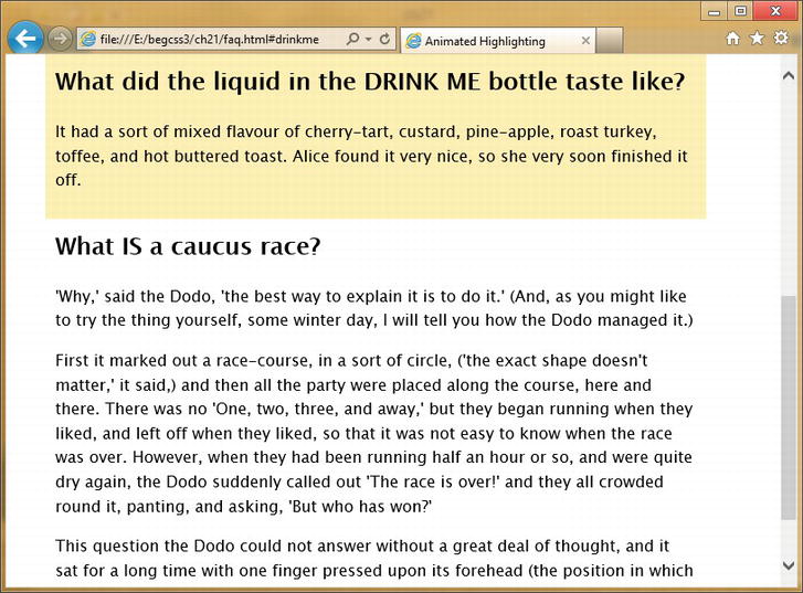
Figure 21-1. The background fades in and out just long enough to draw attention to the item
Note Previously, I have avoided using new HTML5 elements, such as <article> because IE 8 and earlier don’t style them without the help of JavaScript. However, all browsers that support animations also support HTML5.
Setting the Timing Function Between Keyframes
The animation-timing-function controls the pace at which the browser calculates intermediate property values. Although you can apply the same value to the whole animation, it affects the transition between individual keyframes, not the animation from start to finish.
There are two ways to set the timing function. You can set it for individual keyframes in the @keyframes rule as shown earlier in this chapter. Alternatively, you can set it in the style rule that applies the animation to the element. Timing functions are applied in the following order:
- Values in @keyframes rules always take precedence.
- If a timing function hasn’t been set for an individual keyframe in the @keyframes rule, the value in the element’s style rule is used.
- If a timing function hasn’t been set in either place, the default ease is used.
In the example in the preceding section, animation-timing-function has been set to ease-out in both keyframes in the @keyframes rule. The styles could be rewritten like this without changing the meaning:
@keyframes highlight {
    from {
        background-color: rgba(255,204,0,0);
    }
    50% {
        background-color: rgba(255,204,0,.3);
    }
    to {
        background-color: rgba(255,204,0,0);
    }
}
article:target {
    animation-name: highlight;
    animation-duration: 4s;
    animation-timing-function: ease-out;
}
In this case, there’s not a great deal of difference in the amount of code needed. But you might have a more complex animation with ten keyframes where you want a linear transition for each section apart from the first and last. In such a case, you need to set animation-timing-function in the @keyframes rule only for the first and penultimate keyframes. All other keyframes can be controlled by setting animation-timing-function to linear in the element’s style rule.
Setting the Number of Times an Animation Runs
By default, an animation runs only once, but you can change this by setting animation-iteration-count, which accepts a number or the keyword infinite as its value. As you would expect, setting the value to infinite repeats the animation endlessly. Negative values are invalid.
Interestingly, the number for animation-iteration-count doesn’t need to be an integer. The animation ends part-way through the cycle if you use a noninteger. There’s an example of this in partial.html, which uses the following keyframes and animation properties to slide a box back and forth across the screen:
@keyframes slide {
    from {
        transform: translateX(0);
    }
    to {
        transform: translateX(500px);
    }
}
#partial {
    width: 50px;
    height: 50px;
    margin: 10px;
    background-color: #036;
    animation-name: slide;
    animation-duration: 2s;
    animation-timing-function: linear;
    animation-iteration-count: 1.5;
    animation-direction: alternate;
    animation-fill-mode: forwards;
}
The animation properties apply the slide keyframes to the box, set the duration to two seconds, and the timing function to linear. As a result, the box takes two seconds to travel 500px across the screen at a steady pace. The value of animation-iteration-count is set to 1.5, so the animation continues running after the first iteration. The next two properties, animation-direction and animation-fill-mode, are described in detail later, but they have the effect of sending the box back in the opposite direction and fixing it in position when the animation ends. Because the number of iterations is 1.5, the box comes to a halt in the middle of its journey back to its original position (see Figure 21-2).
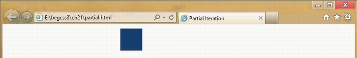
Figure 21-2. The animation stops halfway through the second iteration
Note Chrome 21 doesn’t support partial cycles. It stops the animation at the end of the first iteration. Hopefully, this bug will have been fixed by the time you read this.
Specifying Whether the Animation Should Run in Reverse
The animation-direction property controls whether the animation runs in reverse on some or all cycles. This takes as its value one of the following keywords:
- normal The is the default. All iterations of the animation run in the order defined by the @keyframes rule.
- reverse All iterations run in the reverse order from that defined in the @keyframes rule.
- alternate Counting from 1, all odd cycles run in the normal direction, and all even ones in reverse.
- alternate-reverse Counting from 1, all odd cycles run in reverse, and all even ones run in the normal direction.
To see how they work, load animation-direction.html into a browser, and click the play button alongside each value to toggle the animation on and off (see Figure 21-3).
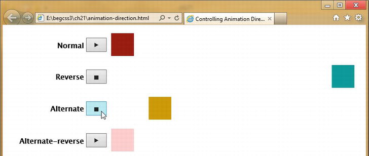
Figure 21-3. The animation-direction property controls the way an animation is repeated
The four squares all share the following animation properties:
animation-duration: 2s;
animation-timing-function: linear;
animation-iteration-count: infinite;
The animation is set to repeat endlessly, but the squares don’t move until you click a button because animation-name hasn’t been set. Clicking the play button alongside a square triggers a JavaScript function that applies the animated class to the square and sets its animation-name to slide. Clicking the button again, removes the class and the animation, causing the box to jump back to its original position.
The slide keyframes are the same as in the preceding example. They simply move the element 500px across the screen. This is how animation-direction affects the repeat pattern:
- normal The square starts on the left, and moves 500px to the right. When it reaches its destination, it jumps back to its original position, and starts moving right again.
- reverse The square jumps 500px to the right, and starts moving left. When it reaches its original position, it jumps back to the right, and starts moving left.
- alternate The square starts on the left, and moves 500px to the right. When it reaches its destination, it starts moving back in the opposite direction, and keeps moving back and forth across the screen.
- alternate-reverse The square jumps 500px to the right, and starts moving to the left. When it reaches its original position, it starts moving to the right, and keeps moving back and forth.
So, normal and reverse always repeat the keyframes in a single direction, but starting at different ends of the animation. The other values for animation-direction repeat the animation in both directions. The difference between alternate and alternate-reverse lies in where they begin the sequence. After that, they both go back and forth.
Note Opera 12.0, Firefox 14, and Safari 5.1 support only normal and alternate. Safari 6 supports all four values. Firefox 16 plans to add support for reverse and alternate-reverse.
The example in the preceding section controlled whether the animation was running by assigning the animation-name property to a class and toggling the class on and off. As a result, a square was no longer animated when the class was removed from it, and it jumped back to its original position. However, you can use the animation-play-state property to pause an animation, freezing the element in its current state. The property accepts the following values:
- running This is the default state. The animation runs normally. If the animation has been paused, it resumes from the current point of the cycle.
- paused The animation stops running. The element(s) continue to display in the state they were in when the animation was paused.
You need some sort of trigger to pause an animation. The simplest trigger is the :hover pseudo-class. For example, pause_hover.html contains the following animation:
@keyframes pulsate {
    from {
        transform: scale(1);
    }
    25% {
        transform: scale(1.2);
    }
    50% {
        transform: scale(1.1);
    }
    75% {
        transform: scale(1.2);
    }
    to {
        transform: scale(1);
    }
}
#box {
    /* Other styles omitted */
    animation-name: pulsate;
    animation-duration: 1s;
    animation-timing-function: ease-in-out;
    animation-iteration-count: infinite;
}
#box:hover {
    animation-play-state: paused;
}
The animation causes a 50px square to pulsate by altering its scale every quarter-second. Hovering over the square brings some blessed relief by setting animation-play-state to paused. But as soon as you move the mouse pointer away, the animation resumes.
To preserve everyone’s sanity, a better solution is to create a class that sets animation-play-state to paused, and then use JavaScript to toggle the class on and off. In pause.html, two (extremely) annoying animations are assigned the class animated. The styles also contain the following class:
.paused {
    animation-play-state: paused;
}
The following JavaScript at the foot of the page identifies all elements with the animated class and binds to them an event handler that toggles the paused class on and off whenever an animated element is clicked:
function toggleAnimations(animated, paused) {
    // Exit silently if old browser
    if (!document.getElementsByClassName) return;
    // Set default class names if no arguments passed to function
    if (!paused) var paused = 'paused';
    if (!animated) var animated = 'animated';
    var animations = document.getElementsByClassName(animated);
    // Exit silently if classList not supported
    if (!animations[0].classList) return;
    for (var i = 0; i < animations.length; i++) {
        animations[i].addEventListener('click', (function(num) {
            return function(e) {
                this.classList.toggle(paused);
            }
        })(i), false);
    }
}
toggleAnimations();
This defines a JavaScript function called toggleAnimations() and immediately executes it. The function optionally takes two arguments for the names of the animation and pause classes. If no arguments are passed to the function, it assigns animated and paused as the default class names.
Caution This JavaScript function relies on an HTML5 feature called classList, which is supported by the latest versions of all mainstream browsers, including IE 10. However, it’s not supported by versions prior to Safari 5.1, iOS 5.0, or Android 3.0. If you need to support those browsers, use the classList polyfill (helper script) from https://github.com/eligrey/classList.js. Alternatively, use jQuery’s toggleClass() method.
The animations in pause.html create a constantly expanding and shrinking orange glow behind a heading and a multicolored box that twirls as it follows a V-shaped path back and forth across the screen (see Figure 21-4). Clicking the heading brings instant relief, but it can be a challenge to catch the multicolored box and bring it to a halt. Clicking them again starts the madness all over.
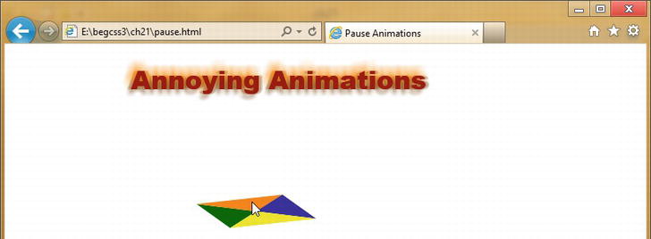
Figure 21-4. Clicking the animations toggles them on and off
The animation-delay property works exactly the same way as transition-delay, which was described in the previous chapter. It delays the start of an animation by the amount specified in seconds (s) or milliseconds (ms).
If you specify a negative value, the animation starts immediately, but at the point it would have reached at the specified offset. So, if the animation is four seconds long, and animation-delay is set to minus two seconds, it begins halfway through.
Controlling Properties Before and After Animation
The animation-fill-mode property controls the state of an element before and after an animation. For example, if an element changes color during the animation, you can choose whether to preserve that color or return to the original one when the animation finishes. It accepts the following values:
- none This is the default. Properties return to their original state when the animation ends.
- forwards Properties retain values set by the final keyframe.
- backwards If the animation is delayed by animation-delay, properties assume values set by the first keyframe while waiting for the animation to start.
- both Values set by the first and last keyframes are applied before and after the animation.
To demonstrate how this affects animated elements, animation-fill-mode.html contains four squares alongside play buttons. When you click a play button, it applies the animated class to the square next to it, and sets the square’s animation-name to slideback. The slideback keyframes cause the square to jump 500px to the right and then slide back to its original position like this:
@keyframes slideback {
    from {
        transform: translateX(500px);
    }
    to {
        transform: translateX(0);
    }
}
Each square has a different value for animation-fill-mode, as indicated by the label next to the play button. However, they all share the following animation properties:
animation-duration: 2s;
animation-timing-function: linear;
animation-iteration-count: 2;
animation-direction: alternate;
animation-delay: 2s;
To show how animation-fill-mode affects the animation, there’s a two-second delay at the start. The animation runs for two iterations, and animation-direction is set to alternate. When the square reaches the left side of the screen, it starts moving back in the opposite direction. The animation comes to an end when it reaches the right side of the screen. This is how each square is animated when you click its play button (see Figure 21-5):
- none After the two-second delay, the square jumps to the right, slides back to the left, and then slides to the right. At the end of the animation, it jumps back to its original position.
- forwards The square behaves the same way as none, but it remains on the right when the animation is over.
- backwards The square immediately jumps to the right of the screen, pauses for two seconds, then moves back and forth across the screen. At the end of the animation, it jumps back to its original position.
- both The square behaves the same way as backwards, but it remains on the right when the animation is over.
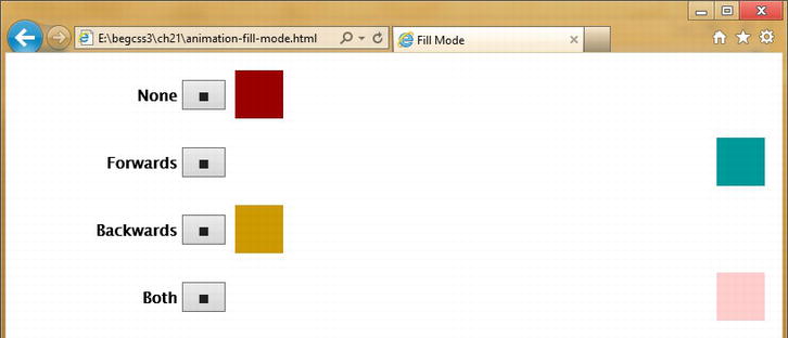
Figure 21-5. Two squares return to their original position, while the others retain the properties set by the final keyframe
Note Clicking the stop button removes the animated class, resetting the square to its original position.
Using the animation Shorthand Property
The animation shorthand property lets you define one or more animations in a single declaration. It accepts values for all the individual properties except animation-play-state. Like the transition shorthand property, the first time value is interpreted as the duration, and the second (if present) is interpreted as the delay.
In animation_1.html, the <h1> heading is animated using the animated shorthand property like this:
animation: bounce 2s ease-out;
There’s only one time value, so it represents the duration. No values are set for the number of iterations or direction, so the animation runs only once in the normal direction. It drops the heading into position and bounces it twice before coming to a halt. The shorthand is the equivalent of the following individual rules:
animation-name: bounce;
animation-duration: 2s;
animation-timing-function: ease-out;
In animation_2.html, a second animation is added to the heading by adding another definition to the shorthand property after a comma like this:
animation: bounce 2s ease-out,
           glow 2s 2s ease-out forwards;
The second animation called glow adds an animated text shadow. It has two time values, the first one is the duration and the second is the delay before the animation starts. There’s no number or direction, so the animation runs only once in the normal direction. But animation-fill-mode is specified as forwards, so the property values in the final keyframe are preserved (see Figure 21-6).
Figure 21-6. The text shadow defined in the last keyframe is preserved after the animation
The shorthand is the equivalent of the following individual properties:
animation-name: bounce, glow;
animation-duration: 2s, 2 s;
animation-timing-function: ease-out;
animation-delay: 0s, 2s;
animation-fill-mode: none, forwards;
The values for each property are separated by commas and are applied to the animations in the same order as they’re listed in animation-name. When using the individual properties like this, you need to specify default values explicitly unless they’re shared by all animations. For example, the bounce animation runs immediately, but glow is delayed by two seconds. In the shorthand version, the delay isn’t specified for bounce. But when the individual properties are used, it needs to be set to 0s. Otherwise it would have the same delay as glow.
Tip Delaying an animation by the same amount as the duration of its predecessor(s) has the effect of running animations in sequence, making it easier to build and maintain the keyframes.
Summary
The animations in this chapter are unlikely to win any awards—except perhaps the wooden spoon. They’ve been designed to show the principles behind creating CSS animations. You define an animation as a set of keyframes using an @keyframes rule, which specifies the values of properties at key points during the animation. Once you have defined the keyframes, you apply the animation to one or more elements using animation properties that specify which set of keyframes to use, the length of the animation, how many times it should run, and other settings, such as whether to preserve the values of the final keyframe when the animation ends.
Defining the keyframes separately from the elements to which they’re applied allows you to reuse animations. You can also run multiple animations on an element, either consecutively, or in sequence by delaying the start of each subsequent animation until the previous one has finished.
There’s a risk that CSS animations will turn back the clock to the early days of the Web when spinning icons were all the rage. However, subtle animations can add interest to a page or draw attention to information that has been updated. Keep animations short by limiting the number of iterations, and trigger them using pseudo-classes or JavaScript events.
In the final chapter, we’ll take a look at other CSS3 features that are on the horizon, including Flexible Box Layout, which promises to solve many of the current problems of web page layout.