Creating Gradients Without Images
A gradient creates a smooth transition between two or more colors, and is often used in graphic design to create an illusion of depth or a 3D effect. Until quite recently, the only cross-browser way to add a gradient to an element was to use a background image. With CSS3, you can generate a gradient simply by specifying its colors and shape. CSS supports both linear gradients—in which the colors fade smoothly from one to the next in a straight line—and radial gradients, which emerge from a single point with the colors spreading out in a circle or ellipse. You can also create gradients that repeat the same sequence of colors indefinitely.
Browsers began implementing CSS gradients before the CSS3 Image Values and Replaced Content module (http://dev.w3.org/csswg/css3-images/) had stabilized. As a result, the syntax has undergone a bewildering number of changes. In mid-2012, it was announced that IE 10 and Firefox 16 would implement the final syntax without browser-specific prefixes. However, WebKit-based browsers, Opera, and earlier versions of Firefox use a slightly different syntax, which works only with browser-specific prefixes.
This chapter concentrates primarily on the final syntax. Separate sections explain the main differences in the nonstandard syntax.
In this chapter, you’ll learn how to do the following:
- Create a linear gradient
- Specify the direction of the gradient
- Define the size, shape, and position of a radial gradient
- Create a repeating gradient
 Note The examples in this chapter use browser-specific prefixes only when they require a different syntax.
CSS Gradient Basics
Although CSS gradients don’t use images, you apply them to an element using the background-image property or the shorthand background property. You define a gradient by setting the property value with one of the four functions listed in Table 19-1.
Table 19-1. CSS Gradient Functions
Browsers draw the gradient inside a gradient box. By default, this fills the element’s padding box (see Figure 8-18 in Chapter 8). The gradient doesn’t have any intrinsic dimensions, but you can control its size and position in the same way as a background image using the background-size and background-position properties, which were covered in Chapter 8.
Using Browser-Specific Prefixes
Normally, browser-specific prefixes are added to the property name. However, gradients use the standard background-image and background properties, so the prefix is added to the function name instead. At the time of this writing, only IE 10 and Firefox 16 support the standard functions listed in Table 19-1. To support other browsers, add the appropriate browser-specific prefix to the function name. For example, the browser-specific versions of linear-gradient() look like this:
- -moz-linear-gradient() Firefox 15 and earlier
- -o-linear-gradient() Opera
- -webkit-linear-gradient() Safari, Chrome, and other WebKit-based browsers
Tip There are several online CSS gradient generators that create all the necessary style rules for you. The one at www.colorzilla.com/gradient-editor handles both linear and radial gradients, and is simple to use. Adobe Fireworks CS6 also generates the necessary style rules from a graphic gradient. Even if you decide to use a tool to create CSS gradients, it’s useful to know what the code means so you can tweak it manually if necessary.
You define a gradient by specifying color stops along an imaginary gradient line. Figure 19-1 shows a linear gradient that fades from a dark color to a lighter one as it moves from left to right across the gradient box. The direction of the gradient line depends on the value passed to the linear-gradient() function.
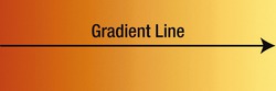
Figure 19-1. In a linear gradient, the colors change along a straight line
Note The original files for Figures 19-1 through 19-5 are in colorstops_1.html through colorstops_5.html in the ch19 folder.
With a radial gradient, the starting point of the gradient line (or gradient ray) is anchored at the center of the circle or ellipse, and the line always extends to the right (see Figure 19-2).
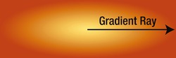
Figure 19-2. The color stops of a radial gradient are drawn on a ray extending from the center to the right
Setting the Position of Color Stops
The position of a color stop along the gradient line or ray can be specified using a length or percentage. Lengths are measured from the starting point. Percentages are relative to the distance between the starting and ending points. In Figure 19-1, the dark color stop is at the starting point (0%) on the left edge of the gradient box, and the light color stop is at the ending point (100%) on the right edge. In Figure 19-2, the starting point is the light color in the center of the ellipse, and the ending point is the right edge of the gradient box. In both cases, the smooth transition from one color to the other is generated automatically by the browser.
Note With a linear gradient, the starting and ending points of the gradient line often lie outside the gradient box. You’ll learn later in this chapter how to determine their location.
If you don’t specify the position of a color stop, the browser applies the following rules:
- If it’s the first color stop, it’s placed at the starting point (0%) of the gradient line.
- If it’s the last color stop, it’s placed at the ending point (100%) of the gradient line.
- Intermediate color stops are spaced evenly between the preceding and following color stops that have positions.
In theory, there’s no limit to the number of color stops, but they must be listed in ascending order. If a color stop has a position lower than any preceding one, it’s reset to the highest preceding value. For example, in the following list, the third color stop is out of order:
#C24704, #D9CC3C 35%, #00ADA7 25%, #FFEB79
This produces a smooth transition between the first and second color stops along the first 35% of the gradient line. The third color stop’s position is reset to 35%, resulting in a sudden change of color at that point, as shown in Figure 19-3.

Figure 19-3. The smooth transition of colors is interrupted by the incorrect sequence of color stops
Tip If you want a sudden change of color, set the position of two adjacent color stops to the same value. For example, the correct way to create the sudden transition in Figure 19-3 is to set the middle two values to 35% like this: #C24704, #D9CC3C 35%, #00ADA7 35%, #FFEB79.
The color stops are usually placed between the starting and ending points, but the gradient line extends infinitely in both directions. So, the first color stop can be before the starting point, and the last one after the ending point. Figure 19-4 demonstrates the effect. Both gradients use the same colors for the first and last color stops. The top gradient positions the colors stops at the starting and ending points, whereas the bottom gradient positions the first color stop at minus 40%. As a result, the bottom gradient is stretched, and it begins with an intermediate shade.
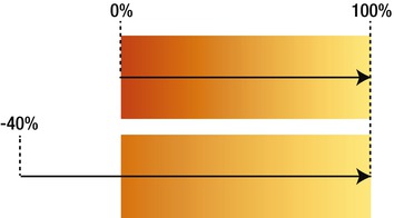
Figure 19-4. Positioning the first color stop before the starting point changes the gradient
If the first color stop is beyond the starting point, the color is drawn as a solid block up to the starting point. Similarly, if the last color stop is before the ending point, the final section is a solid color. For example, the first color stop in Figure 19-5 is positioned at 35%, producing a solid color in the left third of the gradient box.

Figure 19-5. Positioning the first color stop at 35% produces a solid color before the gradient
Tip You can use transparent as a color stop if you want the background to show through part of the gradient.
A linear gradient creates a smooth transition between two or more colors in a straight line. By default, the gradient goes from the top of the element to the bottom, as shown in Figure 19-6.

Figure 19-6. A simple linear gradient between two colors
However, you can control the direction of the gradient using keywords to point to one of the sides or corners, which then becomes the ending point. Alternatively, you can specify the angle at which the gradient should be drawn.
To create a linear gradient, you use the linear-gradient() function, which takes the following comma-separated arguments:
- The angle or direction of the gradient (optional)
- A comma-separated list of two or more color stops
The gradient in Figure 19-6 is created using the following style (the code is in linear_1.html):
div {
    width: 300px;
    height: 100px;
    margin: 20px;
    background-image: linear-gradient(#C24704, #FFEB79);
}
Just two color values are passed to the linear-gradient() function. The first one is a dark orange, and the second one is a shade of yellow. Because no angle or direction is specified, the starting point of the gradient line is the top edge, and the ending point is the bottom edge. Also, no positions are specified for the color stops, so the first one is positioned at 0% and the second one at 100%.
Because a gradient has no intrinsic dimensions, the transition from one color to the next is more gradual (see Figure 19-7) when the height of the <div> is doubled in linear_2.html like this:
div {
    width: 300px;
    height: 200px;
    margin: 20px;
    background-image: linear-gradient(#C24704, #FFEB79);
}

Figure 19-7. The change in height results in a more gradual color transition
Using Keywords to Set the Direction of the Gradient Line
The linear-gradient() function supports the following keywords to set the ending point of the gradient line: top, bottom, right, and left. On their own, they represent the side of the gradient box; but they can also be combined to indicate a corner, such as top left or bottom right. To set the direction, you precede the keyword(s) with to. For example, linear_3.html draws the gradient from the bottom-right to the top-left of the gradient box like this (see Figure 19-8):
background-image: linear-gradient(to top left, #C24704, #FFEB79);
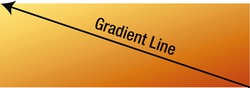
Figure 19-8. The gradient is drawn from the diagonally opposite corner
Caution At the time of this writing, WebKit-based browsers use the keywords on their own (without to) to specify the origin of the gradient line rather than its destination. For example, to draw the gradient line from left to right, -webkit-linear-function() uses left instead of to right.
When the gradient line is drawn to a corner, a color stop at 50% automatically intersects the other corners. For example, the gradient in linear_4.html is defined like this:
background-image: linear-gradient(to top left, #C24704, #FFEB79, #00ADA7);
The positions of the color stops aren’t specified, so they default to 0%, 50%, and 100%, respectively. As a result, the gradient line is drawn from the bottom-right to the top-left corner, and the second color stop intersects the bottom-left and top-right corners, as shown in Figure 19-9.
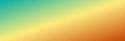
Figure 19-9. The color stop at 50% intersects the other corners
At the time of this writing, Chrome 21 and Safari 6 fail to draw gradients correctly when you use two keywords to point to a corner, producing instead the result shown in Figure 19-10.
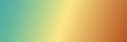
Figure 19-10. Safari 6 gets the gradient direction wrong when using two keywords to point to a corner
Setting the Angle of the Gradient Line
You can use an angle instead of keywords to set the direction of the gradient line. Specifying the angle in degrees with the deg unit of measurement is simple, but there are two complicating factors:
- In all browsers, most angles produce starting and ending points outside the gradient box.
- Browsers that require a browser-specific prefix with linear-gradient() use a different coordinate system from the final specification.
In the standard syntax, 0deg points directly upward. Larger angles move in a clockwise direction, as shown in Figure 19-11.
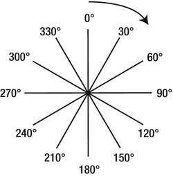
Figure 19-11. CSS angles follow the same coordinates as a compass
The angle is calculated from the center of the gradient box, and the gradient line stretches in both directions. You can use negative values for a counterclockwise angle: -45deg has the same meaning as 315deg.
Note Browsers automatically convert out-of-range angles to the correct value between 0° and 360°.
The gradient in linear_5.html is set at 135° like this:
background-image: linear-gradient(135deg, #C24704, #FFEB79);
Setting the angle of the gradient like this locates the starting and ending points outside the gradient box. Figure 19-12 shows how they are calculated.
Starting from the center, the gradient line extends at the specified angle. The ending point is where a line at right-angles to the gradient line would intersect with the nearest corner of the gradient box. The starting point is calculated in the same way, but in the opposite direction.
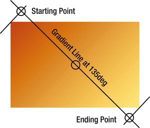
Figure 19-12. Calculating the starting and ending points of a linear gradient
Although this sounds like a convoluted setup, it’s deliberately designed to ensure that the corners of the gradient box use the color stops at the starting and ending points. As Figure 19-12 shows, the top-left corner of the gradient box in linear_5.html uses the first color stop (#C24704), and the bottom-right uses the last color stop (#FFEB79). So, although the gradient is angled at 135°, the full range of colors runs from one corner to the other diagonally opposite.
Using Angles with Browser-Specific Prefixes
Browsers started experimenting with gradients before the W3C drafted any specifications. Firefox was the first to use an angle to specify the direction of the gradient line. However, it decided to use the polar coordinate system (http://en.wikipedia.org/wiki/Polar_coordinate_system). In this system, 0deg points to the right and angles increase counterclockwise, as shown in Figure 19-13. Opera and WebKit-based browsers later adopted the same coordinate system.
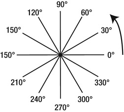
Figure 19-13. The polar coordinate system starts on the right and moves counterclockwise
Microsoft added support for CSS gradients much later, so IE 10 follows the official specification and uses compass coordinates. Firefox 16 also uses compass coordinates in the standard linear-gradient() function. Other browsers will, no doubt, adopt the correct syntax later.
This is where browser-specific prefixes really demonstrate their value. In many cases, you merely repeat the same values as the standard property. However, to specify the angle of a gradient, you need to use polar coordinates with the browser-specific functions, and compass coordinates with the standard function. The “Converting Angles” sidebar explains how to calculate the correct value.
In both coordinate systems, 360° represents a full circle, but angles are measured in opposite directions. Also, 0° in the polar coordinate system is at the same position as 90° in compass bearings.
To calculate the polar-coordinate angle for the browser-specific functions, use the following steps:
- If the compass-bearing angle is 90° or less, subtract 90.
- If the compass-bearing angle is greater than 90°, subtract 450.
- Remove the minus symbol from the result to get the polar-coordinate angle.
For example, if the compass-bearing angle is 30°, subtracting 90 leaves –60°. Removing the minus symbol produces 60°. If the compass-bearing angle is 135°, subtracting 450 leaves –315°. Removing the minus symbol produces 315°.
The gradient definitions in linear_5.html look like this:
background-image: -moz-linear-gradient(315deg, #C24704, #FFEB79);
background-image: -o-linear-gradient(315deg, #C24704, #FFEB79);
background-image: -webkit-linear-gradient(315deg, #C24704, #FFEB79);
background-image: linear-gradient(135deg, #C24704, #FFEB79);
Although the angles look completely different, each browser produces an identical gradient.
A radial gradient emerges from a single point with the colors spreading outward in a circular or elliptical shape (see Figure 19-14).

Figure 19-14. Radial gradients can be circular or elliptical
You define the gradient with the radial-gradient() function, which optionally sets the size and position of the circle or ellipse. The browser-specific functions use a similar syntax to the standard one, but there are some significant differences.
Standard Syntax
The radial-gradient() function takes the following arguments:
- Shape: The accepted values are circle and ellipse.
- Size: This determines the extent of the radial gradient, either using specific dimensions or keywords.
- Position: This determines the center of the circle or ellipse. The value is expressed in the same way as background-position (see Chapter 8), preceded by the keyword at. If omitted, it defaults to at center.
- Color stops: A comma-separated list of colors with optional positions along the gradient ray starting at the center.
The only required argument is the list of color stops. All other arguments are optional.
Setting the Shape of the Gradient
You can set the shape of the gradient explicitly by using the keyword circle or ellipse.
If you omit the shape, it defaults to circle if the size is a single length. In all other cases, it defaults to ellipse.
Setting the Size of the Gradient
You can set the size of the circle or ellipse explicitly or by using keywords.
A circular gradient accepts only a single length, which sets its radius.
An elliptical gradient accepts two values, which can be either lengths or percentages. The first value sets the ellipse’s horizontal radius. The second one sets its vertical radius. Percentage values are relative to the width and height of the gradient box, respectively.
Caution You cannot use a percentage to set the size of a circular gradient because it’s ambiguous whether the percentage should be relative to the width or height of the gradient box.
Both shapes accept any of the following keywords to determine their size:
- closest-side
- farthest-side
- closest-corner
- farthest-corner
To demonstrate the effect of these keywords, Figures 19-15 through 19-18 apply them to a circular gradient and an elliptical one. The center of each gradient is 100px from the left and 50px from the top. They all use the same color stops:
#C24704, #FFEB79 35%, #00ADA7

Figure 19-15. The outer edges of the gradients are determined by the closest sides of the gradient box
Note The code for each example is in a file named after the keyword, for example, closest-side.html.
Figure 19-15 shows the effect of closest-side. The outer edge of the circular gradient exactly meets the side of the gradient box closest to the circle’s center—in other words, the top. The outer edge of the elliptical gradient meets the closest side in the horizontal and vertical axes—in this case, the left and top.
Figure 19-16 shows the effect of farthest-side. This is similar to closest-side, except the size is based on the farthest side(s). The result is markedly different, particularly in the case of the circular gradient. The farthest side from the center of the circular gradient is the right edge of the gradient box. The ellipse is controlled by the right and bottom sides.
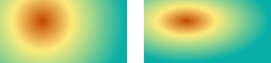
Figure 19-16. The outer edges of the gradients stretch to the farthest side(s)
Figure 19-17 shows the effect of closest-corner. The outer edge of the gradient passes through the corner of the gradient box closest to the shape’s center. The aspect ratio of the elliptical gradient is the same as for closest-side.
Figure 19-17. The outer edge of each gradient passes through the closest corner of the gradient box
Figure 19-18 shows the effect of farthest-corner. This is the same as closest-corner, except the size is based on the farthest corner and the aspect ratio of the elliptical gradient is based on farthest-side.
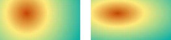
Figure 19-18. The outer edge of each gradient passes through the farthest corner of the gradient box
If no size is set, it defaults to farthest-corner.
Setting the Position of the Gradient
You can position the gradient using the at keyword followed by any expression that’s valid for the background-position property. For example, the circular gradient in Figure 19-18 is positioned 100px from the left and 50px from the top like this (the code is in farthest-corner.html):
background-image: radial-gradient(circle farthest-corner at 100px 50px, #C24704, #FFEB79 ←
35%, #00ADA7);
Caution The shape, size, and position values are passed to the radial-gradient() function as a space-separated list. The shape and size values can be in either order, but the position must come after them (unless both shape and size are omitted). The list of color stops always comes last.
If the position is omitted, the gradient is centered in the gradient box.
Syntax for Browser-Specific radial-gradient() Functions
To create a radial gradient in browsers that don’t yet support the standard syntax, you need to use a browser-specific version of the radial-gradient() function. They all take the same arguments separated by commas:
- Position: This specifies where to locate the center of the circle or ellipse, using any value that’s valid for background-position. If omitted, it defaults to center.
- Shape and size: The shape and size of the gradient are presented as a single argument using the same keywords as the standard syntax. Two additional keywords, contain and cover, act as synonyms for closest-side and farthest-corner, respectively. Both shape and size are optional. If omitted, they default to ellipse and farthest-corner.
- Color stops: A comma-separated list of colors with optional positions along the gradient ray starting at the center.
These arguments are very similar to the standard syntax, but with the following important differences:
- The position, if specified, must be the first argument, and is followed by a comma.
- The value for position is not preceded by the keyword at.
- To set the size of the gradient explicitly in WebKit and Opera, omit the shape, and specify two values for the horizontal and vertical radii. For a circle, both values must be the same.
- The browser-specific function for Firefox 15 and earlier doesn’t support setting the size explicitly.
The styles for the circular gradient in closest-side.html (see Figure 19-15) use both the browser-specific functions and the standard syntax like this:
background-image: -moz-radial-gradient(100px 50px, circle closest-side, #C24704, #FFEB79 ←
35%, #00ADA7);
background-image: -o-radial-gradient(100px 50px, circle closest-side, #C24704, #FFEB79 ←
35%, #00ADA7);
background-image: -webkit-radial-gradient(100px 50px, circle closest-side, #C24704, ←
#FFEB79 35%, #00ADA7);
background-image: radial-gradient(circle closest-side at 100px 50px, #C24704, #FFEB79 ←
35%, #00ADA7);
The main difference can be summarized as follows: the standard syntax puts the shape, size, and position in a space-separated list with the position last like this:
circle closest-side at 100px 50px
In the browser-specific versions, the position comes first, and is separated from the shape and size by a comma like this:
100px 50px, circle closest-side
The functions for repeating gradients, repeating-linear-gradient() and repeating-radial-gradient(), take the same arguments as their nonrepeating equivalents. However, it’s important to position the last color stop before the ending point. If you don’t, it defaults to 100%, preventing the pattern from being repeated.
A simple, yet effective use of a repeating linear gradient is to create diagonal stripes.
The styles in repeating-linear_1.html add the following gradient:
background-image: repeating-linear-gradient(-45deg, #426A77, #FFF 6px);
This sets the angle of the gradient line to –45°, and creates two color stops. The first one is dark blue. No position is declared, so it defaults to 0%. The second color stop is white, and it’s positioned at 6px along the gradient line. So, the gradient transitions from dark blue to white in a very short space. The function then repeats the same pattern infinitely, producing the result shown in Figure 19-19.
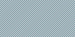
Figure 19-19. The diagonal stripes are created by repeating a linear gradient
To create the same effect in browsers that don’t yet support the standard property, you need to change the angle to the polar-coordinate equivalent like this:
background-image: -moz-repeating-linear-gradient(135deg, #426A77, #FFF 6px);
background-image: -o-repeating-linear-gradient(135deg, #426A77, #FFF 6px);
background-image: -webkit-repeating-linear-gradient(135deg, #426A77, #FFF 6px);
Creating a Smooth Repeating Gradient
The repeating gradient in the preceding example creates the illusion of stripes because there are only two color stops and the distance between them is very short. To create a more fluid repeating gradient, the first and last color stops need to be the same color.
The gradient in repeating-linear_2.html uses two shades of yellow like this:
background-image: repeating-linear-gradient(to right, #D9CC3C, #FFEB79 5%, #D9CC3C 10%);
The darker yellow is used as the first color stop. It has no declared position, so it defaults to the starting point of the gradient line. The lighter yellow is the second color stop at 5%, and the first color is repeated at 10%. This produces the ridge effect shown in Figure 19-20.
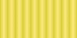
Figure 19-20. Using the same color for the first and last color stops produces a constant transition
The values for the browser-specific versions are identical, except for WebKit, which treats keywords as the origin of the gradient line. Instead of to right, WebKit needs the first argument to be left.
Creating Repeating Radial Gradients
The repeating-radial-gradient() function and its browser-specific equivalents work exactly the same way. The gradient in repeating-radial.html looks like this:
background-image: repeating-radial-gradient(circle at 50% 100%, #FFEB79, #D9CC3C 5%);
This creates a circular gradient anchored at the center bottom with two color stops. The first color stop (light yellow) is anchored at the starting point—in other words, the center of the circle—and the second one (darker yellow) is positioned at 5% along the gradient ray. The size isn’t specified, so it defaults to farthest-corner, producing the gradient in Figure 19-21.
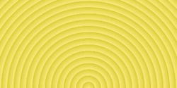
Figure 19-21. A repeating radial gradient that looks like the rings of a tree
The browser-specific versions require the position as the first argument like this:
background-image: -moz-repeating-radial-gradient(50% 100%, circle, #FFEB79, #D9CC3C 5%);
background-image: -o-repeating-radial-gradient(50% 100%, circle, #FFEB79, #D9CC3C 5%);
background-image: -webkit-repeating-radial-gradient(50% 100%, circle, #FFEB79, #D9CC3C 5%);
Because CSS gradients are applied using the background-image property, you can add multiple gradients as the background to an element by listing the gradient definitions separated by commas. The gradients are applied in reverse order, with the first one appearing in front. Because gradients normally fill the entire background, you need to set the final color stop to transparent on gradients that appear in front. Alternatively, you can control the size and position of individual gradients with the background-size and background-position properties.
Radial gradients using the standard syntax are particularly suited for use as multiple gradients because the radial-gradient() function allows you to set the size of the gradient precisely using lengths (for both circles and ellipses) or percentages (for ellipses). To demonstrate the sort of effect you can achieve, multiple_gradients.html contains the following style:
#ball {
    width: 100px;
    height: 100px;
    margin: 20px;
    background-color: #C51D31;
    border-radius: 50%;
    background-image: radial-gradient(circle 12px at 25px 30px, rgba(255,255,255,0.8), ←
    transparent),
                        radial-gradient(circle at 30% 30%, #C51D31, #921524, #450A11);
}
The ball <div> is a 100px square with its border-radius set to 50%, which converts it to a circle.
The first radial gradient is a 12px circle positioned 25px from the left and 30px from the top. Its first color stop is white with 80% alpha transparency, and its final color stop is transparent.
The second gradient appears behind the first one. It’s also a circle, positioned at 30% both horizontally and vertically, offsetting it to the upper left. No size has been declared, so it fills the background to farthest-corner. The three color stops are increasingly deeper shades of red. Figure 19-22 shows the result.
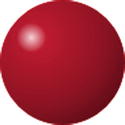
Figure 19-22. Superimposing two radial gradients on top of each other creates a 3D highlight effect
Creating the same effect with browser-specific prefixes isn’t possible with Firefox 15 and earlier because -moz-radial-gradient()doesn’t support setting the size of the gradient explicitly. For WebKit and Opera, you omit the circle or ellipse keyword, and specify two dimensions instead. This is how the two gradients are defined for Opera:
background-image: -o-radial-gradient(25px 30px, 12px 12px, rgba(255,255,255,0.8), ←
transparent),
                    -o-radial-gradient(30% 30%, circle, #C51D31, #921524, #450A11);
WebKit doesn’t render the transition to transparent well, so the styles in multiple_gradients.html set the second color stop of the first gradient to white with 20% alpha transparency like this:
background-image: -webkit-radial-gradient(25px 30px, 12px 12px, rgba(255,255,255,0.8), ←
rgba(255,255,255,0.2)),
                    -webkit-radial-gradient(30% 30%, circle, #C51D31, #921524, #450A11);
Tip For inspiration of what you can do with CSS gradients, visit the CSS3 Patterns Gallery hosted by the extremely talented Lea Verou (http://lea.verou.me/css3patterns/).
The standard syntax has been supported by Internet Explorer since IE 10 and by Firefox since version 16. By the time you read this, it may also be supported by the most recent versions of other browsers.
The following browsers support the browser-specific syntax described in this chapter:
- Firefox 10–15
- Chrome 10+
- Opera 11.6+
- Safari 5.1+
- iOS Safari 5.0+
- Android 4.0+
- Opera Mobile 12+
The simplest way to deal with older browsers is to provide a solid background color. Alternatively, you can create a linear gradient in a graphics program, and tile a thin slice horizontally or vertically as a background image (see Figure 8-4 in Chapter 8). Organize your style rules in the following order:
- Background color
- Gradient image
- Browser-specific gradient functions
- Standard CSS gradient syntax
The last three items all use the background-image or background property. By placing them in this order, browsers that support the browser-specific or standard syntax override the previous values. Only browsers that don’t understand either use the background image. The background color is there as a fallback in case there’s a problem with the gradient definition or background image.
Summary
Using CSS rather than images to add gradient backgrounds to elements reduces the number of server requests, improving download times and making your sites more efficient. Although no images are used, you apply a gradient to an element using the background-image or background property, and using one of the following functions: linear-gradient(), radial-gradient(), repeating-linear-gradient(), or repeating-radial-gradient(). Unfortunately, the syntax has undergone numerous changes, resulting in the need to pass different arguments to the browser-specific functions.
You define a gradient by specifying a series of color stops along an imaginary gradient line. You can either specify the position of each color stop or leave it up to the browser to space them out evenly. The browser automatically transitions the colors smoothly from one color stop to the next.
Linear gradients progress in a straight line. By default, the gradient line runs from the top to the bottom of the element, but you can change the direction using keywords or by specifying an angle. The standard syntax uses angles that follow compass bearings, but the browser-specific functions use the polar coordinate system, which sets 0° on the right and increases counterclockwise.
Radial gradients emerge from a single point, with the colors spreading out in a circular or elliptical shape. You can set the size, shape, and position of a radial gradient. Both types of gradients can also be repeated infinitely to produce a wide range of patterns.
In the next chapter, we’ll look at CSS transforms and transitions, which can be used for simple animation effects.