Choosing the right selector is the key to working successfully with CSS. The CSS3 specification defines more than 40 selectors, allowing you to target your styles accurately without the need for extra HTML markup. The latest versions of all browsers support the full range of CSS3 selectors, plus some nonstandard ones. However, not everyone uses the latest browsers, so—at least in the early stages of learning CSS— it makes sense to concentrate on selectors that are supported even by older browsers.
In this chapter, you’ll learn about the following:
- How the browser uses the Document Object Model to apply styles
- How to change the default look of HTML elements
- Styling new HTML5 elements in older browsers
- What the difference is between class and ID selectors
- Choosing good names for classes
- How to style links with pseudo-classes
- How to apply styles to different sections of a page using descendant selectors
- How to change the look of the cursor
- How to style the first line or letter using pseudo-elements
- Determining which styles take precedence in case of a conflict
How Selectors Work
When a browser loads a web page, it reads the HTML tags to build a tree-like outline of the page’s structure. This is known as the Document Object Model (DOM). Understanding the basic principles of the DOM is essential to many aspects of web design and development. JavaScript manipulates the DOM to add dynamic widgets, such as accordions and tabbed panels, or to load fresh data asynchronously. CSS also relies on the DOM to apply styles to specific elements.
Understanding the DOM
Listing 2-1 contains the HTML markup for a simple web page, dom.html:
Listing 2-1. Exploring the DOM
<!doctype html>
<html>
<head>
<meta charset="utf-8">
<title>Understanding the DOM</title>
</head>
<body>
<h1>How the Document Object Model Works</h1>
<p>The <dfn>Document Object Model</dfn> (<abbr title="Document Object Model">DOM</abbr>) creates a tree-like structure of the page.</p>
</body>
</html>
As Figure 2-1 shows, the browser applies some basic styling to different HTML elements. The <h1> heading is rendered in a large, bold font, the words inside the <dfn> tags are italicized, and the contents of the <abbr> element have a dotted underline.
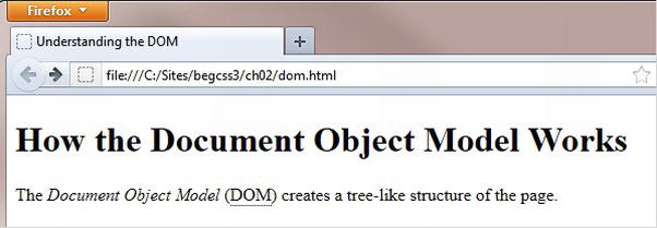
Figure 2-1. The browser adds default styles to the page
 Note The <dfn> tag is one of the oldest elements in HTML, first mentioned in the HTML 2 specification in 1995, but many web designers have never heard of it. The tag represents the defining instance of a term. With the emphasis on semantic—or meaningful—structure in HTML5, the <dfn> tag deserves to be dusted off and restored to its rightful place in HTML markup.
Internally, the browser builds a representation of the DOM like a family tree, as shown in Figure 2-2.
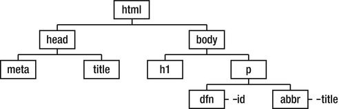
Figure 2-2. The browser sees the page as a hierarchical structure based on the HTML tags
The family tree analogy is also applied to the relationship between HTML elements. At the top of the family tree in Figure 2-2 is the <html> element, which is known as the root element. Next come the <head> and <body> elements, which are the <html> element’s children or child elements. Because they’re at the same level of the family tree, the <head> and <body> elements are considered siblings. Further down the family tree, the <h1> and <p> elements are also siblings, but they’re children of the <body> element and descendants of the <html> element. The relationship also works the other way—the <body> element is the parent of the <h1> and <p> elements. At the bottom level of Figure 2-2, the <dfn> and <abbr> elements have id and title attributes respectively. Going back up the family tree, all elements in the same branch are the ancestors of the <dfn> and <abbr> elements.
The browser uses the DOM as a roadmap to apply styles in accordance with the selector associated with each style rule. You create selectors using the tag and attribute names in various combinations, frequently reflecting the family-tree relationship of different elements. Consequently, it’s important not only to have a clear understanding of the DOM, but also to ensure that your HTML is well constructed. If elements are incorrectly nested, the browser is likely to have difficulty reading the roadmap, and your page might not be styled the way you expected. Also, if your markup is overly complex, the browser will have difficulty navigating the DOM. Even if it renders your styles correctly, your pages are likely to load more slowly.
Tip If your styles aren’t working the way you expect, always check your HTML markup using the W3C validation service at http://validator.w3.org/. Invalid HTML is one of the main causes of problems with CSS.
The first line of the HTML markup in Listing 2-1 looks like this:
<!doctype html>
This is the HTML5 DOCTYPE preamble, which is required to ensure that the browser renders your styles correctly. The DOCTYPE is case-insensitive, so you can use <!DOCTYPE html> or any other combination of uppercase and lowercase.
If you are using HTML 4.01 or XHTML 1.0, you should use one of the following versions of the DOCTYPE:
<!DOCTYPE HTML PUBLIC "-//W3C//DTD HTML 4.01 Transitional//EN"
"http://www.w3.org/TR/html4/loose.dtd">

<!DOCTYPE HTML PUBLIC "-//W3C//DTD HTML 4.01//EN" "http://www.w3.org/TR/html4/strict.dtd">

<!DOCTYPE html PUBLIC "-//W3C//DTD XHTML 1.0 Transitional//EN"
"http://www.w3.org/TR/xhtml1/DTD/xhtml1-transitional.dtd">

<!DOCTYPE html PUBLIC "-//W3C//DTD XHTML 1.0 Strict//EN"
"http://www.w3.org/TR/xhtml1/DTD/xhtml1-strict.dtd">
The important element in each of these versions is the URL, which points to the Document Type Definition (DTD). Browsers use this reference to the DTD to render CSS in standards mode—in other words, according to the CSS specification. Some older HTML editing programs omit the URL like this:
<!DOCTYPE HTML PUBLIC "-//W3C//DTD HTML 4.01 Transitional//EN">
If you use a shorter version of the HTML 4.01 or XHTML 1.0 DOCTYPE or omit the DOCTYPE altogether, browsers switch to quirks mode, which results in widths being applied incorrectly.
Note Quirks mode is hangover from the days when Internet Explorer interpreted the CSS box model (see Chapter 6) incorrectly. IE 6 corrected the problem, but browsers used the DOCTYPE to switch between quirks and standards mode to prevent breaking the huge number of web pages that had been designed using the wrong interpretation of the standard.
The HTML5 DOCTYPE is now the recommended version, which you can safely use in all browsers—even IE 6. It was designed as the shortest string of characters guaranteed to switch all browsers into standards mode.
Deciding Which Selector to Use
The CSS2.1 specification defines 22 selectors, and CSS3 adds almost as many again. Instead of attempting to cover the full range, I think it makes sense to begin with a subset of the most widely supported. The last four items in Table 2-1 (attribute selectors) are not supported by IE 6, but I’ve included them in this list because they are so useful and because IE 6 now has an insignificant market share in most parts of the world.
Table 2-1. Basic CSS Selectors Supported by Most Current Browsers
| Pattern/Selector | Name | Meaning |
|---|---|---|
| * | Universal selector | Matches any element. |
| E | Type selector | Matches any HTML element of type E. The selector consists of the HTML tag name without the angle brackets. For example, h1 selects all <h1> tags. |
| .className | Class | Matches elements with the class attribute className. |
| #someId | ID selector | Matches elements with the id attribute someId. |
| E:link | Link pseudo-class | Matches elements of type E if E is an unvisited link. |
| E:visited | Visited pseudo-class | Matches elements of type E if E is a visited link. |
| E:hover | Hover pseudo-class | Matches elements of type E when the cursor is hovering over it. IE 6 supports this only on links. Other browsers support it on all elements. |
| E:active | Active pseudo-class | Matches elements of type E at the moment the element is being clicked. IE 6 and IE 7 support this only on links. |
| E:focus | Focus pseudo-class | Matches elements of type E when the element currently has focus. Not supported by IE 6 or IE 7. |
| E:first-letter | First-letter pseudo-element | Matches the first letter of element E. |
| E:first-line | First-line pseudo-element | Matches the first line of element E. |
| E F | Descendant selector | Matches any F element that is a descendant of an E element. |
| E[attr] | Attribute selector | Matches elements of type E with the attribute attr. |
| E[attr="x"] | Attribute selector | Matches elements of type E where the value of the attr attribute is exactly "x". |
| E[attr^="x"] | Attribute selector | Matches elements of type E where the value of the attr attribute begins with "x". |
| E[attr$="x"] | Attribute selector | Matches elements of type E where the value of the attr attribute ends with "x". |
The first column in Table 2-1 follows the convention in the CSS specification of using E and F to represent generic selectors. The meaning should become clear in the descriptions and exercises that follow in the rest of this chapter.
Universal Selector
The universal selector is represented by an asterisk (*). It selects any element, but is rarely used except to create hacks to hide styles from IE 6.
Type Selectors
A type selector uses the name of an HTML tag without the angle brackets, and redefines the default look of the tag. For this reason, type selectors are sometimes called tag selectors. For example, h1 defines the style of <h1> tags. You can use type selectors for all HTML 4.01 and XHTML 1.0 elements without problem. However, you need to exercise care when using type selectors for new HTML5 elements, as explained in the sidebar “Styling New HTML5 Elements in Older Browsers.”
STYLING NEW HTML5 ELEMENTS IN OLDER BROWSERS
HTML5 is designed to be backward compatible, so most browsers allow you to apply CSS to the new HTML5 semantic elements, such as <header>, <section>, and <nav>, even if they don’t recognize them. All that’s necessary is to add the following rule to your style sheet:
article, aside, figure, footer, header, nav, section {
display: block;
margin: 0;
padding: 0;
}
This style rule tells the browser to treat the new HTML5 elements the same as a <div>. In other words, the element occupies a line of its own with no extra vertical or horizontal spacing. Unfortunately, IE 6–8 leave HTML5 elements unstyled unless you convince the browser to recognize the new elements by adding the following code just before the closing </head> tag in each page:
!--[if lt IE 9]>
<script src="http://html5shim.googlecode.com/svn/trunk/html5.js"></script>
<![endif]-->
This code is an Internet Explorer conditional comment (www.quirksmode.org/css/condcom.html) that tells versions of Internet Explorer earlier than IE 9 to load a tiny script created by JavaScript genius, Remy Sharp. The script creates dummy HTML5 elements in the browser’s memory. The elements are never displayed, but their existence is sufficient to coax IE 6–8 into styling other HTML5 elements in your page. The link loads the script from Google’s content distribution network. If you prefer, you can download the script, and store it on your own web server.
The only disadvantage of this technique is that it relies on JavaScript being enabled in the browser. A detailed survey by Yahoo! in 2010 estimated that about 2 percent of users in the USA have JavaScript disabled (http://developer.yahoo.com/blogs/ydn/posts/2010/10/how-many-users-have-javascript-disabled/). The figure for most other countries was 1.3 percent. Although that’s a small proportion, on a busy site it can represent tens of thousands or even millions of users. Consequently, if your target audience is still using IE 6–8, you should probably avoid using the new HTML5 elements.
Class Selectors
A class selector applies style rules to elements that have the equivalent class attribute in their opening HTML tag. The selector is created by prefixing the class name by a period. For example, the .warning class selector applies to all elements that have class="warning" in the opening tag. Multiple classes can be applied to the same element by separating the class names by a space in the class attribute, for example, class="warning important".
When choosing class names, try to pick a name that describes what the style is for rather than what it looks like. For example, if you choose boldRed as a class name, it won’t make any sense if you decide to use italic instead. You’ll either be left with a class that no longer accurately describes it, or you will need to change every instance of the class name in your HTML markup.
Class names must also adhere to the following rules:
- No spaces are permitted.
- The only punctuation characters permitted are the hyphen (-) and underscore (_).
- The name cannot begin with a number or a hyphen followed by a number.
Tip If you’re using a language other than English, you can also use accented characters in class names, as long as your pages are encoded as UTF-8. In fact, you can also use Chinese characters or other Asian scripts. When using accented characters or other scripts in an external style sheet, put @charset "utf-8"; on the first line of the style sheet to indicate that it uses UTF-8 encoding.
ID Selectors
An ID selector applies styles to elements that have the equivalent id attribute in their opening HTML tag. Unlike classes, which can be applied to multiple elements in the same page, IDs must be unique within a page. It’s OK to apply the same ID on different pages, as long as it’s used only once on each page.
The selector is created by prefixing the ID with the hash or pound sign (#). For example, #sidebar applies to the element that has id="sidebar" in its opening tag. The rules for naming IDs are the same as for class names.
A pseudo-class doesn’t rely on a class attribute in the HTML markup, but is applied automatically by the browser depending on the position of the element or its interactive state. The pseudo-classes listed in Table 2-1 apply mainly to links and form elements.
Like a pseudo-class, a pseudo-element is not identified as such by HTML markup. It applies styles to content based on its position in the HTML hierarchy. The most widely supported pseudo-elements are
- :first-letter This applies a style to the first letter of the first line inside a block-level element, such as a paragraph, as long as nothing else precedes it.
- :first-line This applies a style to the first line of text in a block-level element. The length expands and contracts dynamically if the text is rewrapped.
Note The CSS3 Selectors specification prefixes pseudo-elements with two colons instead of one. So, :first–letter becomes ::first-letter and :first-line becomes ::first-line. The specification says browsers must accept the single-colon prefix for :first–letter and :first–line, as well as for:before and :after, which are covered in Chapters 13 and 15. IE 8 and earlier don’t understand the double-colon prefix, so you need use the single-colon versions to avoid styles breaking in older browsers.
A descendant selector matches any element that is a descendant of another. To create a descendant selector, separate the two selectors by a space, putting the ancestor first. For example, #sidebar p affects only paragraphs that are descendants of an element that has the ID sidebar.
An attribute selector matches any element that has a particular attribute in its opening HTML tag. Because IE 6 doesn’t support them, attribute selectors have been largely overlooked by web designers. Now that the market share of IE 6 has dropped to insignificant levels in many parts of the world, you should become familiar with them and incorporate them into your styles unless a large part of your target audience is still using IE 6.
You create an attribute selector by putting the attribute—optionally with a value—in a pair of square brackets after a type (tag) selector.
The following sections describe the most common attribute selectors.
The simplest type of attribute selector matches an element that contains a particular attribute in its opening tag. The value of the attribute is unimportant. For example, the following style rule adds a five-pixel red border around every image that contains the alt attribute:
img[alt] {
    border: 5px solid red;
}
This can be useful for checking that all images have alternate text before uploading your site. You can see instantly if the alt attribute is missing from any images because they won’t have a border. Obviously, you would use this only for local testing—unless you like heavy red borders on your images, that is.
To select elements with attributes that have a specific value, add an equal sign after the attribute followed by the value you want to match. This is particularly useful when styling forms. For example, the following style rule gives all text input fields a width of 250 pixels:
input[type="text"] {
    width: 250px;
}
Match the Beginning of a Value
You can select elements by matching only the first few characters of an attribute’s value. Precede the equal sign with a caret or circumflex like this:
a[href^="http://"] {
    color: red;
}
This matches all links where the href attribute begins with http://. In other words, it matches all external links, except those made over a secure connection.
To match the last few characters of an attribute’s value, precede the equal sign with a dollar sign. For example, the following style rule matches all links to PDF documents, and displays a PDF symbol alongside the link text:
a[href$=".pdf"] {
    padding-right: 20px;
    background-image: url(../images/pdficon_small.gif);
    background-repeat: no-repeat;
    background-position: right center;
}
Note Quotation marks around the value of an attribute selector are optional if the value contains only alphanumeric characters.
To avoid repetition when applying the same styles to several elements, you can group selectors as a comma-separated list. For example, the following style rule changes the color of all headings:
h1, h2, h3, h4, h5, h6 {
    color: red;
}
Trying It Out
It’s time to put some of that theory to the test. Listing 2-2 shows the HTML markup in the <body> of basic.html, which you’ll style using the basic selectors in Table 2-1.
Listing 2-2. The <body> Section in basic.html
<body>
<h1>Beginning CSS3</h1>
<ul id="nav">
<li><a href="#">Introducing CSS—the Language of Web Design</a></li>
<li><a href="#">Specifying Sizes, Colors, and Files</a></li>
<li><a href="http://apress.com/">Apress—Books for Professionals by Professionals</a></li>
</ul>
<div id="main">
<h2>Deciding Which Selector to Use</h2>
<p class="intro">Instead of attempting to cover the full range of <abbr title="Cascading Style Sheets">CSS</abbr> selectors, I think it makes sense to begin with a subset of the most widely supported. The <a href="http://www.quirksmode.org/css/contents.html">compatibility charts compiled by Peter-Paul Koch</a> provide detailed support information.</p>
<h3>Type Selectors</h3>
<p>A <dfn>type selector</dfn> uses the name of an HTML tag without the angle brackets, and redefines the default look of the tag. For example, <code>h1</code> defines the style of <code><h1></code> tags. You can use type selectors for all HTML 4.01 and XHTML 1.0 elements without problem.</p>
<h3>Class Selectors</h3>
<p>A <dfn>class selector</dfn> applies style rules to elements that have the equivalent <code>class</code> attribute in their opening HTML tag. For example, the <code>.warning</code> class selector applies to all elements that have <code>class="warning</code>" in the opening tag.</p>
</div>
</body>
When viewed in a browser, basic.html looks like Figure 2-3. The browser adds some default styles, such as underlining links and displaying unvisited links in blue and visited ones in purple. Most browsers display the text in the <abbr> tags with a dotted underline, italicize the text in <dfn> tags, and use a monospaced font for the text in <code> tags.
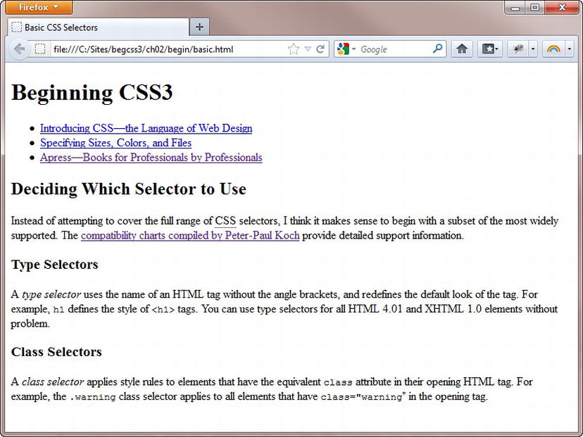
Figure 2-3. The page before custom styles have been applied
Note Browsers that use the WebKit rendering engine, such as Safari and Google Chrome, don’t display <dfn> elements in italic. Checking the default styling of HTML elements is one of the major challenges of CSS.
EXERCISE: REDEFINING THE DEFAULT LOOK OF HTML TAGS
This exercise shows how much you can achieve by redefining the default look of HTML tags with type selectors. Don’t worry if you don’t understand the properties and values. They will be described in detail in subsequent chapters. In any case, you’ll find most of them self-explanatory.
- Open basic.html in the begin folder for this chapter.
- Create a subfolder called css within the begin folder.
- Create a new blank file in the css folder and save it as basic.css.
- Attach the new style sheet (basic.css) to the web page by adding the following <link> tag just before the closing </head> tag in basic.html:
<link href="css/basic.css" rel="stylesheet">
- Redefine the default settings for the <body> tag by adding the following style definition to basic.css:
           body {
                   background-color: #F7F7F7;
                   color: black;
                   font-family: "Trebuchet MS", Arial, Helvetica, sans-serif;
} - Save both pages, and load basic.html into a browser. The background color of the page is now a very light gray, the text is black, and the default font has changed. The font affects all text on the page because the headings, paragraphs, and list items are all descendants of the <body> tag, so they inherit the style automatically. Strictly speaking, there’s no need to specify the text color as black, because that’s the default. But it’s always a good idea to specify both the background color and text color in the body style rule.
- Change the font and text color for the headings by adding the following rule:
           h1, h2, h3 {
                 font-family: Tahoma, Geneva, sans-serif;
                 color: teal;
} - Save the style sheet, and reload basic.html in a browser. The font and text color of the headings has changed, overriding the body rule. The other text still inherits the styles from the earlier rule. The order of the rules isn’t important here. The headings have changed because the h1, h2, and h3 type selectors target them directly, so they no longer inherit the font or text color from the <body>.
- Change the text color of the <dfn> and <code> elements by adding the following styles to basic.css:
           dfn {
                   color: maroon;
           }
           code {
                   color: gray;
} - To display the <dfn> elements in italic in Chrome and Safari, amend the dfn style rule like this:
           dfn {
                   color: maroon;
                   font-style: italic;
} - By default, browsers display paragraph text at 16 pixels. Change the font size in the paragraphs like this:
           p {
               font-size: 14px;
} - Save the style sheet, and reload basic.html in a browser. As Figure 2-4 shows, the text in the paragraphs is smaller, but the size of the headings and list items is unaffected.
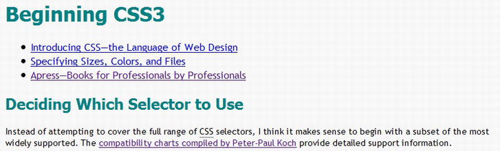
Figure 2-4. Changing the font size of the paragraphs doesn’t affect the other text
You’ll continue making improvements to the look of this page in the remaining exercises
Links are created using the <a> tag in HTML, so you can use a type selector to control the look of links. For example, the following rule makes links bold and red:
a {
    font-weight: bold;
    color: red;
}
That’s fine as far as it goes, but it means that links will look the same, regardless of whether they have been visited or when the mouse passes over a link. The answer is to use pseudo-classes to define how you want links to look dependent on their interactive state. You add the pseudo-class immediately after the type selector like this:
- a:link Unvisited link
- a:visited Visited link
- a:hover Link when the mouse is over it
- a:active Link at the point of being clicked
- a:focus Link when it has focus (for example, when accessed by the Tab key)
For the styles to work correctly, the cascade depends on this order being preserved. Many designers use the mnemonic LoVe-HAte to remember the correct order of pseudo-classes. The capital letters refer to the first letter of each one—L for :link, V for :visited, and so on.
It’s common to create separate styles for :link and :visited, but the :hover pseudo-class is often combined with the :active and :focus styles.
EXERCISE: STYLING LINKS IN DIFFERENT SECTIONS
This exercise shows you not only how to apply styles to links with pseudo-classes, but it also demonstrates the effects of inheritance through the cascade. After creating basic styles for all links, you’ll learn how to use descendant selectors to apply different styles to links according to where they are in the HTML family-tree hierarchy.
- Continue working with basic.html and basic.css from the preceding exercise. Alternatively, copy basic_01.html and css/basic_01.css from the end folder for this chapter.
- Add the following style rule at the bottom of basic.css to set the basic styles for all links:
           a {
                    font-weight: bold;
                    text-decoration: none;
} - Save the style sheet, and reload basic.html in a browser. All links are now bold, and the underline has been removed; but they still retain the browser’s default colors.
- Change the text color for unvisited and visited links by adding the following styles:
           a:link {
                   color: #8D0E6B;
           }
           a:visited {
                   color: #B53392;
} - Save the style sheet, and test the page again. Unvisited links are deep magenta; visited links are a lighter shade of magenta. If all links look the same, click the last link in the unordered list to visit the Apress website. When you return to basic.html, the color of the link should have changed.
- Create a rule that groups the :hover, :active, and :focus pseudo-classes like this:
           a:hover, a:active, a:focus {
                   color: #63550A;
                   text-decoration: underline;
} - Save the style sheet, and test the page again. When you mouse over a link, it turns deep brown and the text is underlined to give a visual signal that it’s clickable.
- To style links differently in a specific part of the page, you can use a descendant selector with the pseudo-classes. To keep the code simple, you’ll just reverse the colors for the links in the unordered list, which has the ID nav. You’ll also apply the same color to both visited and unvisited links. To create a descendant selector, you put the ancestor first—in this case #nav—followed by a space and the selector for the element(s) you want to affect. Add these styles to basic.css:
           #nav a:link, #nav a:visited {
                   color: #63550A;
           }
           #nav a:hover, #nav a:active, #nav a:focus {
                   color: #8D0E6B;
} - Save the style sheet, and reload basic.html in a browser. The links in the unordered list at the top of the page are now a different color. The descendant selectors affect only links that are descendants of the element with the ID nav.
- Mouse over one of the links in the unordered list. Not only does the text change color, but it’s also underlined (see Figure 2-5), even though the style rule you created in step 8 doesn’t set the text-decoration property to underline. The underlining is inherited from the style rule in step 6.
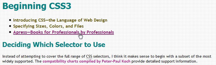
Figure 2-5. The underline is inherited from the rule that applies to all links
- Turn off the underline by amending the final style rule like this:
           #nav a:hover, #nav a:active, #nav a:focus {
                   color: #8D0E6B;
                   text-decoration: none;
           }
When styling links, there’s a danger of removing visual clues that text is clickable. Most users no longer expect blue underlines on links, but choose styles carefully to make links stand out from other text.
Changing the Look of the Cursor
When you mouse over a link, the browser automatically changes the shape of the cursor from an arrow to a hand. Over ordinary text, the cursor changes to an I-beam, indicating that the text is selectable.
Sometimes, it’s convenient to take control over what the cursor looks like. For example, the dotted underline that many browsers display under <abbr> elements is meant to be a visual clue that the meaning of the abbreviation will be displayed as a tooltip if you hover over it. But the visual clue would be much stronger if you changed the cursor to indicate that help is at hand.
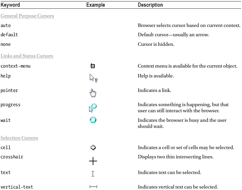
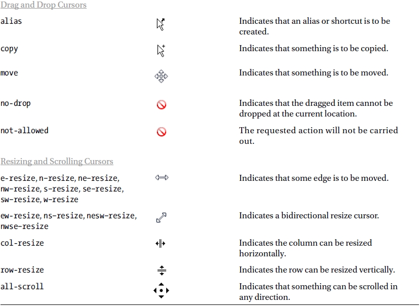
To change the look of the cursor, you use the CSS cursor property, which accepts any of the keywords listed in Table 2-2. The examples in the table show how Opera displays cursors in Windows 7. You can test what the cursors look like in different browsers and operating systems by using cursors.html in the ch02 folder.
Table 2-2. Values Accepted by the cursor Property
Caution Not all browsers support the full range of cursor keywords. In my testing, using no-drop caused Safari 5.1 to crash on Windows 7.
Looking at the available keywords in Table 2-2, the most appropriate one for the <abbr> element is help. To display the appropriate cursor when mousing over the abbreviation, use the abbr type selector in combination with the :hover pseudo-class to add the following style rule to basic.css:
abbr:hover {
    cursor: help;
}
Figure 2-6 shows the help cursor and the tooltip being displayed when the mouse is held over the abbreviation. The tooltip is generated automatically by the browser and cannot be styled with CSS.

Figure 2-6. The style rule changes the look of the cursor
Note Browsers display a tooltip only if you spell out the meaning in the title attribute of the <abbr> tag.
You can also use your own custom image for a cursor by setting the location of the image file as the value of the cursor property. When specifying a custom cursor, you can list fallback options as a comma-separated list like this:
cursor: url(images/awesome.cur), url(images/awesome_cursor.png), pointer;
Browsers attempt to display the first value that they can support. For example, if a browser doesn’t support images with a .cur filename extension, it tries to use the next one. If it can’t support that one either, it falls back to the keyword listed at the end.
Caution Changing a fundamental aspect of the browser such as the cursor can disorient users. But it might be appropriate in situations such as online games.
In CSS3, you can optionally add two space-separated numbers after the file to represent the precise position that is being pointed to. The first number specifies the horizontal offset (in pixels) from the top-left corner of the image. The second number specifies the vertical offset. For example, if your cursor image is 24 pixels square, and you want it to be centered over the position being pointed to, you specify the coordinates like this:
cursor: url(images/bullseye.cur) 12 12, url(images/bullseye.png) 12 12, default;
If you don’t specify any offsets, the position being pointed to is at the top-left corner of the image.
Note The syntax for specifying file locations is explained in Chapter 3
As noted earlier, you create a class selector by prefixing the class name with a period (dot). So, the selector for the intro class in basic.html is .intro. For example, you can use a class selector like this:
.intro {
    /* Styles that affect all elements with the intro class */
}
You can also use a class selector in a descendant selector like this:
.intro a:link {
    /* Styles that affect unvisited links in elements with the intro class */
}
You can prefix the class selector with another selector to target elements precisely, for example:
p.intro {
    /* Styles for paragraphs with the intro class */
}
Note There is no space between the type selector and the period. If you add a space, it becomes a descendant selector: p .intro selects elements with the intro class that are nested inside paragraphs.
Classes can be applied to multiple elements, so using p.intro targets only paragraphs that have the intro class. Any other elements with the same class are ignored, as the following exercise demonstrates.
EXERCISE: TARGETING CLASS SELECTORS
This exercise shows how a class can be applied to different types of elements.
- Continue working with basic.html and basic.css from the previous exercises. Alternatively, use basic_03.html and css/basic_03.css in the end folder.
- In basic.html, add class="intro" to the opening <li> tag of the first item in the unordered list like this:
           <li class="intro"><a href="#">Introducing CSS—the Language of Web
Design</a></li> - In basic.css, use the .intro class selector to create the following style rule:
           .intro {
          text-transform: uppercase;
} - Save both files, and load basic.html into a browser. The style rule has turned the text in both elements with the intro class into uppercase, as Figure 2-7 shows.
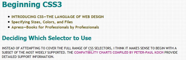
Figure 2-7. The class style affects both the list item and the paragraph
- Amend the selector to apply only to paragraphs with the intro class:
           p.intro {
                   text-transform: uppercase;
} - Save the style sheet, and reload basic.html into a browser. This time, only the paragraph is in uppercase (see Figure 2-8).
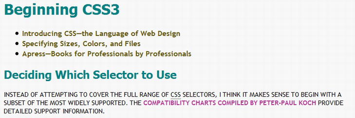
Figure 2-8. The combination of the type and class selector targets only the paragraph
You append the pseudo-element to the basic selector in the same way as a pseudo-class, for example:
p.intro:first-line {
    text-transform: uppercase;
}
This applies the style to the first line of any paragraph with the intro class. As Figure 2-9 shows, the length of the first line changes when the browser viewport is resized.


To style just the first letter of an element, use the :first-letter pseudo-element like this:
p:first-letter {
    font-size: 28px;
}
In most browsers, the combination of these two style rules that use pseudo-elements produces the result shown in Figure 2-10
Figure 2-10. The first letter of each paragraph is displayed in a larger font size
Note Safari and Google Chrome won’t apply two pseudo-elements simultaneously. They apply the :first–letter styles, but ignore the :first-line rule completely. The CSS3 Selectors module says only one pseudo-element may appear per selector, so you can’t chain them like this: p::first-letter::first-line. However, it’s not clear whether the restriction of one pseudo-element also applies to separate style rules as used here.
What Happens When Style Rules Conflict?
As mentioned in Chapter 1, the basic principle of the cascade is that a style definition that comes after another overrides the earlier one in case of a conflict. However, not all selectors are equal. Calculating which style rule wins also depends on a concept known as specificity.
You calculate the specificity of a style rule by counting the value of each part of its selector. The CSS2.1 and proposed CSS3 specifications express the values in slightly different ways, but the underlying calculation remains exactly the same. The CSS3 version is easier to understand, so I’ll start with that and then explain the CSS2.1 formula so that you know what it means if you ever come across it.
- Count the number of ID selectors in the selector as a.
- Count the number of class selectors, pseudo-classes, and attribute selectors in the selector as b.
- Count the number of type selectors and pseudo-elements in the selector as c.
- Ignore the universal selector.
- String abc together to get the selector’s specificity.
- Inline styles always take precedence.
In other words, ID selectors have a value of 100; class, pseudo-class, and attribute selectors each have a value of 10; and type selectors and pseudo-elements have a value of 1.
The CSS2.1 formula expresses each group as a comma-separated list of four numbers. The values are assigned like this:
- Inline style: 1, 0, 0, 0
- ID selector: 0, 1, 0, 0
- Class, pseudo-class, or attribute selector: 0, 0, 1, 0
- Type selector or pseudo-element: 0, 0, 0, 1
Using both formulas, you can calculate the specificity of selectors used in the exercises like this:
a                   /* specificity   1 or 0, 0, 0, 1 */
a:link              /* specificity  11 or 0, 0, 1, 1 */
#nav a:link         /* specificity 111 or 0, 1, 1, 1 */
p.intro:first-line  /* specificity  12 or 0, 0, 1, 2 */
When you see both formulas alongside each other like this, it becomes obvious that the values are the same if you remove the commas from the CSS2.1 formula.
Selectors that are grouped together to apply the same styles to different elements are counted separately. For example, h1, h2, h3 has a specificity of 1, not 3.
If two rules define different values for the same property, the selector with the higher specificity wins regardless of which order the rules appear in the style sheet. If both selectors have the same specificity, the one lower down the style sheet takes precedence.
Note Conflicts apply to individual properties, not to the whole style block.
For example, basic_05.css in the ch02/end/css folder contains the following styles for links:
a:link {                       /* specificity 11 */
    color: #8D0E6B;
}
#nav a:link, #nav a:visited {  /* specificity 111 */
    color: #63550A;
}
Both style rules set the text color for links. The second one takes precedence not only because it’s lower down the style sheet, but also because it has higher specificity. Try reversing the order of the rules like this:
#nav a:link, #nav a:visited {  /* specificity 111 */
    color: #63550A;
}
a:link {                       /* specificity 11 */
    color: #8D0E6B;
}
Even though #nav a:link is now higher in the style sheet, it still takes precedence because of its higher specificity. But the selector targets only links in the nav unordered list, so it doesn’t affect the other link in the main text.
The concept of specificity can be difficult to grasp. Fortunately, it comes into play only when there’s a conflict between styles targeting similar elements. Much of the time, you can forget about it. But when a style isn’t applied where you expect it to be, the answer almost always lies in a more specific rule—in other words, one with higher specificity—taking precedence. Using a browser’s developer tools to inspect which styles are being applied to an element usually helps trace the source of the problem.
Summary
This chapter has covered a lot of ground, introducing 16 basic selectors and showing how they can be combined to target styles more precisely. Many beginners tend to rely heavily on classes to apply styles to page elements, but classes have the disadvantage of requiring extra markup in your HTML. As the exercises demonstrated, you can achieve a great deal through the use of type and descendant selectors. You learned how to apply different styles to links depending on the ID of their ancestor. Choosing the right selector for the job isn’t always easy, but you should be guided by the principle of using the simplest selector possible. It not only makes your work much simpler, but it also makes it easier for the browser, resulting in pages that load quickly and are more responsive.
In the next chapter, you’ll learn how to specify sizes, colors, and the location of files, laying the foundation for a deeper exploration of CSS.