GIMP has a huge collection of special effects, tools, and techniques you can use to modify your image or create something brand-new.
You've probably already experimented with some of GIMP's plug-ins, but there may be some interesting toys that you haven't seen yet.
In this chapter, I'll take you on a tour of some of GIMP's filters and special effects. I won't cover everything—there's always more to explore—but this chapter should give you a taste of the sorts of effects you can create. You'll learn about the following:
Image window filters vs. Toolbox Xtns
Filters for images
Scripts and plug-ins that make new images
Most of GIMP's fun special effects are located in two places: the image window's Filters menu (plus a few in other menus, such as the Colors menu), and the Toolbox window's Xtns menu. What's the difference?
Simply, filters operate on an existing image, while items in the Toolbox's Xtns menu will create a new image.
Note
In GIMP 2.6, the Toolbox Xtns functions will move to the image window's File
The Toolbox options generally create buttons, arrows, bullets, and other items usable in web pages or applications, fancy text that you can use for logos or posters, or patterns that you can use as the background to an image or for effects in other images. Plus, there are a few miscellaneous items you can create, like a shaded sphere.
Filters can change an image in all sorts of ways. There are straightforward operations you've already used such as blurring, sharpening, or adding drop shadows. Various artistic filters are available that can make your photo look like a painting or a sketch. There are filters to handle edge detection or noise reduction, and distortion filters that can bend your image like a pretzel.
I'll cover filters first, and then move on to the operations in the Toolbox that can create new images.
Filter is a general term for anything that can operate on an existing image. Filters will always be found in the menus of an image window, but they aren't all in the Filters menu.
First, in GIMP versions prior to 2.4,scripts (filters written in GIMP's built-in Script-Fu language, or certain other languages such as Perl or Python) appeared in their own top-level menus named for each language : Script-Fu, Perl-Fu, and Python-Fu. In addition, certain plug-ins may also create new menus: for instance, if you install GAP, the GIMP Animation Plug-In, it creates a top-level Video menu.
Finally, other image window menus provide some filter operations, such as Colors (in pre-2.4 versions, these might appear in Layer
Tip
Many image filters work only on RGB images, because they need a full range of color. Other filters will only work on a layer with an alpha channel. If you want to use a filter and can't figure out why it's grayed out, check your image's mode (in the title bar of the image window) and make sure it's RGB, not indexed or grayscale. Also check the Layers dialog to see whether the current layer has transparency. (Right-click on the layer and see if Add Alpha Channel is still available: if it is, the image doesn't have transparency yet. This is generally only an issue on the bottom layer.) In Chapter 11, you'll learn how to find out a plug-in's requirements using the Plug-In Browser.
Most filters are implemented as plug-ins. If you install a plug-in you've downloaded from the web (you'll learn more about that in Chapter 11), it will most often appear in the Filters menu, and will look just like the filters that come installed with GIMP.
The Colors menu contains a mixture of tools and plug-ins. You know about tools: they're operations that have buttons in the Toolbox, like the selection and drawing tools. But did you know that some of the other operations you've used, such as Brightness-Contrast, Levels, and Curves, are also tools?
What's the difference between a tool and a plug-in? Tools can respond to clicks in the image window. When you use a drawing tool, you drag your mouse across the window and leave a trail behind you. When you use a selection tool, you click or drag in the image to indicate where you want the selection to go. Plug-ins can't do that: any adjustment must be done from within the plug-in's own dialog.
Equally important, tools can give you a full-sized preview of their effect in the image window. Plug-ins can only offer a miniature preview in the plug-in's dialog.
Finally, tools display their options in the Tool Options dialog (usually docked below the Toolbox), while plug-ins must use a separate dialog. In menus, tools generally have an icon next to them. Plug-ins usually don't.
There are quite a few tools that don't show up in the Toolbox. You can always get to them from the Tools menu in the image window, or from the File
If you forget the difference between tools and plug-ins, don't worry about it. You can use all these filters just fine without remembering which is which.
This chapter won't cover the filters in the Colors menu; you've already used some of them, and you'll meet the rest in Chapter 8.
The Filters menu is where most GIMP plug-ins live. It's a collection of fun functions that can transform your image in all sorts of ways. You can spend hours exploring and barely scratch the surface.
The first two items in the Filters menu let you repeat the last filter operation. Repeat Last will run whichever filter you ran last (the menu entry will change to tell you what that filter was, e.g., Repeat "Gaussian Blur") with the same settings you used last time. Re-Show Last will bring up the dialog for that filter, so you can run the same filter but use different parameters this time around. (Not every filter shows up in the Repeat menus, though; scripts usually don't.)
Reset all Filters lets you back up all the filter dialogs to their default values. Normally, if you run a filter and change any of its parameters from the default, GIMP will remember those settings until you quit GIMP. Unfortunately, there's no way to reset just a single plug-in back to its default values, though a tool can be reset with the Reset to default values button in the Tool Options dialog.
The rest of the Filters menu is divided into functional areas. Remember, if you're using a version prior to 2.4 and a function isn't where you expect it to be, try looking under the Script-Fu menu.
Tip
In many of these filters, the dialog will show you a preview region. But you may not actually see a preview unless you turn on the Preview checkbox underneath. If you're ever in doubt about whether you're seeing a live preview, look for a box marked Preview. With any luck, in some future version of GIMP it will be possible to say "Always preview."
You learned about the Blur tool and the very useful Gaussian Blur in Chapter 6. The first item in the Blur menu, Blur, is similar to Gaussian Blur except that it offers a bit less control. But there are several other ways to blur an image.
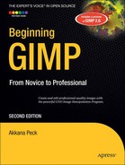
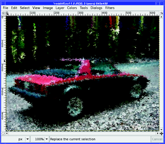
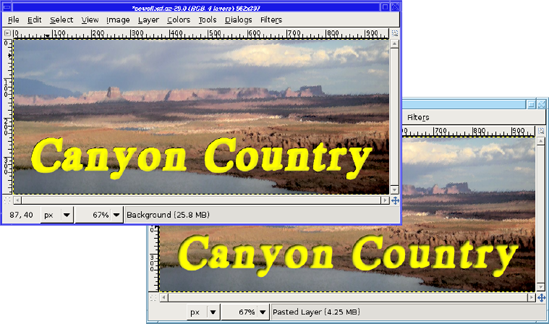
Motion Blur is the most interesting (Figure 7-1). It blurs in only one direction (specified by Angle) to give an impression of motion.
Of course, in addition to giving an impression of motion, this will also make your image look—well, blurry! You can try selecting and blurring just the background, but you have to be fairly precise with the selection. Alternatively, you can get a nice effect by making another layer containing only the foreground object (like the car in Figure 7-1) before you blur the layer underneath.
Select the object and copy it (you don't have to be particularly precise with your selection as long as you feather it a bit). Paste that on top of the layer that you will blur (don't forget to click New Layer to turn the floating layer into a real one), then click on the lower layer again. Run the Motion Blur, then go back to the pasted layer and adjust its transparency and position so it looks like it's leading, with the blur trailing behind. Experiment and see what sorts of effects you can create.
By default, Motion Blur spreads the image along a line (Linear). But it offers two other types of blur. Radial is particularly useful for car images like this one: if you select just a wheel, you can make it look like the wheels are turning. Zoom is good for making diagrams showing the expansion of the universe or the jump to light speed—or just when you want a "zoom" effect for a poster.
For either Radial or Zoom, you will have to specify the Blur Center, the coordinates of the central point for the rotation or zoom. If you know where you want the center, you can easily figure out the coordinates by moving your mouse over the image (without clicking) while watching the status line at the bottom of the image window.
In addition to Motion Blur, the Blur menu offers Pixelize, which replaces the image with a mosaic of squares, as though you had blown up a much lower resolution image.
You can also choose Selective Gaussian Blur, which is similar to Gaussian Blur except that it tries to keep edges sharp while blurring everything else. Try it on a photo and see if you like the effect.
Finally, there's Tileable Blur, which gives you a Gaussian-blurred image whose edges can be combined to make a tiled background (you'll learn more about tiling in Chapter 9). It works best if you start with an image that's already tileable.
The Enhance filters are used to correct problems in images. The menu contains Sharpen and Unsharp Mask, which should already be familiar from Chapter 2. But what are those other filters?
Antialias looks for jagged edges and tries to make them look smoother...like changing a jaggy line drawn with the Pencil tool into the smoother sort of line the Paintbrush tool would draw. Unfortunately, it doesn't offer any controls to adjust the strength of the effect. Deinterlace is intended for images from certain types of video cameras that interlace: they record every other line of an image—say, the odd-numbered lines—and then go back and make a second fill in the even lines. If you're capturing a fast-changing scene, this can create still images that look slightly odd. Deinterlace tries to compensate by creating an image using only the even—or only the odd—lines.
Despeckle is used to remove small elements of "noise" from an image, particularly specks or small lines caused by dust or scratches on a scanned film image. It can also remove the "moiré" effects sometimes seen in scans of prints. That sounds great; of course in practice, it may also remove detail from your image that you wanted to keep. Use it with caution, but it can be helpful when you have a noisy scanned image. (A trick that can help is to duplicate the original layer, despeckle it, and then use the Opacity slider in the Layers dialog to mix the despeckled layer with the original.)
You can control the size of the defects Despeckle will look for with the Radius parameter. Black level and White level control how dark or how light a defect has to be for it to be removed. Adaptive tries to detect the proper Radius setting automatically. Recursive makes the filter repeat itself for a stronger effect.
Destripe removes vertical lines that are left by some older scanners. Usually a better solution is to use a decent scanner.
NL Filter tries to do everything: it's a combination of smoothing, despeckle, and sharpen in one filter. It always works on the whole image, unlike most filters that operate only on the selection (if there is one) and the current layer. If you have an image with all these problems, fiddle with the NL Filter settings. Maybe you can make it better.
Distorts is a fun filter category that offers all sorts of toys that can change the shape of your image.
Blinds makes it look like your image is painted on venetian blinds, and you're adjusting the angle of those blinds.
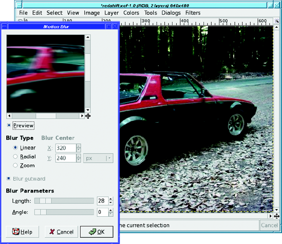
Curve Bend is useful for changing the shape of nearly any layer. It gives you a dialog with a line you can drag to warp the top of your layer to any shape.
But that's not all—you can adjust the bottom of the layer too, by clicking on Lower (Figure 7-2). Click Copy and you'll get a lower curve that matches the upper curve. Reset will make the current curve flat again. Mirror will give you a lower curve that's a mirror of the upper. Swap will exchange the upper curve with the lower one.
Choosing Free instead of Smooth lets you make a spiky curve between your points. Rotate lets you turn the result, though it's not as effective as you might think—you might be better off using GIMP's free rotation tool (as described in the "Free Rotation" section in Chapter 2) to rotate your image after you've bent it. Smoothing and Antialiasing do much the same as in drawing tools (most of the time you'll want to keep them enabled). Work on copy creates a new layer in the image and leaves the original layer unchanged. (The new layer will have visibility disabled, so you have to go to the Layers dialog and make it visible.)
Either way, if you started with a layer that was the size of your image, the distorted layer is probably too big to fit. You may have to do an Image
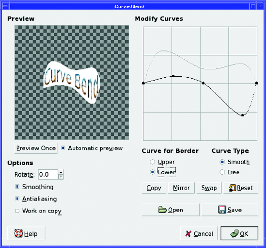
Emboss is another nifty filter (Figure 7-3). It makes your image look as though the picture has been embossed onto metal.
The three adjustments are straightforward: Azimuth is the direction of the light source in the resulting image, starting from 0 at the right and going counterclockwise from there (90° is up). Elevation is the angle of the light above the image plane (90° means that the light will appear to come from overhead). Play with it and see what it does (usually it makes the effect darker or lighter). Depth controls how much relief the emboss will seem to have—that is, how strong the effect is. Finally, selecting Bumpmap instead of Emboss gives a smoother effect that preserves colors. (It's actually just regular Emboss combined with the original layer in Multiply mode. You'll see how to create effects like this in Chapter 10.) Don't confuse this with the extremely important Bump Map plug-in, which you'll meet later in the Map group of filters.
Engrave creates the black-and-white "engraved" look that you sometimes see in old illustrations. It has two options: Height, which controls the height of the lines used, and Limit line width, which keeps the lines from bleeding together completely in the dark areas (such as in the car's shadow).
Engrave requires that the image already have an alpha channel. If it's grayed out, try Layer
Erase Every Other Row (previously located under Script-Fu
Warning
If the result of Erase Every Other Row looks odd to you, check your zoom level. If you're zoomed less than 100%, you may not see the effect properly. It also may not work right if the layer goes outside the boundaries of the image.
IWarp, the Interactive Warp filter, is one of GIMP's best toys. Occasionally it's even useful. It brings up a dialog like Figure 7-4.
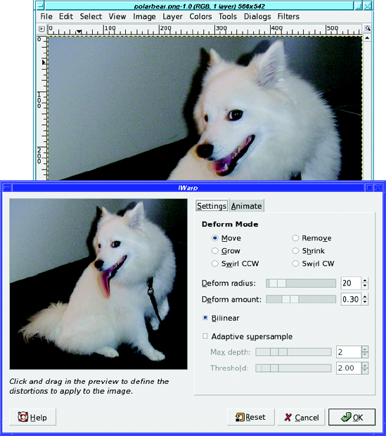
Click and drag in the preview area of the dialog. Parts of the image will drag along with your mouse, "stretching" the image as though it was printed on a rubber sheet and you were deforming the rubber. Use short, repetitive strokes.
You can use IWarp in all sorts of creative ways: you can change animals into other animals, chubby cheeks into gaunt ones, or a human into a Vulcan. It can also be useful as part of other transformations, such as the panoramic images you'll make in Chapter 10.
IWarp has quite a few Deform Modes. The default, Move, stretches the image wherever you drag the mouse.
Remove lets you remove the distortion in one area of the image. There's no Undo for the strokes you make inside IWarp, so if you go too far in one place but you like the changes you've made everywhere else, a quick switch to Remove mode might help.
Grow inflates a round area, as though you placed a magnifying lens only over the area where you're dragging. Shrink does the opposite.
The Swirl options mix up the image under the mouse as you drag—as though you were dragging a cake beater through the image. You can make neat paisley swirls out of any picture.
Deform radius is like a brush size: it controls how many pixels to either side of the mouse position will be distorted. Deform amount controls the strength of the effect.
Bilinear makes the effect smoother (it's selected by default), while Adaptive supersample and its suboptions Max depth and Threshold can smooth the effect even more, at the cost of extra CPU work.
IWarp does have one problem: you have to make your changes in the small preview in the dialog. You can make the preview a little larger by resizing the dialog, but since there's no image-sized preview, it's often difficult to tell when you've gone too far. But don't let that stop you from having fun with one of GIMP's most enjoyable distortion filters.
Back to the Distorts menu, Lens Distortion lets you correct for the way wide-angle camera lenses can warp an image; it can also take an un-warped image and bend it the way a fisheye lens would. It has quite a few options (Figure 7-5).
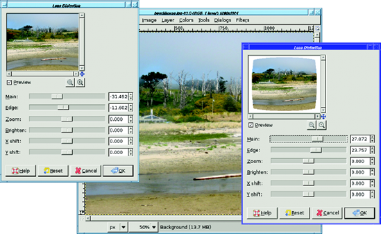
Figure 7-5. Lens Distortion: negative correction (left) compresses the center and expands the edges (note the way the stream in the foreground bends), while positive correction (right) expands the center and compresses the edges.
Main controls how much "spherical correction" to add (imagine you're taking your image and stretching it on the outside or inside of a sphere). Positive values make the image convex as in Figure 7-5; negative values make it concave. Edge lets it add some extra spherical correction to the edges without affecting the center. Zoom lets you zoom in (magnify) or zoom out. Brighten controls whether the image should be brightened or darkened at the edges (many wide-angle lenses "vignette" or darken the image a bit at the edges). X Shift and Y Shift let you shift the center of the lens warp effect away from the image's center.
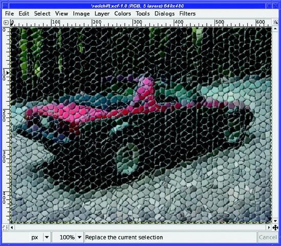
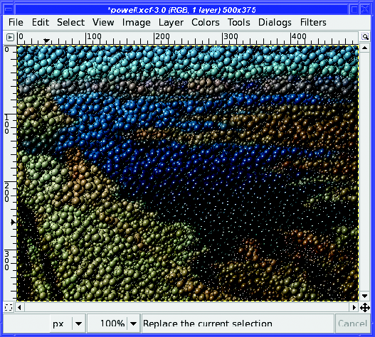
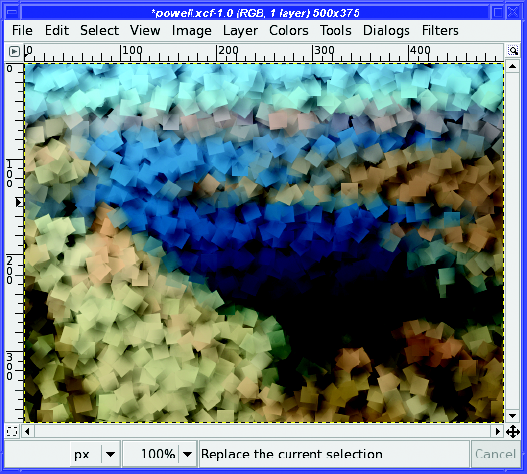
The Mosaic filter does exactly what you'd expect: it creates a mosaic out of your image, as if made with random tiles (Figure 7-6). It has lots of options controlling the tile shape, size, height, spacing, and surface.
The Newsprint filter creates an effect like zooming way in on a newspaper photo, with the individual ink colors visible.
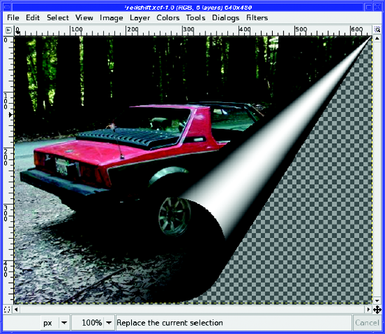
Pagecurl gives the useful effect shown in Figure 7-7. You can control which part of the page is curled and what colors are used for the page. If you want less of the page to curl, try selecting a rectangle in the corner where you want the curl. The size of your selection will control the amount of curl.
The Polar Coords filter wraps an image around a point at the top or bottom center. It can also take an image that is wrapped in this way and unwrap it. This is useful for looping text around in a circle (Figure 7-8). Images with straight lines in them can turn into nifty spiral patterns.
The Ripple filter makes an image look as though it's being viewed through water waves. The options are fairly straightforward and fun to play with, though the Waves filter gives a better water effect. The Border options control what happens at the edges of the image.
Shift moves each row by a random amount, either vertically or horizontally, creating an interesting ripple effect quite different from the one Ripple makes.
Value Propagate is tricky. It finds areas of your image that are nearly black or nearly white (your choice) and expands them. You can set the amount by which areas will be expanded, and how close they have to be to black or white. You can also use it to expand colored areas by selecting Only foreground or Only background. You can even expand or contract areas of transparency.
Still, even with all these options, you'll probably only want it in specialized circumstances. It can be useful when working with layer masks.
The Video filter applies various patterns intended to make the image look as though it's being viewed on a television screen or various other types of low-resolution device. Curiously, unlike most filters, it doesn't have a real preview area; instead, it shows a picture of a fox with pregenerated examples of what each pattern should do.
Waves is similar to Ripple except that the waves are concentric around the center of the image, as if you'd thrown a rock into a swimming pool. It's a nice effect. You can adjust three parameters controlling the size of the waves: Amplitude, Phase, and Wavelength. The Mode (which can be either Smear or Blacken) controls what happens at the edges, much like Border did in the Ripple plug-in.
The Reflective option of Waves makes the waves bounce off the sides of the image and back in, where they interfere with waves coming from the center. It works best if you reduce the amplitude and increase the wavelength. Try it and see.
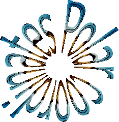
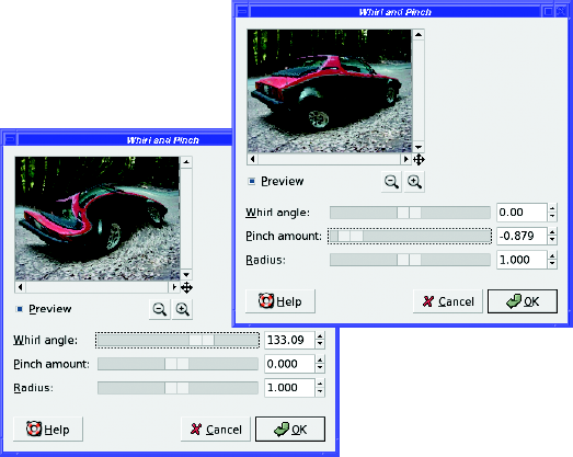
Whirl and Pinch is useful for several types of "funhouse mirror" effects. Its Whirl mode grabs the image from the center and stirs it like clothes in a washing machine. You control the amount with the Whirl angle slider.
Pinch of a negative amount bloats the image as if it's blown up like a balloon from the center of the image (Figure 7-9). A positive pinch does the opposite, compressing the center of the image as though all the pixels were sliding down a drain in the center.
Tip
Pinch can sometimes be used to compensate for lens distortion, though the Lens Distortion filter gives a more easily controlled effect.
Radius controls how much of the image will be affected, with "2" meaning the entire image. This is deceptive, though, since the effect is applied smoothly and will usually look like it's affecting more of the image than it actually is.
The Wind filter gives a nice effect similar to Motion Blur, but it's much more specific. It finds dark or light lines in the image and makes "streaks" trailing in only one direction. Strength controls the amount of wind, while Threshold controls how many lines are drawn. Blast creates thicker lines than Wind, making for a less subtle (and often less effective) result. You can control the Direction from which the wind seems to blow. You can also control the Edge Affected—Leading, Trailing, or Both—but you may need the opposite setting from the one you expect.
GIMP offers quite a few filters relating to lighting and shadows. GIMP 2.4 collects all the lighting plug-ins in a single menu, Filters
GIMP offers several ways to put a bright flare of light into your image: Lens Flare, Supernova, and Gradient Flare all have similar effects (Figure 7-10).
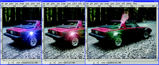
The Lens Flare (previously called FlareFX) has no options to speak of; just click or drag in the preview to set the flare where you want it.
Supernovais similar, but it makes a flare with spiky rays, and you can control the color of the flare.
If those two aren't quite right, Gradient Flare is more general: it lets you choose from a selection of different flare effects in the Selector tab. The Settings tab lets you change all sorts of parameters to adjust the flare exactly the way you want it.
Lighting Effects is even more general. It lets you add a beam of light in many different ways.
This plug-in has more options than there is space to cover them, but here are some tips. In the Light tab are three lighting Types. None always begins the light in the upper left. Point displays a blue point somewhere in the preview: you can drag it around, and you should see a beam of light passing through the blue dot to the center of the image. Directional is similar to Point but offers a bit more control. On the other hand, with Directional it's easy to lose the point as it slips off the edge of the image. The Bump Map option will make sense after you've worked with Bump Map (in Filters
Finally, the Sparkle filter works off the image. Instead of adding one big flare at a place you define, it adds small sparkles in any places that are bright in the image. You can control how bright that has to be with the Luminosity threshold. Flare intensity and the various Spike options control the way each sparkle is drawn. Opacity makes the sparkles translucent, making the effect a bit more subtle (higher numbers indicate more transparency, the opposite of what you would expect from the name).
Sparkle's Random Hue and Random Saturation allow for sparkles of different colors, but the effect is very subtle unless you also increase Opacity. Inverse puts dark sparkles on the dark areas. Foreground color and Background color can control the color of the sparkles; as with the Random options, the effect is much more pronounced if you add some opacity.
You've already seen Drop Shadow, for a text layer in Chapter 3.
The Perspective filter (usually referred to as Perspective Clone) makes a shadow tilted at an angle to show perspective. Unfortunately, the plug-in currently has a bug: the shadow appears in a box that prevents you from seeing most of it, so it isn't very useful. Try it—but if you find the plug-in frustrating, you'll learn how to make this sort of shadow yourself in Chapter 9.
Xach Effect gives the illusion of a translucent object (perhaps made of rough-ground glass) raised above its surroundings. It makes the most sense when you use it on a layer containing a few straightforward objects—for instance, letters in a text layer—above a separate background layer (Figure 7-11). Whatever layer is active in the Layers dialog when you run the effect is the one that will be used for the shape. Alternately, Xach Effect can use a selection, if you have one: you can create nice Xach effects by using the Free Select tool to make a selection of any shape you wish to use.
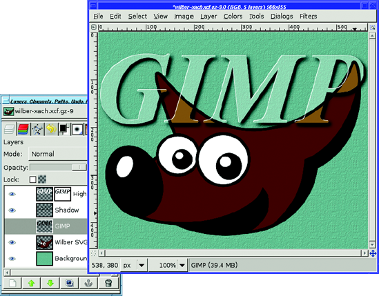
Figure 7-11. Xach Effect on a hidden text layer
Named for Zach "Xach" Beane, a GIMP contributor who came up with the idea, Xach Effect creates several new layers, leaving the existing layers untouched. If you use a foreground layer rather than a selection outline for your shape, you'll probably want to turn off visibility on the foreground layer. (Xach Effect can work on an invisible layer.)
Apply Lens warps the image in the way that a wide-angle lens might. You can get a similar effect by pinching with a negative number in Whirl and Pinch, or by using Lens Distortion, but Apply Lens is more specific and has only one parameter, the index of refraction of the lens being simulated.
Glass Tile makes the image look like it's being viewed through a wall made of many glass bricks, each of which refracts light a little differently.
These filters add noise to an image. Why on earth would you want to do that? You'll see as you explore them.
HSV Noise (previously called Scatter HSV) creates colorful noise. It has four parameters. Hue controls the average color of the generated noise. Saturation and Value control the saturation and brightness of the noise. The other parameter, the oddly named Holdness, controls how much the color of the image is allowed to change. A low value of Holdness will preserve more of the original colors than a high value.
Hurl changes a random selection of pixels to random colors. Randomization is the percent of pixels to be changed; at 100%, the entire image will be replaced by random noise. Repeat runs the effect repeatedly, but you're usually better off just using a higher value for Randomization.
Pick replaces each affected pixel with a value randomly chosen from nearby pixels. So the image won't change nearly as much as it would with most of the other noise filters. Even with Randomization set to 100%, Pick can create an image that's quite recognizable and interesting.
RGB Noise (known in earlier GIMP versions as Scatter RGB) creates very natural-looking colored noise. You can set each color independently, or with Independent RGB turned off, you can slide the three sliders together.
RGB Noise can be used on a grayscale image as well; in that case it will show only a single slider.
Slur is a bit more fun: it randomly moves pixels downward, as though they were melting. That's not immediately obvious when you run it once, but try setting Repeat to a large number like 50 (Figure 7-12).
Spread is somewhat like Pick, except that it replaces each affected pixel with one chosen at random from somewhere nearby in the image (how near it must be is controlled by the Spread Amount parameters). It makes the image look stippled, as though drawn with dots from blunt-tipped colored marking pens.
GIMP comes with five edge-detection filters (though there are other ways to detect edges—you'll learn a few in Chapter 10). They're all a bit different.
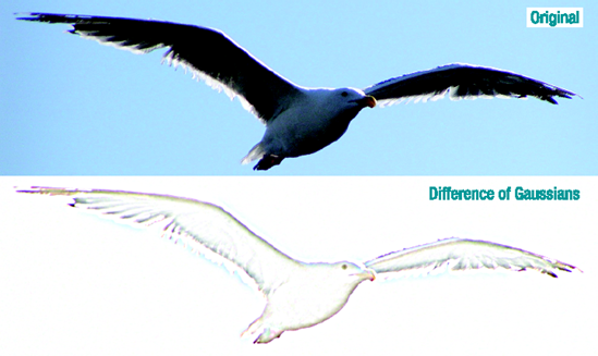
Difference of Gaussians gives a subtle pastel effect by blurring the image with two different radii, and then subtracting one from the other (Figure 7-13). You can tune it by adjusting the two radii.
Edge is a real workhorse, and includes six different edge-detection algorithms, each a little different. It also lets you tune its sensitivity with the Amount slider. Most of its algorithms give a wild neon effect. The more colors in the original image, the better the neon effect will be. Wrap, Smear, and Black are options controlling the effect at the edges of the image, in case you're trying to make a tile that can be used as a repeated background.
Neon also gives a neon look, with fewer options and a somewhat different effect (Figure 7-14).
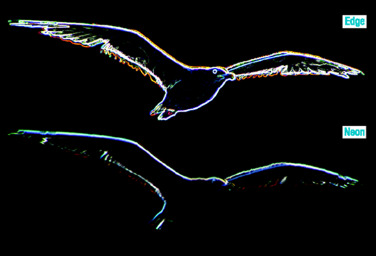
Figure 7-14. Two ways of making a neon sign: the Edge plug-in with the Sobel algorithm vs. the Neon plug-in
Laplace has no options at all. It simply replaces your image with a line drawing. Sobel gives a result somewhat like Laplace, but it gives you a chance to tune the algorithm slightly, with a preview. Sobel is a bit more generous in finding lines than Laplace is.
The Generic category is a catchall for filters that can be used in many different ways. It currently contains only three filters.
Convolution Matrix is a general way for people working on mathematical imageprocessing algorithms to test those algorithms in GIMP. Under the hood, many of GIMP's plug-ins use a convolution matrix. If you don't know what that is, you may not find this plug-in very interesting, though of course you can try typing random numbers into the matrix to see what happens. You may occasionally see convolution matrix numbers on a web page describing a particular effect, in which case you can copy them. Be sure to enable at least one channel in the list, or the convolution matrix won't have any effect.
In GIMP 2.4, Dilate enhances light areas of the image, reducing dark areas. Erode does the opposite, enhancing dark areas at the expense of light areas. Earlier versions of GIMP reversed the meanings of Dilate and Erode, so Dilate made the image darker. They aren't as useful as you might think, since you can't adjust how much the image will be dilated or eroded; if you want more control, you can do something similar by making a selection and adjusting it with Edit
The Combine group is another catchall, and contains only two plug-ins.
Depth Merge combines two images in a complicated way, specified by two other images called depth maps. All four images must be the same size (the plug-in will only let you choose depth maps the same size as the original images).
Source 1 and Source 2 are the two images you want to combine. They can be any layer from any image currently open in GIMP (as long as they're the same size, of course).
The two depth maps specify which part of each image will be most prominent in the final image. It's best if the images contain only blacks, grays, and whites; color is meaningless in a depth map.
Depth Merge compares the two depth maps, and whichever one is darker "wins." Wherever a source image's depth map is black, you will see that source image. Where it's white and the other source image's map is black, you'll see the other source. To try out Depth Merge for the first time, try using two gradients: one that fades from white on the left to black on the right, and a second that is the reverse of the first.
Depth Merge is another way of combining images in a way similar to the ostrich and giraffe layer mask project in Chapter 5. You may find it quicker than setting up the masks yourself and it can be useful for combining three-dimensional images. On the other hand, it's somewhat limited and finicky: images must be exactly the same size, you can't do any editing after the fact, and the plug-in is prone to crashing if it's unhappy with any of the four images. Try it and see if you like it.
Filmstrip combines the layers in the image into a single image that looks like a strip of 35mm film (Figure 7-15).
It's most interesting when you use a set of similar but related images—perhaps different portraits of the same person, or scenes from a vacation. You can specify which images you want to include in the plug-in's dialog, and it will load each image layer as a separate image in the filmstrip. You can either load all your files as layers in the same image by using File
Warning
The Filmstrip plug-in insists that all the layers in the image be the same size. If they aren't, it may crash or otherwise misbehave. Fortunately, when a plug-in crashes, it doesn't take GIMP down with it, though you might be wise to save any open images after any plug-in crashes.
GIMP's Artistic filter menu contains filters to make a photograph look like an oil painting, sketch, woven rug, or other work of art.
It's a great place to explore. Nearly all of the filters there do something fun, and most of them have lots of parameters to tweak. You can see easily what the parameters do by trying them, so it's easy to find an effect you like.
In GIMP 2.2, several of these filters lived in the Script-Fu
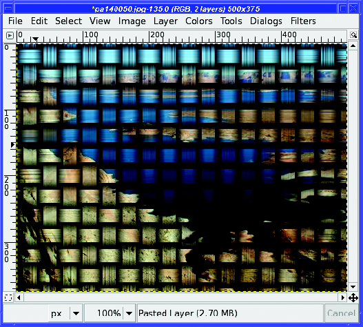
Apply Canvas gives a canvas-like texture to the image (Figure 7-16). Clothify gives a similar effect, but with a slightly different texture.
Cartoon simplifies colors and adds black outlines near edges with the intent of making a photograph look like a hand-drawn and inked cartoon. Most of the time, it doesn't look much like a cartoon, though. Try it and see what you think—it can give interesting looks somewhat similar to Posterize (which you may remember from the Colors menu). Cubism turns your image into cubist art. GIMPressionist will be discussed in the next section. Oilify blurs and flattens it in ways that make it look like a paint-by-number. Photocopy makes the image look as though it was subjected to a poor-quality copy machine, with burnt-out lights and overdone edges. It's not a pretty effect, but it may be useful for some projects.
Predator turns the image into something that should remind you of the movie Predator, or a video game from the 1980s (Figure 7-17).
Softglow gives a "bathed in light" impression, as though the image was hazy and a bit overexposed.
Van Gogh (LIC) gives an image a rather subtle shift. Alas, it won't make your photograph look like Van Gogh painted it, but it can create some interesting effects, and it has all sorts of knobs to twiddle. Play with it and see what you can create. LIC stands for "Line Integral Convolution," the mathematical operation that is happening behind the scenes.
Weave is another texturing plug-in like Apply Canvas and Clothify. It gives the nifty effect that the image has been woven into a basket (Figure 7-18).
Warning
Weave is unlike most filters: its Undo doesn't work in one step. It takes three Undo operations to get rid of a Weave. Don't be too dismayed when the first Undo doesn't do what you expect; just hit a couple more and you'll be fine. You'll learn in Chapter 11 what this means in terms of how Weave was written—and how to fix it if it bothers you!
The crown jewel of the Artistic menu is GIMPressionist. It has an enormous collection of options and can duplicate the functions of several other plug-ins. The catch is that it's a bit harder to use (Figure 7-19).
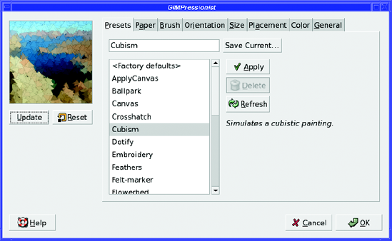
GIMPressionist offers eight tabs, each full of options. Don't panic! You can accomplish most tasks simply by using the presets in the first tab, and never looking any farther than that.
When you first try GIMPressionist, you may wonder why it doesn't seem to be doing anything. You're exploring the presets, but selecting different options seems to have no effect. There are two reasons.
First, GIMPressionist doesn't have an automatic preview. Whenever you change an option and want to see it reflected in the preview, you need to click Update under the preview area.
But even then, changing presets doesn't do anything. If you click Update, you just get another version of the preset you used last, not the one you just selected. What's going on?
The answer is that the presets change values in all the other tabs: Paper, Brush, Orientation, Size, and so on. Since this would overwrite any changes you may have made in those other tabs—and there's no easy way to undo that—GIMPressionist requires you to take two steps in order to apply a preset: choose the preset in the list, and then click the Apply button to the right of the list. Now, when you click Update you'll see the new setup.
You can spend quite a while just viewing all the presets in GIMPressionist. It's often hard to tell from the small preview pane exactly what an effect will look like at full size, so you'll often want to click OK, then Undo and bring up GIMPressionist again (a fast way to do that is Filters
In your explorations, you may find a preset that is almost what you want except for one or two minor attributes. That's your cue to explore the other seven tabs.
If you've selected a preset you like and clicked Apply, the other seven tabs will show the settings that create that effect. For instance, the Apply Canvas preset uses a paper called struc.pgm that has a canvas-like texture; the other tabs are set to reasonable defaults to make the canvas texture look right when it's applied to your image. Cubism uses a much finer paper (though still with a canvas texture), but it uses a large graduated brush called grad01.pgm, while Apply Canvas used a much smaller brush.
You can tweak the settings as much as you like. You can make small changes: start from Cubism and change the paper to create cubist art drawn on bricks, burlap, or marble. Or you can make large changes.
Orientation adjusts the angle of asymmetrical brushes. You can make the brush strokes all go in the same direction, or make them change directions randomly within limits you set. Size controls the size of the brush: to see a strong example of its effect use the Marble Madness preset, click Apply then Update, and then go to the Size tab and make both the minimum and maximum size much smaller (Figure 7-20). Click Update again to see the effect of your changes.
Placement controls how the brush strokes will be grouped on the page—whether they'll be clustered close together or distributed evenly. Color controls how precisely the color is laid; for most images it won't be obvious, but if you're using a large brush on an image with precise sharp bands of color, this setting might affect how sharp the lines are in the result.
The General tab has some useful options. In particular, adding a Drop shadow can add depth to an image. Try starting with Cubism and then adding a drop shadow: you get an effect like an explosion in a sticky-note factory (Figure 7-21).
You can even make your own papers and brushes. Most of them have extensions of .pgm or .ppm. These files are a special format called PPM or Portable PixMap; PGM, or Portable GrayMap, is a special grayscale case of PPM. GIMP has no problem reading and writing PPM and PGM files. Try searching for one of the brush or paper images on your system, like blob.ppm, and opening it in GIMP. Make some changes to it and save it as the same type. GIMP will ask you whether you want Raw or ASCII; choose Raw (that makes the file smaller, so GIMP can load it faster).
Save it where? Find your GIMP profile (look in the Folders category of the Preferences window if you don't remember where it is—more on that in Chapter 12). Go to the folder called gimpressionist. Create folders inside it called Brushes or Papers if they aren't already there (it doesn't hurt to create both folders if you think you might ever need them). Then save the new brush or paper to the appropriate folder. You'll have to dismiss the GIMPressionist dialog and call it up again to see the new brush, but you don't have to restart GIMP.
You may wonder about the drop-down menu in the Brush tab with the Save As button next to it. Is that a way to choose a brush, or save one?
Well, sort of...but you may run into some bugs in trying to use that option (the details vary with GIMP version). Most people are probably better off ignoring the Brush tab's Select menu and Save As button.
Since GIMPressionist has so many different knobs to tweak, it allows you to save settings when you find a combination you like. Save Current... will write the current settings to your GIMP profile, along with a description of what the effect does. Then you can call up the same combination of settings in future GIMP sessions.
The only catch? You probably won't know for sure whether you like a combination of settings until you've seen them in full size on the image. It's hard to tell much from that little preview window. But when you Re-Show "GIMPressionist", the Presets tab is back to <Factory defaults>. It looks like it's forgotten your changes!
Never fear. Although GIMPressionist doesn't remember your last preset, it does remember all the other settings. Click Update to verify that. If you're so happy with your settings that you want to remember them, type a name into the field above the preset list, next to Save Current..., and then click Save Current..... GIMP will prompt you for a longer description of your settings.
The Map filters distort the image a bit, like the Distorts filters—but only in very localized and specific ways.
The first map filter is Bump Map, one of GIMP's most useful filters. It's used in many text and logo effects, but you'll find lots of other applications for it.
It's easiest to see what Bump Map can do if you start with a new blank image and fill it with a pattern (Edit
In the Layers dialog, select the background layer, not the text layer. Then call up Bump Map (Figure 7-22).
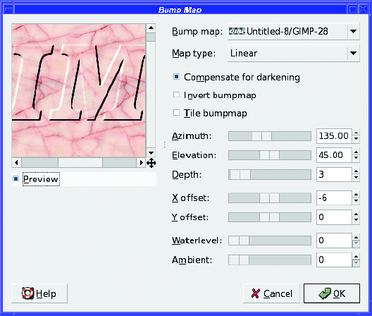
Bump Map makes "bumps" in the active layer, as if another layer (called the bump map) was pushing up from underneath. Where the bump map is light, the layer will seem to be pushed up farther; where it's black, it won't be pushed up at all.
The map layer is chosen from the drop-down menu at the top of the Bump Map dialog. This menu lists every layer in every image that you have open in GIMP. It can be confusing: both the image name and the layer name are crammed into the menu. Sometimes there isn't room for both, so some letters may be left out. Use the tiny layer previews to the left of each image/layer name to help you figure out which layer is which.
Once you've chosen the text layer as the map, you can click OK to create the bump map. You'll probably have to make the map layer invisible in order to see the effect. (It's okay if you keep it invisible. You don't have to be able to see a layer in order for Bump Map to use it.)
Bump Map has several options. The Map type controls how abrupt the map will be and whether it has sharp edges.
Compensate for darkening brightens the image a bit after applying the bump map. The map is implemented using the Multiply layer mode (you'll work with modes in Chapters 9 and 10), and that has a tendency to darken the image. Normally, you'll want to leave this option checked to get the brightness back to normal.
Invert bumpmap makes the bump appear to go into the active layer rather than rising above it. If you want an effect like letters chiseled into marble or routed into wood, use Invert. Tile bumpmap makes the bump map repeat across the image. You can use it with a small map image to get a repetitive pattern all the way across a large background area.
Azimuth controls the direction of the illumination, with zero meaning a light coming in from the right. The default, 135, makes the light appear to come from the upper left, but you can light your bump map from any direction. Elevation controls how high off the page the light source will seem to be (within limits: lowering it won't give you long shadows).
Depth controls how tall or deep the bump will seem. X offset and Y offset shift the bump effect in relation to the position of the map layer. Most of the time, you'll already have positioned the bump map right where you want the effect to be, so you'll leave these at 0.
Waterlevel controls the "bottom edge" of the effect when your bump map layer has transparency, like a text layer would. Increasing Waterlevel can make the effect appear softer and more subtle.
Ambient makes the light source appear more diffuse (think of it as mixing in some ambient light). When it's set to 0, the light will appear to come from only one direction, but increase the value and some of the shaded areas will lighten a bit more to create a more subtle effect.
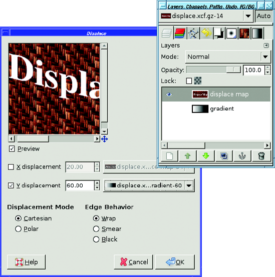
The Displace filter shifts pixels in the active layer according to a gradient map. The map layer must be the same size as the image you want to displace. (Images that aren't the right size won't appear in Displace's option menu.)
What's a gradient map? It's a monochrome image where the gray value at each point specifies what to do with another image; in this case, how much another image will be displaced from that point.
Horizontal and vertical displacements are handled separately: you can use different gradient maps for them.
For horizontal mapping, a white pixel in the gradient map means that the corresponding point in the image will be moved to the left. A black pixel means the point will move right, while a medium-gray pixel means the point will stay where it is. Vertical mapping is similar, except white means move up; black, down.
Confused? A couple of examples will help.
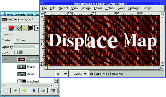
Make an image consisting of some text on a patterned background (Figure 7-23).
What sort of map would it take to lay this text out in a diagonal line from upper left to lower right?
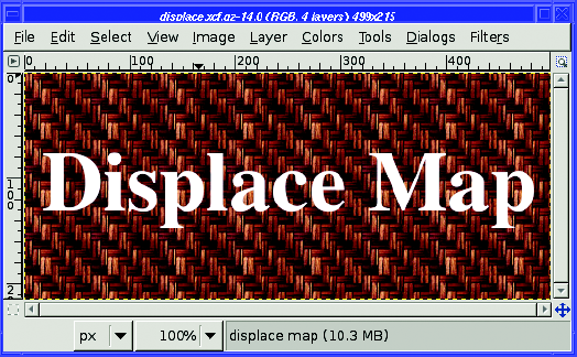
That means only vertical displacement, so don't worry about what happens horizontally. On the left side of the image, you want text to move up—so that means you want white on the left side of the gradient map. You want the right side to move down, so that side needs to be black. A smooth gradient from white on the left to black on the right ought to do that. Make a new layer (call it gradient: it's important to give layers clear names to make it easy to choose them from plug-in menus). Choose the Gradient tool and drag from the right edge of the image to the left to make your gradient.
You can move the gradient layer down in the layer stack, or even hide it. It doesn't have to be visible to work as a displacement map.
Now make the text layer active and call up Displace... (Figure 7-24). Uncheck X displacement since you won't need it, but make sure Y displacement is checked. In the menu next to Ydisplacement, choose the layer with your gradient. You may not be able to read the full layer name in the menu, but look at the layer previews. You should be able to find your gradient there.
Once you've chosen the gradient, the preview shows that the text is indeed slanting from upper left to lower right, as intended. The background is also slanting, though that's more difficult to see. You can make the effect stronger by changing the displacement value from 20.00 to a larger number, like 60.00.
How would you go about displacing in both X and Y at once? For this, it's best to think about each direction separately.
Suppose you want to make it look like you've laid a magnifying glass on the middle of the text. All the text under the glass should be magnified: text near the left edge should move left, text on the right should move right, text above center should move up, below center, down. Everything outside the lens should remain unchanged. How would you design Displace gradient maps to accomplish this?
Consider the horizontal problem first. Make a new layer for your horizontal gradient map—call it hlens.
Most of your text will be outside the magnifying glass, so it won't move at all. That means it needs to be medium gray. Set the foreground color to medium gray (V =50% in the color chooser), and fill the layer with that color. As long as you have that foreground color handy, this is a good time to make a second layer (vlens) and fill that with gray as well.
Now, in your hlens layer, make a circular selection where you want your magnifying glass to be. Give it quite a bit of feathering so the effect will be gradual at the edges.
What should go inside this circular lens? Think about the goal: text at the left edge of the lens should move farther left, so the map needs to be white there. Similarly, the right side of the lens needs to be black so the text will move right. Set the foreground color back to black (the black/white button under the color swatches in the Toolbox is a handy shortcut) and drag the Gradient tool across your selection from right to left (Figure 7-25).
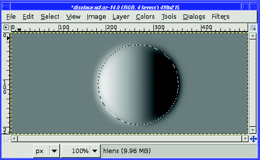
Now make your vertical lens gradient the same way. It needs to be black at the bottom, and white at the top. You can activate the vlens layer and reuse the same selection.
Cancel the selection (Select
If you displace in Polar mode, the two maps are interpreted somewhat differently. Instead of X and Y, you're mapping Pinch and Whirl. In Whirl, white rotates the pixel clockwise around the center of the image, while black rotates it counterclockwise. In Pinch, white pinches the center of the layer in, while black bows it out. Polar mode is hard to visualize, but if you play with it you can get some good results. Try starting with 0 in both Pinch and Whirl numerical fields and changing just one of them by small amounts to get a feel for what it does.
Fractal Trace turns your image into a fractal. This is a class of mathematical equations that can produce all sorts of pretty pictures. There are several parameters to play with, but you can have a lot of fun tweaking them without worrying about the mathematics.
Illusion creates ghostly copies of parts of your image. There aren't many options to adjust, so give it a whirl.
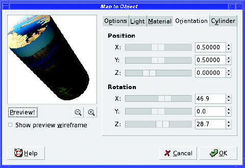
Map Object is another wonderfully useful GIMP workhorse. It takes an image and wraps it around some other shape, such as a sphere or a cylinder (Figure 7-27). It has lots of options, but they're fairly self-explanatory.
Make Seamless warps your image so that the right edge can match up to the left edge, and the top to the bottom. This is useful if you want to tile: use several repetitions of a small image as a background for a larger page. It doesn't always give a realistic result, but it's useful anyway. You'll use Make Seamless for making backgrounds in Chapter 9.
Paper Tile's description is that it "cuts the image, and slides the pieces." It's not a very realistic effect, though.
Small Tiles replaces the image with scaled-down versions of itself, repeated several times (2 × 2, 3 × 3, and so on).
Tile is similar but more flexible: it tiles the image at its full size into a larger image whose dimensions you specify. If you have a 320 × 240 image and you tile it to a 640 × 480 image, you'll see four copies of the original. You can specify any dimensions, though, not just multiples of the original image size.
If you've just run Make Seamless to create a background and want to see how it looks, either Tile or Small Tiles can help. They're also useful if you're printing many small copies of an image.
Warp is like Displace but with a twist—literally. Like Displace, it uses a gradient map to control how much each pixel will move. But Warp only needs a single map where Displace uses two. When warping, the difference between a pixel in the map and the pixels nearby controls the amount and direction of displacement in the source image.
It's most commonly used with random maps. To try it out, create a new layer the same size as the one you want to warp, and then generate some noise (Filters
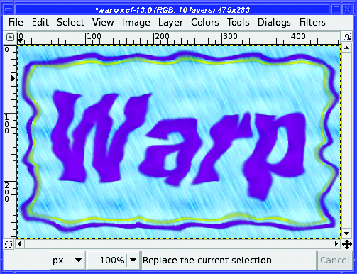
Figure 7-28. 25 steps of random Warp on some text and a rectangular border. The "Rain" pattern background was not warped.
Under Basic Options, Step size controls how far a pixel can move in each step; Iterations controls the number of times Warp will be run. Usually, you'll want to run quite a few steps (Figure 7-28 used 25 steps). It's fun to watch the effect of the warp as it proceeds.
In Advanced Options, Dither size can add some extra randomness. Rotation angle is, according to the documentation, "The angle through which the local gradient of the displacement map (control matrix) will be rotated before displacing the pixel in that direction." (Well, the dialog did warn you that this was an advanced option!) The plug-in's author recommends staying with 90° in most cases. You can add a magnitude map, another monochrome image that adjusts the intensity of the effect at each point (white means maximum effect; black gives no effect). There are several even more advanced options: experiment if you're so inclined.
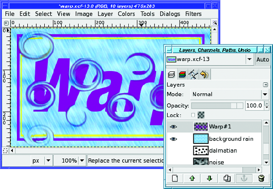
You don't have to use random maps. Try using a series of black feathered polka dots: start with a white background, choose the Ellipse Select tool and turn on feathering, and then make a small circular selection and fill it with black. Make another circular selection and fill it, and repeat until you have as many dots as you want and the layer looks like a Dalmatian. Use that as a map for Warp. It's a neat effect and it's fun to watch it run (Figure 7-29).
The Filters
Clouds provides several ways to get random cloudy patterns.
Plasma creates a wild blending of many colors. It doesn't look like clouds, but it makes a nice background.
Solid Noise looks like a lumpy surface photographed in black and white. It's useful in effects (you saw it used with the Warp plug-in in the previous section) even if it doesn't look that good by itself.
If you have GIMP-Python installed, you may also have Fog in this menu: by default the fog it creates is bright orange, but if you change it to gray you can get a good foggy-day effect.
Nature only provides two filters, Flames and IFS Fractal. They both use the mathematical concept of fractals to create intricate patterns.
Flame doesn't actually create flames. It creates arcs and loops like something you might see if you whirled a can of paint around your head. Experiment with the Colormap options to make the effect a bit more colorful. The Edit button lets you choose different patterns.
IFS Fractal is much more general. IFS stands for "Iterated Function System," and with this plug-in you can create fractal patterns that repeat in a variety of ways.
The dialog presents you with three triangles, which you can drag in various ways to affect the preview. Click on a triangle to select it, and then drag it. You can add another triangle by clicking the New button, or use fewer by clicking on one and then choosing Delete. You can change the shapes, sizes, and orientations of the objects with the Move, Rotate, and Stretch buttons, or you can edit the Spatial Transformation numbers. You can turn the triangles into quadrilaterals by adding another triangle and moving it a bit, into pentagons by adding a fifth and moving it, and so forth.
Choose Full in the Color Transformation tab to add a bit of color to the fractal you create, though controlling it is difficult.
Actually, controlling anything in the IFS Fractal dialog is difficult. The key is to make small changes one at a time. Happily, Ctrl+Z (Undo) works in the dialog, so you can back out changes that didn't work. There are also some interesting tutorials available on tricks you can do with this plug-in: try a web search for GIMP "IFS fractal."
If you want more general fractal patterns, keep reading: you may like Fractal Explorer better.
Pattern offers a variety of—well, patterns. Checkerboard is obvious (and the Psychobilly option can be fun).
CML Explorer generates Coupled Map Lattices. Mostly, these are patterns that "bleed down" from the top of the image in complex ways. You can choose from a large variety of functions that will be of interest to mathematicians. Everyone else, try making random choices and watch how the image changes.
Diffraction Patterns is a real kick. Diffraction is the way light bends when it passes by an obstacle, or through a slit or a pinhole. This causes the light waves to interfere with each other in interesting ways. The Diffraction Patterns plug-in can simulate some of these behaviors, giving you mandala-like images that would look at home on a 1960s-style wall.
There's no automatic preview: when you make a change you'll have to click the Preview! button. Changing colors won't do what you expect: increasing a color won't necessarily show more of that color in the final image. Don't miss the values in the Other Options tab, which can change the image quite a bit.
Grid can draw lines on your image to divide it into pieces. You can choose the color of your grid lines, the spacing between the lines, and their offsets from the top and left sides of the image.
You can even make dashed grid lines by specifying a different color for the intersections of the lines. If you set the width of the grid lines to 0, Grid will draw "plus" characters at the intersections of the grid lines without drawing the lines themselves.
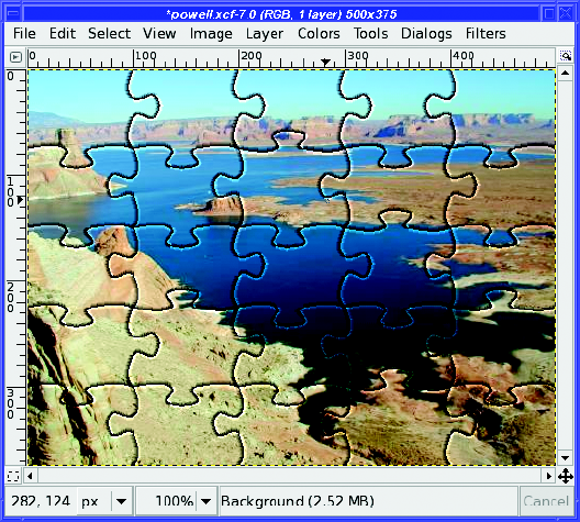
Jigsaw turns your image into a nifty jigsaw puzzle (Figure 7-30). You can control the number of puzzle pieces, whether they're square or curved, and how heavily they'll be shaded.
Maze generates a random maze in black and white. You can even make one that's tileable so you can use it as a background for large images.
Qbist generates random colorful patterns. The dialog shows nine sample patterns. If you like one of them, click on it: that pattern will center, and GIMP will offer some other patterns similar to the one you chose. If you like one of those patterns better, click on it.
Continue until you have one you like; then click OK, and your layer will fill with a pattern similar to the one you saw previewed.
If you find one you really like, click Save to save the pattern to a .qbe file. You can Open it later if you want to use it again.
Sinus won't give you a headache—it makes patterns based on a combination of sine waves. It can produce anything from shaded bars to the grain pattern you see in a really nice piece of wood. It uses two colors, which you define in the Colors tab.
By default, you'll merely get straight bars shading into one another. But vary X scale and Y scale (make sure they're not the same value), and then play with the Complexity to get much more interesting patterns.
Circuit is outside the Pattern submenu, but it's similar to Maze except that it draws rounded traces in black and white. They look like the patterns on a printed circuit board.
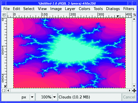
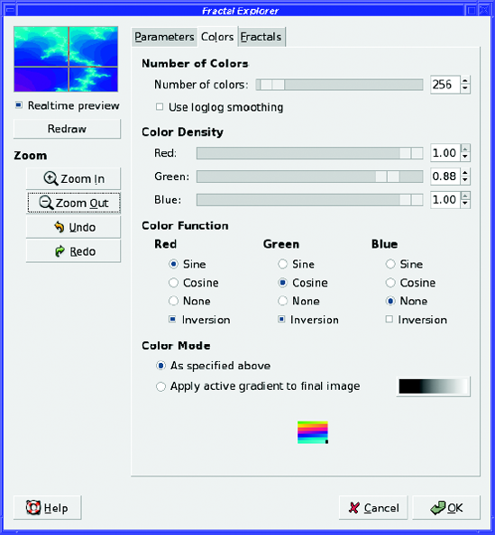
If you like beautiful fractal patterns like Figure 7-31, you can spend hours in Fractal Explorer.
If you've never played with fractals before, start with the Fractals tab. The list there gives you a sampling of patterns you can generate. Double-click on anything in the list to see a preview.
Once you find something you like, you can tweak it as much as you like. Go back to the first tab, Parameters. Twiddling any of the parameters will change the shape of the fractal. Make small changes: fractals are very sensitive, so a tiny bit of fudge in a parameter can mean a huge change in the image. The Colors tab lets you adjust how much of each color will be used in the image.
Fractals have an interesting property: the more you zoom in on a fractal pattern, the more detail you see. The Zoom buttons in Fractal Explorer let you home in on the center of a fractal—but that's not really the point. The most interesting detail may be in one of the fractal's outer arms, as it is in Figure 7-31. Fortunately, you can also drag in the dialog's preview area to zoom in on whatever area interests you most (Figure 7-32). If you don't like what you see, you can Undo or Zoom Out and try another region.
Since you can spend a lot of time tuning fractal parameters to get exactly the right curve, there are buttons to Save a pattern you really like in the Parameters tab, or Open one you've previously saved.
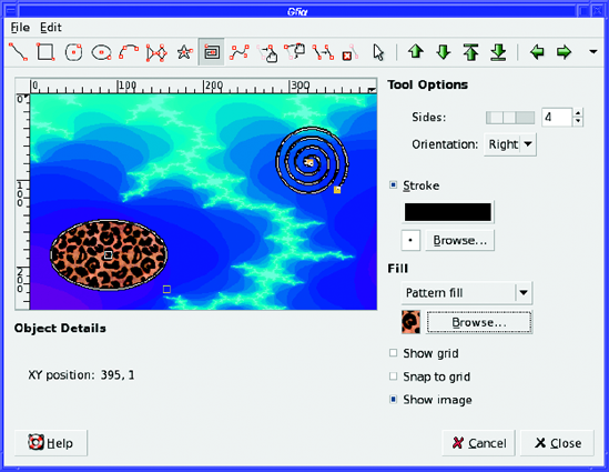
gfig is an odd beast: a vector-drawing program built inside a raster image-editing program.
Its dialog is a simple vector-drawing application all by itself (Figure 7-33). You can make lines, rectangles, ellipses, Bezier curves (like in GIMP's Path tool), stars, spirals, and other patterns. You can move objects around independently and change their fill or stroke style.
What's the catch? Well, gfig doesn't save to a standard format. It draws into its own layer in your GIMP image, but if you want to edit the shapes you made later as gfig objects, you'll have to save to gfig's own format, using File
You probably don't want to use gfig for creating elaborate vector-graphics art. But for adding a few figures to a GIMP image that you might want to change or resize later, it can be quite helpful.
The Render menu ends with a few more interesting designs:
Lava creates a red-on-black pattern that looks a bit like glowing lava at night.
Line Nova creates a starburst pattern using the current foreground and background colors.
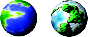
Sphere Designer creates a sphere using a variety of complicated options. You can control all aspects of how the sphere is rotated and its apparent texture. In GIMP 2.2 and earlier, the options were difficult to figure out, but they've been simplified quite a bit in 2.4. Play around and see what you can make. (For a simpler sphere plug-in, keep reading: there's one in the Xtns menu of the Toolbox.)
Spirogimp creates a pattern like a "Spirograph" toy. You can control the number of teeth each Spirograph wheel has, as well as the colors, drawing tool, and pen that will be used.
GIMP offers a few filters to help you prepare images for your web pages.
ImageMap lets you specify regions of the image that will link to other pages. You can specify rectangular or circular shapes, or use the Polygon tool to make any shape you want (Figure 7-34).
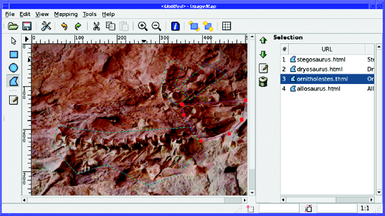
To define a rectangular or circular region, click at one corner, move to the other corner (don't drag), and click again. A dialog pops up to let you enter the web link you want for that region.
Polygonal regions are only slightly more complicated. Click on each point in turn, building up the region. When you get to the last point, double-click instead of single-clicking to complete the region and bring up the dialog.
You can select regions and edit or change them by clicking on them in the list to the right of the preview.
When you've defined all your regions, you can save the image map using the ImageMap dialog's File
One function that's useful for the web isn't included with all GIMP installations. The filters Py-Slice and Perlotine are two ways of chopping up an image into a table of smaller images to put on a web page. Slice is written in Python and Perlotine in Perl, so you'll only see them in the Web menu if you have GIMP Python or Perl installed. (In GIMP versions prior to 2.4, look for them in the Python-Fu or Perl-Fu menus.) They're very similar in function: drag guides from the left and top rulers in the GIMP image window to define where you want to chop the image.
Either Py-Slice or Perlotine will chop the image into bits and then generate a web page in which the pieces are reassembled as a table. You can specify the type of image that will be saved (GIF, JPEG, or PNG), where the HTML and new images will be written, whether there should be space between the images in the table, and a few other details about how you want the web page to work.
This is useful for lots of different sorts of web pages. You can use an image of a keypad to let the user enter numbers, or you can split a map into quadrants and let the user explore them separately. Or you might just want to display extra space between pieces of your image.
GIMP won't show you the web page it wrote: it doesn't know how to show HTML! You'll have to open the HTML file in a web browser to see the result. Of course, there won't be any links on the individual images yet; you'll have to edit the page to make it do what you want.
If you specified no spacing between table elements, don't be too surprised if the web page looks exactly like the original image. It should! Nothing has been deleted from the image—it has merely been split with a very sharp knife.
The act of splitting up an image following the position of the guides is known as a guillotine operation. If you just want to split up one image into several smaller images but you don't need an HTML table, Image
The final filter in GIMP's Web menu is Semi-Flatten (in some versions it can be found in Filters
The Filters
Playback is the way to preview an animation in GIMP. But it also has one unusual feature completely unrelated to animations: the Detach button. Run Playback on any image (even one with no layers) and click Detach. It looks like nothing happened, right? Wrong—try mousing down in the image and dragging it. The image moves without the window frame, and you can drag it anywhere on screen. You can use Playback's Detach as a quick way to see how your image would look on a web page or in a document.
The Animators menu offers a few filters that create animated images for you. Each of these starts from one or more existing layers and creates a new animated image.
Blend makes an animation that gradually fades between the layers of the current image. Burn-in takes an image that consists of two layers—like a text layer and a background layer—and creates an effect of the text being "burned" into the background, letter by letter.
Rippling and Waves each make an image look as though it's being viewed through rippling water. Waves is the better effect, though you'll want to run it on an image that has only one layer. Rippling works on the active layer and ignores any others.
Spinning Globe wraps your image around a globe and then rotates the globe. It works best on an image with a single layer: if there are multiple layers, you'll see flashes as the animation switches layers, but only one layer will be animated. It also works best if your image is tileable, or at least if the left and right edges join together smoothly.
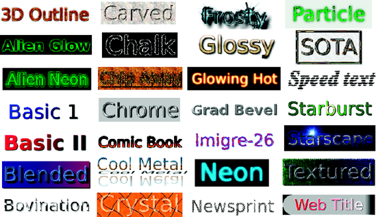
The Alpha to Logo scripts (in the Script-Fu menu of GIMP versions prior to 2.4) create interesting effects from a text layer (or any other layer with transparency). If you want some text in a fancy style, try some of these scripts. Figure 7-35 shows the collection, though of course they all have options to let you change fonts, colors, and other aspects of the effect.
All these logo scripts are also available in the Xtns
The final category of Filters, Decor, lets you dress up an image—or dress it down. You can add a bevel around the outside of an image, add a colored border or make the outside of the image look fuzzy, add splotches that look like coffee stains, or make the image look like an old photo you found in a drawer.
You can round an image's corners, or make it look like an unmounted 35mm slide—these two only work on images without an alpha channel. If they're grayed out, you'll have to use Image
If you have an image that's in grayscale mode, you can carve it into another (colored) image with Stencil Carve, or use it as a map to create interesting chrome effects with Stencil Chrome.
Experiment with these and see which ones you like. But there are some tricks you should know about Add Bevel.
The classic use for Add Bevel... is to shade the edge of rectangular boxes (like buttons for a website) to make them look more three-dimensional. But it can be even more useful on text. Adding a bevel and a drop shadow is a quick way to give boring, solid-colored text more life. But if you activate a text layer and run Add Bevel..., nothing happens. Why?
Some filters, including Add Bevel...., will work only on a selection. So before you can bevel your text, you'll need to select the text layer (or whatever it is you're trying to bevel) by using Alpha to Selection, available either in the right-click menu of the Layers dialog or in Layer
But there's another way of getting a beveled-like look, a trick using drop shadows. You know what a drop shadow looks like on a text layer. But for this effect you'll use the opposite of that. After you've selected the text, invert the selection with Select
The Toolbox's Xtns menu, like Filters, offers a collection of scripts and plug-ins for lots of different effects. The difference is that the Toolbox scripts all make a new image and don't require you to have an image already open. (In GIMP 2.6, these will all move to the image window's File
Logos offers the same list of logo styles as in Filters
Misc
Patterns offers a collection of designs you can use as background images or for any other purpose you can think of.
A Truchet pattern (named for Dominican priest Sebastien Truchet, who first studied them) is a network formed by combining a series of tiles, each of which has a circular arc across two opposite corners. Truchet and 3D Truchet create an image filled with two variants on a Truchet pattern.
Camouflage makes a pattern like you might see on army fatigues. You can change the colors and make camouflage for other environments, of course.
Flatland gives a random pattern rather similar to the one in Filters
Land and Render Map create two different but equally interesting "artificial world map" views. Land gives textured green hills against a powder-blue sea (you can change the colors if you want by using a different gradient). Render Map looks more like something you might see on a globe of the earth. They look even better if you wrap the resulting image around a sphere by using Filters
Tip
You might want to take a look at the layer name after you run Render Map.
Swirl-Tile makes an interesting swirly pattern. You can tile it to a larger image to make a place mat.
Swirly gives a pattern of black-and-white squares with a swirl in one of the corners.
Finally, Web Page Themes offers several "looks" you might want to use on a website. Under each theme, you can make several types of element, such as arrows, buttons, or headings, all coordinated. If you happen to like one of the motifs, you might find this useful.
Well, that's quite a list of toys! When you first installed GIMP you probably played around with a few of the filters, but it's easy to miss some of the most useful functions GIMP has stuffed in its menus.
Now you know when to look in the Toolbox menus vs. the menus in the image window. You've experimented with GIMP's offerings for changing lighting and shadow, adding noise, and detecting edges. You can map images to three-dimensional objects with the Map filters and turn them into art with the Artistic filters. You know how to create interesting logos and other text effects, and how to make images for your web pages.
But there's one class of GIMP filter I skipped in this chapter: the filters in the Colors menu. There's enough to know about color manipulation that it needs a chapter of its own. So grab that psychedelic tie-dye T-shirt from the back of the closet and let's go on a tour of GIMP's color handling, channels, and layer modes.