By now you should have a pretty good feel for how things work in Buildbox. The menu and UI editors work in VERY much the same way. However, we're going to be covering some aspects of Buildbox that we have not handled just yet. We'll be covering animations within Buildbox, text, and implementing controls.
When we created our secret level UIs on the Game Mind Map, they were placeholders until we got around to making our main Game Field UI. Now it's time to remedy this. First, we're going to finalize our main Game Field UI, then replace our secret level UIs with instances of our finalized Game Field UI. Let's get to it.
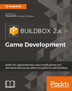
From the Game Mind Map, double-click on the main Game Field UI. You will be confronted with the following screenshot:
You may recognize this as the overlay that is on our worlds while we play in the Preview Mode. We're going to completely redo this interface. It's just not what we're after in our game. The first thing we want to do is move the Game Over Event Observer (on the top-left of our UI) off to the non-visible area. Event Observers are more commonly known to coders as event handlers. All these do is look for something to happen, and then the software makes something else happen. In this case, it sends us to the Game Over screen when the game is over. They also don't need to be in the visible area of the screen. So, let's get it out of the way...drag it off to the left.
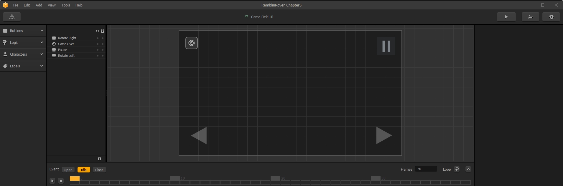
Before we get to creating new buttons, go ahead and replace the images for the current (forward, reverse, and pause) buttons, and move them. Your UI should match the following screenshot:
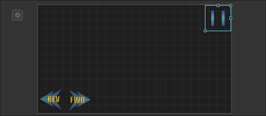
Now, let's add some new buttons to control our Jump and Shoot actions. In the Characters section of the Asset Library, drag two CharacterButtons onto our UI. Rename these Jump and Shoot. Then, we set their Functions to Jump and Shoot respectively. Drag our Jump and Shoot button graphics to the Image field, and make sure Stick to Edge is ticked. Your screen should look like the following screenshot. We've drawn a box around the fields we altered so you can find them easily.
Just one more control to add! You may notice that there is no button control on our UI for our lean (doing flips). This one's actually pretty easy. We're going to add an accelerometer control. An accelerometer is a device inside mobiles, tablets, and some laptops that senses movement. This means that when they twist the device, it will affect the lean on the rover. Our game will now have a physical element to it, which will increase our fun factor.
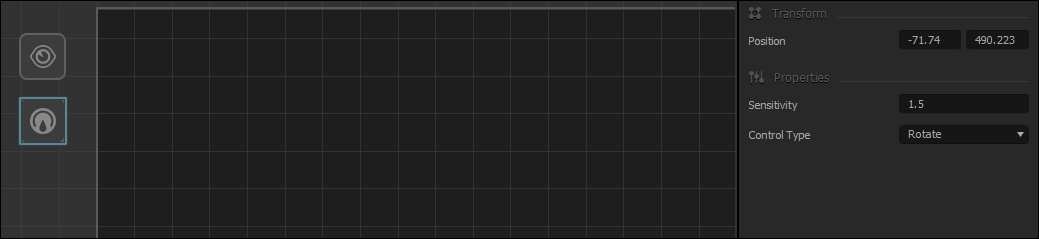
Drag in an Accelerometer object from the Characters section of our Asset Library. You don't have to put this anywhere in the visible UI. We put ours just below the Game Over Event Observer. Just set the Control Type to Rotate, and the Sensitivity to 1.5. That's it! By default, the Rotate control affects the lean. It should look like the following screenshot:
That's it; our game has all of the controls necessary to play on a mobile device. Now, let's set up some score indicators on our UI.
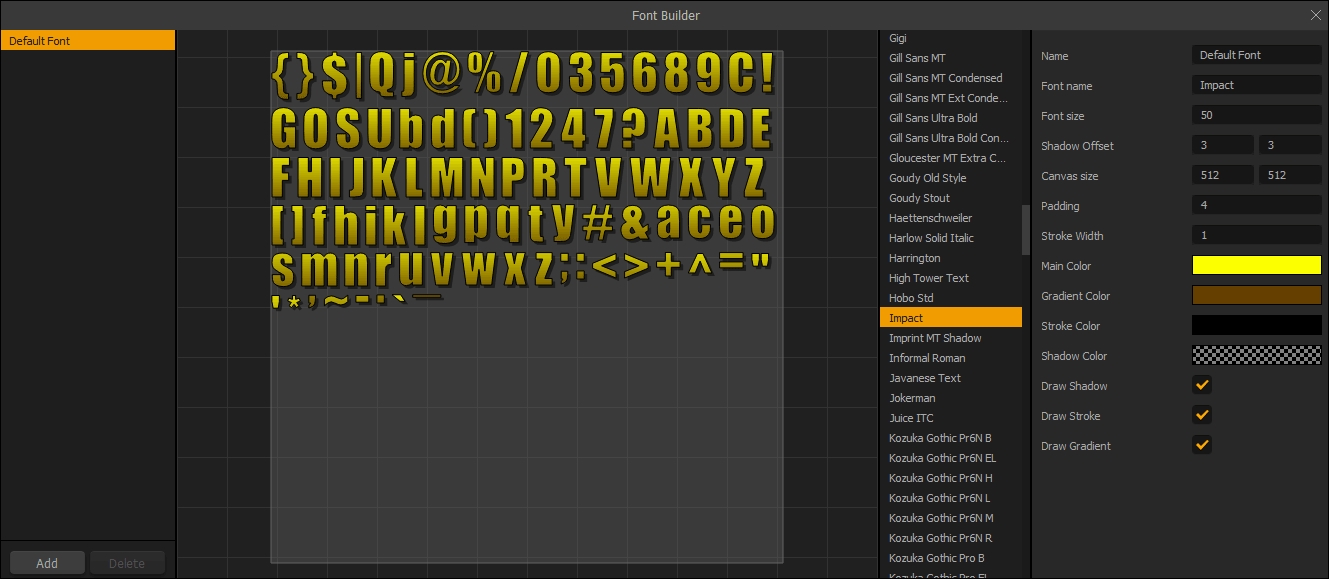
Before we actually place any text on the UI, let's set up our Default Font. Just as we did before, open the Font Editor, and make the settings for the Default Font as shown in the following screenshot:
Tip
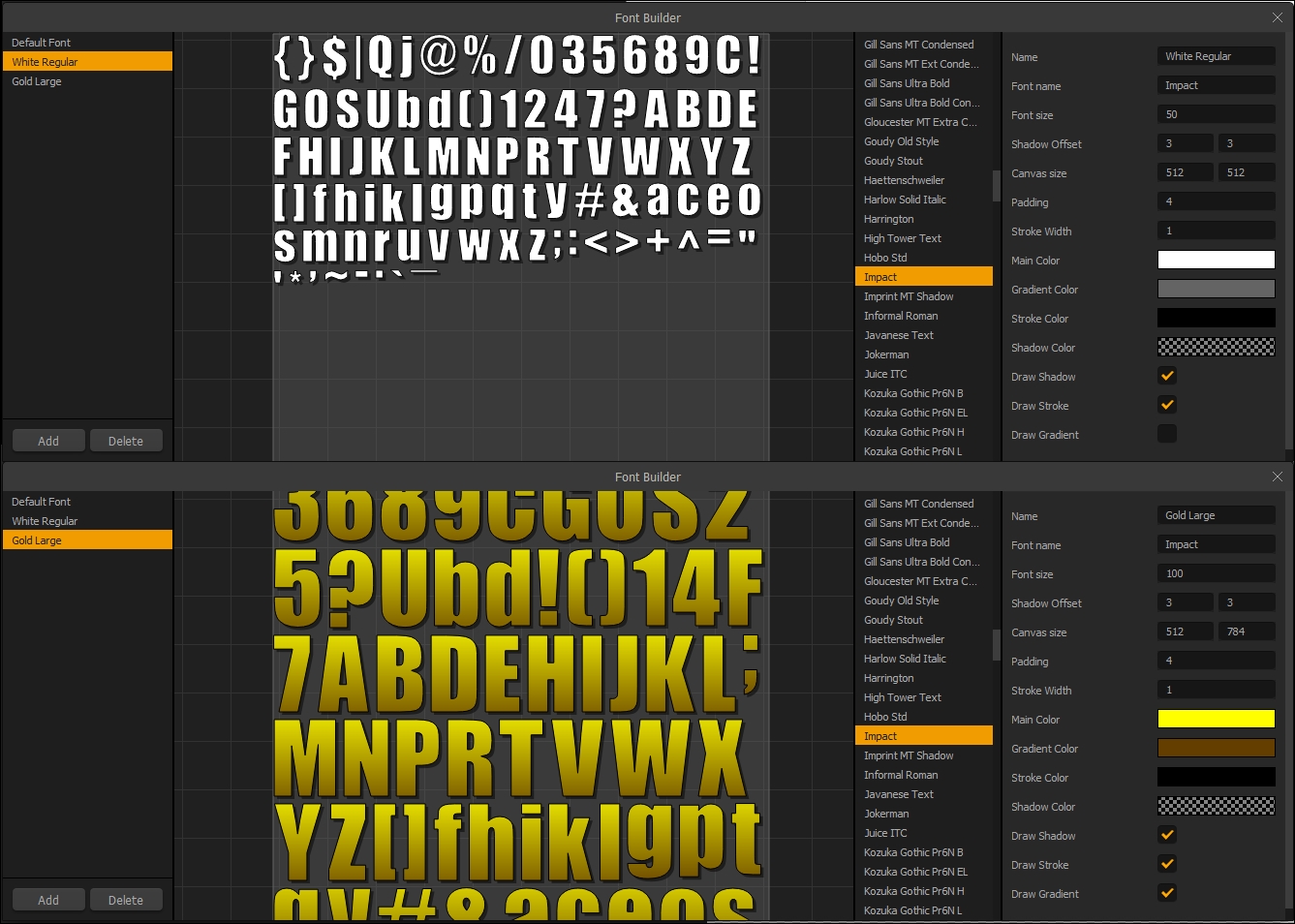
We're using the Impact font. Unfortunately, due to licensing we can neither provide this font, nor a link. However, nearly every free font website has some version of this font. Our Font size is 50, Shadow Offset is 3X3, and all options are ticked. Our gradient is yellow to brown, and the stroke color is black.
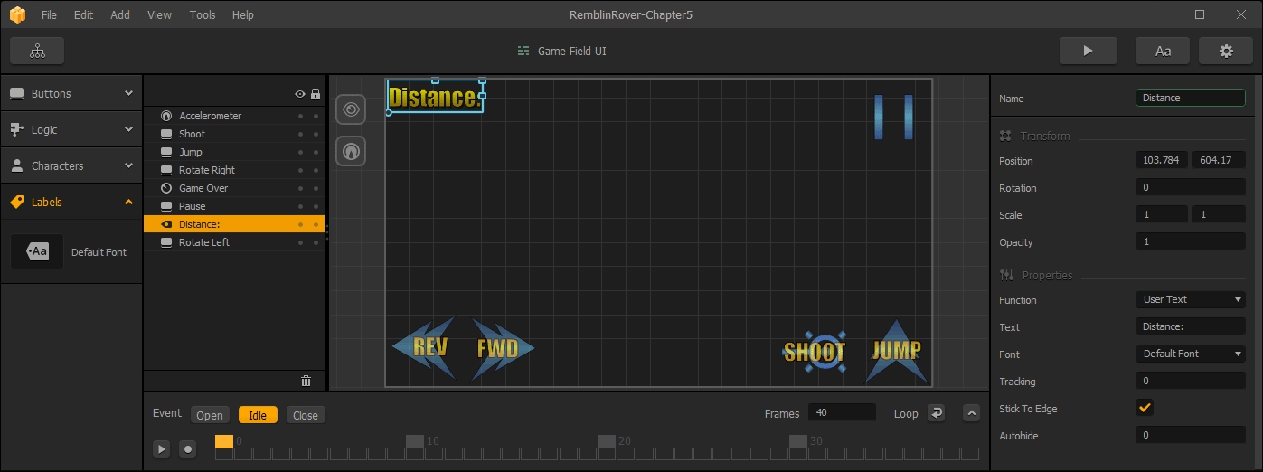
Now, we'll put in some static text (text that does not change) as labels. First, bring in a Default Font asset and place it on the screen. We'll rename this object Distance, and set the Text to read Distance:. Don't forget to tick Stick To Edge. This will help keep the object's position in relation to the edge of the device's screen. Remember, different devices have different resolutions on their screens. The result should look like the following screenshot:
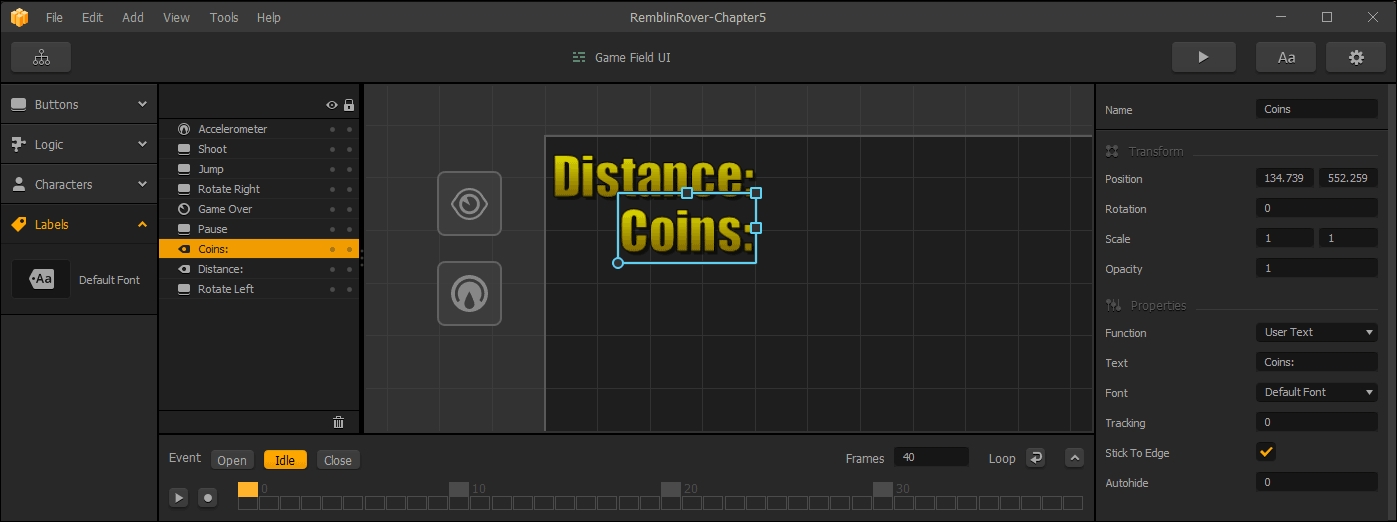
Now, duplicate this object (using the S key). This one should be named, and read Coins. Now, you should have a UI like the following screenshot:
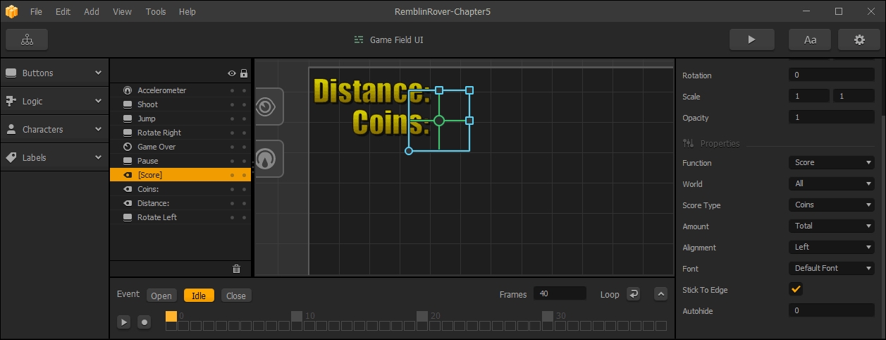
Ok, great! So we've got our static text and buttons, now let's make those values show up. Go ahead and duplicate the Coins text object (using the D key). For this copy, though, we're going to change the Function to Score. You'll see a few fields change based on this option. One of these is a new field called World. Set this to All. We could set this to show just the coins gathered in this try for the player, or just the coins gathered in this world. But we want a total count of coins so that the player knows if they have enough for that rover they've been saving up for. We also want to set the Score Type to Coins, and the Amount to Total in order to accomplish this goal. You should end up with something like the following screenshot:
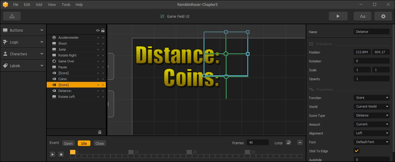
Now, we'll do the same thing with Distance (with a few exceptions). For this dynamic text field, we'll still set the Function to Score. But we want to set our World field to Current World, our Score Type to Distance, and our Amount to Current. What this does is give us a current running total of our distance on this attempt in our current world. It should look like the following screenshot:
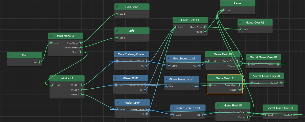
Now, back on the Game Mind Map, you should delete the secret world UIs and replace them with copies of this UI. It should look like the following screenshot:
Just like our Game Field UIs, the Game Over UIs for the secret levels were mere placeholders. Let's go ahead and alter our master Game Over UI (double-click it to edit).
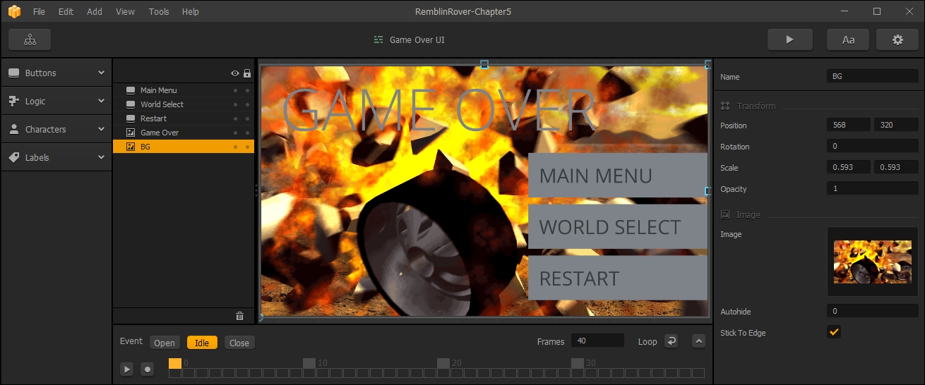
Let's start by setting up the background. Right now, that layer is named Untitled, and is a simple gray solid. Rename this layer BG, and replace the image with the one called GameOver2.png (located in the MenuAssets folder). It should look like the following screenshot:
Ok, before we go any further, use the same methods mentioned earlier to add a white font the same size as our Default Font (named White Regular), and another gold font (the same as our Default Font) that has a size of 100 (named Gold Large). They should look like this:
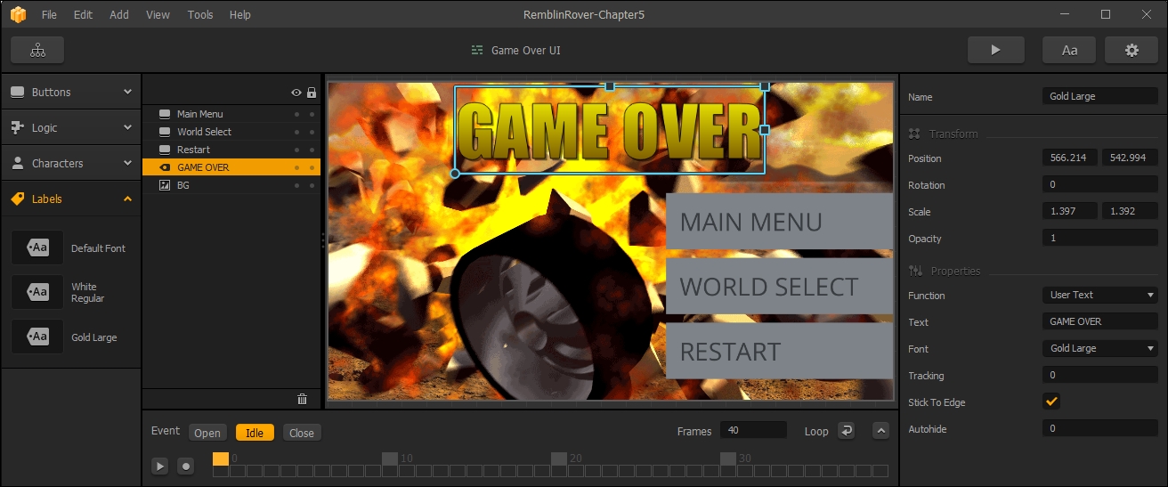
Fantastic! Now that we have some fonts ready for our game over screens, let's populate them. First, let's replace our Game Over text (which is currently an image) with actual text. Use the Gold Large label object we just created, and enter GAME OVER in the User Text field for it. Scale it a bit and position it so the object looks as shown in the following screenshot:
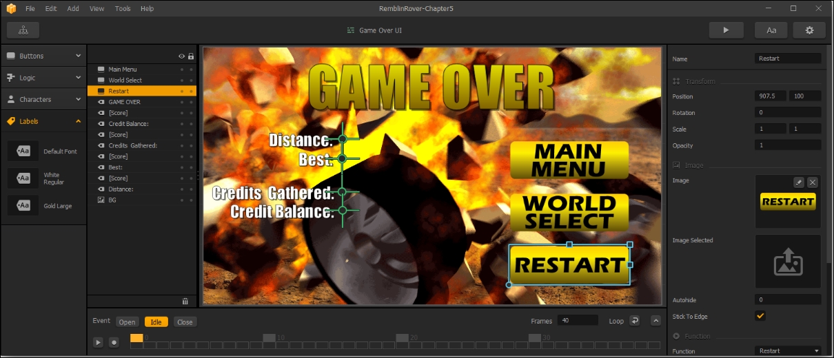
Now that we have some text on our Game Over UI, let's put some indicators on here to show our players how they did. Using our previous methods, let's add some text elements to our screen to match the following screenshot:

The preceding screenshot shows the locations of our text blocks, along with the properties of our corresponding dynamic text blocks. We use our White Regular font for these blocks.
Awesome! Now, to finish the static look of our Game Over screen (we'll get into why we called it that in a moment), just replace the graphics for our three buttons with the graphics shown here:
Great! So we've got our basic look for the Game Over screen. So, we mentioned before that at the bottom of these UIs is an animation timeline. Now, we're going to work with that...
The reason we work with the Idle part of the animation timeline first is because this is where everything lands and stays while waiting for user input. So, it's important to make sure that everything is where you want it to be in the end before editing the Open and Close animations.
Now that you're completely confused, let's explain what these Open, Idle, and Close animations are:
- Open: This is a brief animation that will play when the screen is loaded
- Idle: Idle is the state after the Open animation that will repeat until the user clicks on a button to take them to another UI or World
- Close: A Close animation will play after user input as a transition to the next UI/World
So, if you've ever authored a DVD, you're familiar with these types of transition screen. We're not going to bother with an Idle animation. If we were working with a cute game (like our basic template game with the eyeballs and shoes), we may consider an Idle animation with the character bouncing, or the sky passing by. For this game, any appropriate animations (like, say, a rover shooting or blowing up in the background) would be too resource-inefficient. So, let's just have our buttons and text slide in from the sides on open, and slide out on close. That brings us to the next section.
An animation (whether it's an image sequence, or an animation from within Buildbox) is essentially a sequence of still images known as frames. There are two types of frame: Keyframes and Tween-frames (also called keys and tweens). What are these two types really? Have a look:
- Keyframe: A keyframe is also called a pose. It's a frame where the animator sets an object in a specific position, rotation, or scale, then another keyframe in a different pose a second or two down the timeline. Then the rest of the frames would be filled in.
- Tween: This is all of the frames in be-tween the keyframes. The computer will fill these in to get from the user-defined keyframe to the next keyframe.
The following screenshot shows an example of a ball bouncing with three keyframes, and the rest of the frames filled in (with computer-generated tweens):
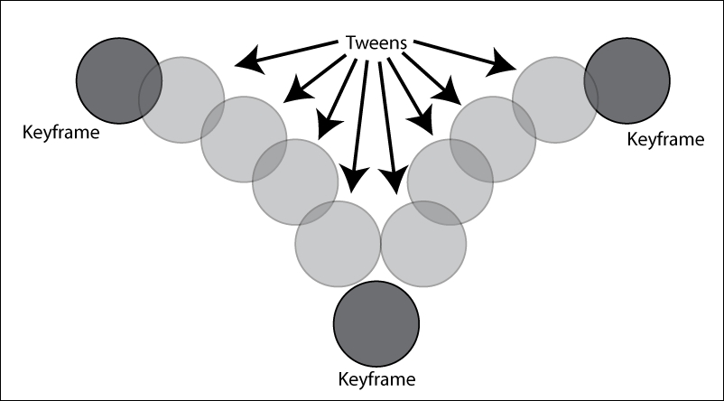
Whether you're developing the next great Pixar blockbuster feature film or creating animated menus in Buildbox, this is essentially how all computer animation works...keys and tweens.
Luckily (for us) the computer generates all of our tweens. But we do have an opportunity to tell it how to generate those tweens using motion curves. We'll get to those in a moment. For now, let's generate some keyframes, and get to animating our Game Over UI.
What we really have to remember is that the open scene is before the Idle scene, so we need to end up in the same position as the Idle scene to make it look good without hiccups in the motion. Let's start by clicking the Open button in the Event field inside the timeline window. We are now officially editing the Open scene.
Think of Frames in Buildbox in terms of the NTSC standard (around 30 frames per second). You can set how long the scene is by adjusting the Frames field. Let's go ahead and set that to 30 (or ~1 second). The orange block inside the timeline represents the current time marker (or where we're at within that 30 frames of opening animation). The line of gray hollow blocks is where we'll see keyframed (a white hollow block) or tween (gray hollow blocks) frames. For now, drag that orange block to the end of the timeline (or frame 30). The animation timeline window should look like this:

The first thing we should do is set a keyframe for an object at the end of the animation timeline to match where it should be at the beginning of the Idle animation. So, select the Main Menu button. Hit the Record button (the button with a white dot in it just left of the timeline) to turn keyframing mode on. In order to set a keyframe, just click inside the x-Position field in the properties window for the Main Menu object, and hit the Enter key on your keyboard; do not actually change the value, just hit Enter. The result should look like the following screenshot:

Now, move the orange block back to frame 20, and move the Main Menu object off-screen to the right. BAM! You just created another keyframe. Now the button will slide in from the right of the screen, and end up on the screen in about 1/3 of a second. But if you try it out (by hitting the Play button), you'll see that the motion is really...linear. It just kind of chunks in from the right, and we want smoother movement. What we really want is the appearance that the button is hitting the brakes and coming to a stop by continuously slowing down. This kind of movement is known as ease.
Remember how we talked about editing motion curves? Here's where that comes into play. If you click on the button marked with the ^ character in it on the right side of the animation timeline, you'll open the motion curve window. You'll notice some orange lines with orange circles at the end on each keyframe. You can grab these orange circles (called handles) to adjust your motion curve. Do this so that it looks like the following screenshot:
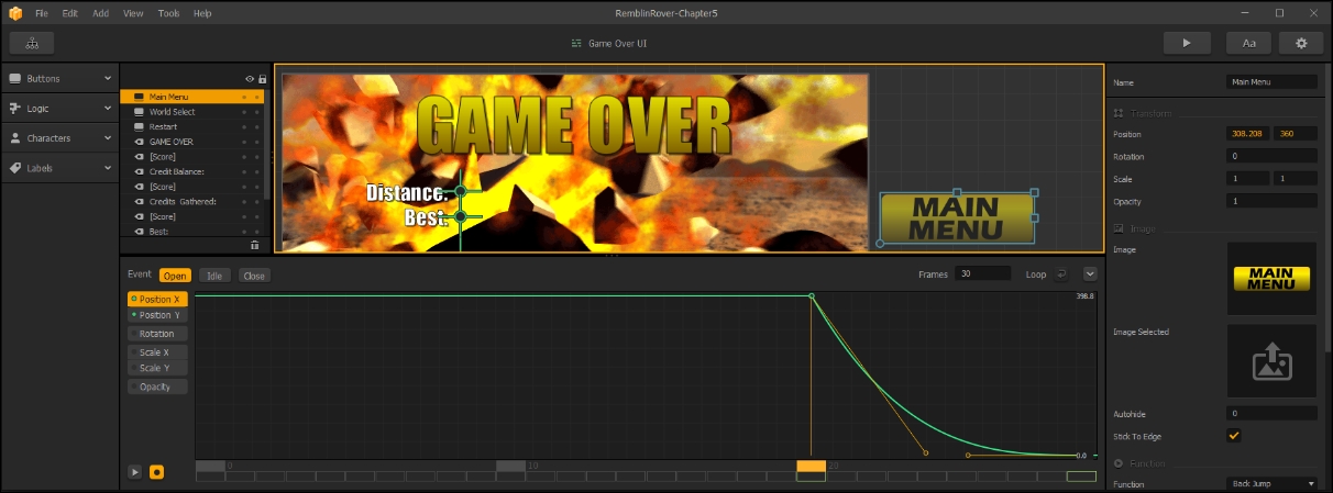
The vertical area of the graph represents the x-Position value, and the horizontal corresponds to time. So you can see that it moves drastically at first, and slows down to a stop at the end.
Let's show you one more button before we ask you to move on to doing the rest of the objects in the scene. Do the same thing with the World Select button. But with this one, let's stagger it back a bit in the timeline so it starts moving on frame 16, and ends on frame 25. The result should look like this:
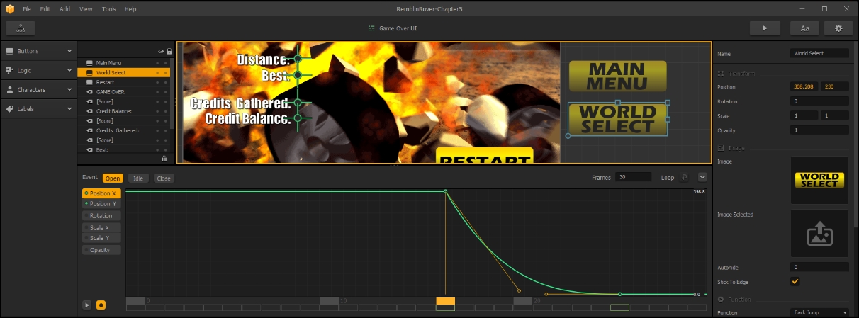
The idea is that if you don't have any of the objects coming on screen stopping at the same time, it becomes more organic and interesting to look at. Go ahead and do the same with all of the remaining objects (except the background) in the scene (including all of the text and dynamic text). Make sure none of them come in screen on the same frame. Remember, you can also use the Y-position in exactly the same way, and if things move from right to left (instead of left to right), the graph will appear inverted (starting low and ending high). The important part is that they start with a steep angle and end shallow.
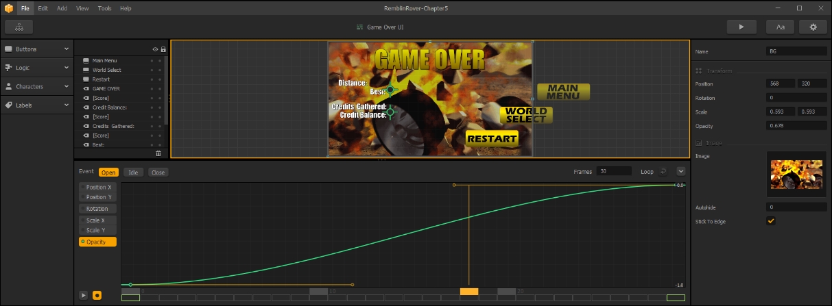
Now that you're done with that, we can let the background fade-in by doing the same thing to opacity. Select the BG layer. Move the orange block to frame 30, click on the Opacity field, and hit your Enter key (to set an Opacity keyframe). Then, move the orange block back to frame 0, and change the Opacity value to 0. You should get a motion curve something like this:
Sweet! You have your first animated menu. Now, we could create a Close animation as well. But our players are going to be in a hurry to get back into the game, so let's not do that. Go ahead and try out the game! It comes in in a cool way, but not so slow that players in a hurry to try again will be frustrated by it.
Now, as we did with the Game Field UI, duplicate the Game Over UI and replace the Secret Game Over UI objects with the copies. Don't forget to set the Restart button's function to Default (so you can link the restart behavior back to the main world it corresponds with). The final result should look like this:
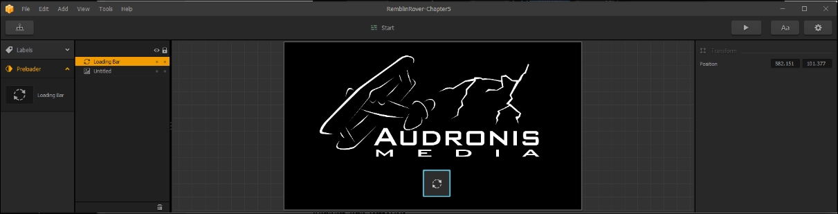
While the game is loading, the initial screen (which we are currently seeing as black) is the Start UI. All this UI is really for is to give the player something to look at, and possibly an indicator to see the loading progress. So because of the need to keep this screen resource-light and consider its narrow purpose, your options for placing objects on this screen are limited.
We're just going to add a company logo and a loading progress bar. Open up the Start UI, and drag the LoadingScreen.png file (inside MenuAssets) onto the stage as an Image. You'll notice that Image is the only option. This is due to the rudimentary nature of the Start UI. Then, drag a Loading Bar asset (in the Preloader section of the Asset Library) to the stage. That's it: Loading (Start) screen done! The result should look as shown in the following screenshot:
Let's move on to some more menus...
Let's start with the Main Menu UI. We're going to use the MainBG.png as the background image, and as another image (not a button) we'll use the Rover001-MenuRender1.png file. Both of these are in the MenuAssets directory. It should look like this:
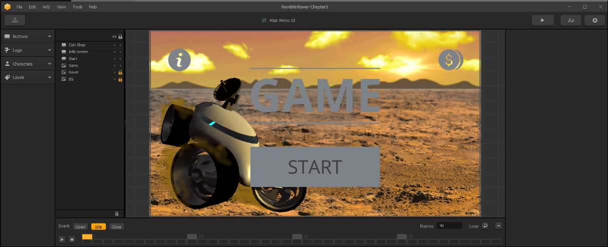
You may be wondering why we used two different assets (rather than one image). Eventually, we'll animate the rover separately to make the appearance of this menu more interesting. We'll get there soon, but for now let's go ahead and replace our other buttons and position them. Also, let's create a copy of our Gold Large font, but with a font called Eras Bold ITC (and name it Title Font), and use that font to make the title of our game (replacing the Game object) so the UI looks like this:
So, what we've done here is simply replaced all of our buttons, and replaced the Game graphic object with text. Another benefit to having the Rover separated from Mars was that we were able to put it on top of all the other layers. We also added two bars (TitleStripe.png) above and below our title text to give it a slightly more interesting look. Finally, we put in a black box (Gray_Backer.png) that is semi-transparent behind out title block to help the text stand out a bit more.
Great! So we have an interesting Main Menu. Now, animate Open using the keyframing techniques we showed you. Be creative, and try keyframing different attributes like Opacity, Scale, and Rotation. If you're curious about what choices we made for our animations, feel free to open the RamblinRover-Chapter5 project to check out our Main Menu.
Let's move on to our Worlds UI. Now that you know how to build menus, we're going to speed up a bit. Try to create the UI so it looks like the following screenshot:
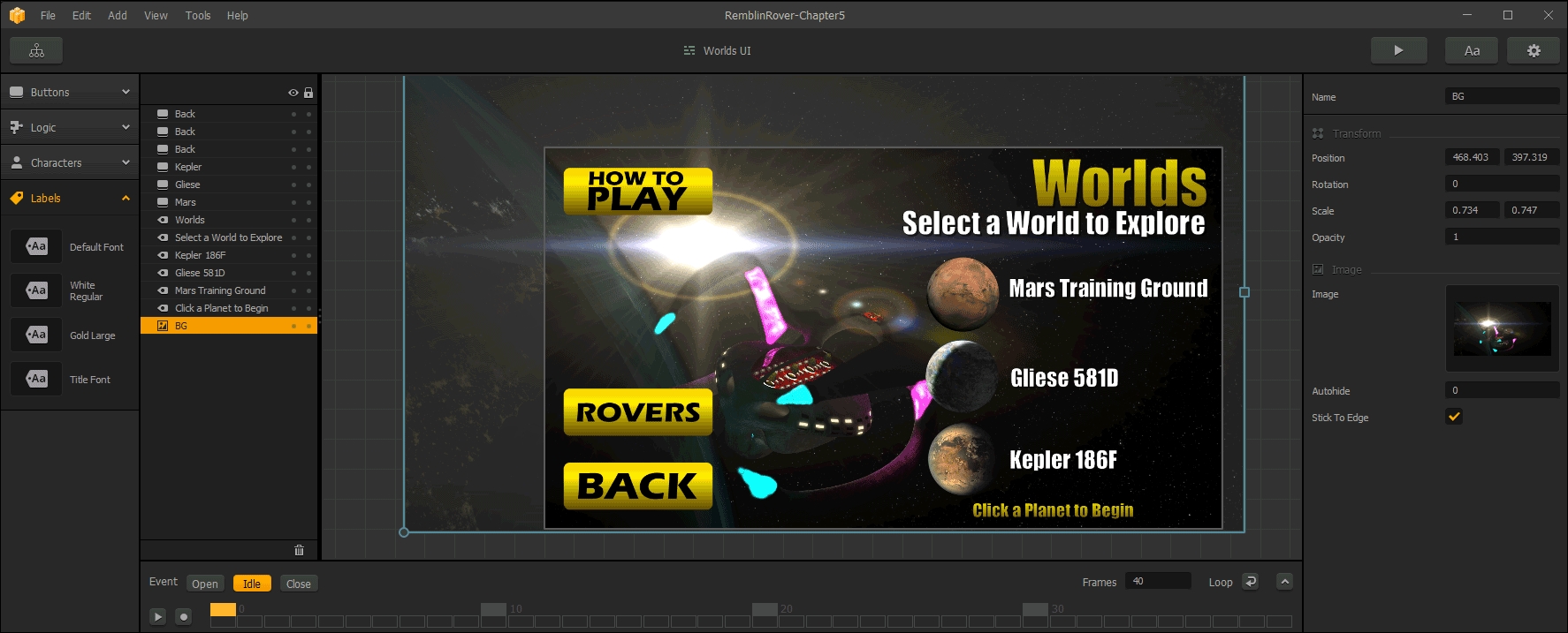
You may notice that we scaled the background image to get it positioned to see the spaceship a bit better behind all the buttons and text, and the addition of two more navigation buttons (one to select a rover before going to the game field, and one for instructions on how to play). Those navigation buttons have a Default
Function, so we'll be able to hook them up to other UIs soon. Finally, we replaced the actual world selection buttons with graphics of the planets we'll be visiting (again, courtesy of NASA), and added supporting text using the fonts we've already created. Again, animate an Open animation for this screen...and we're done with it!
This is one of a few new UI screens we're going to have to create. So start off by creating a new UI (called Rover Selection) in the Game Mind Map and connect it to the Worlds UI as shown in the following screenshot:

Now, just create a UI that looks like the following screenshot as a base:
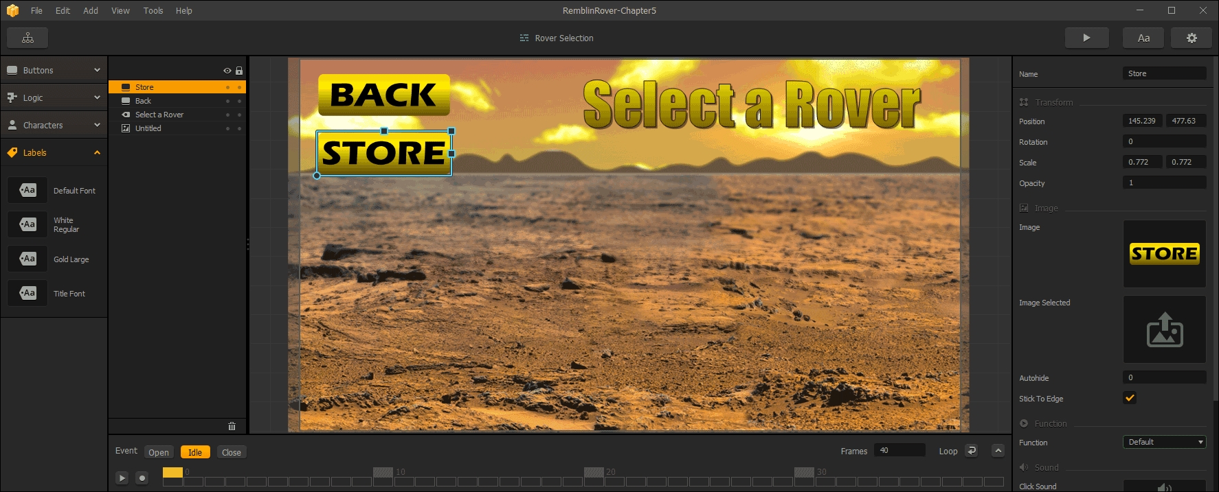
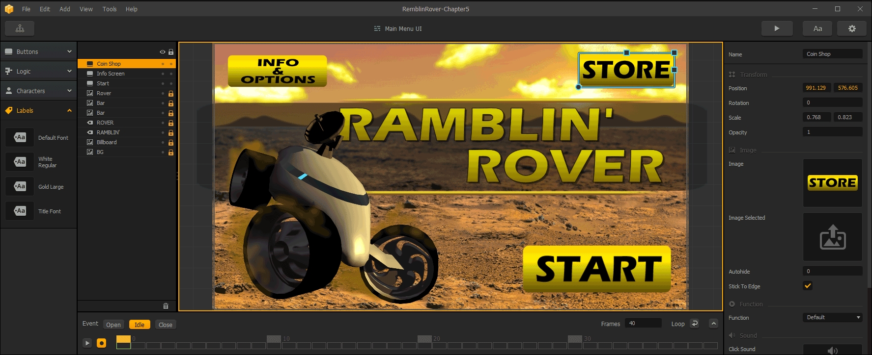
Obviously, the Function on the Back button is Back, and the Function on the Store button is Default. You may wonder why we positioned it toward the top of the screen. This is because banner ads appear on the bottom section of the screen, and we intend to put banner ads on this UI. For most others we'll use a different type of ad, but we'll get to all of that later.
Buildbox has a great carrousel-style character selection button. Let's implement that now. Under the Characters section in the Asset Library, drag the Multiple Unlock object out to the scene in the center. Rename it Character Selection. Most of the parameters in here are self-explanatory, but let's go over the ones we changed. First, we set the Label Vertical Spacing to -120. This will set the text labels (derived from the character names) just below the characters. Positive numbers would put the label above. Furthermore, we want to set our Label Name to our White Regular font. Also, we set the Spread to 300. This sets the distance between the center of each character to 300. Your results should look like this (once you resize the object to match):
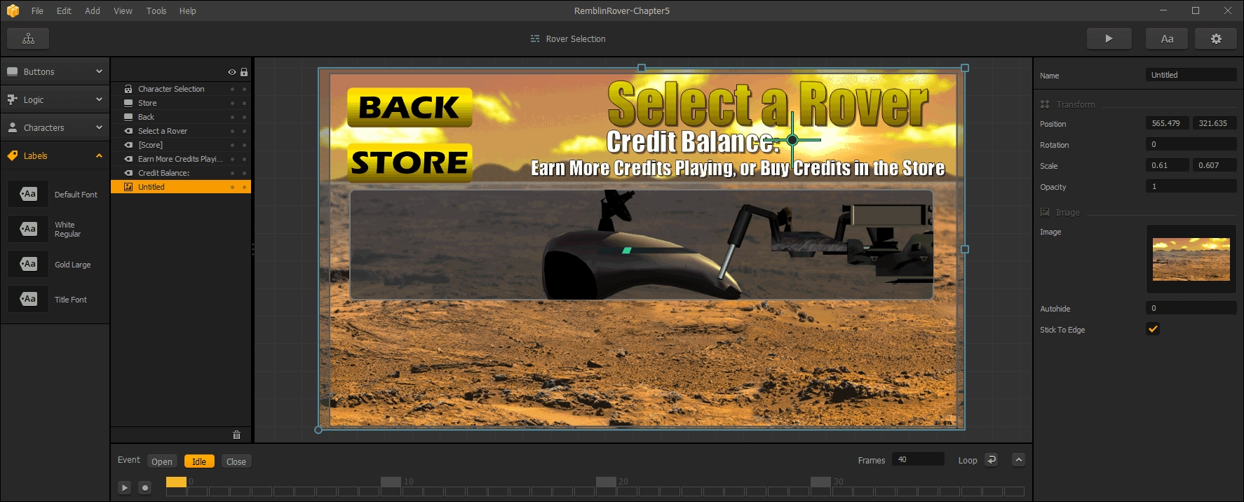
We also added a credit balance using the same methods as on the Game Over screens (because the two upgraded rovers will cost in-game currency), and a call to action for them to buy more credits from the store.
The final step on this screen is to use the Unlock.png file as the Unlock Button for our Character Selection object.
Notice something funky here? The object is using the Default Animation for each character. So, it has no wheels. This would be fine if we were doing a game that didn't utilize wheels, but we want this to look better. For some reason, it will always display the first frame of the Default Animation in our editor, but when we compile or use preview mode (when we play the game), this object will use a Character Icon.
To fix this, we need icons for each character. To do this, we're going to need to go back to a world and open up characters' properties. Let's go do that.
For each character, you're going to need to use the Add Component button to add a Character Icon.
The first thing you're going to notice is that there are three new fields: Regular Icon, Locked Icon, and Selected Icon. Their purposes are exactly as they seem. In the MenuAssets directory, you'll find Rover001-SelectionIcon.png, Rover002-SelectionIcon.png, and Rover003-SelectionIcon.png. Use these for each rover as their Regular Icons. Similarly, use their Locked and Selected variants in the Locked Icon and Selected Icon fields. The training rover will be free, and therefore will never be locked (so we don't need a Locked Icon for this rover). The results should look like the following screenshot:
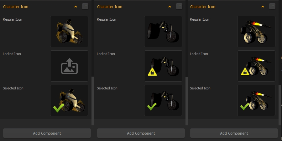
The preceding image shows the replaced icons on our three rovers. This must be done in a world (it doesn't matter which you chose). Our Mars Training Rover (left), our K.R.A.B.B. (middle), and our Phoenix (right) have all had their selection icons replaced.
Since we're already working on the properties of our rovers, let's quickly change their availability (so that they cost coins to purchase). To change this, just scroll up the Properties window until you come to a section called Monetization. Here, all we have to do is change the Purchase Method from Free to In Game Currency. Then we just set our price. Go ahead and change the K.R.A.B.B. to 10,000 and the Phoenix to 100,000. Now, let's finish up our menus...
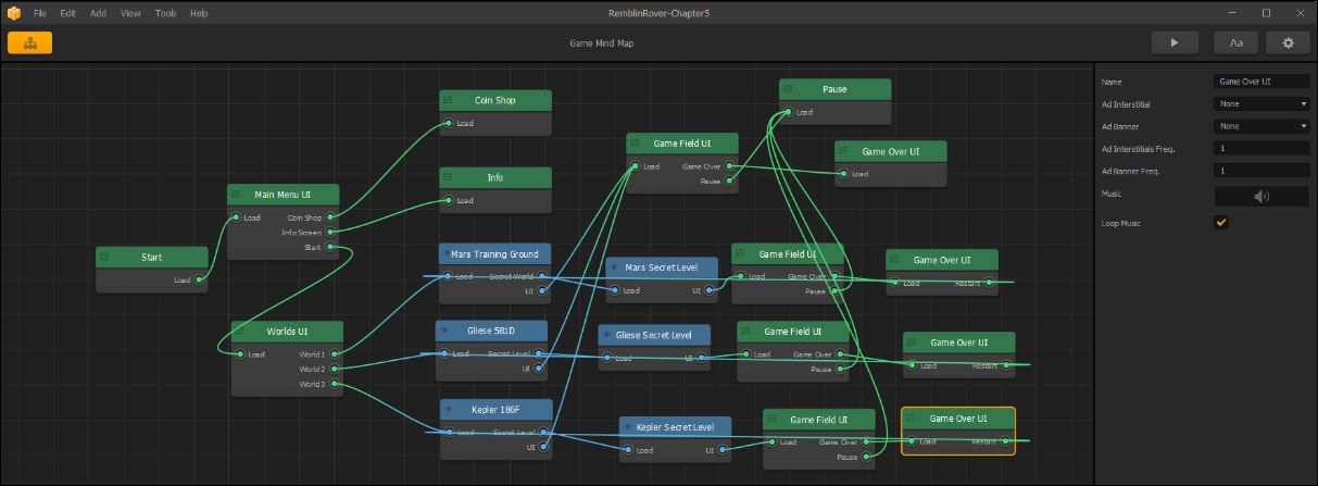
At first we wanted to keep our Game Mind Map as simple as possible. So, we left our Main Menu and World Select buttons alone with their Back Functions. But we're starting to get to the point where we may forget to turn those over to Default. Go ahead and jump into each of our Game Over UIs, and set those actions now. Then, connect them up. Your Game Mind Map should look like a spider web of complexity:
Let's knock the rest of these UIs out of the way.
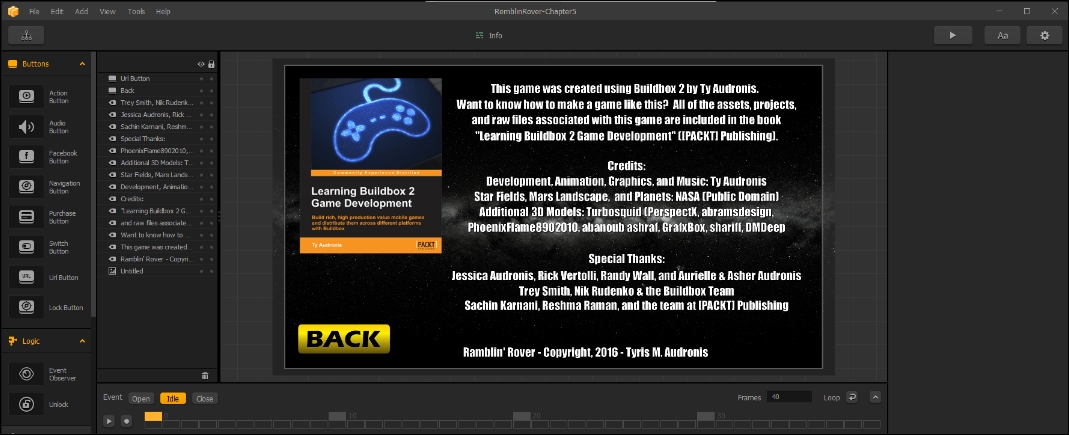
This UI is pretty easy. This is where we put all the credits associated with the game, and the copyright information. We use the TychoStarmap.png file for the background. All of the rest is just text lines, with one exception. The book cover is a URL Button (with the URL set to where this book can be bought from the publisher's website). It looks like this:
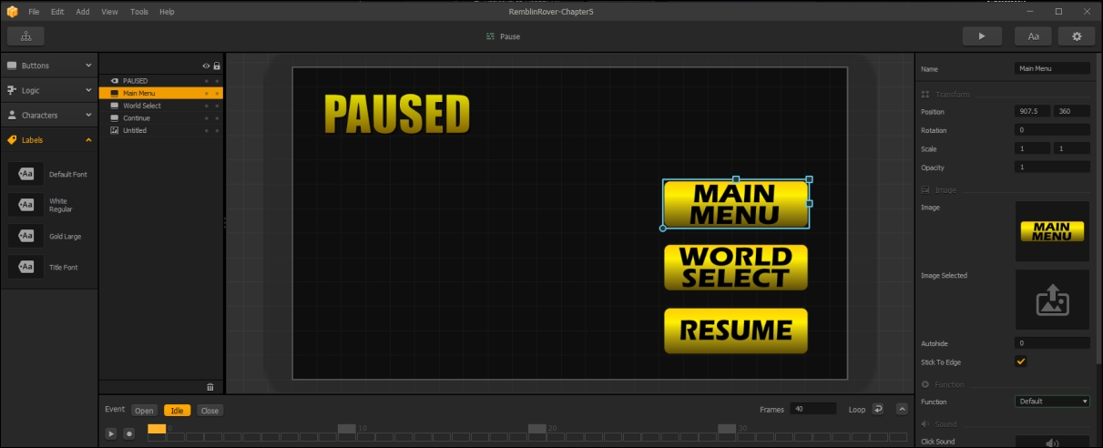
When the game is paused, the game is still present...just paused. The pause UI is rather like an overlay. So, we'll replace the background with our Gray_Backer.png (semi-transparent block) image, and scale that image to fill the whole screen. Then, the player can still see the game in the background. The Game Field UI is replaced (so we don't have to worry about things getting too busy. Don't forget to reset the Main Menu and World Select buttons to Default Functions (and hook up their connections in the Game Mind Map). It should look like this:
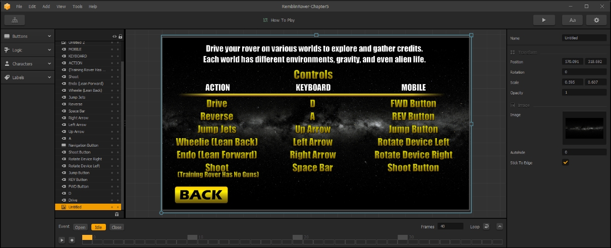
We still need to create this UI and connect it, so in the Game Mind Map, please create a new UI called How To Play, and connect it up to the How To Play output on the Worlds UI node. Now, we just need to create some instructions with a Back button (setting the Function of the button to Jump Back). We made our instructions to look like this:
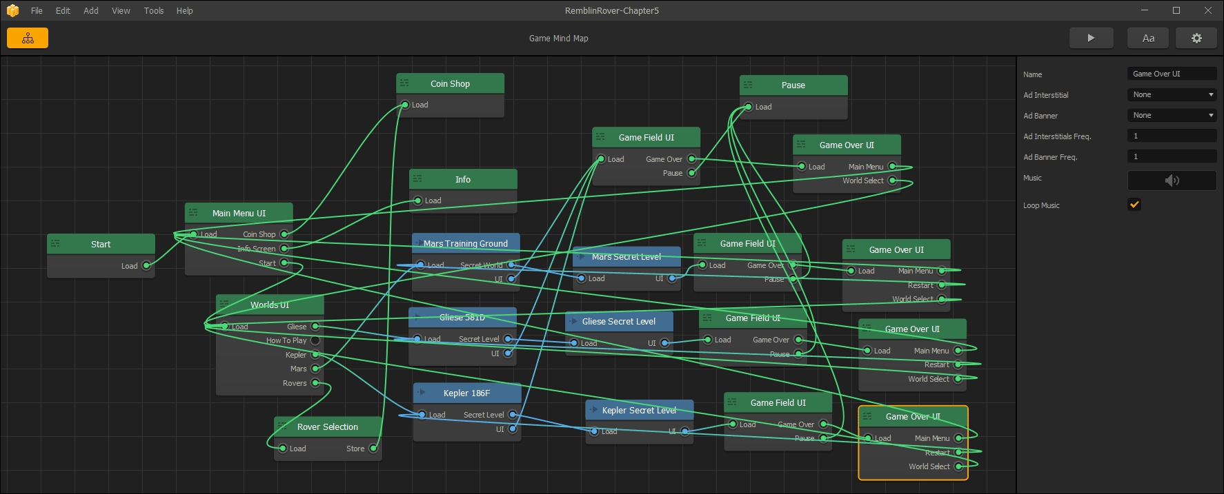
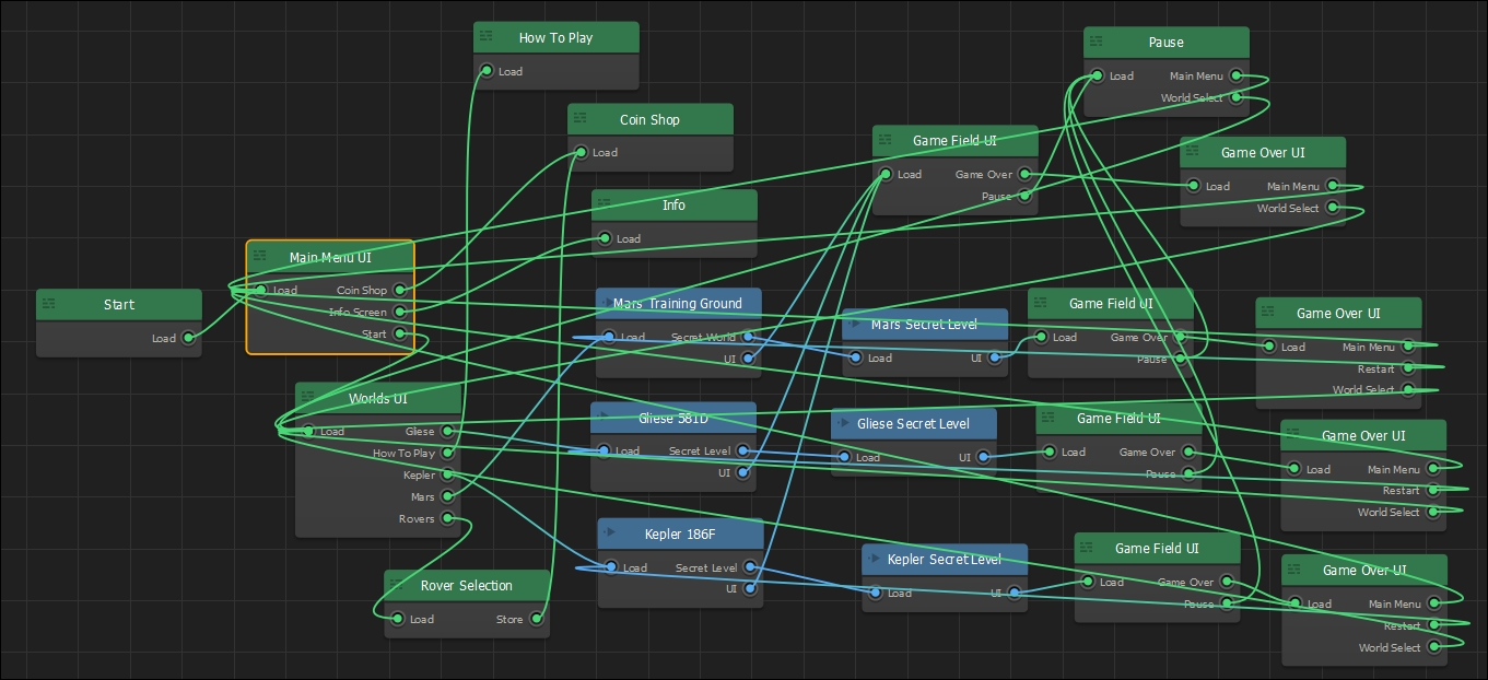
And thus, your final Game Mind Map should look like this:
And that's it! All of our UIs are done! Or are they? In fact, we did not do our coin shop just yet. But as that relates a lot to monetization, we're going to save that for the next chapter (Chapter 6, Monetization — Ramblin' Rover, Part 4). There's a lot more to setting up a coin shop than just a UI, so we'll handle all that at the same time. Remember how, at the beginning of this book, we said that you'd understand complicated Game Mind Maps? Mission accomplished! Now, let's move into one of the easiest facets of Buildbox as a bit of a break from all the brain trauma we've incurred with this deluge of information and UIs.