
Overriding and Defining Styles
 Note You’ve learned all about CSS and how it’s implemented in Windows 8 apps. Now it’s high time to start creating your own styles and overriding and extending those provided by WinJS to give your app its own personality while conforming to Microsoft design principles.
The objective of this chapter is to learn how to style our app like we want. Good design is not entirely objective, but there are a lot of principles that apply and there are certainly a lot of principles around good Windows 8 design that can contribute significantly to your app’s success.
To get some control over the UI in our app, we will first find the style rules defined in the WinJS style sheet that apply to the elements in our app, and then we will either override the style properties defined in those rules or we will add our own properties to extend them. Furthermore, we will create our own style rules to apply to elements on the page or perhaps to custom controls that we write.
Before we can override and extend the style rules defined in WinJS, we have to find the one or more rules that are affecting the visual elements in question. With so many rules, this is not a trivial task.
We’ve already seen that WinJS provides a wealth of styles for us and that’s why without any styling code at all, we start out with an app that looks like a Windows 8 app. The styles in the WinJS library are not only numerous, but some are rather lengthy as well. Listing 10-1 displays two of the many style rule selectors you’ll find in the ui-light.css style sheet. The first simply selects a button, but the second shows how specific they can get and selects the selection border for selected, hovered containers in ListViews that are not “selectionstylefilled”.
Listing 10-1. One very simple and one very complicated style selector
button {
   ...
}

.win-listview:not(.win-selectionstylefilled)
    .win-container.win-selected:hover .win-selectionborder {
   ...
}
Discovering where and how style rules are being applied would be a daunting task full of guesswork if you didn’t have the Trace Style pane in the DOM Explorer to assist. It turns an otherwise painful task into a painless one.
Let’s walk through an exercise to uncover relevant style rules. First, we’ll look for a rule that’s affecting the ListView control.
EXERCISE 10-1: LOCATING THE SELECTION BORDER IN A LISTVIEW
When you select an item in a ListView, you get some visual indicators that let you know you have an item selected. You can set properties on the ListView to determine whether the user can select zero, one, or many items. In this exercise, we’re going to dig into the live DOM and locate the style rules that determine the selection border and checkmark for a ListView. After all, we have to find them if we’re going to change them.
Listing 10-2 resurrects one of the ListView examples from Chapter 7. In Figure 10-1 notice the border, corner fill, and checkmark on list item number 5.
Listing 10-2. Here’s some code you’ve seen before in Chapter 7. It’s a ListView bound to a series of numbers.
<!-- HTML snippet -->
<div id="list" data-win-control="WinJS.UI.ListView"></div>
<div id="template" data-win-control="WinJS.Binding.Template">
<div class="grid">
<div data-win-bind="innerText:this"></div>
</div>
</div>
/* CSS snippet */
.win-listview {
height: 100%;
}
.win-listview .win-item .grid {
display:-ms-grid;
-ms-grid-rows:160px;
-ms-grid-columns:160px;
background-color:gray;
color:white;
}
.win-listview .win-item .grid div {
font-size: 36px;
font-weight: bold;
-ms-grid-column-align: center;
-ms-grid-row-align: center;
}
//JavaScript snippet
var numbersList = new WinJS.Binding.List();
var list = document.querySelector("#list").winControl;
list.itemTemplate = document.querySelector("#template");
list.itemDataSource = numbersList.dataSource;
for (var i = 1; i <= 11; i++) {
numbersList.push(i);
}
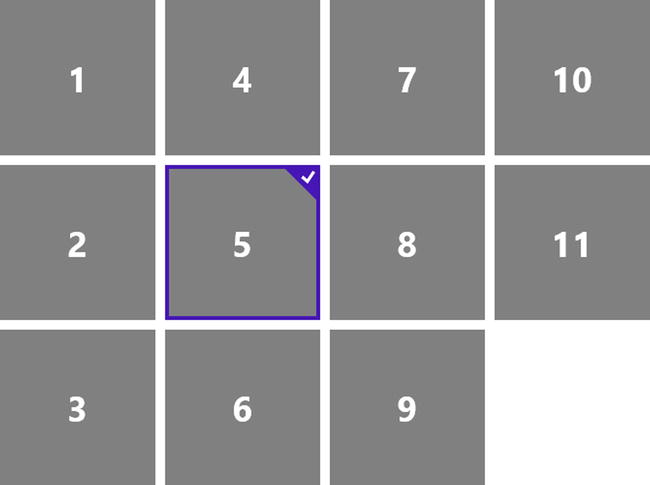
Figure 10-1. After right clicking on the fifth item, the selection styling is visible
These extra features of that tile are there because that item is selected. We know that the styles for that selected item are going to be in the WinJS library, and since we’ve elected to use the ui-light.css file on this page, we know that it’s going to be in that file. Let’s discover where in that style sheet this border and checkmark are defined so that we have some hope of modifying them.
In this exercise you can use the sample project that accompanies this book and is available at www.apress.com/9781430249832 and http://codefoster.com/cssbookcode.
- Run the app in debug mode by pressing F5.
When you press F5 or choose Debug | Start Debugging, your app is launched and Visual Studio associates its debugging tools to it and gives you the DOM Explorer. You should see something like Figure 10-2 in Visual Studio.
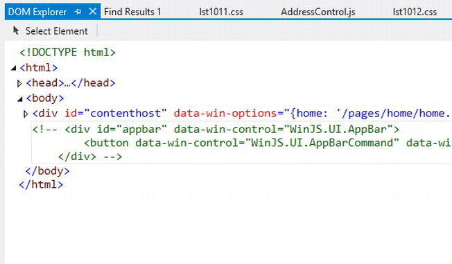
Figure 10-2. The extremely helpful DOM Explorer is always available when Visual Studio 2012 is running in debug mode (but only for HTML/JS apps)
- In the running app, navigate to the Chapter 10 section and then to Listing 10-2.
- Select item number 5 by right clicking on it.
- Switch to Visual Studio and press the Select Element button (CTRL + B) at the top of the DOM Explorer.
Visual Studio should switch you to the running app, and you should notice that hovering over elements highlights them in blue to make it easier to select the target you want.
- Click on the selected ListView item.
Selecting your target element should take you back to the DOM Explorer in Visual Studio with the element you selected highlighted in the DOM and allowing you to see the HTML markup that defines your element. It’s the live DOM so it’s not restricted to the HTML that you authored in the .html file in development, but rather includes even the DOM elements that may have been programmatically appended at runtime. That’s a relief because pretty much the entire ListView was created at runtime by WinJS. Remember, all we did to declare the ListView in our markup was <div data-win-control="WinJS.UI.ListView"></div>.
By the way, if you aren’t able to click directly on the element you’re interested in, you can try to just click near it and then finish locating the exact element by manually navigating the DOM in DOM Explorer.
- Locate the div with a class value of win-selectionbordercontainer, expand it, and select one of its child elements.
When you selected the ListView item, you were taken back to Visual Studio and likely the element in the DOM that was highlighted was the <div class="grid">, and a little further down you should see some more div elements that have been added (when you selected item number 5), one of which has a class of win-selectionbordercontainer.
If you expand this div, you’ll find that it has four individual div elements that make up the border of the selected item. Select one of them. Figure 10-3 should make it clear which element to select.
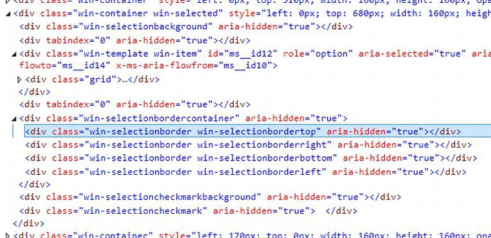
Figure 10-3. The win-selectionbordercontainer is only present in the DOM when an item is selected
- Select the Trace Styles tab in the right pane of the DOM Explorer.
You should see a list of all of the style properties that are affecting the selected element, and that list should look like Figure 10-4.
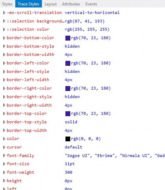
Figure 10-4. All of the styles that apply to the selected object along with their value and tracing information are displayed in the Trace Styles pane of the DOM Explorer
One thing that Visual Studio does that helps a lot when looking for the origin of a color is render a small, square sample of the color next to the value in the Trace Styles pane. I realize that Figure 10-4 might be rendered in grayscale as you read this, but trust me when I say that it’s showing us the same color that we saw around the selected item back in Figure 10-1. So, it appears that we’ve located the source of that style property.
- Expand one of the border color properties to see the origin.
When you expand the border-left-color property, for instance (by clicking small triangular glyph next to it) you see something like Figure 10-5.

Figure 10-5. The Trace Styles pane shows you not only what the value of a style rule is, but where it is defined
The rightmost column tells us that this style rule has been defined in the ui-light.css file. We probably could have guessed that since most of our rules are in there. Clicking on the file name launches that file in Visual Studio. If you have not installed Visual Studio 2012 Update 1 you’ll be taken to the file, but unfortunately you won’t be navigated directly to the style rule. With Update 1 installed, however, you’ll be taken directly to the rule in question. One thing you can’t rely on is the style rule being verbatim between the Trace Styles pane and the actual CSS file. Sometimes the order of the class and pseudo-class selectors gets rearranged. I found the style rule in Figure 10-5 to originate from lines 2250–2252 of ui-light.css:
win-listview:not(.win-selectionstylefilled) .win-container.win-selected .win-selectionborder {
border-color: rgb(70, 23, 180);
}
Having found the source and the reason that selected ListView items have a border color of rgb(70, 23, 180) (a deep purple color), we are armed with what we need to override the color of this border or add other properties to it.
Before we start overriding and adding properties, however, let’s look at one more exercise in style rule location.
EXERCISE 10-2: LOCATING A PROGRESS ELEMENT’S FILL COLOR
In this exercise, we’re going to locate the style rule that gives a progress element its fill color. Listing 10-3 and the resulting Figure 10-6 show one of these simple progress elements. You can see that the area left of the progress value is filled by default with the same color we found the selection rectangle in a ListView to be: a deep purple.
Listing 10-3. A simple progress tag filled to 60%
<!-- HTML snippet -->
<progress value="60" max="100"></progress>
Figure 10-6. The filled area is indicated with a color, while the unfilled area is a light shade of gray
In this exercise, follow the same steps that you used in Exercise 10-1, and you should end up with a Trace Styles pane that looks like Figure 10-7.
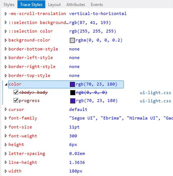
Figure 10-7. The Trace Styles pane also gives you an indication of what styles have been overridden. This can be very helpful if you’re expecting a style to apply and can’t figure which other rule is overriding it
As shown in Figure 10-7, expanding the color property reveals something a bit different from the last exercise. There are two rules and the first is struck through. This indicates that the first style rule took effect on this element, but was later (later in the style sheet that is) overridden by another more specific or subsequent rule. Recall from Chapter 3 that this intentional cascading of styles is a normal function of CSS, and the Trace Styles pane is very helpful in informing us which rules are being applied, which are not, and why.
Clicking on the style sheet link next to the rule in question brings us to lines 2172–2175 in the ui-light.css file, which are:
progress {
background-color: rgba(0, 0, 0, 0.2);
color: rgb(70, 23, 180);
}
Once again, we’ve found the culprit. This style rule is not only determining the fill color to be the same, deep purple, but it’s determining the background color (the color of the unfilled portion) to be black at 20% opacity.
Overriding and Extending Styles
The style sheets that come with WinJS are baked. They are read only and it’s neither recommended nor necessary for you to consider changing them. Instead, you should override and extend the built-in styles.
In the previous exercises, we learned how to search out the style rules that are affecting a certain element in our UI, and that’s important. It’s important to know why some elements look the way they do or are placed where they are. It may seem irrelevant to locate the style rule in the ui-light.css style sheet, since that file is read only and offers us no hope of changing it.
It’s true we can’t (or at least shouldn’t!) change the style in the WinJS style sheet, but we are able to change the appearance of that certain element and we do that by overriding the style properties in the rule.
Remember that the WinJS style sheet is defined before all other style sheets. Listing 10-4 shows what the <head> of a typical HTML file looks like in a Windows 8 app.
Listing 10-4. A typical <head> section from a Windows 8 HTML page showing the order in which the style sheets are referenced
<head>
    <meta charset="utf-8" />
    <title>Lorem Ipsum</title>

    <!-- WinJS references -->
    <link href="//Microsoft.WinJS.1.0/css/ui-light.css" rel="stylesheet" />
    <script src="//Microsoft.WinJS.1.0/js/base.js"></script>
    <script src="//Microsoft.WinJS.1.0/js/ui.js"></script>

    <link href="lorem.css" rel="stylesheet" />
    <script src="lorem.js"></script>
</head>
The ui-light.css style sheet is the first to be declared, and is followed later by the lorem.css style sheet that applies only to this page. This means that assuming the specificity is the same or greater, properties in a style rule that we define in lorem.css will override properties in a style rule from ui-light.css.
You may want to review the topic of specificity from Chapter 3 if it’s not clear in your mind, because this is where it rears its head. If ui-light.css sets a property using a style rule that is more specific than a rule in lorem.css, then former will win and there will be no override.
This means that we can simply write a style rule in our local CSS file (lorem.css in the previous example), match the selector of a style rule that already exists, and expect the properties in our style rule to override those in ui-light.css. You can see an example of this in Listing 10-5.
Listing 10-5. The progress rule below matches the selector of a rule that already exists in the WinJS style sheet. The properties defined come after the WinJS style sheet though, so we can expect them to override.
<!-- HTML snippet -->
<progress value="60" max="100"></progress>

/* CSS snippet */
progress {
    background-color: gray;
    color: lightgray;
}
As you can see in Figure 10-8, our override has amounted to a reversal of the colors that make up the progress bar. The filled area is now lighter (lightgray) and the unfilled area is now darker (gray).
Figure 10-8. As expected, the fill color is light gray and the background (unfilled) is darker now
It is possible to add the term important! (including the exclamation point) to a style property to force the override to happen even when the specificity values would have determined otherwise.
Listing 10-6 shows an HTML paragraph with two style rules that both appear to apply. The ID selector wins, though, in specificity, so even though the .error style rule comes after the #footerText rule, it would not have an effect.
Listing 10-6. Two style rules competing to set the text color of an element
<!-- HTML snippet -->
<p id="footerText" class="error">
    There was an error loading the file.
</p>

/* CSS snippet */
#footerText {
    color: black;
}

.error {
    color: red;
}
We could force the override, however, with Listing 10-7.
Listing 10-7. Two style rules competing to set the same element
<!-- HTML snippet -->
<p id="footerText" class="error">
    There was an error loading the file.
</p>

/* CSS snippet */
#footerText {
    color: black;
}

.error {
    color: red  important! ;
}
I recommend against using the important! keyword. It may produce the desired result today, but you’ll run into trouble tomorrow. It’s a definite code smell and usually leads to poor CSS architecture that will be difficult to read and difficult to maintain.
Locating style rules in the WinJS (or any other) library is helpful not only so that we can override the properties they define, but also so we can add properties they don’t define. Using the same selector assures that our added property will always apply to the exact same element(s) and saves us time trying to compose the selector from scratch.
Let’s look at the progress control again to illustrate how to extend a style. In Listing 10-5, we overrode a style property by defining a style rule in our local style sheet with the same selector as that of the WinJS style sheet and then redefining a property that already existed. To extend the style we do the same except we add style properties that were not originally defined.
The progress style rule that we redefined in Listing 10-5 already contained a color property. In Listing 10-8, we have changed the overriding properties to give the progress control a gray fill color and a white unfilled color, and we have added a new property (border) that was not defined in WinJS.
Listing 10-8. Besides overriding style properties that existed, we can specify new ones that did not
<!-- HTML snippet -->
<progress value="60" max="100"></progress>

/* CSS snippet */
progress {
    background-color: white;
    color: gray;
    border: 1px solid gray;
}
Adding the solid, gray border gives our progress element a containing box as you can see in Figure 10-9.
Figure 10-9. A border gives this progress indicator a whole new look
Some examples are helpful for learning what sort of style overrides and extensions are useful in a Windows 8 app. We’ve already seen the progress control example. Next we’ll look at two more. We’ll look at:
- Formatting the slider on a range input element
- Changing the default icon in the Rating control
Formatting the slider on a range input element
Let’s aim to change the default range input element (<input type="range"/>) so that the slider the user grabs with a touch is round with an outline color that matches the element’s lower fill color. Figure 10-10 shows the default look of a range input element.
Figure 10-10. The default look of a range input element
The Trace Styles pane gives us some good information about the styles that make the range input element look the way it does and help us to know what selectors to use in our own style selectors to override and extend the properties and affect the changes we’re after. Listing 10-9 shows the CSS that we should put in our local style sheet to accomplish this.
Listing 10-9. The HTML and CSS to get a round thumb slider on the range input
<!-- HTML snippet -->
<input type="range" />

/* CSS snippet */
input[type=range]::-ms-track {
    height:16px;
}
input[type=range]::-ms-fill-lower {
    background-color:gray;
}

input[type=range]::-ms-thumb {
    background-color:white;
    border:1px solid gray;
    height:14px;
    width:14px;
    border-radius:14px;
}
Figure 10-11. A round slider might be a better design choice for your app’s personality
Changing the default icon in a rating control
Next, we’ll take a look at the Rating control. Unlike the range input element, the Rating control is a custom control that is provided by WinJS. In general, the WinJS controls are going to be more complex than base HTML elements because they are often composed of a large number of base HTML elements. The Trace Styles pane is all the more our friend when sleuthing into WinJS controls to find out how to override and extend styles.
I’m going to change the number of stars from the default of 5 and then I’m going to change the icon to get away from the boring, old star system. Normally, rating systems use five stars and ask the users to rate something from one to five. It’s a common system, but let’s say we’re working on an app for a chicken restaurant. We might want to give customers a one through ten system using chickens instead of stars to rate their meals. Now that’s an app with personality!
Figure 10-12 shows the default look of a rating control where three stars have been selected.

Figure 10-12. The default Rating control uses a star icon and a max rating value of five
I found a chicken icon in the free Microsoft Office image library at http://office.microsoft.com. I then used my favorite vector editing tool—CorelDRAW—and made four variations of it for all of the possible states the image might be in. The results are in Figure 10-13.
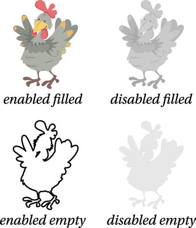
Figure 10-13. Four variations of a chicken icon to cover every state a Rating control element might be in
In Listing 10-10, I’ve declared a Rating control and given it an arbitrary averageRating value of 6.4 to illustrate how partial values are displayed by the control. Usually the value for averageRating won’t be hard coded but rather calculated from a table of data.
The Rating control styles are easy to locate in the ui-light.css file with a simple search. Notice the style rule that looks like this:
.win-rating .win-star:before {
    content: "E082";
}
If you remember back to Chapter 3, the content property is an interesting one that actually adds content in through styling. So, this is how the default Rating control gets its stars. You can change the character that is referenced there if you can find one that suits, but you can also forego the character and use an image instead. That’s what we’re doing in Listing 10-10. Look at the style rule that overrides.win-rating .win-star:before. It is clearing out the content value and thus omitting the star glyph.
Once the star is gone, we’re free to add the image of our own and you can see how we do that in the remaining style rules in Listing 10-10.
Listing 10-10. The code for turning five stars into ten chickens
<!-- HTML snippet -->
<div class="chicken" data-win-control="WinJS.UI.Rating"
    data-win-options="{averageRating: 6.4, maxRating: 10}"></div>

/* CSS snippet */
.win-rating.chicken .win-star:before
{
    content: ""; /*hide the default star glyph*/
}

.win-rating.chicken .win-star
{
    background-repeat: no-repeat;
    background-origin: content-box; /*to allow putting padding between chickens*/
    background-position: left;
    height: 30px;
    background-size: 100% 100%;
}

.win-rating.chicken .win-star.win-empty, .win-rating.chicken .win-star.win-tentative.win-empty
{
    background-image: url("/images/chicken_empty.svg");
}

.win-rating.chicken .win-star.win-full, .win-rating.chicken .win-star.win-tentative.win-full
{
    background-image: url("/images/chicken_full.svg");
}

.win-rating.chicken .win-star.win-disabled.win-empty
{
    background-image: url("/images/chicken_disabled_empty.svg");
}

.win-rating.chicken .win-star.win-disabled.win-full
{
    background-image: url("/images/chicken_disabled_full.svg");
}
Figure 10-14 shows the resulting chicken icons. I designed the chicken_empty.svg image to appear like a placeholder so it’s clear to the user how many possible chicken ratings he is able to select.
Figure 10-14. We’re seeing an average of 6.4 out of 10 chickens
It is also possible (though the code in Listing 10-10 does not go so far) to differentiate between the images the user has chosen and those which represent an average of all user choices. We could have done that by adding a class of .win-user to some rules and .win-average to others.
It’s extremely common to override and extend style rules that have already been defined, but the WinJS style sheet is really just a starting point and you’re going to find plenty of reason to create your own style rules in your app. In the next section we’ll look at some technique as well as some strategy for defining our own styles in our app.
There will be plenty of cases where you will override existing styles and plenty more where you will define your own. For your own style definitions, you may be creating simple class rules or you may be creating your own entire custom control complete with its own classes, its own default styles, and a capability for any developers that use it to override its styles just like we have been to the WinJS library.
In each of the following examples, I am going to include the entire code listing. The objective is to learn the CSS styling, and the entire context of the solution should help with that. You will see prefixes such as .lst1011 in the CSS styles which scope that CSS to that particular code listing.
As an example, let’s say we’re working on the hub page of a point of sale app that has two ListView controls on it. The first is a list of product offerings and the second is a list of possible discounts that might apply. The items in the discounts list are all the same, but it’s possible for items in the product list to be “featured” to draw attention. The concept of featured items should only apply to the first list. Featured items should have a solid gray background, while all other non-featured items should have a simple white background. Use an ID selector to scope styles to the appropriate list and class selectors to handle the featured items.
The solution in this example is going to be rather simple, but it involves targeting the products list (and not the discounts list) and within the products list it involves differentiating between the featured products and the rest. There obviously may be more than one featured item, so we should employ a class selector. Class selectors are made for just that.
The entire solution is represented in Listing 10-11, and an explanation of the code will follow.
Listing 10-11. Complete solution code for featuring items in a ListView
<!-- lst1011.html -->
<!DOCTYPE html>
<html>
<head>
    <meta charset="utf-8" />
    <title>Listing 10-11</title>

    <!-- WinJS references -->
    <link href="//Microsoft.WinJS.1.0/css/ui-light.css" rel="stylesheet" />
    <script src="//Microsoft.WinJS.1.0/js/base.js"></script>
    <script src="//Microsoft.WinJS.1.0/js/ui.js"></script>

    <link href="lst1011.css" rel="stylesheet" />
    <script src="lst1011.js"></script>
</head>
<body>
    <div class="lst1011 fragment">
        <section aria-label="Main content" role="main">

            <div id="productsList" data-win-control="WinJS.UI.ListView"></div>
            <div id="discountsList" data-win-control="WinJS.UI.ListView"></div>

            <div id="productItemTemplate" data-win-control="WinJS.Binding.Template">
                <div xsdata-win-bind="className:isFeatured
                    lst1011.Converters.isFeaturedToString;" >
                    <h3 data-win-bind="innerText:name"></h3>
                    <div data-win-bind="innerText:price" class="win-type-xx-small"></div>
                </div>
            </div>
            <div id="discountItemTemplate" data-win-control="WinJS.Binding.Template">
                ...
            </div>
        </section>
    </div>
</body>
</html>

/* lst1011.css */
.lst1011 #productsList .widget {
    width:200px;
    height:100px;
    border: 1px solid gray;
    padding:10px;
}
.lst1011 #productsList .widget.featured {
    background-color: lightgray;
}

// lst1011.js
(function () {
    "use strict";

    var products = [
        {name: "Widget 1", isFeatured: true, price: 72.99},
        {name: "Widget 2", isFeatured: false, price: 149.99},
        {name: "Widget 3", isFeatured: true, price: 14.99},
        {name: "Widget 4", isFeatured: true, price: 50.99},
        {name: "Widget 5", isFeatured: false, price: 71.99},
        {name: "Widget 6", isFeatured: false, price: 65.99},
        {name: "Widget 7", isFeatured: false, price: 66},
        {name: "Widget 8", isFeatured: false, price: 165.99},
        {name: "Widget 9", isFeatured: true, price: 60.99},
        {name: "Widget 10", isFeatured: false, price: 6.99}
    ];

    WinJS.Namespace.define("lst1011.Converters", {
        isFeaturedToString: WinJS.Binding.converter(function(value) {
            return (value ? "widget featured" : "widget");
        })
    });

    WinJS.UI.Pages.define("/pages/chapter10/lst1011/lst1011.html", {
        ready: function (element, options) {
            var productsList = element.querySelector("#productsList").winControl;
            productsList.itemDataSource = new WinJS.Binding.List(products).dataSource;
            productsList.itemTemplate = element.querySelector("#productItemTemplate");

        }
    });
})();
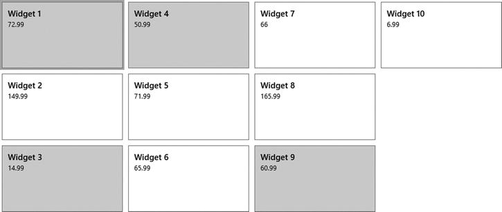
Figure 10-15. The featured items have been highlighted with a gray background
The lst1011.html file declares the products and discounts ListViews with their unique ID attributes. That ID attribute is important because it allows us to scope the styles that we will create to affect only the products list.
The first div in the products item template contains an attribute called data-win-bind in which we define (in bold) a property of the data bound item (isFeatured) and a property of the element (className). We are also implementing something called a converter which is certainly out of the scope of our subject. I wanted to bring it to your attention, however, so you don’t wonder how a property value of isFeatured turns into a class name such as widget featured.
The list binding that the lst1011.js file takes care of is also out of scope, but you’ve seen it a few times now, so perhaps you’ll pick up the syntax anyway. Nevertheless, the code is defining an array of widgets each of which has a property called isFeatured, where a Boolean value of true should indicate a featured product. That simple array is turned into a Binding.List so it can be bound to the ListView.
Finally, our lst1011.css file makes featured items actually stand out. It defines two style rules: one for items with the widget class and another for items with both the widget and the featured classes.
All widgets get the first rule applied, but only the featured ones get the extra background-color property that sets the background of the item to lightgray.
In the following example, let’s imagine that we find ourselves repeating some markup more than we’d like and so we decide to create a custom WinJS control to encapsulate it. The markup we’ve found to be repetitious is the fields of the address: address, city, state, and zip code. In our application we need to collect both the billing and shipping addresses.
WinJS not only provides a number of custom, composite controls for us to use, but allows us to create our own as well. We create the controls entirely in JavaScript and then declare them in our HTML identical to the way the built-in WinJS controls are declared. In my opinion, it’s a very elegant and powerful pattern.
From the consuming page (where we actually use this custom control), we need to still have access to the individual elements of the address control so that we could, for instance, add some CSS properties to the address field. And that’s exactly what we’ll do in this example. We’ll add a double border around the address in both controls to show that we have that capability. Listing 10-12 puts it all together and is followed by an explanation of each file.
Listing 10-12. The code for creating a custom WinJS control and declaring two of them very easily in the markup
<!-- lst1012.html -->
<!DOCTYPE html>
<html>
<head>
    <meta charset="utf-8" />
    <title>Listing 10-12</title>

    <!-- WinJS references -->
    <link href="//Microsoft.WinJS.1.0/css/ui-light.css" rel="stylesheet" />
    <script src="//Microsoft.WinJS.1.0/js/base.js"></script>
    <script src="//Microsoft.WinJS.1.0/js/ui.js"></script>

    <link href="lst1012.css" rel="stylesheet" />
    <script src="AddressControl.js"></script>
    <script src="lst1012.js"></script>
</head>
<body>
    <div class="lst1012 fragment">
        <section aria-label="Main content" role="main">
            <h3>Billing Address</h3>
            <div data-win-control="lst1012.Controls.Address"></div>

            <h3>Shipping Address</h3>
            <div data-win-control="lst1012.Controls.Address"></div>
        </section>
    </div>
</body>
</html>

/* lst1012.css */
.lst1012 .abc-address {
    background-color: lightgray;
}

// lst1012.js
(function () {
    "use strict";

    WinJS.UI.Pages.define("/pages/chapter10/lst1012/lst1012.html", {
        ready: function (element, options) {

        }
    });
})();

// AddressControl.js
WinJS.Namespace.define("lst1012.Controls", {
    Address: WinJS.Class.define(
        function (element) {
            element.innerHTML =
                "Address: <input class='abc-address ' style='width:300px;'/><br/>" +
                "City/St/Zip: <input class='abc-city '/><select class='abc-state '>
                <option></option><option>Alabama</option><option>Alaska</option>
                <option>...</option></select><input class='abc-zip ' style='width:80px;'/><br/>";
        }
    )
});
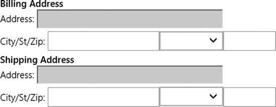
Figure 10-16. Both of the address fields have been styled as we determined, because the address fields were given a class name and the rules in our page’s style sheet have targeted that class
AddressControl.js
The AddressControl.js file does all the work of defining the custom address control, and we have complete control over the markup that it generates including the inclusion of class attributes (in bold) that can be used by the control consumer.
Those class attributes are the only thing you need to really pay attention to at this point, so if you’re putting off your JavaScript studies for now, you can skim the rest of the file. Note that I’ve simplified a custom control creation severely. A well-implemented custom control would certainly have a bit more to it.
In the lst1012.html file, you’ll notice the reference to the AddressControl.js file and the markup that references the control (in bold). I’ve manually declared two instances of the custom control here, but they could just as easily have been declared within the template of a ListView or otherwise added to the page dynamically.
Finally, a single and simple CSS rule in lst1012.css proves that we have access to the individual elements by adding a double border around the address field. If you are the author as well as the consumer of the custom control, then you’ll have no problem matching up class definitions (in your control’s JavaScript file) with the style definitions (in your CSS file). If you are using third-party controls, then discovering what elements and classes they define is a simple matter of using the DOM Explorer as I’ve already shown.
Summary
We’ve seen how to dive into the DOM and view the structure of its elements whether those elements were explicitly written by us or written by including a custom WinJS control. We learned, then, how to find the style rules from the WinJS library that are already applying to those elements.
Locating those elements and the style rules that are already targeting them is an essential first step in understanding how to override and extend those styles to give the app our own brand and personality.
Beyond overriding what’s there, we’re enabled to create our own elements and classes explicitly or by creating a custom control and then defining our own styles to control their appearance.
The examples in this chapter are a very small sampling of the unlimited number of ways that you can style the elements in your app. Keep in mind that you can use the same techniques to locate and override styles in other CSS libraries as well (we will talk about CSS libraries other than WinJS in Appendix A).