
3. Introduction to JavaFX
Swing has been around for a long time and some very powerful applications and frameworks are written with this library. One of those powerful applications is the NetBeans IDE, and one of those powerful frameworks is the NetBeans Platform. Just because these applications and frameworks are based on Swing, however, doesn’t mean you can’t or shouldn’t use JavaFX. Indeed, we hope that the material in this book will help you incorporate JavaFX into your NetBeans Platform applications, and by doing so, create rich client applications that both perform well and are beautiful.
We begin with a nice, gentle introduction to JavaFX. But rest assured, we ramp up the material quickly in this chapter. Obviously, we can’t cover everything you need to know about JavaFX here, but like the previous chapter’s presentation of Swing, we want to give you enough so that you’ll be comfortable reading and using JavaFX code in desktop applications.
In this chapter, you’ll learn the basics of JavaFX, its structure, and the philosophy of how JavaFX constructs a GUI. You’ll learn about different coding styles and discover the styles that best suit you and your development team. In the next chapter, we’ll show you how JavaFX fits into the world of desktop application development. We’ll also lay the groundwork for using JavaFX with the NetBeans Platform.
What You Will Learn
• Understand JavaFX basics.
• Build JavaFX programs and use JavaFX APIs.
• Build a scene graph with shapes, controls, and layout.
• Use FXML and controller classes.
• Incorporate CSS files into your JavaFX designs.
• Apply JavaFX animation and event handling.
• Understand JavaFX properties, observables, InvalidationListeners, and ChangeListeners.
• Understand and apply JavaFX binding.
3.1 What Is JavaFX?
If the NetBeans Platform is written with Swing for its GUI and I already know Swing, why should I learn and use JavaFX? This is a good question. Here are several reasons why.
• JavaFX provides a rich graphical user interface. While you can certainly provide rich content with Swing, JavaFX has the structure and APIs specifically for animation, 2D and 3D geometry, charts, special effects, color gradients, graphical controls, and easy manipulation of media, including audio, video, and images. The bottom line: you can create rich content a whole lot easier using JavaFX than with Swing and Java2D.
• JavaFX graphics rendering takes advantage of hardware-accelerated capabilities. This makes rendering graphics and animation perform well.
• You can embed JavaFX content within Swing panels with JFXPanel. The magic of this specialized Swing component lets you create sophisticated NetBeans Platform applications and include JavaFX rich content in your application windows. Furthermore, you can start using JavaFX without throwing away existing Swing applications.
A Bit of History
JavaFX began as a declarative scripting language (JavaFX Script) that was built on top of Java. While developers enjoyed the ease of a declarative script, it was difficult to integrate JavaFX Script with existing Swing applications. Furthermore, JavaFX Script required learning a new language.
JavaFX 2.0 was released in 2011 and is based on Java APIs. With Java 7, JavaFX is included in the standard release, and beginning with Java 8, which includes 3D capabilities with JavaFX 8, all JavaFX libraries (JAR files) are included in the standard classpath. This means that JavaFX is now part of the Java standard when you download the Java Development Kit (JDK).
While you can certainly use JavaFX APIs in the traditional Java coding style, JavaFX also provides FXML, a declarative XML markup language that describes the graphical components in your application. Scene Builder is a stand-alone application that generates FXML markup. With Scene Builder, you drag-and-drop controls and shapes to design the UI in a visual editor. These coding options make it easier to construct complicated UIs and work with user experience designers. You can also style your JavaFX application with CSS, a standard that is used and known by many designers. We’ll introduce FXML in this chapter and further explore FXML and Scene Builder in the next chapter.
The Scene Graph Metaphor
JavaFX programs with a graphical user interface define a stage and a scene within that stage. The stage represents the top-level container for all JavaFX objects; that is, the content area for the application’s window frame. The central metaphor in JavaFX for specifying graphics and user interface controls is a scene graph. A scene defines a hierarchical node structure that contains all of the scene’s elements. Nodes are graphical objects, such as geometric shapes (Circle, Rectangle, Text), UI controls (Button, TreeView, TextField, ImageView), layout panes (StackPane, AnchorPane), and 3D objects. Nodes can be containers (parent nodes) that in turn hold more nodes, letting you group nodes together. The scene graph is a strict hierarchical structure: you cannot add the same node instance to the graph more than once. Figure 3.1 shows the hierarchical structure of a JavaFX scene graph.
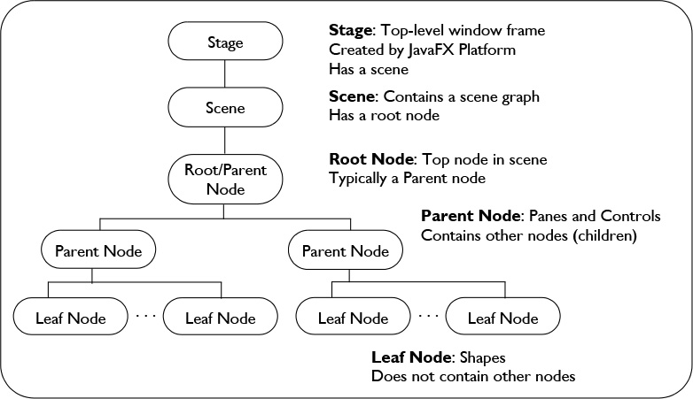
Parent nodes are nodes that contain other nodes, called children. A child node with no children nodes is a leaf node. With parent nodes, you can include Panes (layout containers) and Controls (buttons, table views, tree views, text fields, and so forth). You add a node to a parent with
myParent.getChildren().add(childNode);
or
myParent.getChildren().addAll(childNode1, childNode2);
The power of the JavaFX scene graph is that, not only do you define the visual aspect of your application in a hierarchical structure, but you can manipulate the scene by modifying node properties. And, if you manipulate a node property over time, you achieve animation. For example, moving a node means changing that node’s translateX and translateY properties over time (and translateZ if you’re working in 3D). Or, fading a node means changing that node’s opacity property over time. JavaFX properties are similar to the JavaBean properties we’ve already presented, but JavaFX properties are much more powerful. Applying these transformations to a node generally propagates to any of the node’s children as well.
Single-Threaded Model
Like Swing, JavaFX uses a single-threaded model. The JavaFX scene graph must be manipulated in the JavaFX Application Thread, a separate thread from Swing’s Event Dispatch Thread.1 Like Swing, working with a single-threaded UI is mostly transparent: events are sent and received on the JavaFX Application Thread. And like Swing, threading issues arise when you create tasks to execute on a background thread. The solutions to these common programming scenarios are similar.
1. There is experimental support in JDK 8 for making the EDT and JavaFX Application Thread (FXT) the same thread. Currently, this is not the default behavior. To run with a single EDT-FXT thread, supply runtime VM option -Djavafx.embed.singleThread=true.
How do JavaFX and Swing code co-exist? Will you be writing intertwined graphical spaghetti code? No, not at all. In this chapter you’ll learn about JavaFX without any Swing. Then when you learn how to integrate JavaFX into a NetBeans Platform application window, you’ll see how to keep the JavaFX code separate, cohesive, and highly modular. Both the NetBeans Platform architecture and JavaFX program structure make it easy to add and maintain JavaFX rich content.
3.2 Building JavaFX Programs
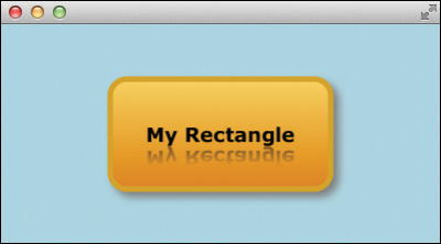
Let’s begin with a simple, graphical example of JavaFX shown Figure 3.2. This application consists of a rounded rectangle geometric shape and a text node. The rectangle has a drop shadow effect and the text node includes a “reflection” effect. The top-level node is a layout node (a StackPane) that stacks and centers its children nodes on top of each other. Let’s show you one way to build this program.
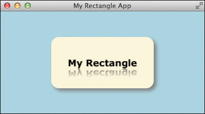
Figure 3.3 shows a diagram of the (partial) JavaFX class hierarchy for the Rectangle, Text, and StackPane classes used in the MyRectangleApp application. Rectangle, Text, and Circle (which we’ll use in a later example) are all subclasses of Shape, whereas StackPane is a subclass of Parent, a type of node that manages child nodes.

Creating a JavaFX Application
To build the MyRectangleApp application with the NetBeans IDE, use these steps.
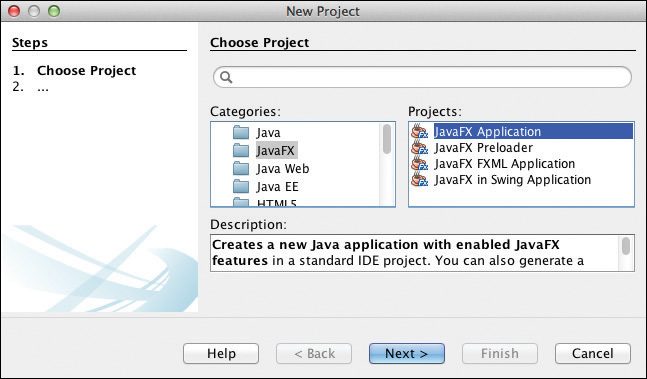
1. In the NetBeans IDE, select File | New Project. NetBeans displays the Choose Project dialog. Under Categories, select JavaFX and under Projects, select JavaFX Application, as shown in Figure 3.4. Click Next.
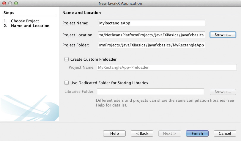
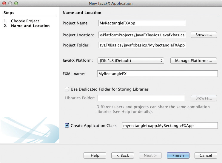
2. NetBeans displays the Name and Location dialog. Specify MyRectangleApp for the Project Name. Click Browse and navigate to the desired project location. Accept the defaults on the remaining fields and click Finish, as shown in Figure 3.5.
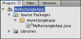
NetBeans builds a “starter” Hello World project for you with a Button and event handler. Figure 3.6 shows the project’s structure, Java file MyRectangleApp.java in package myrectangleapp. NetBeans brings MyRectangleApp.java up in the Java editor. Let’s replace the code in the start() method to build the application shown in Figure 3.2 on page 87.
Java APIs
JavaFX, like Swing, lets you create objects and configure them with setters. Here’s an example with a Rectangle shape.
Rectangle rectangle = new Rectangle(200, 100, Color.CORNSILK);
rectangle.setArcWidth(30);
rectangle.setArcHeight(30);
rectangle.setEffect(new DropShadow(10, 5, 5, Color.GRAY));
This code example creates a Rectangle with width 200, height 100, and color Color.CORNSILK. The setters configure the arcWidth and arcHeight properties (giving the rectangle a rounded appearance) and add a gray drop shadow effect.
Similarly, we create a Text object initialized with the text “My Rectangle.” The setters configure the Text’s font and effect properties with Font and Reflection objects, respectively.
Text text = new Text("My Rectangle");
text.setFont(new Font("Verdana Bold", 18));
text.setEffect(new Reflection());
The layout control is a StackPane for the top-level node. Here we use the StackPane’s default configuration, which centers its children, and specify a preferred height and width. Note that StackPane keeps its children centered when you resize the window. You add nodes to a layout control (a Pane) with getChildren().add() for a single node and getChildren().addAll() for multiple nodes, as shown here. (The getChildren() method returns a JavaFX Collection.)
StackPane stackPane = new StackPane();
stackPane.setPrefHeight(200);
stackPane.setPrefWidth(400);
stackPane.getChildren().addAll(rectangle, text);
Since the rectangle is added to the StackPane first, it appears behind the text node, which is on top. Adding these nodes in the reverse order would hide the text node behind the rectangle.
JavaFX has other layout controls including HBox (horizontal box), VBox (vertical box), GridPane, FlowPane, AnchorPane, and more.
Import and JavaFX
Be sure you specify the correct package for any import statements. Some JavaFX classes (such as Rectangle) have the same name as their AWT or Swing counterparts. All JavaFX classes are part of package javafx .
Listing 3.1 shows the complete source for program MyRectangleApp.
Listing 3.1 MyRectangleApp.java
package myrectangleapp;
import javafx.application.Application;
import javafx.scene.Scene;
import javafx.scene.effect.DropShadow;
import javafx.scene.layout.StackPane;
import javafx.scene.paint.Color;
import javafx.scene.shape.Rectangle;
import javafx.scene.text.Font;
import javafx.scene.text.Text;
import javafx.stage.Stage;
public class MyRectangleApp extends Application {
@Override
public void start(Stage primaryStage) {
Rectangle rectangle = new Rectangle(200, 100, Color.CORNSILK);
rectangle.setArcWidth(30);
rectangle.setArcHeight(30);
rectangle.setEffect(new DropShadow(10, 5, 5, Color.GRAY));
Text text = new Text("My Rectangle");
text.setFont(new Font("Verdana Bold", 18));
text.setEffect(new Reflection());
StackPane stackPane = new StackPane();
stackPane.setPrefHeight(200);
stackPane.setPrefWidth(400);
stackPane.getChildren().addAll(rectangle, text);
final Scene scene = new Scene(stackPane, Color.LIGHTBLUE);
primaryStage.setTitle("My Rectangle App");
primaryStage.setScene(scene);
primaryStage.show();
}
// main() is invoked when running the JavaFX application from NetBeans
// but is ignored when launched through JavaFX deployment (packaging)2
public static void main(String[] args) {
launch(args);
}
}
2. The NetBeans IDE packages your JavaFX Application for you when you Build and Run a JavaFX project. You can package a JavaFX application yourself using command line tool javafxpackager, which is found in the bin directory of your JavaFX SDK installation.
Figure 3.7 depicts the scene graph for program MyRectangleApp. Stage is the top-level window and is created by the JavaFX Platform. Every Stage has a Scene which contains a root node. In our example, the StackPane is the root node and its children include the Rectangle and the Text nodes. Note that StackPane is a parent node and Rectangle and Text are leaf nodes.

Using CSS
We’re not quite finished with our example. Figure 3.8 shows the same program with a linear gradient added to the rectangle. Originally, we built the rectangle with fill color Color.CORNSILK. Now let’s use CSS to configure the rectangle’s fill property with a linear gradient that gradually transforms from a light orange to a dark orange in a rich-looking fill, as shown in Figure 3.8.

(You’ll have to trust our description or run the program, since the book’s black and white print medium lacks color.)
To create this linear gradient, we apply a CSS style with the setStyle() method. This CSS specifies style element -fx-fill, which is the JavaFX-specific CSS style for a Shape’s fill property.
rectangle.setStyle("-fx-fill: "
+ "linear-gradient(#ffd65b, #e68400),"
+ "linear-gradient(#ffef84, #f2ba44),"
+ "linear-gradient(#ffea6a, #efaa22),"
+ "linear-gradient(#ffe657 0%, #f8c202 50%, #eea10b 100%),"
+ "linear-gradient(from 0% 0% to 15% 50%, "
+ "rgba(255,255,255,0.9), rgba(255,255,255,0));");
This style defines five linear gradient elements.3
3. We borrowed this awesome five-part linear gradient from Jasper Potts’ style “Shiny Orange” published on fxexperience.com (December 20, 2011).
JavaFX and CSS
There are other ways to apply CSS to nodes. One of the most common is importing a CSS file. Indeed, all JavaFX controls have standard styles that you can access in the runtime JAR file jfxrt.jar. The default JavaFX CSS style in JavaFX 8 is Modena, found in file modena.css. We’ll show you how to apply a CSS file to your JavaFX scene shortly.
The ability to style nodes with CSS is an important feature that allows graphic designers to participate in styling the look of a program. You can replace any or all of the styles in the JavaFX default CSS file and add your own on top of the default styles.
Creating a JavaFX FXML Application
A helpful structural tool with JavaFX is to specify JavaFX scene graph nodes with FXML. FXML is an XML markup language that fits nicely with the hierarchical nature of a scene graph. FXML helps you visualize scene graph structures and lends itself to easier modification that can otherwise be tedious with Java code.
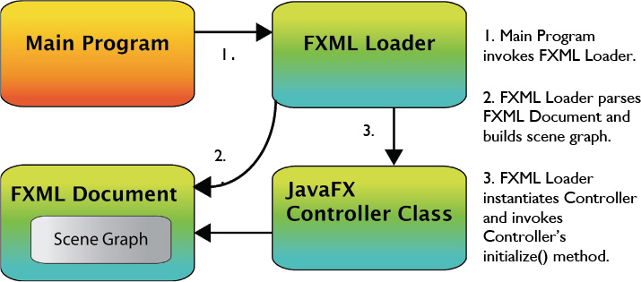
FXML typically requires three files: the program’s main Java file, the FXML file, and a Java controller class for the FXML file. The main Java class uses an FXML Loader to create the Stage and Scene. The FXML Loader reads the FXML file and builds the scene graph. The controller class provides JavaFX node initialization code and accesses the scene graph programmatically to create dynamic content or handle events.
Let’s redo our previous application and show you how to use FXML. You can create a JavaFX FXML Application with the NetBeans IDE using these steps.
1. From the top-level menu, select File | New Project. NetBeans displays the Choose Project dialog. Under Categories, select JavaFX and under Projects, select JavaFX FXML Application, as shown in Figure 3.9. Click Next.

2. NetBeans displays the Name and Location dialog. Provide MyRectangleFXApp for the Project Name, click Browse to select the desired location, and specify MyRectangleFX for the FXML document name, as shown in Figure 3.10. Click Finish.
NetBeans creates a project consisting of three source files: MyRectangleFXApp.java (the main program), MyRectangleFX.fxml (the FXML document), and MyRectangleFXController.java (the controller class).
Listing 3.2 shows the structure of the new main program. Note that the FXML Loader reads in the FXML file, MyRectangleFX.fxml, and builds the scene graph.
Listing 3.2 MyRectangleFXApp.java
package myrectanglefxapp;
import javafx.application.Application;
import javafx.fxml.FXMLLoader;
import javafx.scene.Parent;
import javafx.scene.Scene;
import javafx.scene.paint.Color;
import javafx.stage.Stage;
public class MyRectangleFXApp extends Application {
@Override
public void start(Stage stage) throws Exception {
Parent root = FXMLLoader.load(getClass().getResource(
"MyRectangleFX.fxml"));
Scene scene = new Scene(root, Color.LIGHTBLUE);
stage.setScene(scene);
stage.show();
}
public static void main(String[] args) {
launch(args);
}
}
Figure 3.11 shows the structure of a JavaFX FXML Application. Execution begins with the main program, which invokes the FXML Loader. The FXML Loader parses the FXML document, instantiates the objects, and builds the scene graph. After building the scene graph, the FXML Loader instantiates the controller class and invokes the controller’s initialize() method.
Now let’s look at the FXML markup for this application, as shown in Listing 3.3. Each FXML file is associated with a controller class, specified with the fx:controller attribute (marked in bold). With XML markup, you see that the structure of the FXML matches the hierarchical layout depicted in Figure 3.7 on page 92 (that is, starting with the root node, StackPane). The StackPane is the top node and its children are the Rectangle and Text nodes. The Rectangle’s properties are configured with property names and values that are converted to the correct types. The style property matches element -fx-fill we showed you earlier. (Fortunately, you can break up strings across lines in CSS.)
Both the Rectangle and Text elements have their effect properties configured. The Rectangle has a drop shadow and the Text element has a reflection effect.
Object Creation with FXML
Each element that you specify in the FXML file is instantiated. Thus, you will not have Java code that creates the StackPane, Rectangle, Text, Font, DropShadow, or Reflection objects. The FXML Loader creates these objects for you.
Listing 3.3 MyRectangleFX.fxml
<?xml version="1.0" encoding="UTF-8"?>
<?import java.lang.*?>
<?import java.util.*?>
<?import javafx.scene.*?>
<?import javafx.scene.control.*?>
<?import javafx.scene.layout.*?>
<?import javafx.scene.shape.*?>
<?import javafx.scene.text.*?>
<?import javafx.scene.effect.*?>
<StackPane id="StackPane" prefHeight="200" prefWidth="400"
xmlns:fx="http://javafx.com/fxml"
fx:controller="myrectanglefxapp.MyRectangleFXController">
<children>
<Rectangle fx:id="rectangle" width="200" height="100"
arcWidth="30" arcHeight="30"
style="-fx-fill: linear-gradient(#ffd65b, #e68400),
linear-gradient(#ffef84, #f2ba44),
linear-gradient(#ffea6a, #efaa22),
linear-gradient(#ffe657 0%, #f8c202 50%, #eea10b 100%),
linear-gradient(from 0% 0% to 15% 50%, rgba(255,255,255,0.9),
rgba(255,255,255,0));" >
<effect>
<DropShadow color="GRAY" offsetX="5.0" offsetY="5.0" />
</effect>
</Rectangle>
<Text text="My Rectangle">
<effect>
<Reflection />
</effect>
<font>
<Font name="Verdana Bold" size="18.0" />
</font>
</Text>
</children>
</StackPane>
To access FXML elements from the controller class, give them an fx-id tag. Here, we’ve assigned the Rectangle element fx:id="rectangle" (marked in bold). This references a class variable that you declare in the controller class.
FXML and Controller Class
Name the controller class the same name as the FXML file with Controller appended to it. This is not required but helps identify the link between the FXML file and its controller class.
Now let’s show you the controller class. Listing 3.4 displays the source for MyRectangleFXController.java.
Annotation @FXML marks variable rectangle as an FXML-defined object. The initialize() method is invoked after the scene graph is built and typically includes any required initialization code. Here we configure two additional Rectangle properties, strokeWidth and stroke. While we could have configured these properties in the FXML file, Listing 3.4 shows you how to access FXML-defined elements in the controller class.
Listing 3.4 MyRectangleFXController
package myrectanglefxapp;
import java.net.URL;
import java.util.ResourceBundle;
import javafx.fxml.FXML;
import javafx.fxml.Initializable;
import javafx.scene.paint.Color;
import javafx.scene.shape.Rectangle;
public class MyRectangleFXController implements Initializable {
@FXML
private Rectangle rectangle;
@Override
public void initialize(URL url, ResourceBundle rb) {
rectangle.setStrokeWidth(5.0);
rectangle.setStroke(Color.GOLDENROD);
}
}
The controller class also includes event handlers (we’ll add an event handler when we show you animation). Figure 3.12 shows MyRectangleFXApp running with the Rectangle’s stroke and strokeWidth properties configured.
CSS Files
Instead of specifying the hideously long linear gradient style in the FXML file (see Listing 3.3 on page 96), let’s hide this code in a CSS file and apply it to the scene graph.
You can specify a CSS file either directly in the FXML file or in the main program. To specify a CSS file in the main program, add a call to scene.getStylesheets(), as shown in Listing 3.5.
Listing 3.5 Adding a CSS Style Sheet in the Main Program
package myrectanglefxapp;
import javafx.application.Application;
import javafx.fxml.FXMLLoader;
import javafx.scene.Parent;
import javafx.scene.Scene;
import javafx.scene.paint.Color;
import javafx.stage.Stage;
public class MyRectangleFXApp extends Application {
@Override
public void start(Stage stage) throws Exception {
Parent root = FXMLLoader.load(getClass().getResource(
"MyRectangleFX.fxml"));
Scene scene = new Scene(root, Color.LIGHTBLUE);
scene.getStylesheets().add("myrectanglefxapp/MyCSS.css");
stage.setScene(scene);
stage.show();
}
public static void main(String[] args) {
launch(args);
}
}
It’s also possible to specify the style sheet in FXML, as shown in Listing 3.6. Note that you must include java.net.* to define element URL.
Listing 3.6 MyRectangleFX.fxml—Adding a Style Sheet
<?import java.lang.*?>
<?import java.net.*?>
<?import java.util.*?>
<?import javafx.scene.*?>
<?import javafx.scene.control.*?>
<?import javafx.scene.layout.*?>
<?import javafx.scene.shape.*?>
<?import javafx.scene.text.*?>
<?import javafx.scene.effect.*?>
<StackPane id="StackPane" fx:id="stackpane" prefHeight="200" prefWidth="400"
xmlns:fx="http://javafx.com/fxml"
fx:controller="myrectanglefxapp.MyRectangleFXController">
<stylesheets>
<URL value="@MyCSS.css" />
</stylesheets>
<children>
<Rectangle id="myrectangle" fx:id="rectangle" width="200" height="100"
arcWidth="30" arcHeight="30"
onMouseClicked="#handleMouseClick" />
<Text text="My Rectangle">
<effect>
<Reflection />
</effect>
<font>
<Font name="Verdana Bold" size="18.0" />
</font>
</Text>
</children>
</StackPane>
Before we show you the MyCSS.css file, take a look at the Rectangle element in Listing 3.6. It’s much shorter now since the FXML no longer includes the style or effect property values. The FXML does, however, contain a property id value. This id attribute identifies the node for the CSS style definition.
We’ve also defined an event handler for a mouse clicked event in the Rectangle FXML (#handleMouseClick). The onMouseClicked attribute lets you wire an event handler with an FXML component. The mouse clicked event handler is invoked when the user clicks inside the Rectangle. (We’ll show you the updated controller class in the next section.)
Finally, as shown in Listing 3.6, we modified the StackPane to include element fx:id="stackpane" so we can refer to the StackPane in the controller code.
Listing 3.7 shows the CSS file MyCSS.css, which defines a style specifically for the component with id “myrectangle.”
#myrectangle {
-fx-fill:
linear-gradient(#ffd65b, #e68400),
linear-gradient(#ffef84, #f2ba44),
linear-gradient(#ffea6a, #efaa22),
linear-gradient(#ffe657 0%, #f8c202 50%, #eea10b 100%),
linear-gradient(from 0% 0% to 15% 50%, rgba(255,255,255,0.9),
rgba(255,255,255,0));
-fx-effect: dropshadow( three-pass-box, gray , 10 , 0 , 5.0 , 5.0 );
}
Animation
You don’t actually think we’d introduce JavaFX and not show some animation, do you? As it turns out, animation with JavaFX is easy when you use the high-level animation APIs called transitions.
For our example, let’s rotate the Rectangle node 180 degrees (and back to 0) twice. The animation begins when the user clicks inside the rectangle. Figure 3.13 shows the rectangle during the transition (on the right). We rotate both the Rectangle and the Text.
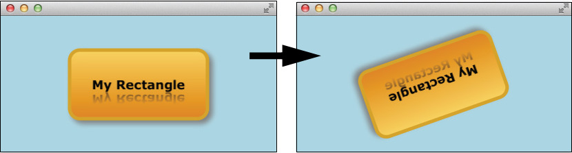
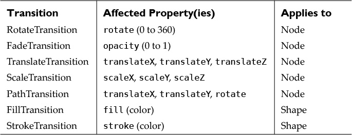
Each JavaFX Transition type controls one or more Node (or Shape) properties, as listed in Table 3.1. The RotateTransition controls a node’s rotate property. The FadeTransition controls a node’s opacity property. The TranslateTransition controls a node’s translateX and translateY properties (and translateZ if you’re working in 3D). Other transitions include PathTransition (animates a node along a Path), FillTransition (animates a shape’s fill property), StrokeTransition (animates a shape’s stroke property), and ScaleTransition (grows or shrinks a node over time).
You can play multiple transitions in parallel (ParallelTransition) or sequentially (SequentialTransition). It’s also possible to control timing between two sequential transitions with a pause (PauseTransition), configure a delay before a transition begins (with Transition method setDelay()), or define an action at the completion of a Transition (with Transition action event handler property onFinished).
You start a transition with method play() or playFromStart(). Method play() initiates a transition at its current time; method playFromStart() starts the transition at time 0. Other methods include stop() and pause(). You can query a transition’s status with getStatus(), which returns one of the Animation.Status enum values RUNNING, PAUSED, or STOPPED.
Since transitions are specialized, you configure each one slightly differently. However, all transitions support the common properties duration, autoReverse, cycleCount, onFinished, currentTime, and either node or shape (for Shape-specific transitions FillTransition and StrokeTransition).
Listing 3.8 shows the modifications to the controller class to implement the RotateTransition and mouse click event handler. We instantiate the RotateTransition rt inside method initialize(). In order to rotate both the Rectangle and the Text together, we specify a rotation for the parent StackPane node, which then rotates its children together (the Rectangle and the Text). Then, inside the event handler we initiate the animation with method play().
The @FXML annotation applies to variables stackpane and rectangle, as well as method handleMouseClick(), in order to correctly wire these objects to the FXML markup.
Listing 3.8 MyRectangleFXController.java—RotateTransition
package myrectanglefxapp;
import java.net.URL;
import java.util.ResourceBundle;
import javafx.fxml.FXML;
import javafx.fxml.Initializable;
import javafx.scene.input.MouseEvent;
import javafx.scene.paint.Color;
import javafx.scene.shape.Rectangle;
import javafx.util.Duration;
public class MyRectangleFXController implements Initializable {
private RotateTransition rt;
@FXML
private Rectangle rectangle;
@FXML
private StackPane stackpane;
@FXML
private void handleMouseClick(MouseEvent evt) {
rt.play();
}
@Override
public void initialize(URL url, ResourceBundle rb) {
rectangle.setStrokeWidth(5.0);
rectangle.setStroke(Color.GOLDENROD);
// Create and configure RotateTransition rt
rt = new RotateTransition(Duration.millis(3000), stackpane);
rt.setToAngle(180);
rt.setFromAngle(0);
rt.setAutoReverse(true);
rt.setCycleCount(4);
}
}
The RotateTransition lets you specify either a “to” angle or “by” angle value. If you omit a starting position (property fromAngle), the rotation uses the node’s current rotation property value as the starting rotation angle. Here we set autoReverse to true, which makes the StackPane rotate from angle 0 to 180 and then back again. We set cycle count to four to repeat the back and forth animation twice (back and forth counts as two cycles).
3.3 JavaFX Properties
The previous sections make frequent references to JavaFX properties. We said that JavaFX properties are similar to JavaBean properties, but JavaFX properties are much more powerful. Clearly, JavaFX properties have considerable significance in JavaFX applications. In fact, JavaFX properties are perhaps the most significant feature in JavaFX. In this section, we’ll explore JavaFX properties in detail and show you how to use them.
What Is a JavaFX Property?
At the heart of JavaFX is its scene graph, a structure that includes (perhaps many) nodes. The JavaFX rendering engine displays these nodes and ultimately what you see depends on the properties of these nodes.
Properties are oh-so-important. They make a Circle red or a Rectangle 200 pixels wide. They determine the gradient for a fill color or whether or not a text node includes reflection or a drop shadow effect. You manipulate nodes with layout controls—which are themselves nodes—by setting properties such as spacing or alignment. When your application includes animation, JavaFX updates a node’s properties over time—perhaps a node’s position, its rotation, or its opacity. In the previous sections, you’ve seen how our example applications are affected by the properties that the code manipulates.
The previous chapter describes how JavaBean properties support encapsulation and a well-defined naming convention. You can create read-write properties, read-only properties, and immutable properties. We also show how to create bound properties—properties that fire property change events to registered listeners. Let’s learn how these concepts apply to JavaFX properties.
JavaFX properties support the same naming conventions as JavaBeans properties. For example, the radius of a Circle (a JavaFX Shape) is determined by its radius property. Here, we manipulate the radius property with setters and getters.
Circle circle1 = new Circle(10.5);
System.out.println("Circle1 radius = " + circle1.getRadius());
circle1.setRadius(20.5);
System.out.println("Circle1 radius = " + circle1.getRadius());
This displays the following output.
Circle1 radius = 10.5
Circle1 radius = 20.5
You access a JavaFX property with property getter method. A property getter consists of the property name followed by the word “Property.” Thus, to access the JavaFX radius property for circle1 we use the radiusProperty() method. Here, we print the radius property
System.out.println(circle1.radiusProperty());
which displays
DoubleProperty [bean: Circle[centerX=0.0, centerY=0.0, radius=20.5,
fill=0x000000ff], name: radius, value: 20.5]
Typically, each JavaFX property holds metadata, including its value, the property name, and the bean that contains it. We can access this metadata individually with property methods getValue(), getName(), and getBean(), as shown in Listing 3.9. You can also access a property’s value with get().
Listing 3.9 Accessing JavaFX Property Metadata
System.out.println("circle1 radius property value: "
+ circle1.radiusProperty().getValue());
System.out.println("circle1 radius property name: "
+ circle1.radiusProperty().getName());
System.out.println("circle1 radius property bean: "
+ circle1.radiusProperty().getBean());
System.out.println("circle1 radius property value: "
+ circle1.radiusProperty().get());
Output:
circle1 radius property value: 20.5
circle1 radius property name: radius
circle1 radius property bean: Circle@243e0b62
circle1 radius property value: 20.5
Using Listeners with Observable Properties
All JavaFX properties are Observable. This means that when a property’s value becomes invalid or changes, the property notifies its registered InvalidationListeners or ChangeListeners. (There are differences between invalidation and change, which we’ll discuss shortly.) You register listeners directly with a JavaFX property. Let’s show you how this works by registering an InvalidationListener with a Circle’s radius property. Since our example does not build a scene graph, we’ll create a plain Java application (called MyInvalidationListener) using these steps.
1. From the top-level menu in the NetBeans IDE, select File | New Project. NetBeans displays the Choose Project dialog. Under Categories, select Java and under Projects, select Java Application, as shown in Figure 3.14. Click Next.
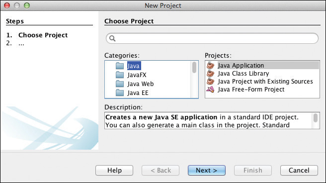
2. NetBeans displays the Name and Location dialog. Provide MyInvalidationListener for the Project Name, and click Browse to select the desired location, as shown in Figure 3.15. Click Finish.

Using InvalidationListeners
Listing 3.10 creates two Circle objects and registers an InvalidationListener with the radius property of circle2. Inside the event handler, the invalidated() method sets the radius property of circle1 with circle2’s new value. Essentially, we are saying “make sure the radius property of circle1 is always the same as the radius property of circle2.”
A registered InvalidationListener is notified when the current value is no longer valid.4 Invalidation events supply the observable value, which is the JavaFX property including the metadata. If you don’t need to access the previous value, listening for invalidation events instead of change events (discussed next) can be more efficient.
4. You can also use a lambda expression in place of the anonymous inner class in Listing 3.10. However, here we’re leaving in the InvalidationListener with the invalidated() method for clarity. Later in the chapter we’ll show you how to use lambda expressions.
Listing 3.10 Registering a JavaFX InvalidationListener
package myinvalidationlistener;
import javafx.beans.InvalidationListener;
import javafx.beans.Observable;
import javafx.scene.shape.Circle;
public class MyInvalidationListener {
public static void main(String[] args) {
// Define some circles
final Circle circle1 = new Circle(10.5);
final Circle circle2 = new Circle(15.5);
// Add an invalidation listener to circle2's radius property
circle2.radiusProperty().addListener(new InvalidationListener() {
@Override
public void invalidated(Observable o) {
System.out.println("Invalidation detected for " + o);
circle1.setRadius(circle2.getRadius());
}
});
System.out.println("Circle1: " + circle1.getRadius());
System.out.println("Circle2: " + circle2.getRadius());
circle2.setRadius(20.5);
System.out.println("Circle1: " + circle1.getRadius());
System.out.println("Circle2: " + circle2.getRadius());
}
}
Output:
Circle1: 10.5
Circle2: 15.5
Invalidation detected for DoubleProperty [bean: Circle[centerX=0.0,
centerY=0.0, radius=20.5, fill=0x000000ff], name: radius, value: 20.5]
Circle1: 20.5
Circle2: 20.5
The output shows the original radius values for both Circles (10.5 and 15.5), the invalidation event handler output, and the updated radius property for both Circles. The getRadius() method displays the value of the radius property. You can also use radiusProperty().get() or radiusProperty().getValue(), but the traditionally named getRadius() is more familiar and more efficient.
Note that with InvalidationListeners, you must cast the non-generic Observable o to ObservableValue<Number> to access the new value in the event handler.
System.out.println("new value = " +
((ObservableValue<Number>) o).getValue().doubleValue());
Using ChangeListeners
Listing 3.11 shows the same program with a ChangeListener instead of an InvalidationListener attached to circle2’s radius property (project MyChangeListener). ChangeListener is generic and you override the changed() method.
The event handler’s signature includes the generic observable value (ov), the observable value’s old value (oldValue), and the observable value’s new value (newValue). The new and old values are the property values (here, Number objects) without the JavaFX property metadata. Inside the changed() method, we set circle1’s radius property with the setRadius(newValue.doubleValue()) method. Because ChangeListeners are generic, you can access the event handler parameters without type casts.
Listing 3.11 Registering a JavaFX Property ChangeListener
package mychangelistener;
import javafx.beans.value.ChangeListener;
import javafx.beans.value.ObservableValue;
import javafx.scene.shape.Circle;
public class MyChangeListener {
public static void main(String[] args) {
// Define some circles
final Circle circle1 = new Circle(10.5);
final Circle circle2 = new Circle(15.5);
// Use change listener to track changes to circle2's radius property
circle2.radiusProperty().addListener(new ChangeListener<Number>() {
@Override
public void changed(ObservableValue<? extends Number> ov,
Number oldValue, Number newValue) {
System.out.println("Change detected for " + ov);
circle1.setRadius(newValue.doubleValue());
}
});
System.out.println("Circle1: " + circle1.getRadius());
System.out.println("Circle2: " + circle2.getRadius());
circle2.setRadius(20.5);
System.out.println("Circle1: " + circle1.getRadius());
System.out.println("Circle2: " + circle2.getRadius());
}
}
Output:
Circle1: 10.5
Circle2: 15.5
Change detected for DoubleProperty [bean: Circle[centerX=0.0, centerY=0.0,
radius=20.5, fill=0x000000ff], name: radius, value: 20.5]
Circle1: 20.5
Circle2: 20.5
The output of the MyChangeListener program is similar to the InvalidationListener output in Listing 3.10.5 Note that ChangeListeners make it possible to access the old value of a changed property and generics mean casting is not needed.
5. Again, a lambda expression can replace the anonymous inner class in Listing 3.11. We’re leaving in the ChangeListener with its changed() method here for clarity.
Read-Only Properties
JavaFX also supports read-only properties. Although you cannot modify read-only properties directly with setters, the value of a read-only property can change. A typical use of a read-only property is with a bean that maintains a property’s value internally. For example, the currentTime property of an Animation object (a Transition or a Timeline) is read only. You can read its value with getCurrentTime() and access the property with currentTimeProperty(), but you can’t update its value with a setter.
Since read-only properties change and are observable, you can listen for change and invalidation events, just as you can with read-write properties. You can also use read-only (as well as read-write) JavaFX properties in binding expressions, which we discuss next.
Binding
There may be situations where you need to define a ChangeListener and register it with an object’s property to monitor its old and new values. However, in many cases, the reason you’d like to track property changes is to update another object with a new value (as we did in Listing 3.10 on page 106 and Listing 3.11 on page 108).
A JavaFX feature called binding addresses this use case. Because JavaFX properties are observable, they can participate in binding expressions. Binding means that you specify a JavaFX property as dependent on another JavaFX property’s value. Binding expressions can be simple, or they can involve many properties in a cascade of property updates initiated perhaps by just one property changing its value (a program’s butterfly effect). Binding is a powerful feature in JavaFX that lets you succinctly express dependencies among object properties in applications without defining or registering listeners. Let’s look at some examples.
Unidirectional Binding
To bind one JavaFX property to another, use method bind() with a JavaFX property.
circle1.radiusProperty().bind(circle2.radiusProperty());
This binding expression states that circle1’s radius property will always have the same value as circle2’s radius property. We say that circle1’s radius property is dependent on circle2’s radius property. This binding is one way; only circle1’s radius property updates when circle2’s radius property changes and not vice versa.
Binding expressions include an implicit assignment. That is, when we bind the circle1 radius property to circle2’s radius property, the update to circle1’s radius property occurs when the bind() method is invoked.
When you bind a property, you cannot change that property’s value with a setter.
circle1.setRadius(someValue); // can't do this
There are some restrictions with binding. Attempting to define a circular binding results in a stack overflow. Attempting to set a bound property results in a runtime exception.
java.lang.RuntimeException: A bound value cannot be set.
Let’s show you an example program with binding now. Listing 3.12 defines two Circle objects, circle1 and circle2. This time, instead of an InvalidationListener or ChangeListener that tracks changes to circle2 and then updates circle1, we bind circle1’s radius property to circle2’s radius property.
Listing 3.12 Unidirectional Bind—MyBind.java
package asgteach.bindings;
import javafx.scene.shape.Circle;
public class MyBind {
public static void main(String[] args) {
Circle circle1 = new Circle(10.5);
Circle circle2 = new Circle(15.5);
System.out.println("Circle1: " + circle1.getRadius());
System.out.println("Circle2: " + circle2.getRadius());
// Bind circle1 radius to circle2 radius
circle1.radiusProperty().bind(circle2.radiusProperty());
if (circle1.radiusProperty().isBound()) {
System.out.println("Circle1 radiusProperty is bound");
}
// Radius properties are now the same
System.out.println("Circle1: " + circle1.getRadius());
System.out.println("Circle2: " + circle2.getRadius());
// Both radius properties will now update
circle2.setRadius(20.5);
System.out.println("Circle1: " + circle1.getRadius());
System.out.println("Circle2: " + circle2.getRadius());
// circle1 radius no longer bound to circle2 radius
circle1.radiusProperty().unbind();
if (!circle1.radiusProperty().isBound()) {
System.out.println("Circle1 radiusProperty is unbound");
}
// Radius properties are now no longer the same
circle2.setRadius(30.5);
System.out.println("Circle1: " + circle1.getRadius());
System.out.println("Circle2: " + circle2.getRadius());
}
}
Output:
Circle1: 10.5
Circle2: 15.5
Circle1 radiusProperty is bound
Circle1: 15.5
Circle2: 15.5
Circle1: 20.5
Circle2: 20.5
Circle1 radiusProperty is unbound
Circle1: 20.5
Circle2: 30.5
In this example, the Circle objects are initialized with different values, which are displayed. We then bind circle1’s radius property to circle2’s radius property and display the radius values again. With the bind’s implicit assignment, the circle radius values are now the same (15.5). When the setter changes circle2’s radius to 20.5, circle1’s radius updates.
The isBound() method checks if a JavaFX property is bound and the unbind() method removes the binding on a JavaFX property. Note that after unbinding circle1’s radius property, updating circle2’s radius no longer affects the radius for circle1.
Bidirectional Binding
Bidirectional binding lets you specify a binding with two JavaFX properties that update in both directions. Whenever either property changes, the other property updates. Note that setters for both properties always work with bidirectional binding (after all, you have to update the values somehow).
Bidirectional binding is particularly suited for keeping UI view components synchronized with model data. If the model changes, the view automatically refreshes. And if the user inputs new data in a form, the model updates.
Bidirectional Binding Is Not Symmetrical
Initially, both properties take on the value of the property specified in bindBidirectional() method’s argument. Thus, bidirectional binding is not symmetrical; the order that you specify the binding affects the bound properties’ initial value.
Listing 3.13 shows how to use JavaFX property method bindBidirectional(). After objects circle1 and circle2 have their radius properties bound, both properties acquire value 15.5 (circle2’s radius property value), and a change to either one updates the other. Note that setters update the radius property values.
You can also unbind the properties with method unbindBidirectional().
Listing 3.13 Bidirectional Binding—MyBindBidirectional.java
package asgteach.bindings;
import javafx.scene.shape.Circle;
public class MyBindBidirectional {
public static void main(String[] args) {
Circle circle1 = new Circle(10.5);
Circle circle2 = new Circle(15.5);
// circle1 takes on value of circle2 radius
circle1.radiusProperty().bindBidirectional(circle2.radiusProperty());
System.out.println("Circle1: " + circle1.getRadius());
System.out.println("Circle2: " + circle2.getRadius());
circle2.setRadius(20.5);
// Both circles are now 20.5
System.out.println("Circle1: " + circle1.getRadius());
System.out.println("Circle2: " + circle2.getRadius());
circle1.setRadius(30.5);
// Both circles are now 30.5
System.out.println("Circle1: " + circle1.getRadius());
System.out.println("Circle2: " + circle2.getRadius());
circle1.radiusProperty().unbindBidirectional(circle2.radiusProperty());
}
}
Output:
Circle1: 15.5
Circle2: 15.5
Circle1: 20.5
Circle2: 20.5
Circle1: 30.5
Circle2: 30.5
Fluent API and Bindings API
Method bind() works well with JavaFX properties that are the same type. You bind one property to a second property. When the second property changes, the first one’s value gets updated automatically.
However, in many cases, a property’s value will be dependent on another property that you have to manipulate in some way. Or, a property’s value may need to update when more than one property changes. JavaFX has a Fluent API that helps you construct binding expressions for these more complicated relationships.
The Fluent API includes methods for common arithmetic operations, such as add(), subtract(), divide(), and multiply(), boolean expressions, negate(), and conversion to String with asString(). You can use these Fluent API methods with binding expressions. Their arguments are other properties or non-JavaFX property values.
Here’s an example that displays a temperature in both Celsius and Fahrenheit using the conversion formula in a binding expression for the Fahrenheit label.
// Suppose you had a "temperature" object
Temperature myTemperature = new Temperature(0);
// Create two labels
Label labelF = new Label();
Label labelC = new Label();
// Bind the labelC textProperty to the Temperature celsiusProperty
labelC.textProperty().bind(myTemperature.celsiusProperty().asString()
.concat(" C"));
// Bind the labelF textProperty to the Temperature celsiusProperty
// using F = 9/5 C + 32
labelF.textProperty().bind(myTemperature.celsiusProperty().multiply(9)
.divide(5).add(32)
.asString().concat(" F"));
Another common use for binding is enabling and disabling a control based on some condition. Here we bind the disable property of a button based on the status of an animation. If the animation is running, the button is disabled.
// Bind button's disableProperty to myTransition running or not
startButton.disableProperty().bind(myTransition.statusProperty()
.isEqualTo(Animation.Status.RUNNING));
The Bindings API offers additional flexibility in building binding expressions. The Bindings class has static methods that let you manipulate observable values. For example, here’s how to implement the Fahrenheit temperature conversion using the Bindings API.
labelF.textProperty().bind(
Bindings.format(" %1.1f F",
Bindings.add(
Bindings.divide(
Bindings.multiply(9, myTemperature.celsiusProperty()),
5), 32)));
Because the Bindings API requires that you build your expression “inside-out,” the expression may not be as readable as the Fluent API. However, the Bindings methods are useful, particularly for formatting the result of binding expressions. The above Bindings.format() gives you the same flexibility as java.util.Formatter for creating a format String. You can also combine the Bindings API with the Fluent API.
Let’s look at another example of using the Fluent API. Figure 3.16 shows an application with a Rectangle. As you resize the window, the Rectangle grows and shrinks. The opacity of the Rectangle also changes when you resize. As the window gets larger, the rectangle gets more opaque, making it appear brighter since less of the dark background is visible through a less-transparent rectangle.
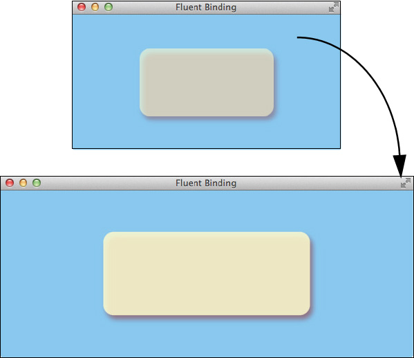
Listing 3.14 shows the code for this application (project MyFluentBind). Constructors create the drop shadow, stack pane, and rectangle, and setters configure them. To provide dynamic resizing of the rectangle, we bind the rectangle’s width property to the scene’s width property divided by two. Similarly, we bind the rectangle’s height property to the scene’s height property divided by two. (Dividing by two keeps the rectangle centered in the window.)
The rectangle’s opacity is a bit trickier. The opacity property is a double between 0 and 1, with 1 being fully opaque and 0 being completely transparent (invisible). So we rather arbitrarily add the scene’s height and width together and divide by 1000 to keep the opacity within the target range of 0 and 1. This makes the opacity change as the rectangle resizes.
Listing 3.14 Fluent API—MyFluentBind.java
package asgteach.bindings;
import javafx.application.Application;
import javafx.geometry.Pos;
import javafx.scene.Scene;
import javafx.scene.effect.DropShadow;
import javafx.scene.layout.StackPane;
import javafx.scene.paint.Color;
import javafx.scene.shape.Rectangle;
import javafx.stage.Stage;
public class MyFluentBind extends Application {
@Override
public void start(Stage stage) {
DropShadow dropShadow = new DropShadow(10.0,
Color.rgb(150, 50, 50, .688));
dropShadow.setOffsetX(4);
dropShadow.setOffsetY(6);
StackPane stackPane = new StackPane();
stackPane.setAlignment(Pos.CENTER);
stackPane.setEffect(dropShadow);
Rectangle rectangle = new Rectangle(100, 50, Color.LEMONCHIFFON);
rectangle.setArcWidth(30);
rectangle.setArcHeight(30);
stackPane.getChildren().add(rectangle);
Scene scene = new Scene(stackPane, 400, 200, Color.LIGHTSKYBLUE);
stage.setTitle("Fluent Binding");
rectangle.widthProperty().bind(scene.widthProperty().divide(2));
rectangle.heightProperty().bind(scene.heightProperty().divide(2));
rectangle.opacityProperty().bind(
scene.widthProperty().add(scene.heightProperty())
.divide(1000));
stage.setScene(scene);
stage.show();
}
public static void main(String[] args) {
launch();
}
}
Custom Binding
When the Fluent API or Bindings API does not apply to your application, you can create a custom binding object. With custom binding, you specify two items:
• the JavaFX property dependencies
• how to compute the desired value.
Let’s rewrite the previous example and create a custom binding object.
First, here is the binding expression presented earlier for the rectangle’s opacity property.
rectangle.opacityProperty().bind(
scene.widthProperty().add(scene.heightProperty())
.divide(1000));
The binding has two JavaFX property dependencies: the scene’s width and height properties.
Next, determine how to compute the value with this binding expression. Without using the Fluent API or the Bindings API, the computation (which results in a double value) is
double myComputedValue = (scene.getWidth() + scene.getHeight()) / 1000;
That is, the opacity’s value is a double that is the sum of the scene’s width and height divided by 1000.
For this example, the custom binding object is type DoubleBinding. You specify the JavaFX property dependencies as arguments in the binding object’s anonymous constructor using super.bind(). The overridden computeValue() method returns the desired value (here, a double). The computeValue() method is invoked whenever any of the properties listed as dependencies change. Here’s what our custom binding object looks like.
DoubleBinding opacityBinding = new DoubleBinding() {
{
// Specify the dependencies with super.bind()
super.bind(scene.widthProperty(), scene.heightProperty());
}
@Override
protected double computeValue() {
// Return the computed value
return (scene.getWidth() + scene.getHeight()) / 1000;
}
};
For StringBinding, computeValue() returns a String. For IntegerBinding, computeValue() returns an integer, and so forth.
To specify this custom binding object with the Rectangle’s opacity property, use
rectangle.opacityProperty().bind(opacityBinding);
Now let’s show you another custom binding example. Figure 3.17 shows a similar JavaFX application with a rectangle whose size and opacity change as the window resizes. This time, we make sure that the opacity is never greater than 1.0 and we display the opacity in a text node inside the rectangle. The text is formatted and includes “opacity = ” in front of the value.
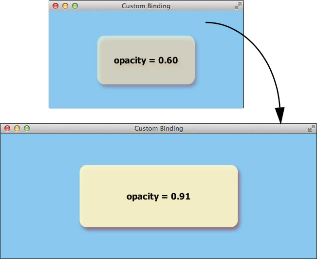
Listing 3.15 shows the code for this program (project MyCustomBind). The same code creates the drop shadow, rectangle, and stack pane as in the previous example. The rectangle’s height and width properties use the same Fluent API binding expression. Now method computeValue() returns a double for the opacity and makes sure its value isn’t greater than 1.0.
The text label’s text property combines the custom binding object opacityBinding with method Bindings.format() to provide the desired formatting of the text.
Listing 3.15 Custom Binding Example—MyCustomBind.java
public class MyCustomBind extends Application {
@Override
public void start(Stage stage) {
. . . code omitted to build the Rectangle, StackPane
and DropShadow . . .
Text text = new Text();
text.setFont(Font.font("Tahoma", FontWeight.BOLD, 18));
stackPane.getChildren().addAll(rectangle, text);
final Scene scene = new Scene(stackPane, 400, 200, Color.LIGHTSKYBLUE);
stage.setTitle("Custom Binding");
rectangle.widthProperty().bind(scene.widthProperty().divide(2));
rectangle.heightProperty().bind(scene.heightProperty().divide(2));
DoubleBinding opacityBinding = new DoubleBinding() {
{
// List the dependencies with super.bind()
super.bind(scene.widthProperty(), scene.heightProperty());
}
@Override
protected double computeValue() {
// Return the computed value
double opacity = (scene.getWidth() + scene.getHeight()) / 1000;
return (opacity > 1.0) ? 1.0 : opacity;
}
};
rectangle.opacityProperty().bind(opacityBinding);
text.textProperty().bind((Bindings.format(
"opacity = %.2f", opacityBinding)));
stage.setScene(scene);
stage.show();
}
public static void main(String[] args) {
launch();
}
}
How do you create binding objects that return compute values that are not one of the standard types? In this situation, use ObjectBinding with generics. For example, Listing 3.16 shows a custom binding definition that returns a darker Color based on the fill property of a Rectangle. The binding object is type ObjectBinding<Color> and the computeValue() return type is Color. (The cast here is necessary because a Shape’s fill property is a Paint object, which can be a Color, ImagePattern, LinearGradient, or RadialGradient.)
Listing 3.16 ObjectBinding with Generics
ObjectBinding<Color> colorBinding = new ObjectBinding<Color>() {
{
super.bind(rectangle.fillProperty());
}
@Override
protected Color computeValue() {
if (rectangle.getFill() instanceof Color) {
return ((Color)rectangle.getFill()).darker();
} else {
return Color.GRAY;
}
}
};
3.4 Putting It All Together
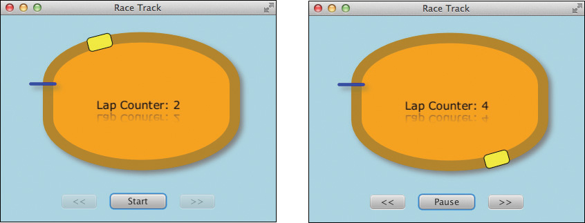
Our final example in this chapter applies what you’ve learned about properties, binding, change listeners, and layout controls to create a program that simulates a race track with one car. As the car travels along the track, a lap counter updates each time the car passes the starting point. Figure 3.18 shows this program running at two points in time.
This example pulls together several important concepts from this chapter: binding properties to keep values synchronized as the program runs; using a change listener to track changes in a property; and writing button event handlers that control the execution of the program. We’ll also show you how to organize nodes in a Group to keep items in their relative coordinate positions while still maintaining the layout’s overall positioning. We’ve shown you a RotateTransition example; now we’ll show you how to use PathTransition for the race track.
The program includes a Start/Pause button to start and pause the animation. Once you start, the speed up and slow down buttons alter the car’s travel rate. When the animation is paused (as shown in the left side figure), the Start/Pause button displays Start and the slower/faster buttons are disabled. When the animation is running (the right side), the Start/Pause button displays Pause and the slower/faster buttons are enabled.
We’ll implement the animation with PathTransition, a high-level Transition that animates a node along a JavaFX Path. Path is a Shape consisting of Path elements, where each element can be any one of several geometric objects, such as LineTo, ArcTo, QuadraticCurveTo, and CubicCurveTo. In our example, we build an oval track by combining Path elements MoveTo (the starting point), ArcTo, LineTo, and ClosePath (a specialized Path element that provides a LineTo from the current Path element point to the starting point).
Our race car is a rounded Rectangle and a Text node displays the current lap count. We implement this example using FXML. An associated controller class defines the buttons’ action event handlers, binding, and the PathTransition.
Figure 3.19 shows the scene graph structure. The top-level node is a VBox, which keeps its children (a StackPane and an HBox) in vertical alignment and centered. The StackPane also centers its child Group and Text nodes. The Group, in turn, consists of the Path, the track’s starting Line, and the race car (a Rectangle). These three nodes use the Group’s local coordinate system for their relative placement.
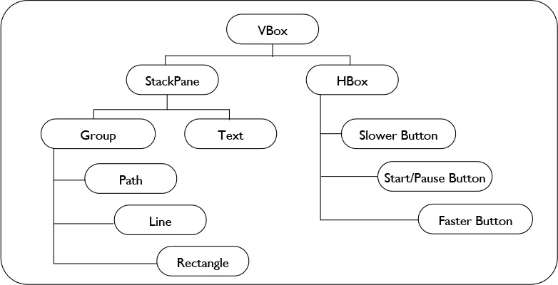
The HBox maintains its children in a horizontal alignment. If you resize the JavaFX application window frame, these components all remain centered.
Listing 3.17 shows the FXML markup for the VBox, StackPane, Group, Text, and HBox nodes (we’ll show you the other nodes next). The scene graph hierarchy from Figure 3.19 matches the FXML elements shown in RaceTrack.fxml. The top node, VBox, specifies the controller class with attribute fx:controller. Note that we also supply an fx:id="text" attribute with the Text node. This lets the Controller class access the Text object in Java controller code.
<?xml version="1.0" encoding="UTF-8"?>
<?import java.lang.*?>
<?import java.util.*?>
<?import javafx.scene.*?>
<?import javafx.scene.control.*?>
<?import javafx.scene.layout.*?>
<?import javafx.scene.shape.*?>
<?import javafx.scene.text.*?>
<?import javafx.scene.effect.*?>
<VBox id="VBox" prefHeight="300" prefWidth="400" spacing="20"
alignment="CENTER" style="-fx-background-color: lightblue;"
xmlns:fx="http://javafx.com/fxml"
fx:controller="racetrackfxapp.RaceTrackController">
<children>
<StackPane >
<children>
<Group>
<children>
(See Listing 3.18)
</children>
</Group>
<Text fx:id="text" >
<font><Font name="Verdana" size="16" /></font>
<effect><Reflection /></effect>
</Text>
</children>
</StackPane>
<HBox spacing="20" alignment="CENTER" >
(See Listing 3.19)
</HBox>
</children>
</VBox>
Listing 3.18 shows the FXML for the Group’s children: the Path, Line, and Rectangle nodes. The Path node includes the elements that form the oval RaceTrack: MoveTo, ArcTo, LineTo, and ClosePath. The Line node marks the starting line on the track. The Rectangle node represents the “race car.” Nodes Path and Rectangle also have fx:id attributes defined for Controller access. Both the Path and Line nodes define a DropShadow effect.
Listing 3.18 Path, Line, and Rectangle Nodes
<Group>
<children>
<Path fx:id="path" stroke="DARKGOLDENROD"
strokeWidth="15" fill="orange" >
<effect>
<DropShadow fx:id="dropshadow" radius="10"
offsetX="5" offsetY="5" color="GRAY" />
</effect>
<elements>
<MoveTo x="0" y="0" />
<ArcTo radiusX="100" radiusY="50" sweepFlag="true" x="270" y="0" />
<LineTo x="270" y="50" />
<ArcTo radiusX="100" radiusY="50" sweepFlag="true" x="0" y="50" />
<ClosePath />
</elements>
</Path>
<Line startX="-25" startY="0" endX="10" endY="0" strokeWidth="4"
stroke="BLUE" strokeLineCap="ROUND" effect="$dropshadow" />
<Rectangle fx:id="rectangle" x="-15" y="0" width="35" height="20"
fill="YELLOW" arcWidth="10" arcHeight="10"
stroke="BLACK" rotate="90" />
</children>
</Group>
Listing 3.19 shows the FXML for the three Button nodes that appear in the HBox layout pane. All three buttons include fx:id attributes because they participate in binding expressions within the Controller class. The onAction attribute specifies the action event handler defined for each button. These event handlers control the PathTransition’s animation. The startPauseButton configures property prefWidth. This makes the button maintain a constant size as the button’s text changes between “Start” and “Pause.”
Listing 3.19 HBox and Button Nodes
<HBox spacing="20" alignment="CENTER" >
<Button fx:id="slowerButton" onAction="#slowerAction" />
<Button fx:id="startPauseButton" prefWidth="80"
onAction="#startPauseAction" />
<Button fx:id="fasterButton" onAction="#fasterAction" />
</HBox>
Now that the UI is completely described with FXML, let’s examine the Controller class, class RaceTrackController, as shown in Listing 3.20 through Listing 3.23. The @FXML annotations mark each variable created in the FXML that the Controller class needs to access. Recall that the FXML Loader is responsible for instantiating these objects, so you won’t see any Java code that creates them.
The initialize() method is invoked by the FXML Loader after the scene graph objects are instantiated. Here we perform additional scene graph configuration. Specifically, we instantiate the PathTransition (the animation object responsible for moving the “car” along the RaceTrack path). This high-level animation applies to a node (here, a Rectangle). The orientation property (OrientationType.ORTHOGONAL_TO_TANGENT) keeps the rectangle correctly oriented as it moves along the path. We set the duration, cycle count, and interpolator, making the cycle count INDEFINITE. The animation rate remains constant with Interpolator.LINEAR.
Listing 3.20 RaceTrackController.java
package racetrackfxapp;
import java.net.URL;
import java.util.ResourceBundle;
import javafx.animation.Animation;
import javafx.animation.Interpolator;
import javafx.animation.PathTransition;
import javafx.beans.binding.When;
import javafx.beans.property.IntegerProperty;
import javafx.beans.property.SimpleIntegerProperty;
import javafx.beans.value.ObservableValue;
import javafx.event.ActionEvent;
import javafx.fxml.FXML;
import javafx.fxml.Initializable;
import javafx.scene.control.Button;
import javafx.scene.shape.Path;
import javafx.scene.shape.Rectangle;
import javafx.scene.text.Text;
import javafx.util.Duration;
public class RaceTrackController implements Initializable {
// Objects defined in the FXML
@FXML
private Rectangle rectangle;
@FXML
private Path path;
@FXML
private Text text;
@FXML
private Button startPauseButton;
@FXML
private Button slowerButton;
@FXML
private Button fasterButton;
private PathTransition pathTransition;
@Override
public void initialize(URL url, ResourceBundle rb) {
// Create the PathTransition
pathTransition = new PathTransition(Duration.seconds(6),
path, rectangle);
pathTransition.setOrientation(
PathTransition.OrientationType.ORTHOGONAL_TO_TANGENT);
pathTransition.setCycleCount(Animation.INDEFINITE);
pathTransition.setInterpolator(Interpolator.LINEAR);
. . .
additional code from method initialize() shown in Listing 3.21,
Listing 3.22, and Listing 3.23
. . .
}
}
Listing 3.21 shows how the Lap Counter works. Here, we create a JavaFX property called lapCounterProperty by instantiating SimpleIntegerProperty, an implementation of abstract class IntegerProperty. We need a JavaFX property here because we use it in a binding expression. (We discuss creating your own JavaFX properties in detail in the next chapter; see “Creating JavaFX Properties” on page 132.)
Next, we create a ChangeListener (with a lambda expression) and attach it to the PathTransition’s currentTime property. We count laps by noticing when the animation’s currentTime property old value is greater than its new value. This happens when one lap completes and the next lap begins. We then increment lapCounterProperty.
We create a binding expression to display the Lap Counter in the Text component. We bind the Text’s text property to the lapCounterProperty, using the Fluent API to convert the integer to a String and provide the formatting.
Note that the ChangeListener method is invoked frequently—each time the current time changes. However, inside the listener method, we only update lapCounterProperty once per lap, ensuring that the Text node’s text property only updates once a lap. This two-step arrangement makes the related binding with the Text node an efficient way to keep the UI synchronized.
Listing 3.21 Configuring the Lap Counter Binding
// We count laps by noticing when the currentTimeProperty changes and the
// oldValue is greater than the newValue, which is only true once per lap
// We then increment the lapCounterProperty
final IntegerProperty lapCounterProperty = new SimpleIntegerProperty(0);
pathTransition.currentTimeProperty().addListener(
(ObservableValue<? extends Duration> ov,
Duration oldValue, Duration newValue) -> {
if (oldValue.greaterThan(newValue)) {
lapCounterProperty.set(lapCounterProperty.get() + 1);
}
});
// Bind the text's textProperty to the lapCounterProperty and format it
text.textProperty().bind(lapCounterProperty.asString("Lap Counter: %s"));
The Start/Pause button lets you start and pause the animation, as shown in Listing 3.22. The @FXML annotations before the action event handlers make the FXML Loader wire the Start/Pause button’s onAction property with the proper event handler. This invokes the handler when the user clicks the button. If the animation is running, method pause() pauses it. Otherwise, the animation is currently paused and the play() method either starts or resumes the animation at its current point.
The button’s text is controlled with binding object When, the beginning point of a ternary binding expression. Class When takes a boolean condition that returns the value in method then() if the condition is true or the value in method otherwise() if it’s false. For the Start/Pause button, we set its text to “Pause” if the animation is running; otherwise, we set the text to “Start.”
Listing 3.22 Start/Pause Button
@FXML
private void startPauseAction(ActionEvent event) {
if (pathTransition.getStatus() == Animation.Status.RUNNING) {
pathTransition.pause();
} else {
pathTransition.play();
}
}
. . .
startPauseButton.textProperty().bind(
new When(pathTransition.statusProperty()
.isEqualTo(Animation.Status.RUNNING))
.then("Pause").otherwise("Start"));
Listing 3.23 shows the faster/slower button handler code. Both buttons’ action event handlers (annotated with @FXML to wire them to the respective Buttons defined in the FXML file) manipulate the animation’s rate property. We specify a maximum rate of 7.0 (seven times the default rate) and a minimum rate of .3. Each time the user clicks the faster or slower button the rate changes up or down by .3. We set the new rate by accessing the transition’s currentRate property. The printf() statements let you see the changed rates for each button click.
The faster/slower buttons are disabled when the animation is not running. This is accomplished with binding expressions that check the animation’s status. Finally, the controller sets the text of the faster/slower buttons.
Listing 3.23 Faster and Slower Buttons
// Constants to control the transition's rate changes
final double maxRate = 7.0;
final double minRate = .3;
final double rateDelta = .3;
@FXML
private void slowerAction(ActionEvent event) {
double currentRate = pathTransition.getRate();
if (currentRate <= minRate) {
return;
}
pathTransition.setRate(currentRate - rateDelta);
System.out.printf("slower rate = %.2f
", pathTransition.getRate());
}
@FXML
private void fasterAction(ActionEvent event) {
double currentRate = pathTransition.getRate();
if (currentRate >= maxRate) {
return;
}
pathTransition.setRate(currentRate + rateDelta);
System.out.printf("faster rate = %.2f
", pathTransition.getRate());
}
. . .
fasterButton.disableProperty().bind(pathTransition.statusProperty()
.isNotEqualTo(Animation.Status.RUNNING));
slowerButton.disableProperty().bind(pathTransition.statusProperty()
.isNotEqualTo(Animation.Status.RUNNING));
fasterButton.setText(" >> ");
slowerButton.setText(" << ");
A key point with this example is that JavaFX properties and bindings let you write much less code. To enable and disable the buttons without binding, you would need to create a change listener, attach it to the animation’s status property, and write an event handler that updates the button’s disable property. You would also need a similar change listener to control the Start/Pause button’s text property. Binding expressions (including custom binding objects) are much more concise and less error prone than listeners that configure property dependencies such as these.
However, at times you will need a ChangeListener or InvalidationListener, as we show in this example to implement the lap counter.
This example also shows how FXML markup helps you visualize the structure of the scene graph that you’re building. Working with FXML, as opposed to only Java APIs, makes it easier to modify scene graphs. We’ve also built this example using only APIs (see project RaceTrack in the book’s download). We encourage you to compare the two projects. We think you’ll find the FXML version easier to understand.
3.5 Key Point Summary
This chapter introduces JavaFX and shows you how to write JavaFX programs that display and manipulate scene graph objects. Here are the key points in this chapter.
• JavaFX provides a rich graphical user interface. Its hierarchical scene graph lets you easily configure rich content and provide visually pleasing effects such as gradients, drop shadows, and reflection.
• JavaFX graphics take advantage of hardware-accelerated graphics capabilities for rendering and animation that performs well.
• You can embed JavaFX content within a Swing panel. This lets you use JavaFX without throwing away Swing applications. (See “The Magic of JFXPanel” on page 259.)
• Like Swing, JavaFX uses a single-threaded execution environment.
• You use Java APIs and/or FXML markup with a controller class to create JavaFX content.
• FXML is an XML markup language that lets you specify scene graph content. The hierarchical form of FXML lets you visualize the scene graph structure more easily than with Java APIs. FXML also helps you keep visual content separate from controller code (such as event handlers).
• You configure FXML scene graph nodes using property names and values that convert to the correct types.
• The FXML controller class lets you provide JavaFX node initialization code, dynamic content, and event handlers.
• CSS lets you style JavaFX nodes. You can configure the style property on nodes individually, or provide style sheets for styling an entire application.
• You can specify CSS files either in the main program or in the FXML markup.
• JavaFX provides high-level transitions that let you specify many common animations. This includes movement, rotation, fading in or out, scaling, color changes for fill or stroke properties, and movement along a path.
• JavaFX properties are a significant feature in JavaFX. JavaFX properties are observable and provide similar naming conventions to JavaBeans properties.
• JavaFX properties can be read-write, read-only, or immutable.
• You can attach a ChangeListener or InvalidationListener to any JavaFX property.
• Bindings are more concise and less error-prone than listeners. Bindings are a powerful mechanism that keep application variables synchronized.
• You can create bindings between JavaFX properties that specify a dependency of one property on another. Bindings can be unidirectional or bidirectional.
• Use the Fluent API and Bindings API to specify more complicated binding expressions with one or more properties.
• You can create custom binding objects that specify property dependencies and how to compute the binding’s return value.
What’s Next?
With this introduction to JavaFX, you are now ready to learn how to use JavaFX effectively in a desktop application. The approach for these next examples will be similar to the examples we’ve presented previously with Swing.