
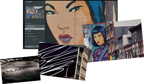
4: Reviewing
Lesson overview
It’s a good policy to spend some time reviewing, sorting, and marking your newly imported images. A little time spent organizing and grouping photos at this stage will make it much easier to find exactly the images you want when you need them.
In this lesson you’ll become familiar with using a variety of viewing modes, tools, and techniques for reviewing your images and navigating through your Lightroom catalog:
• Working in the different Library module views
• Navigating through your catalog
• Using the Navigator panel
• Comparing photos
• Flagging rejects and deleting images
• Using the Quick Collection
• Converting and clearing the Quick Collection
• Designating a target collection
• Hiding the Filmstrip and adjusting its size
• Applying the Filmstrip Source Filters
• Rearranging photos in the Grid view or the Filmstrip
 You’ll probably need between one and two hours to complete this lesson.
The Lightroom Library module offers you a variety of ways to review, evaluate, mark, and label your photos after you import them, making it easier to organize and manage your growing image library. You can sort and group thumbnails in the Grid view, examine a single photo up close in Loupe view, assess images side by side in Compare view, or refine a multiple selection of shots in Survey view.
Getting started
This lesson assumes that you are already familiar with the Lightroom workspace and with moving between the different modules. If you find that you need more background information as you go, refer to Lightroom Help, or review the previous lessons in this book.
Before you begin, make sure that you have correctly copied the Lessons folder from the CD in the back of this book onto your computer’s hard disk and created the LR3CIB Library Catalog file as detailed in “Copying the Classroom in a Book files” on page 2 and “Creating a catalog file for working with this book” on page 3.
1 Start Lightroom.
2 In the Adobe Photoshop Lightroom - Select Catalog dialog box, make sure the file LR3CIB Library Catalog.lrcat is selected under Select A Recent Catalog To Open, and then click Open.
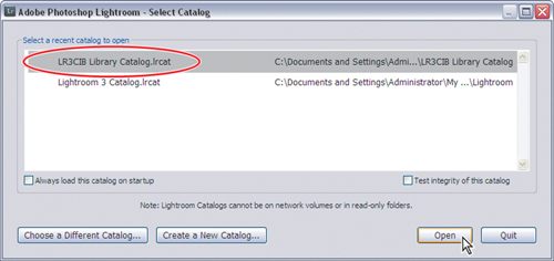
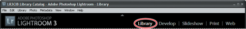
3 Lightroom will open in the screen mode and workspace module that were active when you last quit. If necessary, click Library in the Module Picker to switch to the Library module.
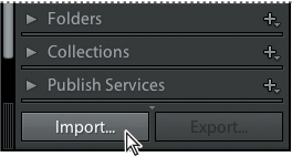
Importing images into the library
The first step is to import the images for this lesson into the Lightroom library.
1 In the Library module, click the Import button below the left panel group.
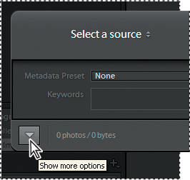
2 If the Import dialog box appears in compact mode, click the Show More Options button at the lower left of the dialog box to see all the options in the expanded Import dialog box.
3 Under Source at the left of the expanded Import dialog box, navigate to the Lessons folder that you copied into the LR3CIB folder on your hard disk. Select the Lesson 4 folder. Ensure that all twelve images in the Lesson 4 folder are checked for import.
4 In the import options above the thumbnail previews, click Add to add the imported photos to your catalog without moving or copying them.
5 Under File Handling at the right of the expanded Import dialog box, choose Minimal from the Render Previews menu and ensure that the Don’t Import Selected Duplicates option is activated.
6 Under Apply During Import, choose None from both the Develop Settings menu and the Metadata menu and type Lesson 4, New York in the Keywords text box. Make sure your settings are exactly as shown in the illustration below, and then click Import.
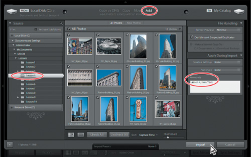
The twelve images are imported from the Lesson 4 folder and now appear in both the Grid view of the Library module and in the Filmstrip across the bottom of the Lightroom workspace.
Viewing and managing your images
The Library module offers a range of viewing modes and a variety of tools and controls to help you evaluate, compare, sort, mark, and group your images. During the import process you applied common metadata in the form of keyword tags to the selection of images as a whole. As you review your photos in the Library module you can add another layer of organization to your catalog, flagging images as picks or rejects, assigning ratings, and applying tags and labels. The Library module also provides sophisticated search functions and customizable filters that enable you to leverage the metadata you attach to your photos. You can search and sort the images in your library by category, subject, or any other association, and then create Collections and Smart Collections to group them—making it easy to retrieve exactly the photos you want quickly, no matter how extensive your catalog.

In the left panel group of the Library module are panels where you can access and work with the folders and collections containing your photos. The right panel group contains panels for adjusting your images and working with keywords and metadata. At the top of the work area is the Filter bar, where you can set the criteria for a customized search of your catalog. The Toolbar, immediately below the work area, provides easy access to your choice of tools and controls.
Switching views
In the Library module you can move between four viewing modes to suit different phases of your workflow. Press the G key or click the Grid view button ( ) in the Toolbar to see thumbnails of your images while you search, apply flags, ratings and labels, or create collections. Use the keyboard shortcut E or click the Loupe view button (
 ) to inspect a single photo at a range of magnifications. Press C or click the Compare view button (
 ) to see two images side by side. Click the Survey view button (
 ) in the Toolbar or use the keyboard shortcut N to evaluate several images at once. The Toolbar displays a different set of controls for each view mode.
The Grid view
By default your images will be displayed in Grid view after they’ve been imported.
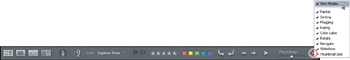
1 Click the triangle at the right end of the Toolbar and ensure that View Modes is activated in the tools menu. If you’re working on a small screen, you can disable all the other options except Thumbnail size for this lesson.
Tools and controls that are currently visible in the Toolbar have a check mark beside their names in the menu. The order of the tools and controls from top to bottom in the menu corresponds to their order from left to right in the Toolbar.
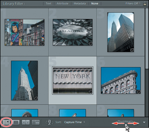
2 If Grid view is not already selected, click the Grid view button (). Adjust the size of the thumbnails by dragging the Thumbnails slider so that you can see about two rows of thumbnails in the Grid view without having to scroll down.
3 To specify how your photos will be displayed in the Grid view image cells, choose View > View Options. The Library View Options dialog box appears.
4 Activate the Show Grid Extras option and choose Compact Cells from the menu beside it. Customize the Options, Cell Icons, Compact Cell Extras, and Expanded Cell Extras settings to your liking. As a guide to the options available, please refer to “View Options for the Grid view” on the next page.
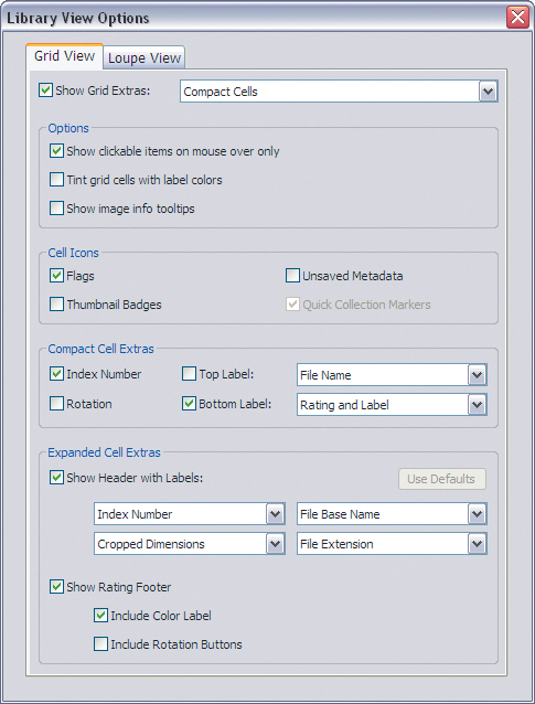
5 From the Show Grid Extras menu at the top of the Library View Options dialog box, choose Expanded Cells. Examine the options available and make whatever changes you wish. When you’re done, choose Compact Cells from the Show Grid Extras menu and close the Library View Options dialog box.
To switch quickly between the two groups of options that you just set in the Library View Options dialog box, choose from the Grid View Style options on the View menu.
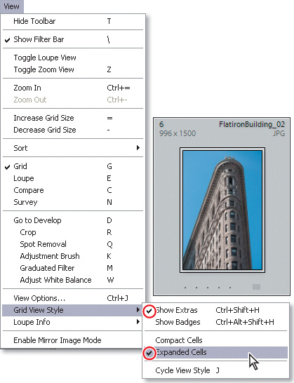
 Tip: To conveniently cycle through the different Grid view styles, press the J key on your keyboard repeatedly, or choose View > Grid View Style > Cycle View Style.
6 Switch to the Expanded Cell mode by choosing the Expanded Cells option from the View > Grid View Style menu. Make sure that the Show Extras option is activated in the same menu.
View options for the Grid view
Depending on the way you like to work, you can choose from a wide range of options that affect the way your photos are displayed in the Grid view image cells—from simplified cells containing nothing but the image thumbnails to expanded cells that display your choice of image information, status indicators, labels, and clickable (interactive) controls.
Show Grid Extras Displays your choice of labels, markers, and controls in each image cell. If this option is disabled most of the other Grid view options are unavailable.
Compact Cells Shows simple cells with less information so more thumbnails are visible in the Grid.
Expanded Cells Expands the image cells to include more information in cell headers and footers.
Show Clickable Items On Mouse Over Only Displays rotation controls, flags, and labels only when you move the pointer over an image cell. Disable this option to show these controls at all times.
Tint Grid Cells With Color Labels Tints the image cell around a photo to indicate its color label.
Show Image Info Tooltips Displays a brief description of an item when you hold the pointer over it, including image info and the names of the controls, status badges, and indicators in the image cell.
Flags Activates clickable flag status indicators in the upper left corner of the image cells. Click the indictor to change the flag status.
Quick Collection Markers Shows a clickable Quick Collection marker in the upper right corner of each thumbnail. Images with a solid grey dot are part of the Quick Collection. Click the marker to add an image to, or remove it from, the Quick Collection.
Thumbnail Badges Displays indicator badges on the thumbnail images indicating which photos have keywords attached and which have been adjusted or cropped.
Unsaved Metadata An icon with a down arrow in the upper right of a cell indicates that an image has changes in its metadata that have not yet been saved to file. An up arrow icon shows that the image file’s metadata has been changed in an external application and an exclamation mark icon indicates that a photo’s metadata has unsaved changes made in both Lightroom and an external application.
Index Number Shows image cell numbers indicating the order of the photos in the Grid view.
Rotation Displays Rotation buttons in the lower corners of the image cells.
Top Label and Bottom Label Displays your choice of image information and attributes above and below the thumbnail in a compact image cell.
Show Header With Labels Displays up to four labels in the headers of expanded image cells, showing whatever information you specify. For each label, you can choose from a menu of image information and attributes.
Use Defaults Restores the Header Label options to their default settings.
Show Rating Footer Shows the rating stars, and optionally the color label and rotation buttons, below the thumbnail in expanded image cells.
Zooming With the Navigator in Loupe view
In Loupe view you can look closely at one photo at a time at a wide range of zoom levels. Use the Loupe view to help you to evaluate your images as you sort them in the Library module and to inspect and adjust them in the Develop module. In the Navigator panel you can set the level of magnification for the Loupe view and find your way around a zoomed image with ease. Like the Loupe view, the Navigator is common to both the Library and Develop modules.
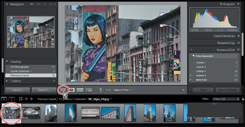
1 Select the first image NY_Signs_03.jpg in the Grid view or the Filmstrip, and then click the Loupe view button () in the Toolbar. Alternatively, press the E key or double-click the thumbnail in the Grid view or the Filmstrip.
2 If necessary, expand the Navigator panel at the top of the left panel group. The zoom controls for the Loupe view are in upper right corner of the Navigator panel. Click 1:1 to see this photo at 100% (or “actual pixels”) magnification.

3 Click the small triangle at the right of the Navigator panel header and choose the zoom ratio 3:1 from the menu.
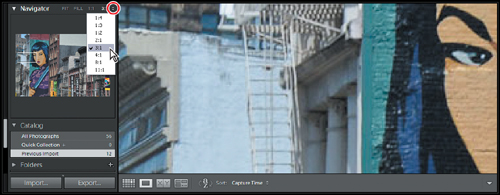
4 When you’re working at such a high level of magnification, the Navigator helps you to move around in the image quickly and easily. Click anywhere in the Navigator preview and the zoomed view will be centered on that point. Drag in the Navigator preview to reposition the view. The white rectangle indicates the area currently displayed in the Loupe view. Click in the Loupe view to move back and forth between the last two zoom levels used; when zooming in, the view will be centered on the point you click. Double-click the image to switch quickly back and forth between the Loupe and Grid views.
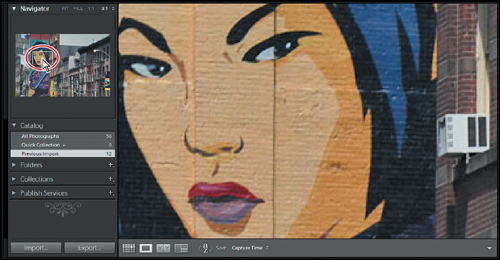
5 In the header of the Navigator panel, click each of the four zoom levels in turn (Fit, Fill, 1:1, and 3:1—the option you chose from the menu). Press the Ctrl key (Windows) / Command key (Mac OS) together with the Minus key (-) repeatedly to zoom out through the last four zoom levels used and to finally switch to Grid view; press the Ctrl key / Command key together with the Equal key (=) repeatedly to switch back to Loupe view and to progressively zoom in. Finally, set the zoom level to Fit.
Tip: The Show Grid Extras option on the Grid View tab of the Library View Options dialog box enables you to display a range of information about your photos in their image cells. In the Loupe View options, activate Show Info Overlay to display the same kind of information overlaid on your enlarged image in the Loupe view. By default, the Loupe view info overlay in disabled.
Comparing photos
As the name suggests, the Compare view is ideal for examining and evaluating images side by side.
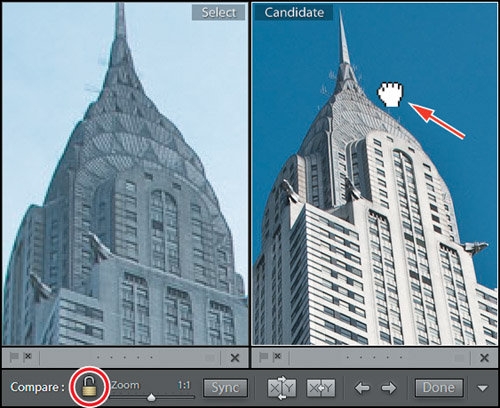
1 In the Filmstrip, click to select the photo ChryslerBuilding_01.jpg, and then Ctrl-click / Command-click its neighbor, ChryslerBuilding_02.jpg. Click the Compare View button () in the Toolbar.
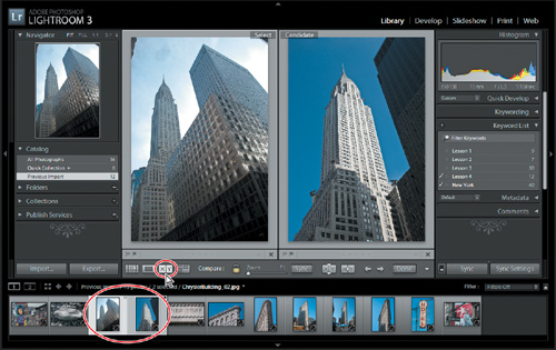
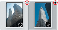
The first image selected becomes the Select image, which is displayed in the left pane of the Compare view; the image displayed in the right pane is the Candidate. In the Filmstrip, the Select image is marked with a white diamond in the upper right corner, and the Candidate image with a black diamond.
To use the Compare view to make a choice from a group of more than two photos, select your favored choice first to place it as the Select image, and then add the other photos to the selection. Click the Select Previous Photo and Select Next Photo buttons ( ) in the Toolbar or press the left and right arrow keys on your keyboard to move between the selected candidates. Should you decide that the current Candidate is better than the Select image, you can reverse their positions by clicking the Swap button (
 ) in the Toolbar.
2 To compare fine detail in the images, zoom in by dragging the Zoom slider in the Toolbar. You’ll notice that the images are zoomed together. Drag either of the images in the Compare view and the images move in unison. The closed lock icon to the left of the Zoom slider indicates that the view focus of the two images is locked.
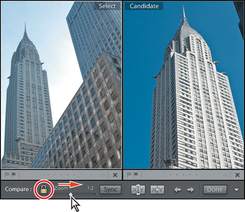
3 If you wish to zoom and move the Select and Candidate images independently, you need to click the view focus lock icon to unlink them.
A thin white line surrounds whichever of the two images in the Compare view is currently the active image: the image that will be affected by the Zoom slider, the controls in the right panel group, or any menu command you may apply.
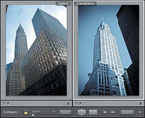
4 Click the lock icon to link the view focus for the two images, and then choose Fit from the zoom levels at the top of the Navigator panel.
5 Click the Candidate photo to make it the active image; then expand the Quick Develop panel, if necessary. From the Saved Preset menu, choose the BW Creative - Selenium Tone preset. In the Tone Control area, click the double-arrow at the right of the Recovery control four times.
Using the controls in the Quick Develop panel while you’re working in Compare view can be a helpful aid in making a choice between images. Although the candidate image in our example contains more detail and is a less cluttered composition, the Select image is more atmospheric. Applying a develop preset or making other adjustments in the Quick Develop panel can help you to make a judgement on how a candidate image will look once it’s edited and adjusted. You can then either undo your Quick Develop operations and move to the Develop module to edit the image with greater precision, or keep the modifications you’ve made as a starting point.
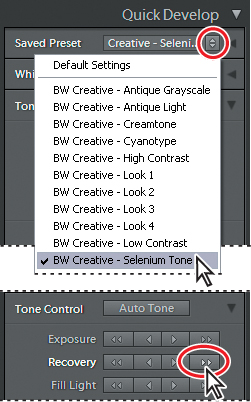
Tip: For the purposes of the illustration above, the Saved Preset menu has been abridged; you’ll find the preset BW Creative - Selenium Tone much further down the list.
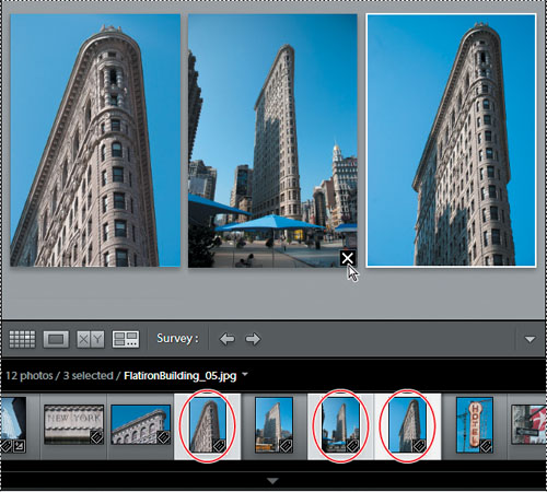
Using Survey view to narrow a selection
The last of the four viewing modes in the Library module, the Survey View lets you see multiple images together on one screen, and then refine your selection by dropping one photo after another from the view.
1 In the Filmstrip, select the five images of the Flatiron Building. Click the Survey view button () in the Toolbar, or press the N key on your keyboard.
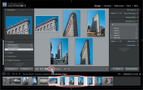
2 Navigate between the images by pressing the arrow keys on your keyboard or click the Select Previous Photo and Select Next Photo buttons () in the Toolbar. The active image is surrounded by a thin white border.
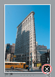
3 Position the pointer over the third photo. A Deselect Photo icon ( ) appears in the lower right corner of the image. Click this icon to drop the image from the selection in the Survey view.
As you eliminate candidates the remaining photos are progressively resized and shuffled to fill the space available in the work area. To help in comparing the photos, you can drag any of the images to reposition it in the Survey view. The other images will automatically be shuffled to accommodate your action.
Tip: If you have eliminated a photo accidentally, choose Edit > Undo to return it to the selection, or simply Ctrl-click / Command-click its thumbnail in the Filmstrip. You can easily add a photo to the selection in the Survey view in the same way.
4 Continue to eliminate photos from the Survey view. For the purposes of this exercise, deselect all but one favorite (we chose the active photo—marked with a white border—in the illustration below).
Dropping a photo from the Survey view doesn’t delete it from its folder or remove it from the catalog; the dropped image is still visible in the Filmstrip—it has simply been deselected. You can see that the images that are still displayed in the Survey view are also the only ones that remain selected in the Filmstrip.
Flagging and deleting images
Now that you have narrowed down a selection of images to one favorite in the Survey view, you can mark your choice with a flag.
Flagging images as either picks or rejects as you review them is an effective way to quickly sort your work; flag status is one of the criteria by which you can filter your photo library. You can also quickly remove images flagged as rejects from your catalog using a menu command or keyboard shortcut.
A white flag denotes a pick ( ), a black one with an x marks a reject (
 ), and a neutral grey flag indicates that an image has not been flagged (
 ).
).
Tip: Press the P key on your keyboard to flag a selected image as a pick (), the X key to flag it as a reject (), or the U key to remove any flags.
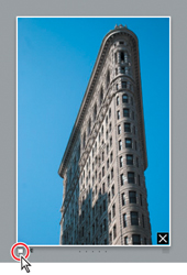
1 Still in the Survey view, move the pointer over the remaining photo to see the flag icons just below the lower left corner. The grayed icons indicate that the image is not yet flagged. Click the flag to the left. The flag turns white, which marks this image as a pick. In the Filmstrip, you can see that the thumbnail now displays a white flag in the upper left of the image cell.
2 Select a different image in the Filmstrip, and then press the X key. The black reject flag icon appears at the lower left corner of the image in the Survey view and at the upper left of the thumbnail in the Filmstrip. The thumbnail of the rejected image is dimmed in the Filmstrip.
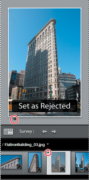
3 Choose Photo > Delete Rejected Photos, or simply press the Delete key on your keyboard. A confirmation dialog box appears; click Remove to remove the photo from your catalog without deleting the master file from your hard disk.
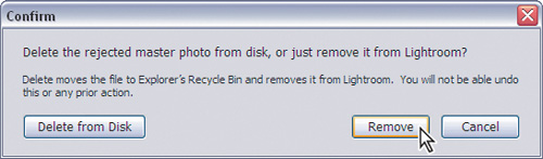
Having been removed from the Lightroom library catalog file, the rejected image is no longer visible in the Filmstrip.
4 Press the G key or click the Grid view icon in the Toolbar to see all the remaining images as thumbnails in the Grid view.
Grouping images in the Quick Collection
A collection is a convenient way to keep a group of photos together in your catalog, even when the image files are actually located in different folders on your hard disk. You can create a new collection for a particular presentation or use collections to group your images by category or any other association. Your collections are always available from the Collections panel where you can access them quickly.
The Quick Collection is a temporary holding collection: a convenient place to group images as you review and sort your new imports, or while you assemble a selection of photos drawn from different folders in your catalog.
In the Grid view or the Filmstrip, you can add images to the Quick Collection with a single click—and remove them just as easily. Your images will stay in the Quick Collection until you’re ready to convert it to a more permanent grouping that will be listed in the Collections panel. You can access the Quick Collection from the Catalog panel so that you can return to work with the same selection of images at any time.
Moving images into or out of the Quick Collection
1 Expand the Catalog panel in the left panel group, if necessary, to see the listing for the Quick Collection.
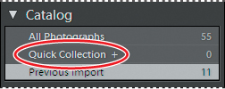
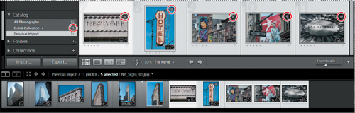
2 Choose View > Sort > File Name, or choose File Name from the Sort menu in the Toolbar; then, select the five NY_Signs images by Ctrl-clicking / Command-clicking their thumbnails in the Grid view or the Filmstrip.

3 To add the selected photos to the Quick Collection, press the B key or choose Photo > Add To Quick Collection.
4 The image count beside the Quick Collection in the Catalog panel indicates that the Quick Collection now contains five images. If you have activated the option Show Quick Collection Markers in the Library View Options dialog box, each image in the Quick Collection is marked with a gray dot in the upper right corner of its thumbnail in the Grid view. The same markers are also shown in the Filmstrip unless the thumbnail size is too small.
You can remove all of the selected photos from the Quick Collection by simply clicking the marker on one of the thumbnails or by pressing the B key.
5 For this exercise, you’ll remove only the first image, NY_Signs_01.jpg, from the Quick Collection. First, deselect the other four images, and then, with only the image NY_Signs_01.jpg selected, press the B key. Your Quick Collection is reduced to four images.
Tip: If you don’t see the Quick Collection marker when you move your pointer over a thumbnail, make sure that Show Extras is activated in the View > Grid View Styles menu. Choose View > View Options and activate Quick Collection Markers under Cell Icons in the Library View Options dialog box.
Converting and clearing the Quick Collection
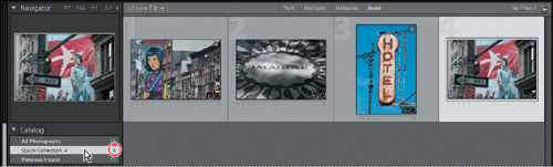
1 Click the Quick Collection entry in the Catalog panel. The Grid view now displays only four images. Until you clear the Quick Collection, you can easily return to this group of images to review your selection.
Now that you’ve refined your selection you can move your grouped images to a more permanent Collection.
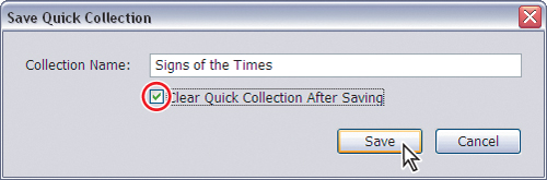
2 Choose File > Save Quick Collection.
3 In the Save Quick Collection dialog box, type Signs of the Times in the Collection Name box. Activate the option Clear Quick Collection After Saving, and then click Save.
4 In the Catalog panel, you can see that the Quick Collection has been cleared; it now has an image count of 0. If necessary, expand the Collections panel so that you can see the listing for your new collection, which displays an image count of 4.
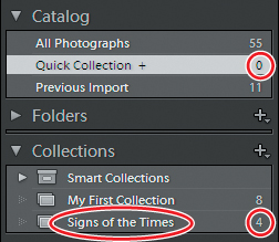
5 In the Folders panel, click the Lesson 4 folder. The grid view once more shows all the photos of New York including those in the signs collection.
Designating a target collection
By default, the Quick Collection is designated as the target collection; this status is indicated by the plus sign (+) that follows the Quick Collection’s name in the Catalog panel. The target collection is that collection to which a selected image is moved when you press the B key or click the circular marker in the upper right corner of the thumbnail, as you did in the previous exercise.
You can designate a collection of your own as the target collection so that you can use the same convenient techniques to add and remove photos quickly and easily.
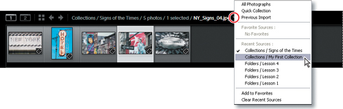
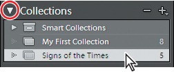
1 Right-click / Control-click the entry for your new Signs of the Times collection in the Collections panel, and then choose Set As Target Collection from the context menu. The name of your collection is now followed by a plus sign (+).
2 Click the Previous Import folder in the Catalog panel, and then select the image NY_Signs_01.jpg in the Grid view or the Filmstrip.
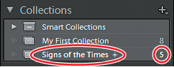
3 Watch the Collections panel as you press the B key on your keyboard; the image count for the Signs of the Times collection increases to 5 as the selected image is added to the collection.
4 Right-click / Control-click the Quick Collection in the Catalog panel and choose Set As Target Collection from the context menu. The Quick Collection once again displays the plus sign (+).
Working with the Filmstrip
No matter which module or view you’re working in, the Filmstrip across the bottom of the Lightroom workspace provides constant access to the images in your selected folder or collection.
As with the Grid view, you can quickly navigate through your images in the Filmstrip using the arrow keys on your keyboard. If there are more images than will fit in the Filmstrip you can either use the scroll bar below the thumbnails, drag the Filmstrip by the top edge of the thumbnail frame, or click the shaded thumbnails at either end to access photos that are currently out of view.
Across the top of the Filmstrip, Lightroom provides a convenient set of controls to help streamline your workflow.
At the far left you’ll find buttons for working with two displays, with pop-up menus that offer a choice of viewing mode for each.
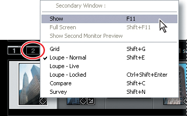
To the right of these buttons is the Grid view button, and arrow buttons for navigating between the different folders and collections you’ve recently been viewing.
Next is the Filmstrip Source Indicator, where you can see at a glance which folder or collection you’re viewing, how many photos it contains, which images are currently selected, and the name of the image currently under your pointer. Click the Source Indicator to see a menu with all the image sources you’ve recently accessed.
At the far right of the Filmstrip header are the Filter controls, which we’ll look at later in this lesson.
Hiding the Filmstrip and adjusting its size
You can show and hide the Filmstrip and adjust its size, as you can with the side panel groups, to make more screen space available for the image you’re working on.
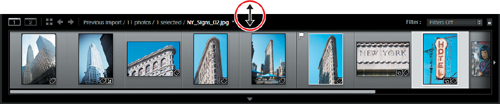
1 Click the triangle in the lower border of the workspace window to hide and show the Filmstrip. Right-click / Control-click the triangle to set the automatic show and hide options.
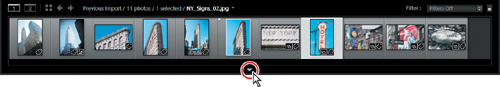
2 Position the pointer over the top edge of the Filmstrip; the cursor becomes a double arrow. Drag the top edge of the Filmstrip up or down to enlarge or reduce the thumbnails. The narrower you make the Filmstrip the more thumbnails it can display.
Using filters in the Filmstrip
With so few photos in the Lesson 4 folder it’s not difficult to see all the images at once in the Filmstrip. However, when you’re working with a folder containing many images it can be inconvenient to scroll the Filmstrip looking for the photos you want to work with. You can use the Filmstrip filters to narrow down the images displayed in the Filmstrip to only those that share a specified flag status, rating, color label, or any combination of these attributes.
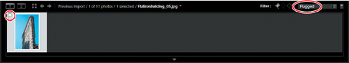
1 In the Filmstrip you can see that one of the images in the Lesson 4 folder displays the white Pick flag that you assigned in a previous exercise. If you don’t see the flag, right-click / Control-click anywhere in the Filmstrip and activate the menu option View Options > Show Ratings And Picks in the context menu. Examine the other options available in the Filmstrip context menu. Many of the commands apply to the image or images currently selected in the Filmstrip; others affect the Filmstrip itself.
2 From the Filter menu at the top right of the Filmstrip, choose Flagged. Only the image with the white flag is displayed in the Filmstrip.
3 The white flag icon is now highlighted among the Filter controls in the top bar of the Filmstrip. Click the word Filter at the left of the flag icons to see the attribute filter options displayed as buttons in the Filmstrip header.
You can activate or disable any of the filters you saw in the Filter menu by clicking the respective Filter buttons. You can set up a combination of filters and save it as a custom preset by choosing Save Current Settings As New Preset from the menu.
4 Click the white flag button to deactivate the active filter or choose Filters Off from the menu to disable all filters. The Filmstrip once more displays all the images in the folder. Click the word Filter again to hide the filter buttons.
You’ll learn more about using filters in Lesson 5, “Organizing and Selecting.”
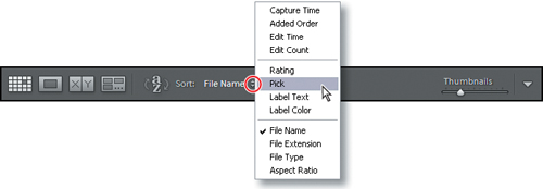
Changing the sorting order of the thumbnails
Use the Sort Direction control and the Sort Criteria menu in the Toolbar to change the display order of the thumbnails images in the Grid view and the Filmstrip.
1 If the sorting controls are not currently visible in the Toolbar, choose Sorting from the tools menu at the right of the Toolbar.
2 Choose Pick from the Sort Criteria menu.
The thumbnails are rearranged in both the Grid view and the Filmstrip to display the image with the white Pick flag first.
3 Click the Sort Direction control ( ) to reverse the sorting direction of the thumbnails. The image with the white Pick flag now appears last in the order.
When you’ve grouped images in a Collection, you can manually rearrange their order however you wish. This can be particularly useful when you’re creating a presentation such as a slideshow or web gallery, or putting together a print layout, as the images will be placed in the template according to their sort order.
4 Expand the Collections panel and click the Signs of the Times collection that you created earlier. Choose File Name from the Sort Criteria menu.
5 In the Filmstrip, drag the second thumbnail (NY_Signs_02.jpg) to the right and release the mouse button when you see a black insertion bar appear between the third and fourth images.
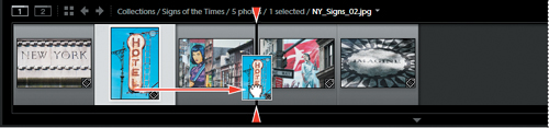
Tip: You can also change the order of the photos in a collection by dragging the thumbnail images in the Grid view.
The image snaps to its new location in both the Filmstrip and the Grid view. The new sorting order is also apparent in the Toolbar; your manual sorting order has been saved and is now listed as User Order in the Sort Criteria menu.
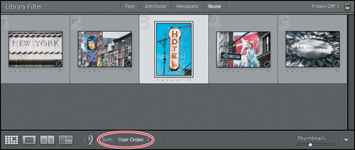
6 Choose File Name from the Sort menu; then return to your manual sorting by choosing User Order.

Congratulations; you’ve finished another lesson. You’ve gained confidence navigating through your library and learned techniques for reviewing, sorting, filtering, and grouping your images as collections. You’ll learn more about structuring and organizing your photo library in the next lesson.
Review Questions
1 How would you use each of the views in the Library module?
2 What is the Navigator?
3 How do you use the Quick Collection?
4 What is the target collection?
Review answers
1 Press the G key or click the Grid view button () in the Toolbar to see thumbnails of your images while you search, apply flags, ratings and labels, or create collections. Use the keyboard shortcut E or click the Loupe view button () to inspect a single photo at a range of magnifications. Press C or click the Compare view button () to see two images side by side. Click the Survey view button () in the Toolbar or use the keyboard shortcut N to evaluate several images at once or refine a selection.
2 The Navigator is an interactive full image preview that helps you move around easily within a zoomed image in Loupe view. Click or drag in the Navigator preview to reposition the view while a white rectangle indicates the portion of the magnified image that is currently visible in the workspace. The Navigator panel also contains controls for setting the zoom levels for the Loupe view. Click the image in Loupe view to switch between the last two zoom levels set in the Navigator panel.
3 To create a Quick Collection, select one or more images and then press the B key or choose Photo > Add To Quick Collection. The Quick Collection is a temporary holding area; you can continue to add—or remove—images until you are ready to save the grouping as a more permanent Collection. You’ll find the Quick Collection listed in the Catalog panel.
4 The target collection that collection to which a selected image will be moved when you press the B key or click the circular marker in the upper right corner of the thumbnail. By default, the Quick Collection is designated as the target collection; this status is indicated by the plus sign (+) that follows the Quick Collection’s name in the Catalog panel. You can designate a collection of your own as the target collection so that you can use the same convenient techniques to add and remove photos quickly and easily.