9
Floating and Vertical Alignment
WHAT YOU WILL LEARN IN THIS CHAPTER:
- The float property and how it is used to change the flow of elements in a document — for instance, to place text beside an image
- The clear property and how this property is used to cancel the effects of the float property
- The vertical-align property and how this property is used to control the vertical alignment of text to create subscript or superscript text or control vertical alignment in table cells
In Chapter 8, I presented a subset of properties that combine to define a concept known as the CSS box model. In this chapter, I continue introducing new properties, this time focusing on two properties most often misunderstood by users new to CSS design: float and clear. These properties are often misunderstood because of their unique effect on the elements in a document.
I'll begin with a discussion of the float property.
FLOATING CONTENT
A simple explanation of the float property is that it is used to put content side-by-side. In the coming sections, you look in depth at the float property, its idiosyncrasies, and how you can use it to lay out a web page. The following table outlines the float property and its values.
| PROPERTY | VALUE |
| float | left | right | none Initial value: none |
At this point, the float property appears fairly simple. It accepts keyword values of left, right, and none. The effects of the float property are intrinsically tied to the CSS box model that you read about in Chapter 8, and specifically as described in the next section. After the float property is applied to an element, regardless of the type of element, that element takes on the behavior of a block element, where its dimensions are defined by width, height, padding, borders, and margins. Before you see some examples of this, the following code shows you how the float property affects a document's layout.

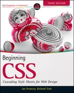
<!DOCTYPE html PUBLIC “-//W3C//DTD HTML 4.01//EN”
    “http://www.w3.org/TR/html4/strict.dtd”>
<html lang=“en”>
<head>
      <meta http-equiv=“Content-Type” content=“text/html; charset=utf-8”>
      <title>FIGURE 9-1</title>
      <style type=“text/css”>
             h1 {
               float: left;
        }
      </style>
</head>
<body>

<h1>Recipes for Cheese</h1>

<p class=“intro”>Cheese is a remarkably versatile food, available in literally
hundreds of varieties with different flavors and textures.</p>

</body>
</html>
code snippet /chapter9/figure_9-1.html
This CSS and markup results in the output in Figure 9-1.
As you can see, the heading has been floated and so the following paragraph wraps around it. The following code shows a more useful example, creating columns out of content.
<!DOCTYPE html PUBLIC “-//W3C//DTD HTML 4.01//EN”
“http://www.w3.org/TR/html4/strict.dtd”>
<html lang=“en”>
<head>
<meta http-equiv=“Content-Type” content=“text/html; charset=utf-8”>
<title>FIGURE 9-2</title>
<style type=“text/css”>
.recipe h2 {
float: left;
}
.recipe .intro,
.recipe ol {
float: right;
width: 500px;
}
</style>
</head>
<body>
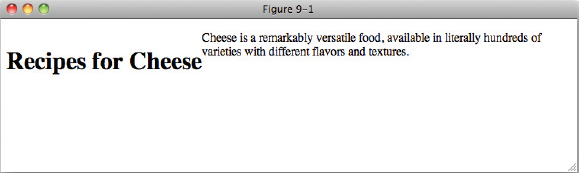
<h1>Recipes for Cheese</h1>
<p class=“intro”>Cheese is a remarkably versatile food, available in literally
hundreds of varieties with different flavors and textures.</p>
<div class=“recipe”>
<h2>Welsh Rarebit</h2>
<p class=“intro”>Welsh Rarebit is a savory dish made from melted cheese, often
Cheddar, on toasted bread, and a variety of other ingredients such as mustard,
egg, or bacon. Here is one take on this classic.</p>
<ol>
<li>Lightly toast the bread</li>
<li>Place on a baking tray, and spread with butter.</li>
<li>Add the grated Cheddar cheese and 2 tablespoons of beer to a saucepan.
Place the saucepan over a medium heat, and stir the cheese continuously
until it has melted. Add a teaspoon of wholegrain mustard and grind in
a little pepper. Keep stirring.</li>
<li>When thick and smooth, pour over each piece of toast spreading it to
the edges to stop the toast from burning.</li>
<li>Place under the grill for a couple of minutes or until golden
brown.</li>
</ol>
</div>
</body>
</html>
code snippet /chapter9/figure_9-2.html
This CSS and markup results in the output in Figure 9-2.
In Figure 9-2, you can see what happens when there is both a left and right float; the left floated heading is positioned alongside the right floated recipe intro and instructions.
On the surface, the concept of floating is pretty simple, and for most things that you set out to accomplish, this is about as complicated as it will get, but there is quite a complex set of rules under the surface of the float property. To understand what happens when an element is floated, you need to know about how the box model is affected and what happens when certain types of elements are floated. These concepts are explored in the coming sections.
Floating Box Model
Because floated elements are repositioned to allow other content to flow around them, they exhibit unique behavior. This behavior is outlined here:
- The margins of floated elements do not collapse, no matter what they are next to.
- Only the contents of elements following a floated element are affected by the floated element. That is, the backgrounds, margins, borders, padding, and width (the box model and dimensions) of elements following a floated element are not affected.
- A floated element is always treated like a block element.
Each rule is important in determining how floated elements are positioned and rendered.
Consider the diagram in Figure 9-3, which shows how the box model is incorporated when an element has been floated.
When an element is floated, it takes on the behavior of a block element, with one major difference: Its sizing becomes shrink-to-fit horizontally and vertically unless you specify width and height properties. That means that if you float a <div> element, its dimensions change such that it only expands enough to accommodate the content within it. In Chapter 8, you learned that the default dimensions of a <div> element are expand-to-fit horizontally, meaning the <div> takes up the whole line, but not so when a <div> element is floated.
Elements within a floated container that are not themselves floated retain their original width unless a width is applied to them, e.g., a paragraph will still take up 100% of the space available to it. If no width had been set on the floated elements in Figure 9-2, the layout would have remained unchanged as the text in the paragraph and the list elements would have retained a width of 100% of the available space.
Now that you've had an overview of the float property, the following Try It Out is a recap of what is possible with the float property.
TRY IT OUT Create a Page Header with Floated Navigation
To see the float property in action, follow these steps.
- Enter the following markup:
<!DOCTYPE html PUBLIC “-//W3C//DTD HTML 4.01//EN” “http://www.w3.org/TR/html4/strict.dtd”> <html lang=“en”> <head> <meta http-equiv=“Content-Type” content=“text/html; charset=utf-8”> <title>Example 9-1</title> <style type=“text/css”> body { width: 600px; margin: 1em auto; } h1 { float: left; margin-top: 0; } .navigation { float: right; margin: 0; list-style: none; } .navigation li { float: left; } .navigation a { display: block; margin-left: 0.5em; padding: 0.5em; border: 1px solid #CCC; color: #233; text-decoration: none; } .navigation a:focus, .navigation a:hover { background: #233; color: #FFF; } </style> </head> <body> <h1>Recipes for Cheese</h1> <ul class=“navigation”> <li><a href=“#”>Home</a></li> <li><a href=“#”>Recipes</a></li> <li><a href=“#”>Suggestions</a></li> </ul> </body> </html> - Save the preceding CSS and markup as example_9-1.html. This example results in the output in Figure 9-4.
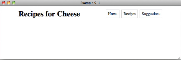
How It Works
In Example 9-1, you floated the h1 element left and the element with the class of navigation right. This positioned the navigation list alongside the heading, aligned to the right of the body.
In the next section, I present a property that allows you to control floated elements, the clearproperty.
CANCELING FLOATED CONTENT
In this section, I discuss a property intrinsically related to the float property: the clear property. The clear property is used to control floating content. The following table outlines the clear property and its possible values.
| PROPERTY | VALUE |
| clear | none | left | right | both Initial value: none |
The simplest explanation for the clear property is that it is used to cancel the effects of one or more floated elements. Figure 9-5 shows what will happen to the example shown in Figure 9-4 when the heading and navigation are followed by further content.
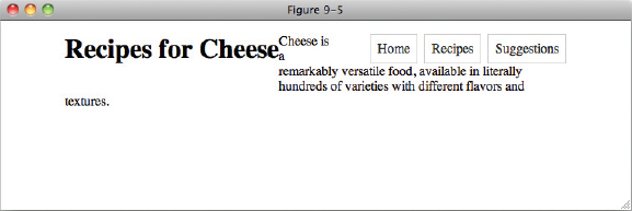
As you can see, the text in the paragraph falls through the gap between the floated elements instead of appearing after it, as you would want. The following code shows how we clear floated elements to ensure that subsequent content follows them.
<!DOCTYPE html PUBLIC “-//W3C//DTD HTML 4.01//EN”
    “http://www.w3.org/TR/html4/strict.dtd”>
<html lang=“en”>
<head>
    <meta http-equiv=“Content-Type” content=“text/html; charset=utf-8”>
    <title>FIGURE 9-6</title>
    <style type=“text/css”>
        body {
            width: 600px;
            margin: 1em auto;
        }

        h1 {
            float: left;
            margin-top: 0;
        }

        .navigation {
            float: right;
            margin: 0;
            list-style: none;
        }

        .navigation li {
            float: left;
        }

        .navigation a {
            display: block;
            margin-left: 0.5em;
            padding: 0.5em;
            border: 1px solid #CCC;
                   color: #233;
                   text-decoration: none;
        }

        .navigation a:focus,
        .navigation a:hover {
            background: #233;
            color: #FFF;
        }

        .intro {
            clear: both;
        }
    </style>
</head>
<body>

<h1>Recipes for Cheese</h1>

<ul class=“navigation”>
    <li><a href=“#”>Home</a></li>
    <li><a href=“#”>Recipes</a></li>
    <li><a href=“#”>Suggestions</a></li>
</ul>

<p class=“intro”>Cheese is a remarkably versatile food, available in literally
hundreds of varieties with different flavors and textures.</p>

</body>
</html>
code snippet /chapter9/fi gure_9-6.html
This CSS and markup results in the output you see in Figure 9-6.
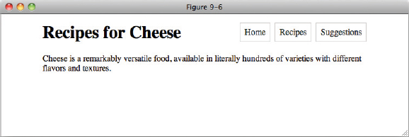
In Figure 9-6, you see the results of the application of the clear: both; declaration on the element with the class name intro. The effects of the float applied to the heading elements have been canceled, and the text is dropped down below the drawing of the heading.
So the clear property is used to control what happens when elements are floated. When you use the clear property, you can cancel a float on a particular element. Here, I have used clear: both; but clear: left; and clear: right; can be used to clear only left and right floated elements respectively.
In the next section I look at some float bugs in IE 6.
FLOAT BUGS IN IE 6
The following section takes a look at float bugs that arise in IE 6 and a few of the techniques you can use to work around these bugs. The bugs that I discuss here are as follows:
- Peek-a-boo bug: As the name implies, this bug involves the use of floats where certain content on a page disappears and occasionally reappears.
- Guillotine bug: This is another bug that comes up in IE when using floats, where content is cut in half.
- Three-pixel jog: This bug causes 3 pixels of space to mysteriously appear when using floats in IE.
- Double-margin bug: This bug causes the left or right margins of a floated box to double when using floats in IE.
Even though the following bugs are a problem in IE 6, all of them have been fixed in IE 7.
TARGETING INTERNET EXPLORER
While in most circumstances you will want to write CSS that works in all browsers, in some cases this may not be possible. The most common possibility is that you will experience bugs that only exist in Internet Explorer, like the ones I will show you here.
These bugs often have solutions that cause no harm when applied to all browsers, but this is not always the case, and you may feel that it makes your CSS less readable. In these cases, being able to target CSS or individual declarations at Internet Explorer can be advantageous.
There are two main techniques that I will cover here: conditional comments and hacks.
Conditional Comments
Conditional comments are just like ordinary HTML comments, but with an extra piece of information:
<!--[if lte IE 6]>
<![endif]-->
The if part of the comment is followed by an equation, which in this case it reads “if less than or equal to IE 6”. This means that if the browser this code is viewed in is Internet Explorer, and the version is 6 or less, then whatever is inside the comment block will be output instead of being a normal comment. Any other browser will treat this as a comment and ignore it. In our example, whatever we put inside the comment (which could be a link or style element for IE only CSS) will only be output for Internet Explorer versions 6 or less.
You can read more about conditional comments at www.quirksmode.org/css/condcom.html.
Hacks
Hacks are tricks you can use to take advantage of bugs in CSS parsers to include CSS that only works in certain browsers. I will show you two hacks here that you may find useful.
First is the underscore hack, which allows you to write CSS that only works in IE 6. This works as follows:
    p {
        _height: 1px;
    }
As you can see, the normal height property has been prefixed with an underscore. Because this is not a valid CSS property, most browsers will ignore it altogehter, but IE 6 does something different. It ignores just the underscore, so to IE 6 this rule looks like:
p {
        height: 1px;
    }
Because IE 6 has ignored the underscore, it will interpret the declaration.
The second hack is the star hack. This works in exactly the same way, but targets both IE 6 and IE 7. It works as follows:
p {
        *width: 100px;
}
The same thing happens here as with the underscore hack. Most browsers will ignore the invalid property, but IE6 and IE7 will ignore the star instead.
With these two hacks you can also target IE7 on its own by using the star hack to apply declarations that apply to both IE6 and IE7, and then using the underscore hack to reset the declaration for IE6:
p {
        *width: 100px;
        _width: auto;
    }
Notice that the order is important here, and that each declaration is hacked independently. You can include non-prefixed declarations alongside hacks within a rule, and the non-hacked declarations will apply to all browsers, as follows:
p {
         width: 100px;
           _width: 97px;
    }
This rule will apply a width of 100px to the paragraph in all browsers except for IE6, which would receive a width of 97px. Again, order is important as IE6 will accept either property declaration. The hacked version must be last for it to be applied.
Hacks can be a powerful tool in your arsenal, but use them with care and as little as possible. Overuse will make your CSS hard to read and difficult to maintain. If you find that you need to write a lot of CSS specific to Internet Explorer or a version of IE then consider using conditional comments to include a separate style sheet.
You can read more about hacks at http://webstandardstips.com/2008/11/18/css-hacks-for-ie-only-style-rules/.
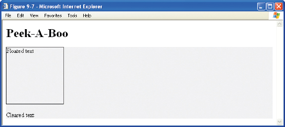
The Peek-A-Boo Bug
The peek-a-boo bug can come up in several different contexts — in fact, in far too many to list here. It involves content that disappears and reappears seemingly at random (hence, its aptly applied name).
Three properties present in the style sheet trigger this bug:
- Floating an element by applying a float: left; or float: right;.
- Including a background on the containing element
- Including a clear on an element following the float, where the margins of the clearing element come into contact with the floating element.
The following code demonstrates the problem.
<!DOCTYPE html PUBLIC “-//W3C//DTD HTML 4.01//EN”
    “http://www.w3.org/TR/html4/strict.dtd”>
<html lang=“en”>
<head>
    <meta http-equiv=“Content-Type” content=“text/html; charset=utf-8”>
    <title>FIGURE 9-7</title>
    <style type=“text/css”>
        #container {
            background: #EEE;
        }

        .float {
            float: left;
            width: 150px;
            height: 150px;
            border: 1px solid #000;
        }

        .clear {
            clear: left;
        }
    </style>
</head>
<body>

<h1>Peek-A-Boo</h1>

<div id=“container”>
    <p class=“float”>Floated text</p>
    <p>Content text 1</p>
    <p>Content text 2</p>
    <p>Content text 3</p>
    <p class=“clear”>Cleared text</p>
</div>

</body>
</html>
code snippet /chapter9/figure_9-7.html
This CSS and markup results in the output you see in Figure 9-7. As you can see, the elements between the first and last line of text are missing. Switch to a different window and back and the missing text may reappear!
So, with an overview of what causes the peek-a-boo bug and what it is, what do you do to work around the bug? You have more than one option:
- Apply a position: relative; declaration to the containing element and floating element.
- Prevent the margins of the clearing element from coming into contact with the floating element.
- Avoid applying a background to the containing element.
- Apply the declaration zoom: 1; to the containing element.
- Apply the declaration display: inline-block; to the containing element.
- Apply a fixed width to the containing element.
The Guillotine Bug
Guillotine is another aptly named bug where only part of the content disappears.
The guillotine bug occurs when the following conditions are present:
- IE is in standards-compliant rendering mode.
- An element is floated inside of a container element.
- Links exist inside the container element in non-floated content that appears after the float.
- a:hover pseudo-class is applied to <a> elements that change certain properties.
The following code demonstrates the problem.
<!DOCTYPE html PUBLIC “-//W3C//DTD HTML 4.01//EN”
    “http://www.w3.org/TR/html4/strict.dtd”>
<html lang=“en”>
<head>
    <meta http-equiv=“Content-Type” content=“text/html; charset=utf-8”>
    <title>FIGURE 9-8</title>
    <style type=“text/css”>
        #container {
          border: 1px solid #000;
        }

        .float {
            float: left;
            border: 1px solid #000;
        }

        ul {
            margin: 0;
            list-style: none;
        }

        a:hover {
            background: #EEE;
        }
    </style>
</head>
<body>

<h1>Guillotine</h1>

<div id=“container”>
    <div class=“float”>
        <p>Content text 1</p>
        <p>Content text 2</p>
        <p>Content text 3</p>
        <p>Content text 4</p>
        <p>Content text 5</p>
    </div>
    <ul>
        <li><a href=“#”>Link</a></li>
        <li><a href=“#”>Link</a></li>
        <li><a href=“#”>Link</a></li>
        <li><a href=“#”>Link</a></li>
    </ul>
</div>

</body>
</html>
code snippet /chapter9/figure_9-8.html
This CSS and markup results in the output you see in Figure 9-8. As you can see, the elements after the first two lines of text are missing, chopped off at the edge of the container element.
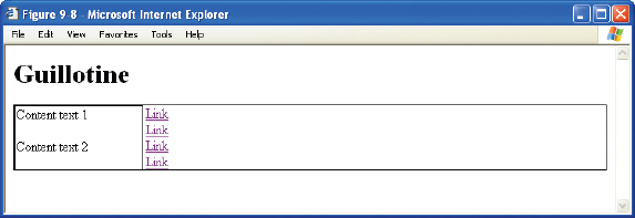
The guillotine bug is yet another bizarre IE rendering bug. The fix is not nearly as elegant as that for the peek-a-boo bug. To fix the guillotine bug, a clearing element must appear after the containing element. The best method to apply this clearing element without affecting the original design is to apply the following rule to the clearing element:
.clear {
    clear: both;
    visibility: hidden;
}
Then in the markup, add the clearing element:
<div class=“float”>Floated Content</div>
<div class=“clear”></div>
The Three-Pixel Jog
The next Internet Explorer rendering bug, which also involves floated elements, is called the three-pixel jog. As the name implies, this bug causes 3 pixels of space to appear between text inside an element that follows a floated element and the inner border of that element.
The following code demonstrates the problem.
<!DOCTYPE html PUBLIC “-//W3C//DTD HTML 4.01//EN”
    “http://www.w3.org/TR/html4/strict.dtd”>
<html lang=“en”>
<head>
    <meta http-equiv=“Content-Type” content=“text/html; charset=utf-8”>
    <title>FIGURE 9-9</title>
    <style type=“text/css”>
        .float {
            float: left;
            border: 1px solid #000;
        }
    </style>
</head>
<body>

<h1>Three-Pixel Jog</h1>

<div id=“container”>
    <div class=“float”>
        <p>Content text 1</p>
        <p>Content text 2</p>
        <p>Content text 3</p>
        <p>Content text 4</p>
        <p>Content text 5</p>
    </div>
    <div>
        <p>Content text 6</p>
        <p>Content text 7</p>
        <p>Content text 8</p>
        <p>Content text 9</p>
        <p>Content text 10</p>
    </div>
</div>

</body>
</html>
code snippet /chapter9/figure_9-9.html
This CSS and markup results in the output you see in Figure 9-9. As you can see, there is a space of 3 pixels between the text in the second column and the border of the first column.
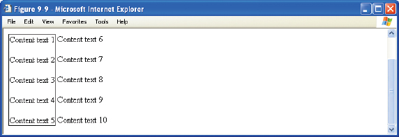
The three-pixel jog can be corrected by applying either a width or height (other than auto) to the element that follows the float.
<!--[if lte IE 6]>
<style type=“text/css”>
    p {
        height: 1px;
    }
</style>
<![endif]-->
You must use conditional comments or the hacks I showed you earlier to target IE 6 only. Because IE 6 and earlier versions have incorrect support for the height property, the content isn't adversely affected by including this declaration. Other browsers won't be so forgiving, however, so this solution must be applied only to Internet Explorer to avoid complications.
In most cases, it is best to not worry about this bug, though, other than you, no one is looking at your site in more than one browser side-by-side, so it is unlikely that such a minor issue will be noticed.
The Double-Margin Bug
Here's yet another Internet Explorer rendering bug involving floated elements. Under certain circumstances left margins on floated elements are doubled.
Three ingredients are required to reproduce this bug:
- A containing element
- A floated element inside the containing element
- A left margin specified on the floated element
The following code demonstrates the problem.
<!DOCTYPE html PUBLIC “-//W3C//DTD HTML 4.01//EN”
    “http://www.w3.org/TR/html4/strict.dtd”>
<html lang=“en”>
<head>
    <meta http-equiv=“Content-Type” content=“text/html; charset=utf-8”>
    <title>FIGURE 9-10</title>
    <style type=“text/css”>
        #container {
            border: 1px solid #000;
            float: left;
        }
        .float {
            float: left;
            margin-left: 50px;
            padding-left: 50px;
            border: 1px solid #000;
        }
    </style>
</head>
<body>

<h1>Double-Margin</h1>

<div id=“container”>
    <div class=“float”>
        <p>Content text 1</p>
        <p>Content text 2</p>
        <p>Content text 3</p>
        <p>Content text 4</p>
        <p>Content text 5</p>
    </div>
</div>

</body>
</html>
code snippet /chapter9/figure_9-10.html
This CSS and markup results in the output you see in Figure 9-10. As you can see, even though the padding between the inner element and its border should be the same as between it and the border of the outer element, the margin is actually double that of the padding.
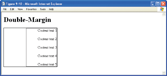
When these ingredients are present, the left margin of the floated element doubles. The fix for this bug is very simple. All you need to do is apply a display: inline; declaration to the floated element. If you recall from earlier in this chapter, all floated elements are always block elements. Using the display: inline; declaration tricks IE 6 into correct behavior. As is the case with the three-pixel jog, you can target IE 6 specifically by including this declaration within a rule inside of a style sheet that resides in conditional comments.
VERTICALLY ALIGNING CONTENT
The vertical-align property is used primarily in two contexts. In one context, it is used to vertically align text appearing within the lines of a paragraph. One example of this creates subscript or superscript text. The vertical-align property may also be used to align the content appearing inside a table cell. The following table outlines the vertical-align property and its possible values.
| PROPERTY | VALUE |
| vertical-align | baseline | sub | super | top | text-top | middle | bottom | text-bottom | <percentage> | <length> Initial value: baseline |
The vertical-align property applies exclusively to inline elements, such as <img/> and <span>. It has different meaning when applied to table cells. I discuss its use in cells in an upcoming section. In the next section, however, I look at how to format subscript text with the vertical-align property.
Subscript and Superscript Text
Within a paragraph, you may need several different types of styles that are only applied to snippets of the text, such as bold or italic fonts. Subscript text is an example of styles that often apply only to a selection of text, rather than to a whole paragraph. Subscript text is text that appears slightly smaller than the text surrounding it and slightly lower than the baseline of the surrounding text. The baseline is the invisible line created for each line of text against which the bottom of each letter is aligned. In other words, the baseline is the line that letters “sit” on. Superscript text, on the other hand, is text raised above the baseline and that appears slightly smaller than the surrounding text. The following code demonstrates subscript and superscript text.
<!DOCTYPE html PUBLIC “-//W3C//DTD HTML 4.01//EN”
    “http://www.w3.org/TR/html4/strict.dtd”>
<html lang=“en”>
<head>
    <meta http-equiv=“Content-Type” content=“text/html; charset=utf-8”>
    <title>FIGURE 9-11</title>
    <style type=“text/css”>
        h1 span {
            font-size: 0.5em;
        }

        .superscript {
            vertical-align: super;
        }

        .subscript {
            vertical-align: sub;
        }
    </style>
</head>
<body>

<h1><span class=“superscript”>Tasty</span> Recipes for <span class=“subscript”>
Tasty</span> Cheese</h1>

</body>
</html>
code snippet /chapter9/figure_9-11.html
This CSS and markup results in the output in Figure 9-11.
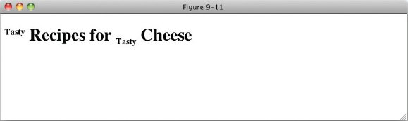
Figure 9-11 shows that the content of the <span> element with the class of superscript appears slightly higher, which is a result of applying the vertical-align: super; declaration. The figure also shows that the content of the <span> element with the class of subscript appears slightly lower, which is a result of applying the vertical-align: sub; declaration.
The next section continues the discussion of the vertical-align property with top, middle, and bottom vertical alignment text.
The top, middle, and bottom Keywords
The top, middle, and bottom keywords are used to control vertical alignment of selections of text that are slightly smaller than the surrounding text. The top keyword is demonstrated in the following snippet.
<!DOCTYPE html PUBLIC “-//W3C//DTD HTML 4.01//EN”
    “http://www.w3.org/TR/html4/strict.dtd”>
<html lang=“en”>
<head>
    <meta http-equiv=“Content-Type” content=“text/html; charset=utf-8”>
    <title>FIGURE 9-12</title>
    <style type=“text/css”>
        h1 span {
            font-size: 0.5em;
        }

        .top {
            vertical-align: top;
        }

        .middle {
            vertical-align: middle;
        }

        .bottom {
            vertical-align: bottom;
        }
    </style>
</head>
<body>

<h1><span class=“top”>Super</span> <span class=“middle”>Tasty</span> Recipes for
<span class=“bottom”>Tasty</span> Cheese</h1>

</body>
</html>
code snippet /chapter9/figure_9-12.html
This CSS and markup results in the output in Figure 9-12.
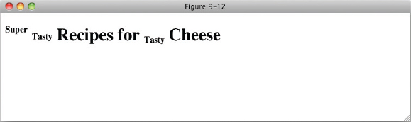
In Figure 9-12, you see that each <span> element is aligned to the top, middle, and bottom of the line box.
The text-top and text-bottom Keywords
Like the top, middle, and bottom values, the text-top and text-bottom keywords raise or lower a subset of text. The difference in the text-top keyword as opposed to the top keyword is that the text-top keyword causes alignment to happen with respect to the tallest character of the font of the surrounding text. Likewise, the text-bottom keyword aligns with respect to the lowest character, for instance the letters p, y, or g, which drop below the baseline. The text-top and text-bottom keyword values produce output similar to that produced by the top and bottom keywords. The most important difference between top and text-top is that top causes the top of the text to align with the top of the line containing that inline box, determined by the line-height (see chapter 6 for a recap), whereas text-top aligns with respect to the tallest character in the font. You can see this in the following code.
<!DOCTYPE html PUBLIC “-//W3C//DTD HTML 4.01//EN”
“http://www.w3.org/TR/html4/strict.dtd”>
<html lang=“en”>
<head>
<meta http-equiv=“Content-Type” content=“text/html; charset=utf-8”>
<title>FIGURE 9-13</title>
<style type=“text/css”>
h1 span {
font-size: 0.5em;
}
.text-top {
vertical-align: top;
}
.text-bottom {
vertical-align: bottom;
}
</style>
</head>
<body>
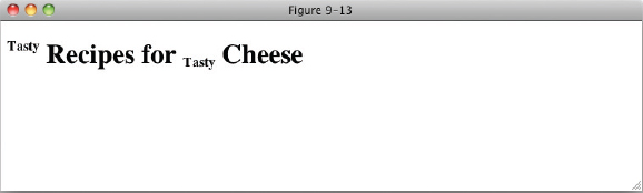
<h1><span class=“text-top”>Tasty</span> Recipes for <span class=“text-bottom”>
Tasty</span> Cheese</h1>
</body>
</html>
code snippet /chapter9/figure_9-13.html
This CSS and markup results in the output you see in Figure 9-13.
The next section discusses percentage and length values as applied to the vertical-align property.
Percentage and Length Value
If the selection of keywords I presented in the previous sections weren't enough for you, the vertical-align property also allows percentage and length values to be applied. The following code demonstrates this:
<!DOCTYPE html PUBLIC “-//W3C//DTD HTML 4.01//EN”
    “http://www.w3.org/TR/html4/strict.dtd”>
<html lang=“en”>
<head>
    <meta http-equiv=“Content-Type” content=“text/html; charset=utf-8”>
    <title>FIGURE 9-14</title>
    <style type=“text/css”>
        h1 span {
            font-size: 0.5em;
            line-height: 10px;
        }

        .align-pixel {
            vertical-align: 5px;
        }

        .align-percent {
            vertical-align: 50%;
        }
    </style>
</head>
<body>

<h1><span class=“align-pixel”>Tasty</span> Recipes for <span class=“align-percent”>
Tasty</span> Cheese</h1>

</body>
</html>
code snippet /chapter9/figure_9-14.html
This CSS and markup results in the output in Figure 9-14.
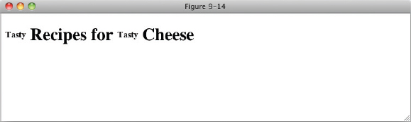
Giving the vertical-align property percentage or length values positioned text above the text base line by the value given. In the case of percentage values, the distance is based on the line-height of the positioned element. In Figure 9-14, the line-height of each element has been set to 10px, and the vertical-align value of the second span to 50%. 50% of 10px is 5px, so it will have the same offset as the first span.
Vertically Aligning the Contents of Table Cells
The vertical-align property has a completely different meaning when it is applied to table cells. When applied to table cells, only the baseline, top, middle, and bottom keywords are applicable, and the vertical-align property is used to align the entire contents of the cell. As these keywords behave in the same way as we have seen before, but with the context of the table cell rather than the bounding box determined by line-height, let's Try It Out!
TRY IT OUT Vertically Aligning Text in a Table
To see the vertical-align property in action, follow these steps.
- Enter the following markup:
<!DOCTYPE html PUBLIC “-//W3C//DTD HTML 4.01//EN” “http://www.w3.org/TR/html4/strict.dtd”> <html lang=“en”> <head> <meta http-equiv=“Content-Type” content=“text/html; charset=utf-8”> <title>Example 9-2</title> <style type=“text/css”> table { width: 200px; text-align: left; } th { vertical-align: bottom; border-bottom: 2px solid #666; } td { vertical-align: top; border-bottom: 1px solid #666; } </style> </head> <body> <table> <caption>Ingredients</caption> <thead> <tr> <th>Ingredient</th> <th>Quantity of Ingredient</th> </tr> </thead> <tbody> <tr> <td>Bread</th> <td>2 medium thickness slices</td> </tr> <tr> <td>Butter</td> <td>Enough for 2 slices of bread</td> </tr> <tr> <td>Grated Cheddar</td> <td>1.5 handfuls</td> </tr> <tr> <td>Beer</td> <td>One splash</td> </tr> <tr> <td>Wholegrain mustard</td> <td>One dollop</td> </tr> <tr> <td>Pepper</td> <td>To taste</td> </tr> </tbody> </table> </body> </html> - Save the preceding CSS and markup as example_9-2.html. This example results in the output in Figure 9-15
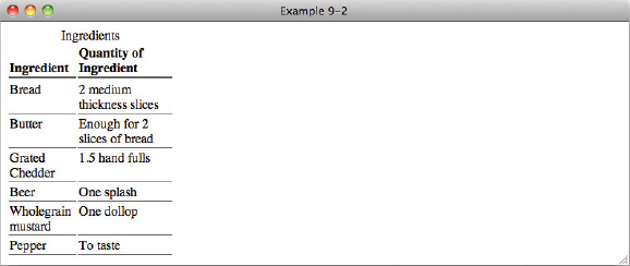
In Example 9-2, you set the text in <th> elements to align to the bottom of the cell and the text in <td> elements to align to the top of the cell.
EXERCISES
- When an element is floated, what rule governs its dimensions?
- What happens when an inline element, such as a <span> element, is floated?
- What are the three keywords of the float property?
- If an element is floated to the right, and you don't want the following element to wrap around it, what declaration would you apply to that element?
- What declarations would you use to create subscript and superscript text?
- When vertically aligning an inline element to the middle, how is the element positioned on the line?
- What is the difference between the text-top and top keywords of the vertical-align property?
- If you are aligning table cells to the baseline, what determines the baseline?
 WHAT YOU LEARNED IN THIS CHAPTER
This chapter focused on three key areas of CSS design. In this chapter, you learned the following:
| TOPIC | KEY CONCEPTS |
| float | The float property is a seemingly complex property that has a unique place in CS design. The float property is used for layout — for instance, to include content in the flow of paragraph text in such a way that text wraps around the floated element. |
| clear | The clear property is used to control the effects of the float property in situations where you don't want all the content following a floated element to float beside it. |
| vertical-align | The vertical-align property is used to vertically align inline elements such as the <span> element or the <img> element relative to the line containing those inline elements; this property can be used, for instance, to create subscript or superscript text. The vertical-align property may also be applied to table cells to control vertical alignment of the content within table cells. If the vertical-align property is applied to table cells, only a subset of properties are applicable. These include the baseline, top, middle, and bottom properties. The behavior of these properties is completely different when applied to table cells as opposed to normal inline content. |