18
Styling Content for Mobile Devices
WHAT YOU WILL LEARN IN THIS CHAPTER:
In Chapter 15 you saw how you could apply styles that applied only when printed with the media attribute and @media rule. Mobile browsers offer a similar challenge to developers as their capabilities and limitations can be very different to those of desktop browsers.
WHY MOBILE IS IMPORTANT
A February 2011 report for YouGov revealed that in the US one in five mobile phone users access the Internet on their phone every day, while in the UK the proportion was even higher with one in three accessing the web with their mobile phone every day. Similar usage patterns can be found the world over, with the trend towards mobile use increasing every year as devices become more sophisticated. The future of the web may well be on a small screen device such as a mobile phone.
The same report also found that over a quarter of mobile phone users in both the US and the UK were discouraged from accessing the web on their mobile phones, not because their devices were hard to use, but because the websites that they wanted to access did not display or function correctly on their phones.
With such large numbers of potential users, but so many being put off by poor user experience, there is a great and increasing need to write CSS in such a way as to be mobile friendly.
DEVELOPING FOR MOBILE
Interacting with a mobile device is very different from using a browser on a desktop computer. On a desktop, you mostly rely on two input devices: the mouse and the keyboard. On a mobile device, the keyboard is not applicable to general browsing (for example, you can't scroll down a page by hitting the space bar in a mobile browser), and the mouse is replaced with either a keypad or joystick-like device for moving around a page or with a touch interface.
With the keypad method of input, you control a cursor in the same way as with a mouse on the desktop, so interactions such as hover states on links will function. With a touch-screen device, hovering doesn't have an equivalent; under most circumstances, tapping on a link will activate it immediately.
The small screen of a mobile device also changes the way users interact with a site. Most modern mobile browsers support zooming in one form or another, either by tapping on the screen to enlarge a certain area or using gestures to change the zoom level on devices that support multi-touch events (that is, actions where more than one finger is used).
Until the user zooms in to the area of the page they are interested in, content may be too small to read or easily identify, and navigating the page can be particularly cumbersome for keypad users.
All of these issues mean that you have to give some specific attention to the design and layouts of sites on mobile devices, in particular:
- Do not set an absolute size on the width of your site.
- Display the main content in a single column.
- Clearly indicate links, buttons, and other interactive controls.
- Do not assume a hover state.
In the next section, I briefly cover testing for mobile devices.
TESTING MOBILE DEVICES
As you read in Chapter 1, there are 4 main families of desktop browser rendering engines:
- Webkit used by Safari and Chrome
- Trident used by Internet Explorer
- Gecko used by Firefox
- Presto used by Opera
Of these, Webkit and Presto are the most strongly represented in the mobile browser space, with the mobile Safari browser from Apple and the Android browser from Google using the Webkit rendering engine, and Opera Mobile and Opera Mini using Presto. The Windows Phone 7 had the Mobile IE 7 browser using the Trident rendering engine. Mozilla has a Firefox mobile browser that uses the Gecko rendering engine, as you might expect.
So far mobile and desktop browsers look very similar, but these common browsers are just the tip of the iceberg. Peter-Paul Koch, an expert on mobile browsers, maintains a table of the most common mobile browsers, a table that at the time of writing includes 20 browsers, 14 Operating Systems, and 14 different device vendors! Take a look for yourself at www.quirksmode.org/mobile/mobilemarket.html.
Testing for all of the different browsers is not practical for most people, and the reality is that, as with desktop browsers, you need to be able to identify which browsers and devices will give you good coverage of the market.
This is a much too complicated subject for this book, and anything I might write would soon be out-of-date, so instead I will give you a link to an article Mr. Koch wrote for the A List Apart website, which, as well as giving an excellent overview of the mobile market as of November 2010, includes advice on testing.
The article lives at www.alistapart.com/articles/smartphone-browser-landscape/.
Of particular interest to you as you read this chapter may be the guide to mobile phone emulators at http://mobiforge.com/emulators/page/mobile-emulators, which will give you links to both online and installable emulators.
The screen shots in this chapter use the iPhone Simulator supplied by Apple for application development.
In the next section, I will show you how to apply styles specifically to mobile devices.
MEDIA QUERIES
As you saw in Chapter 15, you can in theory target different media using the media attribute, which is applied to the link or style element, or from within a style sheet, using @media rules. The different types of media are repeated in the following table.
| MEDIA | PURPOSE |
| all | Suitable for all devices. |
| braille | Intended for Braille tactical feedback devices. |
| embossed | Intended for paged Braille printers. |
| handheld | Intended for handheld devices. |
| Intended for presentation when printed. Use print preview to view the result of using a print style sheet. | |
| projection | Intended for projected presentations. |
| screen | Intended for presentation on a color computer screen. |
| speech | aural | Intended for presentation to a speech synthesizer (called aural in CSS 2, changed to speech in CSS 2.1). |
| tty | Intended for media using a fixed-pitch character grid (such as teletypes, terminals, or portable devices with limited display capabilities). |
| tv | Intended for television (low resolution, low color, limited scrollability). |
As you found in Chapter 15, only the screen, print, and all values are widely supported on desktop browsers, but you may have noticed a handheld value is available, intended for use for handheld devices.
Unfortunately, support for media types is no better in the mobile world, and virtually all mobile browsers ignore the handheld media type.
All is not lost, however. In modern mobile browsers, the media attribute and @media rule support more than just basic media types; enter media queries!
<style type=“text/css” media=“screen and (max-device-width: 480px)”>
</style>

<link rel=“stylesheet” type=“text/css” href=“mobile.css”
  media=“screen and (max-device-width: 480px)”>

<style type=“text/css”>
    @media screen and (max-device-width: 480px) {

    }
</style>
As you can see from the preceding code, we can use media queries anywhere that we can use the media attribute or @media rule. Here I am targeting screen devices, a media type that modern mobile phones support, in order to avoid conflicting CSS on any other type of device that also uses a small screen, and additionally specifying a max-device-width with a value of 480px.
device-width is a media feature, which describes the width of the screen of a device; using the max prefix I am targeting my CSS at devices that have a screen width up to a maximum of 480px. This targets most mobile phones with modern browsers and provides good support coverage. Let's Try It Out.
TRY IT OUT Applying Styles for Mobile Devices
To use styles only for mobile devices, follow these steps.
- Enter the following markup:
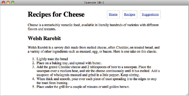
<!DOCTYPE html PUBLIC “-//W3C//DTD HTML 4.01//EN” “http://www.w3.org/TR/html4/strict.dtd”> <html lang=“en”> <head> <meta http-equiv=“Content-Type” content=“text/html; charset=utf-8”> <title>Example 18-1</title> <style type=“text/css”> body { width: 600px; margin: 1em auto; } h1 { float: left; margin-top: 0.2em; } .navigation { float: right; } .navigation li { display: inline; } .navigation a { margin-left: 0.5em; padding: 0.5em; border: 1px solid #CCC; } .intro { clear: both; } @media screen and (max-device-width: 480px) { body { width: auto; margin: 1em; } h1, .navigation { float: none; } } </style> </head> <body> <h1>Recipes for Cheese</h1> <ul class=“navigation”> <li><a href=“#”>Home</a></li> <li><a href=“#”>Recipes</a></li> <li><a href=“#”>Suggestions</a></li> </ul> <p class=“intro”>Cheese is a remarkably versatile food, available in literally hundreds of varieties with different flavors and textures.</p> <div class=“recipe”> <h2>Welsh Rarebit</h2> <p class=“intro”>Welsh Rarebit is a savory dish made from melted cheese, often Cheddar, on toasted bread, and a variety of other ingredients such as mustard, egg, or bacon. Here is one take on this classic.</p> <ol> <li>Lightly toast the bread</li> <li>Place on a baking tray, and spread with butter.</li> <li>Add the grated Cheddar cheese and 2 tablespoons of beer to a saucepan. Place the saucepan over a medium heat, and stir the cheese continuously until it has melted. Add a teaspoon of wholegrain mustard and grind in a little pepper. Keep stirring.</li> <li>When thick and smooth, pour over each piece of toast spreading it to the edges to stop the toast from burning.</li> <li>Place under the grill for a couple of minutes or until golden brown.</li> </ol> </div> </body> </html> - Save the preceding CSS and markup as example_18-1.html. This example results in the rendered output in Figure 18-1 in Safari and other desktop browsers.
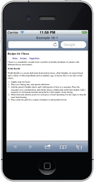
- Now open the same page in a browser on a mobile device or a mobile browser simulator (see earlier in this chapter or in Appendix B for links to available simulators). You will see output similar to that in Figure 18-2.
How It Works
In Example 18-1, you applied separate styles to desktop browsers and mobile browsers using @media rules.
In Figure 18-1, you can see that the page in your browser looks much the same as it has in examples in previous chapters, with the page title on the left and the navigation on the right.
Figure 18-2 shows the same page in the iPhone simulator. Here the page title and navigation have been put on separate lines, and unlike the desktop version the content fills the full width of the page.
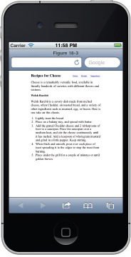
You can see this more clearly when you compare Figure 18-2 to Figure 18-3, which is the page without the addition of mobile device media queries.
In Figure 18-3 you will see that without the addition of mobile-targeted CSS there is a lot of wasted space, as the content does not fit the full width of the screen, making the navigation links in particular virtually unreadable unless the user zooms in.
Another interesting media feature is orientation, which accepts values of portrait and landscape. portrait is defined as the screen width less than or equal to the height; landscape is when the screen width is more than the height.
Adding orientation queries means that we can display different content depending on which way a device is being held, so in the following code I only position the navigation on a separate line if the orientation is portrait.
<!DOCTYPE html PUBLIC “-//W3C//DTD HTML 4.01//EN”
    “http://www.w3.org/TR/html4/strict.dtd”>
<html lang=“en”>
<head>
    <meta http-equiv=“Content-Type” content=“text/html; charset=utf-8”>
    <title>FIGURE 18-4</title>
    <style type=“text/css”>
        body {
            width: 600px;
            margin: 1em auto;
        }

        h1 {
            float: left;
            margin-top: 0.2em;
        }

        .navigation {
            float: right;
        }

        .navigation li {
            display: inline;
        }

        .navigation a {
            margin-left: 0.5em;
            padding: 0.5em;
            border: 1px solid #CCC;
        }

        .intro {
            clear: both;
        }

        @media screen and (max-device-width: 480px) {
            body {
                width: auto;
                margin: 1em;
            }
        }

        @media screen and (max-device-width: 480px) and
           (orientation: portrait) {
            h1,
            .navigation {

                 float: none;
            }
        }
    </style>

</head>
<body>

<h1>Recipes for Cheese</h1>

<ul class=“navigation”>
    <li><a href=“#”>Home</a></li>
    <li><a href=“#”>Recipes</a></li>
    <li><a href=“#”>Suggestions</a></li>
</ul>

<p class=“intro”>Cheese is a remarkably versatile food, available in
literally hundreds of varieties with different flavors and textures.</p>

<div class=“recipe”>

    <h2>Welsh Rarebit</h2>

    <p class=“intro”>Welsh Rarebit is a savory dish made from melted
    cheese, often Cheddar, on toasted bread, and a variety of other
    ingredients such as mustard, egg, or bacon. Here is one take on
    this classic.</p>

    <ol>
        <li>Lightly toast the bread</li>
        <li>Place on a baking tray, and spread with butter.</li>
        <li>Add the grated Cheddar cheese and 2 tablespoons of beer to
        a saucepan. Place the saucepan over a medium heat, and stir the
        cheese continuously until it has melted. Add a teaspoon of
        wholegrain mustard and grind in a little pepper. Keep
        stirring.</li>
        <li>When thick and smooth, pour over each piece of toast
        spreading it to the edges to stop the toast from burning.</li>
        <li>Place under the grill for a couple of minutes or until
        golden brown.</li>
    </ol>

</div>

</body>
</html>
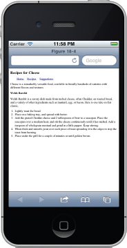
Figure 18-4 shows my iPhone simulator in portrait orientation, and it looks as before. The content fills the full width of the screen and the navigation is below the page title. Now see what happens when I flip the orientation to landscape.
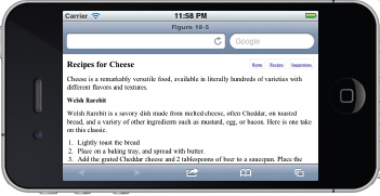
In Figure 18-5 the content still fits the fill width of the screen, but the navigation and page title are on the same line as in the desktop browser version.
There are many other media features available to developers; see Appendix B for a link to a full list. Media queries aren't just about supporting mobile devices. They're a key aspect in what's being called Responsive Design, where the CSS is mixed with media queries to create several layouts depending on the media properties. As you progress in your knowledge of CSS you will see them used in different ways, but I hope this chapter gives you a good basic knowledge.
That's the end of this chapter and almost the end of the book. In the final chapter, I close with a summary of what I've covered and some of my thoughts on the future of CSS.
EXERCISES
- Which media value was intended to apply to mobile devices but which has poor real world support?
- Write a sample style sheet that includes two rules; the first rule applies to all media types, and the second rule applies to mobile.
 WHAT YOU LEARNED IN THIS CHAPTER
In this chapter, I showed you some of the challenges of writing CSS for mobile devices. You learned the following:
| TOPIC | KEY CONCEPTS |
| The benefits of writing mobile specific CSS | The web is widely accessed on mobile devices, with more people using the mobile web every year. Sites designed for desktop browsers can be difficult to use on a mobile, but some simple changes can help enormously. |
| The state of the mobile landscape | There are a wide variety of mobile browsers, operating systems and devices in wide use, and it is impossible for most developers to test on them all. |
| Using media queries | media attributes on link and style tags, and @media rules in CSS files and style elements can be used to write CSS for mobile devices. |