13. Work with business intelligence
In this chapter
![]() Get started with SharePoint BI
Get started with SharePoint BI
![]() Create and publish PowerPivot dashboards
Create and publish PowerPivot dashboards
![]() Display PowerPivot dashboards in web parts
Display PowerPivot dashboards in web parts
![]() Build visualizations by using Power View
Build visualizations by using Power View
![]() Display Power View reports in web parts
Display Power View reports in web parts
Practice files
For this chapter, use the practice file from the SP2016SBSCh13 folder. For practice file download instructions, see the introduction.
Business intelligence (BI) is a set of tools and capabilities that work together to turn large amounts of data into meaningful information for better decision making. SharePoint 2016 provides a BI platform that puts power in the hands of the users, providing self-service capabilities for collaborative data exploration, visualization, and presentation experiences for gaining better and deeper insights.
The BI capabilities provided in SharePoint 2016 and Microsoft Office Online Server integrate with Excel 2016 to explore and visualize data. You can build data models and create a wide range of scorecards and dashboards in Excel, including PowerPivot tables and charts, that you can then publish to SharePoint.
SharePoint 2016 BI functionality includes Power View, an ad hoc reporting tool you can use to build interactive and intuitive reports and animations to visually explore data. You can create a variety of interactive charts and tables, and add timeline controls, filters, and slicers so that users can drill further into the data.
This chapter guides you through procedures related to getting started with SharePoint BI, shaping your data, creating and publishing PowerPivot dashboards, displaying PowerPivot dashboards in web parts, building visualizations by using Power View, and displaying Power View reports in web parts.
Get started with SharePoint BI
The BI tools and components in SharePoint 2016 work together so that you can explore, visualize, and share information in interactive reports, scorecards, and dashboards. In addition to the server-side services, they include SharePoint sites, libraries, and content types that are specifically designed for providing self-service BI functionality.
![]() Important
Important
Full SharePoint BI capabilities are included in SharePoint 2016 Enterprise when it is installed with Microsoft SQL Server 2016 Enterprise in on-premises deployments. For the full range of BI capabilities in SharePoint Server 2016, including Excel integration, you also need to have Office Online Server (OOS) installed and activated in your deployment.
In SharePoint 2016, self-service BI goes beyond individual insight. All self-service BI capabilities are extended into a collaborative BI platform that you can use to share insights and work together to develop insights even further. For example, you can view and interact with data in Power View visualizations and in Excel workbooks that have been published to SharePoint 2016 sites in your browser by using Excel Online.
On the server side, SharePoint 2016 relies on Office Online Server, which connects to SQL Server 2016 Analysis Services (SSAS) and SQL Server 2016 Reporting Services (SSRS) servers to provide PowerPivot and Power View capabilities.
![]() See Also
See Also
For more information about deploying SQL Server 2016 PowerPivot and Power View features in SharePoint 2016, go to https://go.microsoft.com/fwlink/?LinkId=717341.
SharePoint 2016 BI server-side components also include PerformancePoint Services and Microsoft Visio Services. By using PerformancePoint Services, you can create centrally managed interactive dashboards that display key performance indicators (KPIs) and data visualizations in the form of scorecards, reports, and filters.
By using Visio Services, you can view visual diagrams and share them to SharePoint sites. You can create and publish diagrams that are connected to data sources and that can be configured to refresh data to display up-to-date information. The diagrams can be viewed on multiple devices, which means that you can view Visio documents without having the Visio client application installed on your device. Visio diagrams can also be rendered within the Microsoft Visio Web Access web part.
For SharePoint Online, the BI features are supported in several SharePoint Online and Office 365 plans, such as P2, E3, E4, E5, and O365 Education. The BI features in SharePoint Online are more limited compared to those available in SharePoint 2016 on-premises deployments. For example, SQL Server Reporting Services (SSRS) Integrated Mode is not available. You can publish PowerPivot and Power View reports created in Excel, but you cannot build a Power View report in SharePoint Online.
![]() See Also
See Also
For more information about the BI features that are included in the SharePoint Online and Office 365 subscription plans, go to https://technet.microsoft.com/en-GB/library/jj819267.aspx.
![]() Tip
Tip
Office 365 also provides the Microsoft Power BI suite of business analytics tools to analyze data and share insights. The Power BI suite includes the Power BI online service and the Power BI Desktop application, which provide a powerful BI platform and functionalities. The Power BI functionalities are not fully compatible with those provided by SharePoint and Excel. The Power BI Desktop files have a .pbix extension and can be published to the Power BI online service. At the time of writing, the .pbix files are not integrated with SharePoint. For more information about Power BI, go to https://powerbi.microsoft.com.
In addition to the server-side components, SharePoint 2016 BI provides site and library templates that include the BI self-service capabilities, such as the Business Intelligence Center site, the PowerPivot site, and the PowerPivot Gallery library.
![]() Tip
Tip
The Enterprise Search Center site includes a built-in vertical search results page named Reports, which searches the index of BI-related reports and provides previews of the search results for quick reference.
![]() Important
Important
The PowerPivot site and PowerPivot Gallery are not available in SharePoint Online.
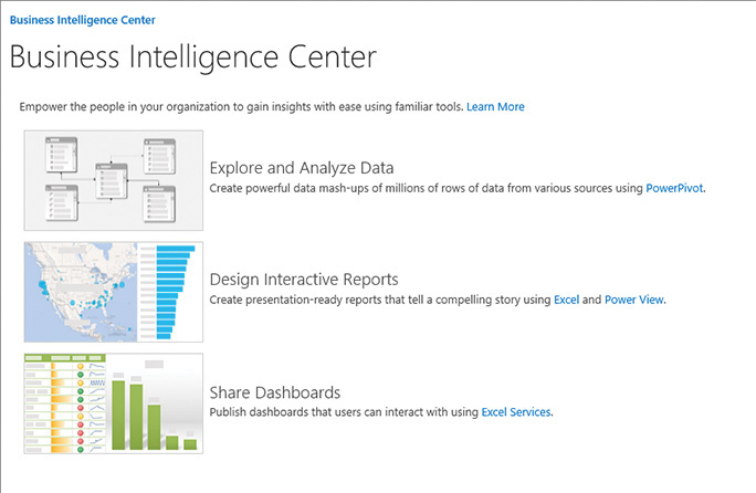
The Business Intelligence Center is an enterprise SharePoint site that is designed to support enterprise-wide BI applications. It provides multiple libraries, web parts, and content types that are optimized for BI self-service applications. By using the Business Intelligence Center, organizations can centrally store and manage data connections, reports, scorecards, dashboards, and web part pages.
The PowerPivot site is a collaboration SharePoint site that includes BI capabilities with PowerPivot and Power View features. It is similar to the Team site, but in addition to the default Documents library, it also provides a PowerPivot Gallery, which is a document library that has additional functionalities that are designed to support BI applications.
![]() Tip
Tip
The PowerPivot capabilities include server-side data refresh processing, collaboration, and management support for PowerPivot workbooks. For these capabilities to be available in your SharePoint 2016 deployment, you need to install Microsoft SQL Server 2016 PowerPivot for SharePoint 2016, which is available as a free download from https://www.microsoft.com/en-us/download/details.aspx?id=52675.
When the PowerPivot site feature is active in the site collection, the PowerPivot site template becomes available in the New SharePoint Site page when you create a new site in the site collection.
Create a new PowerPivot site
The PowerPivot Gallery is a special-purpose library in SharePoint that you can use to view and update Excel workbooks that contain PowerPivot data. It also includes options for configuring a data refresh schedule and creating a Power View report based on a published PowerPivot workbook. The PowerPivot Gallery is deployed as a part of a PowerPivot site and is displayed on its Quick Launch.
You can also add the PowerPivot Gallery to an existing team site. When PowerPivot for SharePoint 2016 is deployed in a site collection, the PowerPivot Gallery app is added to the list of available apps for all sites in the site collection and is listed on the Your Apps page on the team site.
Add a PowerPivot Gallery
When you publish an Excel workbook to the PowerPivot Gallery, you can use different library views to display the worksheets. When the workbook is uploaded to the PowerPivot Gallery, it is displayed in the Gallery view, which allows you to focus on individual worksheets in the workbook by displaying a sheet in the viewing area.
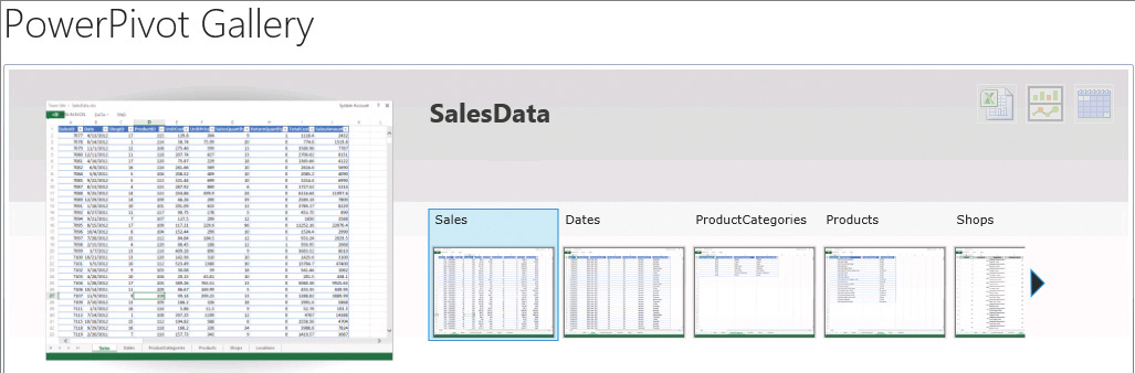
Use a Gallery view to browse through the worksheets in an Excel workbook
In the Theatre view, the viewing area is centered, with individual worksheets revolving to the front as you focus on them. In the Carousel view, you can browse through the worksheets by clicking or tapping left and right arrows. The All Documents view displays the list of files in the PowerPivot Gallery. This view is useful for managing files.
The PowerPivot Gallery views—such as the Gallery, Theatre, and Carousel views—require Microsoft Silverlight to display the workbooks. Client devices must have Silverlight installed to use the PowerPivot Gallery.
Although the PowerPivot Gallery is specially designed for BI reports, when the PowerPivot site feature is active, the PowerPivot for SharePoint capabilities can also be used in a generic document library, such as the default Documents library, to view and update the Excel workbooks that contain PowerPivot data.
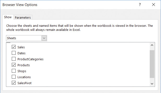
You can choose to display one or more worksheets or the individual named items in the workbooks by using the browser view options in Excel. The default is to display an entire workbook with all worksheets.
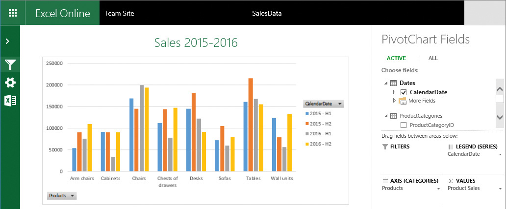
When you choose to display a worksheet, an entire worksheet is displayed in Excel Online, similar to how it looks in Excel. This view works well for dashboards that are created in Excel, because you can see all the charts and tables on the screen in a single view. When you use a filter, all displayed items that are connected to that filter are refreshed. If you’ve identified more than one worksheet in the workbook to be displayed, the additional worksheets are shown as tabs across the bottom of the screen that you can select to view another worksheet.
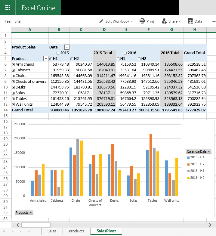
View an entire worksheet in Excel Online
When you choose to display a named item, such as a chart, a table, or a range of cells, the item is displayed in the center of the screen in Excel Online, and additional parameters, such as filters, can be displayed as thumbnail images along the right side of the screen. When you use a filter, the displayed chart or table is refreshed. This view works well for individual charts and tables.
Display an individual named item in Excel Online
To publish worksheets or named items in an Excel workbook to a document library
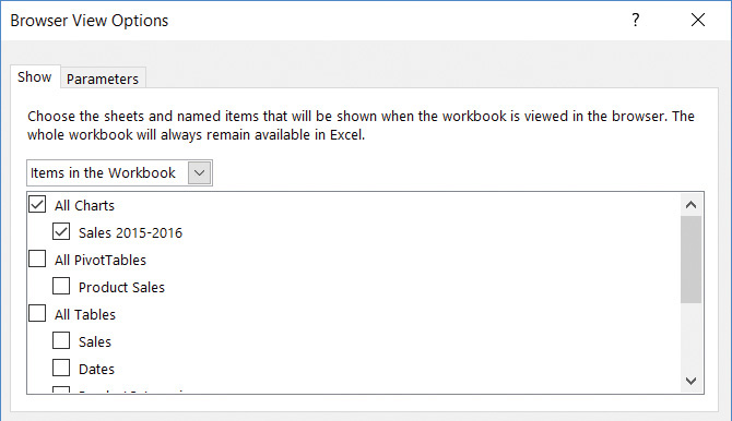
1. In Excel, open the workbook that you want to publish to a SharePoint document library. Select the File tab, and on the Info page, select Browser View Options to open the Browser View Options dialog box.
2. In the Browser View Options dialog box, do one of the following:
• To publish worksheets, on the Show tab, in the drop-down list, select Sheets. Then select the check boxes next to the worksheets that you want to display, and select OK.
Select worksheets to publish to SharePoint
• To publish named items, on the Show tab, in the drop-down list, select Items in the Workbook. Then, select the check boxes next to the named items that you want to publish. If there are additional filters and slicers to be displayed, on the Parameters tab select Add, and then select the filters. Select OK to confirm and return to the Parameters tab. When you are done, select OK in the Browser View Options dialog box.
3. Save and close the workbook.
4. Upload the workbook to a document library.
To create a PowerPivot Gallery in a team site
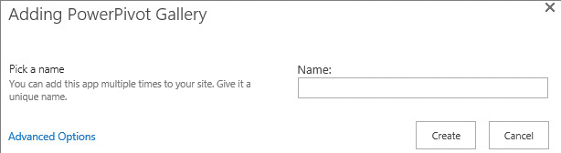
1. In a team site where you want to create a PowerPivot Gallery, on the Your Apps page, select the PowerPivot Gallery app.
2. In the Adding PowerPivot Gallery dialog, in the Name box, enter the name of the new gallery, and then select Create.
Create a PowerPivot Gallery
3. On the Quick Launch, select your new gallery. If Silverlight is not installed on your device, a message appears prompting you to install Silverlight. Click or tap the message to download Silverlight and start the setup wizard. Follow the wizard to install Silverlight, and then select Close on the Installation Successful page.
![]() Tip
Tip
When a new PowerPivot Gallery is created, its link is added to the Recent section of the Quick Launch. If you want the link to be permanent, you can edit the Quick Launch to move the link from the Recent section into another area on the Quick Launch.
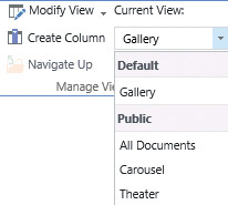
To switch views in a PowerPivot Gallery
1. In the PowerPivot Gallery, on the Library tab, in the Manage Views group, under Current View, select the arrow to display a list of views.
Switch between views in the PowerPivot Gallery
2. Select the view you want to switch to.
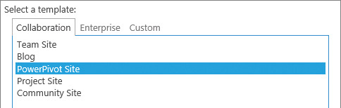
1. In the parent site where you want to create a PowerPivot site, on the Site Contents page, select new subsite.
2. On the New Site page, enter the name and URL for the new site.
3. In the Template section, on the Collaboration tab, select PowerPivot site.
4. Select the permissions and navigation options you want, and then select Create to confirm the new site creation.
Shape your data
When you work with business intelligence, there are three main steps to consider:
1. Identify the data sources for your reports and establish connections to them.
2. Organize the data from these multiple sources to build a coherent data model.
3. Build and share reports based on that data model.
The first two steps are dedicated to identifying and shaping your data into an aggregate data model so that you can then build insightful and compelling reports for better decision making. Your BI report is as insightful as the data model it is based on.
With data models that are supported in SharePoint 2016 and Excel 2016, you can bring data from a variety of sources into one cohesive data set, and then use it to create charts, tables, reports, and dashboards. A data model is essentially a collection of data from multiple sources with relationships between different fields, which you can create and organize by using PowerPivot for Excel. Typically, a data model includes one or more tables of data. To build a data model, you can sort, organize, and calculate the data and create relationships between different tables.
When you create a data model in Excel, in addition to data that is native to Excel, you can also combine data from one or more external data sources. SharePoint and OOS support a subset of the external data connections that you can create from Excel. The external data connections that are supported in SharePoint Server 2016 and OOS include connections to the following data sources:
![]() SQL Server tables
SQL Server tables
![]() SQL Server Analysis Services cubes
SQL Server Analysis Services cubes
![]() OLE DB and ODBC data sources
OLE DB and ODBC data sources
![]() OData data sources
OData data sources
![]() Tip
Tip
To use data from external data sources that are not supported in SharePoint 2016 and OOS, you might be able to import a snapshot of the data into Excel, and then use it in your data model as data native to Excel.
To build a data model, you can use the PowerPivot add-in for Excel that is included in Excel 2016. With PowerPivot for Excel, you can import data from external sources, if needed, and build relationships between disparate data so that you can work with the data as a whole.
![]() Tip
Tip
If you do not see the PowerPivot tab in Excel, you might need to enable the PowerPivot for Excel add-in.
PowerPivot provides the data-modeling engine in Excel that is used to create data relationships and hierarchies to design your data model according to your business requirements.
After you have created a data model in Excel, you can use it as a source to create multiple charts, tables, and reports. For example, you can use Excel 2016 to create interactive PivotChart reports and PivotTable reports, or you can use Power View to create interactive visualizations such as pie charts, bar charts, bubble charts, line charts, and many others.
![]() See Also
See Also
For more information about building data models in Excel 2016, go to https://support.office.com/en-us/article/Create-a-Data-Model-in-Excel-87E7A54C-87DC-488E-9410-5C75DBCB0F7B.
You can use SharePoint Server 2016 BI capabilities to view and use published workbooks that contain data models. You collect data in a data model, and then use it for reports and scorecards that you can publish and share. You can use SharePoint permissions to control who can view and use the reports, scorecards, and workbooks that you have published. SharePoint and Office Online Server retain connectivity to external data sources and refresh the data so that the reports, scorecards, and workbooks remain up to date.
To enable the PowerPivot for Excel add-in
1. In Excel 2016, select the File tab, and then select Options to open the Excel Options dialog box.
2. In the Excel Options dialog box, select Add-ins.
3. Select COM Add-ins, and then select Go.
4. In the COM Add-ins dialog box, select Microsoft Power Pivot for Excel from the list of available add-ins, and then select OK.
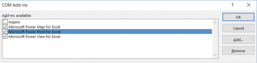
Enable the PowerPivot for Excel add-in
5. Verify that the PowerPivot tab is available.
To explore a data model in an Excel workbook
1. In Excel, on the PowerPivot tab, in the Data Model group, select Manage to open the data model in Data View.
2. In Data View, explore the data in each table and do the following:
• View the formulas in the calculated fields by pointing to each calculated field column. The calculated fields are displayed in a different color than the rest of the fields in the table.
• Move between tables in the data model by using the tabs at the bottom of the view.
3. On the PowerPivot tab, in the View group, select Diagram View to switch to the Diagram View.
4. Explore the data model diagram by doing the following:
• Explore the relationships between tables and connections between the related fields.
• Identify whether data hierarchies are set up in the tables by scrolling down within the table boxes to view the hierarchies.
5. When you’re done, switch to the Excel workbook by clicking or tapping the Excel icon in the upper-left corner of the PowerPivot window.
Create and publish PowerPivot dashboards
By using PowerPivot for Excel, you can combine data from multiple sources and build PivotTable reports and PivotChart reports for information analysis, which you can then publish to SharePoint as interactive dashboards.
After you create a data model, you can use it to build PivotTables and PivotCharts in an Excel workbook. The workbook can then be published to a SharePoint site, where the PowerPivot server components provide server-side query processing of PowerPivot data in Excel workbooks that you access from SharePoint sites.
![]() See Also
See Also
For more information about building PivotTables in Excel 2016, go to https://support.office.com/en-US/article/Create-a-PivotTable-in-Excel-2016-to-analyze-worksheet-data-c875f798-78cf-49a2-9f79-c842dcdd2869. For more information about building PivotCharts in Excel 2016, go to https://support.office.com/en-US/article/Create-a-PivotChart-in-Excel-2016-for-Windows-b7668cdd-1981-4271-9ce1-9de5a71c230a.
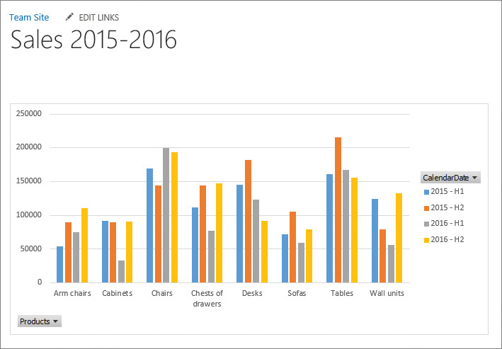
When you publish a workbook with PowerPivot data to a PowerPivot Gallery or to a general document library, SharePoint creates pages to display its PowerPivot items in Excel Online. The published workbooks can contain embedded PowerPivot data or have a connection to PowerPivot data that is published in a different workbook in the same library. SharePoint 2016 and OOS include the data model functionality that you use to interact with PowerPivot dashboards in a browser. You can view, sort, filter, and interact with PivotTables and PivotCharts in the Excel Online app in your browser as you would if you were using the Excel client application. You can show or hide the PivotTable or PivotChart Fields panel, depending on whether you want to modify the reports in Excel Online.
Publish a PivotChart to SharePoint
When you want to publish an individual PivotTable or PivotChart, you must set up the browser viewing options in Excel to point to the named table or chart with the associated filters that users would interact with. You then publish the workbook to a PowerPivot Gallery or a document library on the SharePoint site to create an interactive PowerPivot dashboard.
![]() Important
Important
For on-premises deployments, you must publish to a SharePoint 2016 server that has Microsoft SQL Server 2016 PowerPivot for SharePoint 2016 installed and to a site that has the PowerPivot site collection feature activated. If you publish to a server or a site that does not have PowerPivot server-side capabilities, the data will not load when you open the workbook from a library.
To publish a PivotChart or PivotTable to SharePoint
1. In Excel, open the workbook where the PivotChart or PivotTable is located.
2. Open the Browser View Options dialog box.
3. On the Show tab, select Items in the Workbook, and then select the name of the PivotChart or PivotTable you want to publish.
Publish a chart to SharePoint
4. If there are additional filters that you want to add, on the Parameters tab, select Add, then select the filters for the table or chart. After you’ve selected all filters, select OK to confirm and return to the Parameters tab.
5. Select OK in the Browser View Options dialog box, and then save and close the workbook.
6. Upload the workbook to a document library or a PowerPivot Gallery.
7. Open the workbook in Excel Online to display the PivotChart or PivotTable with the appropriate filters for user interaction.
To analyze the data in a PowerPivot dashboard
1. Display the Pivot Table or the PivotChart you want to work with.
2. If necessary, minimize the Fields pane to provide more space for the table or chart.
3. Do any of the following:
• To drill down into data in the PivotTable, use the plus and minus buttons to expand and condense the sections in the table.
• To analyze the data by using the PivotChart, use various combinations for the available filters. For example, you can select different combinations of parameters for the horizontal and vertical axes by using their drop-down lists in the chart control. Within each parameter, you can select different values to filter the data further.
Display PowerPivot dashboards in web parts
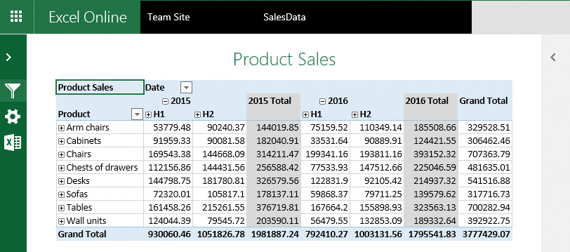
After you have published a PivotTable and a PivotChart to a SharePoint site, you can display them in a webpage by using an Excel Web Access web part. An Excel Web Access web part is a container that displays Excel content in a SharePoint site. You don’t have to open the workbook for viewing; in the web part, the content is displayed as part of the page. The web part connects to the published workbook to obtain the data and present the PowerPivot charts and tables to the users.
Publish PowerPivot reports in an Excel Web Access web part
Web parts are server-side controls that run in the context of SharePoint site pages and provide additional features and functionalities. For an in-depth discussion of web parts, see Chapter 7, “Work with webpages.”
You can create a dashboard-style webpage by adding several Excel Web Access web parts to the same page to display different PowerPivot charts and tables side by side. Each web part is independent, and filters applied in one report do not affect another. The PowerPivot charts and tables displayed in web parts on the same page can be from different Excel workbooks, but all workbooks must be published to SharePoint.
To publish a PivotTable or PivotChart in an Excel Web Access web part
1. Open the SharePoint page where you want to publish a PivotTable or a PivotChart in a web part for editing.
2. Do the following to add the Excel Web Access web part to the page:
a. Position your cursor in a zone in the page content area where you want to add the web part, and then on the Insert tab, select Web Part.
b. In the Categories pane that appears near the top of the page, select Business Data.
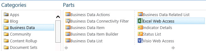
Add an Excel Web Access web part to a webpage
c. In the Parts pane, select Excel Web Access, and then select Add to add the web part to the page.
3. Connect to a workbook that contains the PowerPivot dashboard by doing the following:
a. In the Excel Web Access web part, select Click here to open the tool pane.
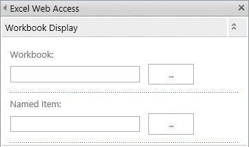
Connect to the workbook that contains the PowerPivot report
The PivotChart or PivotTable must be available for browser viewing in the published workbook.
b. In the tool pane, in the Workbook Display section in the Workbook box, do one of the following:
• Enter the URL for the workbook.
• Select the ellipsis (...) button, then in the Select an Asset dialog, browse to the workbook that you want to use, and then select Insert.
c. In the Named Item box, enter the name of the PivotChart or PivotTable you want to display.
4. If you want options for modifying the PivotChart and PivotTable to be displayed within the web part, including the Fields pane, in the Navigation and Interactivity section, select PivotTable & PivotChart Modification. If you want users to be able to explore the report but not modify it, leave this option unchecked which is the default.
5. In the Appearance section, in the Chrome Type list, select None.
6. Specify settings for the web part in other sections, if required. When you’re done, at the bottom of the tool pane, select OK to apply your changes and close the pane.
7. On the Page tab, select Save to save the webpage and return to browse mode. Check the page in and then publish it to make the page available to the site users.
Build visualizations by using Power View
Power View in SharePoint 2016 is a browser-based Silverlight application. By using Power View, you can present and share insights with others in your organization through interactive presentations. Power View in SharePoint 2016 provides a highly interactive, browser-based data exploration, visualization, and presentation experience. By using Power View, you can create interactive reports with intuitive charts, grids, and filters that provide the ability to visually explore data and easily create interactive visualizations to help define insights.
Power View is available as a standalone version in SharePoint 2016 on-premises deployments and as a native feature in Excel 2016. Power View in Excel 2016 supports HTML5, whereas Power View for SharePoint requires Silverlight to be installed on the user’s device.
You can publish Excel Power View reports to SharePoint Online for viewing as a part of an Excel workbook, but you cannot create Power View reports in SharePoint Online and Office 365. The BI capabilities in Office 365 are available in the Power BI platform, but they are not compatible with SharePoint at the time of writing. For more information about the Power BI platform, see https://powerbi.microsoft.com.
![]() Tip
Tip
In SharePoint 2016, Power View is a feature of the SQL Server 2016 Reporting Services Add-in for Microsoft SharePoint Products.
Power View reports in SharePoint 2016 provide views of data from data models based on PowerPivot workbooks published in a PowerPivot Gallery, or models deployed to SSAS instances. Each page within a Power View report is referred to as a view. In Power View, you can quickly create a variety of interactive and intuitive visualizations, including tables and matrices, and pie, bar, and bubble charts.
With Power View, you can plot your data on a map and create sets of multiple interconnected charts.
Create interactive visualizations by using Power View
Power View uses the metadata in the underlying data model to compute the relationships between the different tables and fields. Based on these relationships, Power View provides the ability to filter one visualization, and at the same time highlight another visualization in a current view. In addition to filters, you can use slicers to compare and evaluate your data from different perspectives. When you have multiple slicers in a view, the selection for one slicer filters the other slicers in the view.
![]() Important
Important
Power View reports on SharePoint are separate files that have the .rdlx file format. In Excel, Power View sheets are part of an Excel .xlsx workbook. The .rdlx file format is not compatible with the .xlsx format. In other words, you cannot open a Power View .rdlx file in Excel. Equally, SharePoint cannot open Power View sheets in an Excel .xlsx file. The .rdlx file format is also not compatible with the .rdl files that you create in SQL Server Report Builder or SQL Server Reporting Services (SSRS). You cannot open .rdl reports in Power View, and vice versa. Additionally, the .rdlx file format is not compatible with the .pbix file format of the Power BI Desktop application.
The Power View design environment in SharePoint 2016 is similar to the Power View tab in Excel 2016. You can open a published worksheet in the Power View design mode from the PowerPivot Gallery.
![]() Tip
Tip
Power View uses SharePoint 2016 permissions to control access to Power View reports.
A Power View report in SharePoint 2016 can contain multiple views that are all based on the same data model. However, each view has its own visualizations and filters. In design mode, you can copy and paste between the views, and you can also duplicate views.
Power View in SharePoint 2016 has two presentation modes: a reading mode and a full-screen mode. In the presentation modes, the ribbon and other design areas are hidden to provide more space for the reports, which are still fully interactive.
To open a workbook data model in Power View
1. In the PowerPivot Gallery, in the upper right of the workbook gallery view, select the Power View icon to open the workbook data model in the Power View design environment.
Open the workbook in Power View Design mode
To switch between design and presentation modes in Power View
1. In the Power View design environment, do one of the following:
• To switch from the reading mode to the design mode, in the upper right of the page, select Edit Report.
• To switch from the design mode to the reading mode, on the Home tab, in the Display group, select Reading Mode.

Select the presentation mode for the Power View report
• To switch to from the design mode to the full-screen mode, on the Home tab, in the Display group, select Full Screen.
• To switch from the reading mode to the full-screen mode, in the upper right of the Power View report, select Full Screen.
1. In the Power View design environment, in design mode, select the File tab and then select Save As.
2. In the Save As dialog box, select the URL of the Power Pivot Gallery or another location that you want to save the report to, and then enter the name of the file that will contain the report. Select Save to save the report.
![]() Tip
Tip
A Power View report is saved as a file with the .rdlx extension. The file is separate from the .xlsx workbook that contains the data model the report is based on.
To open a Power View report from a PowerPivot Gallery
1. Open the PowerPivot Gallery that contains the report.
2. Select the report snapshot to open it in the Power View environment.
To add a view to a Power View report
1. Open a report in the Power View environment and switch to the design mode.
2. On the Home tab, in the Insert group, select New View to add a view page.

Create a new view in Power View report
To create a chart in Power View
1. In the Power View design mode, open the view you want to add a chart to.
2. Build a table that would provide a base for your chart by doing the following:
a. In the Fields List pane, locate the first field you want to include in the table and drag it to the view. Power View builds a table in which a column displays the values of the field.
b. Locate the second field in the Fields List pane and drag it to the table you created for the first field. When the table is highlighted, drop the field. Power View calculates the data and displays a table with two columns.
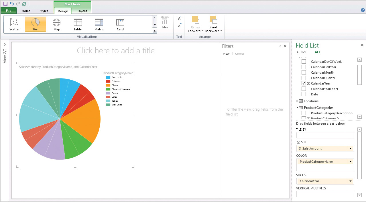
3. On the Design tab, in the Visualizations group, in the Charts section, select the chart type that you want to create, such as a pie chart, column chart, or bar chart.
![]() Tip
Tip
The choice of virtualizations in the Charts section is contextual: the list displays only the virtualizations that can be used with the selected data. For example, all charts are unavailable if there are no aggregated numeric values in the data.
4. To add a slicer to a pie chart, in the Fields List, locate the field that you want to slice by, and then drag it to the Slices area at the bottom of the Field List pane.
To create a Power Map with pie charts
1. In the Power View design mode, open the view you want to add a map to.
2. Build the table that will provide data for the pie charts you want to display on the map by doing the following:
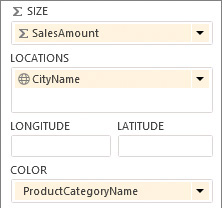
• In the Fields List pane, locate the field that will define the size of a “whole pie” circle in each location, and drag it to the design surface view. Power View draws a table with the actual data displayed in a column.
![]() Tip
Tip
Power View in SharePoint 2016 supports two-dimensional (2D) charts plotted on maps. Power View in Excel 2016 supports both 2D and 3D charts for Power Maps.
• In the Fields List pane, locate a field that would define the geographic location of the charts on the map and drag it to the table to add this field. Power View calculates the data and displays a new table with two columns.
![]() Tip
Tip
Power Map requires at least one geographic value per row of data. This could be a Latitude/Longitude pair, City, Country/Region, Zip code/Postal code, State/Province, or Address. The accuracy of Power Map depends on the geographic data you provide. For more information about how to prepare your data model, go to https://support.office.com/en-us/article/Get-and-prep-your-data-for-Power-Map-67e19f9a-22b8-4b89-a604-3ebb49a368e5.
3. On the Design tab, in the Visualizations group, select Map. Power Map uses Bing to geocode your data based on its geographic properties. If a privacy warning appears in the yellow bar under the ribbon, stating that some of the data needs to be geocoded by sending it to Bing, select Enable Content to confirm that you would like to proceed.
4. A map visualization appears in the view, with the “whole pie” circles plotted in the locations identified. To show the pie charts instead of the circles, in the Fields List pane, identify the field that would define the sectors of the pie circles and drag it to the Color area at the bottom of the pane.
Set up fields that contain data for plotting pie charts on the map, such as their size, location, and colors
5. The map is redisplayed with pie charts for each location and a legend in the upper right of the view page. The legend lists the values of the field you configured in the previous step for the pie sectors, with each value mapped to its sector color in the pie charts.
To move among views in a Power View report
1. Do one of the following:
• In the design mode, select one of the preview images in the View pane on the left of the screen to move to that view.
• In the reading and full-screen presentation modes, select the navigation arrows in the lower-right corner of the page view to move among views.
Display Power View reports in web parts
Power View reports can be integrated into SharePoint site pages by using web parts. Two generic web parts provided by SharePoint 2016 can be used to display the Power View reports on a webpage: the Page Viewer web part and the Silverlight web part.
The Page Viewer web part is a general-purpose web part that retrieves and displays a webpage by using a hyperlink. You can easily add this web part to new and existing pages to display Power View reports. When you need to display a report for users to analyze and explore data, the Page Viewer web part can come in useful.
Display Power View reports in the Page Viewer web part
![]() Important
Important
The Page Viewer web part uses the HTML <IFRAME> element and therefore cannot be used in browsers that don’t support IFrames.
The Silverlight web part is a container for Silverlight applications. It can be used to display the Power View environment.
To display a Power View report in a Page Viewer web part
1. Open for editing the SharePoint page where you want to display a Power View report in a web part.
2. Do the following to add the Page Viewer web part to the page:
a. Position your cursor in a zone in the page content area where you want to add the web part, and then on the Insert tab, select Web Part.
b. In the Categories pane that appears near the top of the page, select Media and Content.
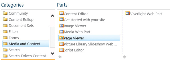
c. In the Parts pane, select Page Viewer, and then select Add to add the web part to the page.
3. Link to the Power View report by doing the following:
a. In the Page Viewer web part, select open the tool pane.
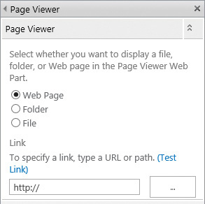
Link to the Power View report webpage
b. In the web part tool pane, in the Link section, provide a link to the Power View report by doing the following:
i. Open a new tab or window in your browser and navigate to the Power View report you want to display. In the Power View environment, set up a view page the way you want it to appear in the web part. For example, switch to the reading mode and display the view page that you want to appear in the web part when it first appears on the webpage. When you’re done, copy the URL from the browser address bar.
ii. Return to the Page Viewer tool pane, and select the ellipsis to the right of the link box to open the text editor. Delete any text from the text box, and then paste the Power View report URL in the text box (by right-clicking in the text box and selecting Paste).
iii. To provide a better user experience when the report is displayed in a web part, you can hide the top tool bar in the Power View page (the bar that includes the Edit Report and the Full Screen options) by adding a PreviewBar parameter to the URL. In the text editor, at the end of the URL, add &PreviewBar=False.
iv. In the text editor, select OK to insert the URL into the Link box in the web part tool pane.
![]() Tip
Tip
You can verify the URL by selecting Test Link above the Link box. The URL is tested in a new browser tab.
4. In the Appearance section of the web part tool pane, in the Chrome Type list, select None.
5. Specify other settings in the web part tool pane if required. When you’re done, at the bottom of the pane, select OK to apply your changes and close the pane.
6. On the Page tab, select Save to save the webpage and return to the browse mode. Check the page in, and then publish it to make the page available to the site users.
Skills review
In this chapter, you learned how to:
![]() Get started with SharePoint BI
Get started with SharePoint BI
![]() Create and publish PowerPivot dashboards
Create and publish PowerPivot dashboards
![]() Display PowerPivot dashboards in web parts
Display PowerPivot dashboards in web parts
![]() Build visualizations by using Power View
Build visualizations by using Power View
![]() Display Power View reports in web parts
Display Power View reports in web parts

![]() Important
Important
You must have sufficient permissions to perform the operations involved in each practice task to complete that practice task. For more information, see Appendix A, “SharePoint 2016 user permissions and permission levels.”
Get started with SharePoint BI
Open Excel 2016, then go to your SharePoint site and perform the following tasks:
1. In your SharePoint site, create a new PowerPivot Gallery named PowerPivot Gallery. Upload the SalesData.xlsx Excel workbook to the PowerPivot Gallery.
2. In the PowerPivot Gallery, do the following:
a. Open the workbook in the default Gallery view.
b. Switch the PowerPivot Gallery view to the Carousel view, and open the SalesData.xlsx workbook in this view.
c. Switch back to Gallery view.
3. In Excel, open the SalesData.xlsx workbook. Publish the following worksheets to the Documents library on your SharePoint site:
• Sales
• Products
• SalesPivot
4. In the Documents library, open the SalesData.xlsx workbook in Excel Online, and then do the following:
• In the SalesPivot worksheet, expand the Chairs category in the table and view how this change is reflected in the chart.
• Condense H1 and H2 for year 2015 into a single column and view how the chart changes to reflect your actions in the table.
• Explore the data further by expanding or condensing rows and columns in the table and viewing how these changes are reflected in the chart.
• Change some data in the Sales worksheet, and then view the changes reflected in the table and chart. You might need to refresh the table to see the changes; you can do so by right-clicking the table and selecting Refresh.
![]() Tip
Tip
If a security prompt appears, confirm that you want to refresh the workbook.
5. Close Excel Online when you’re done.
Shape your data
Continuing in Excel 2016, perform the following tasks:
1. In the SalesData.xlsx workbook, go to the Power Pivot tab and explore the data model.
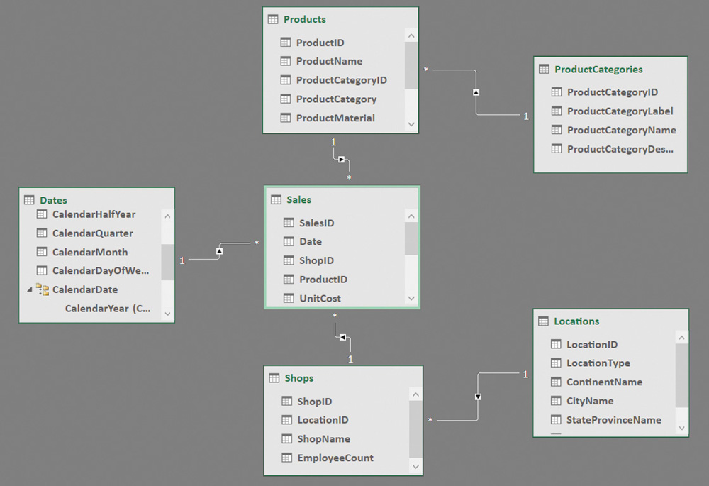
2. In the diagram view, do the following:
a. Review the table relationships and field connections:
• Between the Sales and Shops tables.
• Between the Sales and Dates tables.
• Between the Sales and Products tables.
• Between the Shops and Locations tables.
• Between the Products and Product Categories tables.
b. In the Dates table box, scroll down to display the Calendar hierarchy that establishes the relationships between the columns in the Dates table. For example, a date is a part of a month, which in turn is a part of a quarter, which in turn is a part of a half year, which in turn is a part of a year.
c. In the Products table box, scroll down to explore the Products hierarchy that establishes relationships between the ProductName and ProductCategory fields.
3. In the data view, in the Products table, analyze the formula in the ProductCategory calculated column.
Create and publish PowerPivot dashboards
Continuing in Excel 2016 and your SharePoint site, perform the following tasks:
1. In Excel, save the SalesData.xlsx workbook as SalesDataPivotChart.xlsx in the same folder. Publish the PivotChart named Sales 2015-2016 in the SalesDataPivotChart.xlsx workbook to the Documents library on your SharePoint site.
2. Analyze the data in the PivotChart in Excel Online by doing the following:
• Filter the Products on the horizontal axis so that only the Tables sales data is plotted on the chart.
• Filter the Calendar to see only the 2016 sales data in the chart.
• Experiment with adding more filters to the horizontal and vertical axes to drill further into the data.
3. Close Excel Online when you’re done.
Display PowerPivot dashboards in web parts
Continuing in Excel 2016 and your SharePoint site, perform the following tasks:
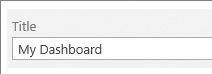
1. Add a page to your site and name it MyDashboard. In the new page that opens for editing, in the Title area at the top of the page, add a space between the words, so that the title reads My Dashboard.
Give your dashboard a title
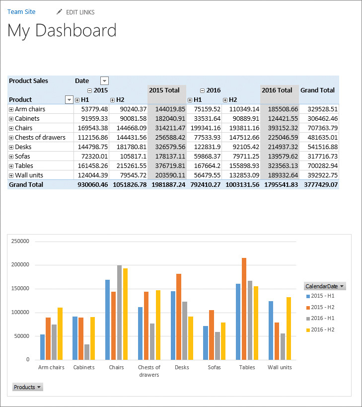
2. On the My Dashboard page, publish a PivotTable in the Excel Web Access web part, with the following settings:
• Workbook Display section
• Workbook SalesData.xlsx in the Documents library
• Named Item Product Sales
• Toolbar and Title Bar section
• Type of Toolbar None
• Appearance section
• Height Select Yes; enter 300 for the height in pixels
• Chrome Type None
3. Publish a PivotChart in the second Excel Web Access web part in the My Dashboard page, with the following settings:
• Workbook Display section
• Workbook SalesData.xlsx in the Documents library
• Named Item Sales 2015-2016
• Toolbar and Title Bar section
• Type of Toolbar None
• Appearance section
• Height Select Yes; enter 350 for the height in pixels
• Chrome Type None
4. Check in and publish the My Dashboard page on your site. Validate that the table and chart are interactive and that users can analyze the data.
Publish PowerPivot dashboards in web parts
Build visualizations by using Power View
Continuing in your SharePoint site, perform the following tasks:
1. In the PowerPivot Gallery, open the SalesData.xlsx workbook data model in Power View.
2. Switch from the reading mode to the design mode.
3. Create a Power Map with sales data pie charts plotted at store locations, using the following data fields for plotting the pie charts on the map:
• Size of a pie circle
SalesAmount field in the Sales table
• Location
CityName field in the Locations table
• Categories for the sectors (mapped to different colors in the chart)
ProductCategoryName field in the ProductCategories table
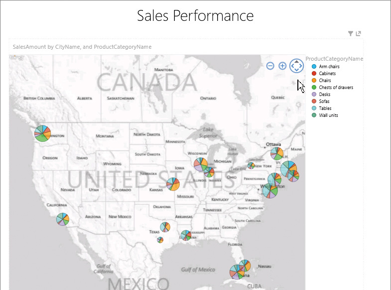
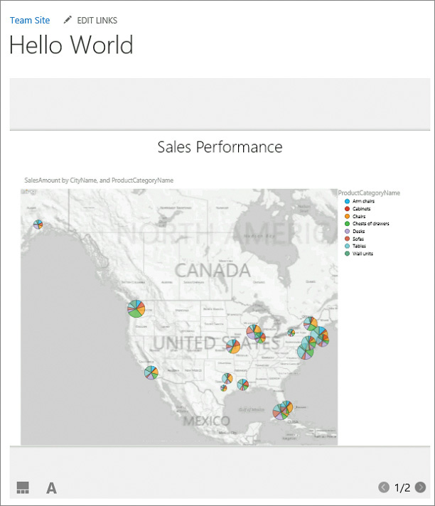
4. At the top of the view page, in the title area, enter Sales Performance.
5. Switch to the reading view and explore the map visualization you’ve built by doing the following:
• Call out a particular product category by selecting the category in the legend; for example, Chairs. The colors for other categories in the pie charts are dimmed, so that the sales performance for the Chairs category is easily identifiable in all locations.
• Point to a pie chart in a city location to display the sales data for the location.
• Experiment with selecting different filters in the upper right of the view page to further drill into the data.
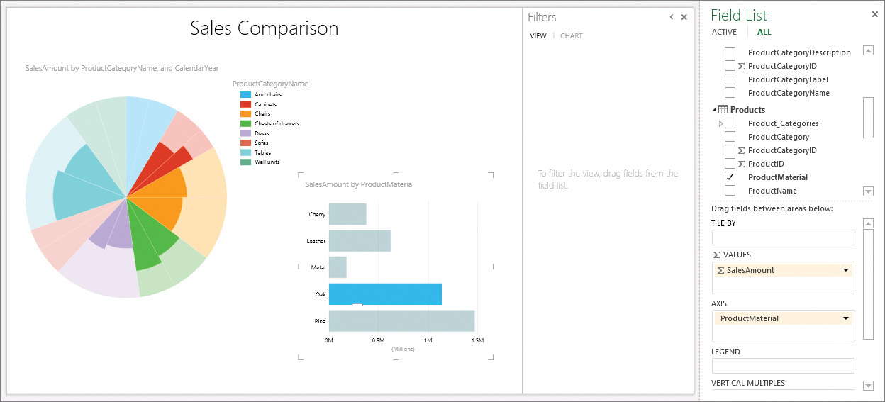
6. Add a view to your Power View report. In the new view, create two connected visualizations, a pie chart and bar chart, by doing the following:
a. Create a pie chart that displays the sales amount by product category for all stores sliced by year, to complement the pie charts for individual stores on the map on the first view page. Set up the pie chart so that it is based on the following data fields:
• Size of the whole pie
SalesAmount field in the Sales table
• Categories for the sectors (mapped to different colors in the chart)
ProductCategoryName field in the ProductCategories table
• Slicer
CalendarYear field in the Dates table
b. Create a bar chart that displays the sales amount by the product material, such as Oak, Pine, Cherry, Leather, and Metal. When the material filter is selected in the bar chart, the selection will filter the pie chart.
The bar chart is based on the following data fields:
• Values for the horizontal axis
SalesAmount field in the Sales table
• Categories for the vertical axis
ProductMaterial field in the Products table
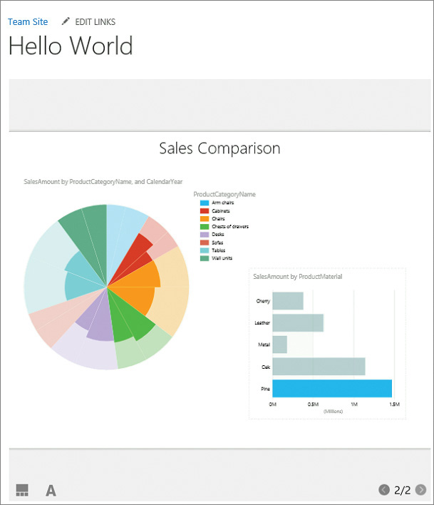
7. At the top of the view, in the title area, enter Sales Comparison.
8. To filter the pie chart based on the selection in the bar chart, in the bar chart, click or tap a bar for a material; for example, Oak. Other bars in the bar chart become dimmed. The pie chart displays only the parts that apply to oak furniture, with the other parts dimmed.
Create interconnected charts in Power View
9. Switch to the Sales Performance view page. Verify that the visualization in the first view is unchanged and displays the pie chart diagrams for all product materials; in other words, the first view has not been affected by the ProductMaterial filter in the second view.
10. Save the Power View report to the Power Pivot Gallery with the name SalesPerformance.rdlx.
Display Power View reports in web parts
Continuing in your SharePoint team site, perform the following tasks:
1. Add a new page to your site and name it HelloWorld. On the new page that opens for editing, in the Title area at the top of the page, add a space between the words, so that the title reads Hello World.
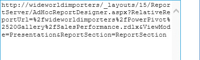
2. On the Hello World page, display a Power View report in the Page Viewer web part, with the following settings:
• Page Viewer section, Link box
Provide a URL of the first view page in the SalesPerformance.rdlx report that you created in the previous section. Append the &PreviewBar=False parameter to the URL to hide the top toolbar in the Power View page.
• Appearance section
• Height Select Yes; enter 600 for the height in pixels
• Width Select Yes; enter 600 for the width in pixels
• Chrome Type None
![]() Tip
Tip
When you are done, select OK in the web part tool pane to save your settings and return to the webpage.
3. Check in and publish the Hello World page on your site. Verify that you can move between the views and that the views are interactive.