
58 Monochrome
A single color or hue that acts as the dominant color theme within a space.
Further Reading
Shoko Wanger, “How to Pull Off a Monochromatic Room,” Architectural Digest, May 25, 2017, www.architecturaldigest.com/story/monochromatic-room-design-tips.
Monochrome refers to designing in one color or in the same undertones. Monochromatic color schemes are derived from a single base hue and are extended using variations of its tints, shades, and tones. Monochromatic interiors can also be accented and enhanced by architectural features, materials, textures, and art.
Designing with a monochrome palette can create a sense of calm and reduce visual clutter. This is supported by the mechanics of how the eye perceives images. Due to the processing of light in the human retina, it is easier for the human brain to detect a single wavelength of color rather than a range of wavelengths from multiple color families. Repeating color makes a space simpler to process and as a result, it looks more comfortable and aesthetically soothing. By avoiding contrasting colors, and using a monochromatic color scheme, designers create spaces that are more comfortable for people with color blindness.
Hue
Hue is the base color and serves as the foundation of the overall color scheme. Hue must be carefully considered, as it will set the mood of a space.

Tint
Tint is a lighter version of the hue and is the basic color with white added.

Shade
Shade is a darker version of the hue that acts as a contrast to the base color, and is essentially the hue with black added.

Tone
Similar to shade, tone is a darker version of the hue but with grey added. This results in a less bright and more muted appearance.

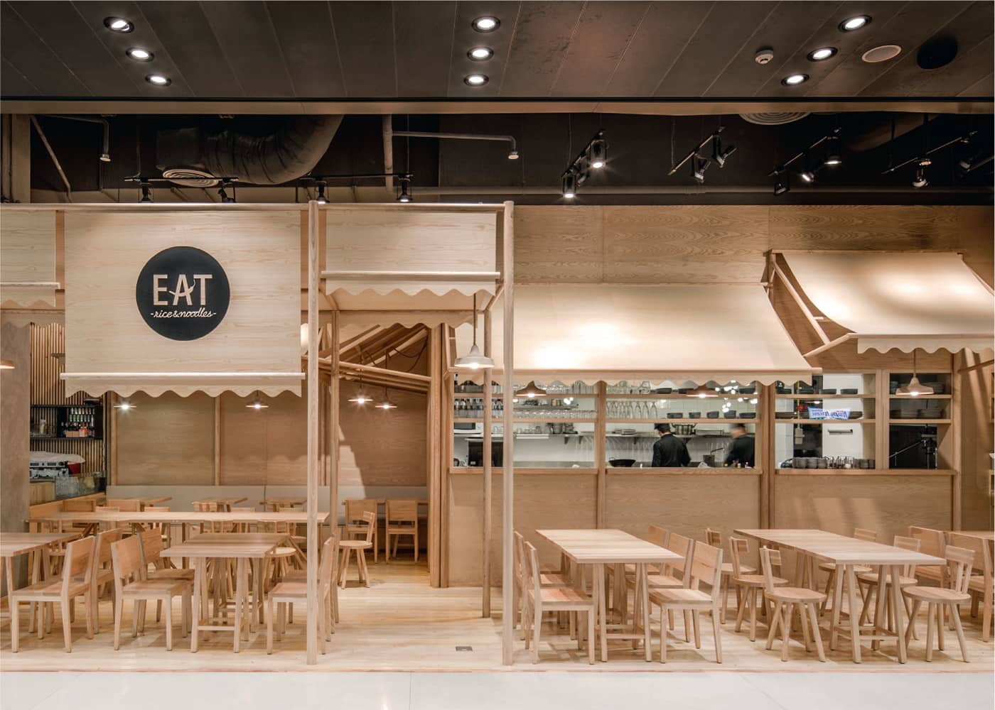
Designed by local studio Onion, the furniture and surfaces in a Bangkok, Thailand, eatery are made exclusively from ash and plywood. Even the pendant lamps and awnings, commonly found in outdoor street stalls, are built in monochromatic wood.
Texture
Texture becomes more important when designing with a monochromatic palette. Variations in textures will keep the color from appearing too flat.
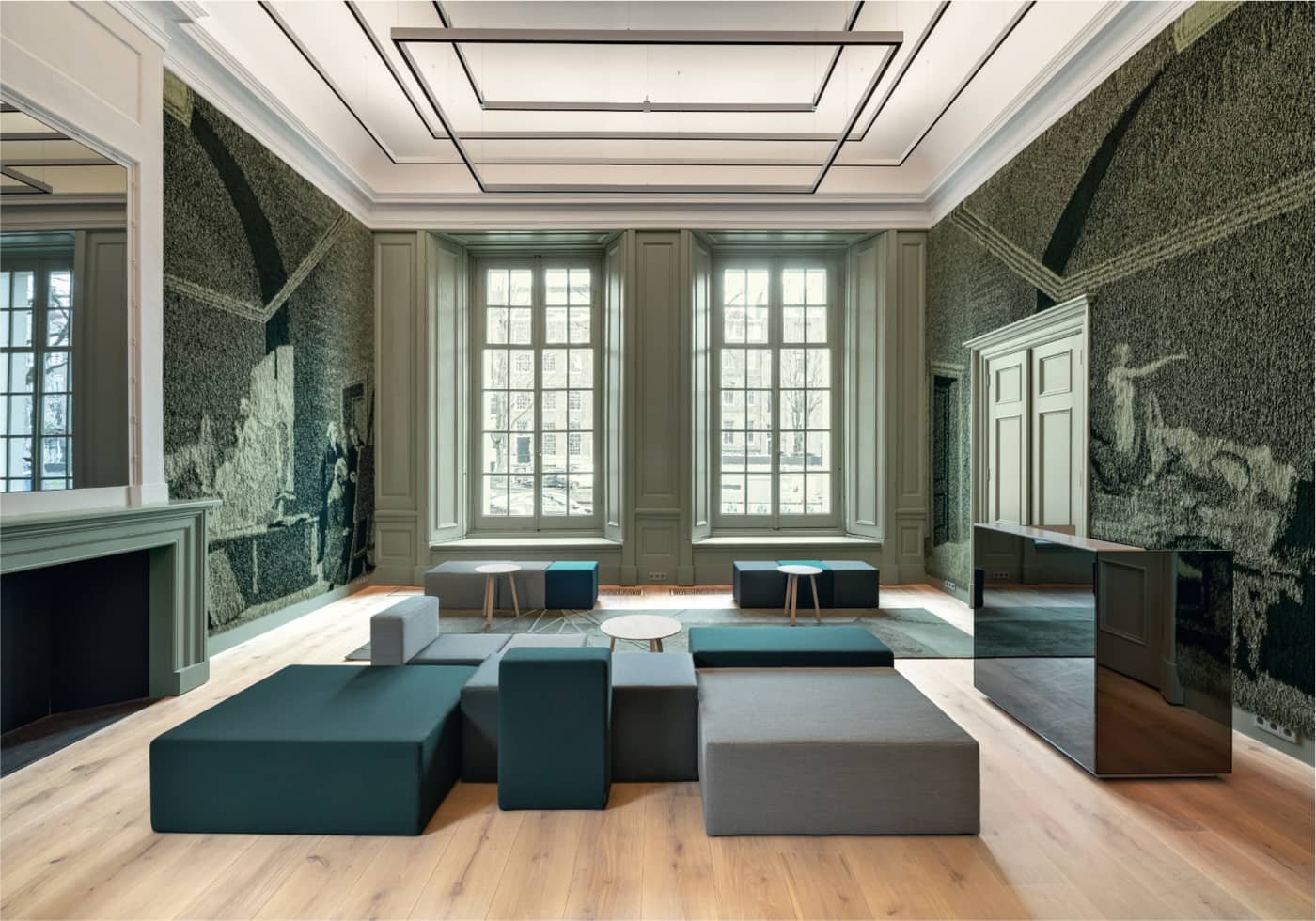
The renovation of the historic civic building Felix Meritis in Amsterdam by i29 incorporates monochromatic greens into the custom tapestry-like walls, furniture, and flooring.