
93 Tone
The character or quality of a space.
Designers use tone to create a dominant mood in a space, which is also related to a project’s color scheme. Tone can also aid in developing the character of a project, and influencing the psychology of the inhabitants of the space. In color theory terms, tone is defined as the mix of tint (white) and shade (black), and is understood as the lightness or brightness of a color.
Tone can be utilized to alter the proportions of a space, and its effects vary depending on intensity. The deeper the tone, the more light absorbed. This has the effect of the color appearing closer to the viewer, and the room appearing heavier. Lighter tones reflect more light, and as a result, the color often appears further away, making the room appear airier and spacious.
Designers often establish the mood of their projects with the inclusion of the following tonal groupings
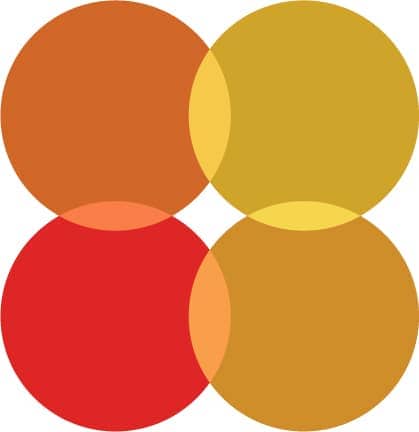
Warm Tones
Oranges, yellows, and reds.
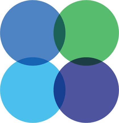
Cool Tones
Blues, greens and purples.
Earth Tones
Oranges, reds, blues, and browns.

Jewel Tones
Pastels, light blues, and turquoises.


Merge Architects utilized tonal colors in the selection of materials to distinguish three otherwise identical conference rooms of a tech workplace in Cambridge, Massachusetts.

Still Life (1943) by Italian painter Giorgio Morandi. Morandi is known for his still life paintings with their tonal subtlety in depicting simple subjects/objects.

Our perception of how light or dark something may be is influenced by the field in which it is placed. The same fifty-percent grey surrounded by black and white plays a trick on the eyes. Because of different tonal backgrounds, one dot appears much darker than the other.