
38 Gradation
The technique that uses a gradual shift in scale, texture, or color to generate visual movement or create perspective.
Like rhythm in interior design, gradation can create visual movement with a progression of elements that shift gradually. Gradation stems from the Latin word gradus, meaning “step” and “degree.”
The three prominent uses of gradation in interior design are scale, color and texture
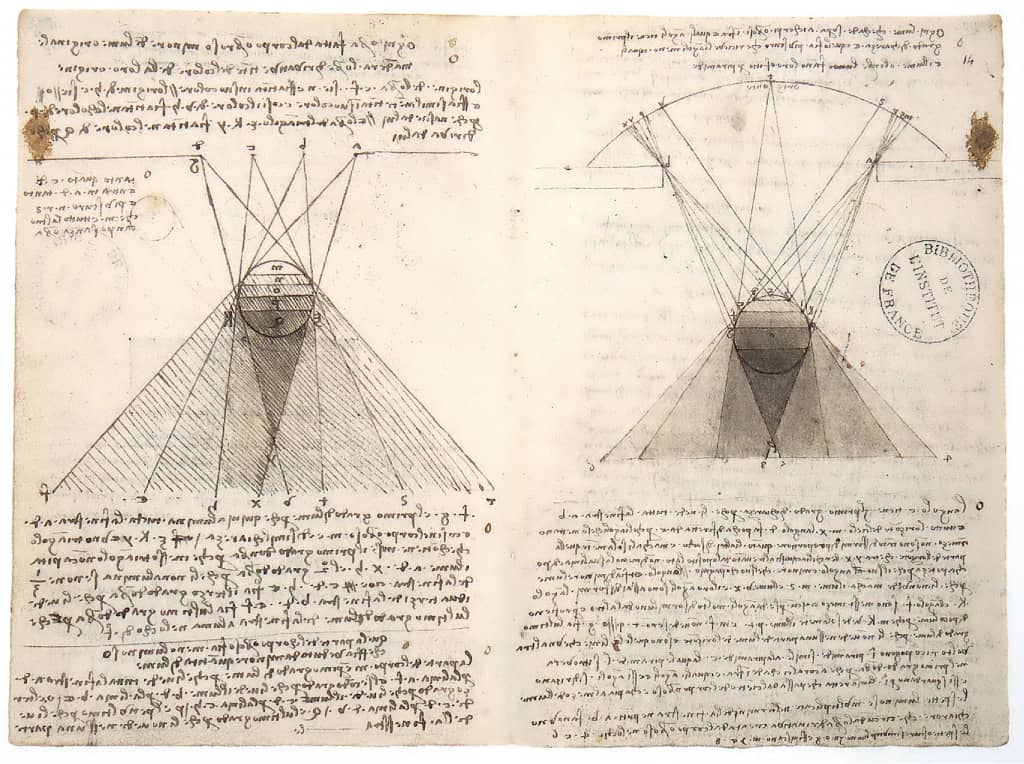
Leonardo da Vinci’s Study of the Graduations of Shadows on Spheres (1492).

Three Houses by Paul Klee (1922), watercolor on paper, uses gradated tones of blues, greens, and violets.
Scale
Perhaps the simplest way to understand gradation is to line up objects from small to large. The shift in size can instantly move the eye across the objects. Gradated scale can be found in size and placement of furniture, patterned textiles, or even in light fixtures. Strategically spacing objects (e.g., lighting or decor) can also generate the appearance of gradated scale and movement.
Color
Gradated color can involve a single hue, successively shifting opacity, or shade, tint, or multiple colors gradating from one color to another. For example, gradation in color from red to blue would also include tones of purple where the two colors overlap.
Texture
Gradation in texture is more difficult to perceive, but can be achieved by changing finishes from matte to glossy or shifting textures from smooth to rough.

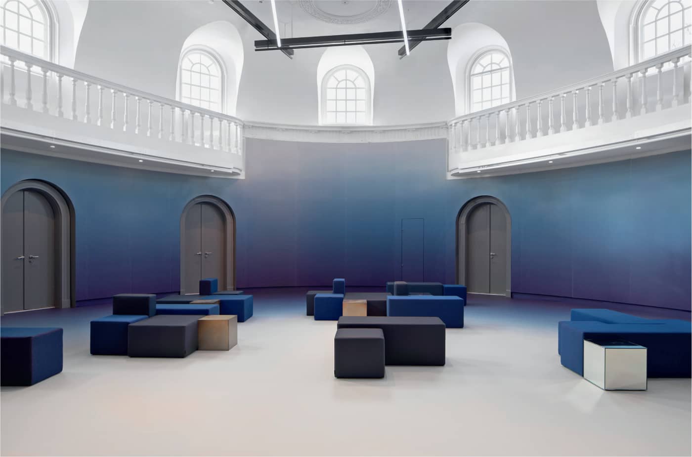
Dutch firm i29 celebrates color and whimsy in their restoration of Felix Meritis, a historic civic building in Amsterdam. Each space is designed to reference colors and materials from a particular time period.