
7.3 Descriptive Statistics
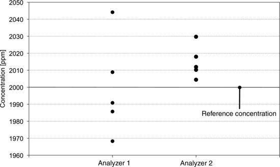
A gas analyzer is calibrated daily by using a reference gas with known concentration. During the calibration procedure, measurements of the reference concentration and the zero point are made repeatedly before calibration factors are determined. Figure 7.1 shows measurements of the reference concentration from two analyzers. With analyzer 1 the values are scattered over a wide range. As a group the values are centered on the reference concentration but they display a large variation around it. With analyzer 2 the situation is reversed. The variation between the measurements is small but the centering is poor. In statistical terms we would describe these analyzers in terms of their accuracies and precisions. We would say that analyzer 1 has good accuracy but poor precision. Analyzer 2 has good precision, but the accuracy is poor. These terms are often used in connection with measurement data, so make sure to memorize that precision describes variation, while accuracy describes centering. In this section, some measures of variation and centering are presented.
Figure 7.1 Readings from two gas analyzers during calibration. Left: Analyzer 1 has good accuracy and poor precision. Right: Analyzer 2 has poor accuracy and good precision.
When we have measured something we often want to get a quick impression of the result. Methods for summarizing the essential features of a data set are collectively called descriptive statistics. They include measures that most readers are familiar with, such as the standard deviation and mean of a data set. They also include graphical tools for presenting data visually, such as histograms, box plots and normal probability plots. These tools give an impression of the variation and the centering, or central tendency, of the data. They may also show the distribution of the data.
The mean is perhaps the most common measure of central tendency and is just the average of a set of data. You calculate it by adding all the values in the set and dividing by the number of values in it. The mean of a set of n values is:
(7.1) ![]()
where the mean, ![]() , is read as “y-bar” and the symbol Σ (capital sigma) means that all the y values are to be added together. The median is another useful measure of central tendency and is simply the midpoint of a data set. It can be determined by sorting the values from the smallest to the largest. If the number of values in the set is odd there is exactly one value such that half of the values are below it and half are above. This is the median. If the number of values in the set is even it can be divided exactly into two halves. The median is then the value midway between the largest value in the lower half and the smallest value in the upper half, or, in other words, the average of these values. Still another measure of central tendency is the mode, which is the most frequently occurring value in a set of data.
, is read as “y-bar” and the symbol Σ (capital sigma) means that all the y values are to be added together. The median is another useful measure of central tendency and is simply the midpoint of a data set. It can be determined by sorting the values from the smallest to the largest. If the number of values in the set is odd there is exactly one value such that half of the values are below it and half are above. This is the median. If the number of values in the set is even it can be divided exactly into two halves. The median is then the value midway between the largest value in the lower half and the smallest value in the upper half, or, in other words, the average of these values. Still another measure of central tendency is the mode, which is the most frequently occurring value in a set of data.
Think about which measure of central tendency you would use if you wanted to find out how well you had done on a written exam compared to your classmates. Comparing your score to the mean score does not necessarily show if you did better than most students. This is because the mean says more about the total score of the group than about the number of students who scored higher than you. To find out if you are in the upper half of your class, for example, the median is a better measure than the mean. In any situation, the relevant choice of a measure of central tendency depends on the question we want to answer.
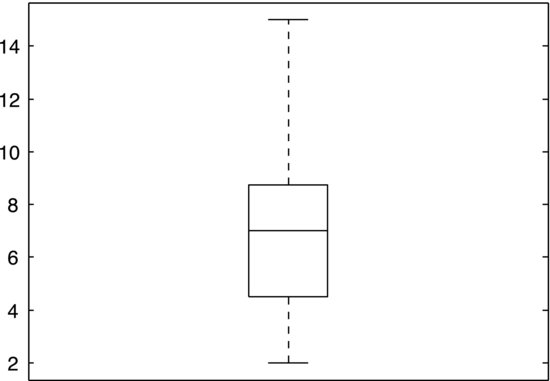
Quartiles are concepts related to the median. Just as 50% of the data fall below the median, 25% fall below the lower quartile and 25% above the upper quartile. The quartiles and the median thereby divide a data set into four equally large groups. We may also speak in more general terms of percentiles, which are values that a certain percentage of the data fall below. For example, the 80th percentile is the value below which 80% of the data are found. The median and the quartiles are used in a common graphical tool, the so-called box plot, that depicts the distribution of the values in a data set. Figure 7.2 shows a box plot of the data set given in Exercise 7.2. A box represents the mid-50% of the data, which is often called the inter-quartile range as it has the upper and lower quartiles as its upper and lower bounds. Lines extend from the box to the largest and smallest values of the set. Finally, a horizontal line across the box represents the median.
Figure 7.2 A box plot of the data set in Exercise 7.2.
Let us look at measures of variation instead. The most basic one is the range, which is simply the difference between the largest and the smallest values in a data set:
(7.2) ![]()
Experiments should generally be designed so that they produce a data range that is larger than the precision of the measurement system. Consider a synthesis experiment in organic chemistry. If we want to measure how the concentration, x, of a certain reactant affects the yield, y, we should vary x sufficiently to produce a range, Δy, that is substantially larger than the precision of the balance that we use to measure the yield. If we do not, the effect that we are interested in will be indistinguishable from the uncertainty of the measurement. The range is a useful measure because of its simplicity but is too sensitive to extreme values for most purposes.
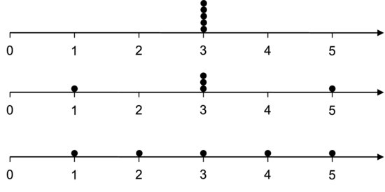
Figure 7.3 Dot plots of three data sets.
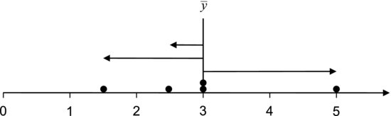
A more detailed description of the variation in a data set is given by the residuals. These measure how far the data are from the mean. The residual for a value is given by:
(7.3) ![]()
where ![]() is the mean and yi is the ith value of the data set. Residuals are described graphically in Figure 7.4. The standard deviation, which is one of the most common measures of variation, is calculated using the residuals.
is the mean and yi is the ith value of the data set. Residuals are described graphically in Figure 7.4. The standard deviation, which is one of the most common measures of variation, is calculated using the residuals.
Figure 7.4 The residuals measure the distance from the values to the mean, as indicated by the arrows.
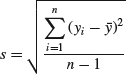
Let us assume that we have a sample of n values and want to calculate its standard deviation. Box 7.1 shows all the intermediate steps involved. Firstly, the residuals are calculated, as these describe how far each value deviates from the mean. To make sure that we are working with positive values the residuals are squared. We then add all the squared residuals up, for every value of i from 1 to n. This sum is called the sum of squares and is used so often in statistics that it has its own abbreviation, SS. Dividing the sum of squares by n – 1 we get a measure of the average deviation from the mean that is called the variance. (The fact that we do not divide by the number of observations n may seem confusing and will be discussed shortly.) You may note that the variance does not have the same unit as y. If, for example, y is a distance measured in millimeters (mm) the residuals have the same unit, but the sum of squares and the variance have the unit mm2. It is often useful to measure the variation in the same units as the mean. This is achieved by taking the square root of the variance and the measure obtained is the sample standard deviation,
We might ask why it is necessary to first square the residuals and then take the square root. What would happen if we simply summed the residuals? It is easy to convince yourself that the residuals always sum to zero. This will obviously not provide a useful measure of the average deviation from the mean. By squaring the residuals we make sure that all the terms in the sum of squares are positive and that all the values contribute to the standard deviation.
The reason for calculating s is, of course, that we want to estimate the standard deviation of the population from which the sample is drawn. The population standard deviation is generally denoted σ. The estimate s is not necessarily equal to σ due to sampling error. This means that there will be differences between different samples taken from one and the same population. We therefore represent s and σ by different symbols. The larger the sample, and the more representative of the population it is, the better the estimate of σ. Similarly, the sample mean ![]() is an estimate of the population mean μ and not necessarily equal to it.
is an estimate of the population mean μ and not necessarily equal to it.
The reason that n – 1 occurs in the denominator of Equation 7.4 has to do with the fact that we have to calculate ![]() to determine s. n – 1 is called the number of degrees of freedom in the sample. This number is related to the number of values in the sample and to the number of population parameters that are estimated from them. It measures the number of independent values in the sample. Consider a sample of n = 10 independent observations. Since they are independent, any observation can attain any value regardless of the others. In other words, there are 10 degrees of freedom in this sample. If we now calculate the sample mean the 10 observations are no longer independent. This becomes clear if we reason as follows. If we pick one value from the sample we have no idea what it will be. The same is true if we pick a second and a third value, but when we have picked nine values, we automatically know the tenth. It is given by the first nine values together with the sample mean. This means that there are now only nine independent values, or n – 1 degrees of freedom left. Since Equation 7.4 requires us to first calculate the sample mean, it dispenses of one degree of freedom and thereby contains n – 1 in the denominator. The theoretical motivation for using the number of degrees of freedom instead of the sample size in Equation 7.4 goes beyond the scope of this book. We will settle with stating that using n to calculate the standard deviation of a small or moderately sized sample tends to provide too low an estimate of the population standard deviation. Using n – 1 is said to provide an unbiased estimate.
to determine s. n – 1 is called the number of degrees of freedom in the sample. This number is related to the number of values in the sample and to the number of population parameters that are estimated from them. It measures the number of independent values in the sample. Consider a sample of n = 10 independent observations. Since they are independent, any observation can attain any value regardless of the others. In other words, there are 10 degrees of freedom in this sample. If we now calculate the sample mean the 10 observations are no longer independent. This becomes clear if we reason as follows. If we pick one value from the sample we have no idea what it will be. The same is true if we pick a second and a third value, but when we have picked nine values, we automatically know the tenth. It is given by the first nine values together with the sample mean. This means that there are now only nine independent values, or n – 1 degrees of freedom left. Since Equation 7.4 requires us to first calculate the sample mean, it dispenses of one degree of freedom and thereby contains n – 1 in the denominator. The theoretical motivation for using the number of degrees of freedom instead of the sample size in Equation 7.4 goes beyond the scope of this book. We will settle with stating that using n to calculate the standard deviation of a small or moderately sized sample tends to provide too low an estimate of the population standard deviation. Using n – 1 is said to provide an unbiased estimate.
Let us consider our synthesis experiment again. If we repeat the synthesis several times we expect the measured yield to vary from time to time, even if the conditions are kept as fixed as possible. If we are only interested in seeing how large this variation is the standard deviation is a useful measure. This is because the standard deviation has the same unit as the yield and can be directly compared to it. In some situations it is interesting to obtain more detailed information about the variation. We might want to analyze different parts of the variation separately. For example, a part of the measured variation comes from the synthesis itself, since there will always be small variations in the concentrations of reactants, the homogeneity of the mixture, its temperature and so forth. All of these factors may affect the yield. We also know that another part of the variation comes from the measurement procedure, as the balance for weighing the product has a certain precision, the person weighing it has a certain repeatability and so on. Suppose that we are interested in comparing the part of the variation coming from the synthesis to the one coming from the measurement. In that case the standard deviation is not a suitable measure, because standard deviations cannot be added. Variances, on the other hand, can.
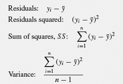
This property of variances can be understood using the Pythagorean theorem. Looking at Figure 7.5 we immediately see that the distance c is not the sum of the distances a and b, but Pythagoras tells us that c2 = a2 + b2. The distance a is given by coordinates on the x-axis and b by coordinates on the y-axis. Since a and b are characterized by two different variables (x and y) they can vary independently of each other. Now, returning to the synthesis experiment, the variability of the measurement system can be expected to be independent of the variability of the synthesis. This is because they are governed by different processes, so one can change without affecting the other. The total variance of the measured yield can thereby be written on the “Pythagorean” form:
Figure 7.5 The sides of a right-angled triangle cannot be added to obtain the hypotenuse, but the Pythagorean theorem states that the sum of their squares equals the square of the hypotenuse. Similarly, standard deviations cannot be added, while variances can.
If we know the measurement precision and the total variation we can use this equation to determine the variability of the synthesis. Trying to add standard deviations would be like trying to add the sides of a right-angled triangle to obtain the hypotenuse. If the variance were to be divided into several independent components, Equation 7.5 could be generalized to as many dimensions as desired:
(7.6) ![]()
Now, let us use what we have learned so far to try to analyze a practical problem. Do your best to answer the following exercises. We will return to them in the next chapter.
Besides the measures introduced so far, we may also obtain an impression of the central tendency and variation of a sample using graphical tools. One such tool is the box plot, which was shown in Figure 7.2. Another common tool is the histogram. It provides a more detailed overview of the distribution of values in the sample than the box plot. An example is shown in Figure 7.6. Histograms are created by sorting the values from the smallest to the largest and dividing them into classes, or bins, covering intervals of equal width. The number of values in each bin is called the frequency. Each bin is represented by an interval on an axis and the frequencies by rectangles over the intervals. The area of each rectangle is proportional to the frequency of its bin. In Figure 7.6 we see that all the values in the sample are contained in an interval from zero to 20, with most of them residing near three. It is most likely to find a value in the bin covering the interval from three to four. Since this bin has the highest frequency it is called the modal bin.
Figure 7.6 Histogram of a right-skewed sample.
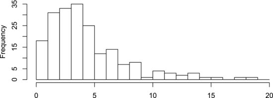
Besides assessing the central tendency and variation of a sample, the histogram can be used to describe the distribution of the data. Most of the data in Figure 7.6 extend in a tail on the right-hand side of the modal bin. This distribution is therefore said to be right-skewed. A left-skewed distribution, correspondingly, has a tail extending to the left. If two similar tails extend in both directions from the modal bin the distribution is said to be symmetric. You have probably heard of the so-called normal distribution, which is one case of a symmetric distribution that is of general interest. It is discussed at some length in the next couple of sections. It is useful to remember that it requires rather a large amount of data to judge from a histogram if the data are normally distributed. Usually, 30–50 values are considered to be a reasonable minimum.