
Special Topics A: Key Reliability Statistics
A.1 Introduction
Reliability statistical analysis can be complex. However, the basic statistics needed for industry are not too difficult and we will provide an overview of the key statistics needed for the reader. This will help in understanding the full scope of the science of degradation and its analysis. We will overview a number of methods that are common throughout the industry.
It can be somewhat incomplete to understand the physics of degradation and not understand reliability. This is because understanding and preventing failures from occurring is an inexact science. This means we have to deal with distributions and probability of failure occurring. It is not enough to understand the failure mechanism. We need to ask the following questions.
- What is the failure mechanism?
- What is the probability of it occurring?
- Can we demonstrate with a certain probability that a high failure rate will not occur on a product?
- How can we verify that failure will not occur if the product is to be in the field for 10 years?
- What types of accelerated test do we do?
- What is the sample size that is required?
- What is the confidence in our estimates?
A.1.1 Reliability and Accelerated Testing Software to Aid the Reader
It is helpful to use software in understanding reliability and accelerated testing analysis in Special Topics A and B. Free reliability statistics and accelerated testing software is available to aid the reader at the author’s website, www.dfrsoft.com, to try for all the examples in Special Topics A and B [1]. This chapter provides reference to the module and row number that the reader can go to in the software to follow the examples. For example: (dfrsoft, module 2, row 13). The software is in friendly Excel format with reference modules (see menu) that includes help with: reliability conversions; reliability plotting (Weibull, lognormal, …); system reliability; distributions; field returns; acceleration factors; test plans; environmental profiling; reliability growth; reliability predictions; parametric reliability; availability and sparing; derating; physics of failure; process capability index (Cpk) analysis; lot sampling; statistical process control (SPC); thermal analysis; shock and vibration; corrosion; and design of experiment.
A.2 The Key Reliability Functions
There are a number of key reliability functions that help define reliability. The key reliability functions that we will be referring to in this chapter are listed below.
- Cumulative Distribution Function (CDF) F(t):
This is an important function for data analysis as we will show in this chapter. Experimentally, it is the cumulative percent failure at each observed failure time when plotted versus time. It therefore gives a probability of a component failing at time t. We will provide examples of how to find this in Sections A.7.2 (Example A.6) and A.7.3 (Example A.7). In terms of the reliability R(t), we write
(A.1)
- Reliability Function R(t):
This is the number of units surviving at time t divided by initial number of units. Another way of saying this is the probability of the component surviving to time t.
- Probability Density Function (PDF) f(t):
Experimentally, it is the instantaneous slope at time t found on the CDF plot. One might recall how the normal distribution PDF looks like a bell shaped curve.
- Failure Rate λ(t):
Often called the hazard rate or instantaneous failure rate, this is expressed in terms of f(t) and R(t) as (see also average failure rate):
- Cumulative Failure Rate λ(t)cum:
This is not used often in reliability. Once F(t) is known however, it is simply given by
(A.5)
- Average Failure Rate λ(t)ave:
This is the fractional failures occurring or the expected fractional failures occurring in time Δt. As
 , this is equal to the hazard rate.
 - Mean Time To Failure (MTTF) or Mean Time Between Failures (MTBF):
This is the mean time that we anticipate a system will be operational. When a system is repairable we use MTBF. When it is not repairable, such as a semiconductor, we use MTTF. Note that people often use MTBF for a system or part that is not repairable! While this is of course not accurate, the reader should be aware of such common misuse of the term. When the failure rate (FR) is constant we can write
- Availability:
This is a term used for how available a system is in its steady-state operation mode. In simple terms, people often use what is called the “inherent availability” that is equal to the “up time”; the MTBF; and “down time,” which is usually the mean time to repair (MTTR) a system. Often availability is a better number to advertise. Inherent availability is then
In addition to these functional definitions, two key areas of reliability should be defined. These are system and component reliability. Component reliability concerns discrete items such as resistors, capacitors, diodes, etc. System reliability concerns issues of multiple discretes that make up a unit, such as hybrids, subassemblies, and assemblies. In system reliability, the whole is usually equal to the sum of the parts in terms of the failure rate, unless the system has what is called redundancy.
As we have noted in our definitions, we can talk about system reliability which is usually made up of many parts such as hybrids or assemblies, or we can talk about component reliability (resistor, integrated circuits or ICs, etc.). Each component has associated with it a failure rate that is based on analysis or historical information from prior experiments. There are a number of prediction methods that use libraries of failure rate values for different components. Two popular methods for predicting the failure rate of an assembly are Telcordia and MIL STD 217 (see dfrsoft, modules 11, 12, 13, 14). There are also a number alternative methods used today. The key for accurate predictions however is of course the library and knowledge of the stress applied to each part and the stress modeled used to assess the component failure rate. Often, these libraries and stress models are not very accurate. As we mentioned, reliability is not an exact science. It is always better to have field data to obtain a more accurate MTBF. The actual failure rate for the assembly when there is no redundancy simply sums the modeled failure rates of each component. Therefore, the failure rate for an assembly (with no redundancy) with N critical parts can be written after each component failure rate is modeled with a stress assessment as:

We will not be focusing on assembly reliability. Since assemblies are made up of parts, it is important to understand component reliability first. Once one has a grasp of component reliability, there are numerous references for understanding assembly reliability [2, 3].
A.3 More Information on the Failure Rate
Failure rates can be classified into two categories:
- time-dependent failure rate λ(t); and
- time-independent failure rate λ(t) = λ.
For a time-dependent failure rate, we need to specify the time at which the failure rate is given. The time-dependent failure is typically more complicated to asses. This is obtained once we have knowledge of the PDF and/or the reliability time-dependent function through the derivative as we defined in Section A.2. Experimentally, we can also obtain this from the CDF as will be exemplified in this chapter. However, the time-independent failure rate is much easier to work with so we will start with this. We can use the definitions at Equations (A.6) and (A.7) to provide a simple example (see dfrsoft, module 1, row 13 [1]) for a constant failure rate. For example, using Equation (A.7) and assuming an MTTF of 10 h, then ![]() .
.
A very popular reliability metric that we will use in this chapter is failures per million hours (FMH) and failures per billion hours (FITs). To convert the above failure rate to FMH and FITs (see dfrsoft, module 1, row 13 [1]):
- To convert to FMH, 0.1 fractional failure (1 × 10⁶)/(1 × 106) h; 100 000 FMH where the denominator 1/(1 × 106) = FMH.
- To convert to FITs, 0.1 fractional failure (1 × 10⁹)/(1 × 109) h; 100 000 000 FITs where the denominator 1/(1 × 109) = FITs.
Another example on using the constant failure rate, for 2% failure (0.02 fractional failure) in 8760 h (1 year):
Convert to failures per million:
Convert to MTTF = 1/failure rate = 438 000 h.
Table A.1 provides a list of some important constant failure rate metrics. The reader may wish to verify some of the numbers as an exercise (see dfrsoft, module 1, row 13 [1]).
Table A.1 Constant failure rate conversion table
| FMH (fail/106 h) | MTBF (h) | 1 year (PPM) | 1 year (% failure) | 10 year (PPM) | 10 year (% failure) |
| 0.001 | 1.00 × 10⁹ | 9 | 0.0009 | 88 | 0.009 |
| 0.005 | 2.00 × 10⁸ | 44 | 0.0044 | 438 | 0.044 |
| 0.025 | 40 000 000 | 219 | 0.022 | 2188 | 0.22 |
| 0.100 | 10 000 000 | 876 | 0.09 | 8722 | 0.87 |
| 0.260 | 5 000 000 | 1750 | 0.18 | 17 367 | 1.74 |
| 0.290 | 2 500 000 | 3498 | 0.35 | 34 433 | 3.44 |
| 1.00 | 1 000 000 | 8722 | 0.87 | 83 873 | 8.39 |
| 2.00 | 500 000 | 17 367 | 1.74 | 160 711 | 16.07 |
| 4.00 | 250 000 | 34 433 | 3.44 | 295 594 | 29.6 |
| 10.00 | 100 000 | 83 873 | 8.39 | 583 555 | 58.4 |
A.4 The Bathtub Curve and Reliability Distributions
The reader is likely familiar with the bathtub curve and its regions. Many readers may not however realize that the key reliability models are closely related to this curve. It is therefore a good place to start and explain reliability models, how they are derived, and how they are used. The common bathtub curve appearing in most reliability books is shown in Figure A.1. The curve is modeled after the human mortality rate. The important thing to note is that the key reliability failure-rate models will fit the bathtub curve or portions of it. The main regions of the bathtub cure are as follows:
- The infant-mortality region indicates the portion of shipped product that fails in early life. This typically goes up to 1 year. This is an important region for commercial products as it is the worst possible situation to allow customers to receive products that can fail in early life. If a proper qualification is not done on the product, and potential infant mortality still exists, then companies have to come up with a screen to weed out bad products.
- The next important region is the steady-state period. This is the area where customers are expected to use the product. The failure rate is constant and it is desired that this is as low as possible.
- The wear-out region represent end-of-life failures. It depends on the product type. Passive components can last 25 years; power transistors may only last for 10 years. Often, the wear-out region is not reached when the item is out of date. Cell phones can be a common case.
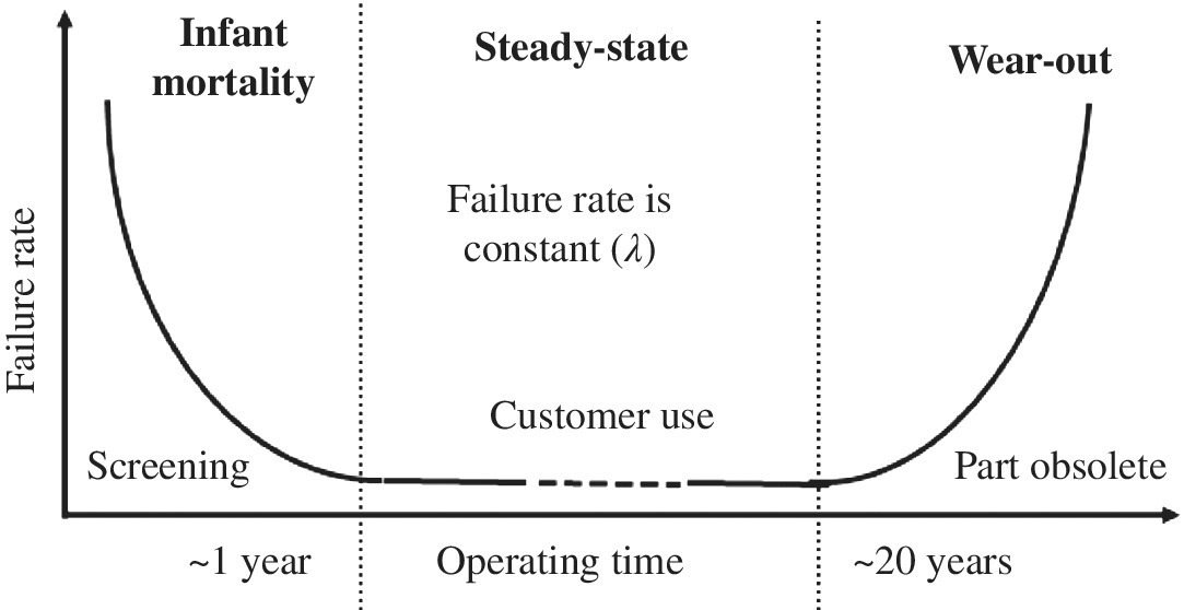
Figure A.1 Reliability bathtub curve model
There are four key reliability distributions that are commonly used: exponential; Weibull; lognormal; and normal. The former three can model all or portions of the bathtub curve, and are commonly used in catastrophic life data analysis. While the normal distribution is rarely used by reliability engineers in this way; it is well used in other areas (see Section A.6.1). Below is a summary of each distribution and some of the rationale behind it.
A.4.1 Exponential Distribution
The exponential distribution is the simplest to understand as it is a one-parameter distribution; that parameter is the failure rate which is independent, yielding a constant failure rate. It therefore models the flat part of the bathtub curve where λ(t) = λ and is given by:
- Reliability function:
- CDF (see Equation (A.2)):
- PDF (see Equation (A.3)): (A.12)

- Failure rate (see Equation (A.4)):
A.4.1.1 Example A.1: Some Basic Math of the Exponential Distribution
From Equation (A.4) we can verify that R(t) above satisfies the requirements for the exponential distribution, that is
Insert Equation (A.10) to see that it satisfies the result of Equation (A.13).
Another important result of the exponential distribution is noted by doing a Taylor series expansion on Equation (A.11). That is
This is important to note as it is intuitive that, for a constant failure rate which has units of fractional failure per unit time, when we multiply the failure rate by time we get the fractional failure. The above approximation works when λt << 1 (where higher-order terms are small).
A.4.1.2 Example A.2: Estimating the Number of Failures and Availability with Exponential Reliability Function
Consider a complex repairable item with a constant failure rate of 25 FMH. What is its MTBF? If 1000 units are shipped per year at a 90% duty cycle, what is the percentage that is anticipated to fail in the first year? If the MTTR is 72 h, what is the inherent availability?
The constant failure rate is then (see dfrsoft, module 1, row 13 [1]):
With 50% duty cycle per year, the operating time is 4380 h. Then the number of failures per year is (see dfrsoft, module 1, row 13 [1]):

We note that λt × 1000 = 110, which illustrates that the approximation F(t) ≈ λt is reasonable but not as accurate as one might like. The MTBF is
The inherent availability (see Equation (A.8)) is
Note that this item has an MTBF that may not be competitive. However, because we can repair it in just 3 days, we might wish to only advertise the availability of 99.8%. This may be a very competitive number to tell customers, who are likely only interested in the operational availability.
A.4.2 Weibull Distribution
The Weibull distribution was named after Waloddi Weibull who first published it in 1951 [4]. As mentioned, reliability distributions model portions of the bathtub curve. Let’s overview this a bit to simplify some of the mystery behind the Weibull function. If we were to try and say model the wear-out portion of the bathtub curve’s shape in Figure A.1, what function would we select? We know it is non-linear so let’s try a power law, for example ![]() as shown in Figure A.2. This indeed gives a good shape.
as shown in Figure A.2. This indeed gives a good shape.

Figure A.2 Demonstrating the power law on the wear-out shape
We could therefore come up with a general model,
This is essentially the AT&T (American Telephone and Telegraph) -equivalent Weibull model [5]. In that model, we note that if Y = 0 we are in the flat portion of the bathtub curve; if Y < 0, we would be in the infant mortality region; while if Y > 1 we are in the wear-out portion. The Weibull distribution is presented in a similar manner but, instead of Y, Weibull used essentially ![]() (see Equation (A.17)). The full two-parameter popular Weibull model is:
(see Equation (A.17)). The full two-parameter popular Weibull model is:
- Reliability function: (A.14)

- CDF (see Equation (A.2)):
- PDF (see Equation (A.3)): (A.16)

- Failure rate (see Equation (A.4)):

The Weibull model for the bathtub curve is shown in Figure A.3. We note that in Figure A.2, we shifted the wear-out axis to time zero. Alternatively, this can be accomplished by including a third time shift parameter. Such a three-parameter Weibull model is also used, but not detailed here. However it is essentially just a time shift. We note that any of the reliability distributions can have a time shift. For one reason or another, it is only customary to include it in the popular Weibull model.

Figure A.3 Modeling the bathtub curve with the Weibull power law
The Weibull model is often considered the premier reliability model. This is because of the physical significance of β: the wear-out region is indicated by β > 1; the infant mortality region by β < 1; and steady state by β = 1, as illustrated in Figure A.3. Therefore reliability engineers tend to use it often; when life test data are fitted to the CDF, β is determined and the knowledge of where the data lie relative to the bathtub curve is very helpful in determining the product issues. The key is to remember that, although the Weibull distribution seems to have this advantage, the best distribution to use is the one that best fits the data.
Figure A.4 illustrate the behavior of the hazard rate for a number of different values of β, while Figures A.5 and A.6 present an idea of how the PDF and CDF functions behave for β = 2 (wear-out) and β = 0.5 (infant mortality) (see dfrsoft, module 2, row 115 [1]).

Figure A.4 Weibull hazard (failure) rate for different values of β [1]

Figure A.5 Weibull shapes of PDF and CDF with β = 2 [1]

Figure A.6 Weibull shapes of PDF and CDF with β = 0.5 [1]
A.4.3 Normal (Gaussian) Distribution
The normal (or Gaussian) distribution is important. It has so many practical applications in statistics and is used in quality, reliability, economics, biology, physics, etc. The reader might recall that we discussed uses of the Gaussian distribution when we looked at white noise in Chapter 2, which is a Gaussian distribution. In terms of its use in reliability, it is primarily used in variable data. This differs from what we typically make use of when working in reliability with the Weibull or lognormal functions, which we primarily use to analyze catastrophic pass–fail data. One should note that the normal distribution function can be used to fit catastrophic data as well. However, it is atypical to find catastrophic data analyzed using it. The popular PDF bell-shaped curve is probably the first thing one remembers when thinking of it, as shown in Figure A.7. The distribution is summarized below (this formulation will also help us to understand the lognormal distribution).

Figure A.7 Normal distribution shapes of PDF and CDF; μ = 5, σ = 1 [1]
- PDF (see Equation (A.3)): (A.18)

- CDF approximation:
- Population mean and variance: (A.20)

- Sample mean and variance: (A.21)

Figure A.7 illustrates the PDF and CDF functions for the normal distribution.
A.4.3.1 Example A.3: Power Amplifiers
Power amplifiers are distributed normally with a mean of 5 W and a variance of 1 W. What percent of the population is below 4 W?
The plot of the PDF and the CDF is given in Figure A.7 for these semiconductors. Note that those plots normally have the X-axis in time, but here we simply substitute watts. We can see from the CDF plot in Figure A.7 that the fraction below 4 W is about 15%. Using Equation A.19, the results is calculated as (see dfrsoft, module 5, row 23 [1]):

(note that erf(–x) = –erf(x). If the specification limit for power amplifiers was 4 W or higher for shipments, we would lose about 15.9% of the population.
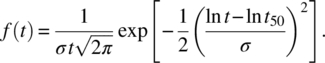
A.4.4 The Lognormal Reliability Function
The lognormal distribution is often used to model semiconductors. We noted in Chapter 9 that it has a lot of physical significance. That is, many parametric aging laws were described using the TAT models (see Chapters 6 and 7) that describe aging in log(time) dependence of key parameters. Creep was a good example. If we have a parametric threshold for failure, and the parameters are normally distributed and age in log(time) relative to the parametric threshold, then the failure rate is lognormal in time (this is detailed in Chapter 9). It is also reasonable to assume that catastrophic lognormal failure rates follow if microscopic aging is occurring in log(time) and the product spends most of its lifetime with this aging dependence. We also noted that many empirical aging power laws exist that are likely log(time), but can also be modeled as a power law rather than log(time) aging law (see Figure 6.3).
The lognormal distribution can be obtained similarly to the normal distribution functions by taking the logarithm of the time parameter. The results are as follows.
- PDF (see Equation (A.3)): (A.22)

- CDF (see Equation (A.2)):(A.23)

- PDF (see Equation (A.3)): (A.24)
- Failure rate (see Equation (A.4)): (A.25)

- Median = t50. Shape parameter:(A.26)

Figure A.8 illustrates the lognormal hazard rate for different shape parameters. We also illustrate this for the CDF and the PDF functions in Figure A.9 (see dfrsoft, module 2, row 155 [1]). In Section A.7 we provide an example comparing the Weibull to lognormal analysis on life test data.

Figure A.8 Lognormal hazard (failure) rate for different σ values [1]

Figure A.9 Lognormal CDF and PDF for different σ values [1]
A.5 Confidence Interval for Normal Parametric Analysis
The normal distribution is used a lot in quality and reliability analysis. Typical areas in industry include: Cpk analysis (design maturity testing); parametric analysis (process reliability testing); accelerated testing of parametric data; and parametric confidence.
In industry, often we cannot determine the population mean and sigma as we are doing sampling. When sampling is involved we can estimate the population mean from the sample mean using the confidence interval
where Zσ/2 is the Z value of a standard normal distribution leaving an area of α/2 to the right of the Z value. The Z-value for any random variable x is ![]() . For small samples when n < 30 normal population mean is approximated using the student t distribution, where μ is given by
. For small samples when n < 30 normal population mean is approximated using the student t distribution, where μ is given by
where tα/2 is the t value with v = n–1 degrees of freedom, leaving an area of α/2 to the right. The confidence equation is illustrated in the following example.
A.5.1 Example A.4: Power Amplifier Confidence Interval
In Section A.4.3.1, the power amplifiers were observed to have a mean of 5 W and sample sigma of 1 W. If this was determined for 40 amplifiers, what is the confidence around the population mean?
Analysis: We note that the sample size is larger than 30 units so that Equation (A.27) applies. For the 90% confidence interval α = 1 – 0.9 = 0.1 and α/2 = 0.05. For Z0.05 = 1.64, the confidence interval is (see dfrsoft, module 5, row 23 [1])

which reduces to
This is the 90% confidence interval about the mean. We are 90% confident that the mean falls within these limits. That is, if we took sample populations and measured means and sigma, 9 times out of 10 the results should fall within this range.
A.6 Central Limit Theorem and Cpk Analysis
The central limit theorem is important because it is a reason that many of our procedures such as SPC work well. It simply states that: the sampling distribution of the mean of any independent, random variable will be normal or nearly normal, if the sample size is large enough.
The next question is: how large is large enough? Often people default to a size n ≥ 30 as this size is considered to have reduced fluctuations in the value of the variance. If the population is reasonably well behaved without being too skewed, this is a good rule of thumb. Otherwise, some statisticians like to see a minimum of 40 devices.
A.6.1 Cpk Analysis
Industry uses Cpk as a major metric for quality control. It is a value that can also be related to yield (see Table A.2). It is also used in reliability qualification testing. In that application, samples are selected and key parameters are assessed using the Cpk index as a measure before and after qualification; the Cpk values are then compared. In order to use the Cpk method, the parameter being measured should be normally distributed. Figure A.10 illustrates the use of the Cpk index with key values.
Table A.2 Relationship between Cpk index and yield [1]
| Cpk value | Two-sided (PPM) | Two-sided normal percent | One-sided (PPM) | One-sided normal percent |
| 2.00 | 0.002 | 99.9999998 | 0.001 | 99.99999990 |
| 1.667 | 0.6 | 99.99994 | 0.3 | 99.99994 |
| 1.50 | 6.8 | 99.99932 | 3.4 | 99.99966 |
| 1.333 | 63 | 99.994 | 32 | 99.997 |
| 1.166 | 465 | 99.95 | 233 | 99.98 |
| 1.00 | 2700 | 99.73 | 1350 | 99.87 |
| 0.833 | 12 419 | 98.76 | 6210 | 98.76 |
| 0.667 | 45 500 | 95.45 | 22 750 | 97.73 |
| 0.500 | 133 615 | 86.64 | 66 807 | 93.32 |
| 0.333 | 317 311 | 68.27 | 158 655 | 84.13 |

Figure A.10 Cpk analysis
The Cpk upper and lower values are given by:
where LSL and USL stand for lower and upper specification limit, respectively.
Here we select the worst-case minimum Cpk value to characterize the sample.
A.6.2 Example A.5: Cpk and Yield for the Power Amplifiers
We can find the Cpk for the power amplifiers and the corresponding yield to illustrate how Cpk works (see dfrsoft, module 21, row 10 [1]). Consider the power amplifiers example where the mean was 5 W; we can use 4 W as the LSL and 7 W as the USL, so that
Therefore, the Mean – LSL is the minimum value. Since σ = 1, the sample Cpk index is given by CpkLSL, defined
From Figure A.10, this is an undesirable Cpk value and likely requires some design improvements. We note from Section A.4.3.1 for this USL that about 16% of the product is out of specification (also this is shown in Table A.2).
It is instructive to look at the Cpk for the USL as well, this is
From Table A.2 we see that about 2.3% is out of specification on the high end. The total product out of specification is 2.3% + 16% = 18.2%. This illustrates the concept of Cpk and how it relates to yield.
A.7 Catastrophic Analysis
We have looked at a number of uses in the area of parametric analysis such as Cpk and yield. Another excellent area that is a bit outside the scope of this chapter is parametric reliability analysis. The reader is referred to dfrsoft, module 16 [1] for more information in this area.
In this section we will detail catastrophic failure analysis specifically for life testing when there are say greater than 5% failures observed. When we have few failures, the underlying distribution is likely a constant failure rate and we are testing in the steady-state portion of the bathtub curve. In this case, we will use the methods in Section A.8 (also see Special Topics Sections B.1.3 and B.6). When we have a large number of failures on life test, the failure population is likely in the infant mortality or wear-out region of the bathtub curve. In order to analyze the data, we must look specifically at a particular failure mechanism. That is, when doing life test analysis using Weibull or lognormal distributions, each failure mechanism has its own characteristic life and work path to failure affecting the statistics. We will address mixed modes in Section A.7.3 as well. The process to analyze life test data is as follows.
Arrange the failures in increasing time of occurrence. Since we will be using the CDF to fit the data, the most common unbiased plotting method for cumulative i failures out of a total of n devices is the median ranked plotting position for the CDF:
The reader may wonder why we do not use a simple plotting position such as i/n. The main reason is that it is biased in that we never plot the zero point but would be able using this method to plot the 100 percentile point. This is then considered biased, while a plotting position such as (i − 0.3)/(n + 0.4) is considered unbiased in this regard.
A.7.1 Censored Data
Typically in reliability testing we may end the test before all the failures have occurred and/or we may not know the exact failure time, and so forth. We therefore have what is called censored data. Such data are said to be censored on the right (failure time > t0). A failure time known only to be before a certain time is said to be censored on the left (failure time < t0). However, if a failure time is known to within an interval, when it is not continuously monitored, it is said to be interval censored (t0 < failure time < t1). If all units are started together on test and the data are analyzed before all units fail, the data are singly censored. Data are multiply censored if units have different running times, intermixed with the failure times. Time-censored data are also called Type 1 censored; this is the most common type of censored data. There are a number of methods used in data analysis for singly and multiply censored data [2, 3].
A.7.2 Example A.6: Weibull and Lognormal Analysis of Semiconductors
In Table A.3 we list life test data for an accelerated semiconductor test. Devices were put on test at 225°C under bias condition with a junction rise of 10°C. Find the estimated MTBF at 80°C use conditions. Assume an Arrhenius acceleration model with 0.7 eV. What is the estimated percent of the population that will fail in 15 years?
Analysis: (See dfrsoft, module 2, row 13 [1].) We have arranged the data in increasing failure times and plot the median ranked position. We are now able to use a linearized form of the Weibull Equation (A.15) to fit the data and find the Weibull parameters. Similarly, we do this for the lognormal distribution. Using the linearized version of these CDFs, the multiple regression analysis best fit is obtained.
The results are displayed in Figure A.11 for both the Weibull and lognormal (see dfrsoft, module 2, row 13, Col T and AA [1]). First note that β > 1 for the Weibull, which indicates that we are in the wear-out portion of the bathtub curve. This tells us that we do not expect poor reliability performance. We note the regression coefficients are 0.984 for the Weibull and 0.987 for lognormal, that is, a slightly better fit for the lognormal analysis.
Next we would like to project this result to use condition. The junction test temperature is 225°C + 10°C = 235°C, and the actual junction use condition is 80°C + 10°C = 90°C. Using the Arrhenius acceleration factor (see Equation (5.20); Section B.1.2.1) with 0.7 eV we obtain an estimated acceleration factor of 591. Then the Weibull MTBF = 591 × 1186 = 700 926 h and the characteristic life is 1328 × 591 = 784 848 h. The fraction that will fail in 15 years (= 131 400 h) is, according to Equation (A.15):

Table A.3 Life test data arranged for plotting
| Cumulative failures, i | No. failures | Cumulative failures, i | Plotting position Fs = (i − 0.3)/(n+ 0.4) N = 15 | Failure times at 200°C (h) |
| 1 | 1 | 1 | 4.55 | 500 |
| 2 | 1 | 2 | 11.04 | 650 |
| 3 | 1 | 3 | 17.53 | 725 |
| 4 | 1 | 4 | 24.03 | 900 |
| 5 | 2 | 6 | 37.01 | 1000 |
| 6 | 3 | 9 | 56.49 | 1200 |
| 7 | 2 | 11 | 69.48 | 1500 |
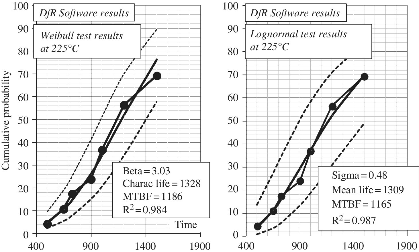
Figure A.11 Life test: (a) Weibull analysis compared to (b) lognormal analysis test at 200°C [1]
A.7.3 Example A.7: Mixed Modal Analysis Inflection Point Method
If a distribution is made up of two failure mechanisms, it is difficult to see the two modes if the data had been plotted without separating out failure mechanisms first. This can occur if both modes fail in the same time frame throughout the test. Thus, the only way to analyze the data is by doing failure analysis on the product and determining the actual failure mechanism for each failure observed.
However, in life testing a subpopulation and main population are often observed, occurring at two distinct time frames. The subpopulation (sometimes called “freaks” or infant mortality failures) show up at early test times compared to the main failure population.
This also commonly occurs in field data. Field data are presented in Table A.4 (see dfrsoft, module 2, row 13, Col. B and K [1]). This characteristic for the data in Table A.4 can be observed by an inflection point in the life test data as shown in Figure A.12 at the 42% point. This behavior can occur from the same failure mode with two failure mechanisms; early failure types could be mechanical failures while later failures could be, say, electrical. Recognizing this, one sees a distinct separation at an inflection point (sometimes looking like S-shaped data, other times just a simple inflection) in the cumulative probability plot as displayed in Figure A.12, with inflection point at 42%. This divides the total population into lower (early time) 42% subpopulation and main or upper (later time) population (58%) groups. The field data for Figure A.12 in Table A.4 (see dfrsoft, module 2, row 13, Col. T [1]) are obtained from 40 units with 22 failures observed and 18 suspensions (units that have not failed at the last observation time). The observed failure times are listed in the table. Here we assume that all the suspensions are part of the upper population.
Table A.4 Field data and the renormalized groups
| Failure time (months) | Number of units that fail at the time | Main population (i − 0.3)/(n + 0.4) | Lower distribution | Upper distribution |
|
Total units = 17(i − 0.3)/(n + 0.4) |
Fail = 5, Susp = 18(i − 0.3)/(n + 0.4) |
|||
| 1 | 3 | 6.7 | 15.9 | |
| 2 | 2 | 11.6 | 27.7 | |
| 3 | 2 | 16.6 | 39.5 | |
| 4 | 1 | 19.1 | 45.4 | |
| 5 | 1 | 21.5 | 51.3 | |
| 6 | 1 | 24.0 | 57.2 | |
| 7 | 1 | 26.5 | 63.1 | |
| 8 | 1 | 29.0 | 69.0 | |
| 10 | 1 | 31.4 | 74.8 | |
| 13 | 1 | 33.9 | 80.7 | |
| 17 | 1 | 36.4 | 86.6 | |
| 21 | 1 | 38.9 | 92.5 | |
| 24 | 1 | 41.3 | 98.4 | |
| 27 | 1 | 43.8 | 3.1 | |
| 42 | 1 | 46.3 | 7.4 | |
| 51 | 1 | 48.8 | 11.7 | |
| 60 | 1 | 51.2 | 15.9 | |
| 69 | 1 | 53.7 | 20.2 |
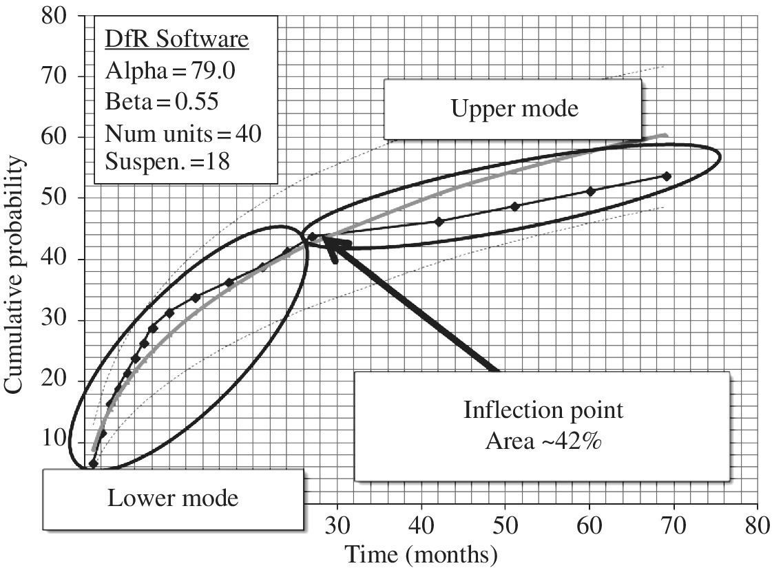
Figure A.12 Field data (Table A.4) displaying inflection point as sub and main populations [1]
The inflection point analysis method is fairly straightforward. The lower and upper populations are simply renormalized by treating each separately above and below the inflection point. This is illustrated in Table A.4 using a Weibull analysis. First we have provided in columns 1 and 2 the failure times and the corresponding number of units failing at that time (interval). In column 3, we list the cumulative percent failure plotting position prior to separating out the population which is plotted and fitted to a Weibull distribution in Figure A.12. Then this graph provides us with the observed inflection point. If this point is not visible, it is likely that there are not two distinct populations. Often one is tempted to do multimodal analysis even when the inflection point is not there. Without some knowledge of an early failure population either statistically (by seeing the inflection point) or from field data analysis of the failure mechanisms on failed units, it is likely that such an analysis will not be justified. However, as in this case when there is an inflection point, then one renormalizes the lower population as in column 4 and similarly for the upper population in column 5. One can then proceed and do a Weibull analysis or, if need be, a lognormal analysis. The results of the main, upper, and lower population are displayed in Figure A.13 (see dfrsoft, module 2, row 55, Col. AU or use the hyperlink [1]).
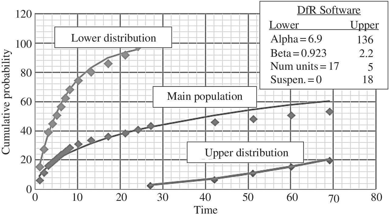
Figure A.13 Separating out the lower and upper distributions by the inflection point method [1]
Note that in Figure A.13 we see that the Weibull results indicate that the lower population indeed has a β < 1 (0.92), indicating that it is an infant mortality problem; the upper population has a β > 1 (2.2), indicating a wear-out failure mode.
A.8 Reliability Objectives and Confidence Testing
We described catastrophic analysis in Section A.7, where we observed a reasonable percent of the sample population on test failing. We are now interested in demonstration testing where we have few failures if any (less than a few percent of the population failing). To this end, we need to do what called statistical confidence demonstration testing.
There are two kinds of confidence: engineering confidence; and statistical confidence.
In engineering confidence we use judgment. For example, based on your experience you are confident that the experiment shows you have a reliable product. Often this may be a valid view. We use engineering judgment all the time in design and in testing as well as in manufacturing products. Without engineering confidence, technology might still be in the dark ages.
However, we often need to go a step further and require more than engineering confidence; we would therefore like to have a certain measure of statistical confidence. Statistical confidence plays a big role not only in product reliability but also in areas such as the medical industry. Statistical confidence in this section implies that we will select a statistically significant sample size, and test the device for a statistically significant period of time to assess the reliability of the product under appropriate stresses. This is in fact the way qualification testing is done. Customers often want to see the data. They want to buy a product that has been statistically verified to be reliable. For example, depending on the complexity of the item being qualified, the test objective might be
- for small parts, ICs,
 ;
; - for complex hybrids,
 ; or
; or - for complex assemblies,
 .
.
A.8.1 Chi-Squared Confidence Test Planning for Few Failures: The Exponential Case
When we have few failures in an accelerated life test, we essentially must be in that portion of the bathtub curve called steady state. As mentioned in Section A.4.1, the steady-state portion of the bathtub curve has a constant failure rate is modeled by the exponential distribution.
The problem is how best to design a test for few failures. Reliability engineers often use what is called the chi-squared distribution in test design for this situation. It is shown in Section A.8.1.1 that when the failure rates are exponentially distributed the chi-squared distribution can be used in design of reliability tests. This is the option that we will describe here. The chi-squared equation for testing [2, 3] is
- where
 = the upper bound on the failure rate; N is test sample size; AF is the acceleration factor; t is the test time; χ2 is the chi-squared statistic (found in tables); γ is the confidence level (typically 60, 80, or 90%); and y is the planned or observed number of test failures.
A.8.1.1 Chi-Squared Validity
Here we provide a bit more information on the validity of the chi-squared method. In statistics, the chi-squared equation is also written for simple statistics when we wish to know the upper bound fractional failure portion P as
This is presented in statistics as valid for y/N < 10%. That is, we now know the upper bound fractional failure. Now we recall in Section A.4.1.1 that F(t) for the exponential distribution can be approximated by ![]() for
for ![]() . This is only valid for the exponential distribution with its constant failure rate. Then:
. This is only valid for the exponential distribution with its constant failure rate. Then:
In an accelerated test we simply replace t by AF × t, yielding Equation (A.30).
We now have roughly two restrictions for the accuracy of Equation (A.30): y/N < 10% and λt << 1. Note that y/N is not much of a restriction for accelerated testing as N has essentially been replaced by y/(N AF t) < 10%. A simple way to think of the restriction λt << 1 is to rewrite it as t << MTBF.
An alternate method for exact accelerated test planning is called the binomial exact sampling method (see dfrsoft, module 8, row 145 [1]). This is beyond the scope of this chapter.
A.8.2 Example A.8: Chi-Squared Accelerated Test Plan
As an example, consider an accelerated test to be planned for a complex hybrid with the objective for hybrids given in Section A.8 of 4 FMH. We would like to estimate the sample size for the following test: ![]() ; test time = 1000 h; AF = 85. Allow for 1 failure to occur.
; test time = 1000 h; AF = 85. Allow for 1 failure to occur. ![]() . What is N?
. What is N?
In this example, we plan for 1 failure to perhaps occur, the confidence is 90%, and we wish to find the sample size N. This is basically a plug-in problem. The χ2 value may be found in statistical tables where:
Then the sample size is (see dfrsoft, module 8, row 15, col. E [1])

Note that the point estimate for the failure rate is .
We are 90% confident that if we perform this test with no more than 1 failure occurring, that the failure rate will be no higher than 4 FMH. That is, we will observe no higher than this failure rate 90 times out of 100.
A.9 Comprehensive Accelerated Test Planning
We see how important accelerated testing is for being able to demonstrate a failure rate objective in a reasonable test period. In Special Topics B we describe numerous accelerated test examples based on the physics of this book. Such models are necessary to estimate the effects of raising the level of the appropriate stress to accelerate a potential device failure mode and effectively compress time. Thus, estimating time compression strongly influences test planning. Once the overall acceleration factor is estimated, tests can be properly planned.
Multiple accelerated testing is also done for sophisticated planning. Table A.5 illustrates an optimized test plan. We will detail the results in Special Topics Section B.6.
Table A.5 Multiple stress accelerated test to demonstrate 1 FMH [1]
| Stress | Example number | Acceleration factor | Test time | FMH | Minimum sample size |
| High-temperature operating life (HTOL) | B.1 | 114 | 1000 h | 0.233 | 87 |
| Temperature–humidity bias (THB) | B.5 | 295 | 1000 h | 0.144 | 54 |
| Temperature cycle (TC) | B.6 | 25 | 200 cycles | 0.226 | 85 |
| Total | 0.6 | 226 |
References
- 1. Author’s software, download at http://www.dfrsoft.com (see Section A.1.1 for details) to follow along with examples.
- 2. O’Connor, P. and Kleyner, A. (2012) Practical Reliability Engineering, 5th edn, John Wiley & Sons, Ltd, Chichester.
- 3. Feinberg, A., Crow, D. (eds) Design for Reliability, M/A-COM 2000, CRC Press, Boca Raton, 2001.
- 4. Weibull, W. (1951) A statistical distribution function of wide applicability. Journal of Applied Mechanics, 18, 293–297.
- 5. Klinger, D.J., Nakada, Y. and Menendez, M.A. (1990) AT&T Reliability Manual. Van Nostrand Reinhold, New York.