
CHAPTER 8
CREATING CSS DESIGNS
While back-end development such as db-driven programming and ecommerce functionality has made large strides over the years, so has the front-end design of sites. In the past, to create a website that had the look and feel of traditional graphic design, the designer had to resort to using nested HTML (now XHTML) tables for the majority of content placement. The tables not only allowed the designer to mortise images together, but they also allowed for the layout of XHTML text that was styled using CSS. With the evolution of browsers, nearly all layouts can now be accomplished using CSS. While Chapter 6, “What Is Needed to Build Mortised Sites,” outlines essential basic information about CSS, this chapter explains the basics of how to use that code to create such sites. The chapter also explains the differences between XHTML table-based design and CSS-driven design.
THE BASICS OF CSS-BASED DESIGN WORKS VERSUS XHTML TABLE-BASED DESIGN
While a designer will very rarely use nested XHTML tables to lay out pages anymore, it’s still good to have a rudimentary understanding if a page needs to be coded or if a page needs to be edited. Plus, a little history only makes us more knowledgeable in the present.
With table-based Web design, the content of a homepage is mortised, or pieced, together using XHTML tables. This content may include text, images, or both. No matter what is included in the design, a minimum of one table is typically used to position the elements. CSS is then generally used to format the text. Figure 8.1 is an example of a site that uses one table to display the content. The table border is set to 3 to show how the page is constructed.
Figure 8.1
Mortised XHTML homepage, with the border’s value set to 3, which uses one table to display both text and images.
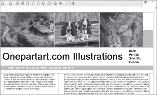
Source: Onepartart.com.
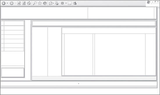
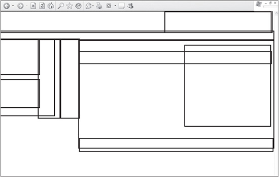
Unfortunately, most XHTML sites that employ more visually and technically advanced design usually cannot be created with one table. The designer therefore must nest tables inside of tables to position the various elements of the site. Figure 8.2 is the combination of nested tables that are used to place all the elements together in a design.
Notice in Figure 8.2 that the tables are nested inside one another. The purpose of this method is to place the content in various positions, down to the specific pixel, in some cases. This design is created to be a “liquid” design, which means it can flex to wider resolutions. Figure 8.3 shows what the design looks like when the images and text are added, along with the basic CSS formatting.
Figure 8.2
Table structure of a more complex table-based design, with the nested tables’ borders set to 3 to display the framework.
© 2014 Cengage Learning.
Figure 8.3
Design with table borders set to 0, and images, text, and CSS added to populate the table cells.
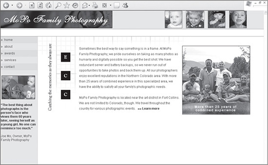
© 2014 Cengage Learning.
As complex as this design is, CSS can also be used to lay out the content. With relatively basic coding, a designer can make most sites look close, if not exact, to their table-based counterparts. Figure 8.4 is the same design as Figure 8.3, but it is laid out using a limited amount of CSS.
Figure 8.4
Design elements from Figure 8.3 laid out using CSS instead of XHTML tables.
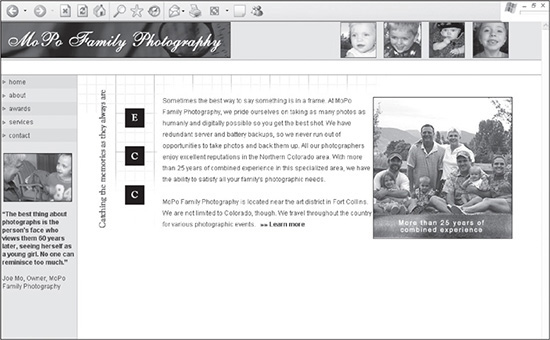
© 2014 Cengage Learning.
In general, CSS sites work by using block- and line-level tags, such as <DIV> and <SPAN> tags, in addition to a few other XHTML tags, such as <BR /> and <H1>, to format and position the content. The <DIV> and <SPAN> tags are wrapped around individual elements of content and then assigned rules in a style sheet to position and style them. While the design in Figure 8.4 does not have tables that can have their borders set to 3 to show the layout, the borders or backgrounds of the tags can be set to 3 to differentiate them. Figure 8.5 shows the design with the borders “turned on” and the images and content removed.
Figure 8.5
Borders turned on and content removed to show the basic structure of the site.
© 2014 Cengage Learning.
One thing to note about CSS-based sites is they require considerably less coding. Listing 8.1 is the table-based code that is used to lay out the design in Figure 8.3.
Listing 8.1 XHTML Code for Figure 8.3
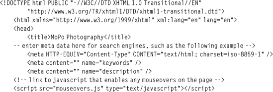
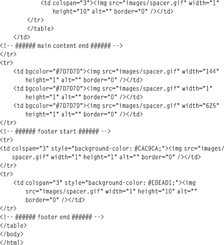
This code contains seven tables and 185 lines of code to lay out the elements of the page. CSS-based design has much cleaner XHTML code, reducing the weight, or download file size, of a page. The page contains only 67 lines of code. Listing 8.2 displays the code to produce the design in Figure 8.4.
Listing 8.2 CSS Code for Figure 8.4
Not only is the code much cleaner in Listing 8.2, but the file size is also dramatically reduced, coming in at approximately 3.2KB versus 11.2KB for the table-based design in Listing 8.1. Because there is more CSS added to a style sheet to create such a design, the style sheet is going to be larger, but not by much. The style sheet weight for Listing 8.1 is approximately 0.70KB, while the weight for Listing 8.2 comes in around 3.6KB. When the entire coding weight of each design is added up, the table-based design comes in around 12KB, while the CSS-based design comes in at 6.8KB, making a difference of nearly 50 percent. And this is only for one page. When the reduced file size for additional pages on the site is compounded, the reduction becomes much greater.
UNDERSTANDING THE BOX MODEL
To design a CSS-based design, such as Figure 8.4, the designer needs to use the box model method. This method involves wrapping <DIV> and <SPAN> (at least with the style used in this book) tags around page elements to position and place them. These tags are commonly referred to as containers because they are used to style elements that are contained within them.
When thinking in terms of a table-based design, the box model’s containers are analogous to individual tables being nested inside one another. Positioning with CSS-based design is different than with table-based design. The latter uses table elements, such as table rows, columns, and cells, many times in association with spacer.gifs, to determine where items are placed. The former uses CSS’s absolute or relative positioning to tell the boxes exactly where they will be in terms of any corner, usually at the top left or top right of the browser or in relation to a box or container in which it is nested.
Listing 8.3 displays a Web page with a style sheet that tells the box with the id value of photo_bottom_left where it needs to be positioned in relation to the top-left corner of the page, where the X,Y coordinates are 0,0.
Listing 8.3 Code for a Website That Uses the Box Model in Figure 8.4
<!DOCTYPE html PUBLIC "-//W3C//DTD XHTML 1.0 Transitional//EN"
       "DTD/xhtml1-transitional.dtd">
    <html xmlns="http://www.w3.org/1999/xhtml" xml:lang="en" lang="en">
    <head>
        <title>A5design</title>

        <style>
            body {
                margin:0px;
                padding:0px;
                background:#ffffff;
                }
            #logo {
                position:absolute;
                top:245px;
                left:160px;
    border:1px solid #000000;
                }
        </style>
    </head>
    <body>
        <div id="logo"><a href="index.htm"><img src="images/logo.jpg"
            width="144" height="92" alt="" border="0" /></a></div>
    </body>
    </html>
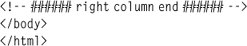
Figure 8.6 illustrates how the image is placed 245 pixels from the top and 160 pixels from the left. The property border has been added with a value of 1 and a color of #000000. This turns on the border to allow the designer to see the size of the box better.
Figure 8.6
Box placed inside a Web page with absolute positioning, forcing the image 245 pixels from the top and 160 pixels from the left.
© 2014 Cengage Learning.
When two other <DIV> tags are added, for example, they also can have either absolute or relative positioning assigned to them. In Listing 8.4, the <DIV> tag with the id of box2 is given absolute positioning outside the photo_bottom_left box (shown in Figure 8.7). The <DIV> tag with the id of box3 is given relative positioning inside the <DIV> tag with the id of box2.
Listing 8.4 Two Additional Boxes Added, One with Relative Positioning and the Other with Absolute
<!DOCTYPE html PUBLIC "-//W3C//DTD XHTML 1.0 Transitional//EN"
       "DTD/xhtml1-transitional.dtd">
    <html xmlns="http://www.w3.org/1999/xhtml" xml:lang="en" lang="en">
    <head>
        <title>A5design</title>
        <style>
            body {
                margin:0px;
                padding:0px;
                background:#ffffff;
                }
            #photo_bottom_left {
                position:absolute;
                top:245px;
                left:160px;
                border:1px solid #000000;
                }
            #box2 {
                position:absolute;
                top:400px;
                left:350px;
                width:100px;
                color:#ffffff;
                background:#000000;
                border:1px solid #000000;
                }
            #box3 {
                position:relative;
                top:0px;
                left:50px;
                height:100px;
                background:#D5C012;
                border:1px solid #000000;
                }
        </style>
    </head>

    <body>
        <div id="photo_bottom_left"><a href="index.htm"><img src="images/
            photo_bottom_left.jpg" width="144" height="92" alt=""
            border="0" /></a></div>
        <div id="box2">
            This is box 2
            <div id="box3">This is box 3</div>
        </div>
    </body>
    </html>
Positioning Content in the Top-Left Corner with No Padding
The margin:0px; and padding:0px properties and values are added to the <BODY> tag in the style sheet to ensure that the content is positioned in the top-left corner of the browser. If these attributes are not added, content will not always begin at the X,Y attributes of 0,0 in a browser. Depending on the browser, this distance can change. Similar to XHTML table-based designs, it is necessary to declare background page colors when creating CSS-based designs, which is why the background property is added. This is included to ensure that all browsers use the same background color, not leaving the option to be declared by their default values.
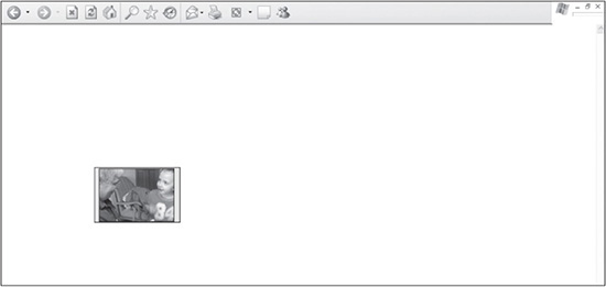
When the page is displayed, box2 is located 100 pixels from the top and 350 pixels from the left. box3 is then placed inside the box2 tag and positioned 50 pixels from the left. Both boxes are assigned background colors, and they have their borders turned on to better illustrate their shapes and positions (see Figure 8.7).
Figure 8.7
A box with relative positioning placed inside a box with absolute positioning.
© 2014 Cengage Learning.
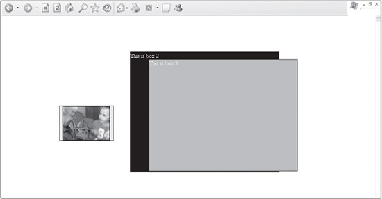
Because box3 is positioned inside box2 using relative positioning, the latter stretches to the full height of both boxes. If, however, box3 is assigned absolute, instead of relative, positioning in the style sheet (see Listing 8.4), it will react differently (see Figure 8.8).
Figure 8.8
A box with absolute positioning placed inside another box with absolute positioning.
© 2014 Cengage Learning.
Following are three things to notice about how the relationship between the two boxes changes:
 Rather than position itself relative to
 box2, box3 positions itself from the top-left corner of box2.
box2 will not recognize the combined height of the two boxes. Rather, it will recognize only its height. This is because absolute-positioned elements, similar to floating elements, fall outside the flow of relative-positioned elements. In other words, box2’s border will not contain box3. This is important to keep in mind when nesting <DIV> tags in each other.
The nested box does not inherit the width of the parent box. It will now need to be forced into the style sheet, using the width property.
These are just the overall concepts of the box model. Similar to XHTML tables, the box model, once understood at the basic level, can be used in more creative and advanced ways, such as the site shown in Figure 8.4. The case studies later in the book provide more detailed examples of building more advanced sites.
WHEN TO USE TABLES
Some CSS purists believe CSS Web designs should include very little, if any, XHTML tables. While there are more advantages than disadvantages to creating CSS-based sites over table-based designs, this does not mean that there is no longer a need for tables.
Tables serve a practical purpose in Web design: handling columns and rows of data. While there are ways to handle such content using CSS, there is no reason that XHTML cannot and should not be used in such circumstances, such as in Figure 8.9. In this example, 77 cells are used in the table. CSS would, in many cases, be too time-consuming to create and maintain.
Figure 8.9
Example Web page where using an XHTML table is more practical to position 77 cells of data than using CSS.
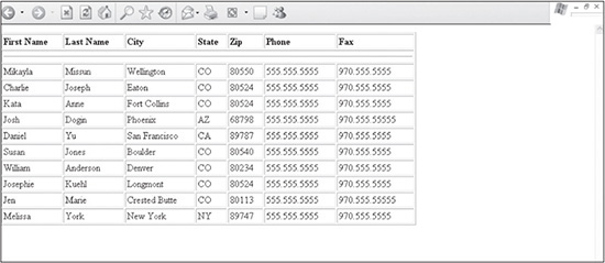
© 2014 Cengage Learning.
VALIDATING CODE
The W3C is the governing body when it comes to the creation of Web standards that help the Web “reach its true potential,” according to the consortium. Over the years, an increasing number of designers and developers have begun adhering to such standards.
During Web page design, both XTHML and CSS should be validated, using the W3C’s free online validating services. They not only help a developer understand what code is not compliant, but they also now provide explanations and examples of correctly written code. Following are the URLs for each validating service:
XHTML Markup Validation Service: http://validator.w3.org/
CSS Validation Service: http://jigsaw.w3.org/css-validator/
The W3C also offers a downloadable version of its CSS Validator. The software can be found at http://dev.w3.org/cvsweb/2002/css-validator/.
Using W3C to Validate Pages
Once a page is validated, the W3C provides and encourages designers and developers to include a W3C validation image on the page, which verifies that the page has been validated for either XHTML or CSS or both.
TESTING DESIGNS IN VARIOUS BROWSERS
Testing websites in various browsers used to be a major part of Web design because of how inconsistently the browsers rendered pages. These days, browsers do a great job of adhering to standards, which makes pages much more consistent. Still, it is wise for a designer to always test a page in the major browsers, which include Chrome, FireFox, Safari, and Internet Explorer. A good method for testing is to open the page in all the browsers and then to simply refresh the page (hitting the F5 button) in them when changes are made.
SUMMARY
While there is a learning curve that comes with changing a coding style from creating XHTML table-based designs to CSS-based designs, this chapter gives a basic understanding of the benefits of the CSS method and how it works (Chapters 9–14 then put these principles to use). The box model is explained, including how absolute and relative positioning are used to position block elements. As with all development, testing is encouraged. W3C validation services are included to give the designer a place to validate both the XHTML and CSS of a site.