C H A P T E R 4
Getting Started with CSS
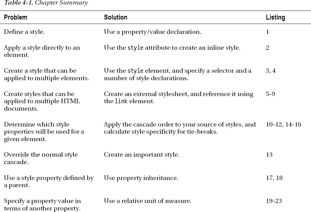
Cascading Style Sheets (CSS) are the means by which you specify the presentation (the appearance and the formatting) of an HTML document. In this chapter, I'll show you how to create and apply CSS styles, explain why they are called cascading style sheets, and provide an overall foundation for future chapters. Table 4-1 provides the summary for this chapter.

Defining and Applying a Style
A CSS style is made up of one or more declarations separated by a semi-colon. Each declaration consists of a CSS property and a value for that property separated by a colon. Listing 4-1 shows a simple style.
Listing 4-1. A Simple CSS Style
background-color:grey; color:white
Figure 4-1 shows the declarations, properties, and values in this style.
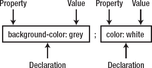
Figure 4-1. The anatomy of a CSS style
In this example, the style has two declarations. The first sets the value grey for the background-color property, and the second sets the value white for the color property.
There is a wide range of CSS properties available, and each controls some aspect of the appearance of the elements to which it is applied. In Chapters 19 through 24, I describe the available CSS properties and demonstrate their effect.
Understanding the CSS Properties Used in This Chapter
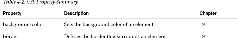
To demonstrate how CSS operates, I need to use some CSS properties that I don't describe fully until later chapters. Table 4-2 lists these properties, gives a very brief description of them, and shows you which chapter contains full details.
Applying a Style Inline
It isn't enough to just define a style— you also need to apply it, effectively telling the browser which elements the style should affect. The most direct way to apply a style to an element is by using the style global attribute (described in Chapter 3), as shown in Listing 4-2.
Listing 4-2. Applying a Style Using the Style Global Attribute
<!DOCTYPE HTML>

<html>

    <head>

        <title>Example</title>


    </head>

    <body>

        <a href="http://apress.com" style="background-color:grey; color:white">

            Visit the Apress website

        </a>

        <p>I like <span>apples</span> and oranges.</p>

        <a href="http://w3c.org">Visit the W3C website</a>

    </body>

</html>
There are four content elements in this HTML document—two hyperlinks (created with the a element) and a p element that contains a span element. I used the style global attribute to apply the style to the first a element—the one that links to the Apress web site. (You can learn more about the a, p, and span elements in Chapters 8 and 9. For the moment, you are interested only in applying styles.) The style attribute acts upon only the element to which it has been applied, as you can see in Figure 4-2.
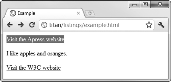
Figure 4-2. Applying a style directly to an element
The impact of the two CSS properties used in the example can be seen in the figure. The background-color property sets the color of the background of the element, and the color property sets the color of the foreground. The other two content elements in the HTML document are unaffected by the style.
THE ISSUE OF CSS RELIGION
Creating an Embedded Style
Applying styles to individual elements can be a useful technique, but it is an inefficient approach when applied to a complex document that might require dozens of different styles. Not only do you have to apply the correct style to each element, but you have to be careful to correctly apply updates, which is an error-prone process. Instead, you can use the style element (as opposed to the style attribute) to define an embedded style and direct the browser to apply the style using a CSS selector. Listing 4-3 shows how you can use the style element with a simple CSS selector.
Listing 4-3. Using the Style Element
<!DOCTYPE HTML>

<html>

    <head>

        <title>Example</title>

        <style type="text/css">

            a {

                background-color:grey;

                color:white
            }

        </style>

    </head>

    <body>

        <a href="http://apress.com">Visit the Apress website</a>

        <p>I like <span>apples</span> and oranges.</p>

        <a href="http://w3c.org">Visit the W3C website</a>

    </body>

</html>
I describe the style element and its attributes in Chapter 7. In this chapter, we are interested in how to specify a style inside of the style element. You still use declarations, but they are wrapped in braces (the { and } characters) and follow a selector, as shown in Figure 4-3.

Figure 4-3. The anatomy of a style defined inside a style element
The selector in this example is a, which instructs the browser to apply the style to every a element in the document. You can see how the browser does this in Figure 4-4.
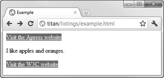
Figure 4-4. The effect of the a selector
You can define multiple styles in a single style element—you just repeat the process of defining a selector and a set of declarations. Listing 4-4 shows a style element that has two styles.
Listing 4-4. Defining Multiple Styles in a Single Style Element
<!DOCTYPE HTML>

<html>

    <head>

        <title>Example</title>

        <style type="text/css">

            a {

                background-color:grey;

                color:white

            }

            span {

                border: thin black solid;

                padding: 10px;

            }

        </style>

    </head>

    <body>

        <a href="http://apress.com">Visit the Apress website</a>

        <p>I like <span>apples</span> and oranges.</p>

        <a href="http://w3c.org">Visit the W3C website</a>

    </body>

</html>
This new style has a selector of span (which means the browser will apply the style to all span elements in the document and use the border and padding properties). The border property defines a border around the targeted element, and the padding property creates some space around it. You can see the effect in Figure 4-5. The selectors and the properties in these examples are very basic. I describe the full range of selectors in Chapters 17 and 18 and the properties in Chapters 19 and 20.
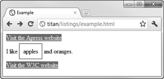
Figure 4-5. Applying multiple styles
Using an External Stylesheet
Rather than define the same set of styles in each of your HTML pages, you can create a separate stylesheet. This is an independent file, conventionally one that has the .css file extension, into which you put your styles. Listing 4-5 shows the contents of the file styles.css, which you can find in the source code download that accompanies this chapter and which is available from apress.com.
Listing 4-5. The styles.css File
a {

    background-color:grey;

    color:white

}

span {

    border: thin black solid;

    padding: 10px;

}
You don't need to use a style element in a stylesheet— you just use the selector, followed by the declarations for each style that you require. You can then use the link element to bring the styles into your document, as shown in Listing 4-6.
Listing 4-6. Importing an External Stylesheet
<!DOCTYPE HTML>

<html>

    <head>

        <title>Example</title>

        <link rel="stylesheet" type="text/css" href="styles.css"></link>

    </head>

    <body>

        <a href="http://apress.com">Visit the Apress website</a>

        <p>I like <span>apples</span> and oranges.</p>

        <a href="http://w3c.org">Visit the W3C website</a>

    </body>

</html>
You can link to as many stylesheets as you need—one per link element. I describe the link element fully in Chapter 7. As with the style element, the order in which you import stylesheets is important if you define two styles with the same selector. The one that is loaded last will be the one that is applied.
Importing from Another Stylesheet
You can import styles from one stylesheet into another using the @import statement. To demonstrate this feature, I created a second stylesheet called combined.css, the contents of which are shown in Listing 4-7.
Listing 4-7. The combined.css File
@import "styles.css";

span {

    border: medium black dashed;

    padding: 10px;

}
You can import as many stylesheets as you want, using one @import statement per stylesheet. The @import statements must appear at the top of the stylesheet, before any new styles are defined. In the combined.css stylesheet, I imported styles.css and then defined a new style for span elements. Listing 4-8 shows the combined.css stylesheet being linked from an HTML document.
Listing 4-8. Linking to a Stylesheet That Contains Imports
<!DOCTYPE HTML>

<html>

    <head>

        <title>Example</title>

        <link rel="stylesheet" type="text/css" href="combined.css"/>

    </head>

    <body>

        <a href="http://apress.com">Visit the Apress website</a>

        <p>I like <span>apples</span> and oranges.</p>

        <a href="http://w3c.org">Visit the W3C website</a>

    </body>

</html>
The @import statement in combined.css has the effect of importing both of the styles defined in the styles.css stylesheet and then overriding the style that will be applied to span elements. You can see the effect shown in Figure 4-6.
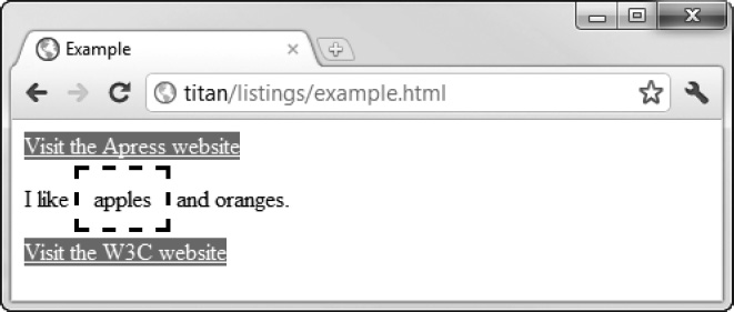
Figure 4-6. Importing styles from another stylesheet
The @import statement isn't widely used. This is partly because its existence isn't well known, but it is also because browser implementations have tended to deal with @import statements in such a way as to offer slower performance than using multiple link elements and relying on the way that styles cascade (which I explain in the next section).
Specifying the Character Encoding of a Stylesheet
The only thing that can come before an @import statement in a CSS stylesheet is an @charset statement, which specifies the character encoding used by the stylesheet. Listing 4-9 demonstrates how to specify the UTF-8 encoding (which is the most prevalent).
Listing 4-9. Specifying a Type of Character Encoding in a Stylesheet
@charset "UTF-8";

@import "styles.css";

span {

    border: medium black dashed;

    padding: 10px;

}
If you don't specify a type of character encoding, the browser will use the encoding specified in the HTML document that loaded the stylesheet. If there is no encoding specified for the HTML document, UTF-8 will be used by default.
Understanding How Styles Cascade and Inherit
The key to understanding stylesheets is to understand how they cascade and inherit. Cascading and inheritance are the means by which the browser determines which values should be used for properties when they display an element. Each element has a number of CSS properties that will be used when the browser needs to render the page. For each of those properties, the browser needs to navigate through all of the sources of styles it has. You have seen three different ways you can define styles (inline, embedded, and from an external stylesheet), but there are two other sources of styles that you need to know about.
Understanding Browser Styles
The browser styles (more properly known as the user agent styles) are the default styles a browser applies to an element if no other style has been specified. These styles vary slightly between browsers, but they tend to be broadly similar. As an example, consider how a browser displays an a element—a hyperlink—when there are no other styles defined in the HTML document. Listing 4-10 shows a simple HTML document that contains no styles.
Listing 4-10. An HTML Document That Contains No Styles
<!DOCTYPE HTML>

<html>

    <head>

        <title>Example</title>

    </head>

    <body>

        <a href="http://apress.com">Visit the Apress website</a>

        <p>I like <span>apples</span> and oranges.</p>

        <a href="http://w3c.org">Visit the W3C website</a>

    </body>

</html>
This listing is just a variation of the previous example, without any styles. You can see how the browser renders the a elements in Figure 4-7.
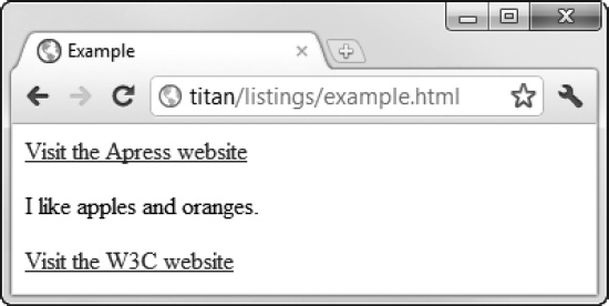
Figure 4-7. The default style for hyperlink elements
We are so accustomed to seeing the style that browsers apply to links that it becomes invisible. However, if you stop and consider what you are looking at, you can see details of the style. The text content of the link is displayed in blue and is underlined. You can extrapolate from what you see and assume the browser is applying a style similar to the one shown in Listing 4-11.
Listing 4-11. Extrapolating to Create the Default Browser Style for a Elements
a {

    color: blue;

    text-decoration: underline;

}
Browsers don't have default styles for every HTML element, but many elements are displayed using such styles. In each chapter of this book that describes HTML elements, I include the typical default style you can expect common browsers to apply. You can see the description for the a element in Chapter 8.
Understanding User Styles
Most browsers allow users to define their own stylesheets. The styles that these stylesheets contain are called user styles. This isn't a widely used feature, but users who define their own stylesheets often attach great importance in being able to do so—not least, because it provides a way of making pages more accessible.
Each browser has its own mechanism for user styles. Google Chrome, for example, creates a file in the user's profile directory called DefaultUser StyleSheetsCustom.css. Any styles added to this file are applied to any site the user visits, subject to the cascading rules I describe in the following section. As a simple demonstration, Listing 4-12 shows a style I added to my Custom.css file.
Listing 4-12. Adding a Style to the User Stylesheet
a {

    color: white;

    background:grey;

    text-decoration: none;

    padding: 2px;

}
This style applies to a elements and overrides the default browser style. Figure 4-8 shows the effect of my user style if I reload the HTML document in Listing 4-9.
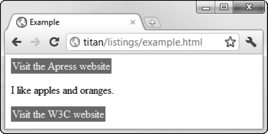
Figure 4-8. Defining user styles
Understanding How Styles Cascade
Now that you have seen all of the sources of styles that a browser has to consider, you can look at the order in which the browser will look for a property value when it comes to display an element. The order is very specific:
- Inline styles (styles that are defined using the
styleglobal attribute on an element)- Embedded styles (styles that are defined in a
styleelement)- External styles (styles that are imported using the
linkelement)- User styles (styles that have been defined by the user)
- Browser styles (the default styles applied by the browser)
Imagine that the user needs to display an a element. One of the things the browser needs to know is what color the text should be displayed in. To answer this question, it will need to find a value for the CSS color property. First, it will check to see if the element it is trying to render has an inline style that defines a value for color, like this:
<a style="color: red" href="http://apress.com">Visit the Apress website</a>
If there is no inline style, the browser will look for a style element that contains a style that applies to the element, like this:
<style type="text/css">

    a {

        color: red;

    }

</style>
If there is no such style element, the browser looks at the stylesheets that have been loaded via the link element, and so on, until the browser either finds a value for the color property—and that means using the value defined in the default browser styles if no other value is available.
The first three sources of properties (inline styles, embedded styles, and stylesheets) are collectively referred to as the author styles. The styles defined in the user stylesheet are known as the user styles, and the styles defined by the browser are known as the browser styles.
Tweaking the Order with Important Styles
You can override the normal cascade order by marking your property values as important, as shown in Listing 4-13.
Listing 4-13. Marking Style Properties as Important
<!DOCTYPE HTML>

<html>

    <head>

        <title>Example</title>

        <style type="text/css">

            a {

                color: black !important;

            }

        </style>

    </head>

    <body>

        <a style="color:red" href="http://apress.com">Visit the Apress website</a>

        <p>I like <span>apples</span> and oranges.</p>

        <a href="http://w3c.org">Visit the W3C website</a>

    </body>

</html>
You mark individual values as important by appending !important to the declaration. The browser gives preference to important styles, regardless of where they are defined. You can see the effect of property importance in Figure4-9, where the embedded value for the color property overrides the inline value. (This may be a little hard to see on the printed page.)
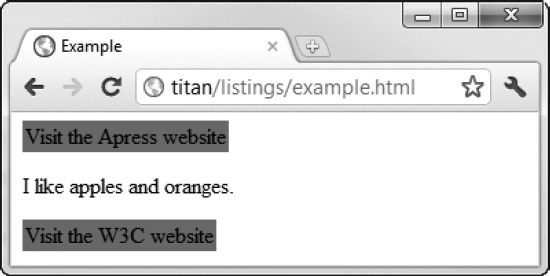
Figure 4-9. Important property values overriding inline property values
 Tip The only thing that will take precedence over an important value that you define is an important value defined in the user stylesheet. For regular values, the author styles are used before the user styles, but this is reversed when dealing with important values.
Tie-Breaking with Specificity and Order Assessments
You enter a tie-break situation if there are two styles that can applied to an element defined at the same level and they both contain values for the CSS property the browser is looking for. To decide which value to use, the browser assesses the specificity of each style and selects the one that is most specific. The browser determines the specificity of a style by counting three different characteristics:
- The number of
idvalues in the style's selector- The number of other attributes and pseudo-classes in the selector
- The number of element names and pseudo-elements in the selector
I explain how to create selectors that contain all of these different characteristics in Chapters 17 and 18. The browser combines the values from each assessment and applies the property value from the style that is most specific. You can see a very simple example of specificity in Listing 4-14.
Listing 4-14. Specificity in Styles
<!DOCTYPE HTML>

<html>

    <head>

        <title>Example</title>

        <style type="text/css">

            a {

                color: black;

            }

            a.myclass {

                color:white;

                background:grey;

            }

        </style>

    </head>

    <body>

        <a href="http://apress.com">Visit the Apress website</a>

        <p>I like <span>apples</span> and oranges.</p>

        <a class="myclass" href="http://w3c.org">Visit the W3C website</a>

    </body>

</html>
When assessing specificity, you create a number in the form a-b-c, where each letter is the total from one of the three characteristics that are counted. This is not a three-digit number—a style is more specific if its a value is the greatest. Only if the a values are equal does the browser compare b values—the style with the greater b value is more specific in this case. Only if both the a and b values are the same does the browser consider the c value. This means that a specificity score of 1-0-0 is more specific than 0-5-5.
In this case, the selector a.myclass includes a class attribute, which means that the specificity of the style is 0-1-0 (0 id values + 1 other attributes + 0 element names). The other style has a specificity of 0-0-0 (that is, it contains no id values, other attributes or element names). The browser finds a value for the color property when rendering an a element that has been assigned to the myclass class. For all other a elements, the value from the other style will be used. You can see how the browser selects and applies values for this example in Figure 4-10.
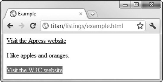
Figure 4-10. Applying values from styles based on specificity
When there are values defined in styles with the same specificity, the browser selects the value it uses based on the order in which the values are defined—the one that is defined last is the one that will be used. Listing 4-15 shows a document that contains two equally specific styles.
Listing 4-15. Styles That Are Equally Specific
<!DOCTYPE HTML>

<html>

    <head>

        <title>Example</title>

        <style type="text/css">

            a.myclass1 {

                color: black;

            }

            a.myclass2 {

                color:white;

                background:grey;

            }

        </style>

    </head>

    <body>

        <a href="http://apress.com">Visit the Apress website</a>

        <p>I like <span>apples</span> and oranges.</p>

        <a class="myclass1 myclass2" href="http://w3c.org">Visit the W3C website</a>

    </body>

</html>
Both styles defined in the style element have the same specificity score. When the browser is rendering the second a element in the page, it will select the white property for the color property because that is the value defined in the latter style. You can see this in Figure 4-11.
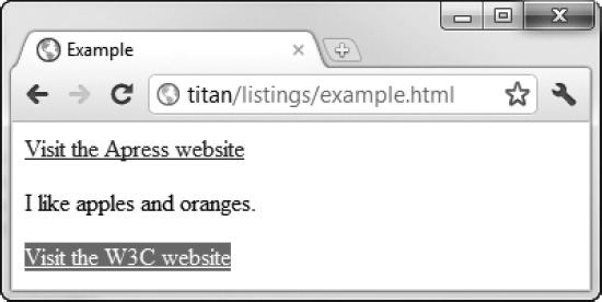
Figure 4-11. Selecting property values based on the order in which styles are defined
You can reverse the order of the styles to prove that this is the way the browser has selected the value for the color property, as shown in Listing 4-16.
Listing 4-16. Reversing the Order in Which Styles Are Defined
<!DOCTYPE HTML>

<html>

    <head>

        <title>Example</title>

        <style type="text/css">

            a.myclass2 {

                color:white;

                background:grey;

            }

            a.myclass1 {

                color: black;

            }

        </style>

    </head>

    <body>

        <a href="http://apress.com">Visit the Apress website</a>

        <p>I like <span>apples</span> and oranges.</p>

        <a class="myclass1 myclass2" href="http://w3c.org">Visit the W3C website</a>

    </body>

</html>
As expected, the value the browser selects for the color property is now black, as shown in Figure 4-12.

Figure 4-12. The effect of changing the order in which styles are defined
The notion of selecting a value is based on the specificity and order performed on a property-by-property basis. In the examples in this section, I defined a value for the background property as well. Because this value was not defined in both styles, there was no conflict and thus no need to look for alternative values.
Understanding Inheritance
If the browser can't find a value for a property in one of the available styles, it will use inheritance, which means taking the value for the property defined by the parent element. Listing 4-17 provides a demonstration.
Listing 4-17. CSS Property Inheritance
<!DOCTYPE HTML>

<html>

    <head>

        <title>Example</title>

        <style type="text/css">

            p {

                color:white;

                background:grey;

                border: medium solid black;

            }

        </style>

    </head>

    <body>

        <a href="http://apress.com">Visit the Apress website</a>

        <p>I like <span>apples</span> and oranges.</p>

        <a class="myclass1 myclass2" href="http://w3c.org">Visit the W3C website</a>

    </body>

</html>
In this example, we are interested in the properties the browser applies to the span element, whose parent is a p element. You can see how the browser renders this document in Figure 4-13.
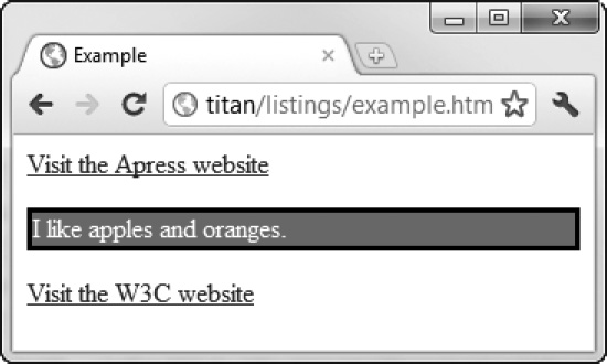
Figure 4-13. The application of inherited CSS property values
Nowhere in this document have I defined a value for the color property in a style that is applied to the span element, yet the browser has used the value white to display the text content. This value has been inherited from the parent p element.
Confusingly, not all CSS properties are inherited. As a rule of thumb, those that relate to the appearance of an element are inherited (text color, font details, and so forth) and those that relate to the layout of the element on the page are not inherited. You can force inheritance by using the special value inherit in a style, which explicitly instructs the browser to use the parent element's value for the property. Listing 4-18 shows the inherit value being used.
Listing 4-18. Using the Special Inherit Value
<!DOCTYPE HTML>

<html>

    <head>

        <title>Example</title>

        <style type="text/css">

            p {

                color:white;

                background:grey;

                border: medium solid black;

            }

            span {

                border: inherit;

            }

        </style>

    </head>

    <body>

        <a href="http://apress.com">Visit the Apress website</a>

        <p>I like <span>apples</span> and oranges.</p>

        <a class="myclass1 myclass2" href="http://w3c.org">Visit the W3C website</a>

    </body>

</html>
In this example, I created a style that will be applied to span elements and inherit whatever the parent's value for the border property is. You can see the effect of this in Figure 4-14. There is now a border around the span element and the containing p element.
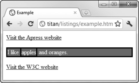
Figure 4-14. Using the inherit property
Working with CSS Colors
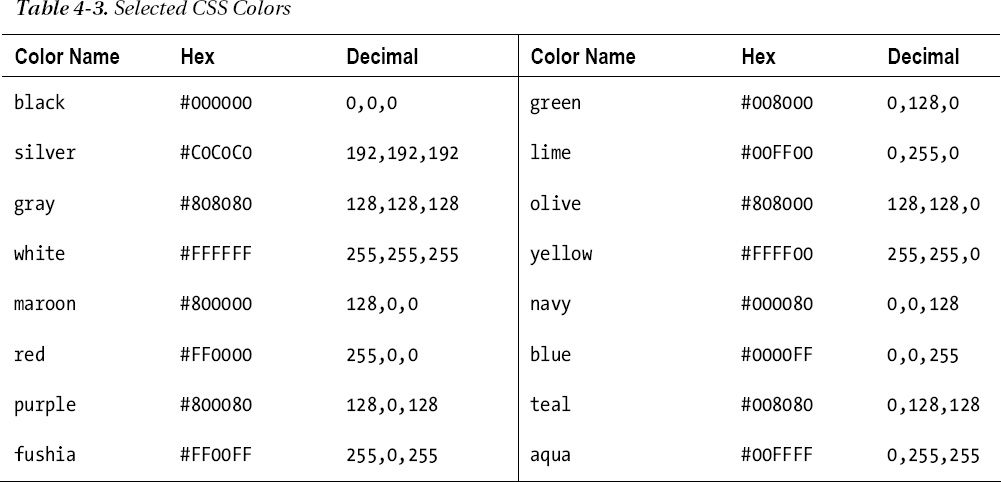
Colors are very important in web pages, and when using CSS you can specify colors in a range of different ways. The simplest ways are to use one of the predefined color names or to use a decimal or hexadecimal value for each of the red, green, and blue components. Decimal values are separated by a comma, and hex values are usually prefixed with #—such as #ffffff, which represents white. You can see some of the predefined names for colors and their decimal and hex equivalents in Table 4-3.
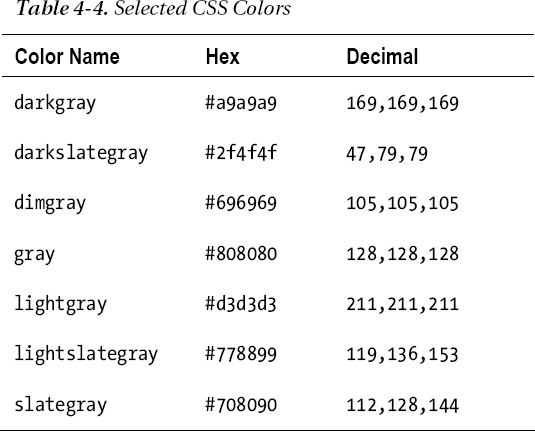
These are known as the basic color names—CSS defines the extended colors as well. There are too many color names to list here, but a complete list can be found at www.w3.org/TR/css3-color. There are a lot of new shades defined by the extended colors, including slight variations on the colors in the basic list. As an example, Table 4-4 shows the extended set of gray shades that can be used.
Specifying More Complex Colors
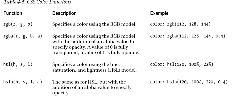
Color names and simple hex values aren't the only way you can specify colors. There are a number of functions that allow you to select a color. Table 4-5 describes each of the functions available.
Understanding CSS Lengths
Many CSS properties require you to specify a length. A couple of examples are the width property, which is used to specify the width of an element, and the font-size property, which is used to specify the size of font used to render an element's content. Listing 4-19 shows a style that uses both of these properties.
Listing 4-19. Specifying Units of Measurement in Properties
<!DOCTYPE HTML>

<html>

    <head>

        <title>Example</title>

        <style type="text/css">

            p {

                background: grey;

                color:white;

                width: 5cm;

                font-size: 20pt;

            }

        </style>

    </head>

    <body>

        <a href="http://apress.com">Visit the Apress website</a>

        <p>I like <span>apples</span> and oranges.</p>

        <a class="myclass1 myclass2" href="http://w3c.org">Visit the W3C website</a>

    </body>

</html>
When you specify a length, you concatenate the number of units and the unit identifier together, without any spaces or other characters between them. In the listing, I specified the value of the width property as 5cm, which means 5 of the units represented by the cm identifier (centimeters). Equally, I specified the value of the font-size property as 20pt, which means 20 of the units represented by the pt identifier (points, which are explained in the following sections). CSS defines two kinds of length unit—those that are absolute, and those that are relative to another property. I'll explain both in the sections that follow.
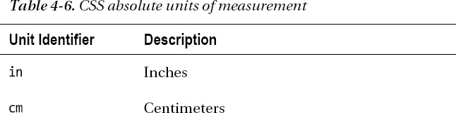
Working with Absolute Lengths
In the preceding listing, I used the cm and pt units, both of which are examples of absolute units. These units are real-world measurements. CSS supports five types of absolute units, which are described in Table 4-6.

You can mix and match units in a style and also mix absolute and relative units. Absolute units can be useful if you have some prior knowledge of how the content will be rendered, such as when designing for print. I don't use the absolute units that much in my CSS styles. I find the relative units more flexible and easier to maintain, and I rarely create content that has to correspond to real-world measurements.
Tip You might be wondering where pixels are in the table of absolute units. In fact, CSS tries to make pixels a relative unit of measurement—although, as I explain later in this chapter, this hasn't been how things worked out. You can learn more in the “Working with Pixels” section.
Working with Relative Lengths
Relative lengths are more complex to specify and implement than absolute units, and they require tight and concise language to define their meaning unambiguously. A relative unit is measured in terms of some other unit. Unfortunately, the language in the CSS specifications isn't precise enough (a problem that has plagued CSS for years). This means that CSS defines a wide range of interesting and useful relative measurements, but you can't use some of them because they don't have widespread or consistent browser support. Table 4-7 shows the relative units that CSS defines and that can be relied on in mainstream browsers.

In the following sections, I show you how to use these units to express lengths.
Working Relative to Font Size
When you use a relative unit, you are effectively specifying a multiple of another measurement. The first units we will look at are relative to font size. Listing 4-20 gives an example.
Listing 4-20. Using a Relative Unit
<!DOCTYPE HTML>

<html>

    <head>

        <title>Example</title>

        <style type="text/css">

            p {

                background: grey;

                color:white;

                font-size: 15pt;

                height: 2em;

            }

        </style>

    </head>

    <body>

        <a href="http://apress.com">Visit the Apress website</a>

        <p>I like <span>apples</span> and oranges.</p>

        <p style=" font-size:12pt">I also like mangos and cherries.</p>

        <a class="myclass1 myclass2" href="http://w3c.org">Visit the W3C website</a>

    </body>

</html>
In this example, I specified the value of the height property to be 2em, which means that p elements should be rendered so that the height of the element on the screen is twice the font size. This multiple is calculated for each element as it is displayed. I defined a default font-size of 15pt in the style element and specified an inline value of 12pt on the second p element in the document. You can see how the browser displays these elements in Figure 4-15.
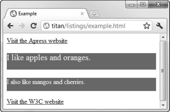
Figure 4-15. The effect of using relative measurements
You can use relative units to express a multiple of another relative measure. Listing 4-21 gives an example where the height property is expressed in em units. The em units are derived from the value of the font-size property, which I have expressed using rem units.
Listing 4-21. Using Units That Are Derived from Other Relative Values
<!DOCTYPE HTML>

<html>

    <head>

        <title>Example</title>

        <style type="text/css">

            html {

                font-size: 0.2in;

            }

            p {

                background: grey;

                color:white;

                font-size: 2rem;

                height: 2em;

            }

        </style>

    </head>

    <body style="font-size: 14pt">

        <a href="http://apress.com">Visit the Apress website</a>

        <p>I like <span>apples</span> and oranges.</p>

        <a class="myclass1 myclass2" href="http://w3c.org">Visit the W3C website</a>

    </body>

</html>
The rem unit is relative to the font size of the html element—also known as the root element. In this example, I assigned an absolute font size of 0.2 inches using a style (although I also could have created an inline style by defining the style attribute on the html element directly). The font-size value in the other style is expressed as 2rem, which means that the font size in every element that this value is applied to will be twice the size of the root element font—0.4 inches. The height property in the same style is specified as 2em, which is twice as much again. This means the browser will display p elements using a font that is 0.4 inches high and the overall element will be 0.8 inches high. You can see how the browser handles these styles in Figure 4-16.
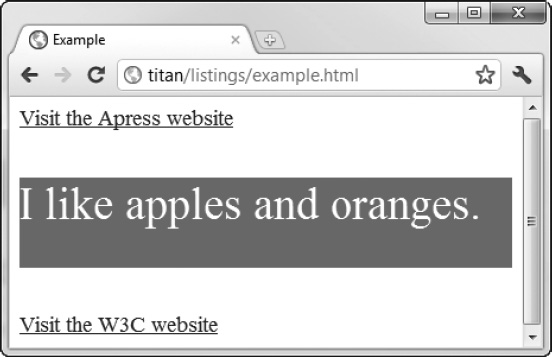
Figure 4-16. Defining relative units in terms of other relative units
The third font-related relative unit is ex, which is the current font's x-height. This is the distance from the typeface baseline and the midline, but it is generally about the height of the letter x (hence the name). As a rule of thumb, 1ex is approximately 0.5em.
Working with Pixels
Pixels in CSS are not what you might expect. The usual meaning of the term pixel refers to the smallest addressable unit on a display—one picture element. CSS tries to do something different and defines a pixel as follows:
The reference pixel is the visual angle of one pixel on a device with a pixel density of 96dpi and a distance from the reader of an arm's length.
This is the kind of vague definition that plagues CSS. I don't want to rant, but specifications that are dependent on the length of a user's arm are problematic. Fortunately, the mainstream browsers ignore the difference between pixels as defined by CSS and pixels in the display, and they treat 1 pixel to be 1/96th of an inch. (This is the standard Windows pixel density. Browsers on platforms with displays that have a different pixel density usually implement a translation so that 1 pixel is still roughly 1/96th of an inch).
Tip Although it isn't much use, you can read the full definition of a CSS pixel at www.w3.org/TR/CSS21/syndata.html#length-units.
The net effect of this is that although CSS pixels are intended to be a relative unit of measure, they are treated as an absolute unit by browsers. Listing 4-22 demonstrates specifying pixels in a CSS style.
Listing 4-22. Using Pixel Units in a Style
<!DOCTYPE HTML>

<html>

    <head>

        <title>Example</title>

        <style type="text/css">

            p {

                background: grey;

                color:white;

                font-size: 20px;

                width: 200px;


            }

        </style>

    </head>

    <body>

        <a href="http://apress.com">Visit the Apress website</a>

        <p>I like <span>apples</span> and oranges.</p>

        <a class="myclass1 myclass2" href="http://w3c.org">Visit the W3C website</a>

    </body>

</html>
In this example, I expressed both the font-size and the width properties in pixels. You can see how the browser applies this style in Figure 4-17.
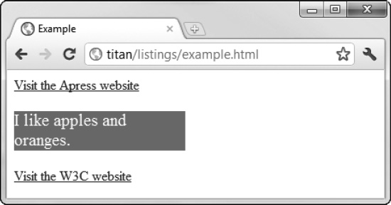
Figure 4-17. Specifying units in pixels
Tip Although I often use pixels as units in CSS, it tends to be a matter of habit. I find em units more flexible. This is because I only have to alter the size of the font when I need to make a change and the rest of the style works seamlessly. Remember that although CSS pixels were intended to be relative units, they are absolute units in practice and can become a little inflexible as a consequence.
Working with Percentages
You can express a unit of measurement as a percentage of another property value. You do this using the % (percent) unit, as demonstrated in Listing 4-23.
Listing 4-23. Expressing Units as a Percentage of Another Property Value
<!DOCTYPE HTML>

<html>

    <head>

        <title>Example</title>

        <style type="text/css">

            p {

                background: grey;

                color:white;

                font-size: 200%;

                width: 50%;

            }

        </style>

    </head>

    <body>

        <a href="http://apress.com">Visit the Apress website</a>

        <p>I like <span>apples</span> and oranges.</p>

        <a class="myclass1 myclass2" href="http://w3c.org">Visit the W3C website</a>

    </body>

</html>
There are two complications in using percentages as units. The first complication is that not all properties can be expressed in this way. The second is that each property that can be expressed as a percentage individually defines which other property the percentage refers to. For example, the font-size property uses the inherited font-size value and the width property uses the width of the containing block.
This isn't as confusing as it might seem. I'll explain what containing block means in Chapter 16. (It is an important and recurring concept.) I'll also tell you which CSS properties support percentage units and what the percentage is calculated from as I describe each CSS property starting in Chapter 19.
CSS Units Without Wide Support
In addition to the relative units I listed, CSS defines some units that have yet to get wide support. Table 4-8 lists these new units. These will be useful when they are implemented widely and consistently, but they should be avoided until this happens.
The vw, vh, and wm units have the potential to be useful in a wide range of situations, but at present they are implemented only in Internet Explorer. Even then, my brief testing suggested that the implementation doesn't quite match the CSS specification.
CSS Unit Calculations
CSS3 defines an interesting feature that lets you calculate units. This is a flexible approach that gives you both control and precision when you create styles. Listing 4-24 provides an example.
Listing 4-24. Calculating Units
<!DOCTYPE HTML>

<html>

    <head>

        <title>Example</title>

        <style type="text/css">

            p {

                background: grey;

                color:white;

                font-size: 20pt;

                width: calc(80% - 20px);

            }

        </style>

    </head>

    <body>

        <a href="http://apress.com">Visit the Apress website</a>

        <p>I like <span>apples</span> and oranges.</p>
        <a class="myclass1 myclass2" href="http://w3c.org">Visit the W3C website</a>

    </body>

</html>
You use the calc keyword and parentheses to encompass a calculation. You can mix other units and perform basic arithmetic. Before you get too excited, I should point out that, as I write this, only Internet Explorer implements support for the calc() feature. I generally avoid describing features in this book that are not widely supported, but I am hopeful this particular feature will get traction and I believe it is worth tracking its adoption.
Other CSS Units
Lengths aren't the only CSS units. In fact, there are lots of different units, but only a small number of them are used widely. In the following sections, I describe the units we'll use in this book.
Using CSS Angles
You will need to use angles when you come to transforms in Chapter 23. You express angles as a number followed by a unit—for example, 360deg. Table 4-9 shows the set of supported angle units.
Using CSS Times
You can measure intervals using the CSS time used. You express times as a number of units followed by a time unit—for example, 100ms. Table 4-10 shows the supported time units.
Testing for CSS Feature Support
The fragmented nature of the CSS specification and its patchy implementation in browsers means you might find it hard to figure out which CSS features are available. I find a couple of tools are useful in determining support.
The first is the web site http://caniuse.com, which provides a comprehensive analysis of which versions of which browsers support HTML5 and CSS3 features. Detailed information is available on a wide range of desktop and mobile browsers on a range of operating systems. Also, there are some simple decision-support tools that are tied to browser popularity and market penetration. I find this web site very useful when starting a new project to get a feel for which features I can reasonably rely on. It makes tracking the fragmented standard process and browser implementation reasonably simple.
The second tool is Modernizr (www.modernizr.com), which tests for individual features dynamically. It takes the form of a small JavaScript library that tests for the presence of key HTML5 and CSS features, allowing you to adapt to the features that the user's browser supports. It also has some other nice features, such as enabling the styling of the new HTML5 semantic elements (described in Chapter 10) in older versions of Internet Explorer.
Useful CSS Tools
There are some tools I don't discuss in this book but that you might find useful when working with CSS. Each of the following sections describes one of these tools. All of these tools are freely available or included in mainstream browsers.
Browser Style Reporting
All mainstream browsers include style inspection as part of their developer tools. The implementations differ slightly, but the basic premise is that you can select an element from the rendered document or the document markup and see the styles the browser has applied.
These style inspectors show the order in which styles have been cascaded and the computed style (which is the overall style applied to the element by processing all of the cascaded and inherited styles). They even let you edit and create new styles to see their effect. You can see the Google Chrome style inspector in Figure 4-18.

Figure 4-18. Inspecting CSS styles with Google Chrome
Creating Selectors with SelectorGadget
In Chapters 17 and 18, I explain all of the different selectors that CSS supports. There are a lot of them, and they can be combined to create powerful and flexible effects. Mastering CSS selectors takes time, and one of the most helpful tools I have found to help in this area is SelectorGadget, which is a JavaScript bookmarklet available at www.selectorgadget.com.
This tool hasn't been updated for a while, but it still works on modern browsers. Follow the installation instructions. When you load the script, you are able to click on elements in the browser to create CSS selectors. Figure 4-19 shows SelectorGadget at work.
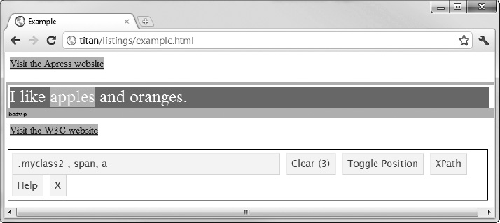
Figure 4-19. Using SelectorGadget to create CSS selectors
Enhancing CSS with LESS
When you start working with CSS, you will quickly realize that it is a verbose and repetitive way of expressing styles. There is a lot of duplication, which can make long-term maintenance of your styles time consuming and error prone.
You can extend CSS using LESS, which uses JavaScript to enhance CSS. It supports some nice features, such as variables, inheritance from one style to another, and functions. I have been using LESS a lot lately, and I have been pleased with the results. You can get details and download the JavaScript library at http://lesscss.org.
Using a CSS Framework
A number of high-quality CSS frameworks are available that you can use as the foundation for web sites and web applications. These frameworks contain sets of styles, which mean you don't have to reinvent the wheel. The better frameworks also smooth out the differences in implementation between browsers.
The CSS framework that I recommend is Blueprint, which is available for download at www.blueprintcss.org. It is simple to use and very flexible, and it has an excellent system for creating grid layouts.
Summary
In this chapter, I described how you create and apply styles, how these styles cascade, and how CSS handles units of measurements. I also mentioned some useful tools for determining and detecting support for particular CSS features in browsers and some additional resources that can be useful when working with CSS.